Counter Studio's 'quietly beautiful' identity for indie paint maker Atelier Ellis
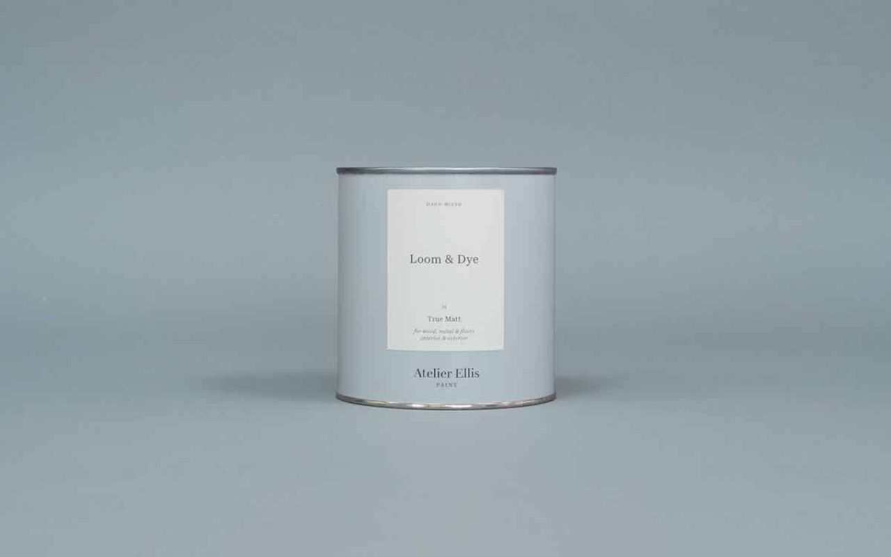
Counter Studio has refreshed the brand identity and packaging designs for independent paint maker Atelier Ellis, creating new designs and naming inspired by the idea of storytelling.
Atelier Ellis was founded in 2011 by Cassandra Ellis and had been operating under the name Ellis Paints. Focusing on creating beautifully crafted, hand-mixed paints., the independent paint maker had been "steadily been gaining a reputation for beautiful, quiet colours made with real care," according to Counter Studio.
The increasing success of the business meant that it had changed its production and operations processes to ensure the company was developing in a more sustainable way. Setting up a workshop in Battersea, south London, to gain more control over the paint production process, the brand decided a new name was needed, along with a refreshed identity and packaging designs.
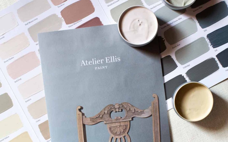
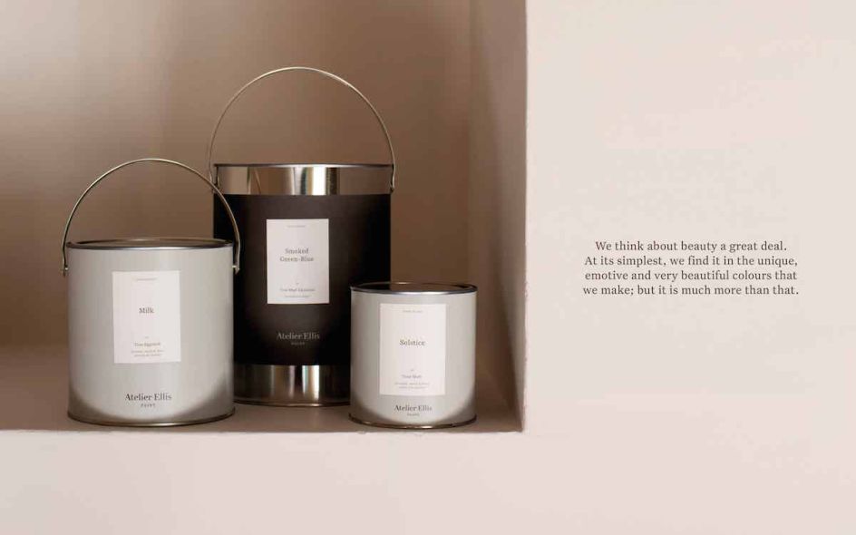
The new fully recyclable metal tins needed a design solution that would work across three different sizes, three different paint finishes and more than 50 different colours. There are currently 450 different combinations, a number that's steadily set to grow in future.
Counter Studio streamlined the brand to operate under the main Atelier Ellis name in a big to create a stronger, more unified identity and a simpler customer experience.
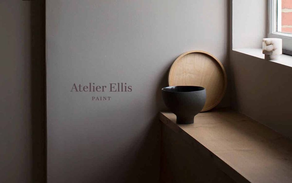
In a nod to the company's core aim of helping people create "beautiful homes that tell their own story," the new brand look was inspired by the idea of storytelling.
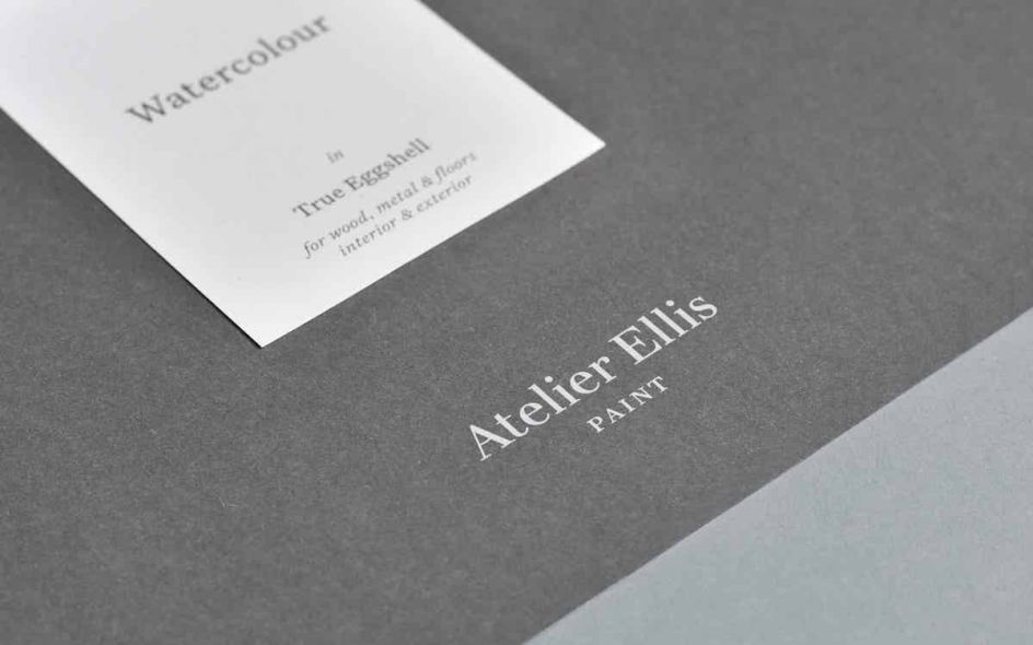
The new tins aim to be elegant and simple, using a design that works seamlessly across all sizes – with a uniformly sized, hand-placed label used across the range to distinguish the different paint finishes and colours.
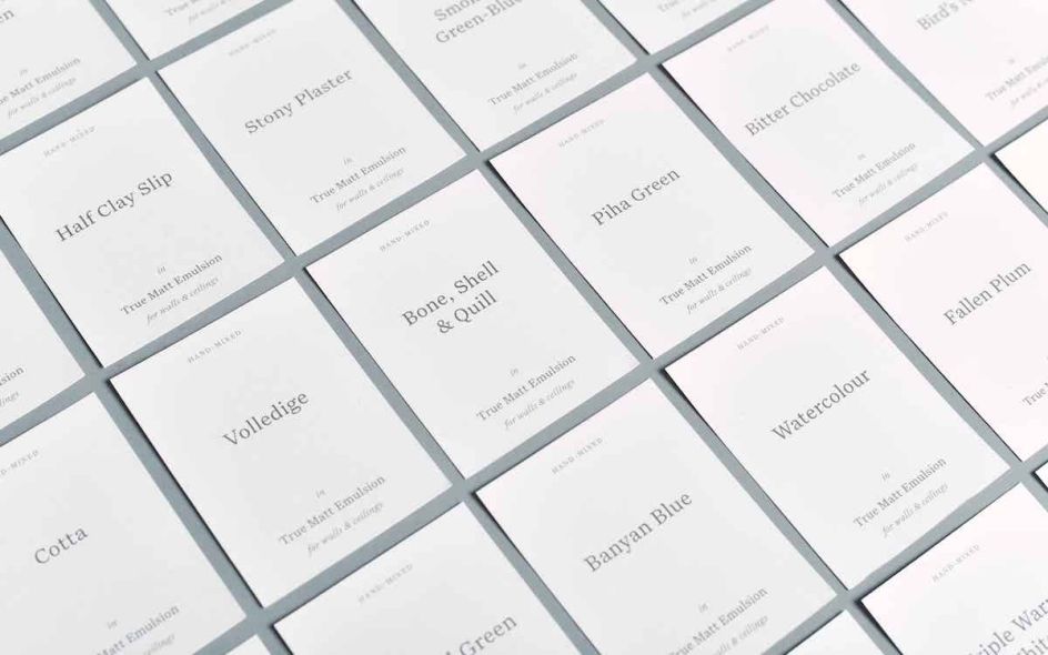
The visual language of books was also used to inform the designs, drawing on the idea of title pages to inspire the paint labels; and a "classic" typographic style was chosen to allow "words and space to become the low-key heroes," says Counter Studio founder Elizabeth Ellis—no relation to the brand.
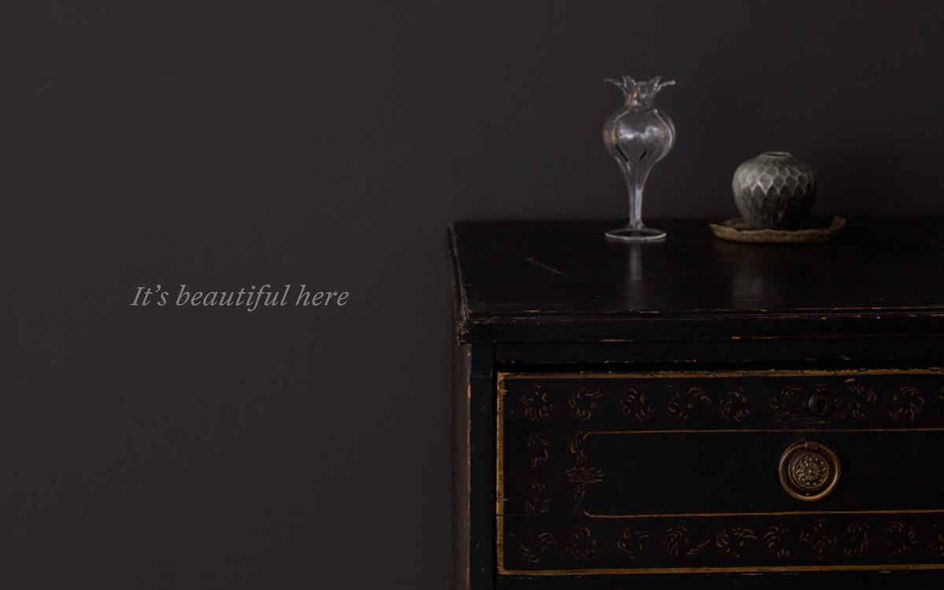
"The whole identity is deliberately understated and quiet, allowing the individual paints and the stories to take centre stage."
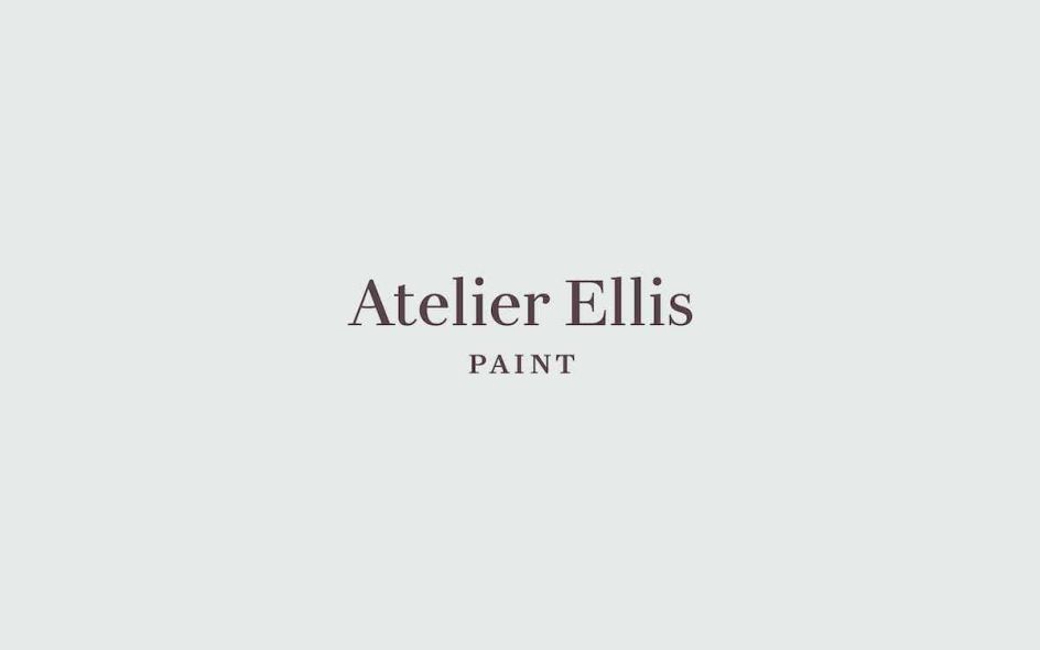
Counter Studio redrew the Atelier Ellis wordmark from scratch, basing the letterforms on the characteristics of the font Didot that was used in the former logo. The letter shapes were refined to add a "subtle sense of warmth and joy" while also ensuring the mark was robust enough to be used and legible across any size.
The storytelling premise meant that brand copy was very important, and Counter Studio commissioned Ed Pritchard to create rich, vibrant copy that reflected the "subtle delicacy and honesty" of the paint colours.
"The identity has been designed to allow the colours and the stories around them to shine – sophisticated, refined and beautifully quiet, just like the paint itself," says Ellis.
Editor's Picks


Trending


](https://www.creativeboom.com/upload/articles/90/908fdb6378db1e95d12595416f54e6336d5e80b8_732.jpg)
Podcasts


Editor's Picks
Further Reading