Cora rebrand by Mother Design finds the comfort in menstrual care and wellness
Cora, the leading US brand for period care and wellness, has teamed up with Mother Design to craft a new identity that puts inclusivity and comfort front and centre. With a bold look and personal tone, the rebrand taps into feelings of self-care and pride.
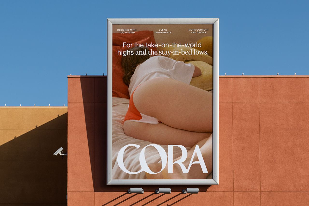
Photography by Molly Matalon
Since launching in 2016, it has firmly established itself in the natural period care sector with abundant product choices. However, for various reasons, period care is still seen as something of an afterthought, with consumers dashing in and out of aisles as quickly as possibly carrying the most convenient products to the checkout.
Enter Mother Design. The self-proclaimed small studio with a big heart helped Cora to reclaim its prominence on supermarket shelves and appeal to millennial customers by shifting the conversation away from an impersonal experience that needs to be dealt with to a more relatable, personal one that is rooted in comfort.
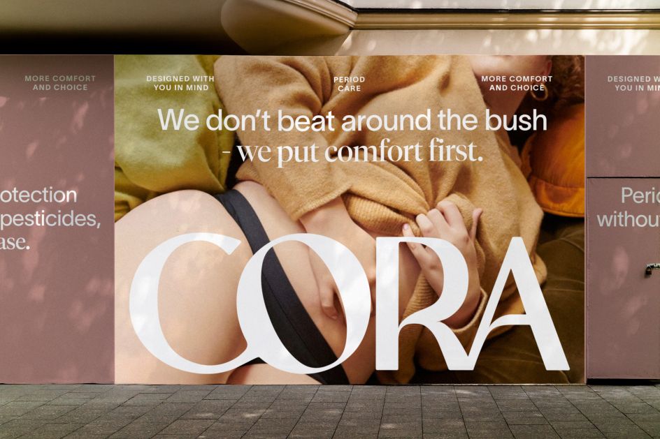
Photography by Molly Matalon
At the core of this goal was the idea that consumers want an empathetic brand identity that genuinely understands what they're going through. "We want to evolve period care to feel more like self-care," says Andrea McCulloch, VP of brand and creative of Cora. "Branding inspired by skincare and beauty–packaging worthy of belonging on your bathroom countertop, not hidden away in the drawers below."
The rebrand comes at a crucial time for the sustainable feminine care category. The market has grown significantly and is projected to be worth £1.56 billion by 2028. Add to that the fact that newer brands offering reusable products made out of organic materials look set to appeal more to modern sensibilities, there's a clear niche in the market waiting to be tapped.
"The sector straddles a practical need to work and be efficient and the cultural conversation to do with our bodies and our identities," says Kathryn Jubrail, managing director of Mother Design. "Consumers want an empathetic approach and understanding of their experiences that offer emotional and physical comfort."
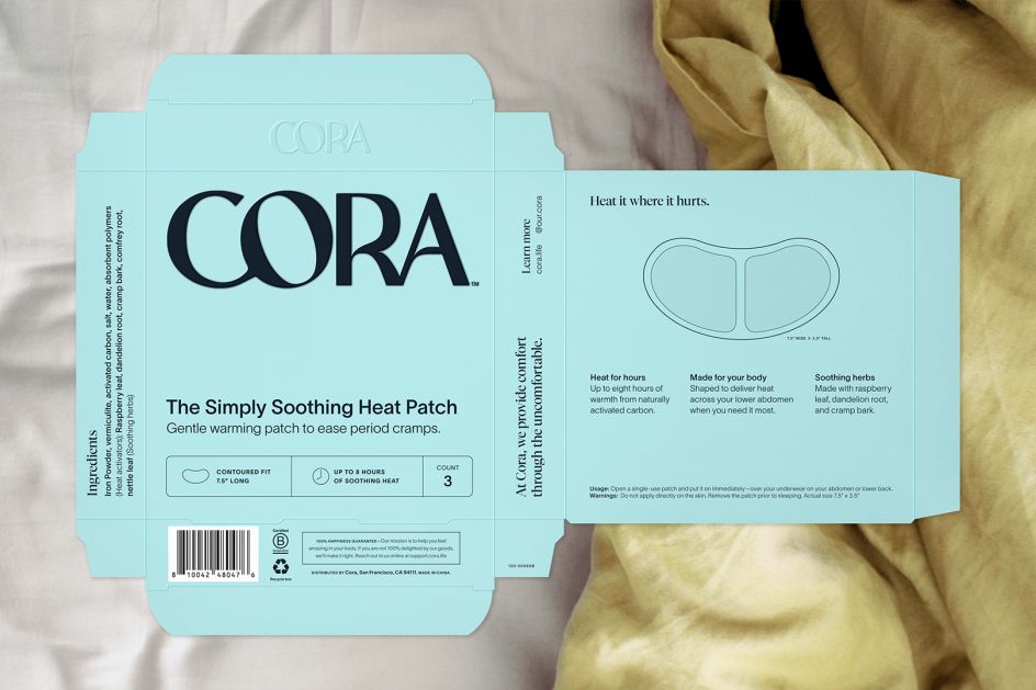
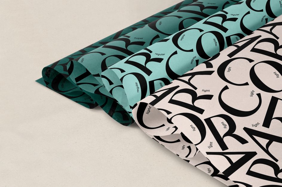
To address all of these concerns, Mother Design built on Cora's brand recognition with a new, oversized logo crafted with a bespoke typeface. Conveying authority and support through is rounded, fluid and balanced design, subtle details like the rounded stress of the 'O' as it is propped up by the 'C' create an impression of care. The very act of the lettering supporting itself also keys into the human element the brand was striving towards.
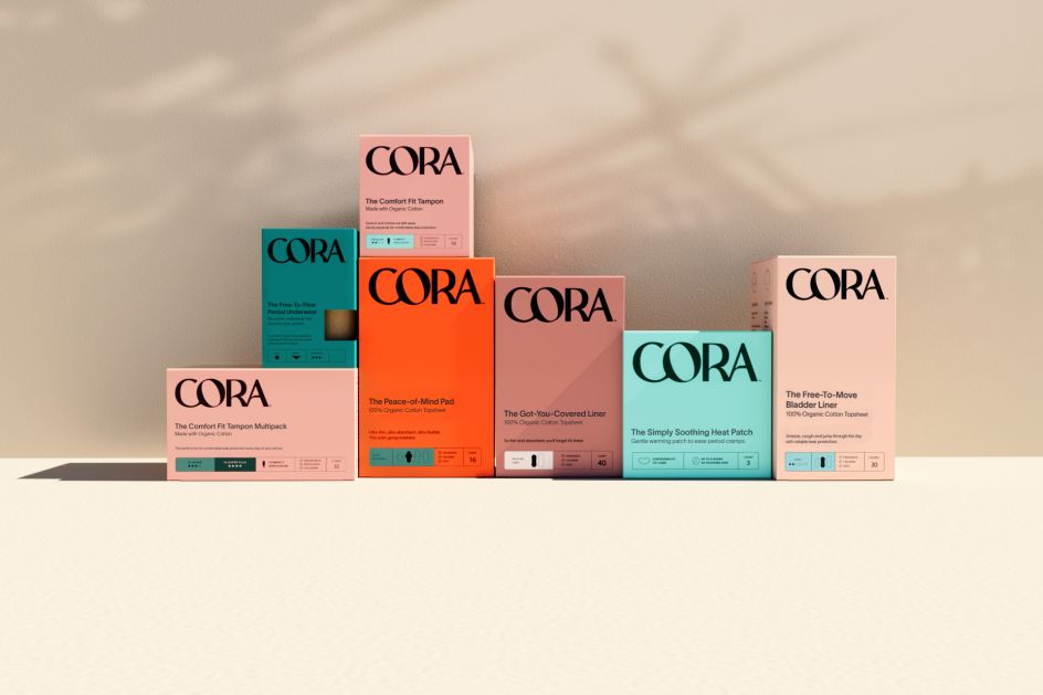
And whereas the previous packaging relied on white as its hero colour, the rebrand takes a modern approach by using an assortment of earthly tones. A cleverly organised hierarchy system based on colour makes the packaging easier to navigate for harried shoppers. No more struggling to read the box or the packet to figure out which absorbency you're adding to your basket.
"We set out to provide comfort both at a product level and emotional level," explains George Wu, design director of Mother Design. "The new identity gives the brand the confidence to champion and be a partner in consumers' physical care and wellbeing, but also to champion them culturally, recognising that bodies and experiences are unique and ever-evolving."
Typography and innovative product naming cap off the rebrand. Two new typefaces are introduced to help spell out Cora's brand expression. The first is clean and sophisticated, whereas the editorial font appears more characterful. The two are always combined to highlight messages that bring a sense of duality to the copy.
Meanwhile, the product names sum up the shift to an emotionally driven tone of voice. Cora stood out from its competitors and settled on names that suggest an emotional benefit, such as The Comfort Fit Tampon, The Peace-of-Mind Pad, The Got-You-Covered Liner, and The Perfect Fit Disc.