Through a series of flipbooks, Chloe Vandewalle has created a world where nothing seems to happen
Prepare to be both frustrated and amazed in Chloe's recent project, Rapport d'inactivité, which sees playfully illustrated objects given no purpose at all.
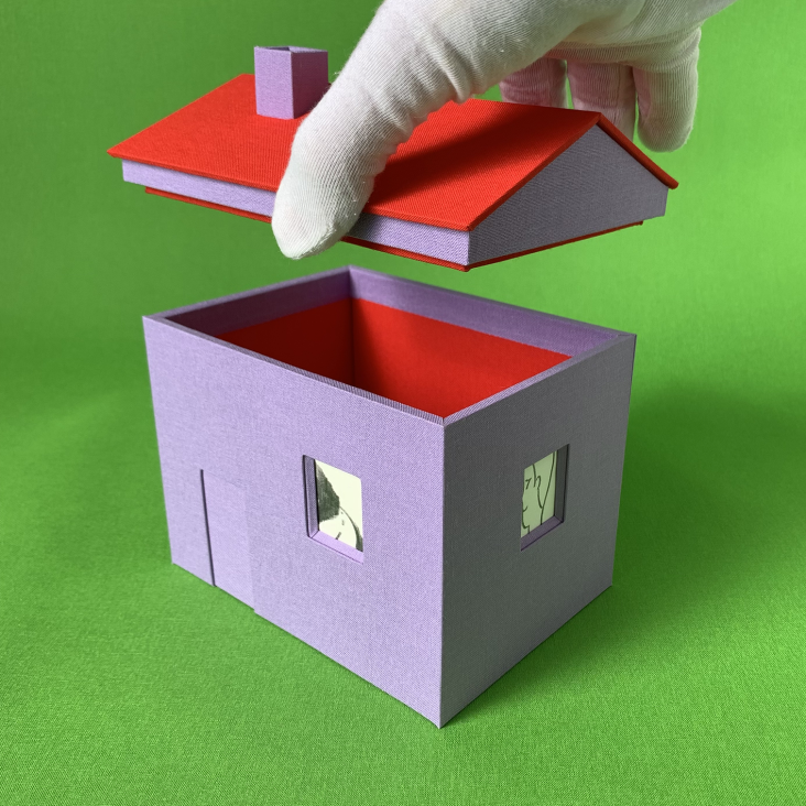
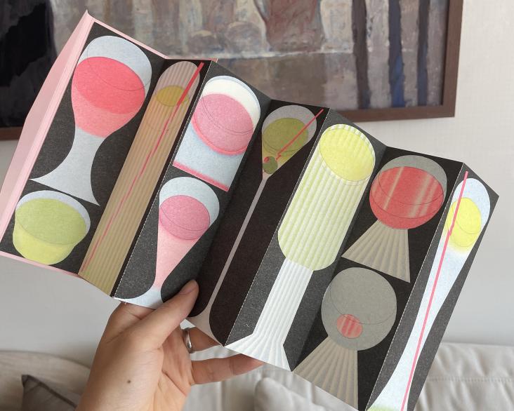
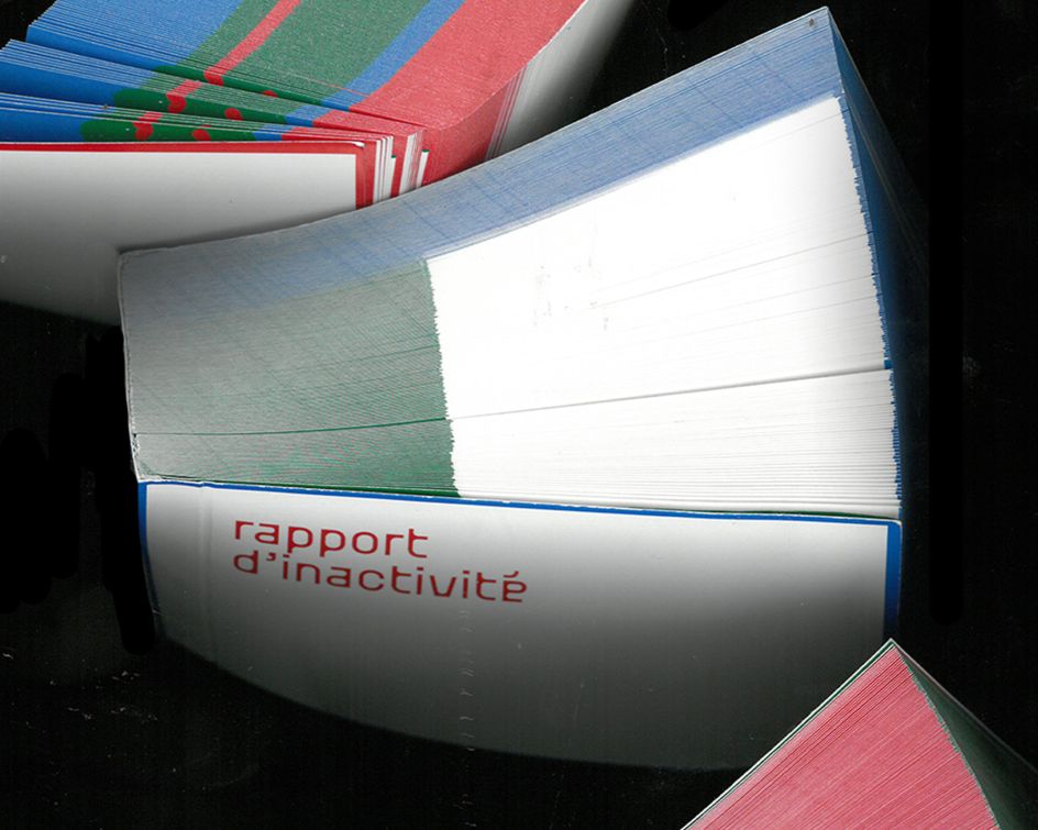
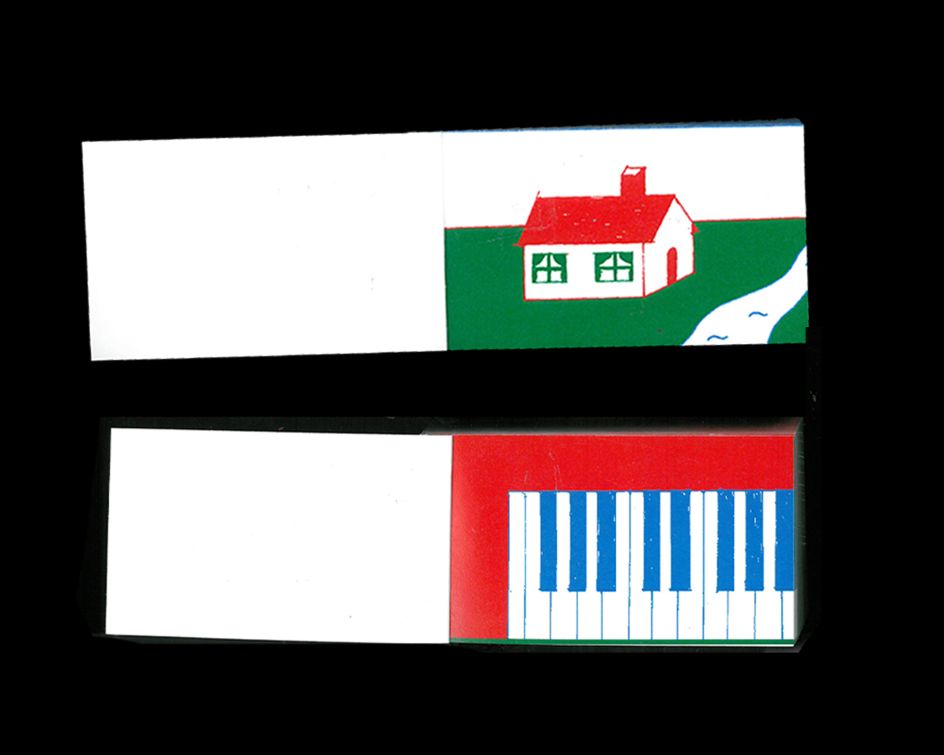
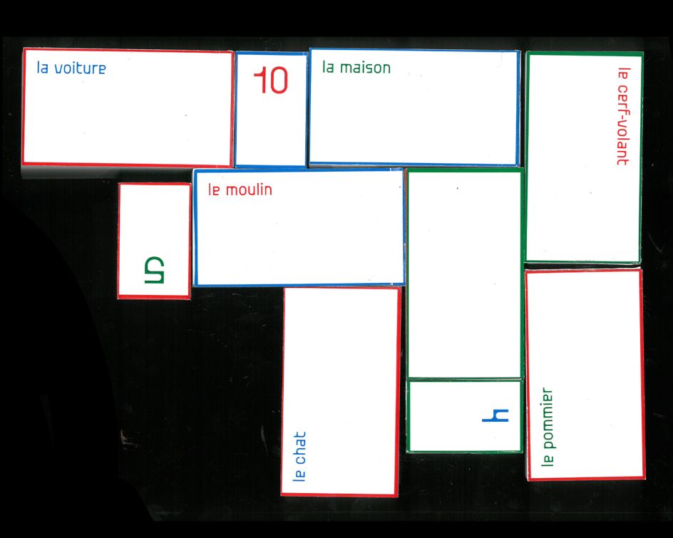
If you're arriving at Chloe Vandewalle's new project, Rapport d'inactivité with the hope of some answers or even just a story, then prepare to be a little disappointed. Consisting of 10 flipbooks made as part of a course at ÊCAL, the project features primary hues, bold shapes, simple typography and playful illustrations of cats, dogs, houses and pianos. It's a spinoff of the typical corporate activity report, where business growth is celebrated. Only in these reports nothing seems to happen.
After being given the brief, the task was to take an existing book and give it an entirely new twist. Chloe's choice was the "Rapport d'activité des transports lausannois" – she added the prefix "in" and playfully transformed it into "rapport d'inactivité" which translates to "inactivity report".
In this ingenious endeavour, Chloe created a world where (almost) nothing happens, leaving the viewer with a sense of latent frustration. "Therefore, I created these flipbooks which, as such, move by the movement of the pages, but whose content, on the other hand, remains fixed," she says. "I wanted to explore a medium where the expectation of its finality is rather high, only to be disappointed because the action isn't there."
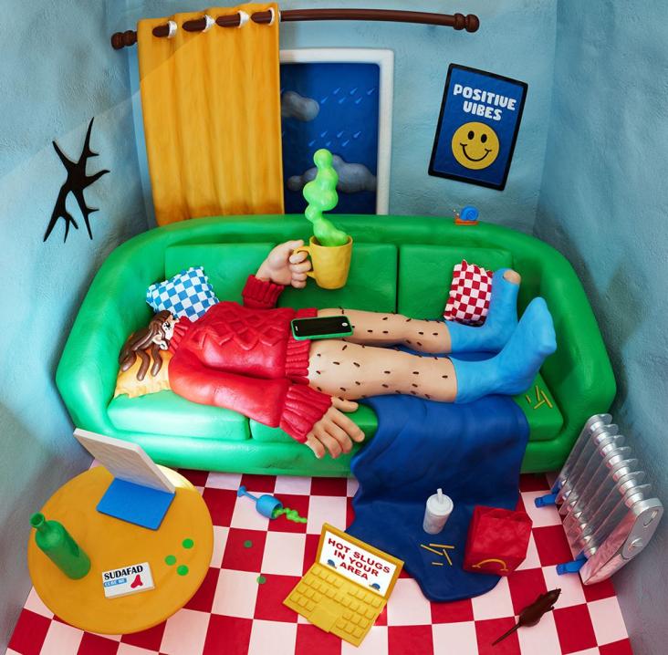
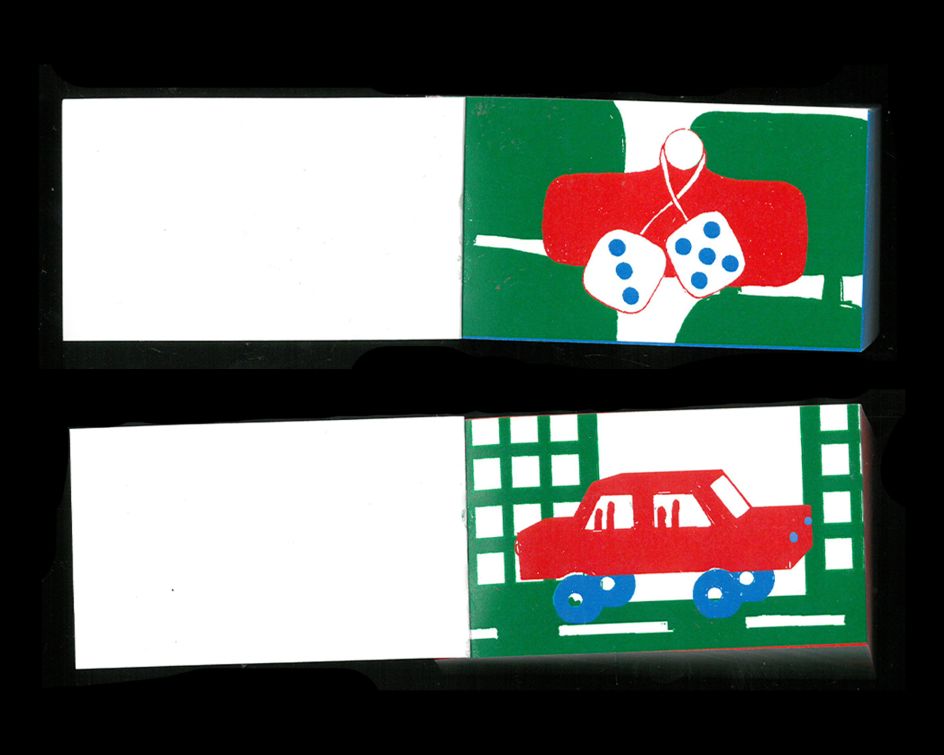
The concept behind this project shows that not only is Chloe a skilful designer and illustrator, but she also has a lot of artistic wits. The book tells a story of inactivity, contrasting sharply with the conventional corporate activity reports that are known for celebrating growth and production. It showcases objects in a state of non-performance: a stationary mill, a kite stuck in the sky, a bowling ball missing its target, and a car refusing to run. This portrayal of inactivity forms the very essence of Rapport d'inactivité, inviting viewers to ponder the inefficiency of objects designed to perform a function.
Chloe's choice of a bright and colourful aesthetic is a deliberate one. "I like the contrast between the inertia of the flipbook, which presents itself as a concrete wall that puts a rather cold stop to us, and the mischievousness of the more colourful, crude illustrations, which almost taunt us for not having given us what we expected of them."
These artistic decisions reflect Chloe's desire to play with contrasts and engage viewers in her experiences. She explains how, in her approach, she always tries to take, "le premier degré au second et le second degré au premier" – which loosely translates to going from the first point to the second, and back to the first again. A cyclical and confusing concept, Chloe doesn't shy away from visuals that may appear naive at first but hold a deeper meaning. Rapport d'inactivité is paramount to that.
The design details in the flipbooks are marked by raw lines executed in a beautifully childlike manner. "If you look closely," she says, "you can see that sometimes the colour sticks out a little in an area where it shouldn't be. That's part of the logic of the project: to do things that aren't meant to be."
As Chloe selects her favourite moments from the project, she points to the car in the city that refuses to mop, the silent piano and the stubbornly standing pins. "Because the very essence of their function has been fully erased, yet they're there and stand still, shamelessly," she adds.
All in all, she hopes that she evokes a smirk on people's faces when they pick up a copy of these flipbooks and understand the links between the title, process and result. "You know that little moment when your brain links everything, and you're like, 'ah, pas mal!' that's when I know I can be content with myself."


](https://www.creativeboom.com/upload/articles/90/908fdb6378db1e95d12595416f54e6336d5e80b8_732.jpg)