Baillat Studio's identity for Rose Orange terrace is inspired by the warming hues of the sunset
Located high in Montreal, the terrace's delectable sunsets influenced the entire graphic identity.
Sat atop the 44th floor, way up high on the prestigious Place Ville Marie, Monreal, is a new summer terrace, Rose Orange, designed by the A5 group. With heads almost in the clouds, visitors can enjoy the views and indulge in the sunsets on show every evening. The warm, milky hues of the terrace sunsets are what have inspired the graphic identity created by Baillat Studio, who was enlisted to give the terrace a pink-infused makeover.
"The brief was to bring something joyful, playful and vibrant to the brand look," says Jean-Sébastien Baillat, founder of the studio. Located on top of the towering and iconic Montreal building – 185 metres in height, to be exact – this venue demanded a look that resonated with its exceptional location and the colours created when the sun slowly takes itself to bed. "From the terrace, we have a spectacular view over Montreal, and since the happy hour leads to the sunset, it was an obvious inspiration with such a spectacular view."
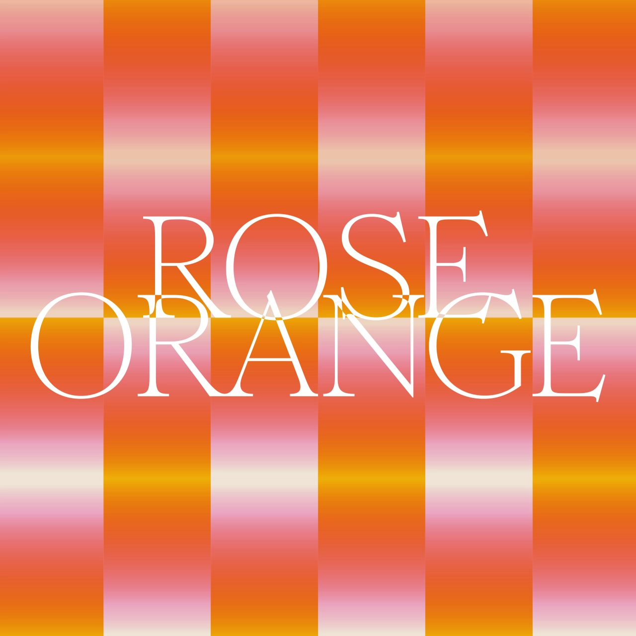
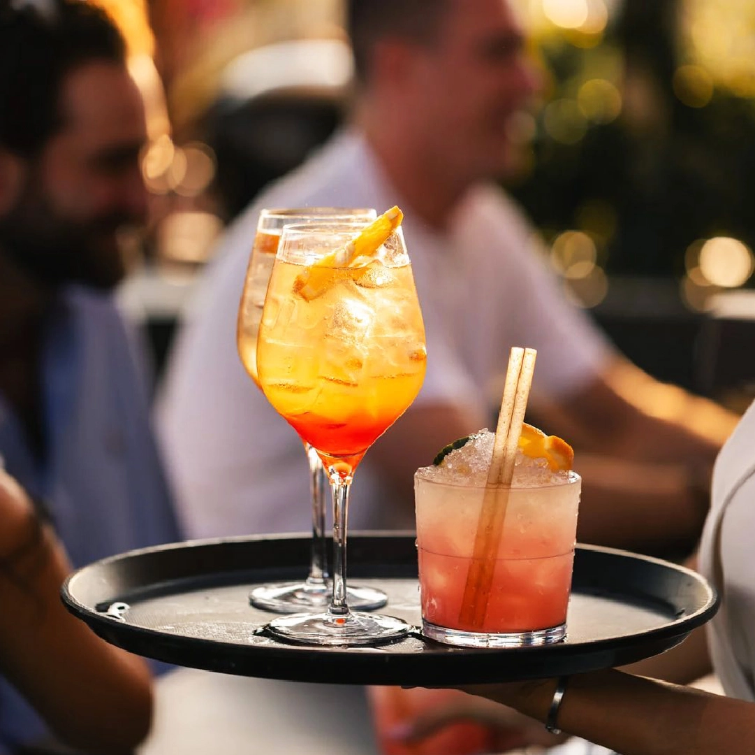
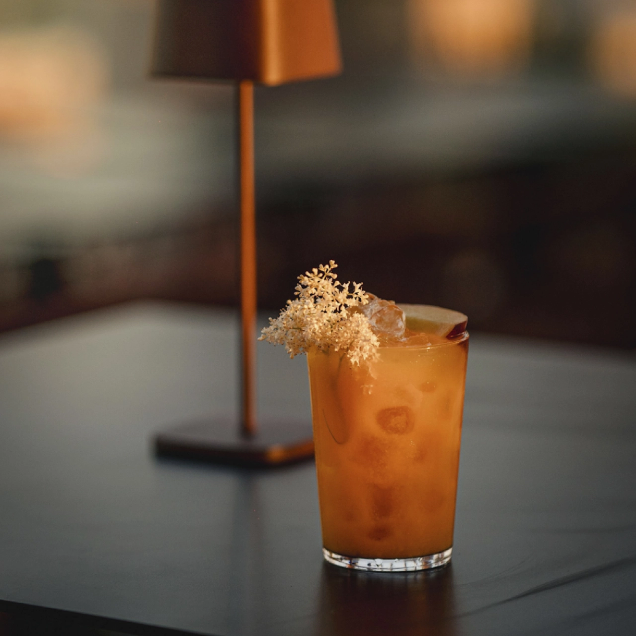

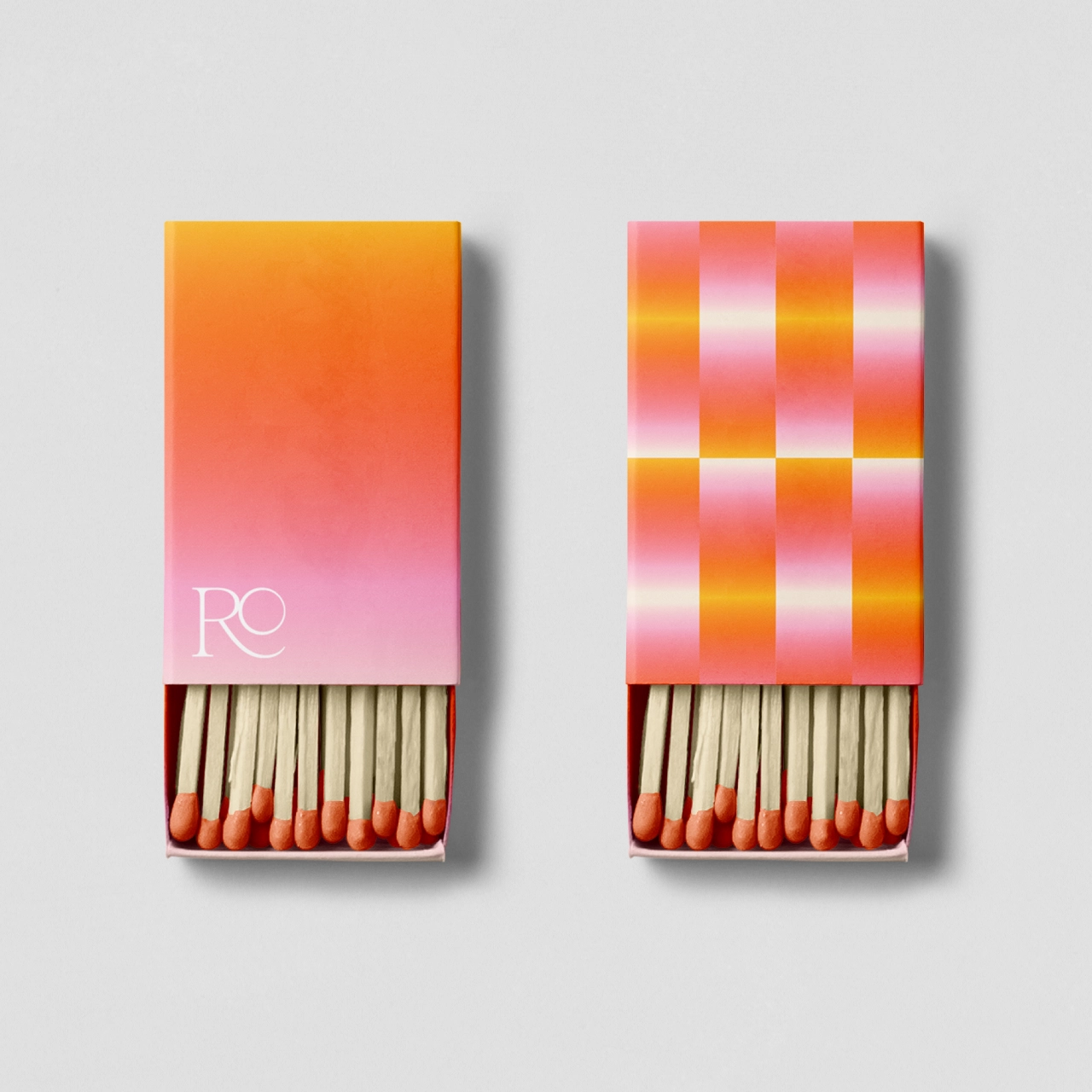
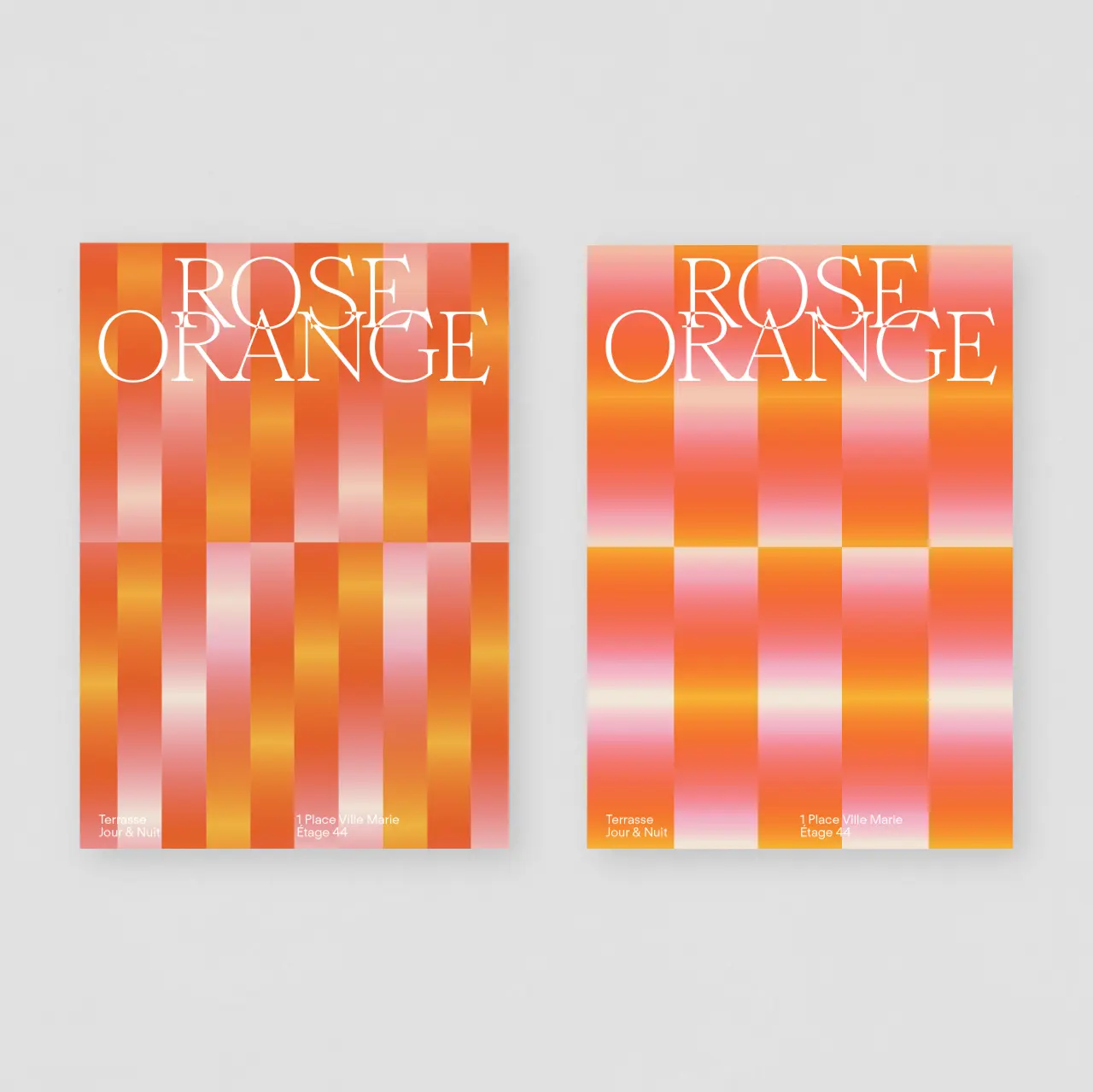
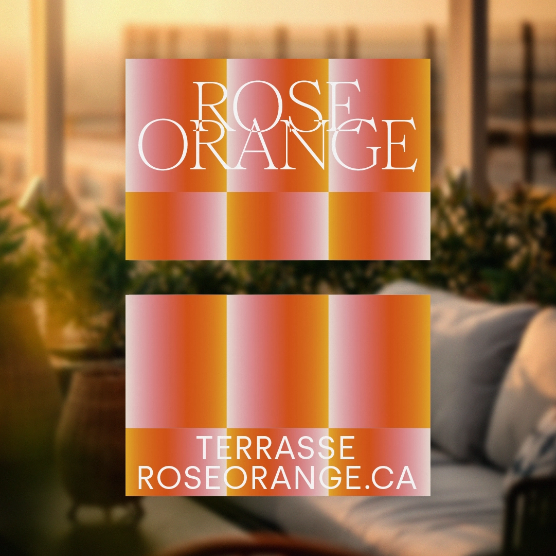
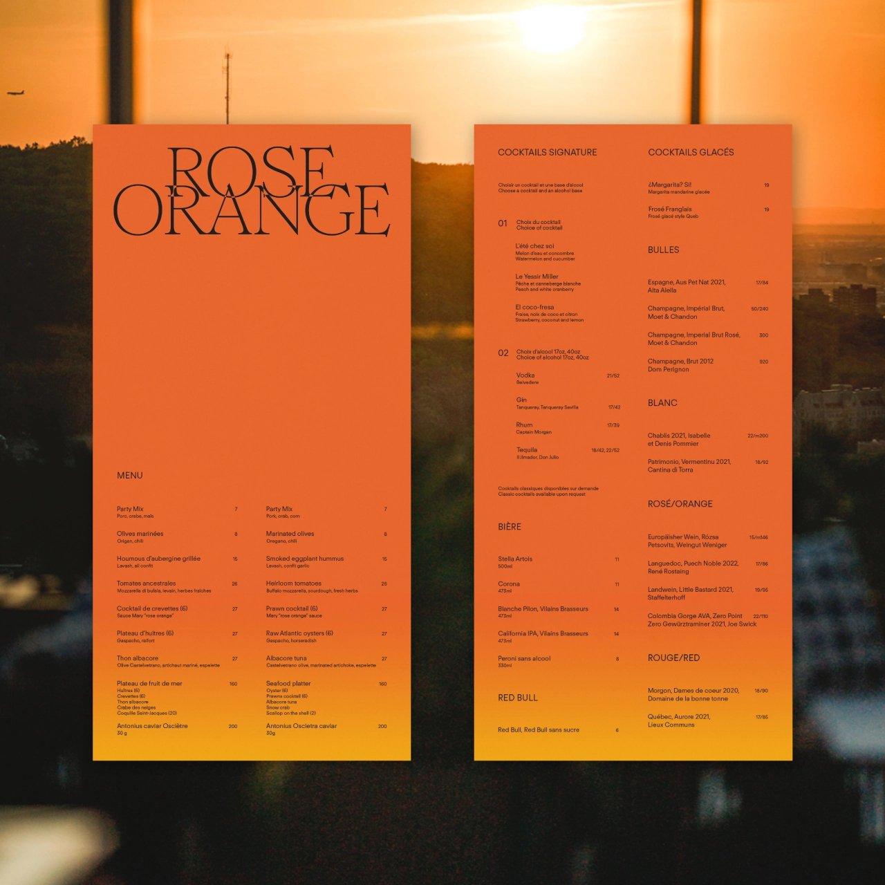
Aesthetic details played a significant role in shaping the brand identity of Rose Orange. Baillat Studio chose to embrace the gradient of the sunset, "breaking up" the hues in a modern, almost woven-like composition lavished in pinks and reds. This can be seen in a chequered design on the back of a coaster, the poster design, website, matchboxes, menu or even the colour of an ice-cold Aperol Spritz – all of which makes the "terrace look unique and modern", says Jean-Sébastien.
Typography, a vital aspect of the project, further reinforces the venue's "upscale side" and the character of the rooftop space. Baillat Studio opted for a serif font to exude an air of sophistication and refinement; the font chosen for the logo is Romie by Margot Lévèque, while the secondary typeface is Regola Neue by Formula Type. These fonts work in tandem to create a brand identity that is both timeless and contemporary, working in harmony with the colour palette. "All of it was designed in Illustrator with a very simple and vibrant approach," continues Jean-Sébastien.

When asked about the response they hope to elicit from the audience, Baillat Studio expresses a desire to "convey love and vibrance". The design choices, inspired by the sunset and shaped by contemporary aesthetics, seek to create a warm and inviting atmosphere where patrons can bask in the joy of the moment, sit back and enjoy the unique location.
Editor's Picks





Trending






Latest Jobs
Principal Software Engineer at BBC Media Tech
Full-time·Glasgow·Up to £83,790
Account Manager at Moxie and Mettle
Full-time·Cheltenham·Up to £35k
Senior Operations Manager at BIG Partnership
Full-time·Glasgow·£45k–£50k
Junior Project Coordinator at Colorido Studios
Full-time·Twickenham·£28k–£32k
Creative Content Executive at Cognition
Full-time·Birmingham·£28k–£35k
Senior Designer at Definition
Contract·London·£45k–£50k