SomeOne designs an identity for Canada Water Dockside that encourages self discovery
Peace, beauty and self-discovery are at the heart of SomeOne's visual identity for London's newest district and working quarter, Canada Water Dockside.
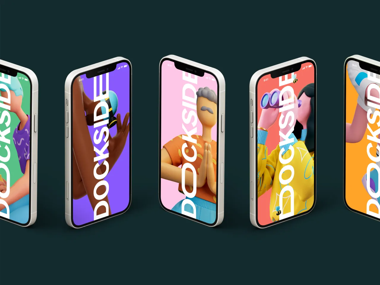
London-based design agency SomeOne has collaborated with ArtInvest and Liam Pitchford to create a visual narrative for the Canada Water Dockside area, one which will encourage those who live and work there to flourish and achieve their full potential.
The district, nestled in the heart of Zone 2, promises to be a "healthier mix" of nature, work and play. A short distance from Bank and Canary Wharf, Canada Water Dockside represents a fresh approach to living in the city. And with this comes a suitably fresh approach to creating the look and feel for the area.
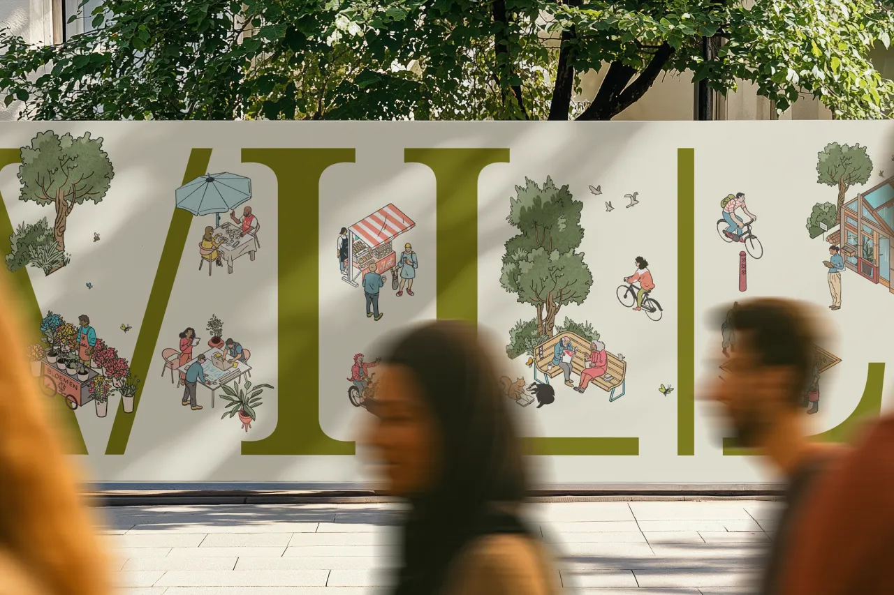
Working under the assumption that "the greatest experiences in life are the ones where we find ourselves", SomeOne's identity represents a breath of fresh air when it comes to designing for city living. Capitalising on the unique charms of the 5.2-acre green site and the dock itself, SomeOne created a visual botanical playground for Dockside, that "constantly adapts and showcases the very best of what the area has to offer."
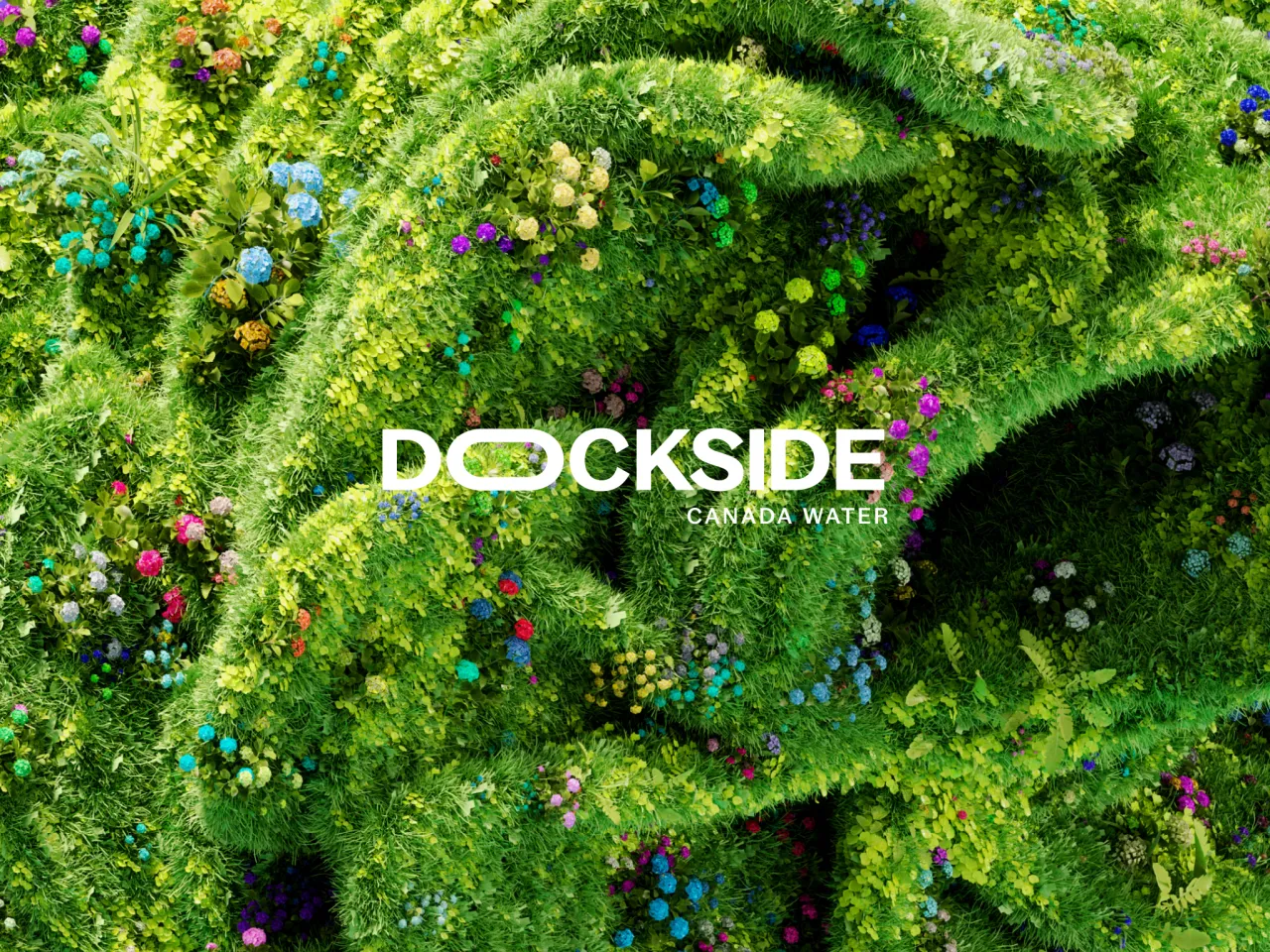
Ian Dawson, the lead designer at SomeOne, adds: "Imagine a place where everything is designed to encourage you to flourish, and you get close to what we are designing."
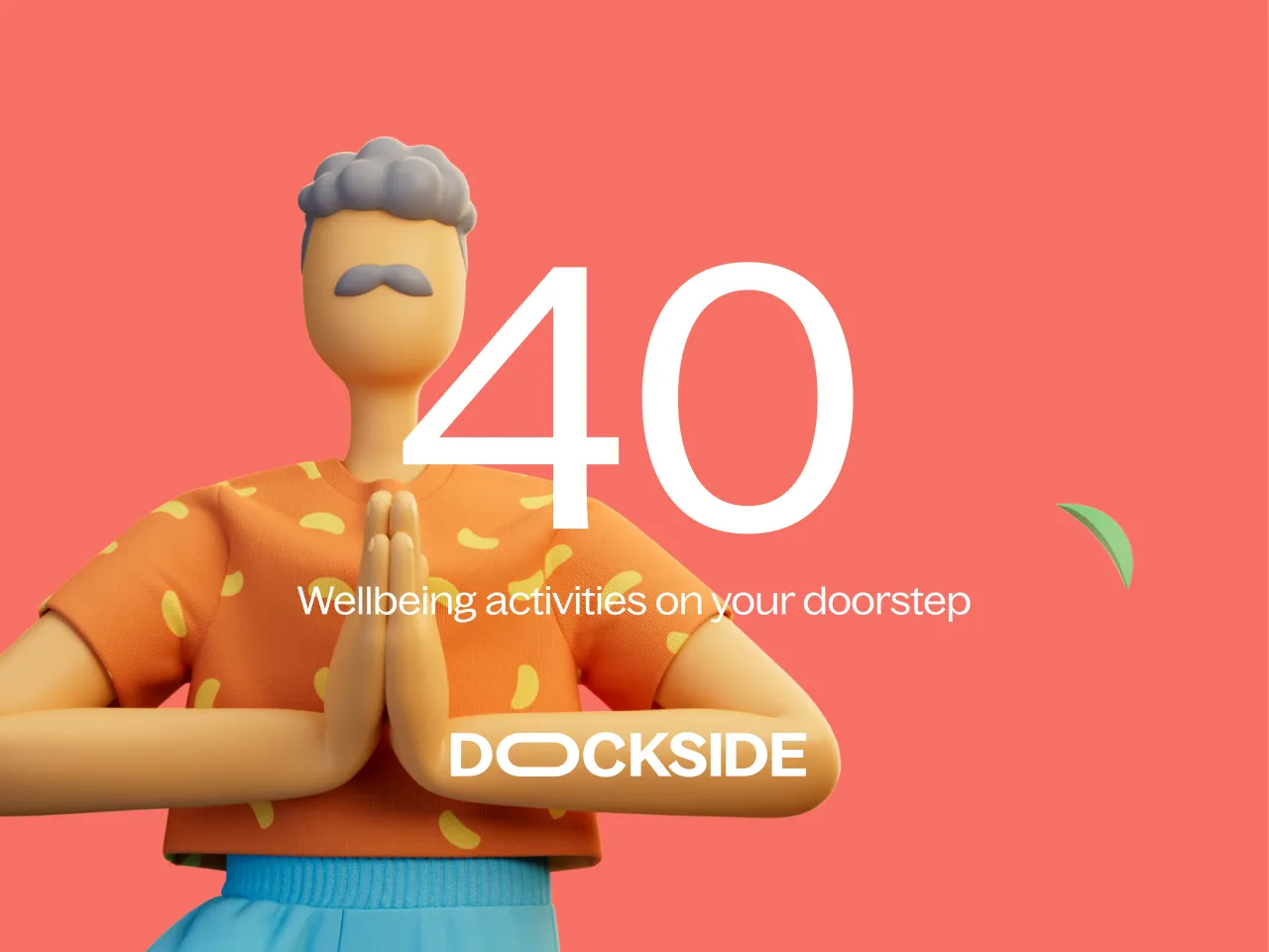
To bring Canada Water Dockside to life, SomeOne decided to showcase the best of what it has to offer. Its brand narrative includes a flexible logotype, highly detailed and refined botanical forms in UHD, and an extensive library of Dockside mascots.
All of these elements work together to generate a sense of community. One that rejects egos and properties and instead aims to build optimism for people, London, the nation, and the planet.
"The planet demands the development of more ethical, sustainable, respectful ideas to connect communities, support livelihoods, to grow responsibly and healthily," says SomeOne. "So the team looked beyond the immediately obvious into wider concerns to ensure they are building places, spaces, services and ideas that don't just fit with right now, they leave us all fitter and healthier tomorrow."
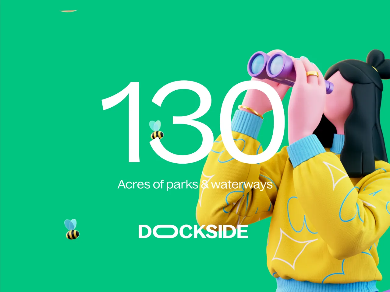
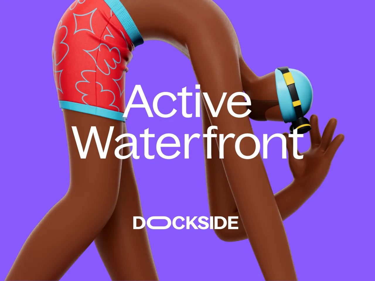

A prime example of this approach, seen throughout the new branding, is the Bagoss font by Displaay Type Foundry. Bold enough to stand out yet flexible enough for everyday messaging, it's the perfect companion to SomeOne's Dockside playground approach.
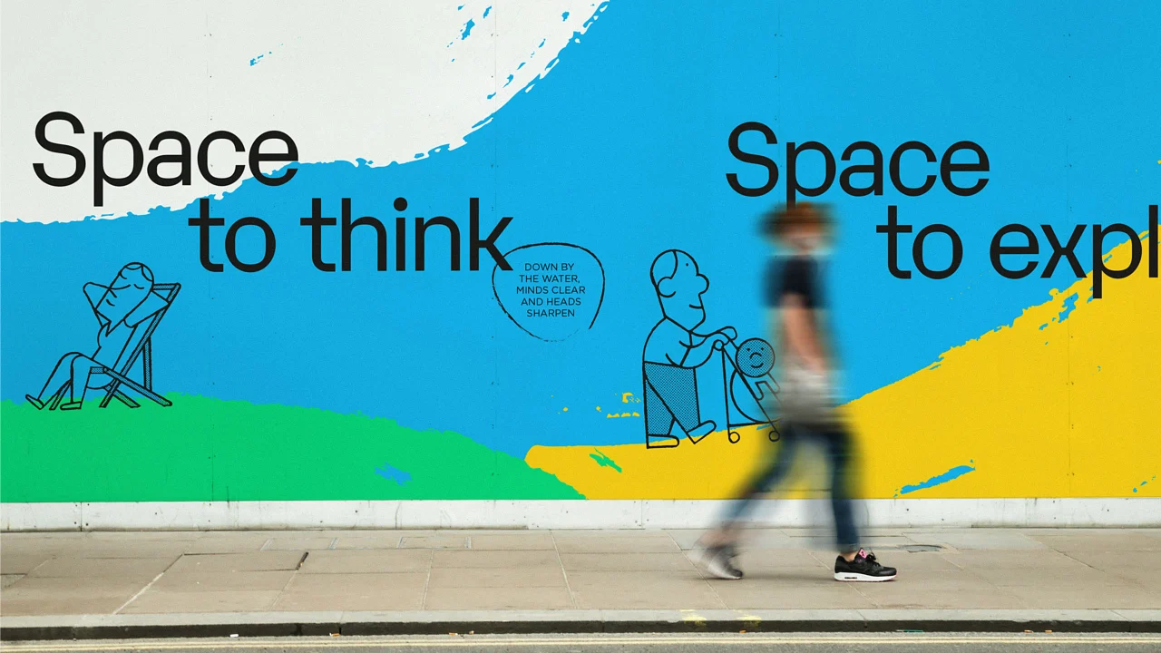
Accompanying Bagoss is a library of Dockside mascots created with Arcade Studio. These give the identity a sense of "relatable, conventional charm" as each character highlights the opportunities available to visitors and residents, including swimming, paddle boarding, yoga, and bird watching.
"Placemaking is a very similar endeavour to what we look to do with brands… both efforts require lateral thinking and a collaborative mindset," says SomeOne creative director Shaun Turnbull.
"Illustration, bespoke typography, strategy, animation, iconography, copywriting, CGI, storytelling, signage, advertising… it's all here, and more."
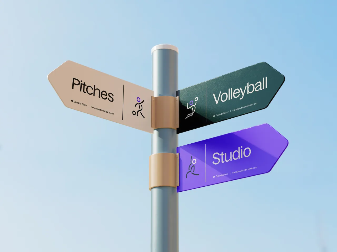

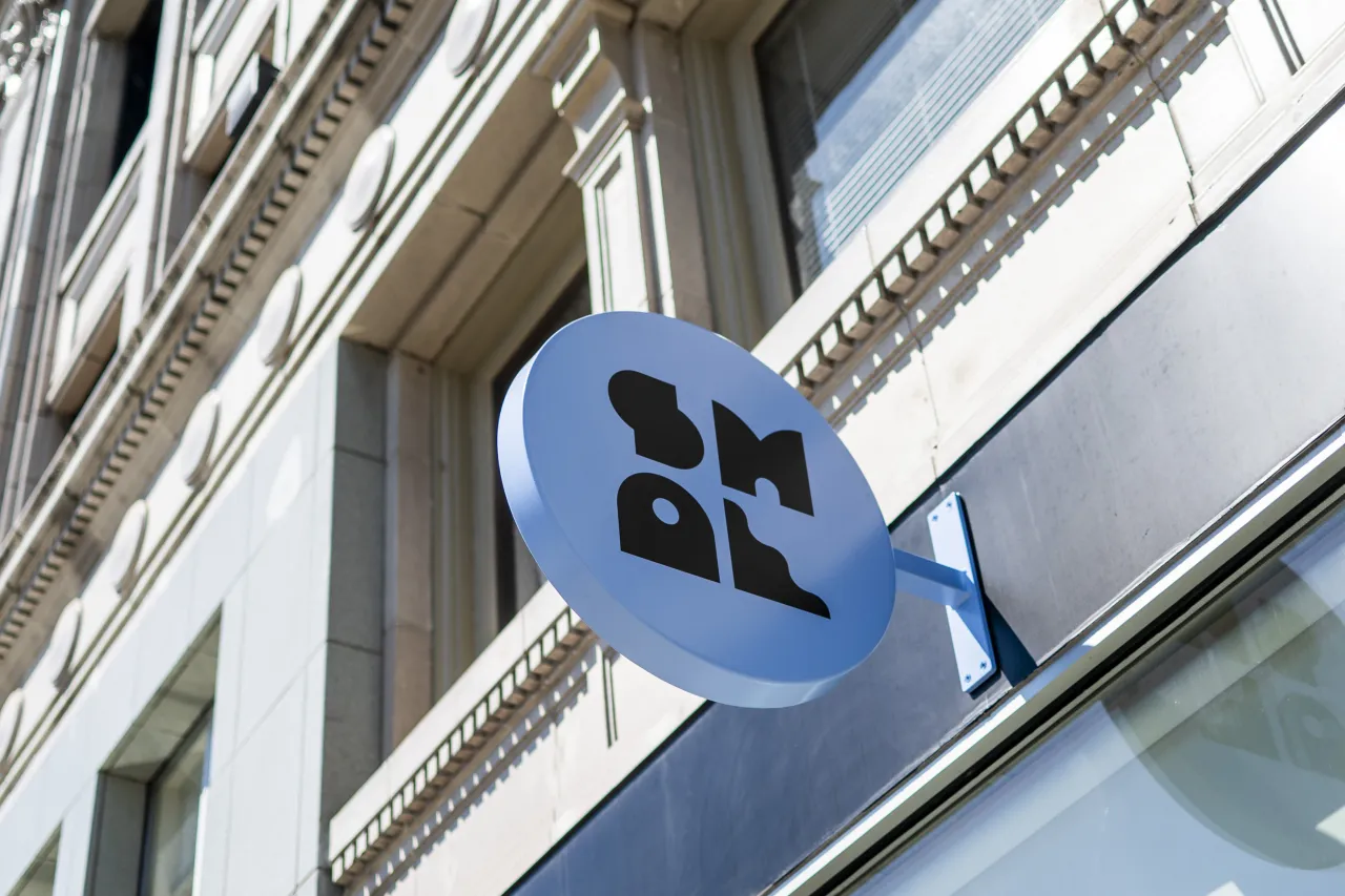
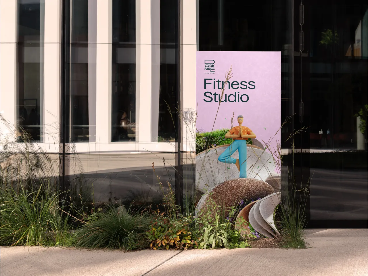
Elsewhere, a suite of iconography and signage enhances the physical spaces in Docklands. In this instance, they take the functionality aspects further in terms of both physical and digital experiences with the help of supergraphics. These bring lightly branded moments to surrounding community areas, and further help deliver the idea of self-discovery and development.
"This is a highly recognisable, enduring branding programme for a place being reinvented from many points of view for many differing audiences," says SomeOne founder Simon Manchipp. "It makes sense for this to be a visual shapeshifter where themes tie together – avoiding fixed repetitive stamps."
SomeOne adds: "You'll find more than you were looking for on the Dockside – and the same can be said for the new visual identity."
Editor's Picks





Trending





Latest Jobs
Creative Social Content Producer at Bompas & Parr
Contract·London·£32k–£40k
Principal Software Engineer at BBC Media Tech
Full-time·Glasgow·Up to £83,790
Paid Media Executive at Munro Agency
Full-time·Glasgow·From £27,000
Client Director at Koto
Full-time·Berlin·€70k-€85k
Midweight Graphic Designer at We Are Your Friends
Full-time·London·£36k–£44k
Art Director at The New York Times
Full-time·New York·$120k–$130k