Queer-focused Brazilian mag Samba's design is a 'beacon of hope' in uncertain times
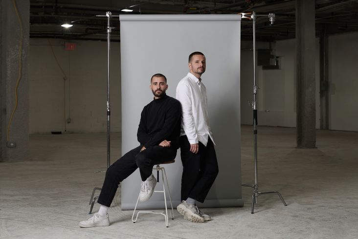
Despite all the current dystopian strangeness/hideousness going on at the moment, Brazilian designers Leo Porto and Felipe Rocha have cause for celebration: the longtime collaborators have teamed up to create their now Brooklyn-based practice, Porto Rocha.
The pair says that the studio was founded on the idea that "unique and global perspectives are key to developing brands that remain deeply connected and relevant to the rapidly changing world that we live in today."
Porto and Rocha are respectively former design director of Collins and art director at Spotify and Sagmeister & Walsh; they finally decided to take the plunge and set up on their own, and already have an impressive roster of clients including Apple, Airbnb and H&M.
The designers have always been active in promoting design from their native Brazil. In 2017, they launched design platform Bonde which which "spotlights the contributions of Brazilian creatives and the importance of immigrants alike", as they put it.
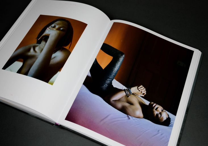
One project that caught our eye is the studio's editorial design for Samba; a publication focused on Brazilian queer culture. The mag launched last year "as a response to Brazil's politically turbulent climate," says Porto Rocha, "featuring some of the most prominent and rising LGBT+ voices in the country." The studio adds that the features and images in Samba forms "a constellation of authentic narratives that both inspires younger generations and encourages us all to dream".
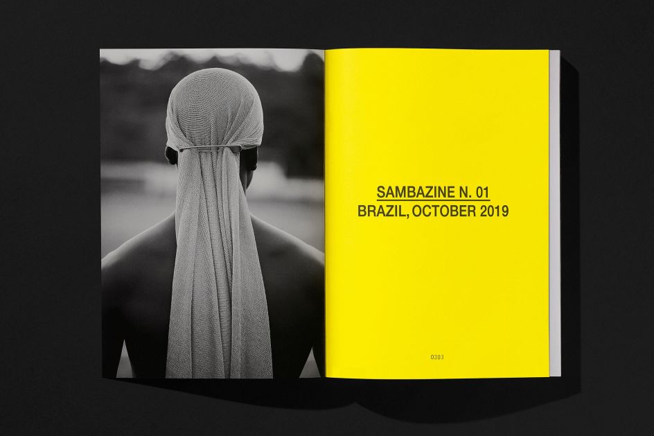
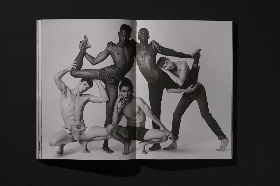
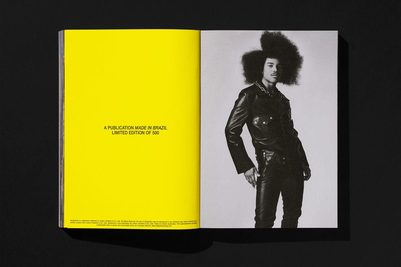
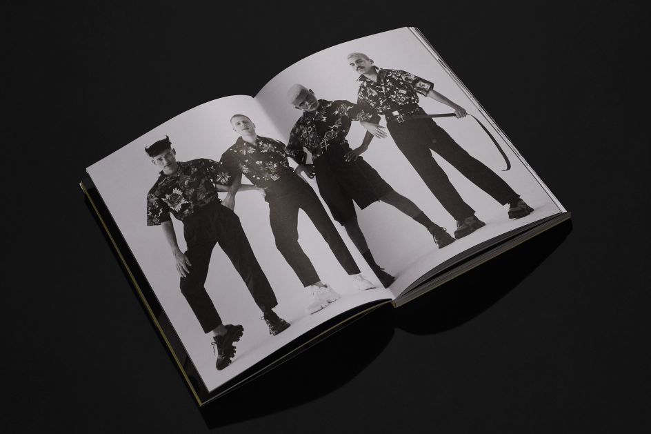
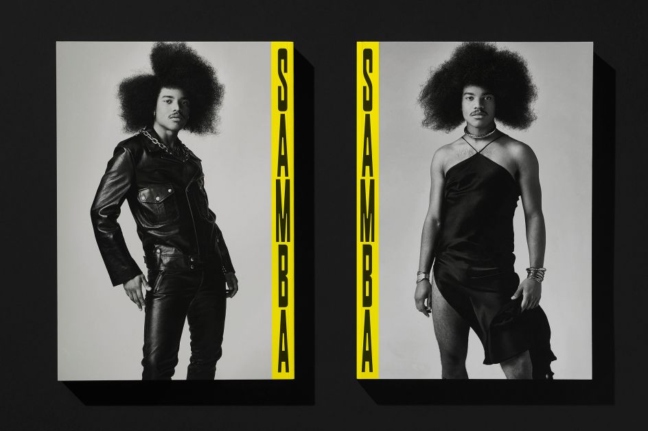
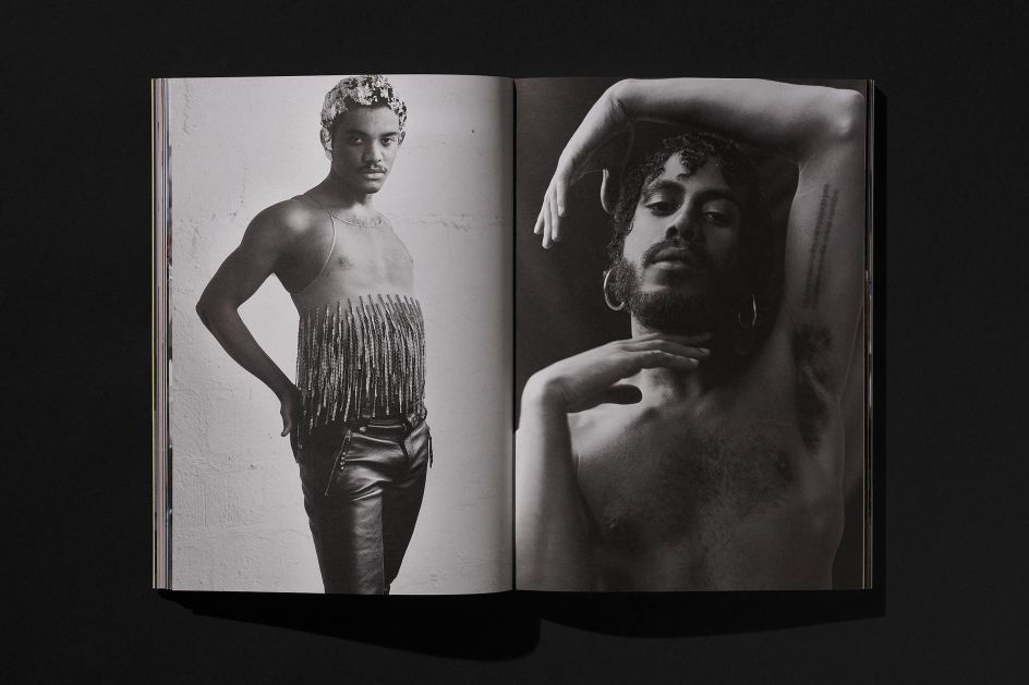
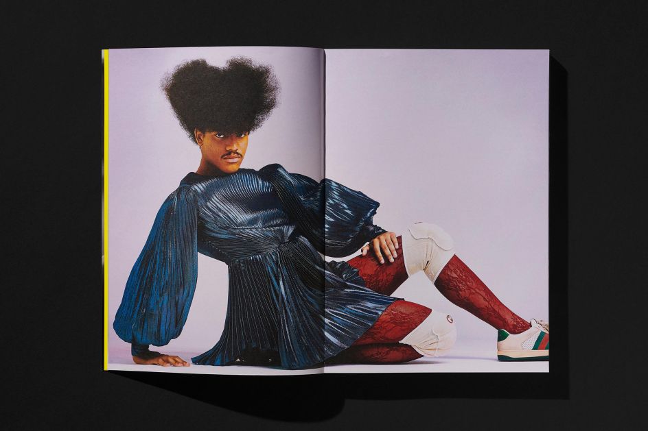
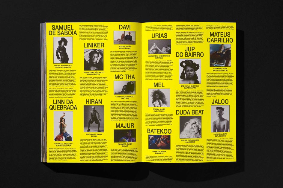
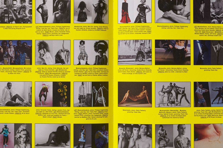
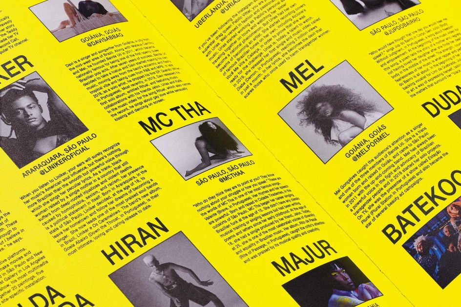
Samba focuses mostly on striking photographic across art, music and fashion, and their interrelationship with Brazilian queer and Blac"k culture with collaborators ranging from established names such as Liniker to "Instagram-sourced folk like Iago Kulesis. The cover star is young, Black queer artist Samuel de Saboia. This cover choice "not only challenges President Bolsonaro's rhetoric but also provides as a beacon of hope in a time of vast uncertainty," says Porto Rocha.
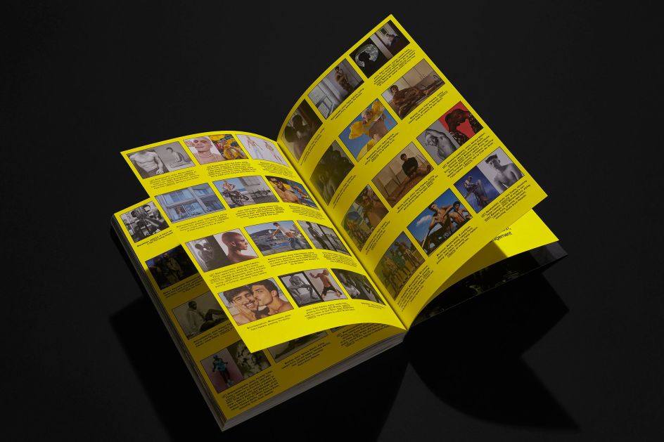
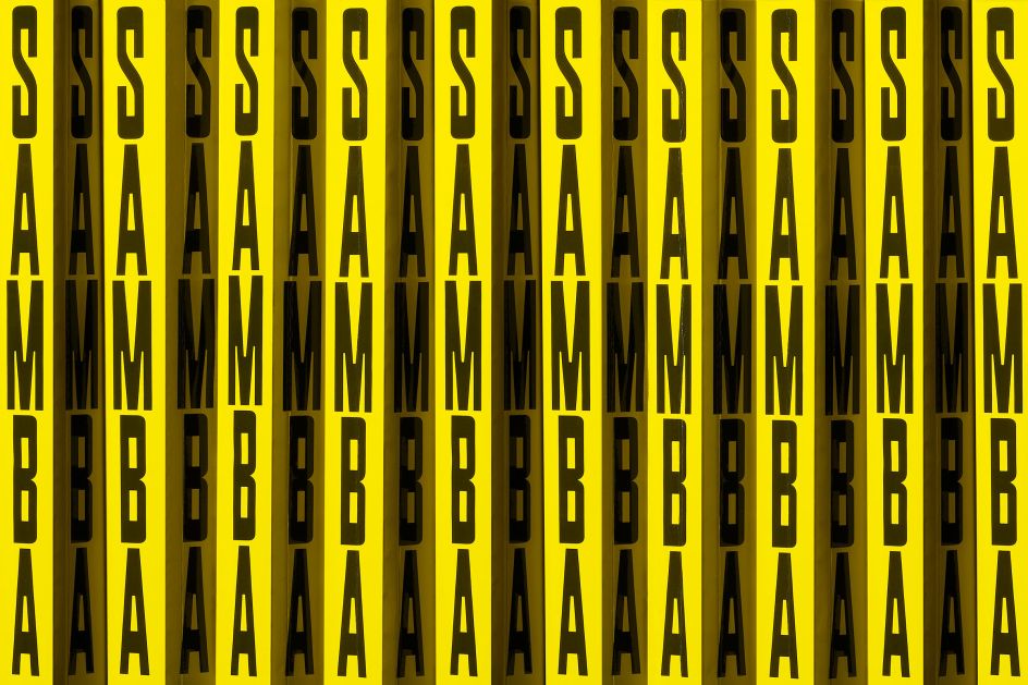
"The cover was designed to stand out on any magazine shelf," it adds. "The use of yellow in combination with Plaak's robust, condensed letterforms evokes a raw, urban sensibility. A sense of urgency is created by repeating and enveloping every side of the magazine with a vertically stacked logo. Samba, therefore, remains visible from all angles, reflecting the varied stories that unfold across its pages."
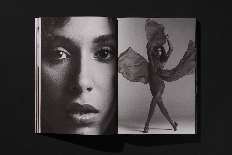
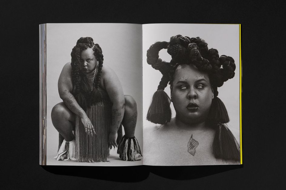
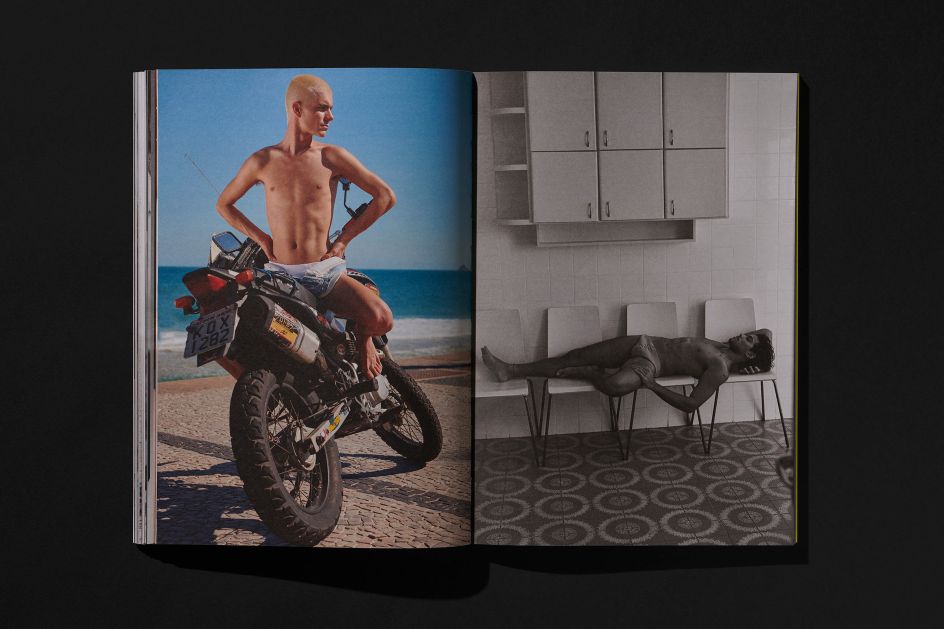
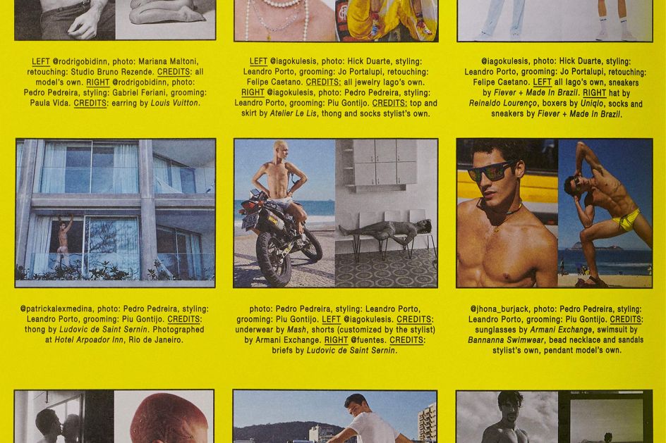
The idea of duality – a key theme for the magazine – is echoed in its design: two opposing covers are used, with the front seeing Samuel de Saboia pose in a satin dress; on the back, he's looking smokin' in leather. Both were shot by Philippe Vogelenzang. "In this way, the magazine also explores different conceptions of identity," says Porto Rocha. "Free of text, the seamless flow of full-bleed imagery contrasts with a structured index that credits each of the contributing artists, drawing inspiration from the directory-like aesthetics of Yellow Pages."
Proceeds from sales of the mag are donated to Casa 1, an organisation supporting the LGBT+ community in São Paulo.
Editor's Picks


Trending


Podcasts


Editor's Picks
Further Reading

 in Manchester. Photography by Ash Young](https://www.creativeboom.com/upload/articles/47/479095bdd525062e5cf4c8296b1e60372780e6b7_732.jpg)