Brandpoint's refreshed brand for Keogh’s Crisps goes back to its Irish roots
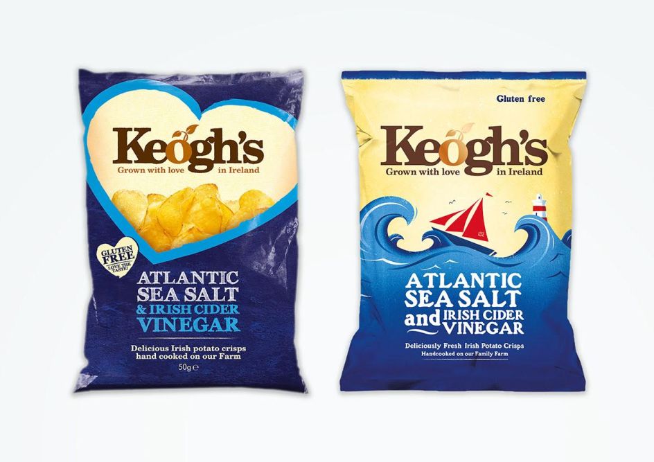
Having created the original brand identity back in 2011, crisp and potato brand Keogh’s returned to London agency Brandpoint to review its design strategy, hoping to better reflect its traditional Irish roots and make itself stand out in an increasingly competitive market.
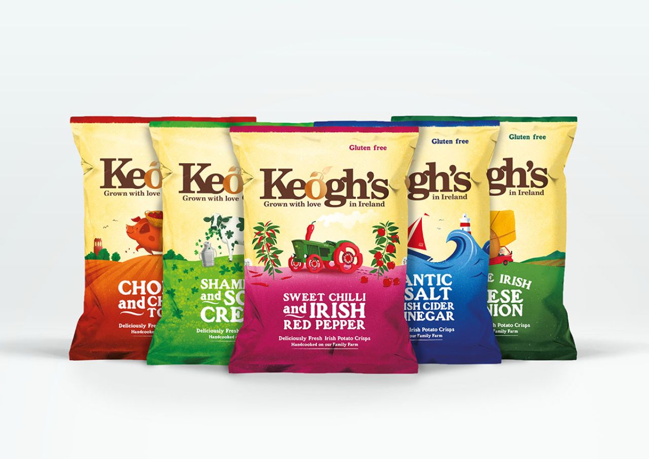
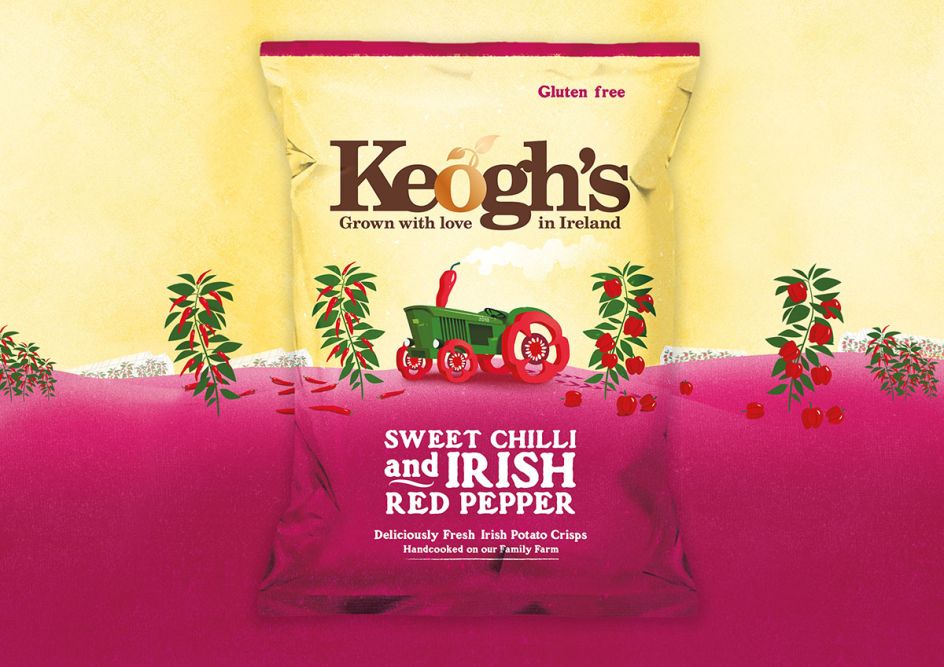
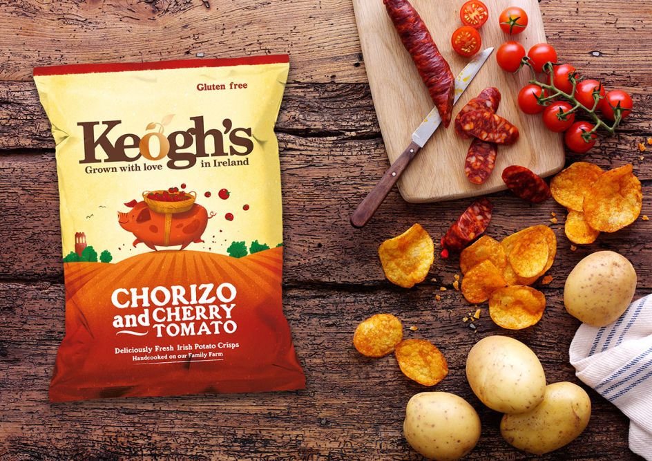
The aim of the redesign was to communicate Keogh’s unique proposition of hand-cooked crisps "Grown with love in Ireland" on its family farm. This involved creating an entire suite of brand assets, from photography and illustration to an in-depth brand book piece, which has become the foundations of the new brand identity.
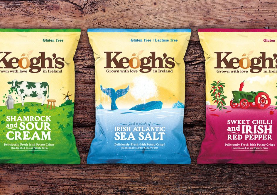
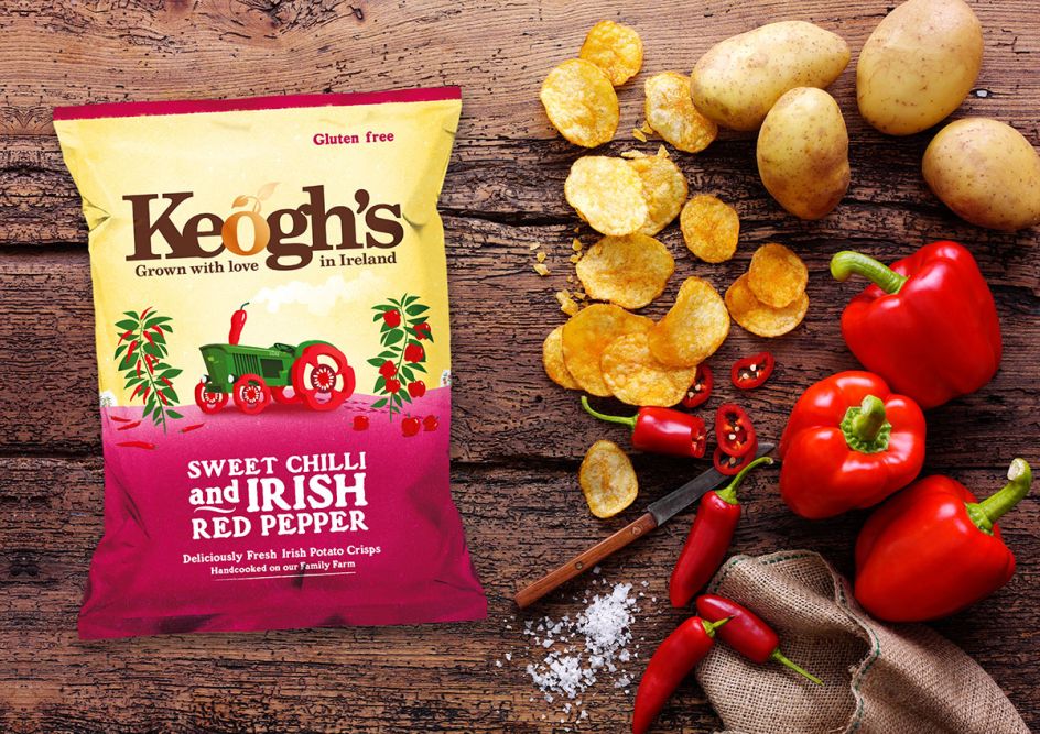
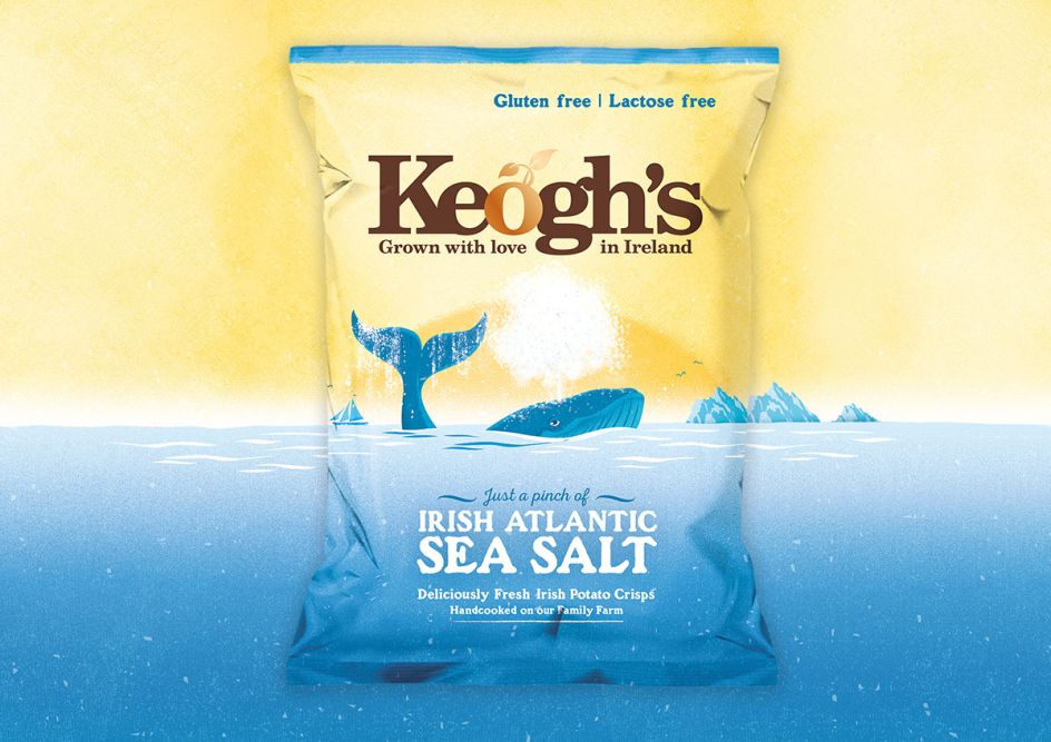
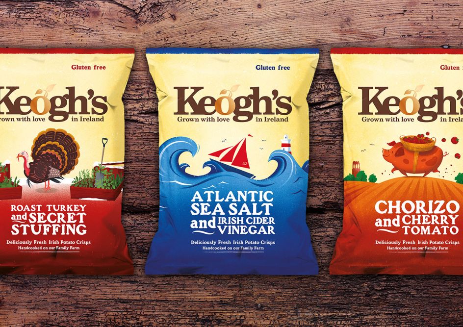
The new packaging design pays homage to the wholesome, authentic process that goes into making Keogh’s crisps, specifically referencing to the unique flavour-partner stories and the quality of the all-Irish ingredients.
"We commissioned Irish illustrator, Peter Donnelly, to capture the spirit of each flavour through a whimsical illustration that features various Irish landscapes along with a representation of the ingredients in the crisps," says Tim Leahy, Creative Director. "We chose a bold and beautiful colour palette to ensure product differentiation amongst the range and competitors."
The Keogh’s brandmark has also been updated with the introduction of a copper foil applied to the Keogh’s 'Potat-O', which adds to the more premium look and feel.
Since working with Brandpoint, Keogh’s have become Ireland’s leading premium crisp producer and now exports across the world. Brandpoint also celebrates the victory of winning a Special Mention from the German Design Awards 2018 for its work on the redesign of the brand.
Editor's Picks


Trending


](https://www.creativeboom.com/upload/articles/90/908fdb6378db1e95d12595416f54e6336d5e80b8_732.jpg)
Podcasts


Editor's Picks
Further Reading