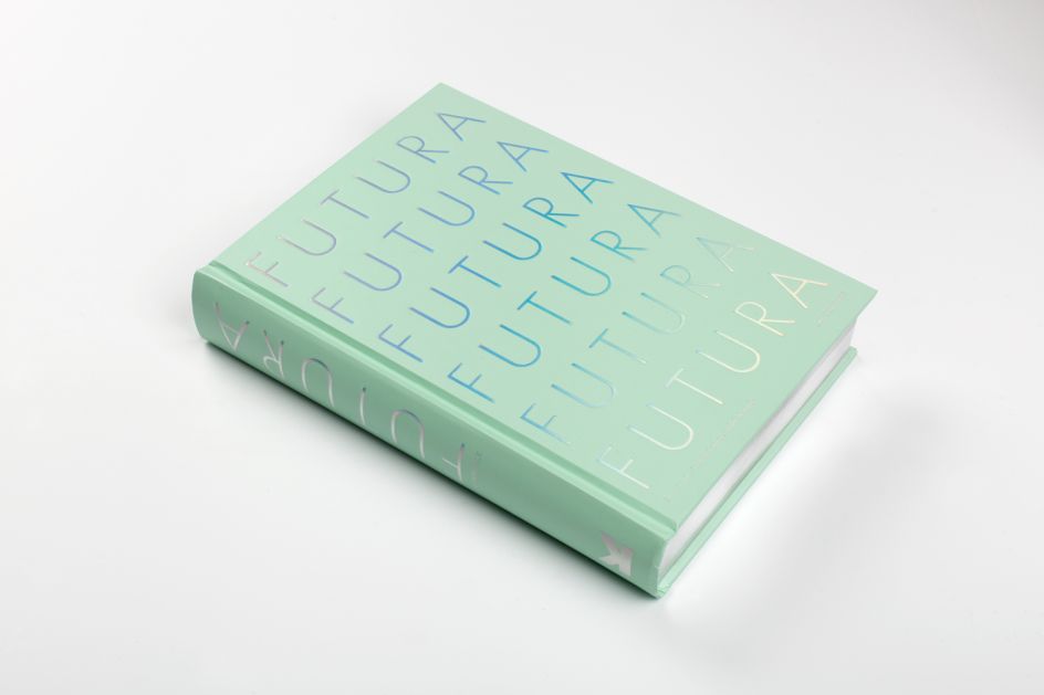
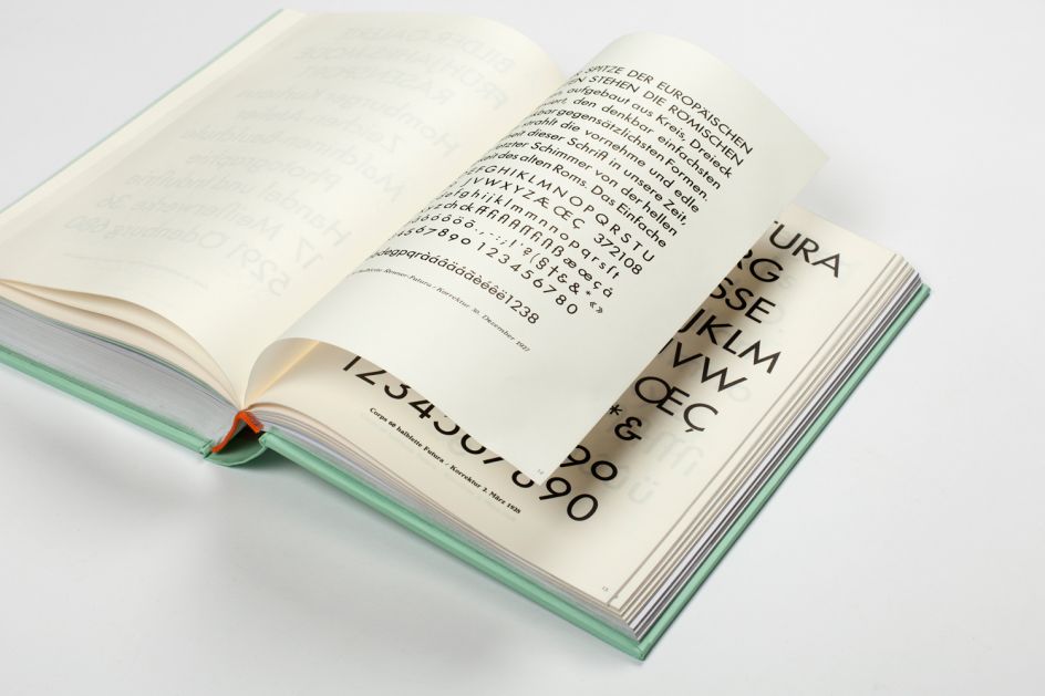
Futura: The Typeface is a stunning showcase of one of the most popular typefaces
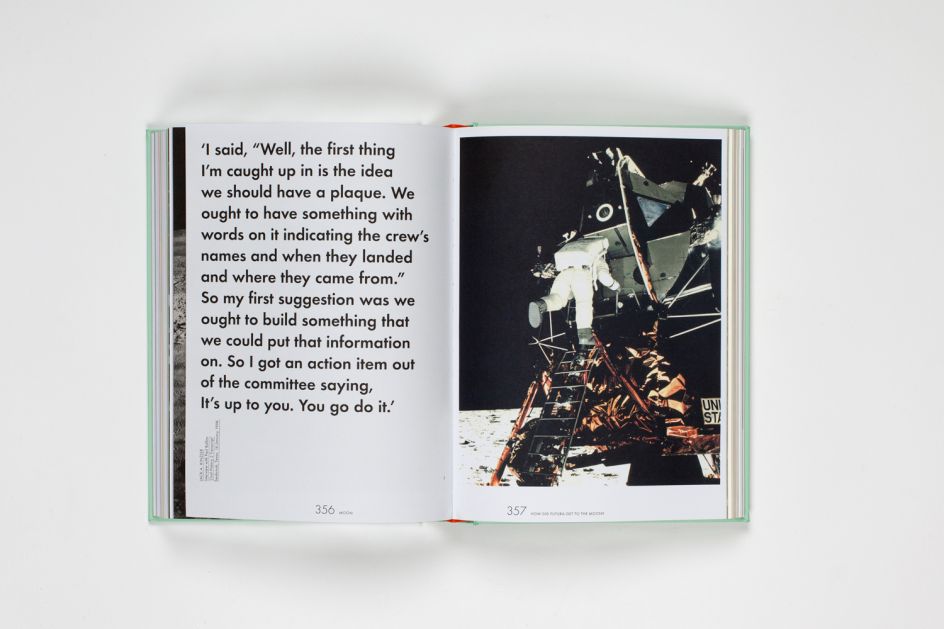
Celebrating its 90th anniversary this year, the life and times of Futura is a fascinating one. Charting its Bauhaus origins to its use as the first font on the moon in 1969, Futura: The Typeface is a new book that tells the story of how the typeface went from representing radicalism in design to dependability.
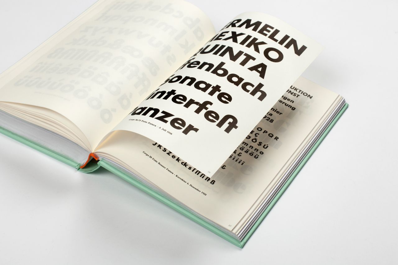
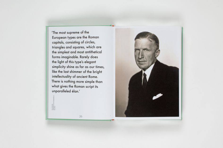
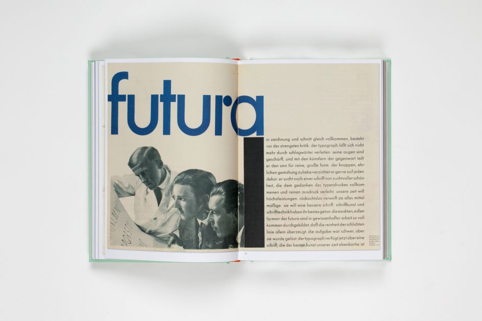
It celebrates and rediscovers this timeless font through archive illustrations and informative essays, revealing fascinating facts like... did you know Futura was Stanley Kubrick's favourite typeface? And that it was used on the film poster for 2001: A Space Odyssey? Or even that Vanity Fair used Futura as an experiment for five issues in 1929, defining their progressive design style, and pin-pointing Futura as "a face representing the New Typography of the European avant-garde"?
Expect insight and observations from renowned design writers such as Steven Heller, Erik Spiekermann and Christopher Burke. Edited by Petra Eisele, Professor of Design History and Design Theory at the University of Mainz; Dr Annette Ludwig, Director of the Gutenberg Museum and Isabel Naegele, Professor of Typography at the University of Mainz.
Futura: The Typeface is a stunning examination of one of the most popular typefaces ever created. And it's available from 30 October via publisher Laurence King.
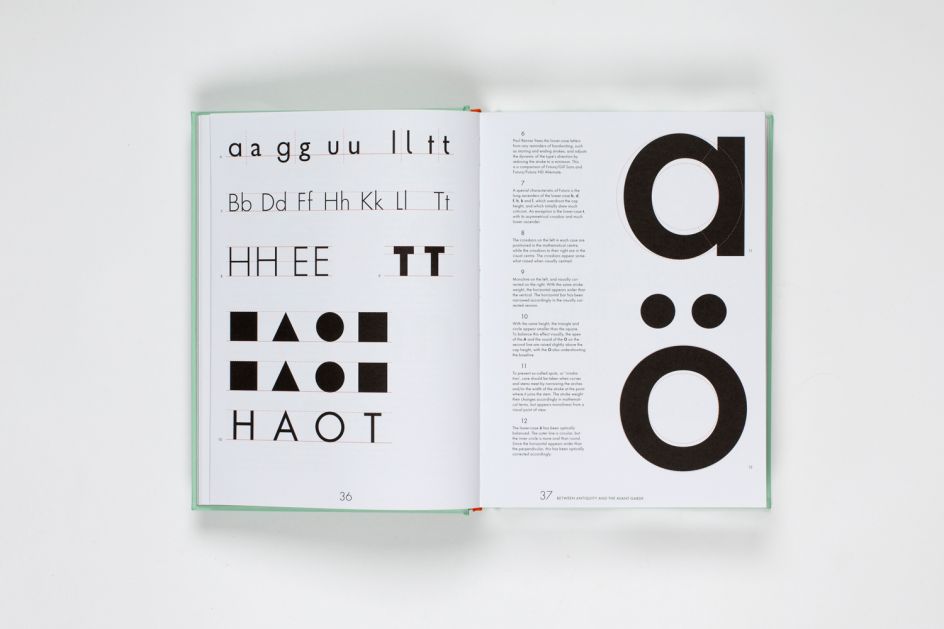
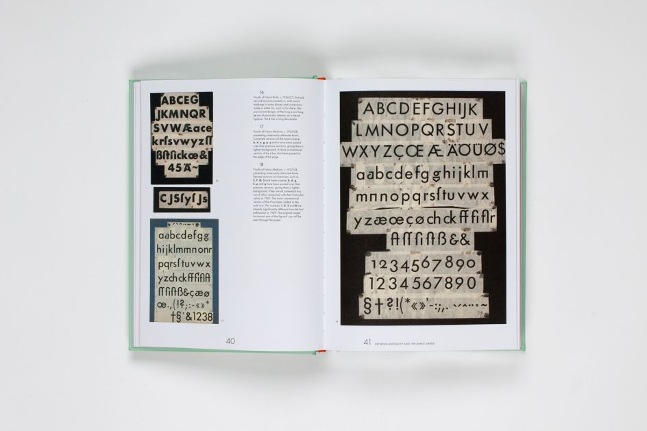
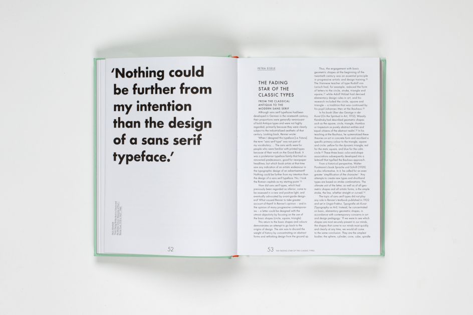
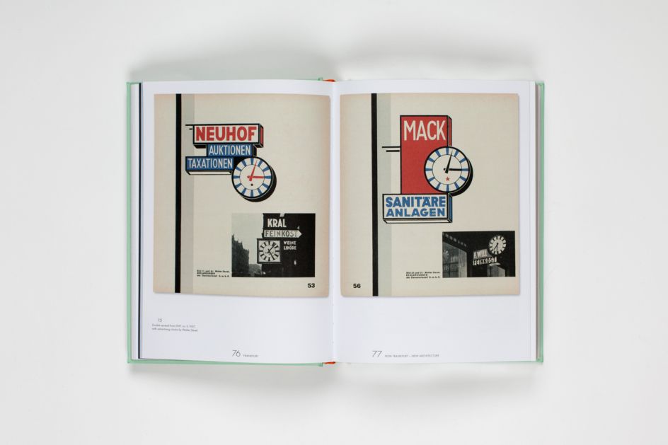
All images courtesy of Laurence King
Editor's Picks


Trending


Podcasts


Editor's Picks
Further Reading

. In use by [Garbett](https://garbett.com.au/) for Career Trackers](https://www.creativeboom.com/upload/articles/0f/0f4e193ba9164073646e67421eb37b4b26986c67_732.png)