BrandOpus creates 'playful' rebrand for Utterly Butterly
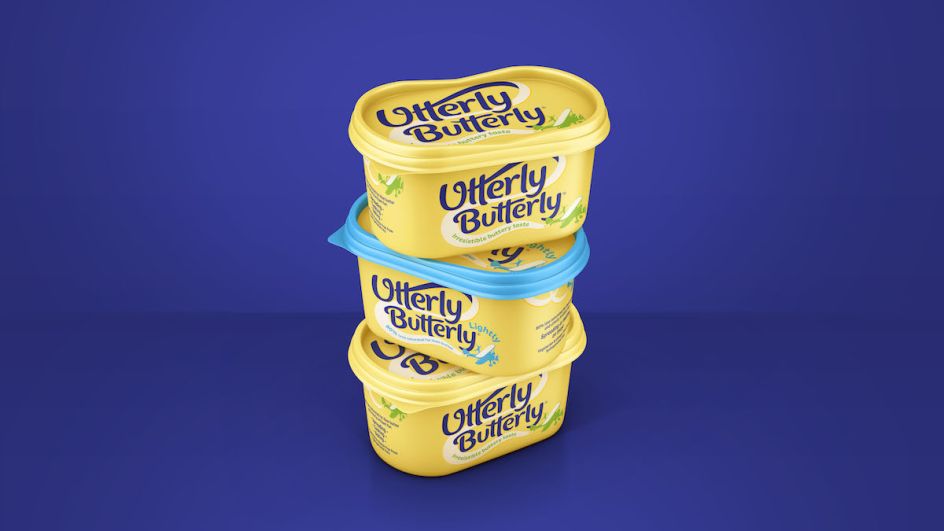
Creative agency BrandOpus has worked with Saputo Dairy UK to overhaul the branding for Utterly Butterly, aiming to "better connect with consumers emotionally through a joy-fuelled identity and pack".
Famed for its bonkers late 90s ads, Utterly Butterly was looking to regain some of the love it had been shown in years gone by.
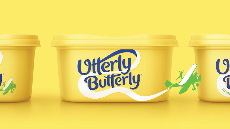
According to the agency, the BrandOpus team identified that the spread brand "lacked an emotive meaning and needed to better differentiate itself against own-brand" alternatives. Its new designs use a new "quirky symbol" to create a more distinctive and ownable identity.
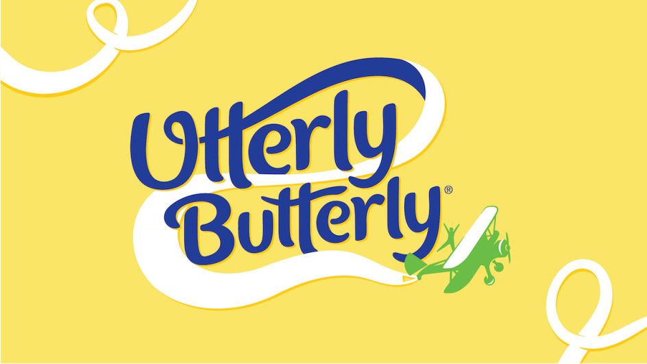
The symbol takes the form of "a daredevil aerial acrobatic flexing on a plane", referencing Utterly Butterly's playful nature and paying homage to the brand's aerobatic heritage in its ads and the fact the brand was a key sponsor for the AeroSuperBatics Wingwalkers, the world's only aerobatic formation wing-walking team.
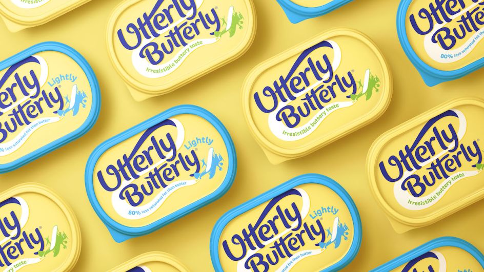
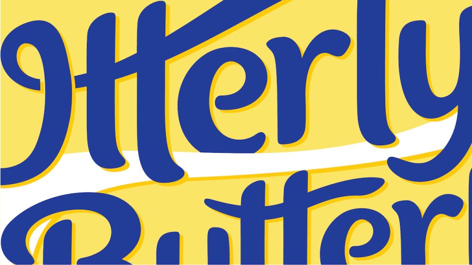
"By uniting the spread brand with joyful entertainment and family spectacles, the symbol suggests associations of fun, escapism and light-heartedness," says BrandOpus. This is used alongside a bubbly wordmark that acts as a flight path graphic, linking up to create the banner of the plane. A new softer, more inviting colour palette with a "splash of fresh white" was created to align with the new, more modern identity. The original "buttery accents" have been removed.
"Our mission was to draw out the brand's memorable quirks and deliciously unserious personality to reinvigorate the family favourite," says Ellen Munro, creative director at BrandOpus, comments. "The introduction of the aerobatics visual helped us to do both things at once, bringing more meaning into the brand and giving it a new distinctive symbol."

Editor's Picks


Trending


Podcasts


Editor's Picks
Further Reading