Bleed's identity for A Few Good Things embraces Scandinavian minimalism and a neat graphic device
It's surely safe to say there are numerous reasons Oslo and Vienna-based agency Bleed went for such a confident, minimal design for their client A Few Good Things. Yhey're a Scandi agency (founded in 2000 by Svein Haakon Lia and Dag Solhaug Laska) designing for a Scandi client (it's going to be minimal, right?), designing an identity for a show that aims to "rethink our approach to design" at a time when "our everyday lives are overcrowded with ‘things’."
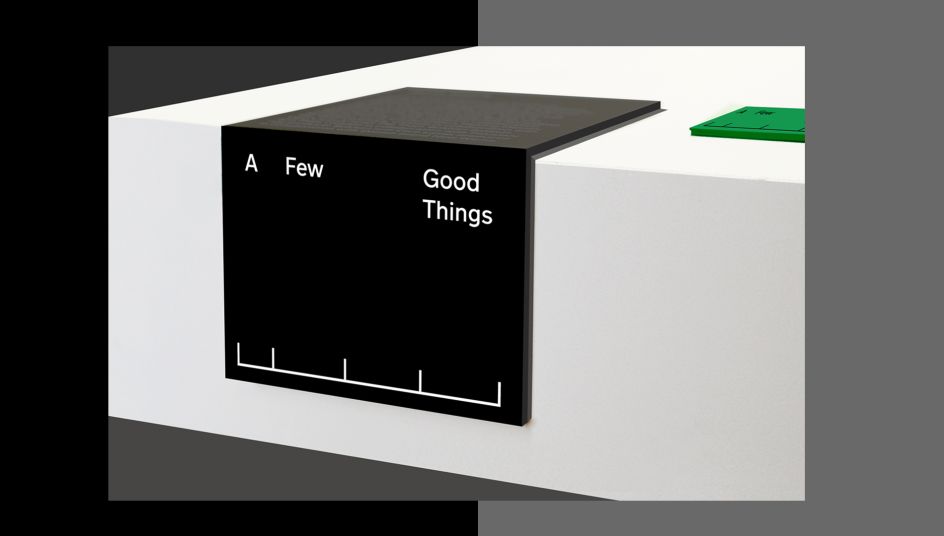
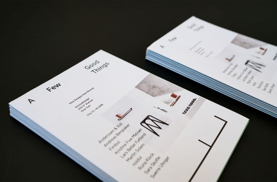
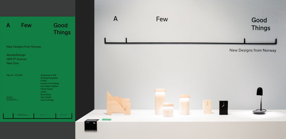
Also, the clue is in the name: a few good things – a carefully selected and limited colour palette of black, grey, green and white; a quiet, neat and rather beautiful sans serif font; carefully considered paper stocks and a neat graphic device tying it all together make for a cohesive, uncomplicated identity system.
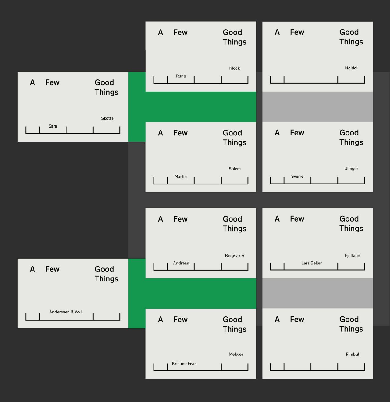
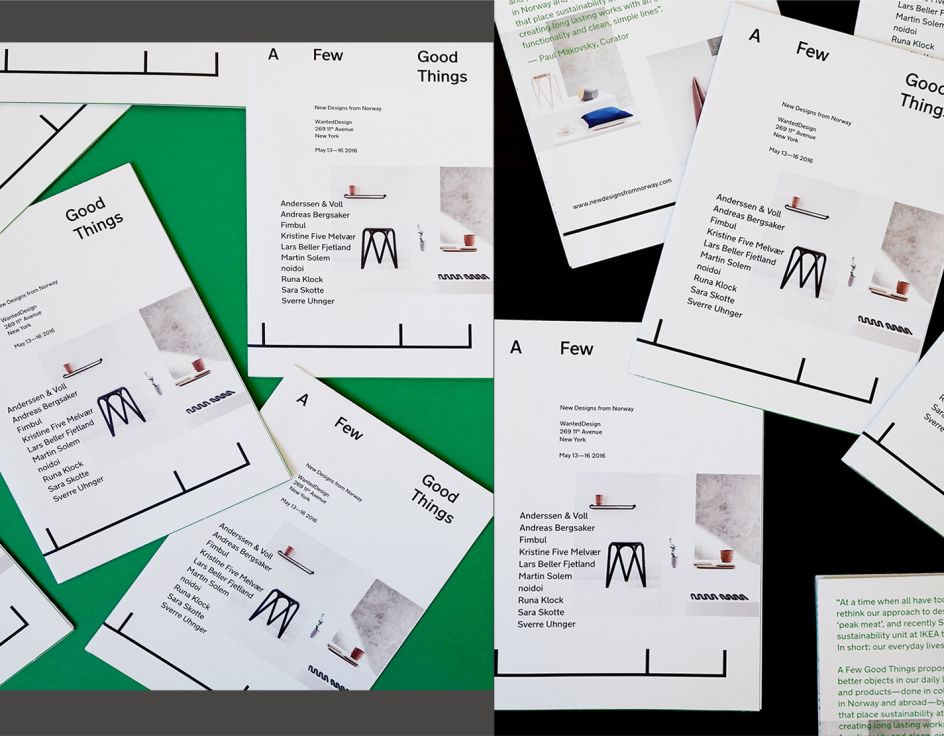
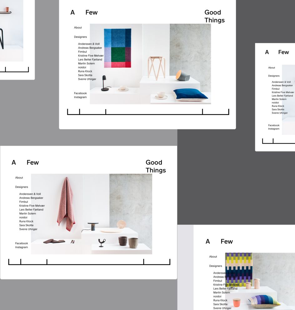
A Few Good Things, which took place in mid-2016, was a showcase of ten Norwegian designers as part of New York's Wanted Design show NYC x DESIGN. The identity therefore required a pared back approach, to let the work do the talking and also due to the vast number of applications, from show graphics, to a website, to catalogues and stationery. The designs for the business cards show the adaptability of the simple graphic that features across these touchpoints, a measuring tape-like line with nodes that vary in their distance from one another across different team members' cards.
Editor's Picks


Trending


Podcasts


Editor's Picks
Further Reading
](https://www.creativeboom.com/upload/articles/90/908fdb6378db1e95d12595416f54e6336d5e80b8_732.jpg)