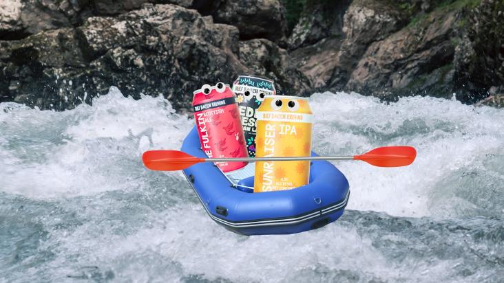
Designs for a beer brand that fly in the face of convention through collage, colour and a wild way with typography
If you think about designs for beer, you usually consider two options: a macho, no-nonsense red and white (a la Duff), or a sans serif, pared back "craft" look that could have been taken right out the hipster logo generator.
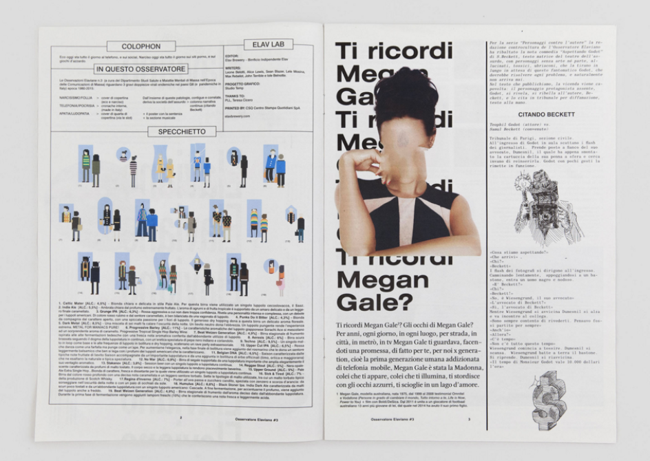
Eschewing both of these tried and tested pathways is Studio Temp, an agency based in Bergamo, Italy, which has been working with beer brand Birrificio Indipendente Elav since 2014. Studio Temp was tasked with the art direction and graphic design for Osservatore Elaviano, a newsprint magazine published by the brand to be distributed to several pubs and beer shops across Italy.
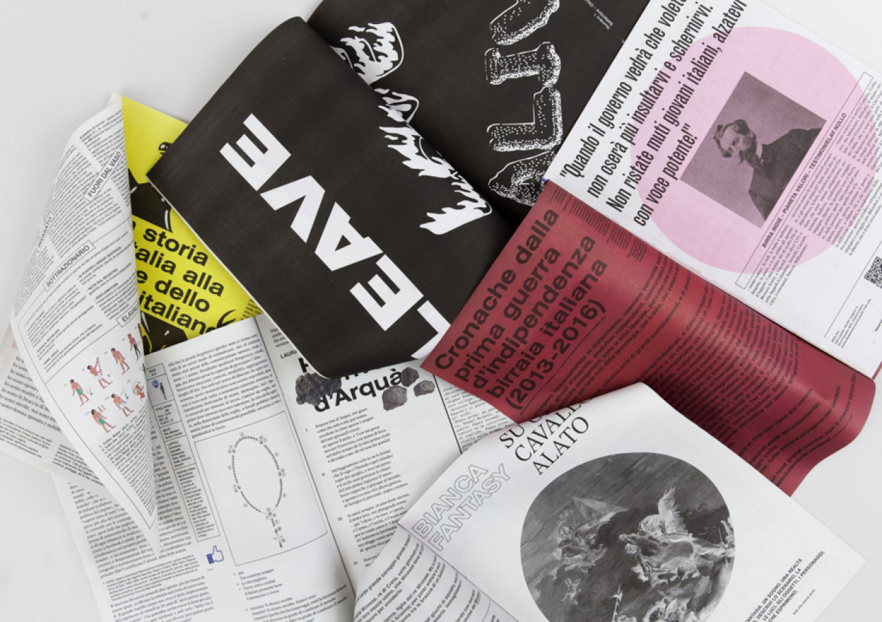
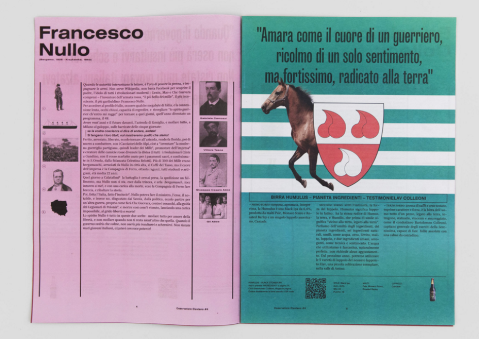
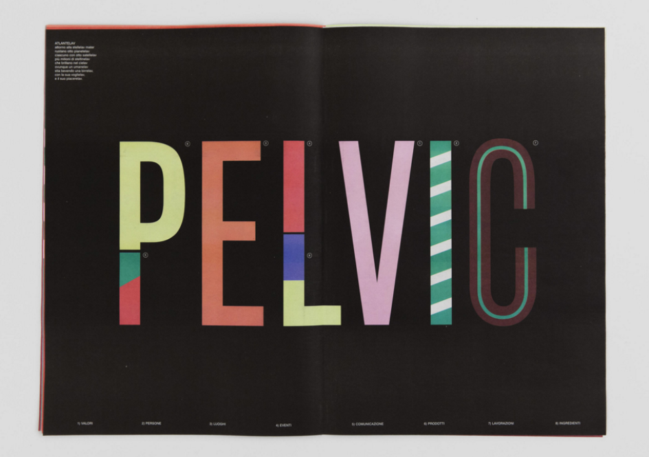
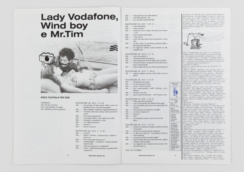
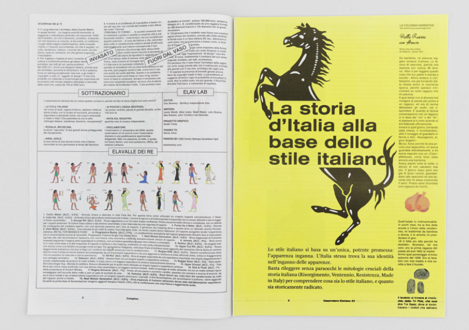
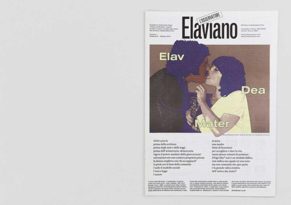
What they came up with is superbly designed and deliciously unexpected. The design language – which Studio Temp describes as "some crazy art direction" – comes alive like a sort of Tumblr IRL, creating combinations of words, images, colours, typefaces and visual quirks that are far removed from the conventions of "beer" imagery.
Across the publication we see numerous different fonts, text obscured by strange out-of-context images, and articles punctuated with collaged cut-outs. It's at once expertly considered and humorous, and if that's not what you want for a brand awareness campaign, we don't know what is.
Studio Temp waS founded in 2007 by Guido Gregorio Daminelli, Fausto Giliberti and Marco Fasolini, who "met as teenagers, and haven’t stopped working together ever since," according to the agency. It works across printed media, art direction, visual identity and web design for clients including adidas Originals, the ICA in London and Vice. You can see more of Studio Temp's work here.
Editor's Picks


Trending


](https://www.creativeboom.com/upload/articles/90/908fdb6378db1e95d12595416f54e6336d5e80b8_732.jpg)
Podcasts


Editor's Picks
Further Reading