Bedow celebrates awkward teenage-hood in smart type designs informed by its 'refined design process'
While many of us turned 15 years-old by necking illicitly procured Blue WKD and being sick on yourself etc., Stockholm-based design studio Bedow took a somewhat smarter approach to reach this milestone by releasing two complementary typefaces.
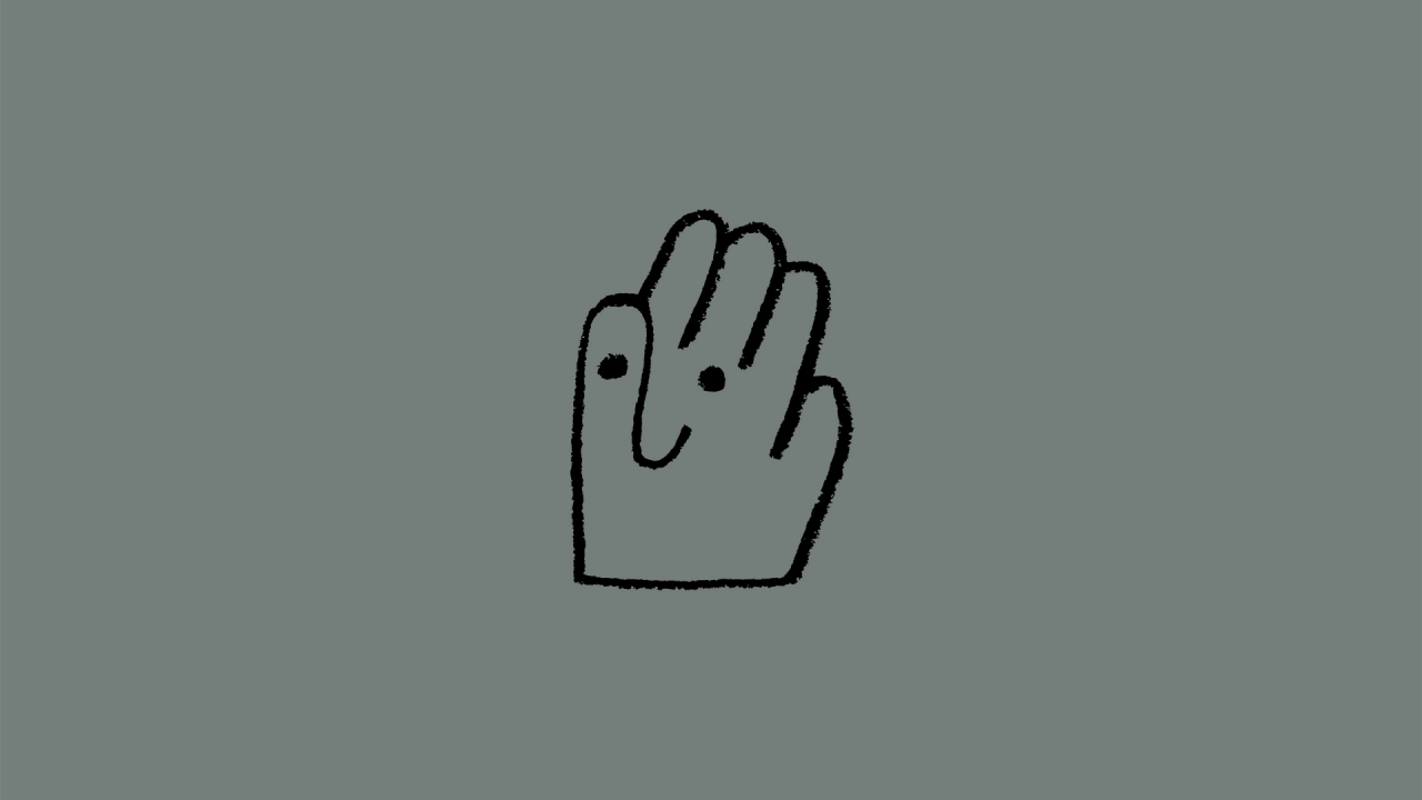
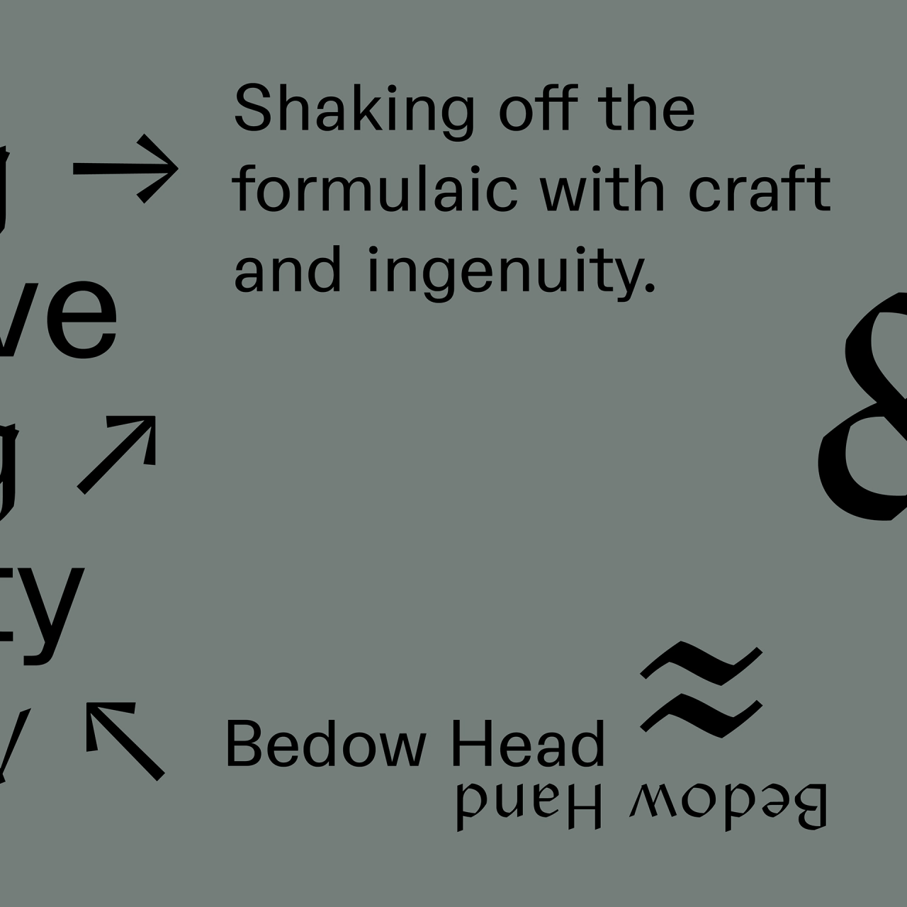
Bedow Head and Bedow Hand were developed in collaboration with Swedish type designers Tor Weibull and Alexander Örn of type foundry Kanon.
Both typefaces are "informed by its refined design process", according to the studio. "Our main strength has always been to find a clear narrative and unexpectedly interpret that," says Perniclas Bedow, creative director of Bedow. "It doesn't matter if it's a big or small client; we always use the same process of combining strategy and craft. We're showing that in our new identity through the transition of the head and the hand."
The typeface names Head and Hand aim to indicate the studio's overarching aim to marry "thinking and making"; and are accompanied by a new studio Head-Hand symbol mark.
These are united by a variable font that was created for a seamless transition between the two; and are showcased with the new mark on Bedow's redesigned website.
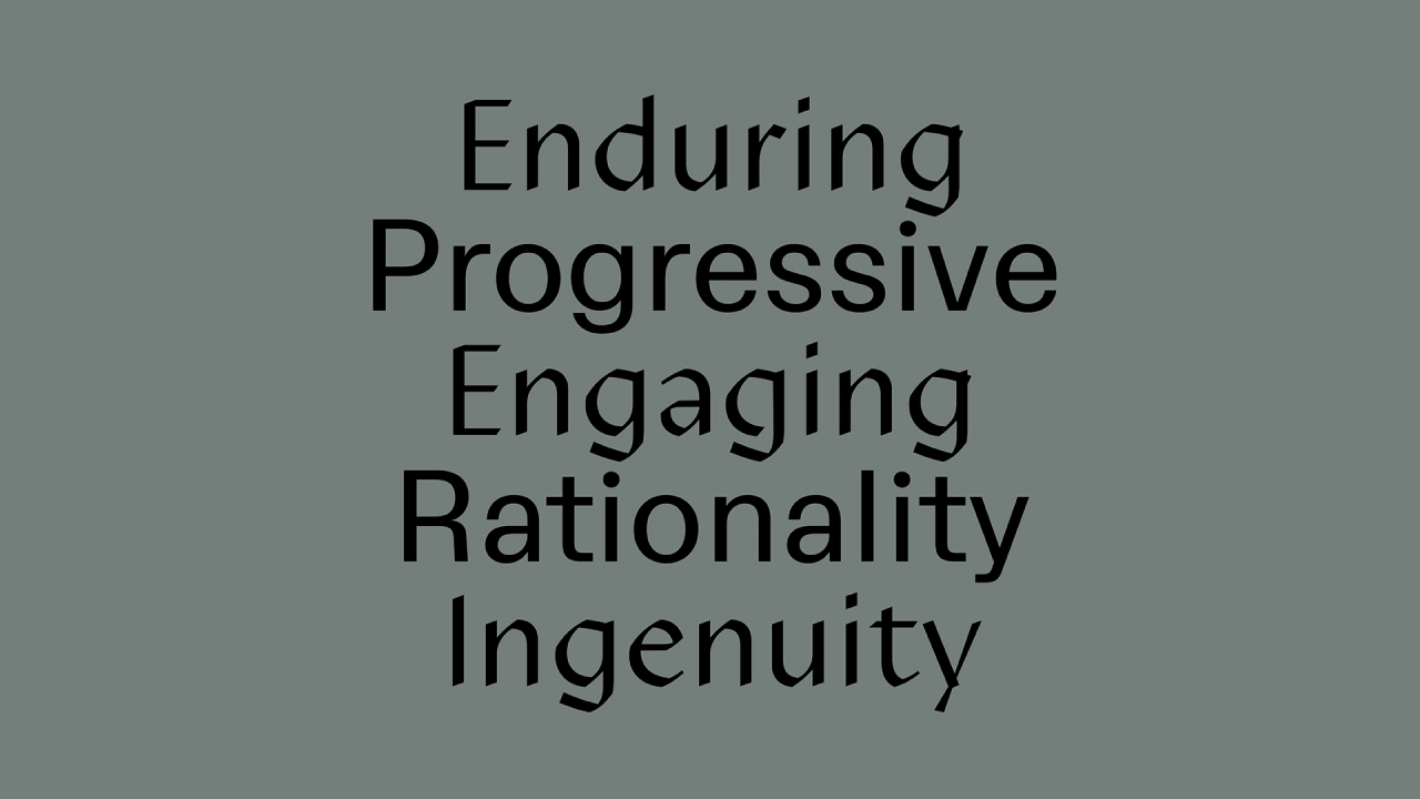
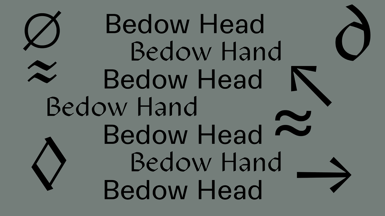
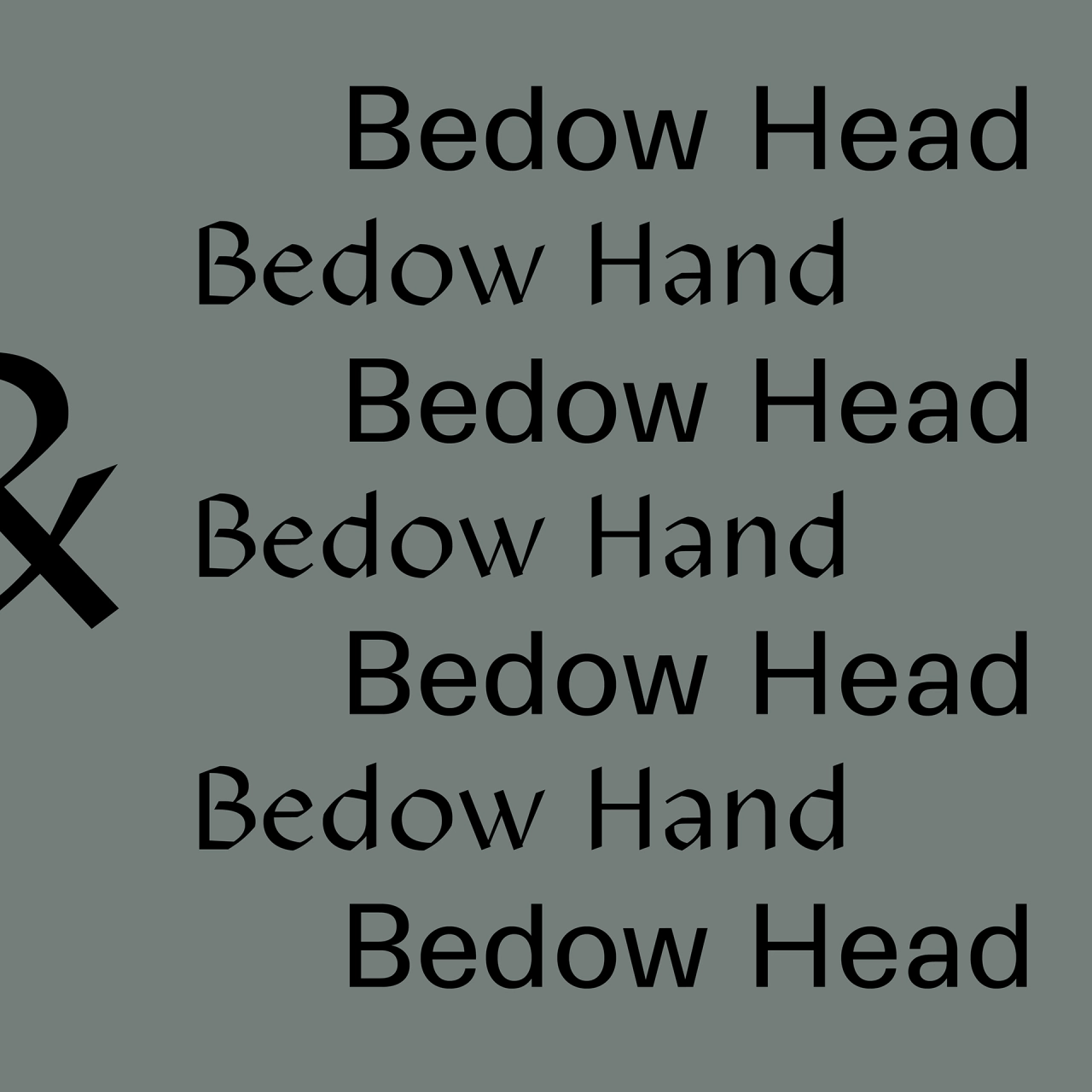
Bedow Head and Bedow Hand are described as "two siblings in the same family with distinct personalities." Head is a rational, clear sans serif—"a pure strategist with an oversized head to match its intellect," as Bedow puts it. It was designed to be suitable for everyday workhorse uses for body copy, captions and callouts.
Bedow Hand acts as a foil to Head: it acts as a contrasting more "sensitive" typeface distinguished by its calligraphic, irregular aesthetic that looks to work brilliantly in bringing personality to "irregular flourishes" that might be needed in a font used for headlines and pull quotes. "Though on the surface they're so different, they adapt to each other very well," says Bedow.
Editor's Picks





Trending




Latest Jobs
Senior Brand Designer at Analogue
Full-time·Leeds·£38k-£45k
Brand Designer at Adfin
Full-time·London·£30k–£50k
Creative Project Manager at Analogue
Full-time·Leeds·£28k–£35k
Client Success & Growth Director at Revolution Growth
Full-time·Manchester·£60k-£70k
Client Director at Koto
Full-time·Berlin·€70k-€85k
Brand Designer, Product Launches at Figma
Full-time·New York·$127k–$269k