A LINE's new identity for Tatari takes its inspiration from TV elements
Brand and design studio A LINE has come up with this rather nice identity for Tatari, a company on a mission to "transform" TV advertising into a digital experience.
Via Creative Boom submission. All images courtesy of A LINE
Founded three years ago by a leadership team from disruptors like Shazam, TruCar, Liverail, Google and Facebook, Tatari has grown to more than 80 employees in four offices, working across industries such as fashion, insurance, healthcare, and finance, and including more than 50% of the IAB's "250 DTC brands to watch".
Poised for yet more growth, Tatari needed a brand that could scale with the company, "embracing the excitement of a growth-stage disruptor with the credibility, reliability, and trust of an enterprise".
James Trump, co-founder and creative director at A LINE told us that: "Tatari helps their clients better understand the enormous complexity of data across today’s media landscape by creating actionable insights and outcomes. To create a brand that communicated this, we needed to develop a strategy and visual identity which focused on turning complexity into bold simplicity."
The studio began by identifying and aligning who Tatari is, where they were going, and what made them different. "By creating a clear, future-facing brand aspiration, and a set of uniquely ownable characteristics and values," adds James, "we built a brand platform that positioned Tatari as visionary experts boldly leading their clients through an exciting revolution in TV advertising."
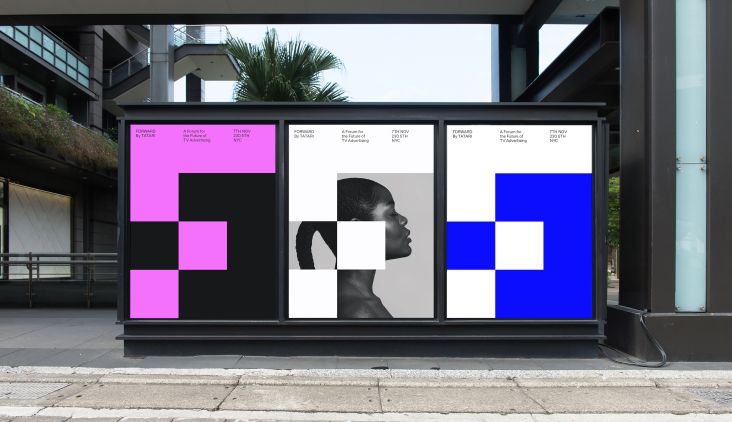
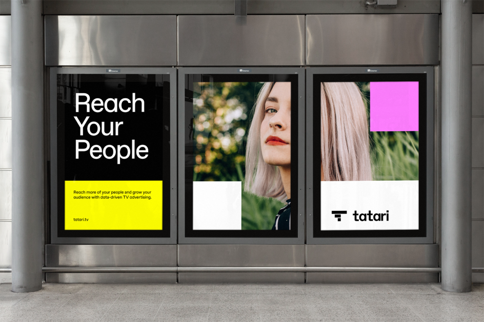
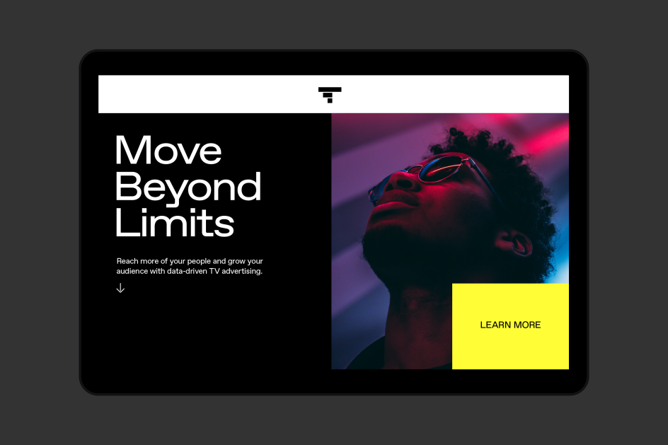
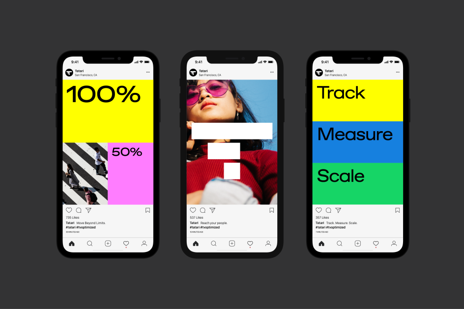
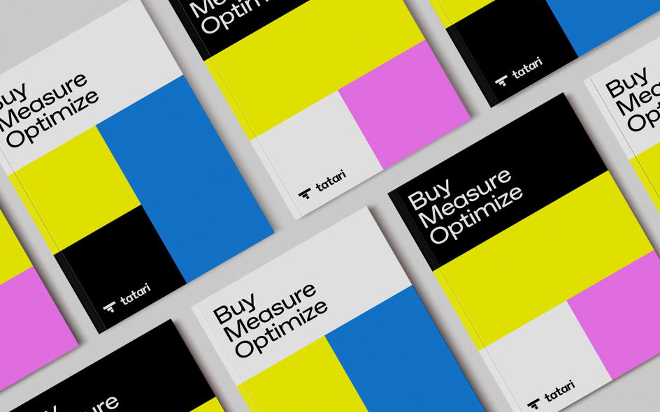
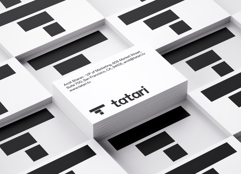
To differentiate, A LINE saw an opportunity to "infuse" the new visual identity with TV-inspired elements. Starting with the idea of a pixel, they designed a square grid from which they created the symbol, composition, and iconography. This was followed by a bold colour palette inspired by a 4K UHD TV test card.
Favorit is the brand typeface due to its "boldly simple feel". James adds: "With forward-leaning characters and squared-off, elongated terminals, it perfectly complemented the grid we had created."
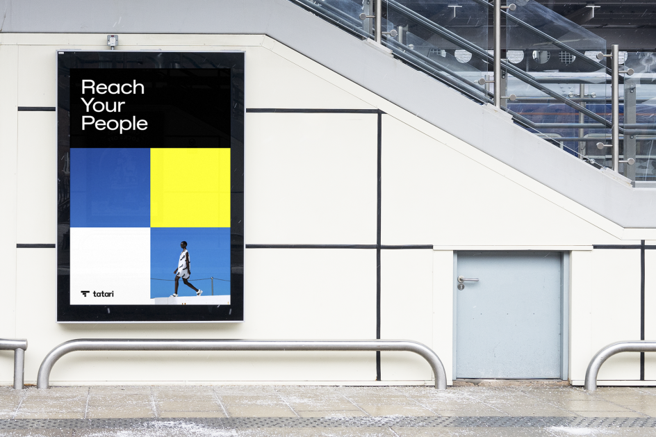
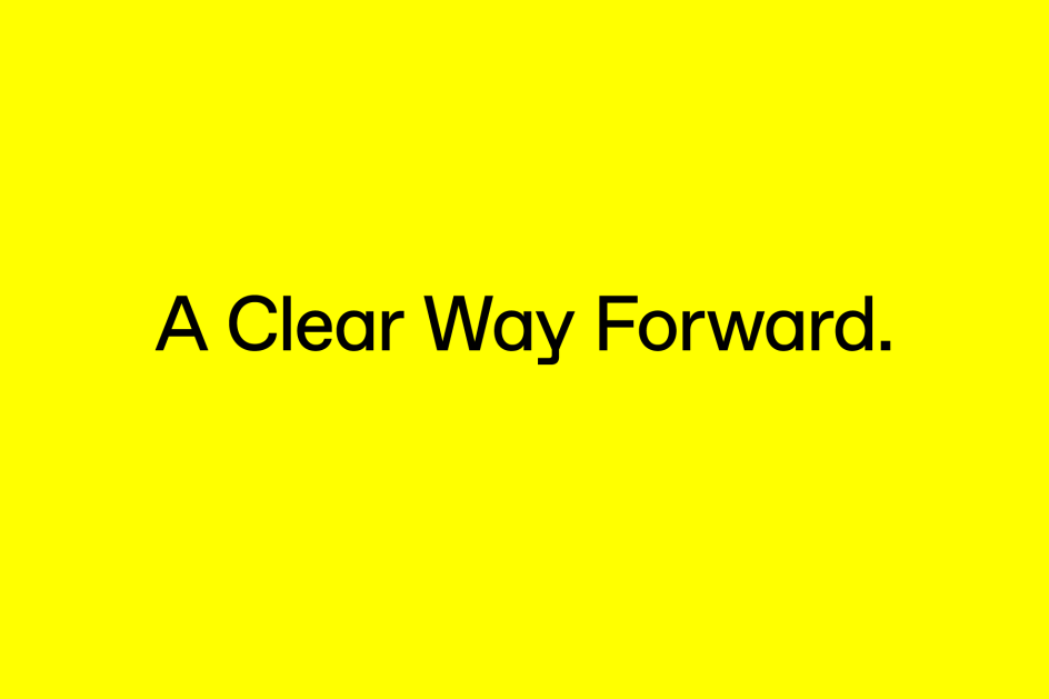
To amplify A LINE's strapline, "A clear way forward", the studio used motion, with selective builds and swipes, bringing the identity to life.
The new brand was launched in September to coincide with Tatari’s third anniversary, rolling out across touchpoints including product, sales and marketing collateral, social media, environmental, and the website.
Editor's Picks


Trending


Podcasts


Editor's Picks
Further Reading