A new identity by Moving Brands for Blank, a New York retouching and digital capture firm
Moving Brands recently designed a new identity for Blank Digital, a New York-based retouching and digital capture company.
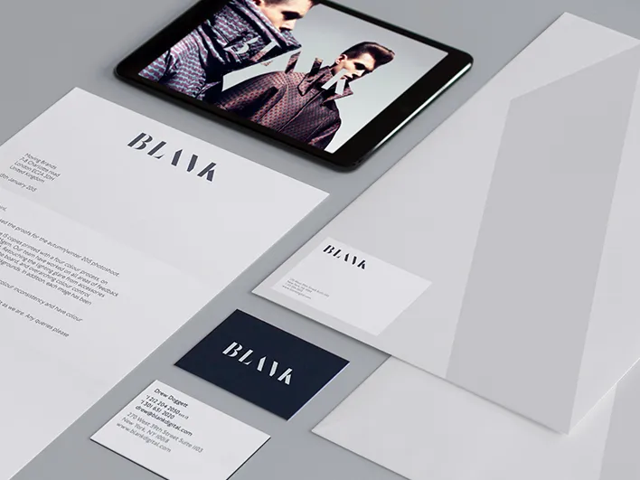
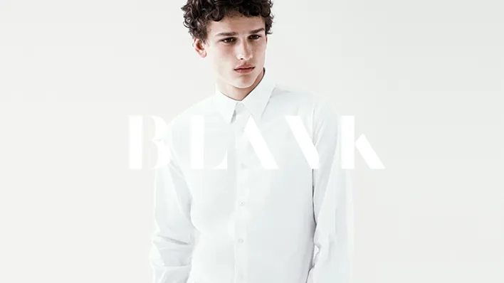
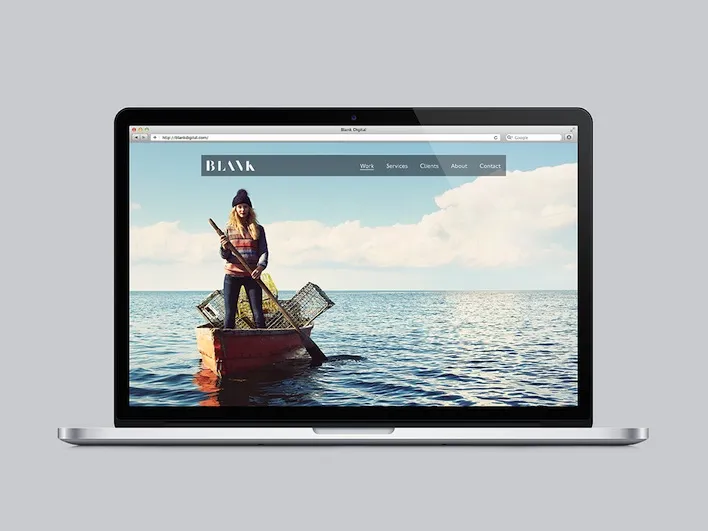
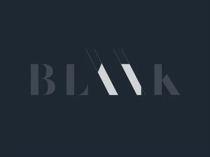
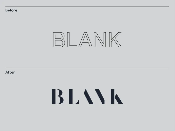
Blank was looking for a more effective strategy in order to help establish relationships with the top luxury, fashion and media businesses of the world. Moving Brands explained: "We defined their brand narrative as ‘realising image potential’ – an ambitious stance that focuses on the real business benefit they offer. The monochromatic identity system has an attitude and an edginess to appeal to their high-fashion audience. The mark references Blank’s own editing process; it appears to be at the point of mid-creation, but still elegant.
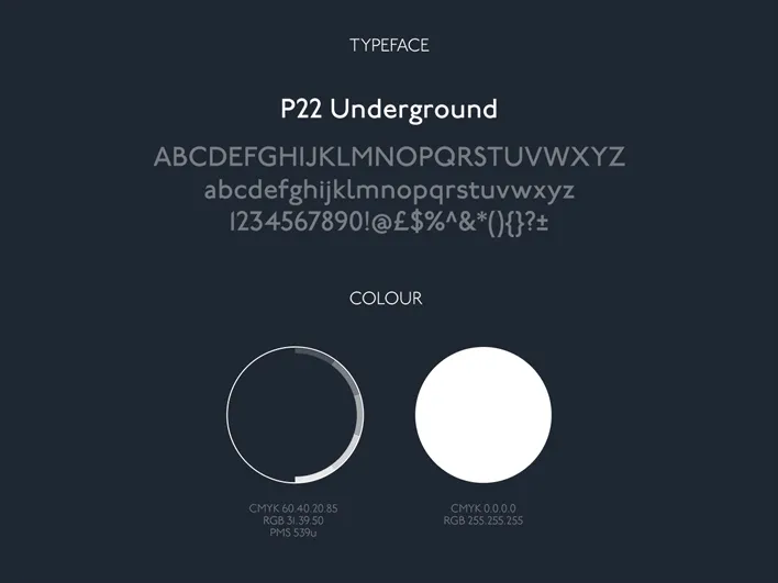
"The soft colour palette and typeface nod to the family-focused values and love of tailored, crafted elements, and characteristics of the business that were often referenced in workshops with the Blank founders. Most importantly, the system provides a sophisticated, flexible foundation from which their own work can shine."
Editor's Picks





Trending





Latest Jobs
Creative Content Executive at Cognition
Full-time·Birmingham·£28k–£35k
Brand Designer at Adfin
Full-time·London·£30k–£50k
Brand Copywriter at Origin
Full-time·Porthleven, Cornwall·£35k–£40k
Senior Graphic Designer at MoMA Retail
Full-time·New York·$72k-$80k
Senior 3D Motion Designer at Art&Graft
Full-time·London·£50k-£65k
Principal Software Engineer at BBC Media Tech
Full-time·Glasgow·Up to £83,790