20 student packaging designs you wish existed
There's something about a beautiful bit of packaging to make any designer smile. The unique choice of materials, the clever methods applied, the inventive ways of adding colour and interest – packaging design is surely the ultimate creative satisfaction.
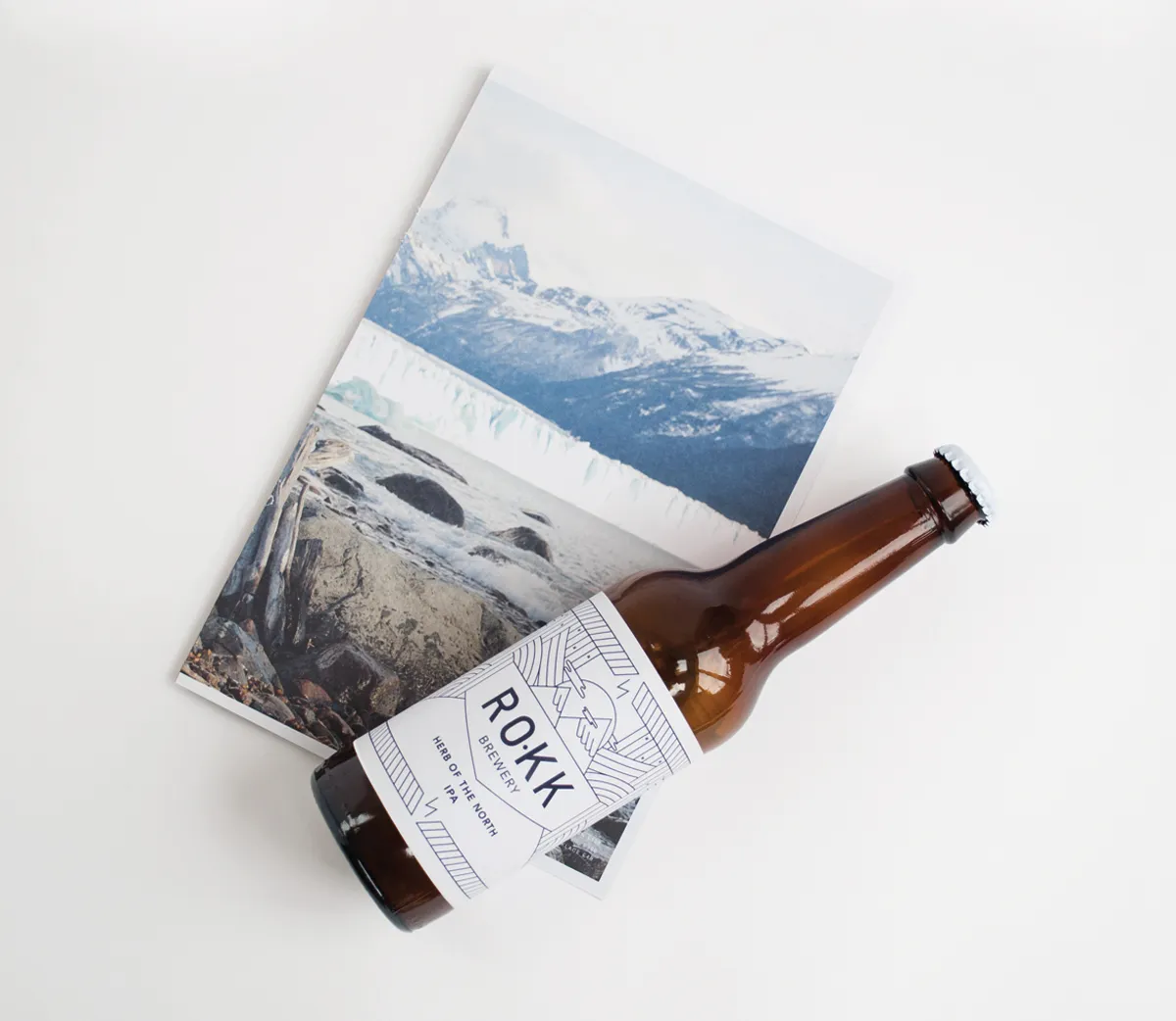
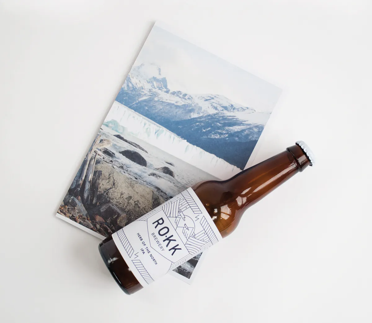
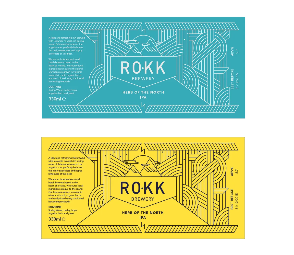
Anna Delis: 'Rokk' beer. All images courtesy of Shillington and its students.
For those of you who appreciate labels, wrapping and containers for the things we love to buy and consume, this collection of student packaging designs will be something you wish was real. Created and dreamed up by our own students at Shillington, I've hand-picked a few excellent examples for you to be inspired by.
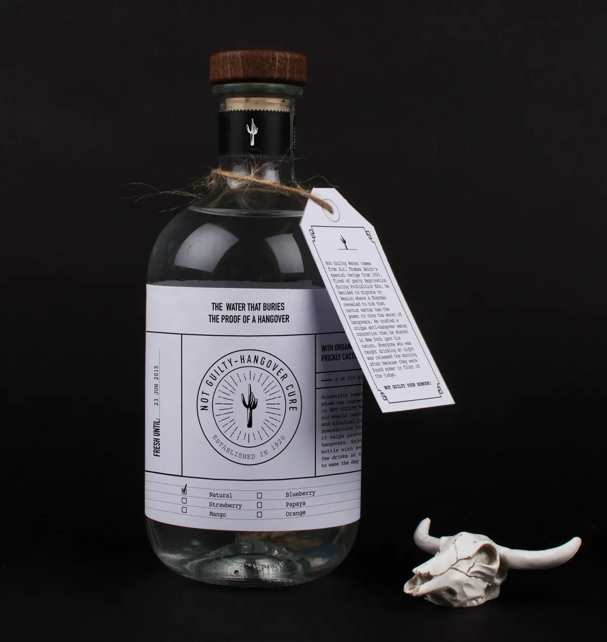
1. Bianca Oggiano: 'No Hangover Cure' drink
When you need something to kill a hangover, the 'No Hangover Cure' drink will be just what the doctor ordered. Plucked from Bianca Oggiano's imagination, the bottle packaging was inspired by 1920's medical labels.
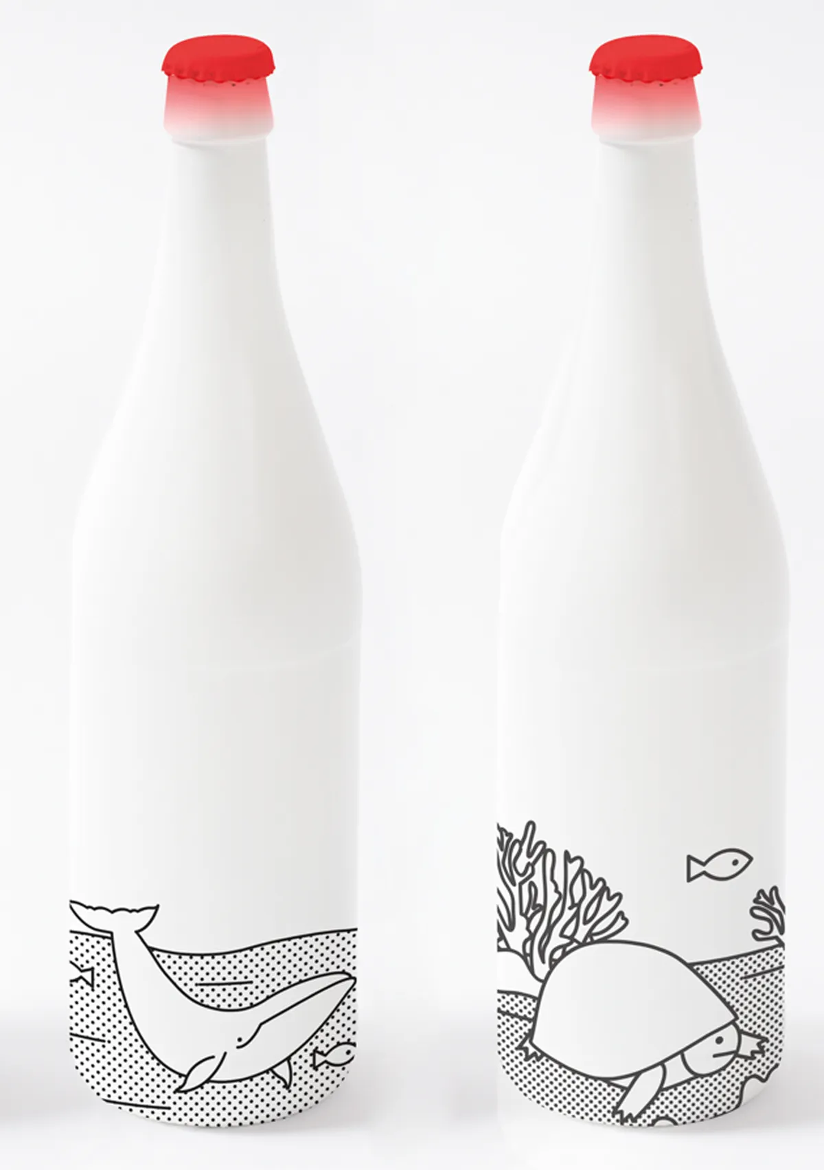
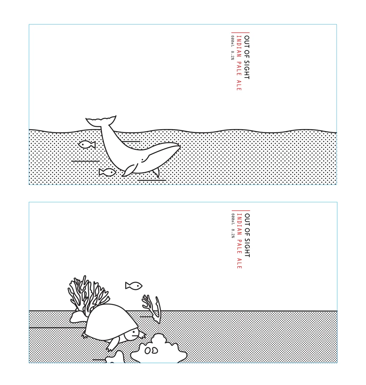
2. Joanna Copperman: ' Out of Sight' beer
This wonderful craft beer design by Joanna Copperman is for a "unique, specialised brewery". The idea was to create the rarest possible beer, using albino animals and humans as inspiration for her colour palette and illustrations. Clean, crisp and certainly different.
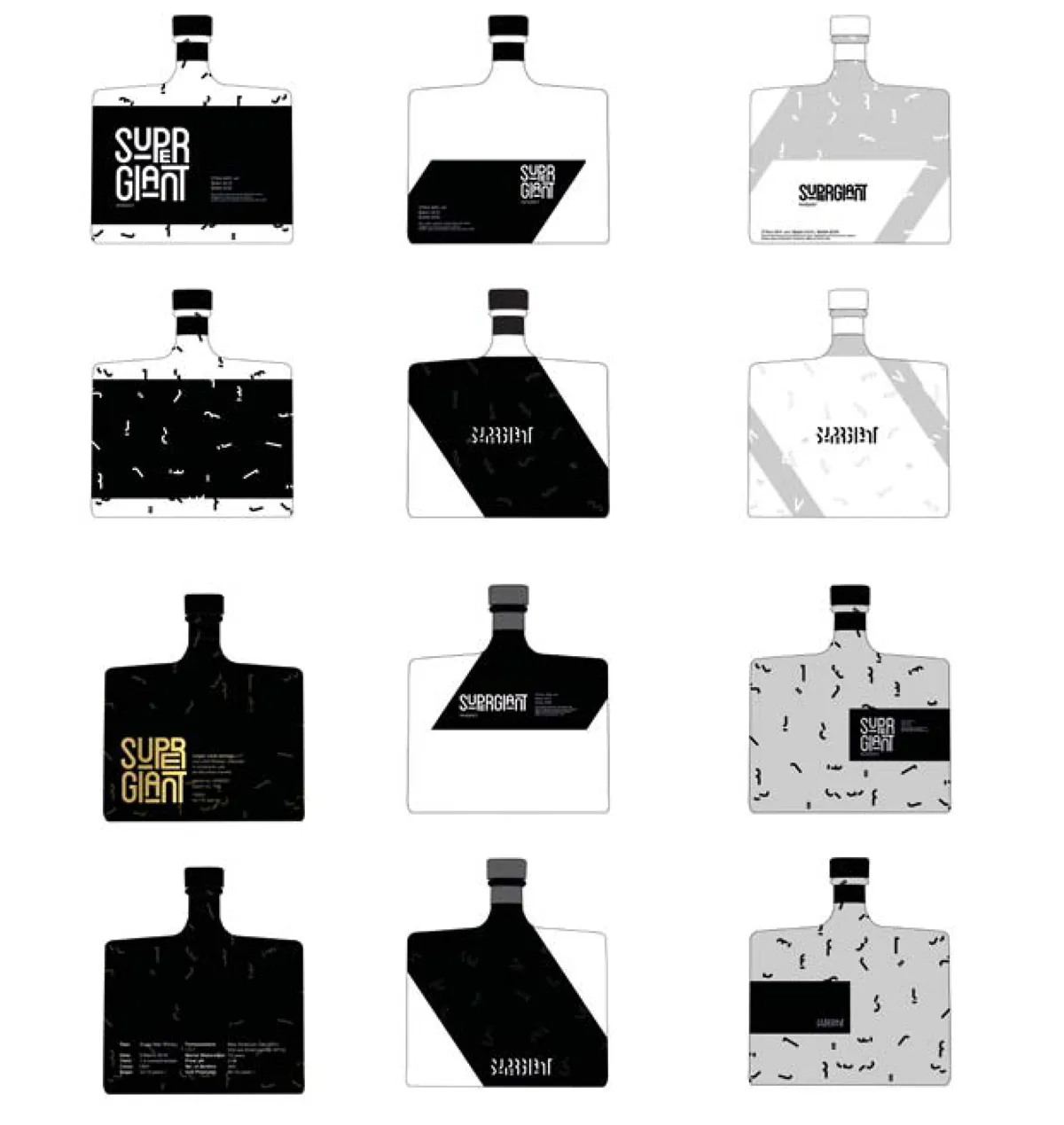
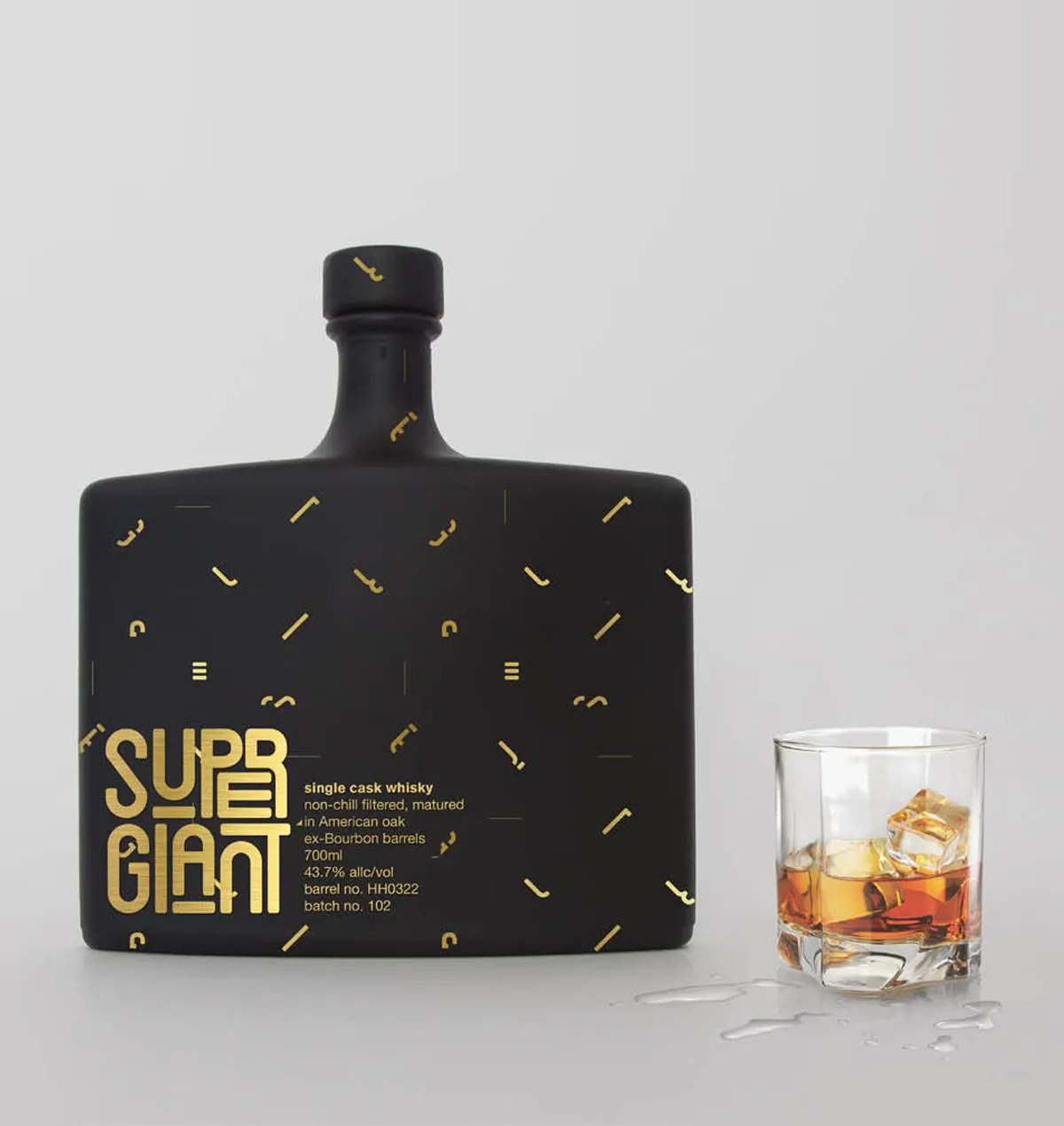
3. Lauren Basser: 'Super Giant' whiskey
Faced with the task of inventing a fictional product, Lauren Basser decided to create the "Whiskey for Geeks". After going through a lot of research and development, she came up with "Supergiant". She explains: "Available only via the dark net, this whisky would be a platform for geeks to embrace their inner gentlemen, providing them with confidence and swag to socialise with other people, gain confidence and feel invincible."
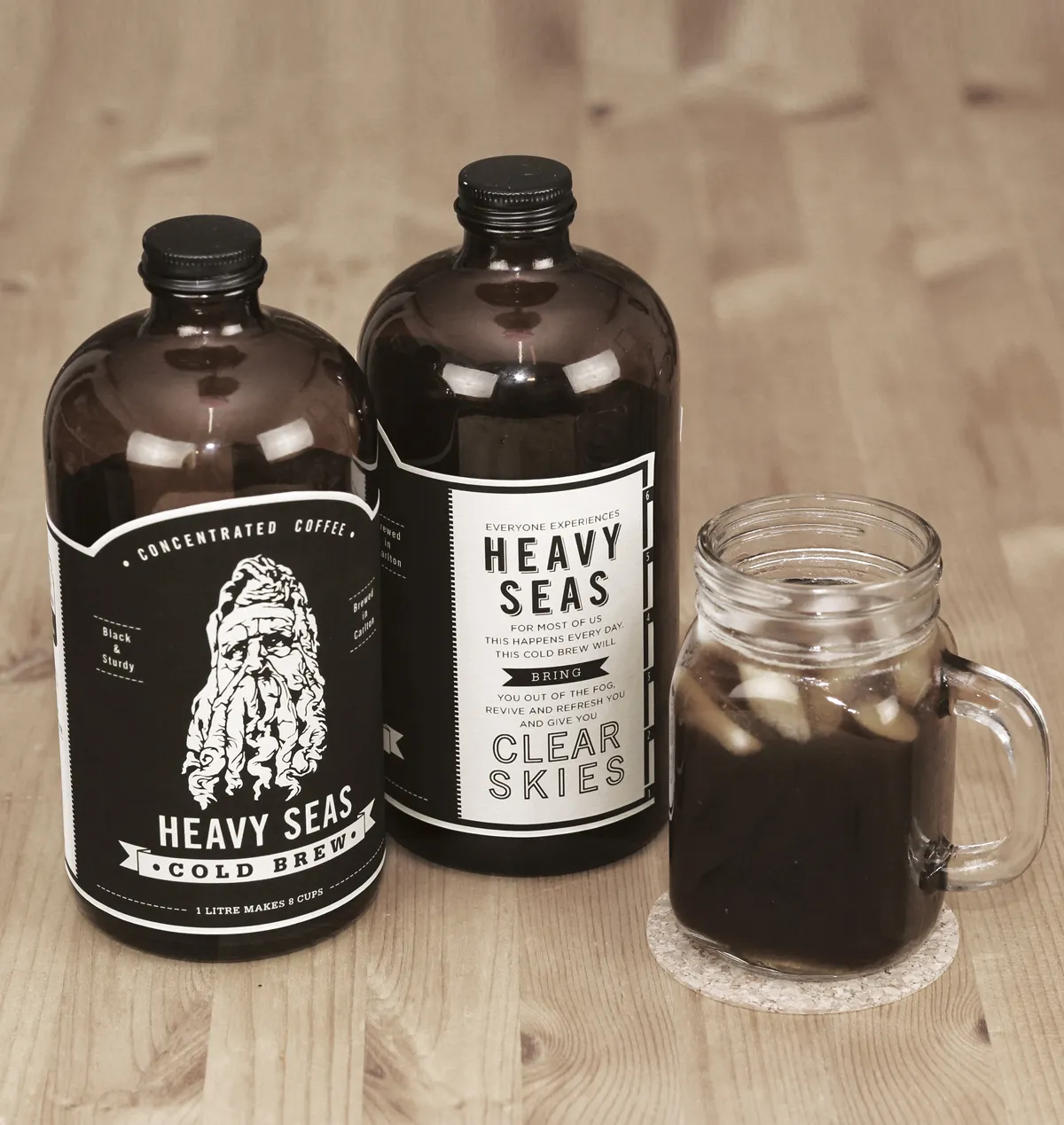
4. Paul Hatch: 'Heavy Seas' cold brew coffee
Moving away from naughty booze, Paul Hatch decided to opt for "cold brew" coffee, creating packaging for Heavy Seas – a new caffeine product developed by two brothers from Carlton, Melbourne. Knowing that the packaging had to stand out, Paul emphasised the positive effects of the brown drink.
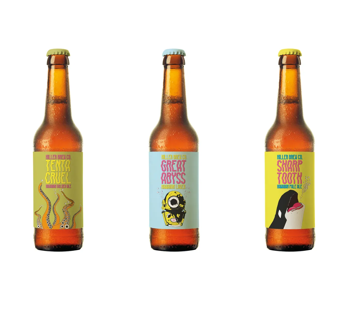
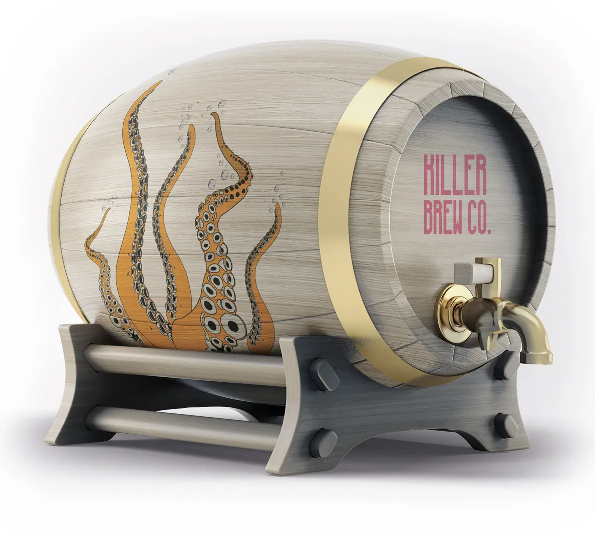
5. Greg Gilbey: 'Killer Brew Co' beer
Back to beer, and Greg Gilbey dreamed up some dangerously nice packaging for the Killer Brew Co. With names for different bottles including Sharp Tooth and Great Abyss, along with illustrations of killer whales and deadly octopuses – it's deadly branding that quenches your design thirst.
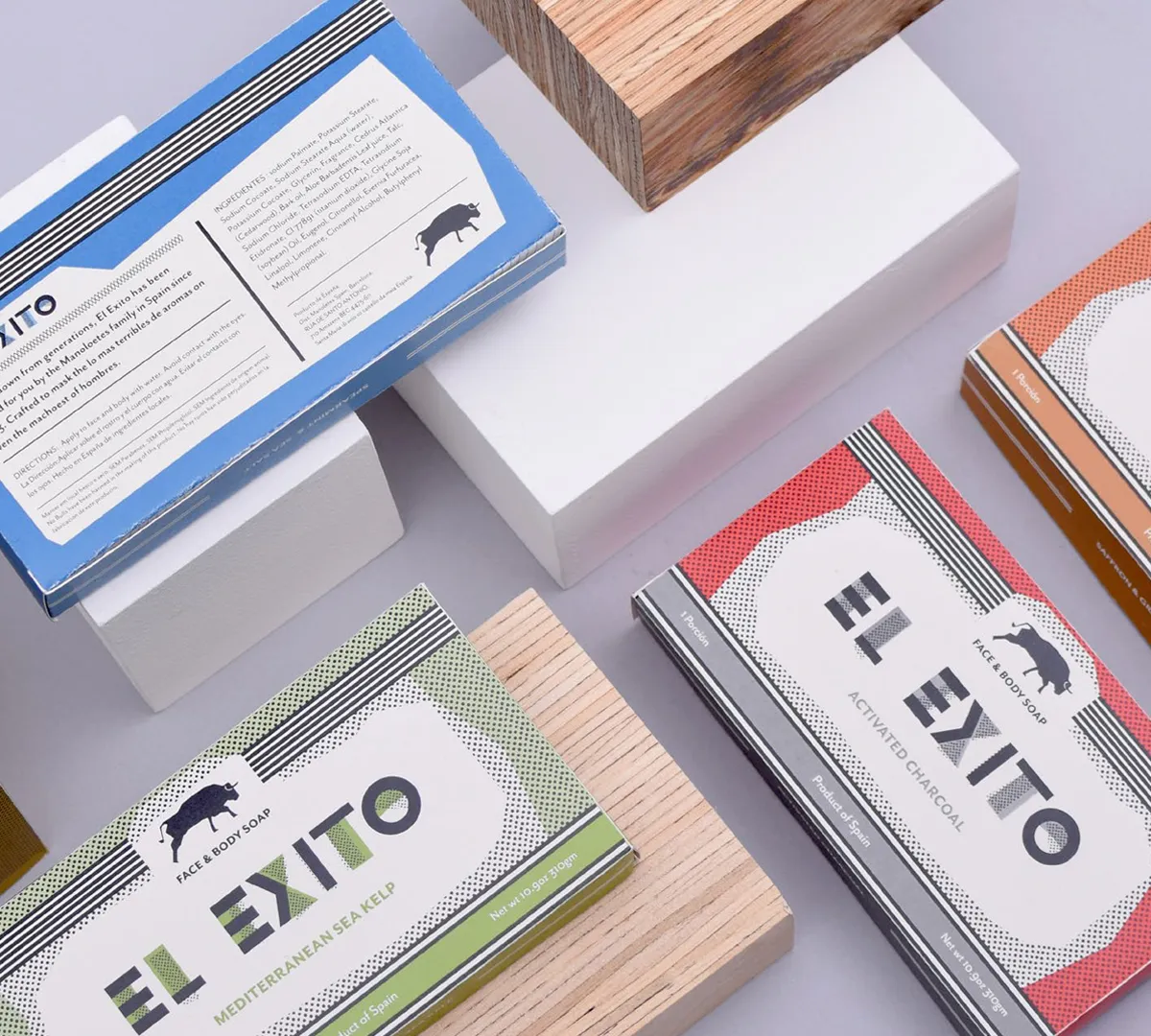
6. Emily Morant: 'El Exito' soap
Melbourne graphic designer Emily Morant certainly cleaned up her act when creating the packaging for a Spanish soap brand. Taking inspiration from the brand's home country, and its name El Exito, the design includes an icon of a bull, alongside playful typography and a colourful, vibrant palette.
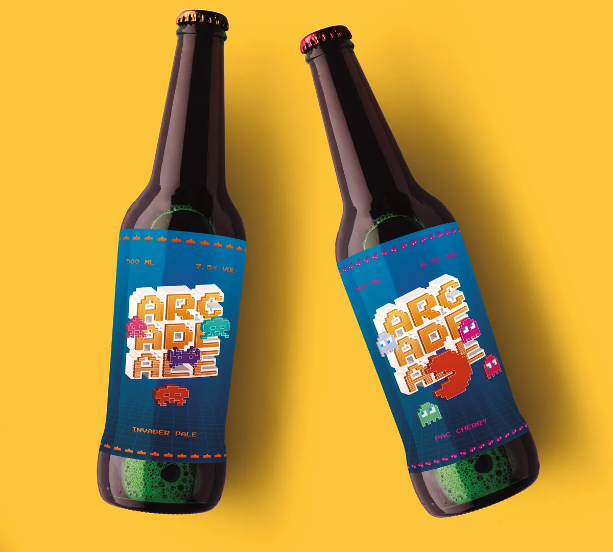
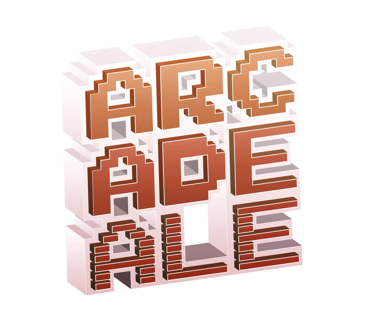
7. Alessandro Rizzi: 'Arcade Ale' beer
If you love gaming as much as you love beer, then this next playful offering by Alessandro Rizzi will certainly be a winner. Called Arcade Ale, Alessandro takes inspiration from classic video games with an 8-bit look and feel, vintage characters and retro typography.
8. Katie Neal: 'Simiao' skin care product
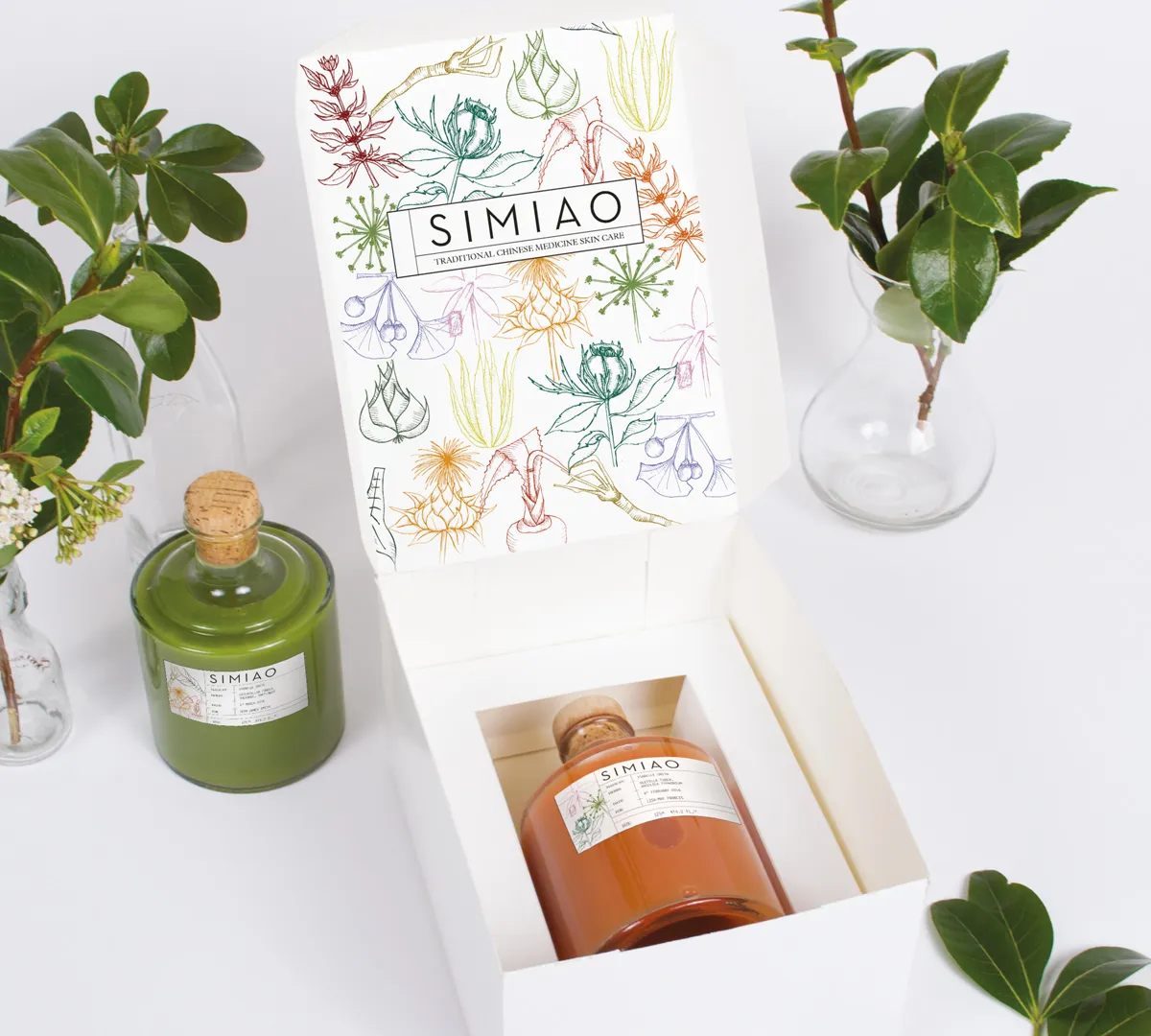
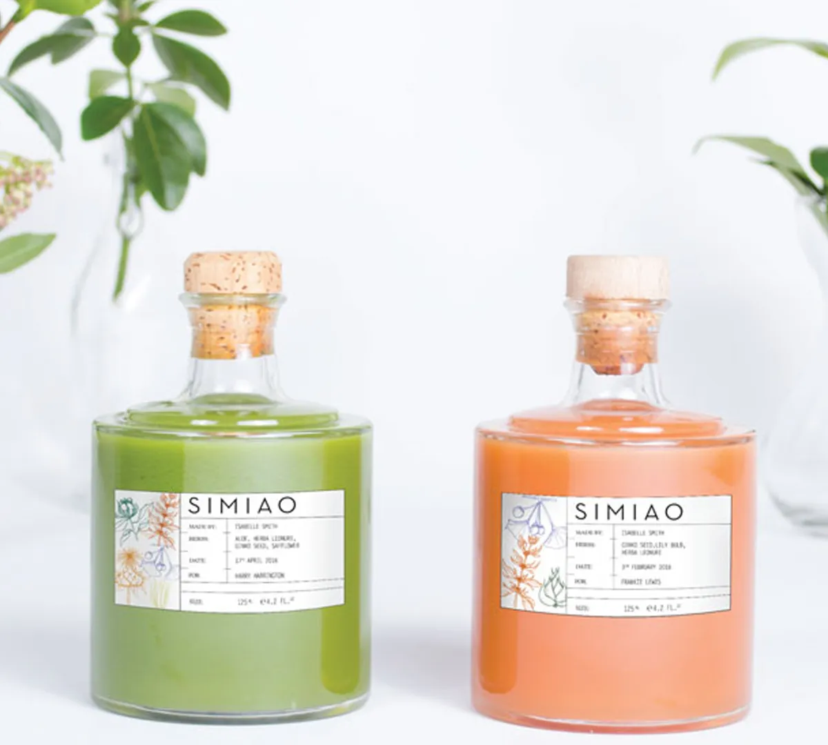
After all that beer and chocolate, you'll need something to soothe your skin. Enter Simiao – a skin care brand based on traditional Chinese medicine, with beautiful packaging design by Katie Neal.
Speaking of the concept, Katie said: "It's based on the importance of specific herb combinations and how imperative balance is both internally and externally for each individual. Furthermore the importance of natural hand-farmed ingredients. Each lotion produced is enriched with a specific hand-picked combination of herbs for each client based on one to one consultation."
9. Amy Liu: 'Solution' perfume
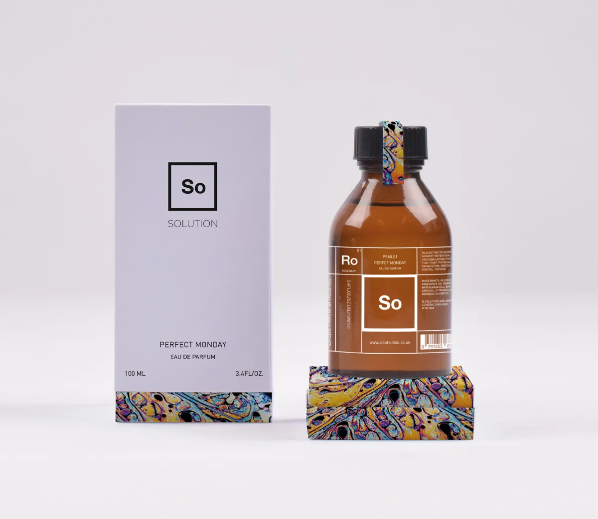
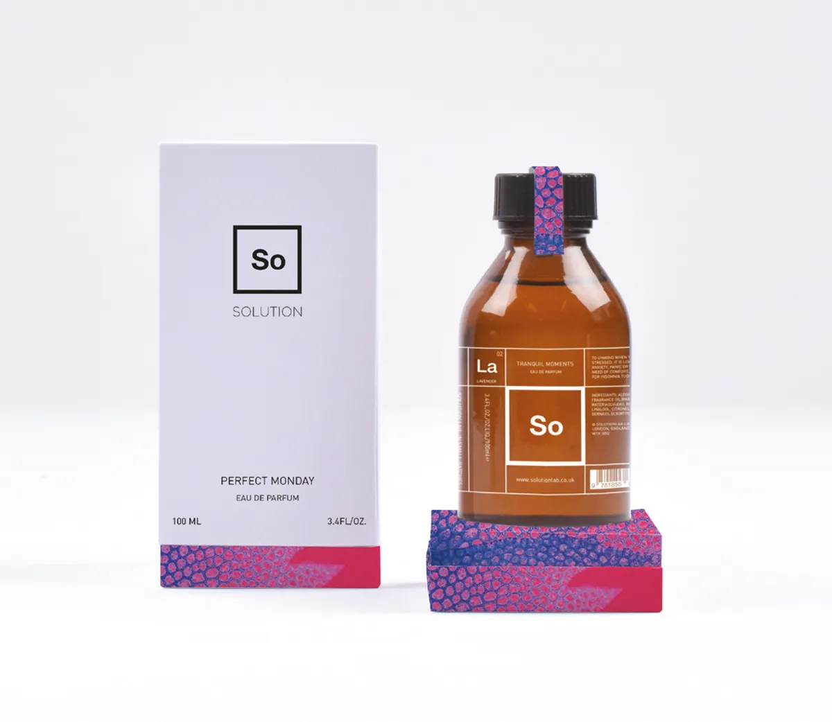
Brisbane designer Amy Liu decided to offer just the solution to create appealing packaging for a perfume brand. Called, you guessed it, Solution, the product was wrapped up in a lilac box with an almost chemistry-set type look and feel to the bottle and branding. Accompanying illustration helped soften the design.
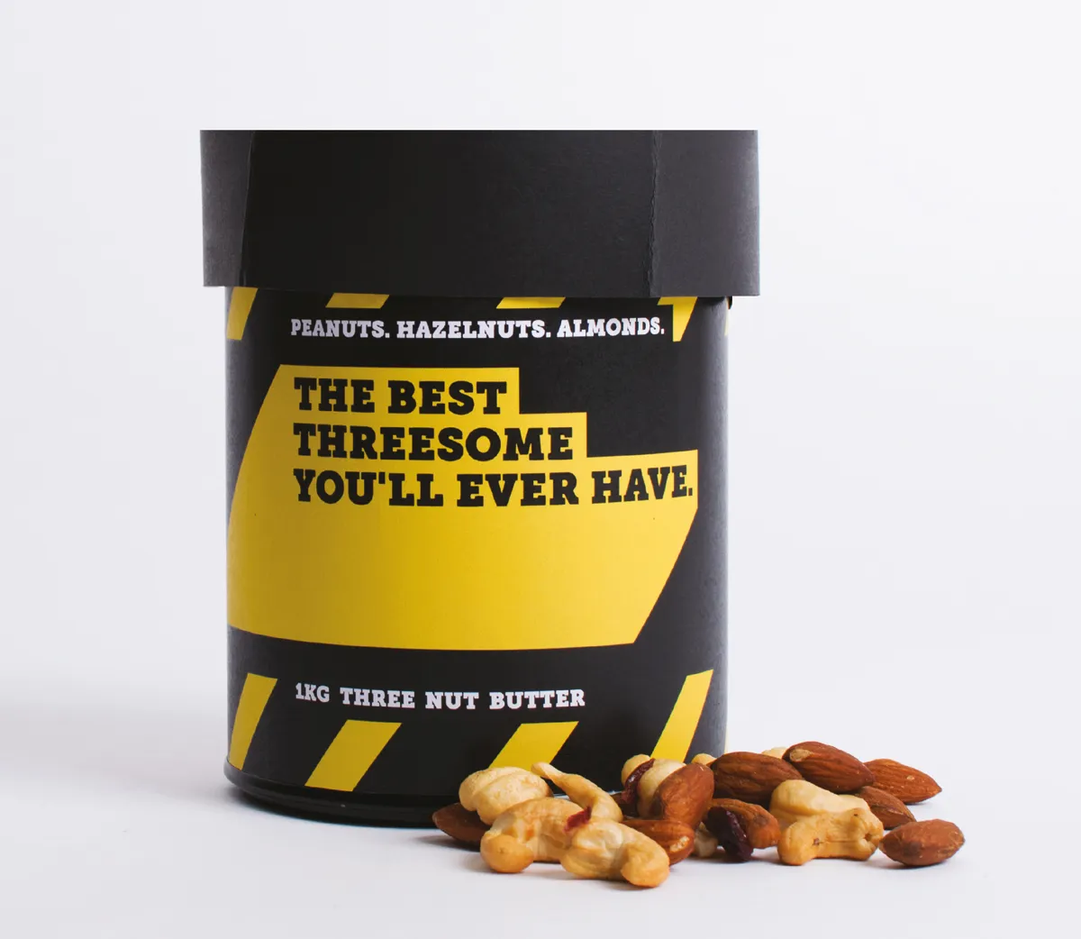
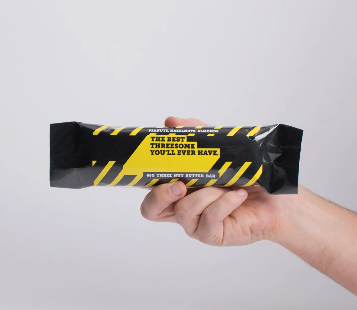
10. Bobby Hendry: 'Three Nut Butter' snack
How do you sell snacks to Australia's building and trade industry? For Sydney designer Bobby Hendry, she decided to design packaging that hits the nail on the head. With a black and yellow palette, and roadworks-inspired design, the wrapping and containers for "Three Nut Butter" certainly understands its target market.
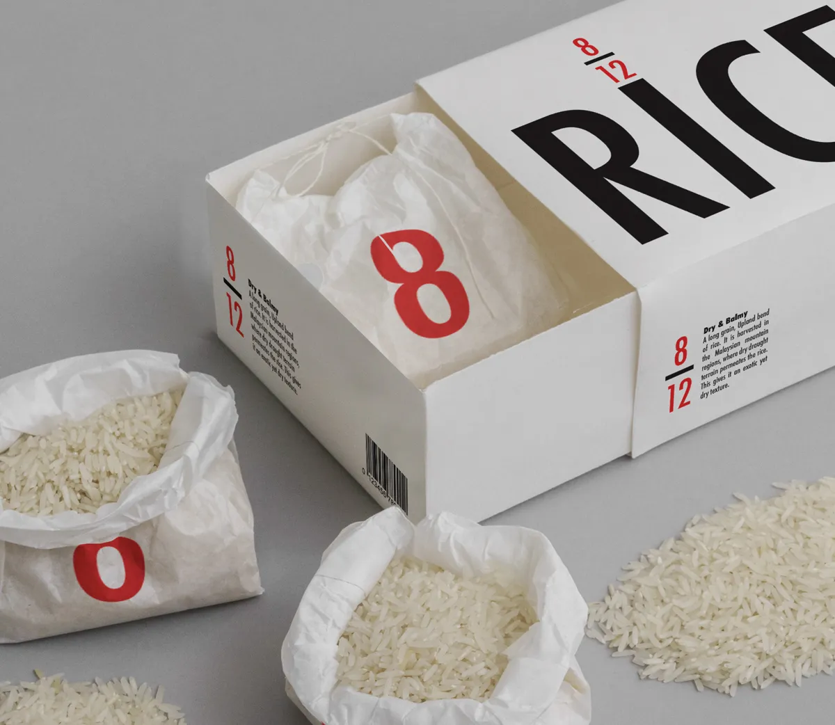
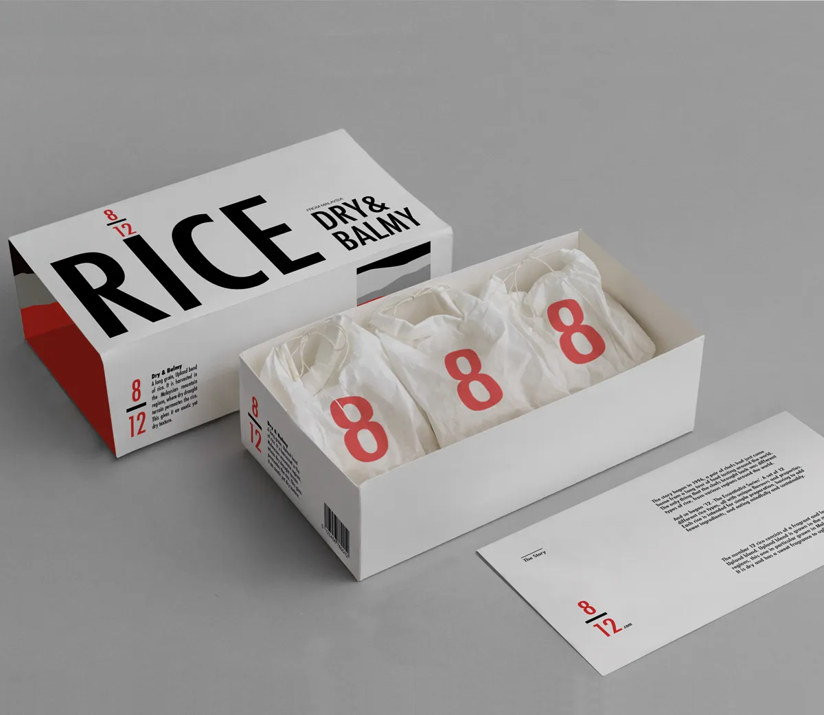
11. Lallu Nykopp: '12—The Essentialist Series'
The brief for Lallu Nykopp was to design rice packaging for a minimalist man, with keywords focused on "essentialist", "pure" and "collectible". Lallu came up with a bold and clear concept, where red and black typography conveys simplicity. The packaging is so uplifting and unique, it's good enough to eat.
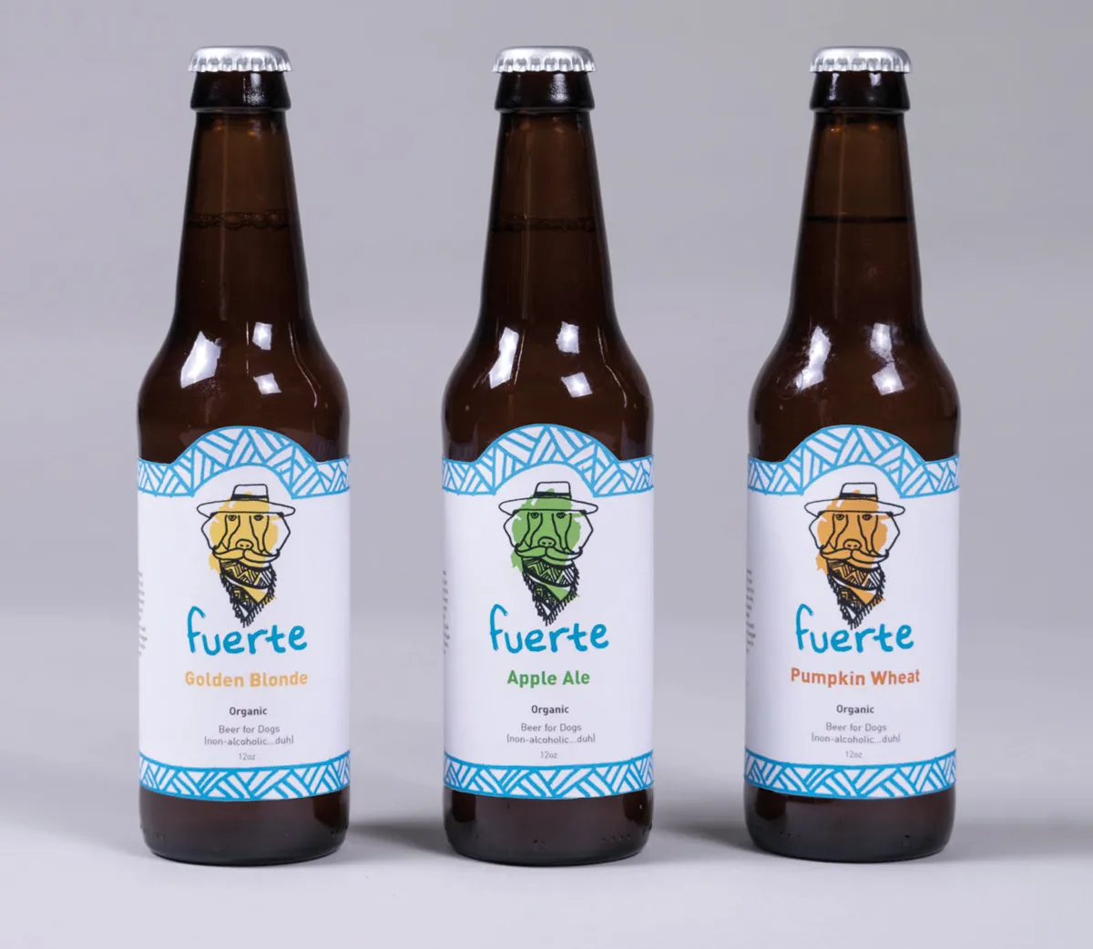
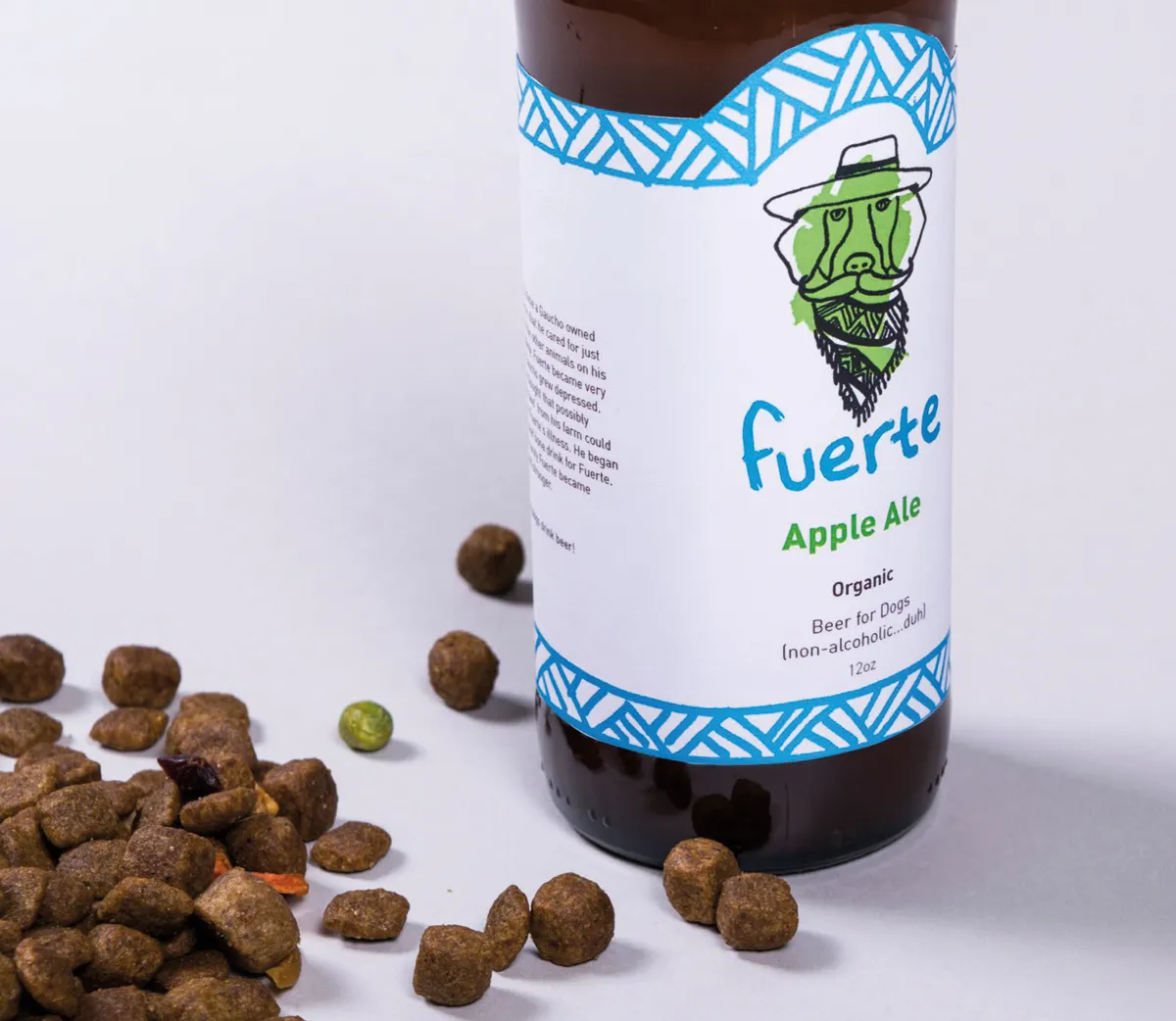
12. Lindsay Koffler: 'Fuerte' beer for dogs
Lindsay Koffler wanted to create a beer that was healthy, delicious and... nutritious for a dog. Yes, that's right. Lindsay brewed up "Fuerte" – a beer for dogs. She explains: "Dogs love meat right? Argentina came up and so I created a story revolving around a Guacho and his dog, Fuerte. Fuerte became sick so the Gaucho made a drink for him using the beef he had on his farm and magically cured Fuerte. So as the saying goes, 'Only strong dogs drink beer'."
13. Madeline Segalas: 'Healing Hive' honey
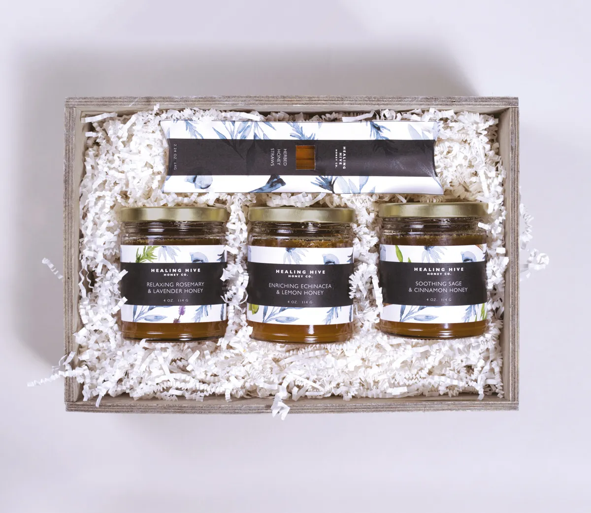
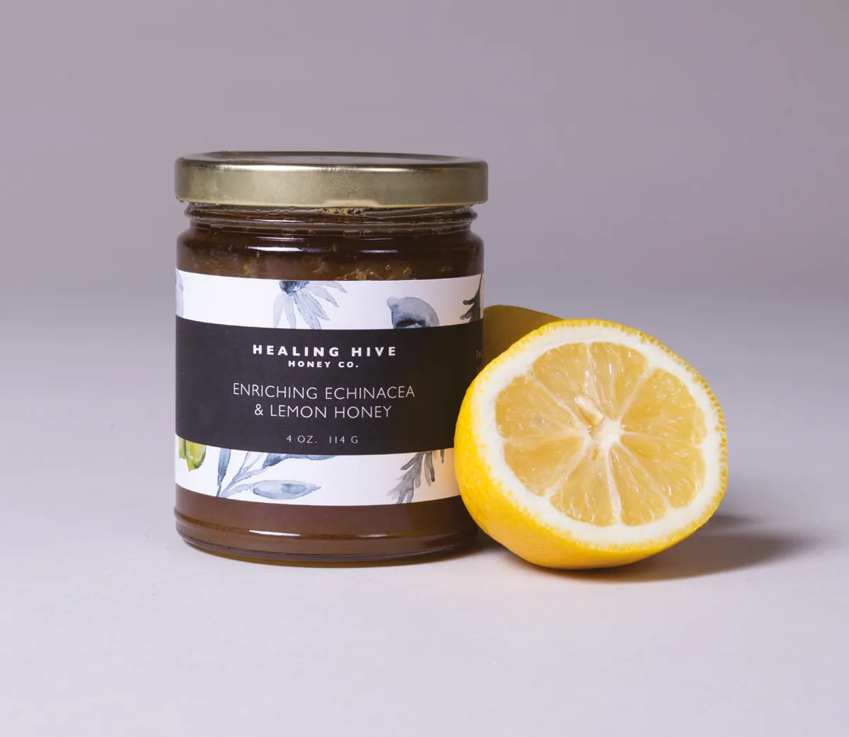
Madeline Segalas crafted elegant and luxurious packaging for Healing Hive, a gourmet honey brand. Coming up with concepts for jars, straw packets and recipe pamphlets, her buzzing designs are targeted at "boutique grocery stores and for thoughtful, discerning customers".
14. Anna Delis: 'Rokk' beer
London designer Anna Delis raised a glass to Rokk, a craft beer inspired by Iceland with crisp, geometric illustrations and a nod to Icelandic culture and climate. It's a refreshing take on bottle packaging for beer, and something that will help it stand out in a market saturated with alcohol products.
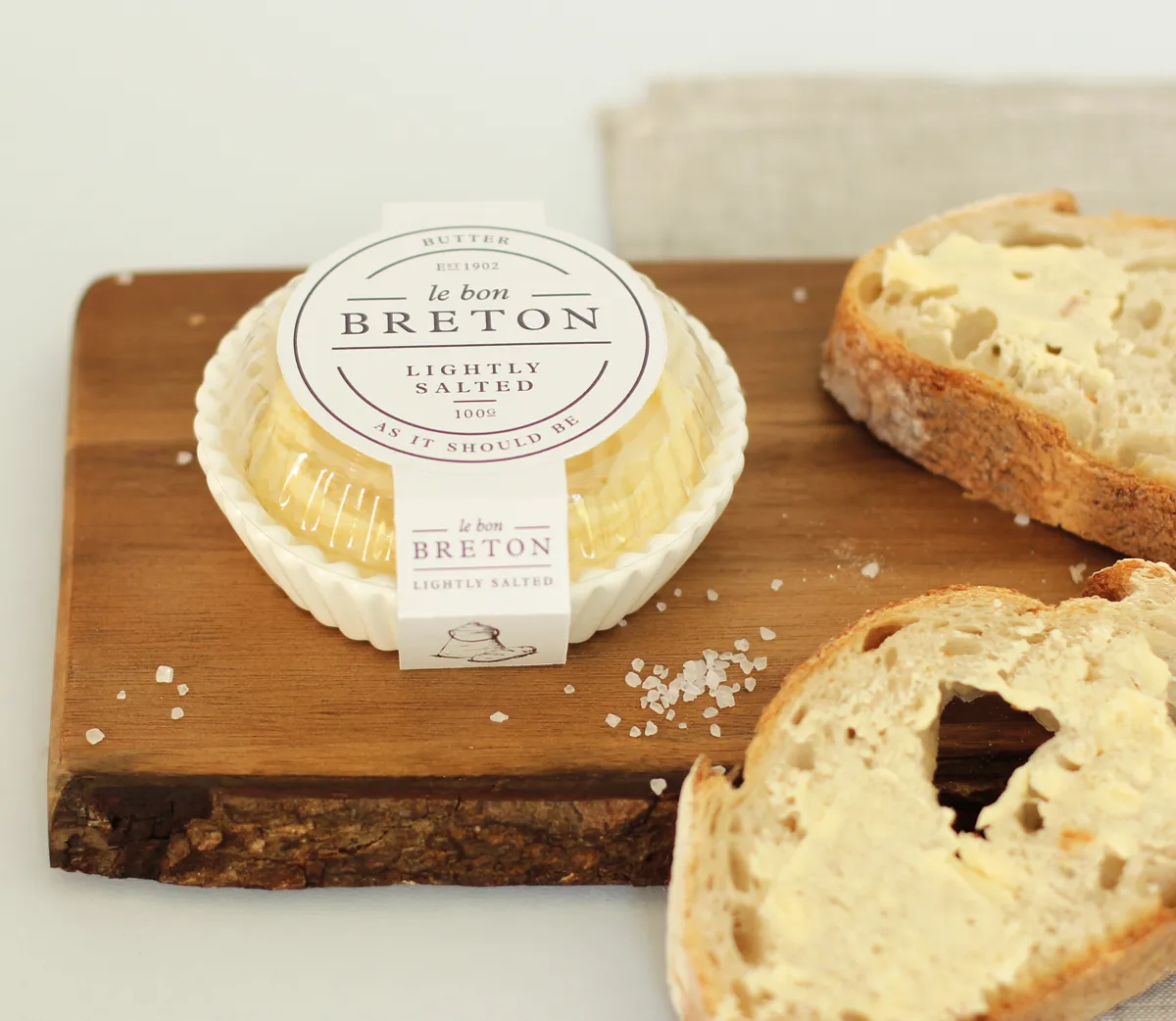
15. Katie McLurg: 'Le Bon Breton' butter
There's nothing cheesy about Katie McLurg's packaging for Le Bon Breton, a brand of butter from a country farm in Brittany. The company ships high quality produce to clients across France, but is trying to break into the delicatessens of Paris. This is where Katie's elegant, affluent design comes into its own. She says: "The bounding strokes are taken from the Breton region’s flag, while the serif font and muted colour palette lend themselves to the classic, high-end nature of the product."

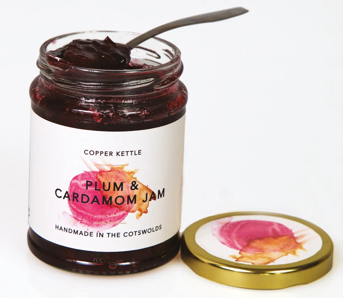
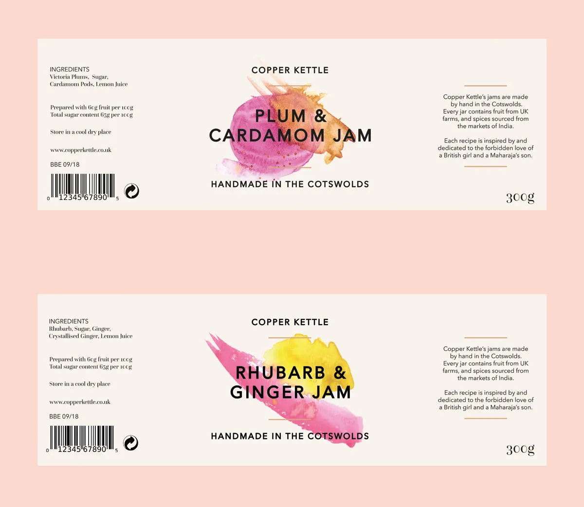
16. Nicki O'Donoghue: 'Copper Kettle' jam
Manchester designer Nicki O'Donoghue dished out a tasty packaging design for Copper Kettle, a boutique jam that she dreamed up. The labels include a series of watercolours, each unique and representing the flavour of the conserve. This look and feel was then rolled out to cookbooks, stationery and even a website.
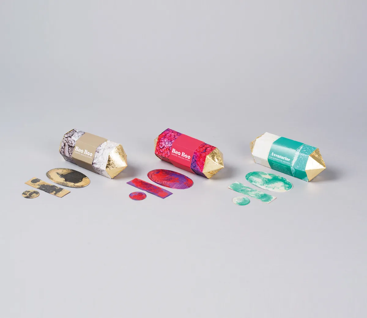
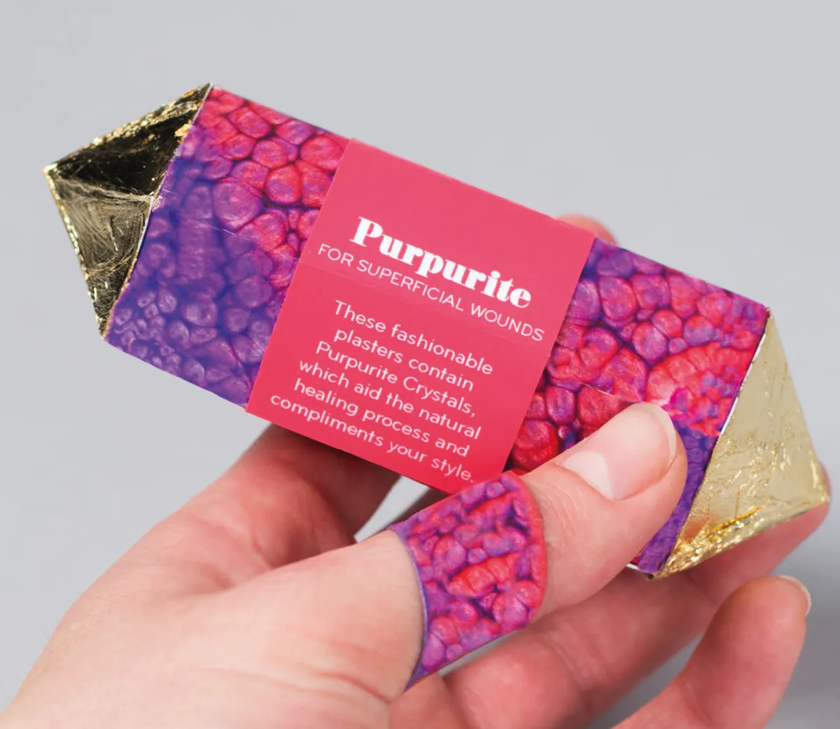
17. Louise Harris: 'Purpurite' skin treatment
Louise Harris decided to craft the most intriguing packaging for Purpurite, a luxurious skin treatment that contains "purpurite crystals, which aid the natural healing process and complements your style". The unusual containers feature gold foiled elements, adding to their high-end feel.
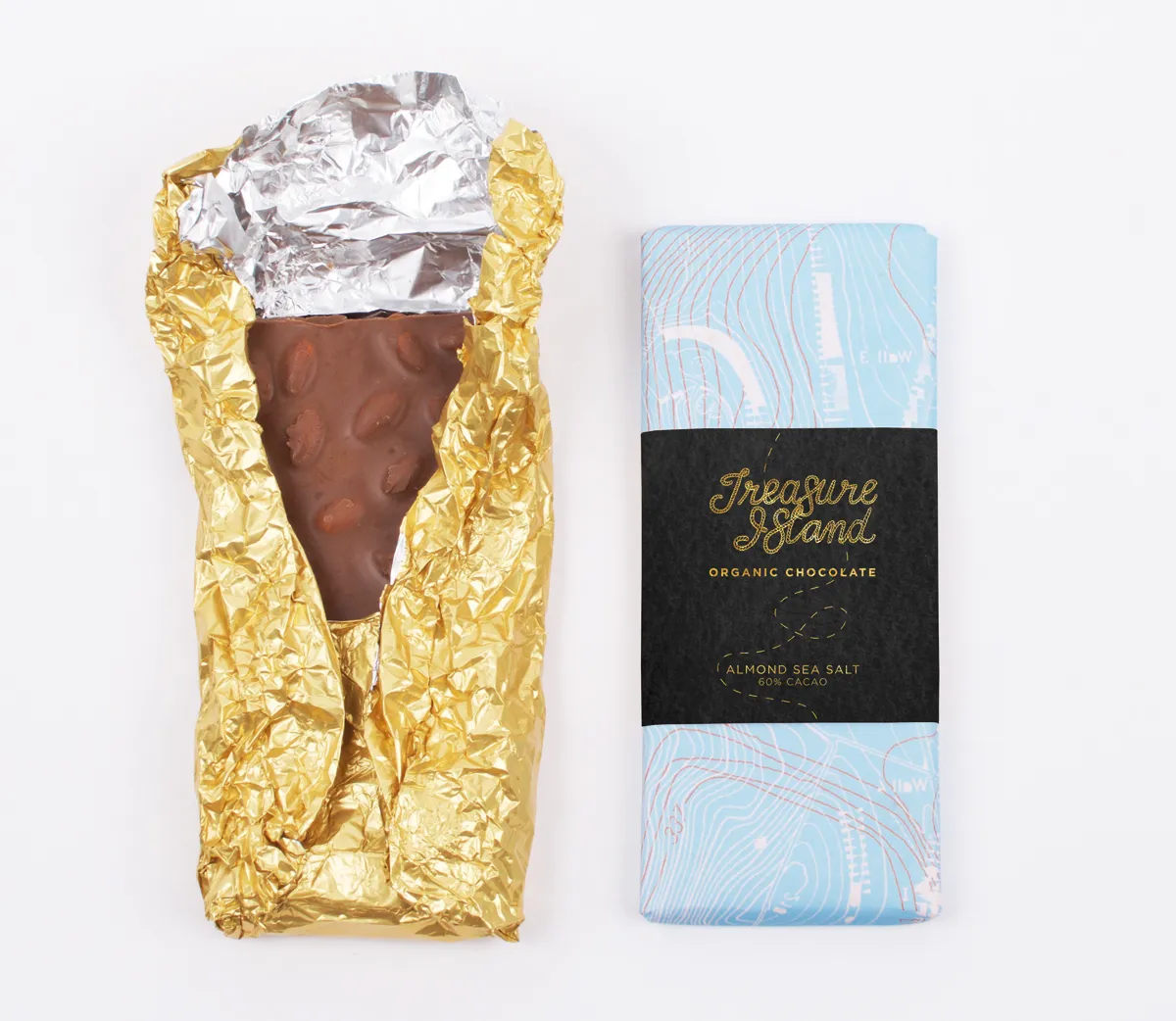
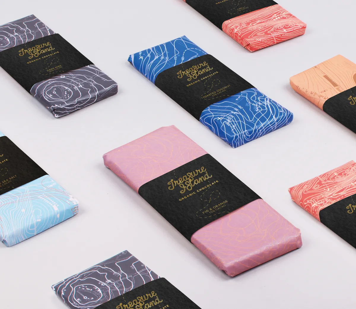
18. Breanna Sinclair: 'Treasure Island' chocolate
Breanna Sinclair was inspired by pirates for her take on Treasure Island chocolate. The sweet treats were wrapped up in packaging that features a series of contour maps. The logo was crafted by hand to add authenticity and a traditional feel. Breanna's work was so tasty, she was a finalist in the AGDA Awards.
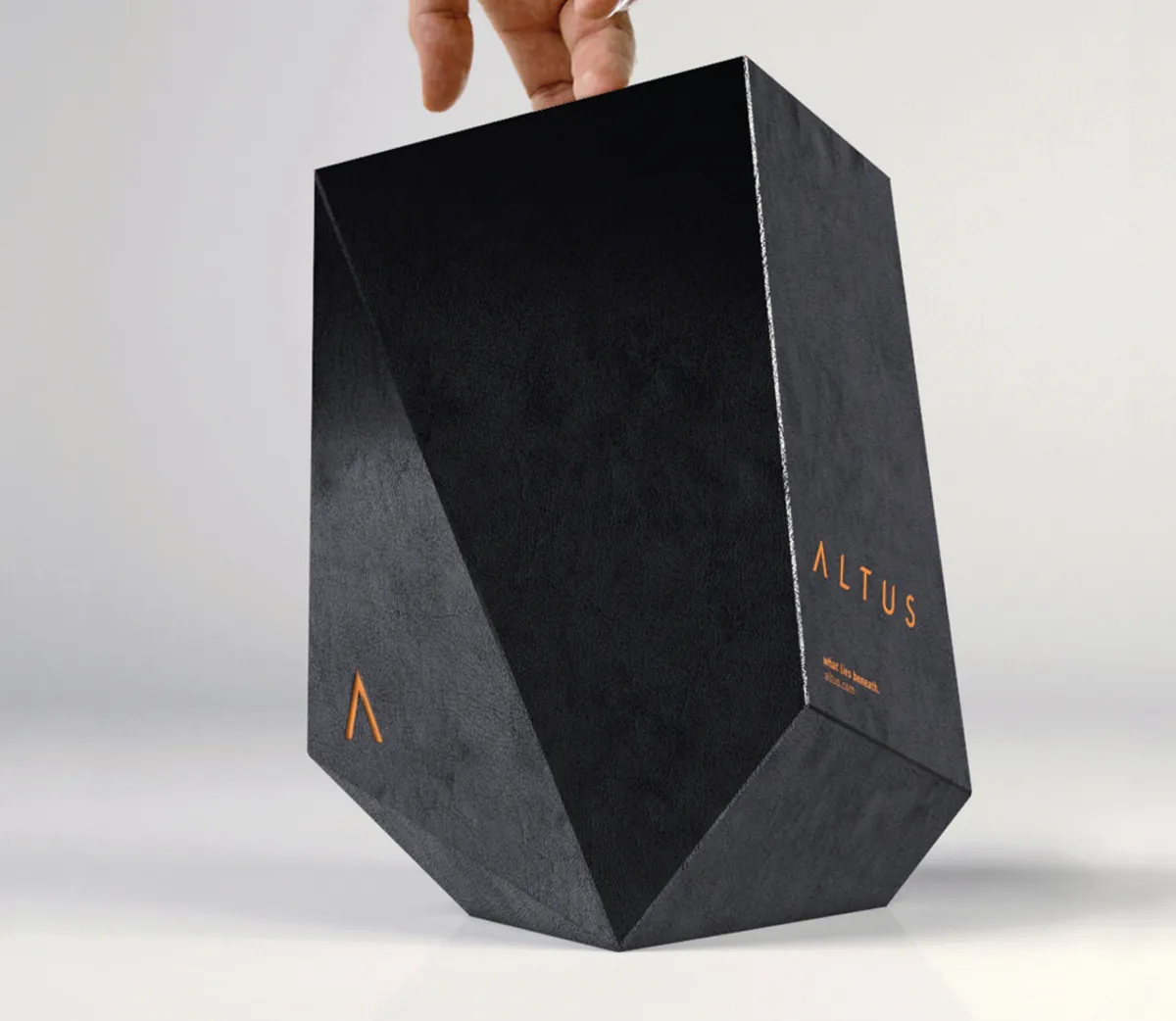
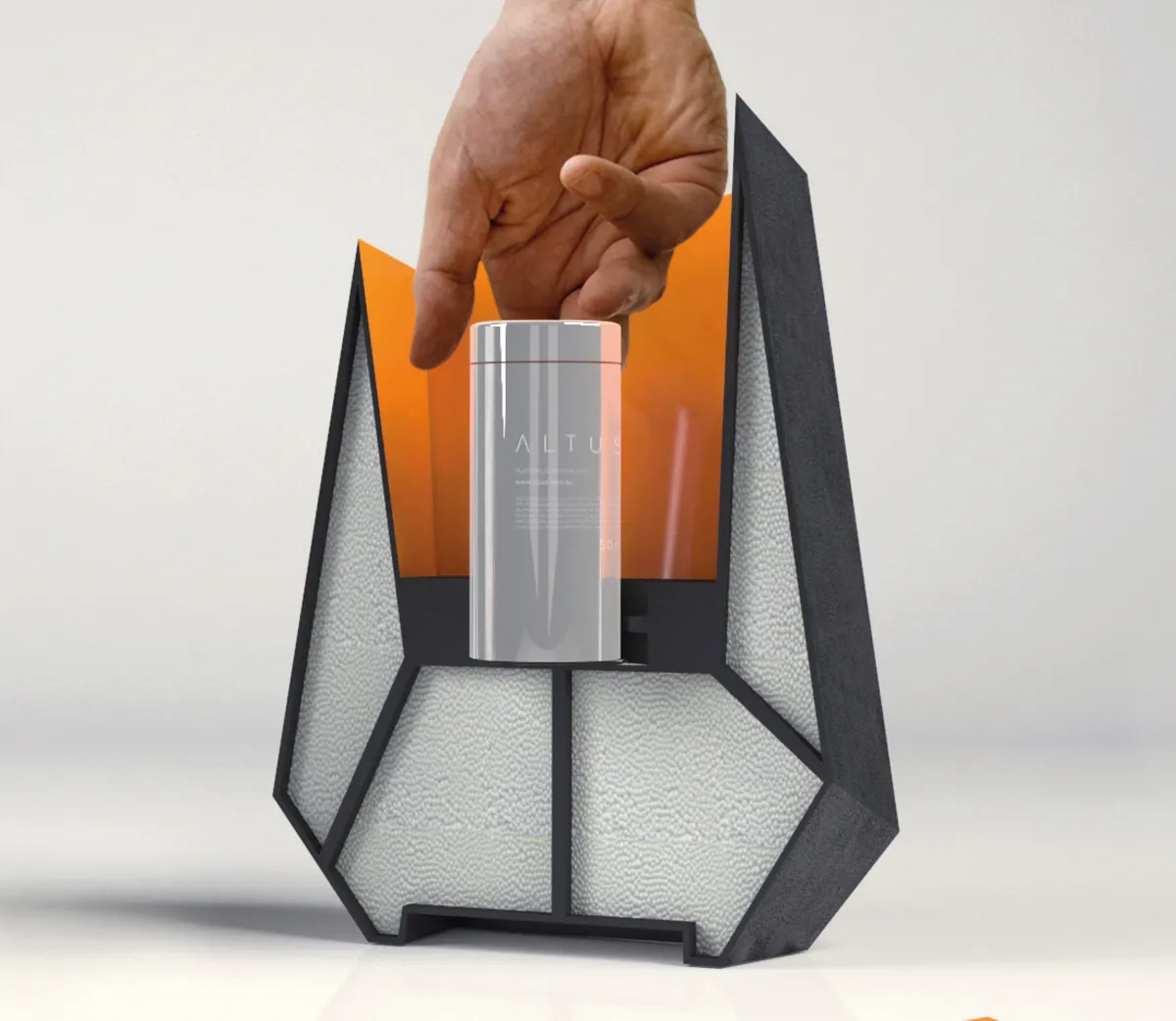
19. Owen Fisher: Atlus moisturiser
If you're going to create a new brand of moisturiser for men, then it has to be something that stands out. For Owen Fisher, he decided to take inspiration from the name Atlus, which means "depth" in Latin. Encasing the elegant bottle of moisturiser within a larger black box, the product feels unique, boutique and luxurious.
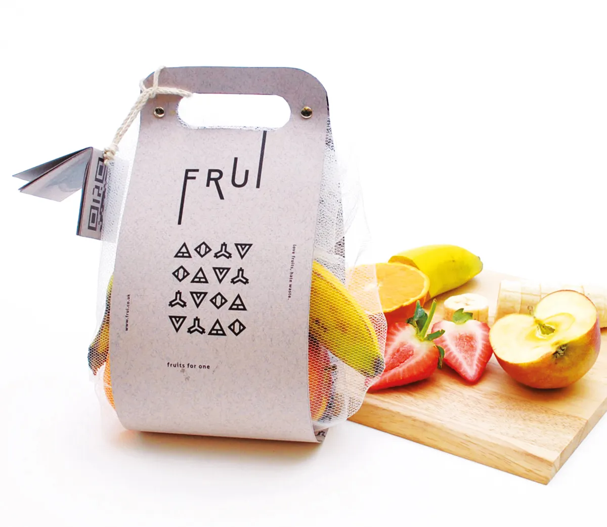
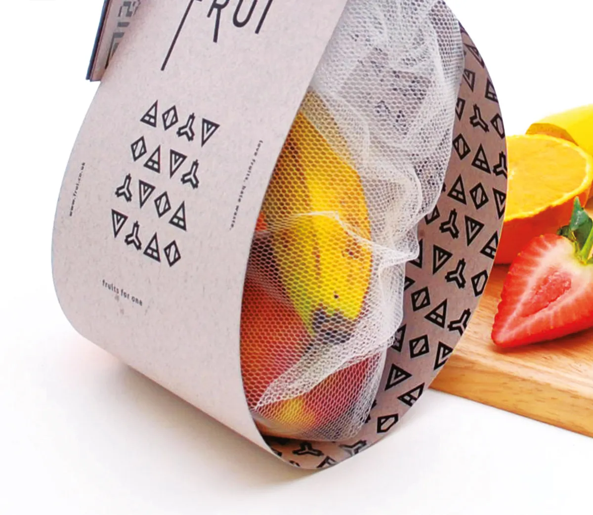
20. Bo Sun: 'Frui', fruit packaging
Manchester designer Bo Sun was certainly feeling fruity when she came up with fresh packaging for Frui, a brand that provides a range of fruit for "one-person households". With the idea being that a customer can simply purchase a healthy fruit box, the wrapping has a clever handle that makes it even easier to pick up and buy.
Editor's Picks





Trending






Latest Jobs
Creative Project Manager at Analogue
Full-time·Leeds·£28k–£35k
Design Director at Koto
Full-time·London·£72k-£90k
Client Director at Koto
Full-time·Berlin·€70k-€85k
Creative Social Content Producer at Bompas & Parr
Contract·London·£32k–£40k
Senior Front End Developer at Crown Creative
Full-time·Belfast·£50k–£60k
Digital and Marketing Manager at Manchester Art Gallery
Contract·Manchester·£38,126 pro rata