18 'non-boring' corporate reports designed by graphic design students
How do you transform a corporate report that some might consider stale and boring into something rather wonderful?

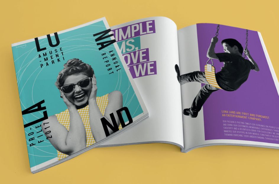
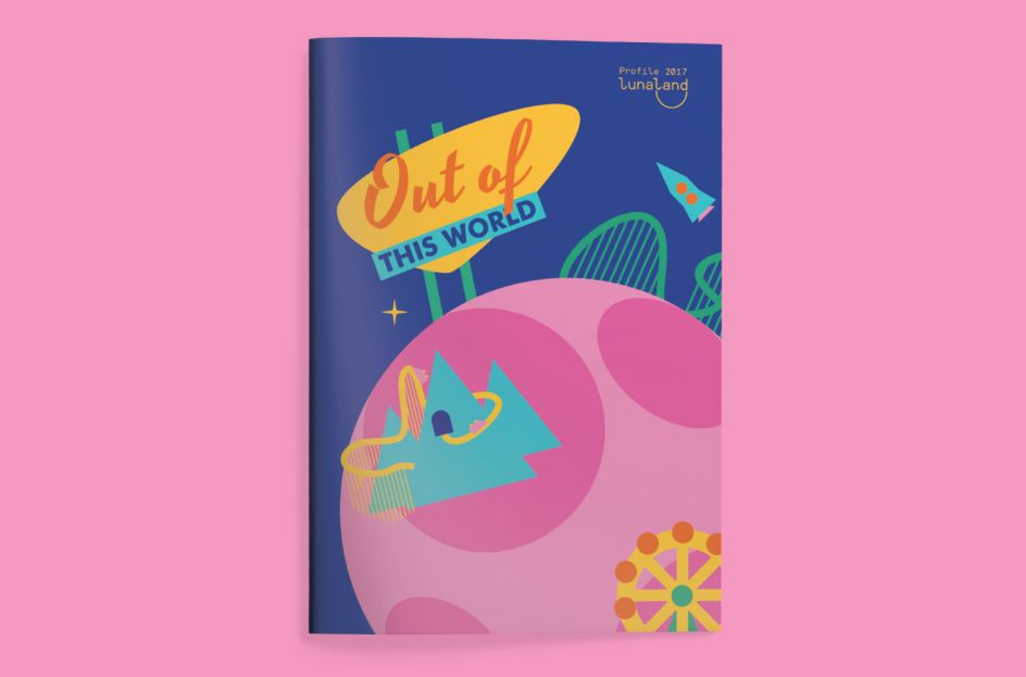
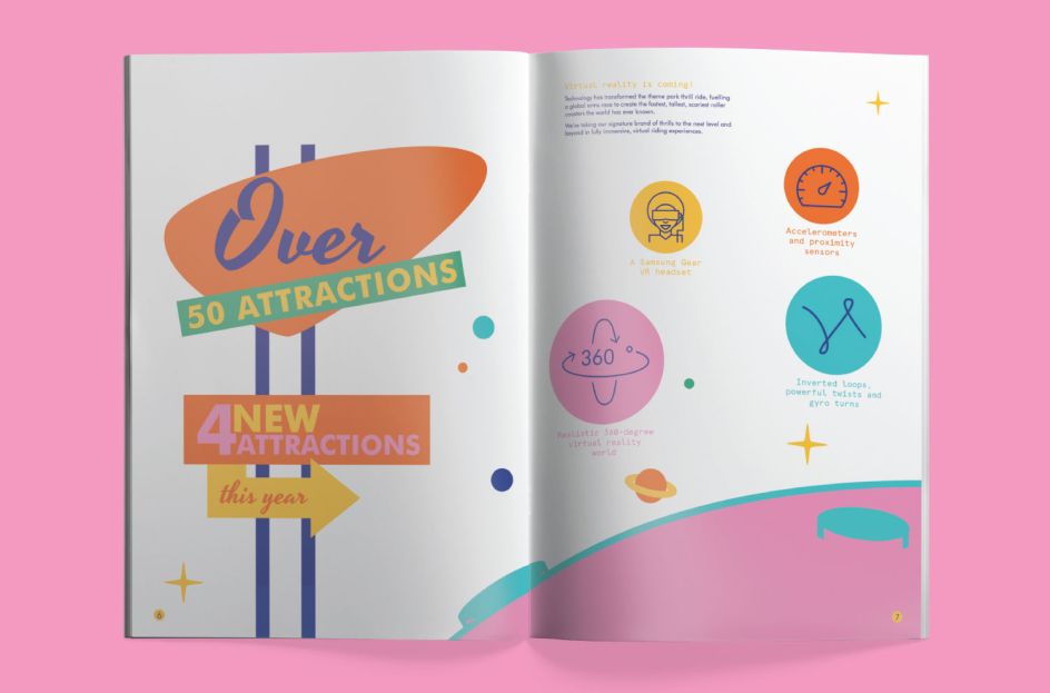
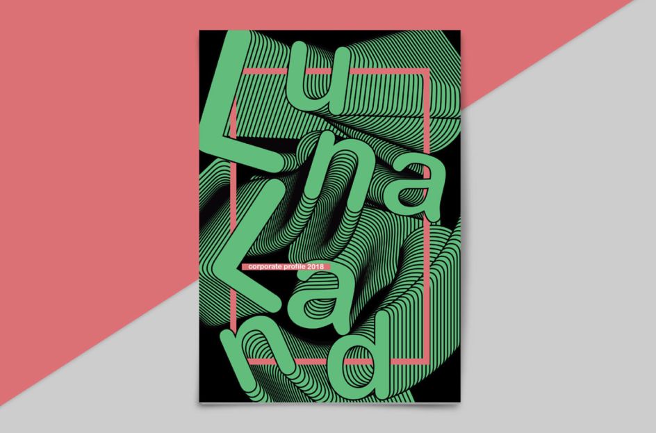
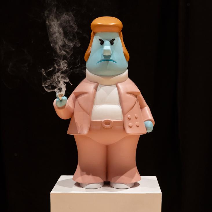
Luna Land Amusement Park by Milly Hilton. All images courtesy of Shillington and its students.
It's a challenge we often task our students with at Shillington at our six campuses around the world.
Using their graphic design skills, they turn heavy stats, information and text into a visually appealing document – one that any of us would have the pleasure in reading. For your inspiration, we've picked out 18 "non-boring", gloriously creative corporate reports designed by our students – some based on real brands while others are purely fictional.
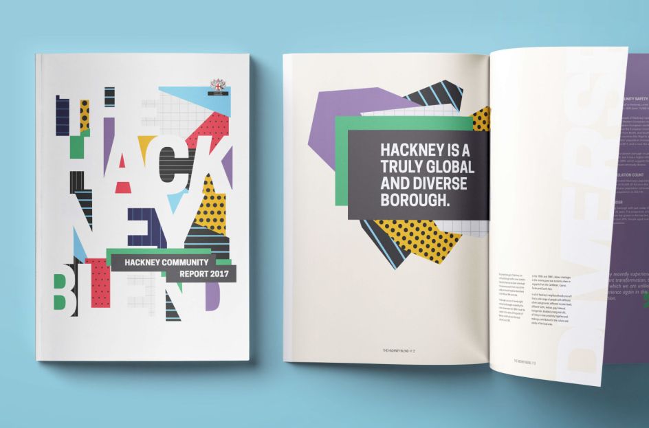
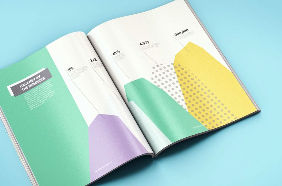
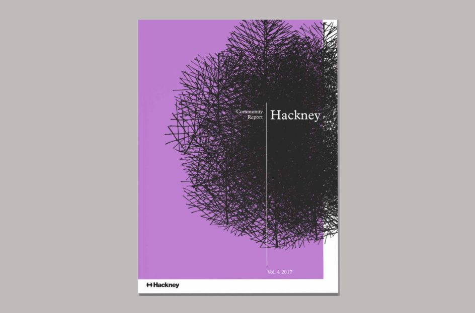
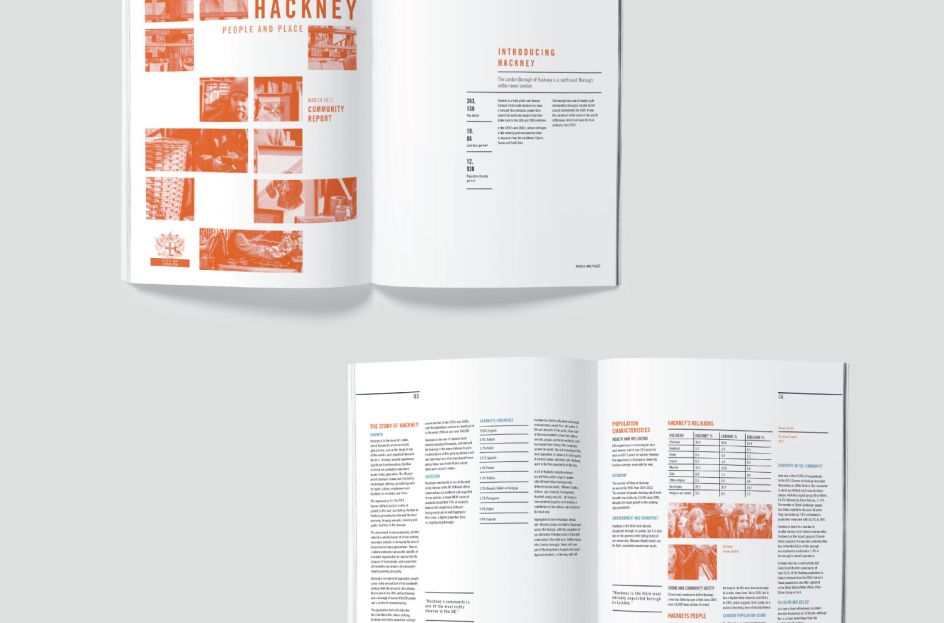
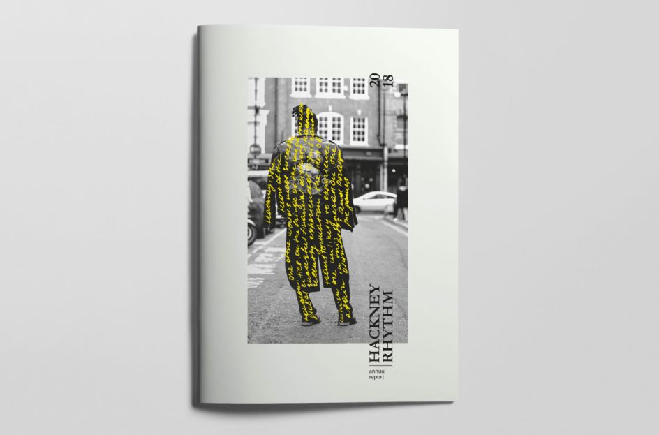
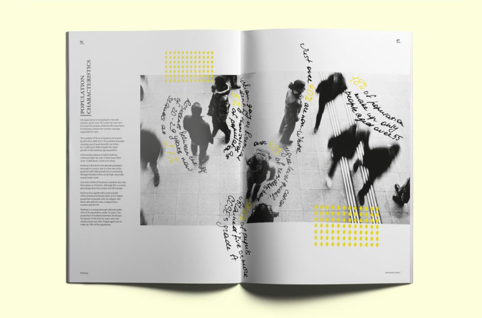
1. Hackney Community Report by Derk van der Woude
Derk van der Woude crafted a corporate report to highlight the diversity of Hackney in London. "Where cultures meet and overlap, something new and fresh emerges," Derk says, a sentiment he adopted in his bright and colourful graphical document for the Hackney Community Report 2017.
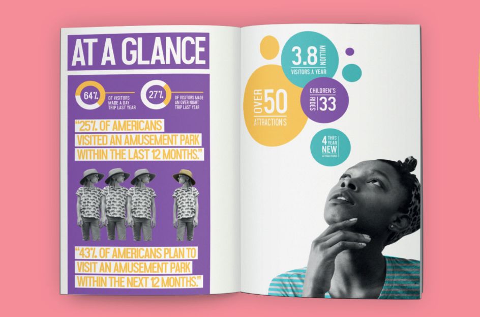
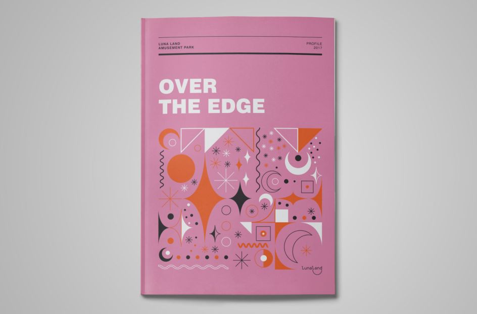
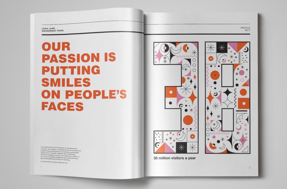
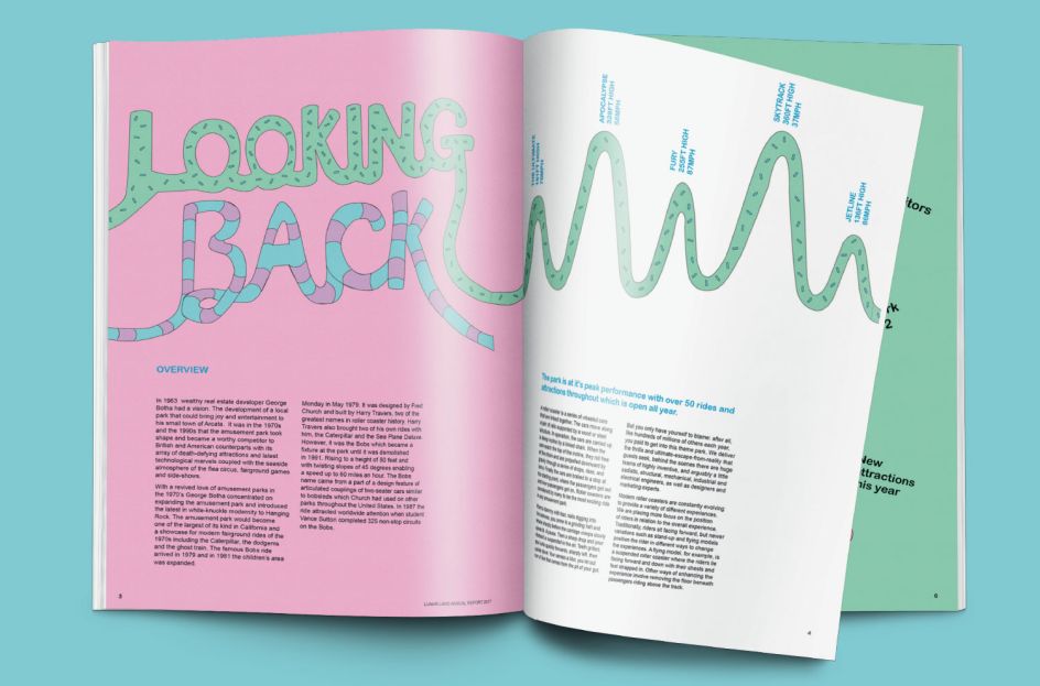
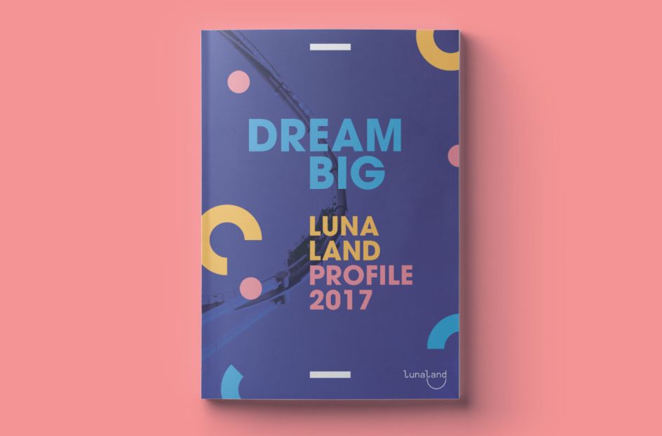
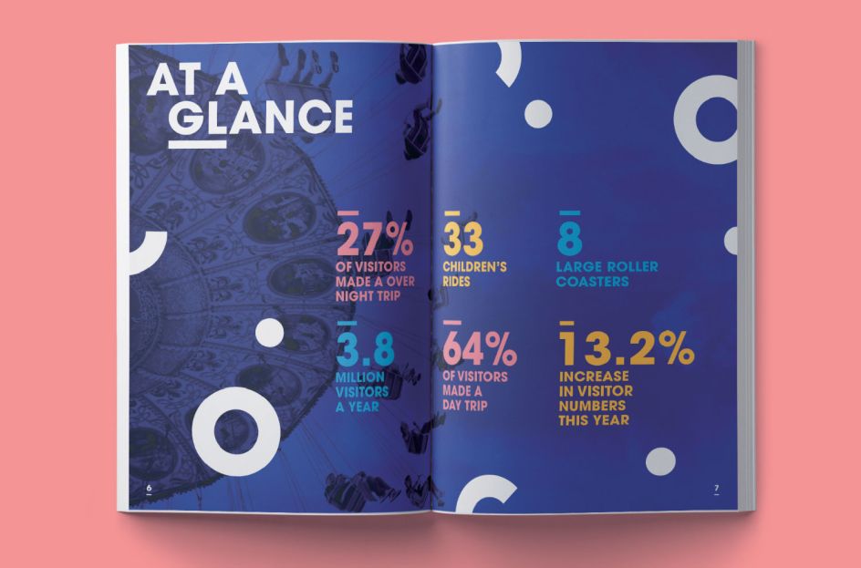
2. Luna Land Amusement Park by Aleksandra Wiese
For her take on corporate reports, our Manchester graduate Aleksandra Wiese chose Luna Land as her inspiration. Taking some interesting facts and figures about the fictional amusement park's stats over the previous 12 months, she created a document that graphically informs without being overwhelming.
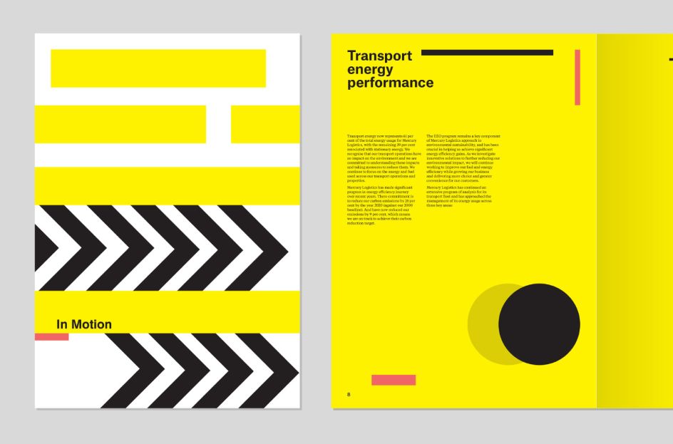
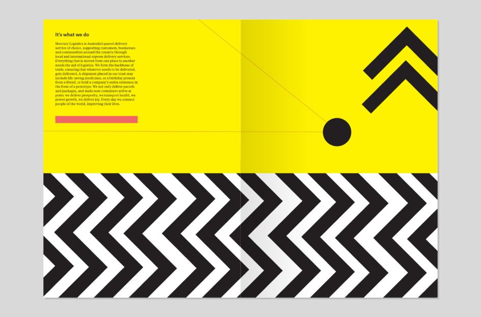
3. Mercury Logistics by Steve Lo Castro
Our Melbourne graduate, Steve Lo Castro, designed a stunning report for Mercury Logistics, a parcel delivery service in Australia, using an underlying theme of black, white and yellow with dashes of red and strong graphical elements. We love the feeling of motion throughout its pages, hinting at the movement behind the company.
4. Luna Land Amusement Park by Emma Clay
For Emma Clay in Melbourne, the brief was to design an annual corporate report for our fictional amusement park, Luna Land. "I took inspiration from artist Mary Blair and used simple geometric shapes to give the report a non-conventional amusement park feel, yet still conveying fun."
5. Luna Land Amusement Park by Peter Howell
Peter Howell, one of our students in London, also designed Luna Land's corporate report following the brief to "turn it into something as exciting as the rides themselves". His design plays on the main feelings people associate with theme parks – anticipation and disorientation. "The former comes in the images of people looking forward to something – a holiday, a cold drink, a ride in their car," explains Peter. "The latter comes through in the unusual layout which appears confusing at first but makes perfect sense."
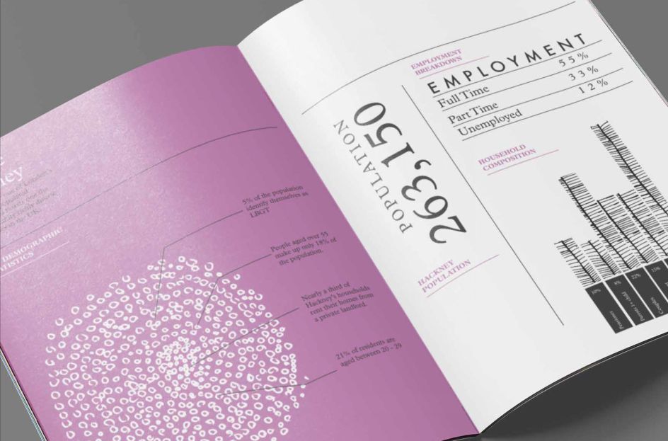
6. Hackney Community Report by Jake Parry
Jake Parry added illustrative natural elements to his design for the Hackney Community Report, suggesting dandelions, leaves and branches throughout. The purple theme adds to the soft approach and we love the interesting use of typography to add further interest.
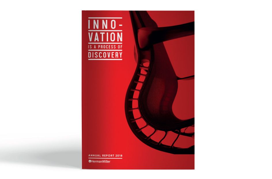
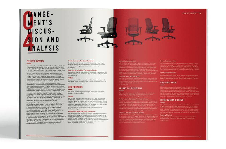
7. Herman Miller's Annual Report by Elle Estah
Over at our Brisbane campus, Elle Estah decided to craft an annual report for Herman Miller, the modern furniture brand. Sleek, contemporary and with a clever use of photography, it's an enticing design that draws you in. "I wanted to create a modern and engaging design for the report," says Elle. "Herman Miller is a popular and renowned international furniture manufacturing company for creating bold, unique and timeless pieces. Thus, I wanted to encapsulate that and reflect that same boldness and modernism into their collateral."
8. Luna Land Amusement Park by Ché Creasey
In London, Ché Creasey also selected the fictional Luna Land for her corporate report. Speaking of her work, she said: "The brief requested that the report should be fun and engaging whilst delivering the essential information required. The influence for the design, colour and illustration were the sweets and candy floss that are enjoyed on a day at the parks as well as the twists and turns of the rollercoasters."
9. Hackney Community Report by Alexandra Francis
Alexandra Francis tackled the Hackney Community Report for her brilliant work at Shillington. She created the cover, spreads and infographics for the document, exploring the theme of a "crowded house" and reflecting a welcoming and tight-knit community.
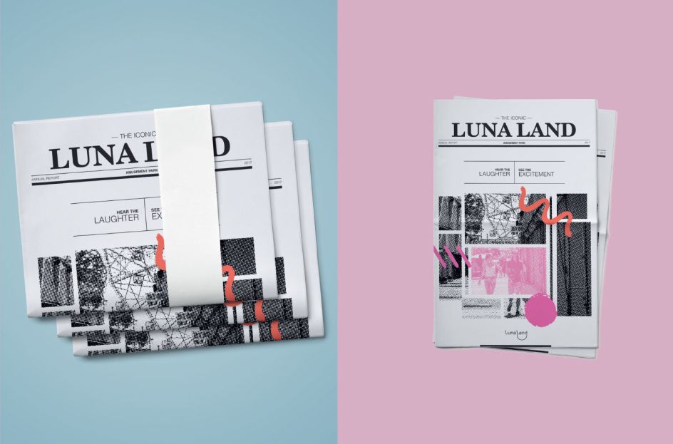
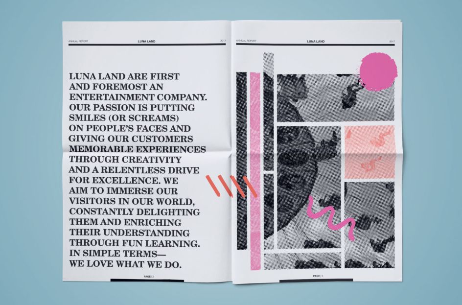
10. Luna Land Amusement Park by Lauren Turner
Lauren Turner also chose Luna Land for her corporate report design. "I decided to take a modern approach with a newspaper look and feel to represent the companies history versus their future aspirations. The graphics communicate the theme parks energetic, animated and lively atmosphere where families bond and make new memories."
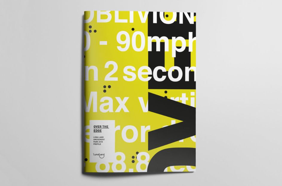
11. Luna Land Amusement Park by Talya Baker
Our London graduate Talya Baker worked on the editorial design for Luna Land's annual report. We love her intense black, white and yellow theme along with bold typography and layouts which convey "the human's natural fight or flight instinct through type and colour".
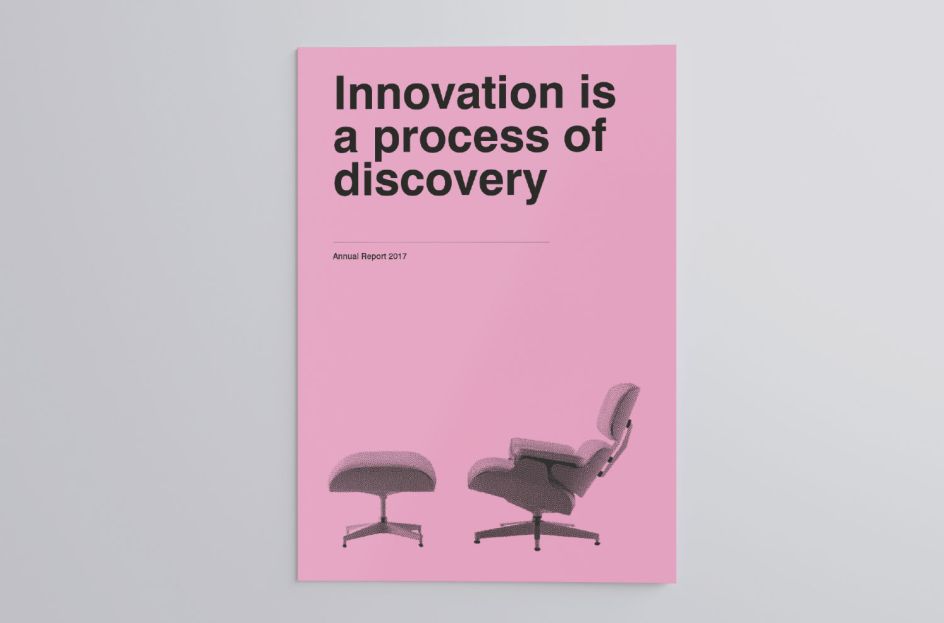
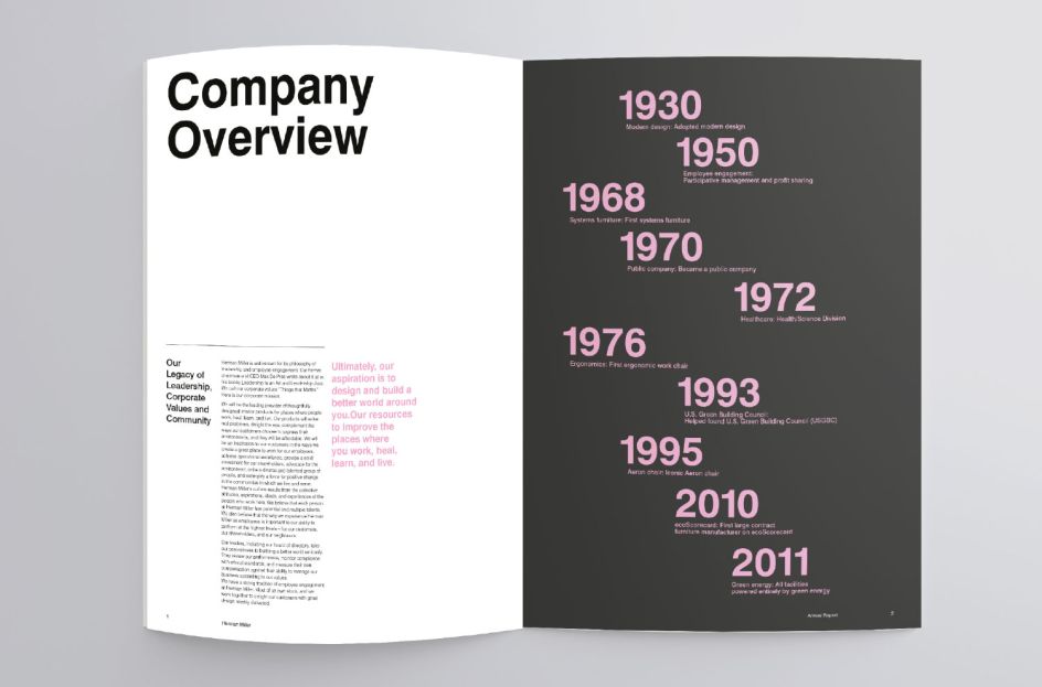
12. Herman Miller's Annual Report by Minka Smith
Minka Smith's take on Herman Miller's Annual Report was inspired by Swiss modernism. "I kept the typesetting design simple and bold, then I used a bright yet soft pink as the feature colour," she explains.
13. Hackney Community Report by Siuzanna Avanesova
Siuzanna Avanesova decided to focus on a musical theme for her design for the Hackney Community Report. With gorgeous, hand-written words on the cover of her document, as though they were lyrics to a song, the page-turning booklet shows a real love of the London borough and presents the stats and facts beautifully.
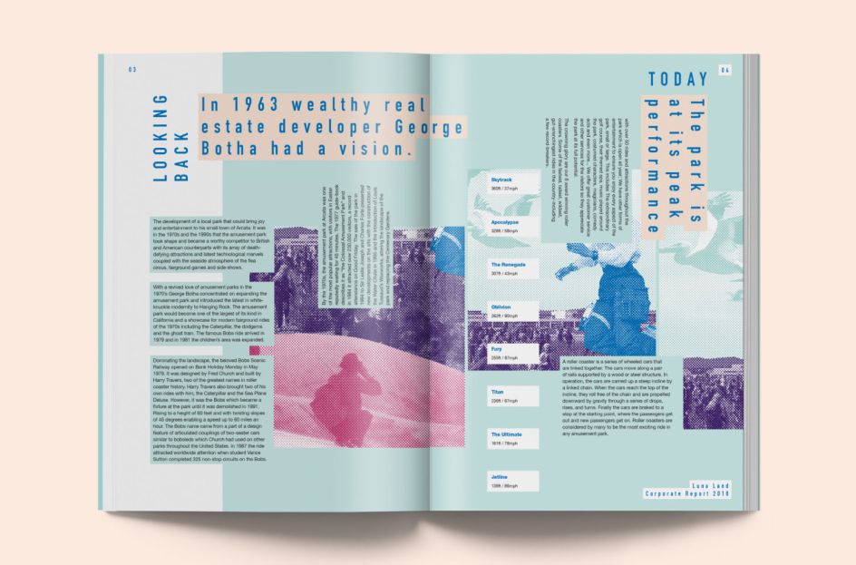
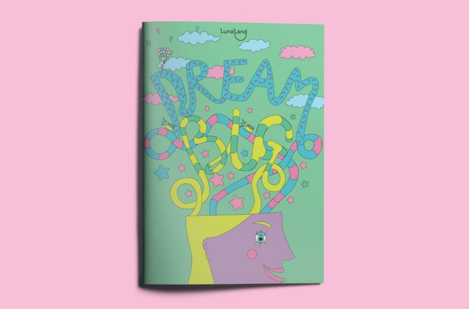
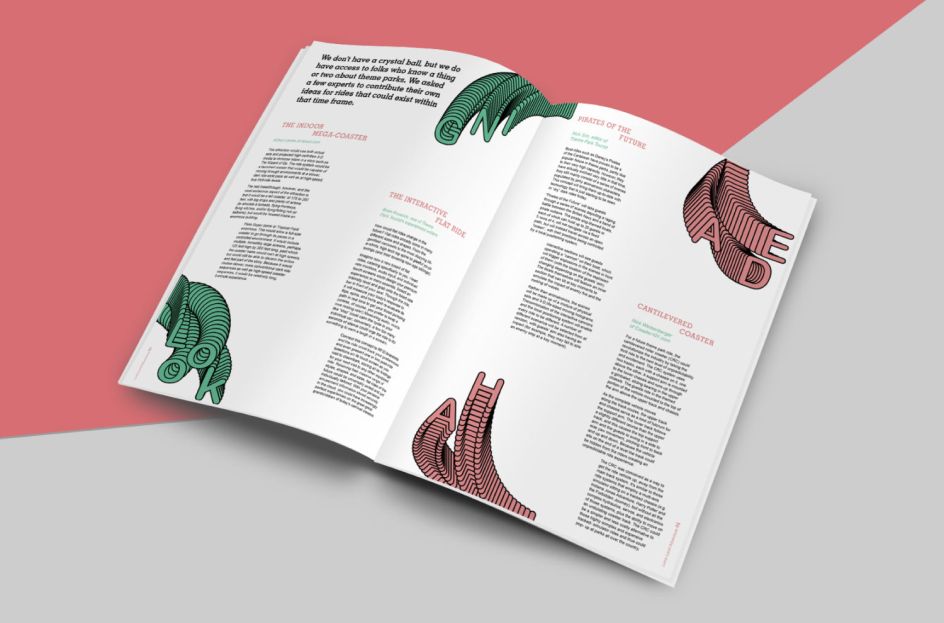
14. Luna Land Amusement Park by Milly Hilton
Milly Hilton was a qualified junior doctor before she decided to change direction and study graphic design at Shillington in London. Her design for Luna Land shows a promising career in creativity. You can see more of her work on her showreel.
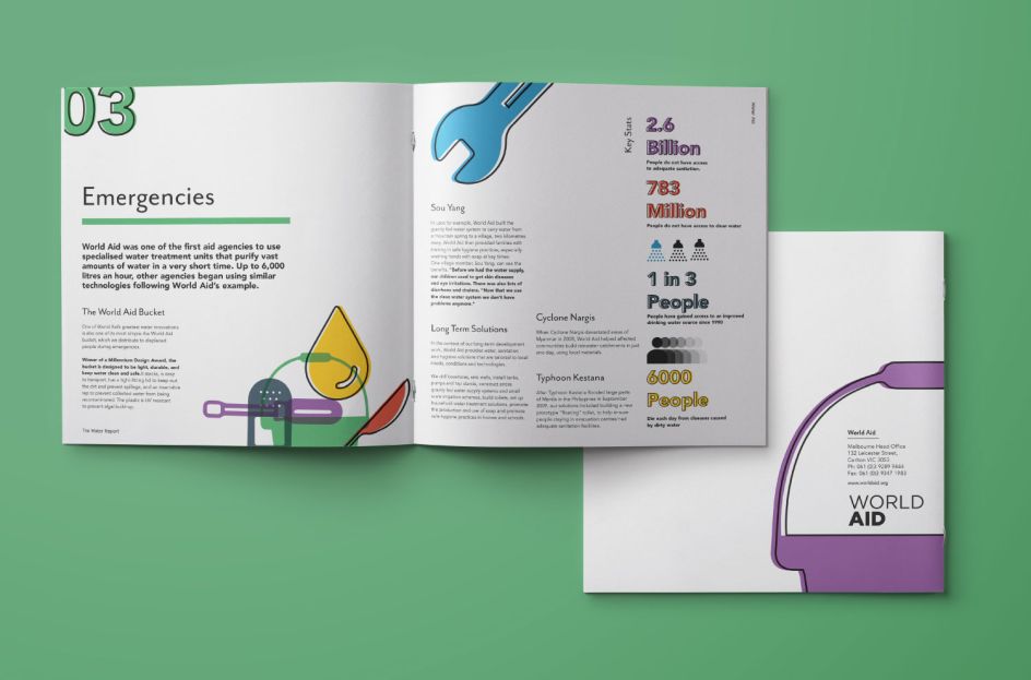
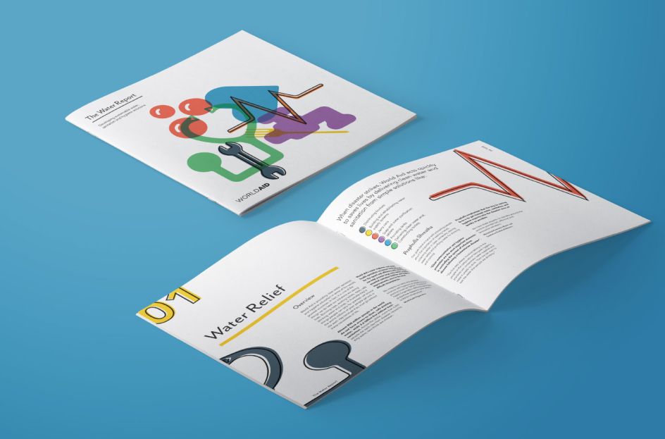
15. Water Report for World Aid by Stephen Hoult
Stephen Hoult put together a clear and appealing Water Report for World Aid, using a colourful palette, interesting graphical elements and lots of white space without being afraid of allowing the content to breathe.
16. Luna Land Amusement Park by Petra Venturini
Another contender for the fictional Luna Land was Petra Venturini who created a corporate report that features movement on each and every page. With energetic, escaping illustrations to capture the passion and essence of the business and using a complementary colour palette, the document brings the amusement park to life.
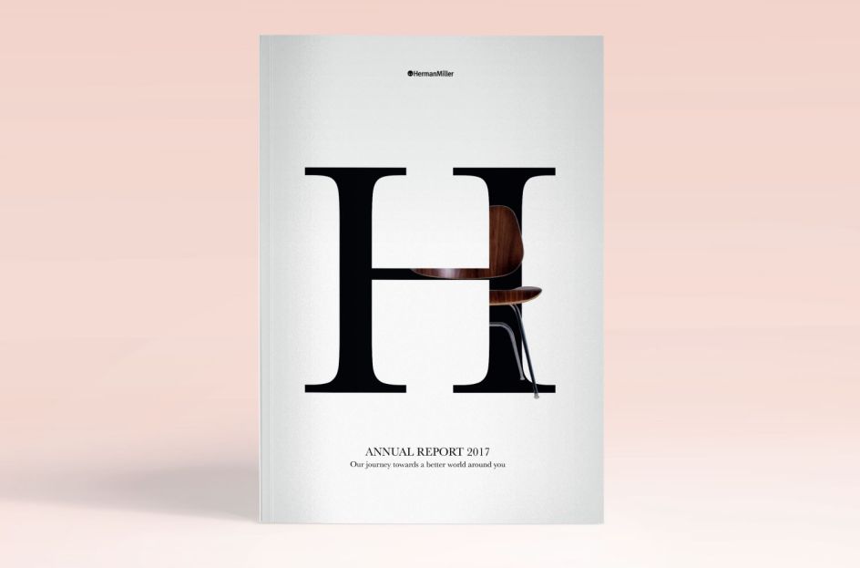
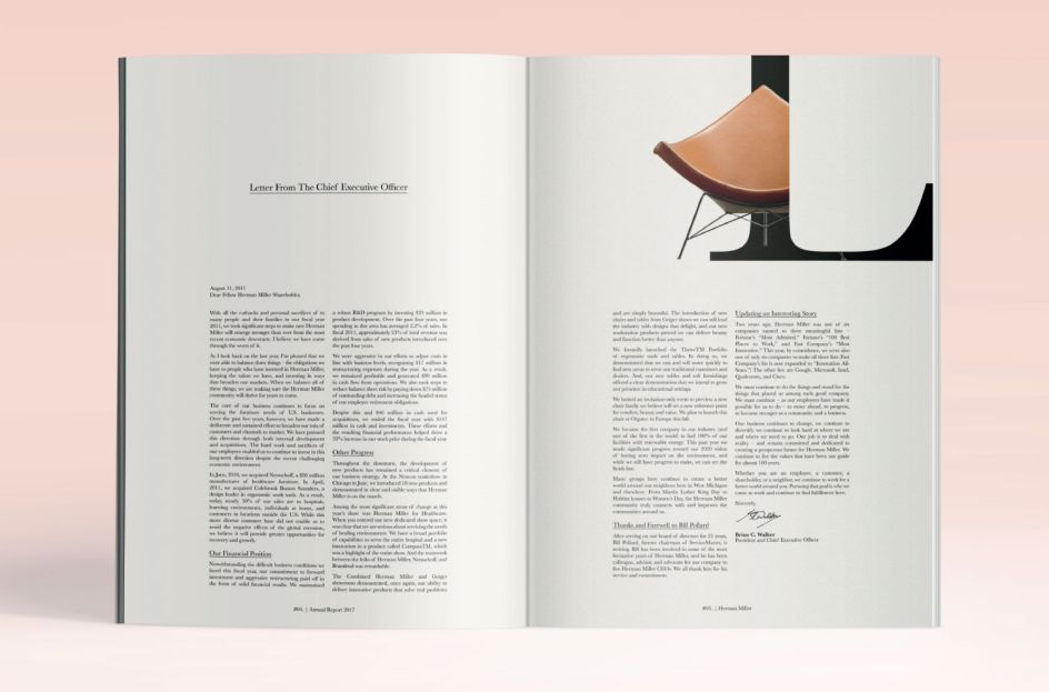
17. Herman Miller's Annual Report by Olive Hare
We love Olive Hare's typographical approach with Herman Miller's annual report. Using very classic and stylish typography and allowing content to breathe throughout, it's the use of single letters with hints of the brand's iconic furniture that really adds excitement and interest to an otherwise boring document.
18. Luna Land Amusement Park by Navada Currie
Navada Currie also decided to design a corporate profile for Luna Land, our fictional theme park. Going along the lines of creating something that is fun and playful, Navada incorporated graphical elements over images and emulated the circular shapes of roller coasters.
Further Information
This article was written by Anthony Wood, who is the Managing Director of Shillington. With 15 years of experience in design and a long stint of freelancing in Sydney and London, he relished the challenge of joining the international design school in New York City. He likes to write about design, entrepreneurship and learning.
Editor's Picks


Trending

Podcasts


Editor's Picks
Further Reading
](https://www.creativeboom.com/upload/articles/90/908fdb6378db1e95d12595416f54e6336d5e80b8_732.jpg)