10 imaginative corporate reports designed by students
Annual or board reports might be corporate, but it doesn't mean they have to be boring. Design doesn't have to follow the same dull format; information can be presented in fresh and imaginative ways.
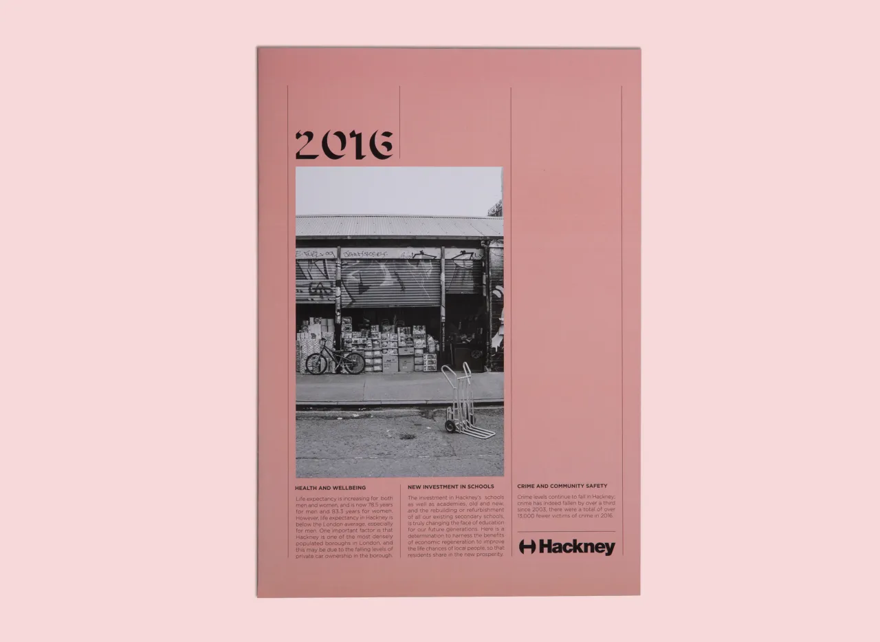
Report design by Lallu Nykopp. All images courtesy of Shillington and its students.
When we set the brief with our students at Shillington to come up with something creative for various brands, government authorities and organisations, we were overwhelmed with the results. The following are just 10 examples of some of the interesting work produced. From an annual report for the Australian Government to a corporate report for Herman Miller – these projects will inspire.
1. Adriana Lambert
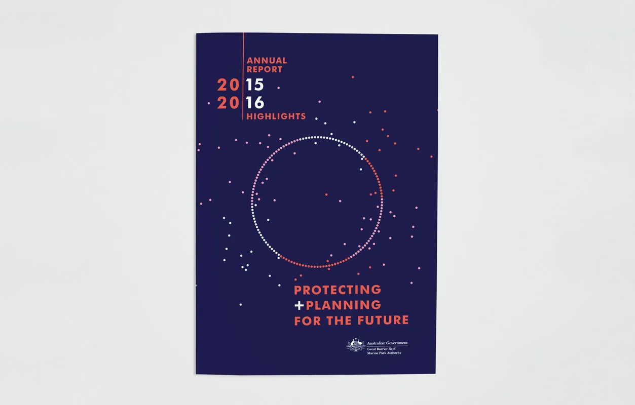
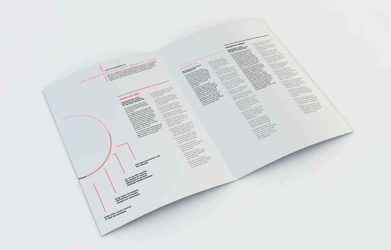
Adriana Lambert crafted this annual report for the Australian Government's Great Barrier Reef Marine Park Authority. Diving deep into an ocean-inspired colour scheme, the document – although serious and well laid-out – considers the subject, and is full of interesting graphics and imagery to breakup the text and keep things engaging.
2. Angus James
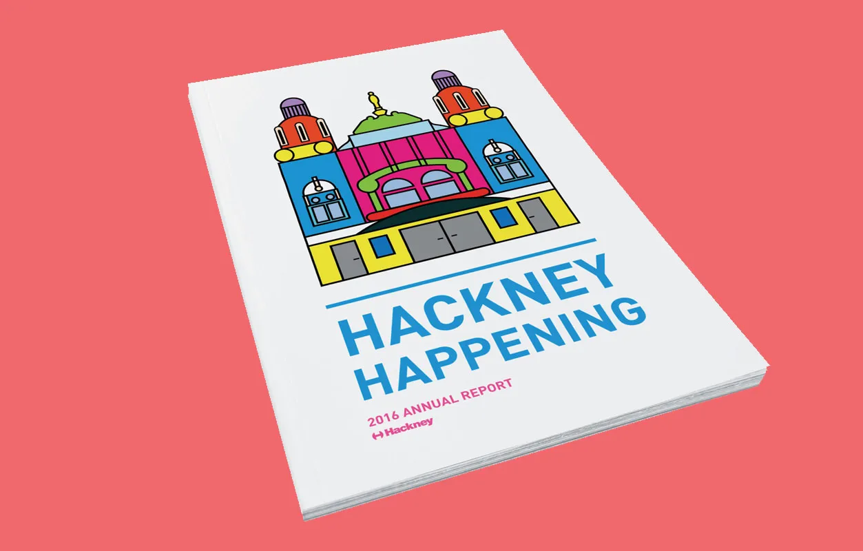
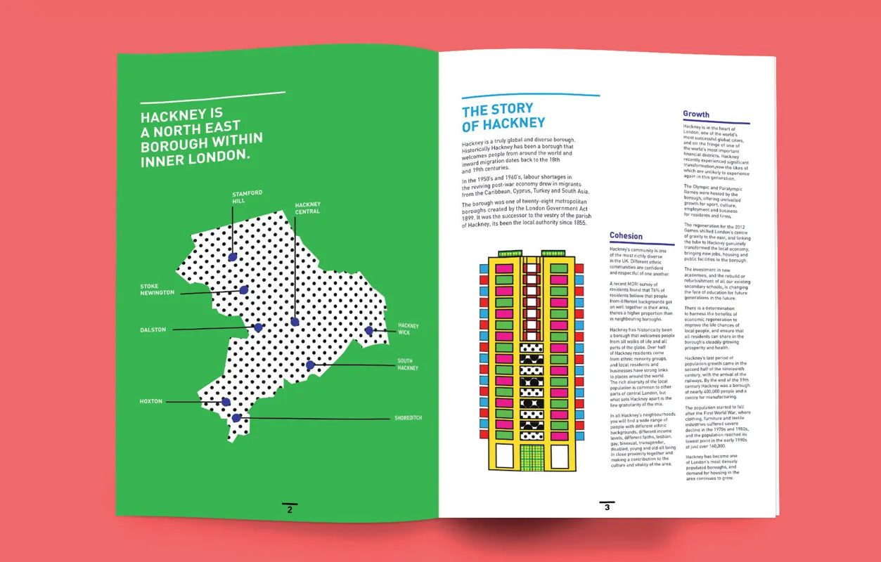
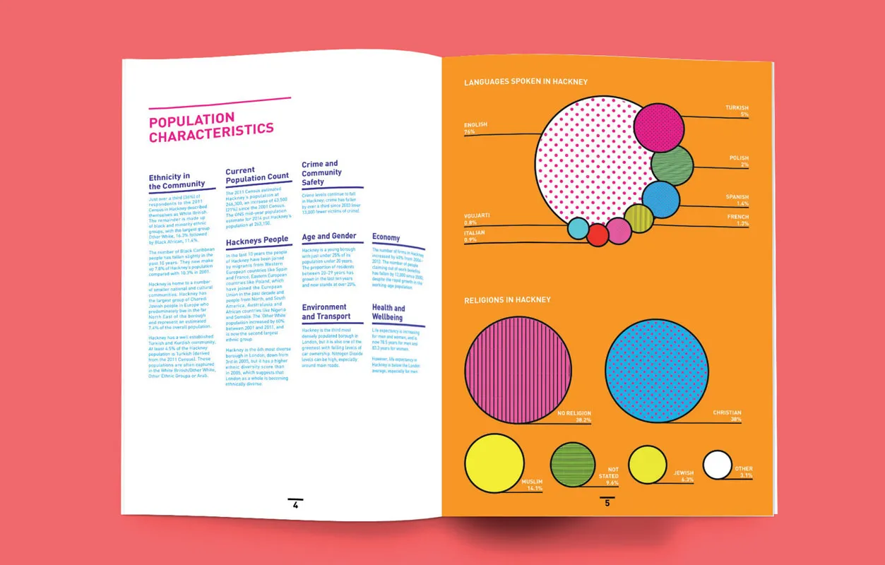
With an active nightlife, some of London’s best cafes and a bustling creative scene, Hackney has a reputation for being an unconventional and unique borough. So when it came to designing a community report for the local area, Angus James went for a fun, creative document – bursting with colour and playful typography.
3. Chloe Herald
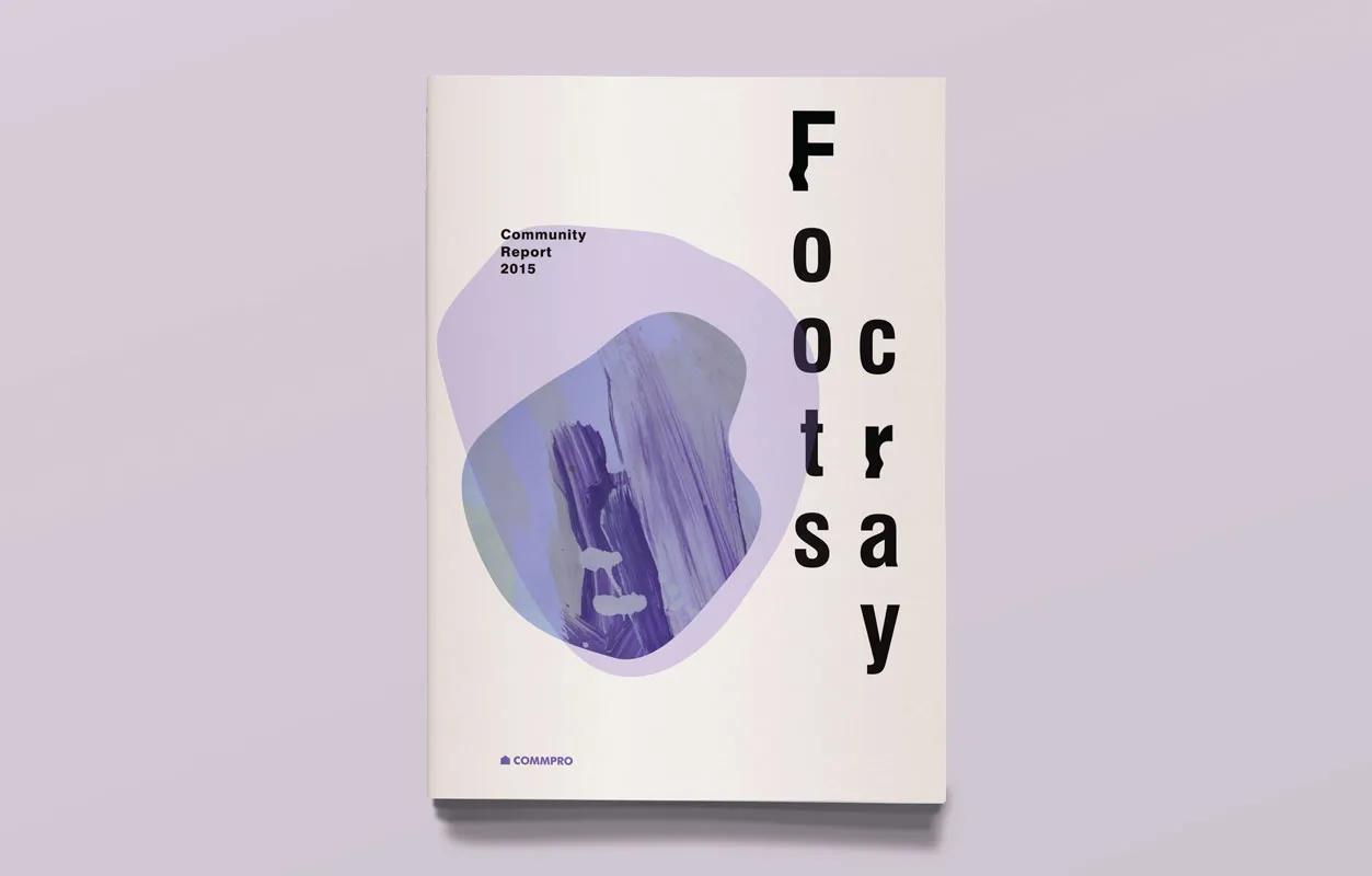
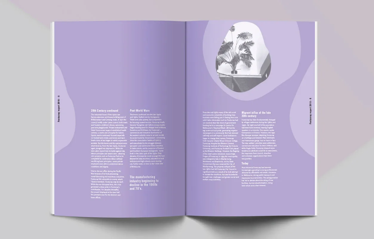
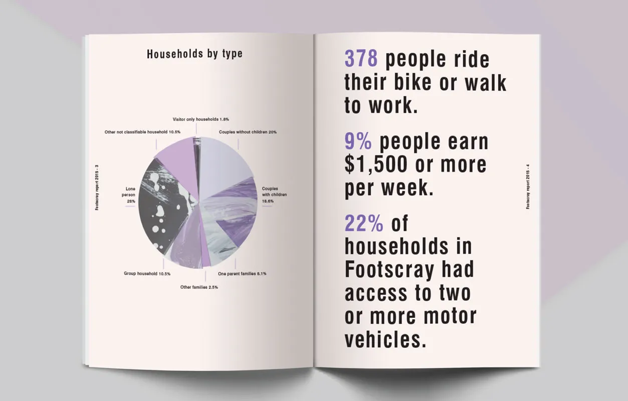
Chloe Herald created a community report for Footscray, a multicultural suburb bursting with history, young creative energy and opportunity. She said: "I was required to create a contemporary census report for the suburb of Footscray that would appeal to businesses, developers, and the general public. I used abstract blocks of paint and opaque shapes to convey a sense of creative opportunity, change and integration. The purple, cream and black colour palette was used to create a feeling of youth, excitement and opportunity for growth."
4. Jack Slater
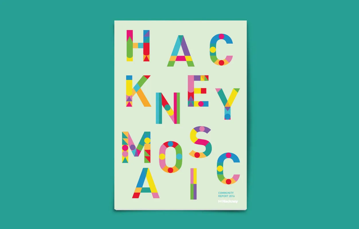
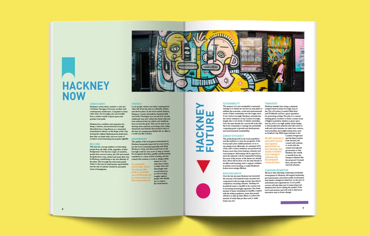
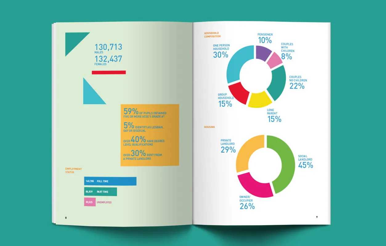
Jack Slater also turned his creative hands to designing a community report for Hackney. Creating a snapshot of the area and produced for the local council, the document is bright, vibrant and focused on clean typography throughout. Jack's use of colour helps to create a consistent theme without being repetitive.
5. Jolene Cody
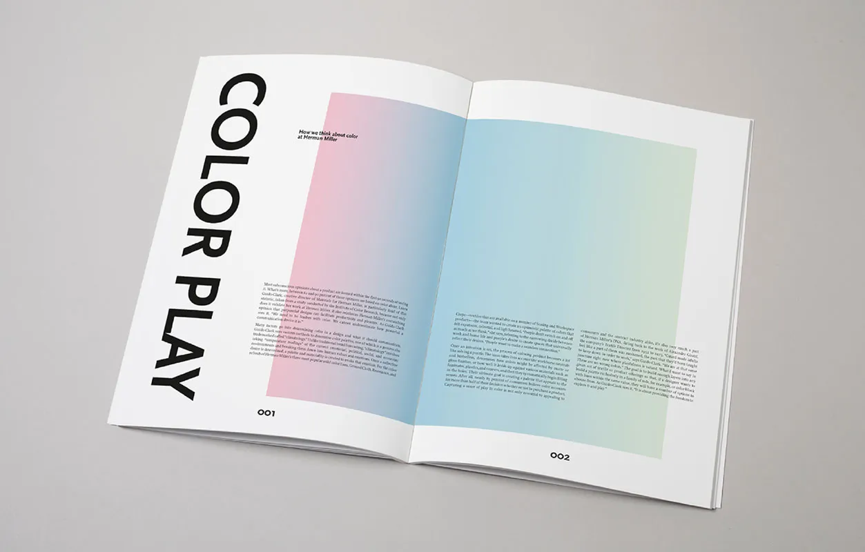
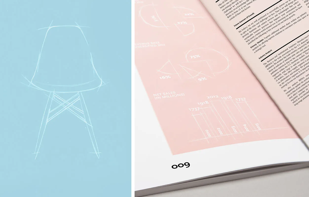
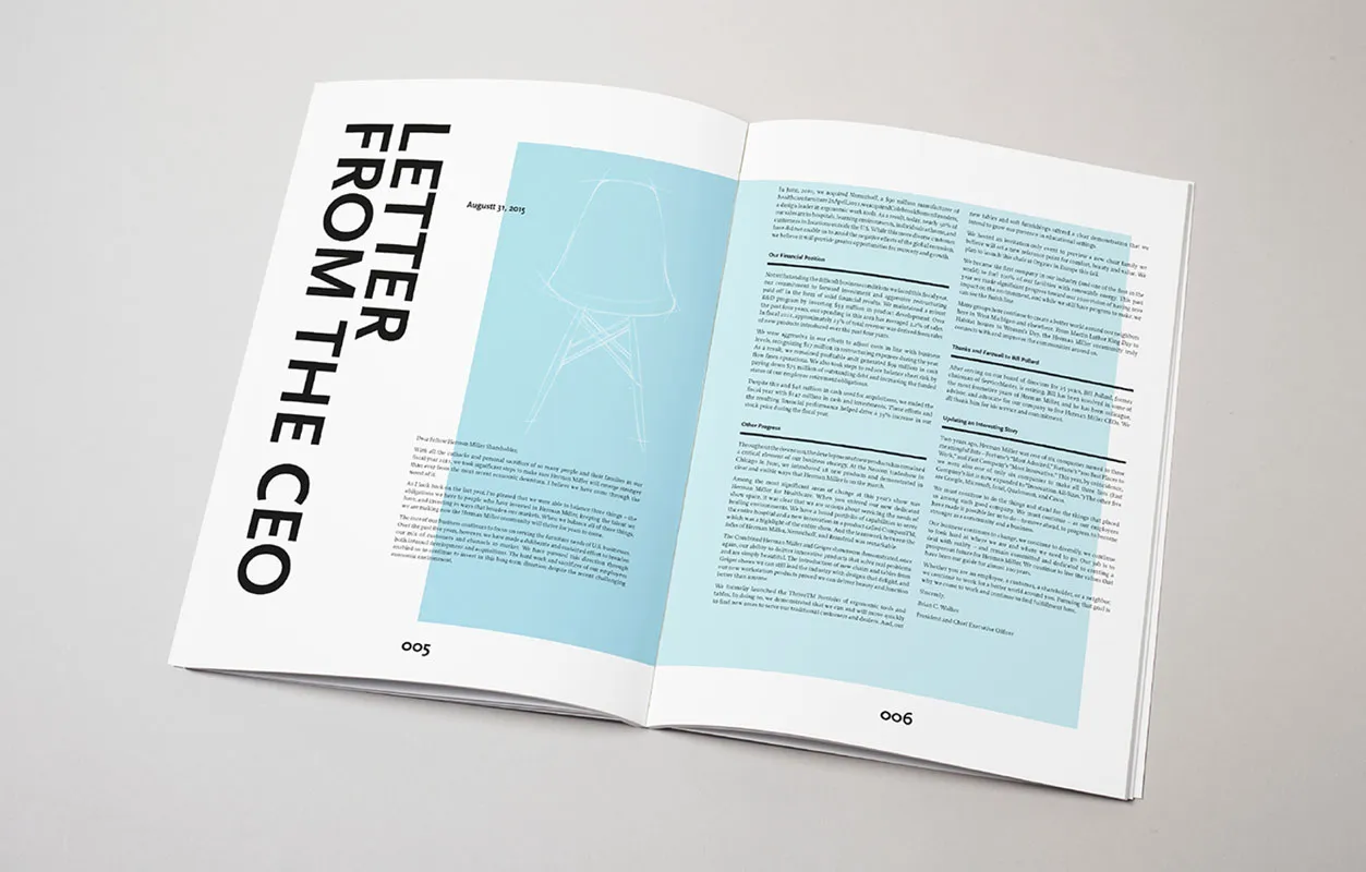
Jolene Cody gave herself the difficult challenge of designing an annual report for Herman Miller – one of Fortune Magazine's "most admired" furniture brands, and operating globally in more than 40 countries around the world. With a claim to "design and build a better world", Herman Miller's report had to reflect its mantra. Jolene certainly crafted a document that is sophisticated and design-led, but with an element of fun.
6. Kim Melvin
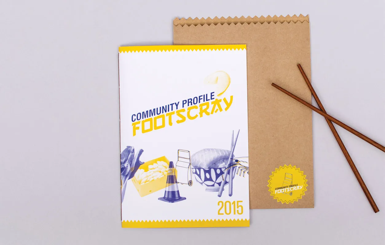
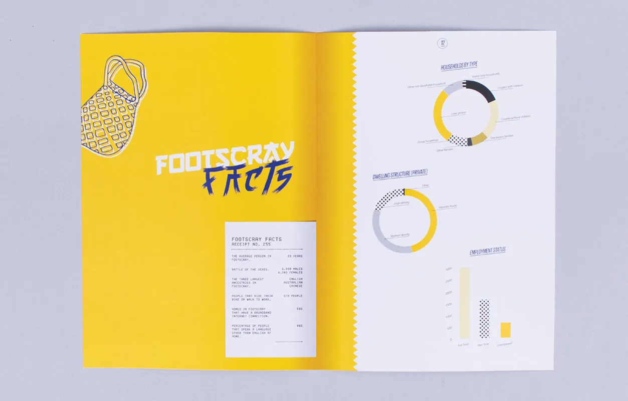
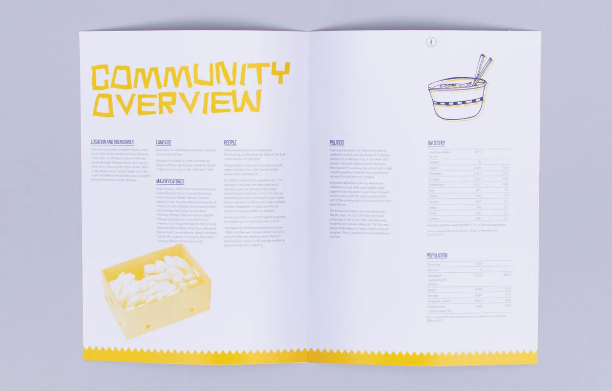
Another attempt at redesigning Footscray's community report, this time by Kim Melvin. Providing a snapshot of this Melbourne suburb, Kim's document is unique, yellow-themed and with a focus on the area's Asian community. Strong yet fun typography helps to present the facts and information in an interesting, refreshing way.
7. Lallu Nykopp
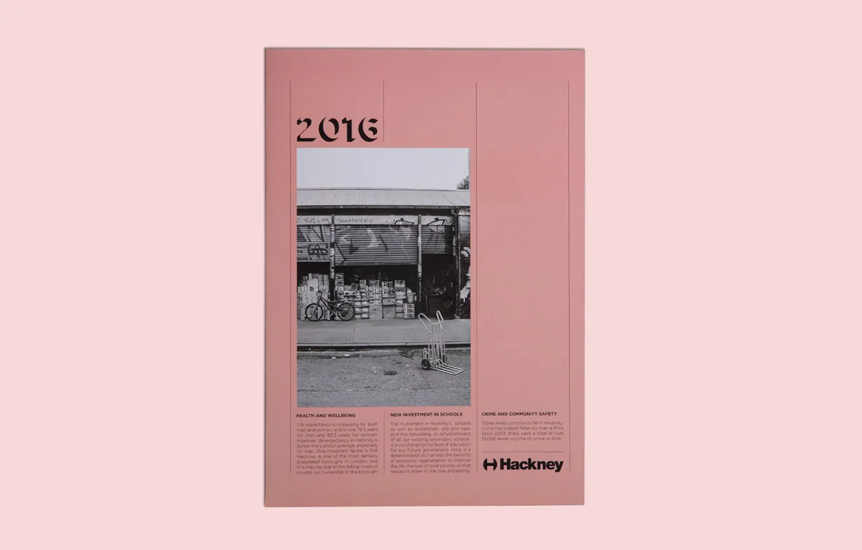
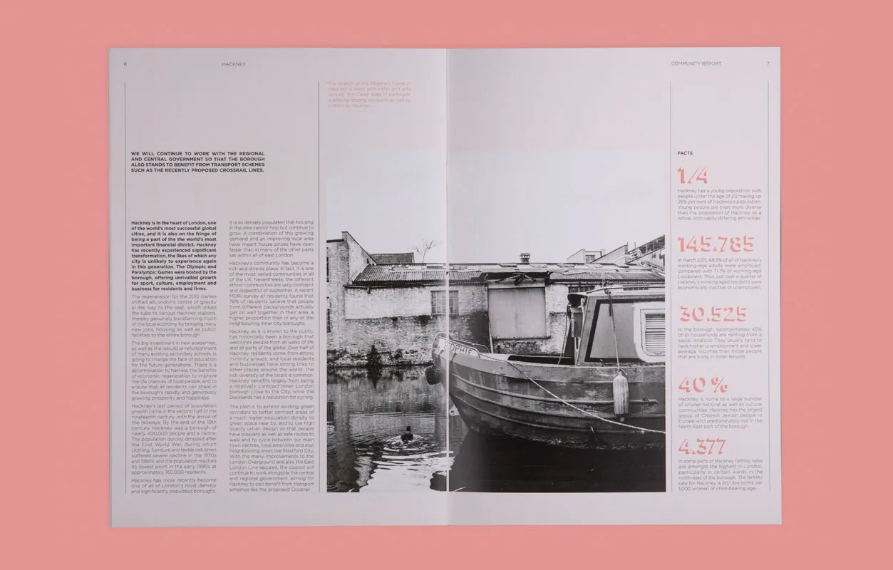
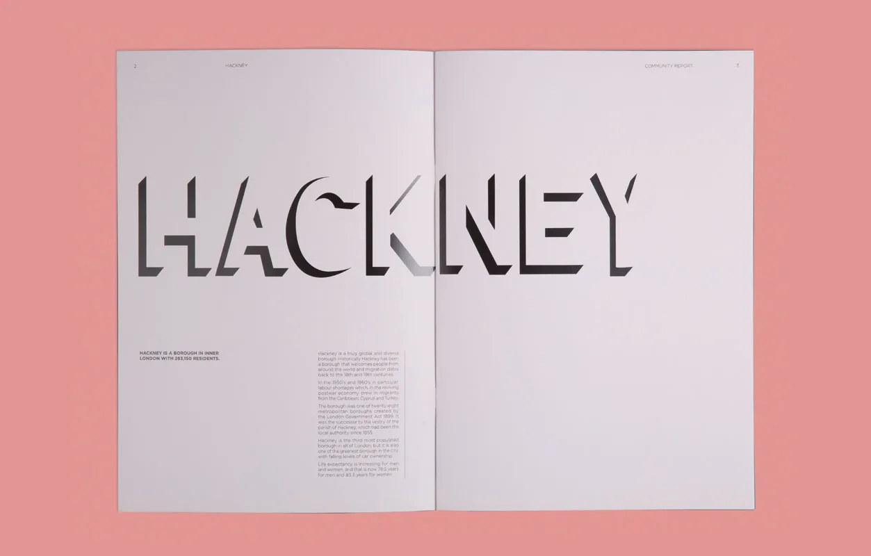
Lallu Nykopp also decided to overhaul a community report for the London Borough of Hackney, opting for bold and big typography with an underlying pink and purple colour scheme. Easy-to-read and beautifully presented, Lallu's design transforms the mundane into something really quite wonderful.
8. Meg Herbst
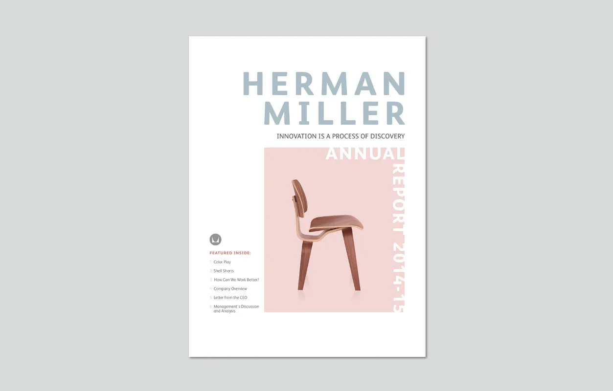
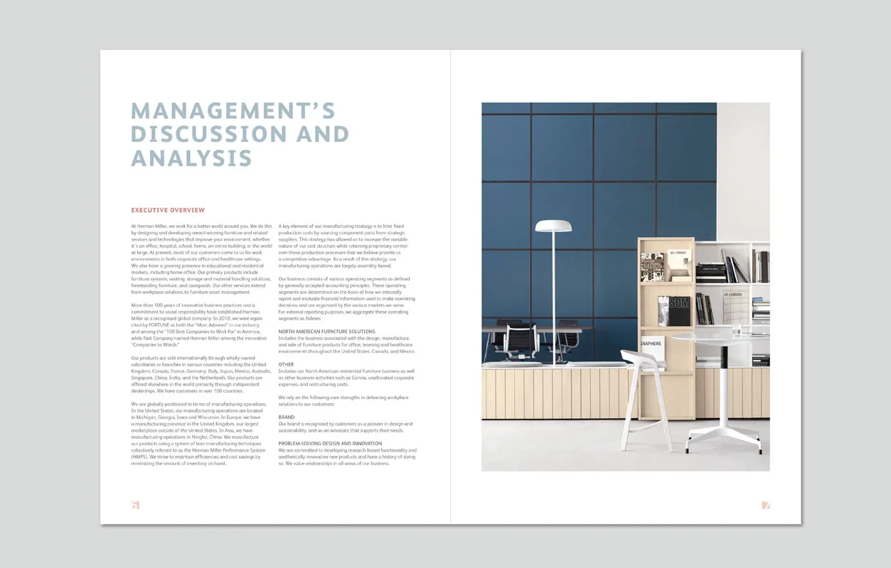
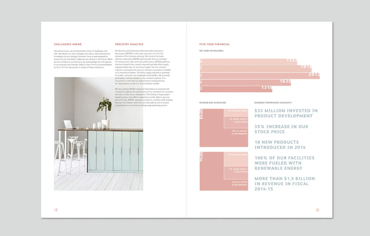
Another attempt at redesigning Herman Miller's annual report, this time from Meg Herbst. Renowned as a modernist manufacturer of office furniture, equipment and home furnishings, the brand's reports should always communicate "innovation" and "quality" – something Meg focused on with her own design. Presenting the facts and figures in a high-end style, the resulting document feels more like a brochure than a boring annual report.
9. Mitch Reyes
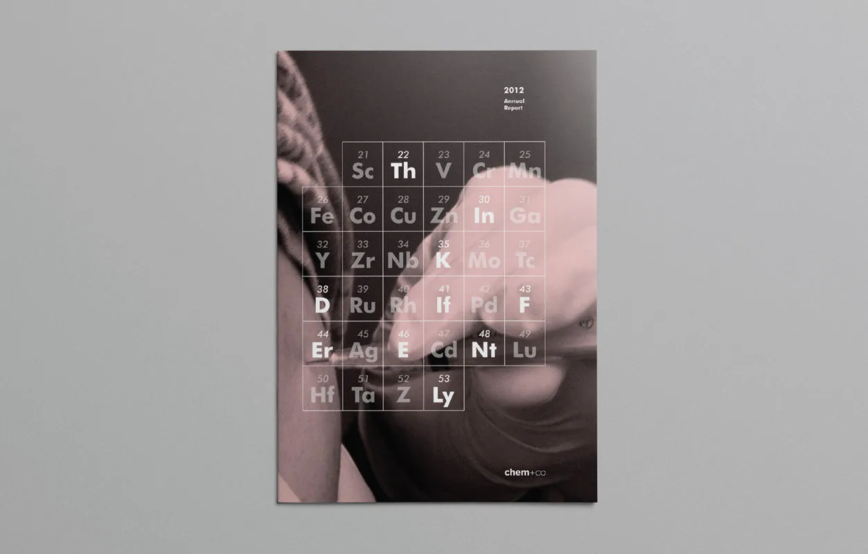
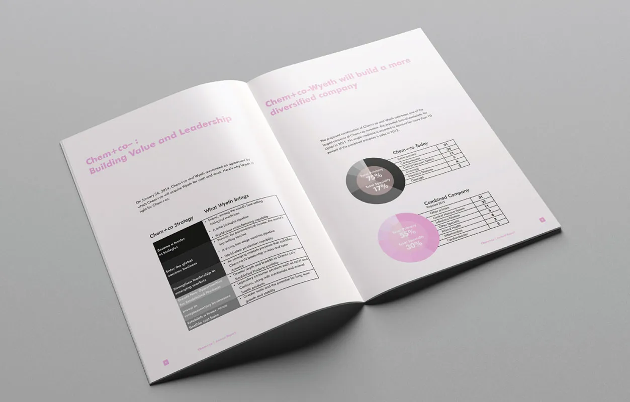
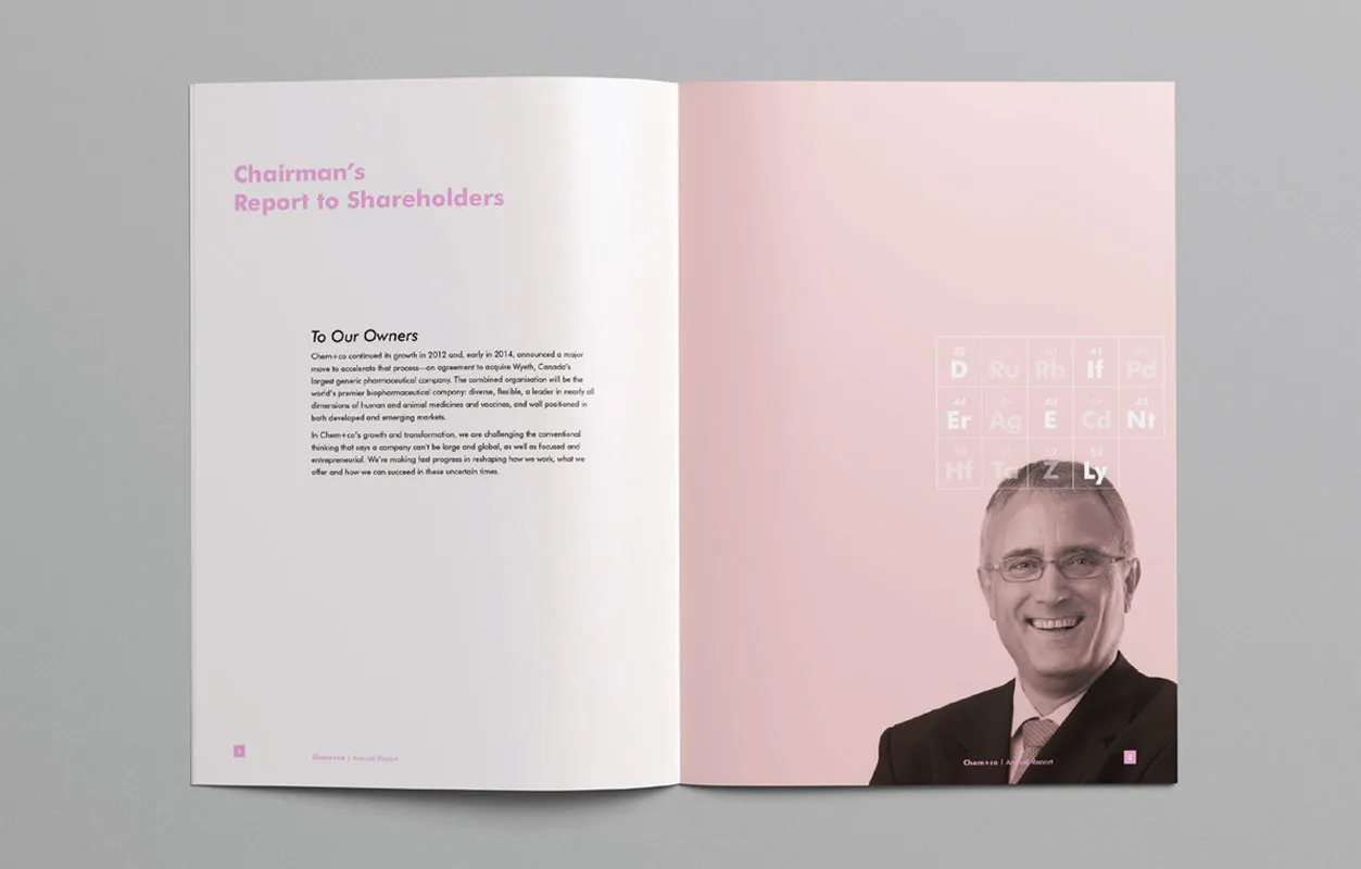
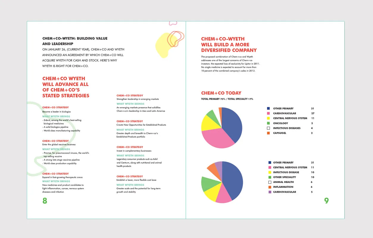
Established in 2004 in Vancouver, Canada, Chem+Co is a "pretend" chemist brand pharmaceutical company – dreamed up for our students at Shillington. Mitch Reyes was tasked with designing and laying out content for its 2012 annual report, and successfully transformed what is rather a dull subject into something appealing. With a soft pink palette, and no fear of allowing copy and imagery to breathe, Mitch's report is truly imaginative.
10. Sophie Van Den Berkhof
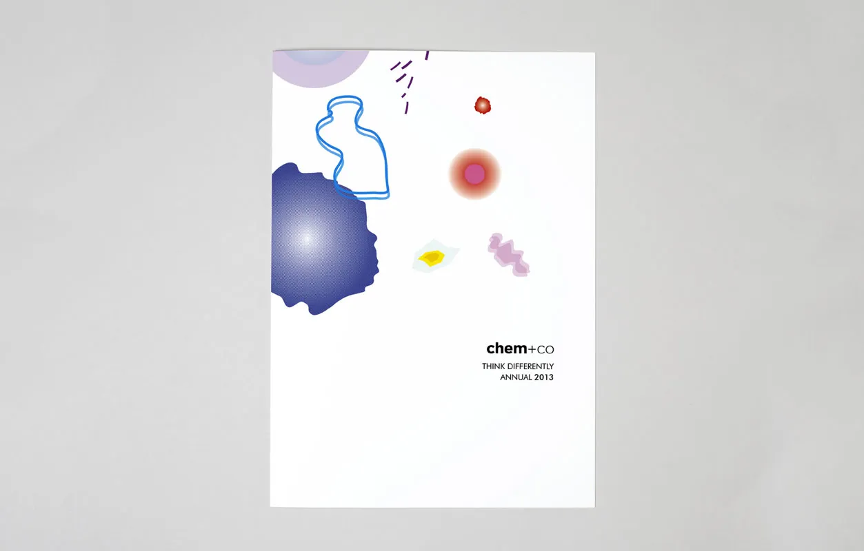
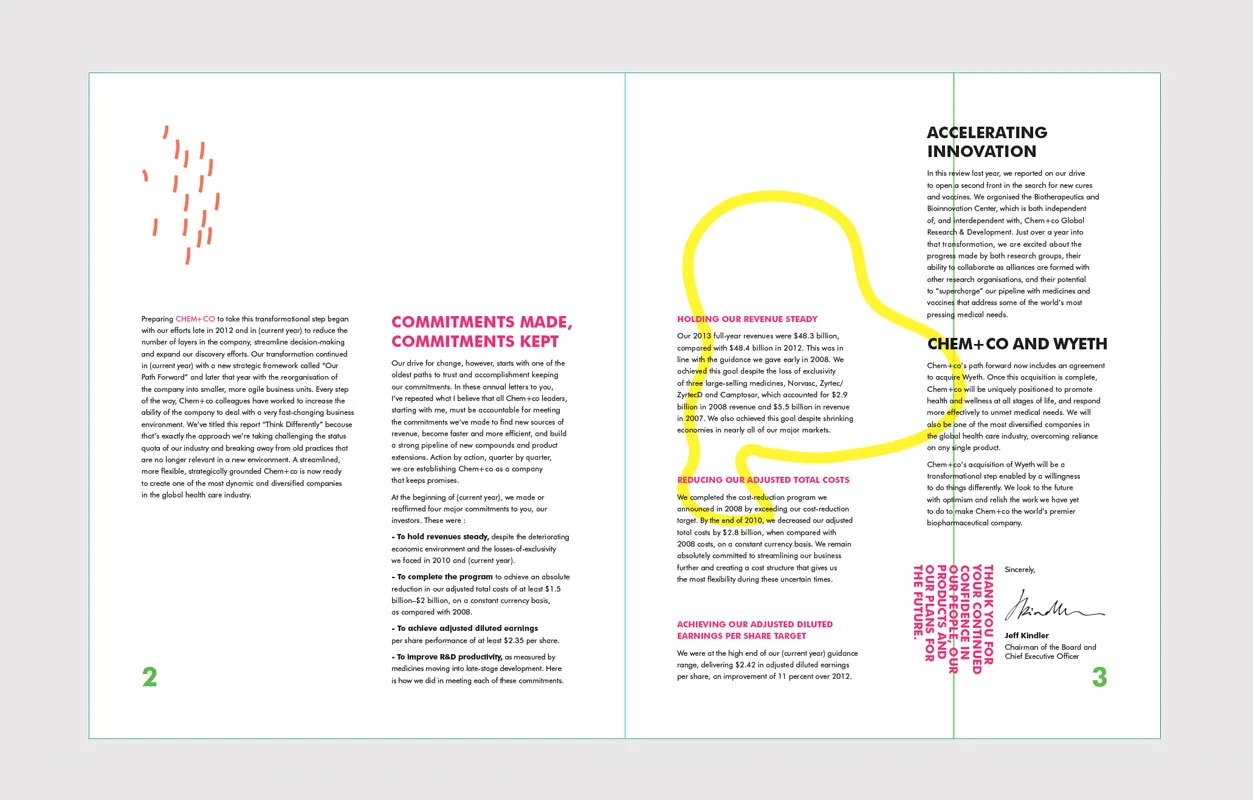
Sophie Van Den Berkhof also created an annual report for the fictional Chem+Co, along the theme of 'Think Differently'. Different to the cold and monotonous aspect of a lot of annual reports, the design of this colourful molecular pattern flows through the whole document and actively encourages the reader to interpret the brand from a fresh perspective.
Editor's Picks





Trending




Latest Jobs
Account Manager at Moxie and Mettle
Full-time·Cheltenham·Up to £35k
Creative Project Manager at Analogue
Full-time·Leeds·£28k–£35k
Senior Creative Lead at Random Studio
Full-time·Amsterdam / Paris·€90k-€110k
Account Manager at BUILDHOLLYWOOD
Full-time·London·£34k–£38k
Graphic & Motion Designer at The SHARP Agency
Full-time·Leeds·£26k–£33k
Head of design at Cog Design
Full-time·London·£55K




](https://media.creativeboom.com/7a1e2857-b4fe-4532-b27a-44aad620d310/conversions/1534a8a570312292c43f74da9968eac42becfa65-medium.webp)