10 cities beautifully rebranded by celebrated graphic design students
How do you go about rebranding a city? So that it becomes part of its own identity? So woven into every single street, building and bit of infrastructure that it is instantly recognisable, as well as visually pleasing? It's no easy feat, as many of you will know.

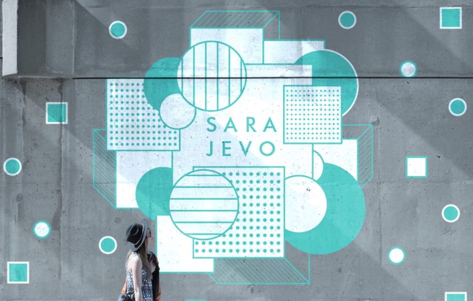
Sarajevo by Julia Chesbrough. All images courtesy of Shillington and designers involved.
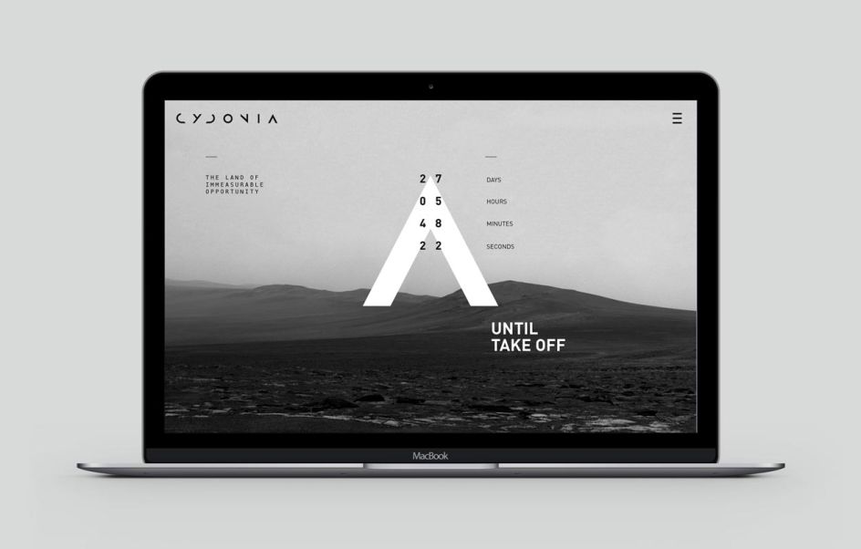
When faced with such a colossal task, you have to take into account a city's history and heritage, and consider where it is heading. You must think of its culture and people, its strengths and achievements. And you have to wrap up that knowledge into a branded package that will please both residents and visitors... unless of course we're talking about Cydonia – the first city on Mars.
With the above in mind, we've pulled together 10 city rebrand projects from our students at Shillington which will hopefully spark some inspiration and leave you pondering how you might shake up the identity of your own local metropolis.
1. Bristol by Bianca Oggiano
With Roman Baths, Banksy street art and a thriving food and drink scene, Bristol is arguably one of the best cities in the UK for culture lovers. It also offers an exciting opportunity for a rebrand, which is what Bianca Oggiano happily sunk her teeth into with her own imagined identity of Bristol. With a vibrant colour palette and plenty of strong typography, we love Bianca's graphical elements that perfectly tell the story of this historic city on the River Avon.
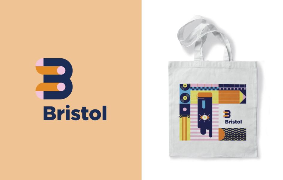
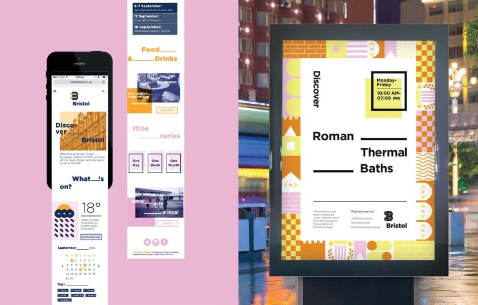
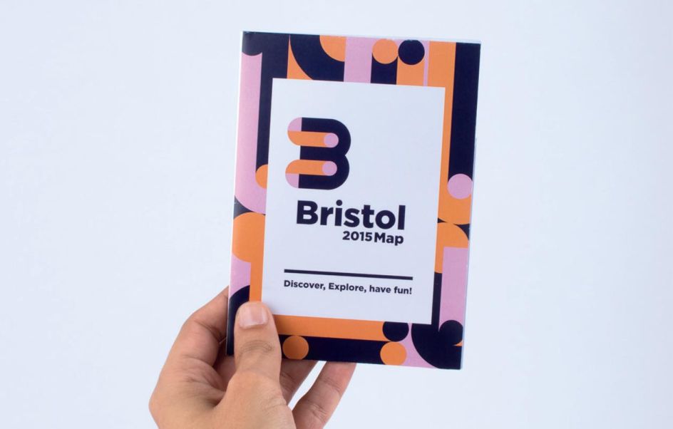
Discover more: www.biancaoggiano.com
2. Cydonia by Shahad Alasfour
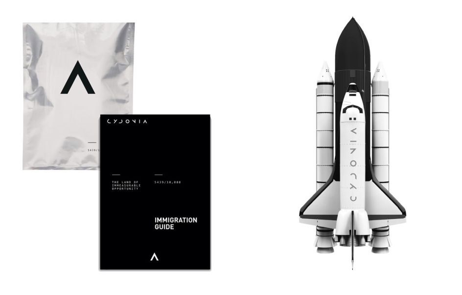
What would the identity for the first city on Mars look like? This is what Shahad Alasfour considered when faced with the task of rebranding any city she liked. With a monochrome palette forming the basis of her work, Shahad also created her own typeface to suit the futuristic hub and polished things off nicely with an appealing strap line: "The Land of Immeasurable Opportunity".
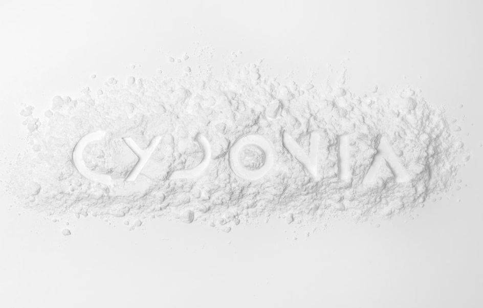
Discover more: www.shahadalasfour.com
3. Fremantle by Katie Grim
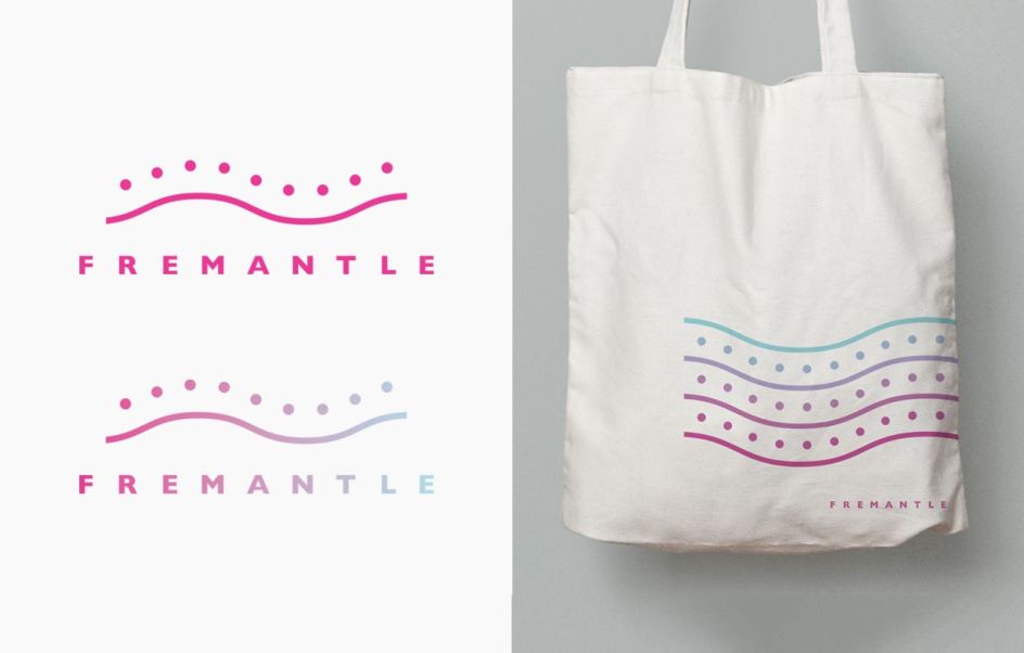
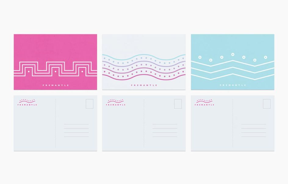
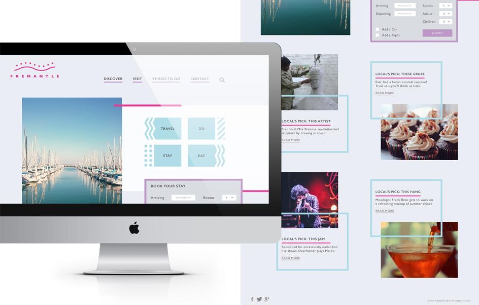
Fremantle is a small port town in Australia with a lively atmosphere and thriving arts scene that Katie Grim challenged herself to rebrand. Speaking of the direction she chose, she said: "I was drawn to a motif found in much of the area's aboriginal art that is dominated by groups of swirling, almost hypnotic, lines and dots. I loosely referenced this visual language, updating it with a more contemporary colour palette and used the simple, yet dynamic shapes to communicate a sense of playfulness and vibrancy."
Discover more: www.katiegrim.com
4. Isfahan by Roo Cassels
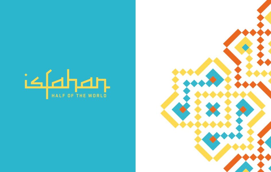
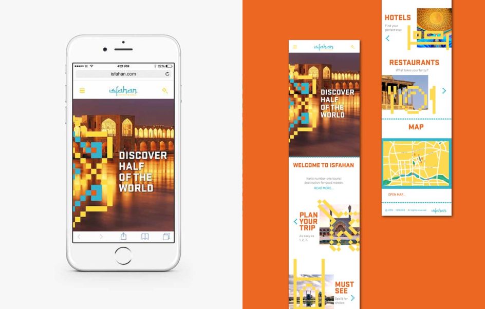
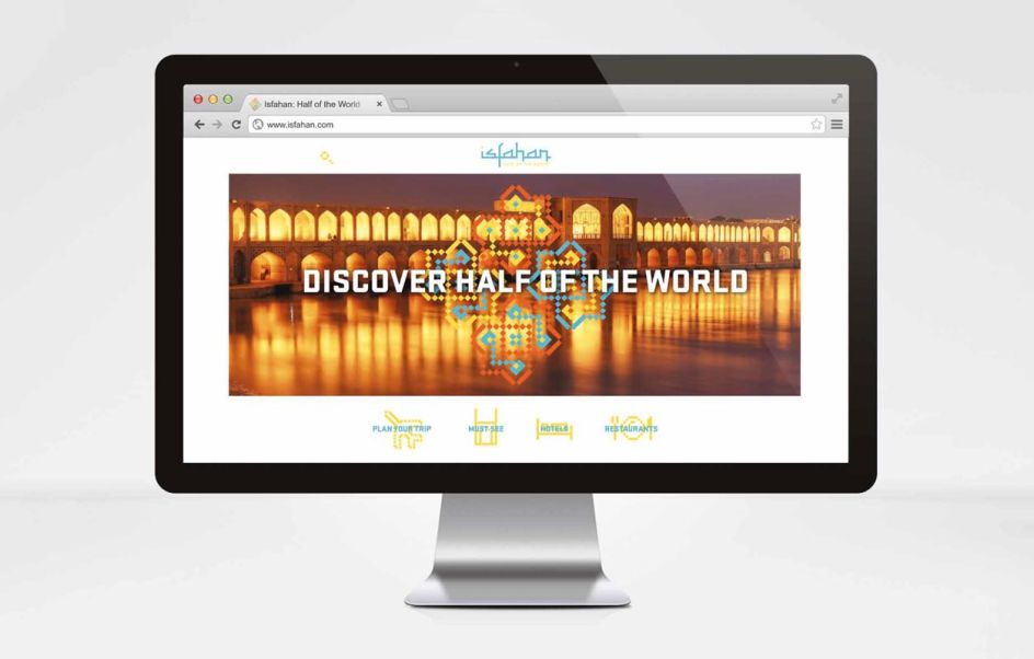
Isfahan is one of Iran's many hidden jewels. From its ancient Safavid gardens and UNESCO-listed Imam Square to its immaculate blue domed mosques, it's easy to agree with the 16th century saying 'Isfahan nafs-e jahan' – meaning, Isfahan is half of the world. Roo Cassels wanted to celebrate the impressive qualities this city has to offer with a special rebrand: "One of the many lasting impressions I had when visiting were the breathtaking, coloured mosaic tiles covering the numerous mosques, both inside and out. These calligraphic, geometric and arabesque patterns were my main influence in the creation of the identity."
Discover more: www.roocassels.com
5. Leeds by Jim Oliver
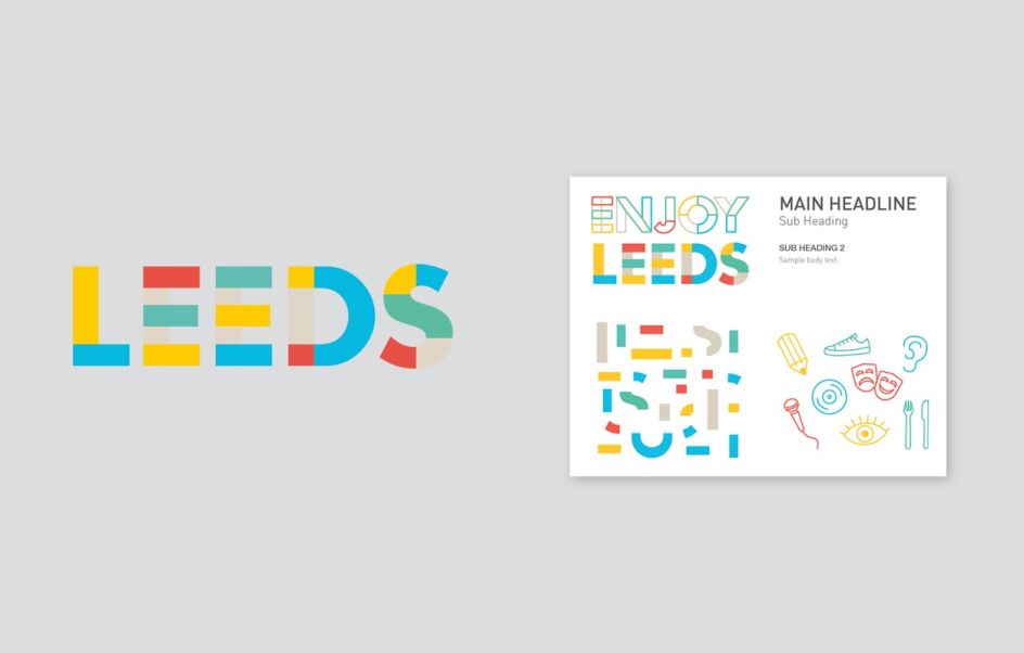
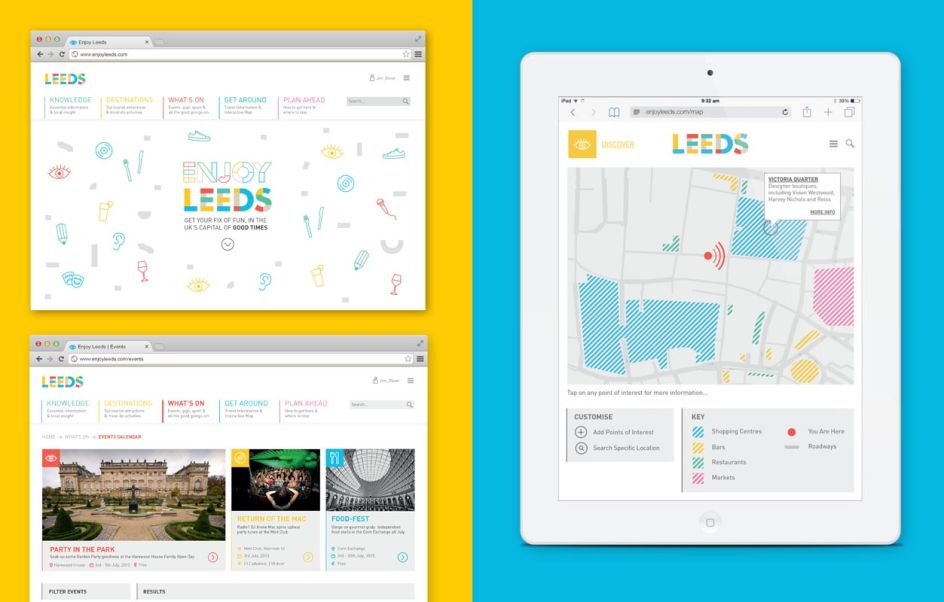
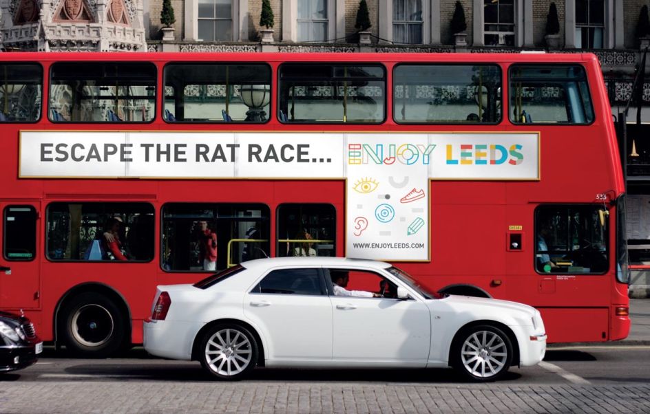
Leeds is one of the fastest-growing cities in the North of England, and its vibrancy, culture and people make it a challenging brief for a rebrand. But this didn't faze student Jim Oliver, who took it upon himself to create a winning 'tourism' identity for the Yorkshire metropolis. With the overriding theme focused on 'Enjoy Leeds', this colourful and playful brand sells the city as the capital of 'variety, entertainment and good times'.
Discover more: www.jimoliver.co.uk
6. Lord Howe Island by Emili Hsu
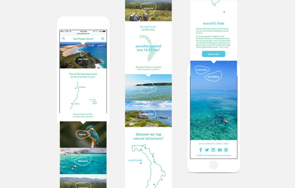
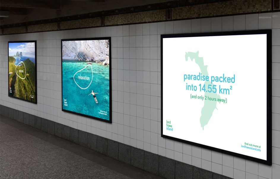
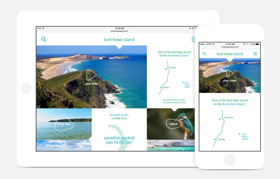
The ecosystem of Lord Howe Island, a destination off of the Australian coast, is under threat due to global warming and climate change. By encouraging responsible tourism, authorities hope to create an income stream that can be reinvested into ecological research and environmental programs. But how do you visually communicate this mission? This was the challenge set for Emili Hsu, who crafted an identity that focuses on the Island's natural beauty. She explained: "The visual language features breathtaking full bleed photos of the destination, coupled with a colour palette that references its clear waters and untouched forests, friendly rounded typography, and irregular organic forms as a recurring visual element."
Discover more: www.emilihsu.com
7. Moscow by Jon Anderson
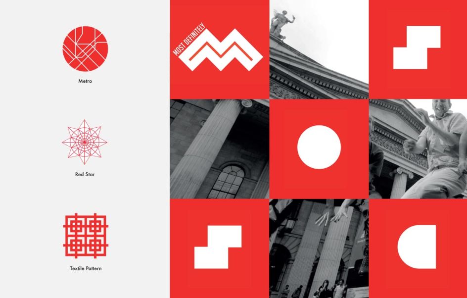
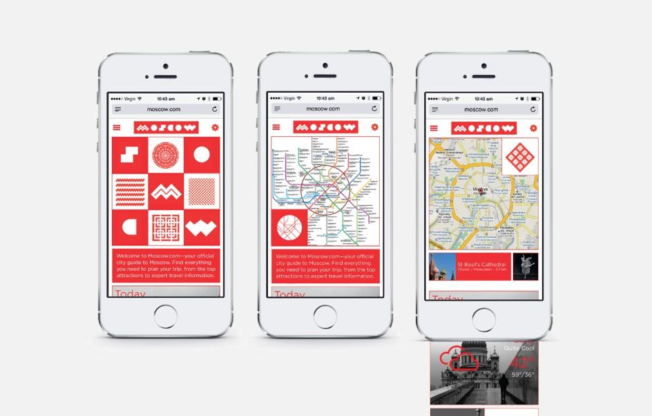
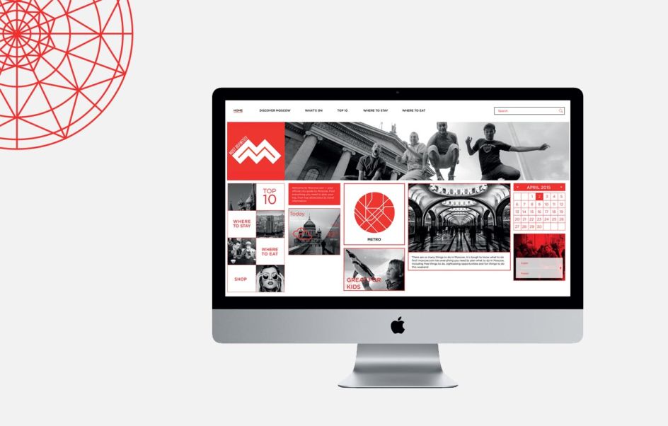
Jon Anderson bravely challenged himself with the rebranding of Moscow, taking inspiration from the city's cultural design and iconic architecture to help capture its unique identity. He also designed a website and mobile app to help tourists and visitors find their feet when exploring the city. Key features of the app included a transport section to help visitors get around, a where to eat guide and activities for families and children.
Discover more: www.jonandersondesign.com
8. Napoli by Grace Cook
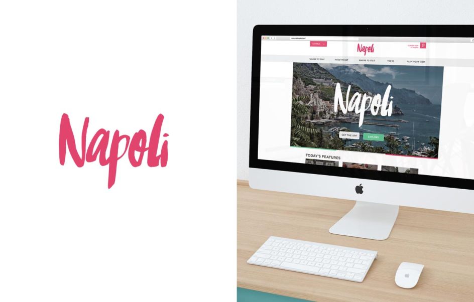
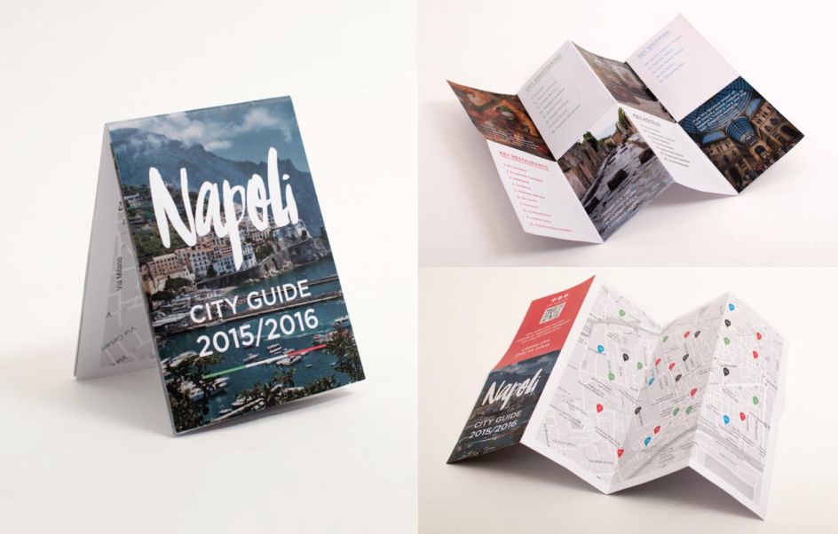
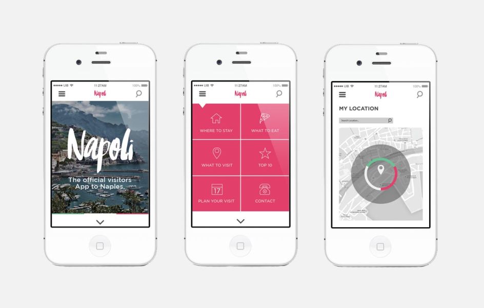
Incredibly beautiful, a tad chaotic and one of the oldest continuously inhabited cities in the world, Naples should be on everyone's bucket list – even if you go to just sample the pizza (it's supposed to be the best). When tasked with its rebrand, Grace Cook avoided all the usual cliches and went for a fresh, clean identity with a pink and green palette, presumably paying homage to the city's architecture. She included a website design, city guides, and other essential marketing materials to bring her brand to life.
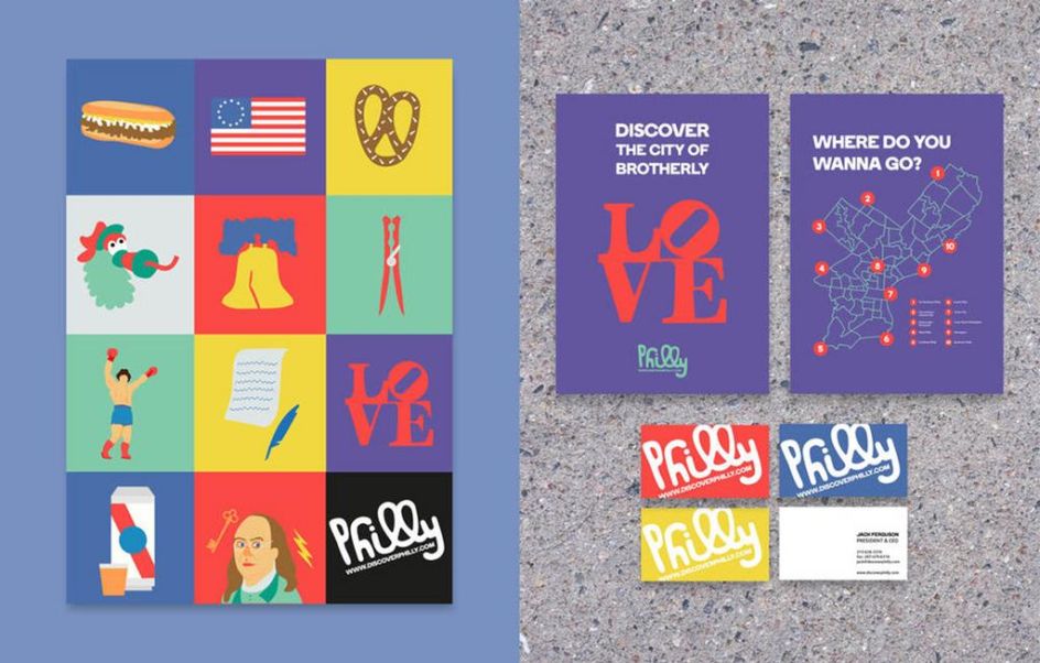
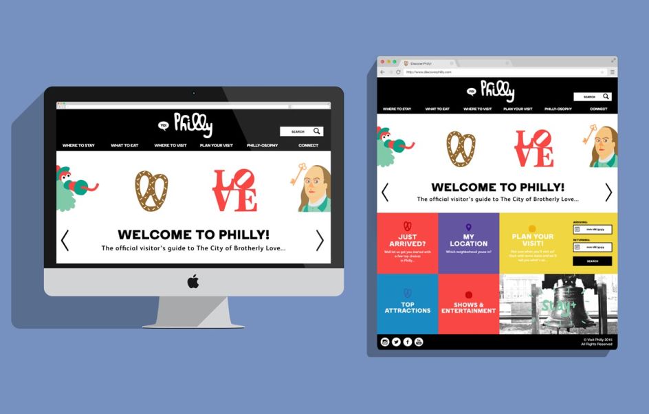
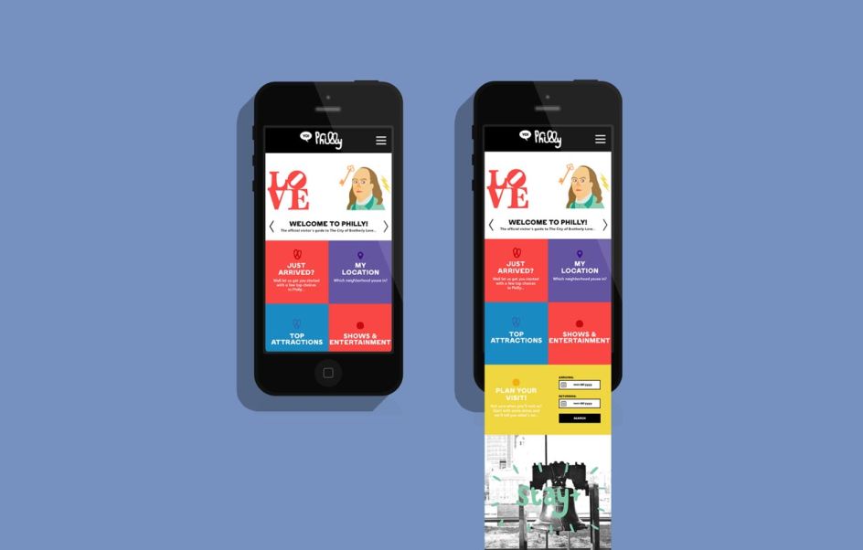
9. Philadelphia by Keiran McCann
"Fun, approachable, warm and silly," said Keiran McCann, describing her identity for Philadelphia – the City of Brotherly Love. The graphic designer used a bright and vibrant colour palette, and included quirky illustrations that pay homage to many of the American city's key features. We especially adore the tribute to Robert Indiana's LOVE sculpture.
Discover more: www.keiranmccann.com
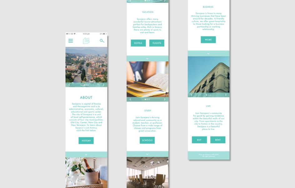
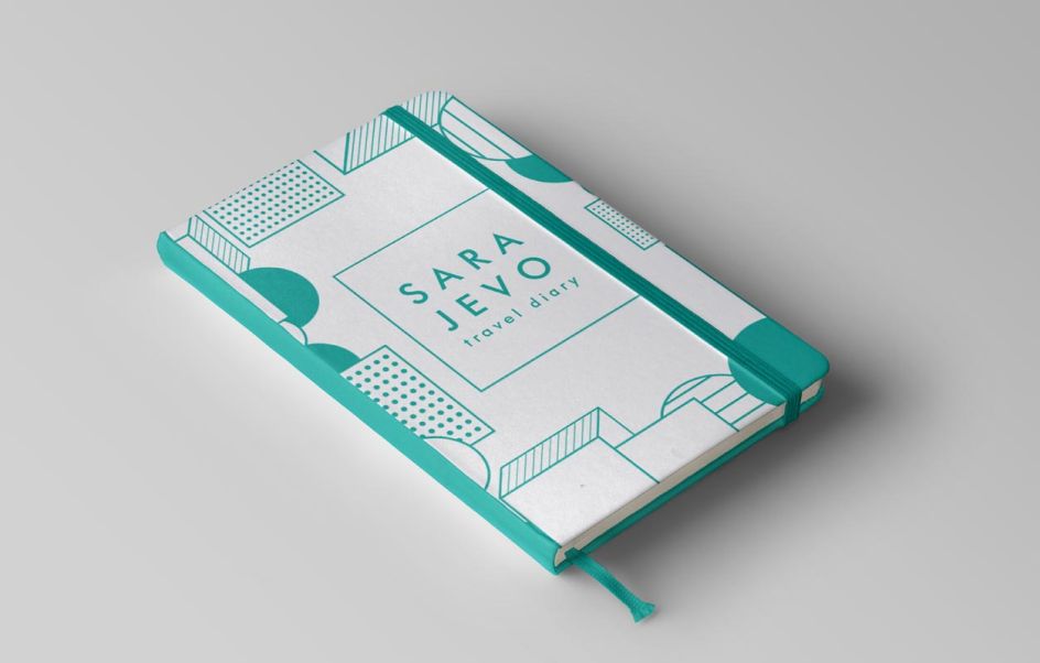
10. Sarajevo by Julia Chesbrough
Julia Chesbrough was tasked with designing a logo for a city looking to boost its tourism. She chose Sarajevo, and began her research into its local history, culture and traditions. She discovered that its people love coffee, so this formed the basis of her identity: "They have a sense of pride in their Bosnian recipe, and even have a particular way of drinking the warm beverage. They bite into a sugar cube, sip the coffee, and let the sugar disintegrate on their tongues. Finding this a fascinating cultural tradition, I chose to design my logo and rollout based on the disintegrating sugar cubes."
Discover more: www.juliachesbrough.com
Further Information
This article was written by Anthony Wood, who is the Managing Director of Shillington. With 15 years of experience in design and a long stint of freelancing in Sydney and London, he relished the challenge of joining the international design school in New York City. He likes to write about design, entrepreneurship and learning.


