Kurppa Hosk creates new visual identity for Google music production platform Soundation
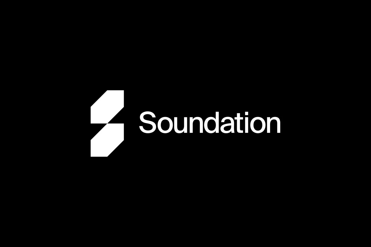
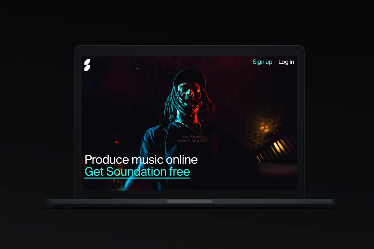
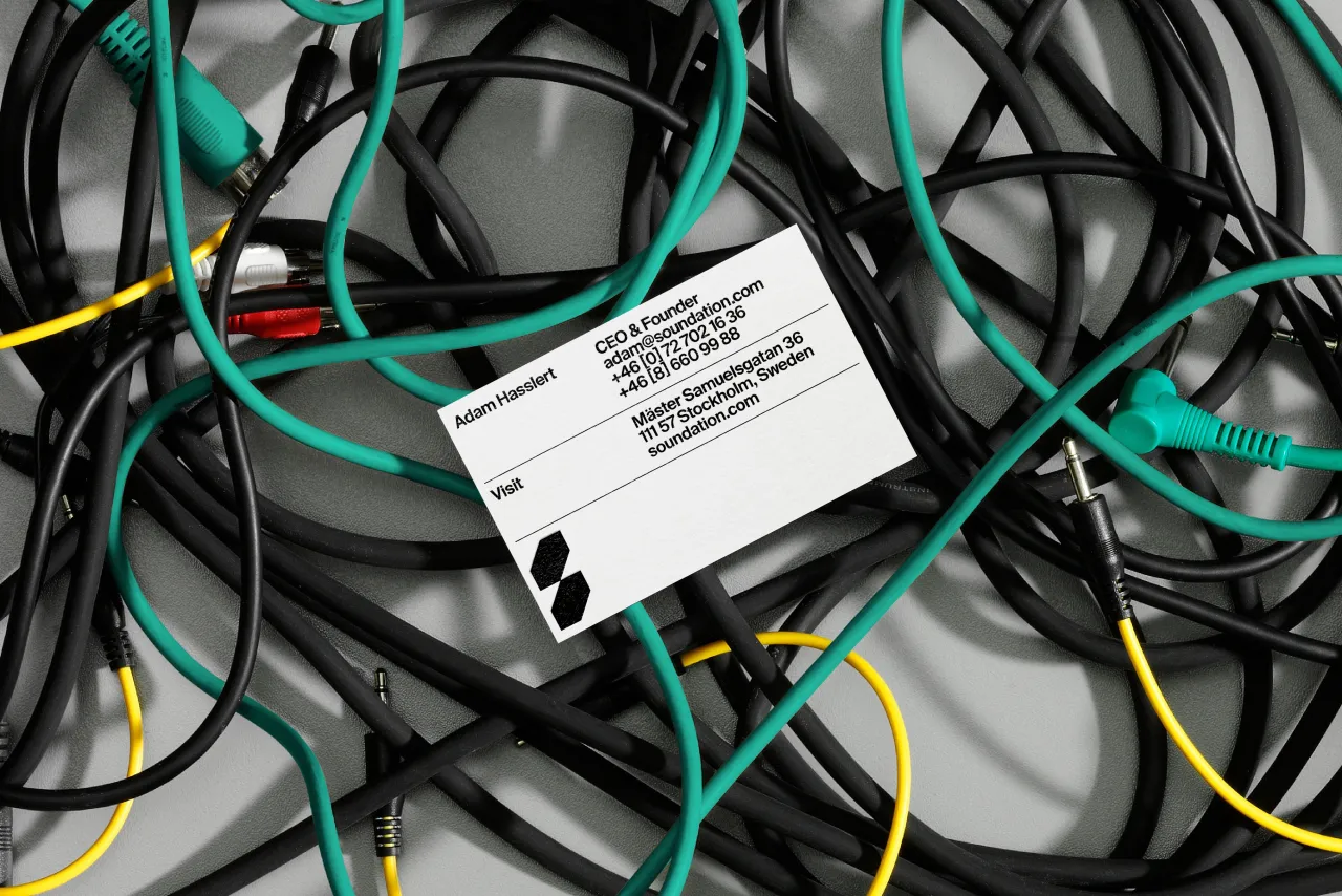
Stockholm and New York-based agency Kurppa Hosk has created the identity for Soundation, an online music production platform created in collaboration with Google.
Soundation was created nearly ten years ago, aiming to offer a powerful and high-quality online music production service for new-coming producers. With an ever-growing demographic of young and ambitious producers using the service, Kurppa Hosk was brought in to create a new visual identity "that really speaks to the young and creative target group, but most importantly, that motivates them to follow through with their passion."
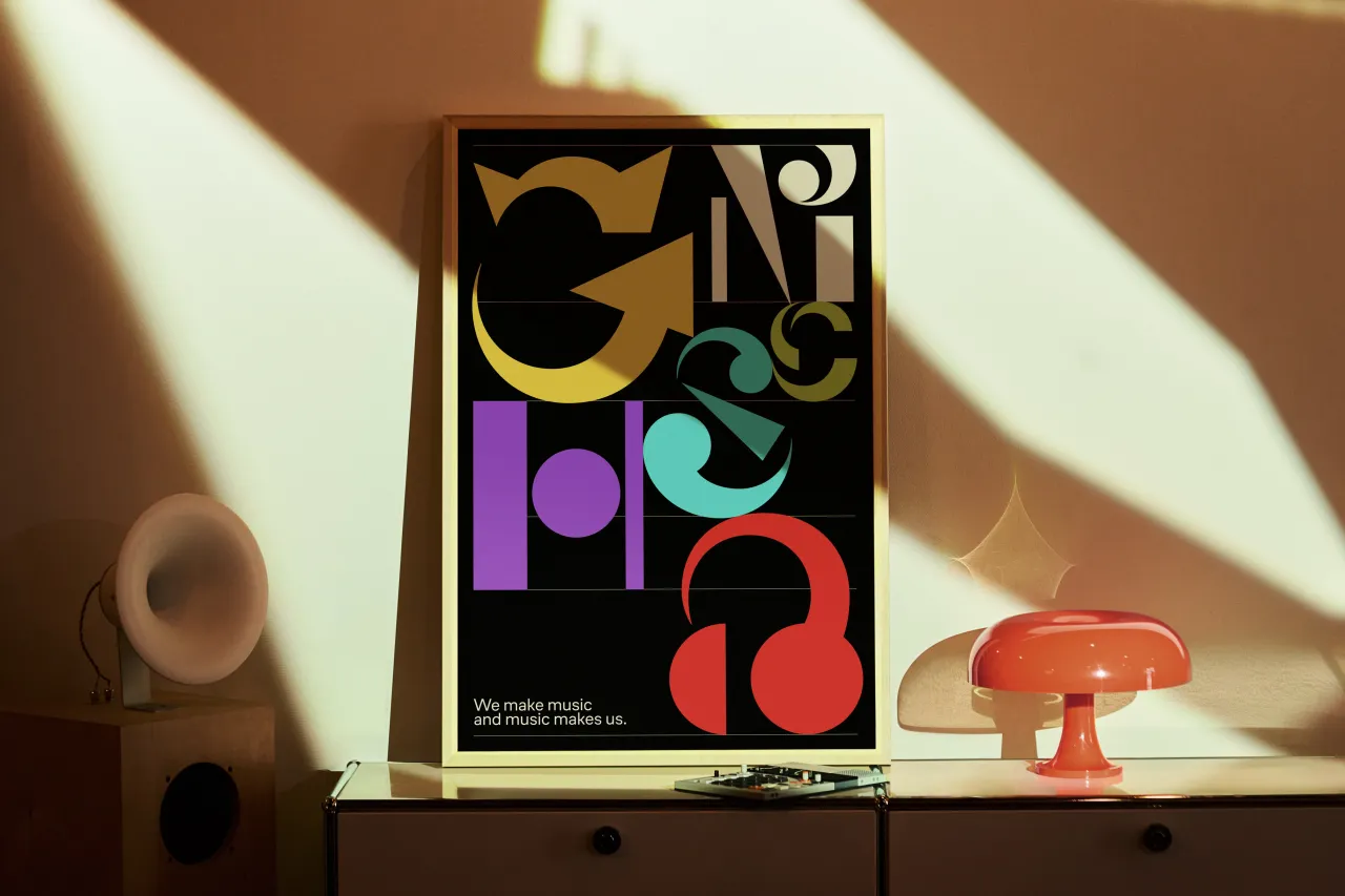
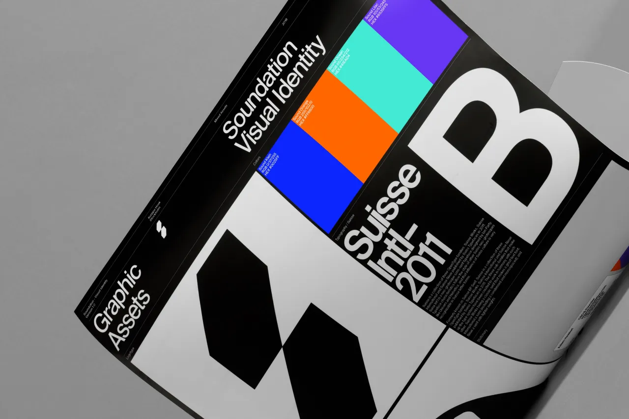
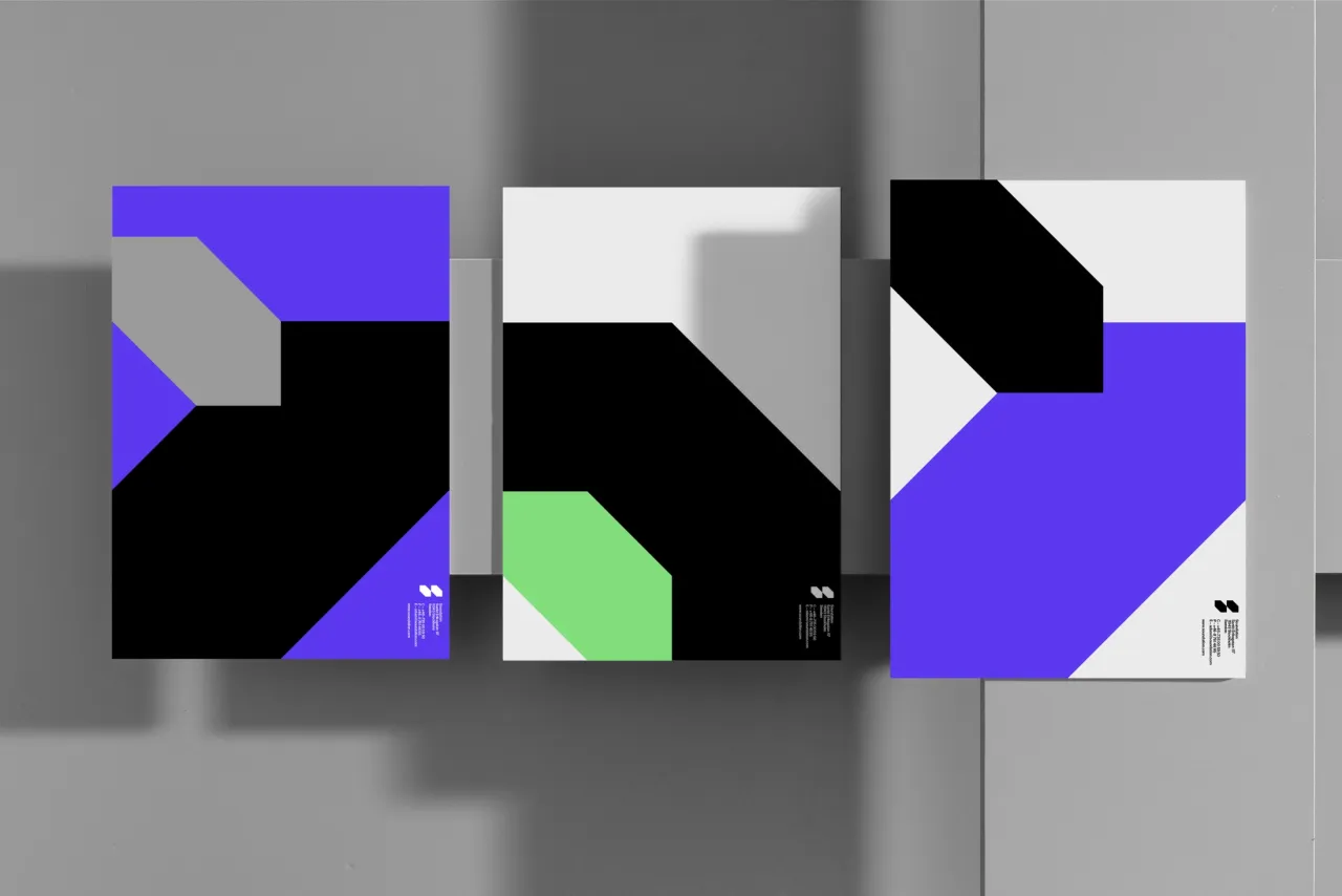
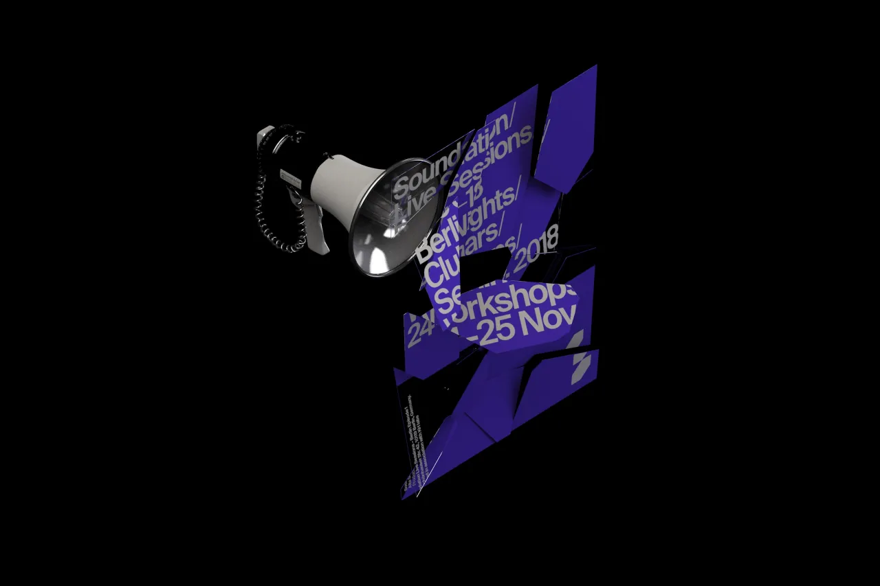
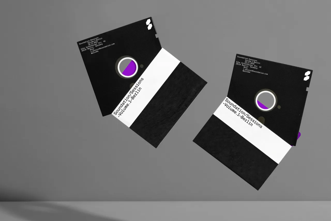
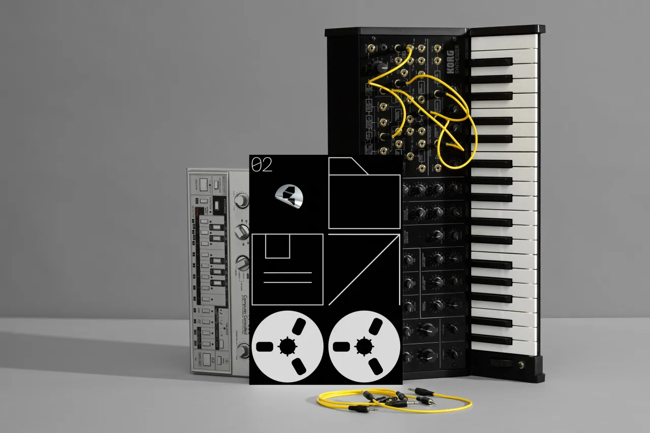
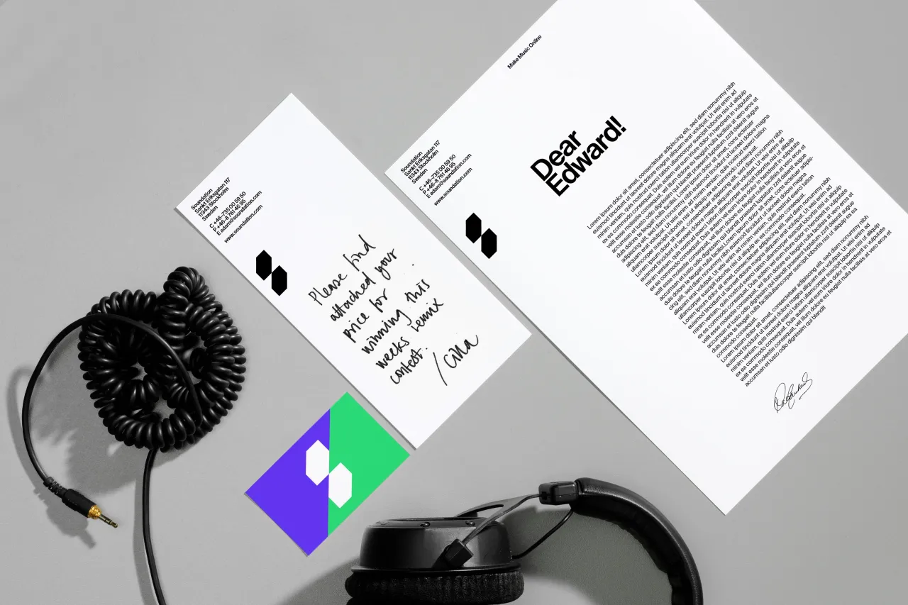
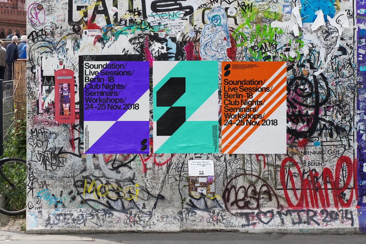
The new designs use “strong and clear elements that are both contemporary and timeless,” says the agency, which chose the primary typeface Suisse Intl and secondary typeface Suisse Intl Mono. “Its dynamic composition – based on a simple mathematical angle 45°– makes it easy to change, adjust and develop. We strived to create an expression that is relevant without becoming too confined to the category.”
Soundation and Kurppa Hosk worked together to perform a thorough user analysis and “prioritise the service’s tools according to popularity,” the agency explains. “Subsequently, the reorganisation of tools helps to declutter and organise the sophisticated service. This helped Kurppa Hosk better understand the service’s users and design a visual identity that better resonates with current and better appeals to future users.”
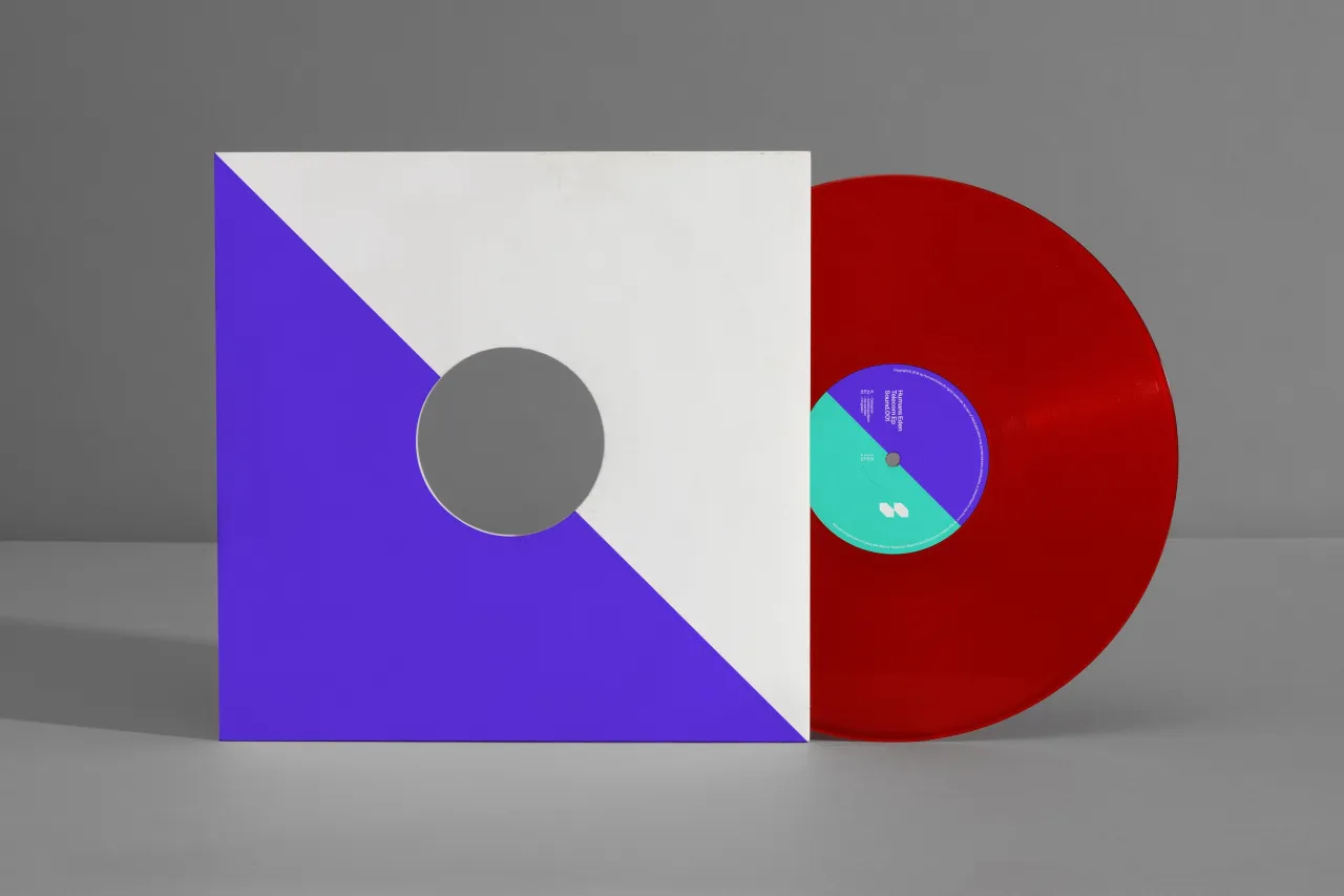
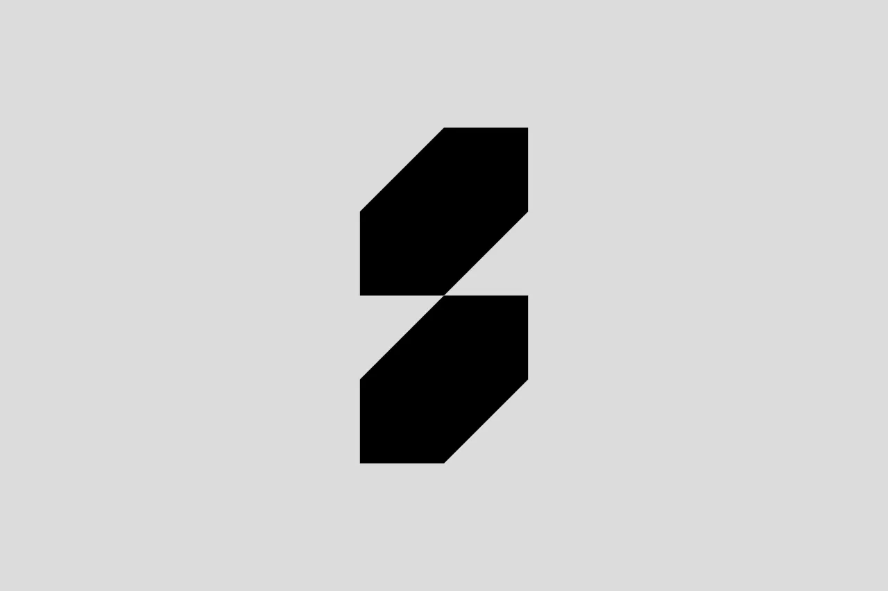
According to Kurppa Hosk, the design overhaul looks to better communicate Soundation’s ambitions “to facilitate musical creativity around the world” and achieve consistency across all touchpoints. Every element is graphically connected through a graphic that features two interconnected rectangles at 45° angles, which are said to “signal precision.”


Editor's Picks





Trending






Latest Jobs
Account Director at How&How
Full-time·London·£73k-£79k
Brand Designer at Adfin
Full-time·London·£30k–£50k
Designer at New Genre
Full-time·London·£36k–£48k
Client Success & Growth Director at Revolution Growth
Full-time·Manchester·£60k-£70k
Account Manager at BUILDHOLLYWOOD
Full-time·London·£34k–£38k
Midweight Designer at Catalyst Creative
Full-time·London·£32k-£36k