Why packaging is one of the most powerful spaces in contemporary design
There was a time when packaging was dismissed as functional or forgettable, but now it's evolved into one of the most emotionally charged and culturally revealing areas of creative work. As Pentawards marks 20 years, its history tells a bigger story about where this discipline is heading.
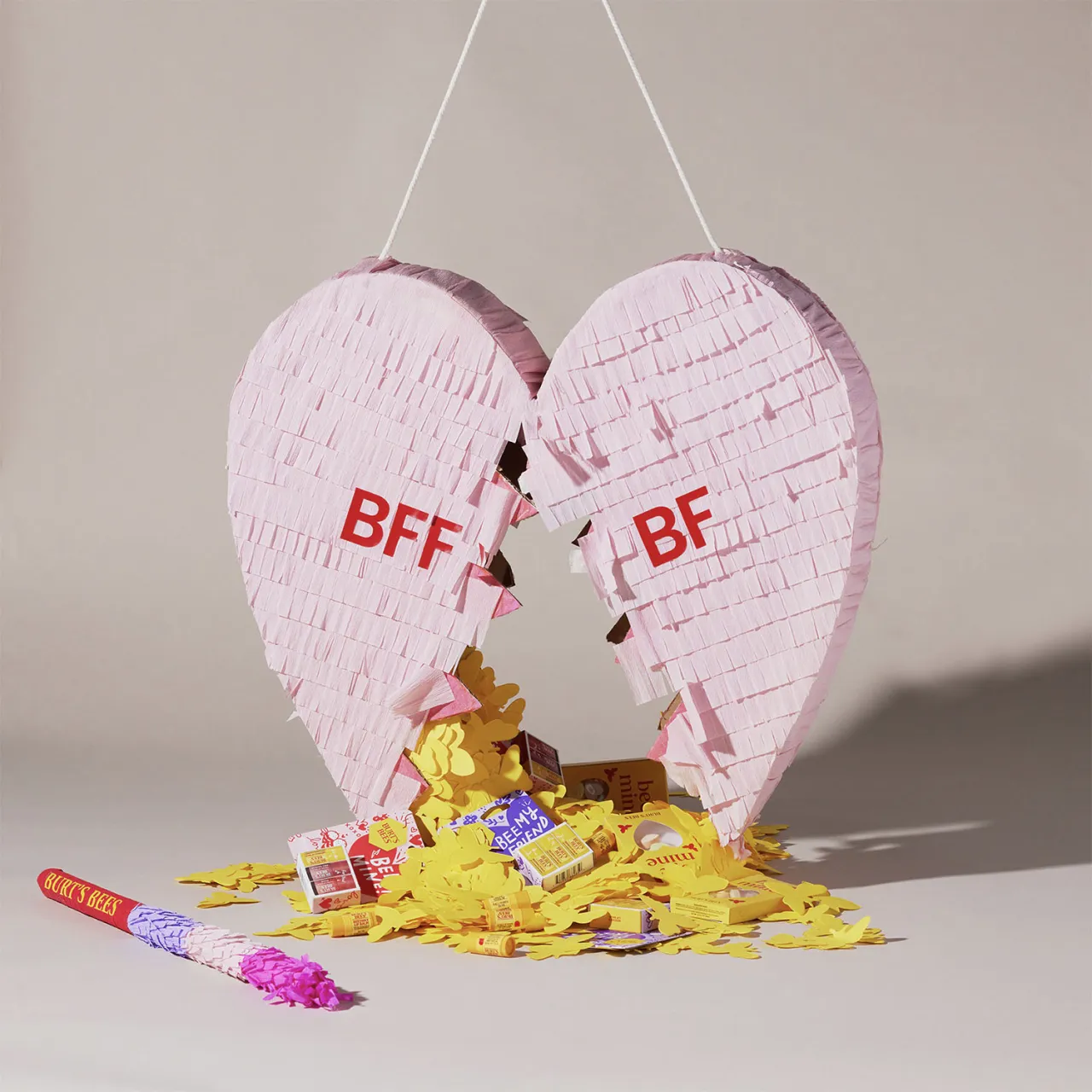
Some might think packaging is one of the least glamorous corners of design. It's functional and regulated, and if it's not something you specialise in, it's probably an afterthought when you're designing for brands.
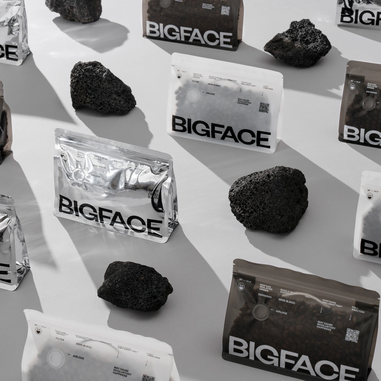
But if you've spent any time looking at the past two decades of award-winning packaging, a different picture emerges. Packaging has arguably become one of the most emotionally charged, culturally revealing and ethically scrutinised spaces in design today.
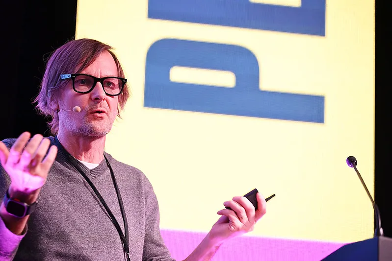
With Pentawards marking its 20th anniversary this year, it feels like a good time to take stock and look closer at what's evolved and why. According to Adam Ryan, head of Pentawards, the biggest change hasn't been about aesthetics alone.
"Packaging has shifted from looking good, to being seen, to actually doing good," he explains. What was once treated as a marketing surface is now understood as a brand experience in its own right, and it's one of the last physical touchpoints where values, intent and worldview can be meaningfully expressed.
In an increasingly digital world, physicality matters. Packaging isn't just what holds the product anymore; it's where brands demonstrate who they are when no one's scrolling.
From excess to intention
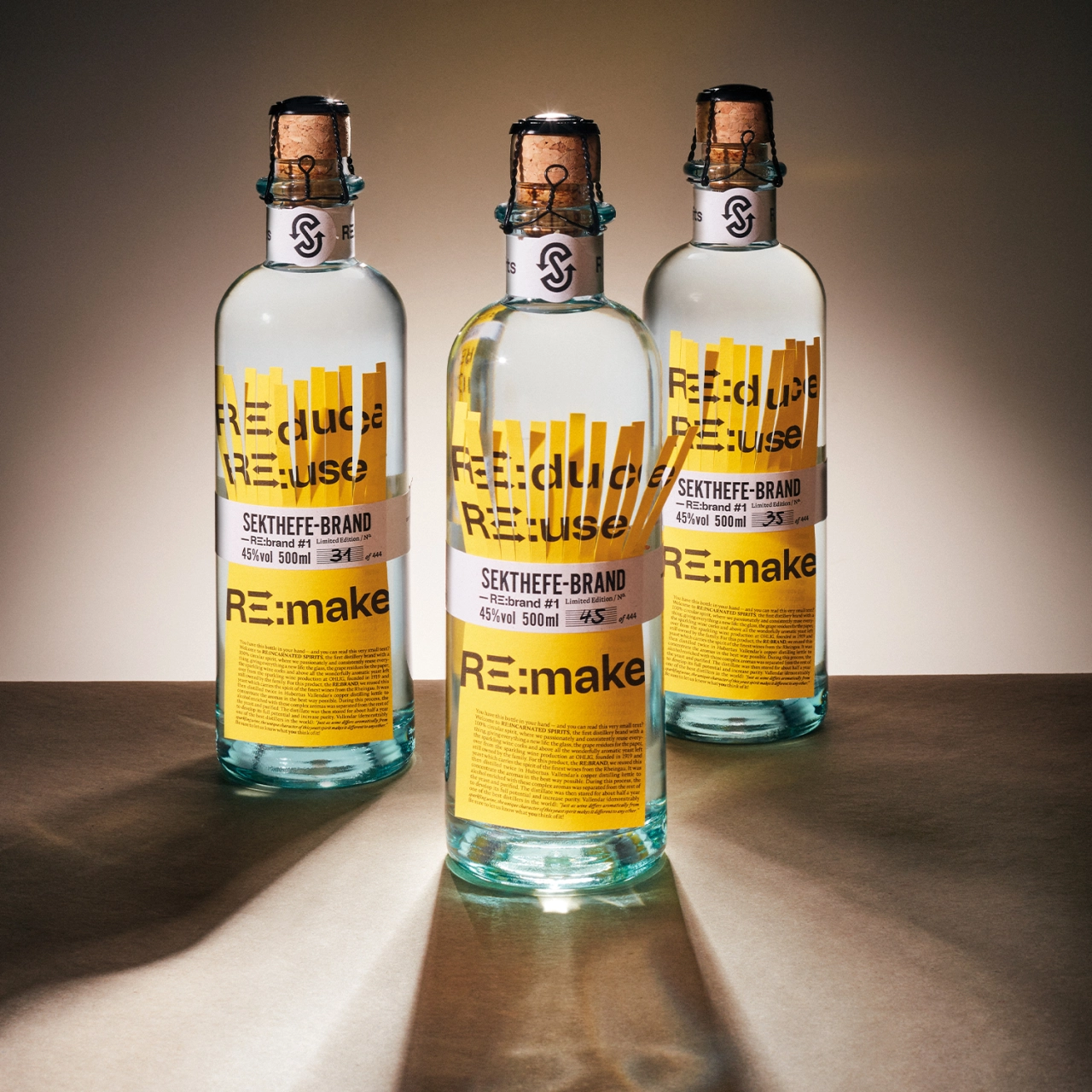
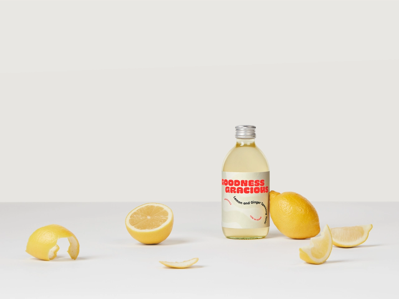
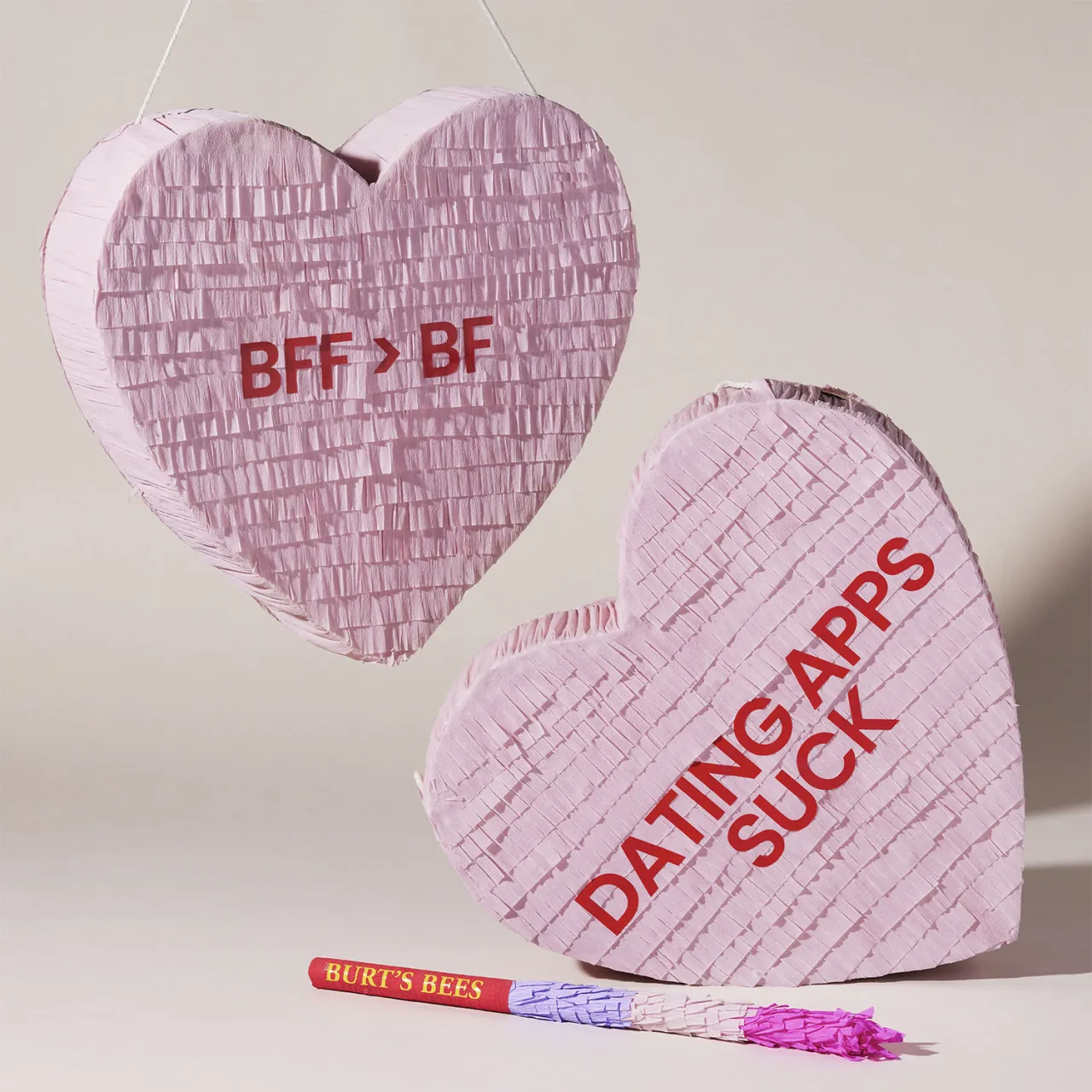
If you rewind twenty years, particularly in luxury, premium packaging often equated value with abundance. Creatives and businesses alike favoured weighty materials, gloss finishes, and elaborate construction. Today, that language feels a little tone deaf and outdated. Premium has been redefined not by how much you use, but by how thoughtfully you choose.
What's notable, Ryan says, is that craft hasn't disappeared. It's simply moved. Designers are now solving a harder brief, grappling with how to express value through restraint, ethics and clarity rather than excess. The technical challenge remains, but the cultural stakes are higher.
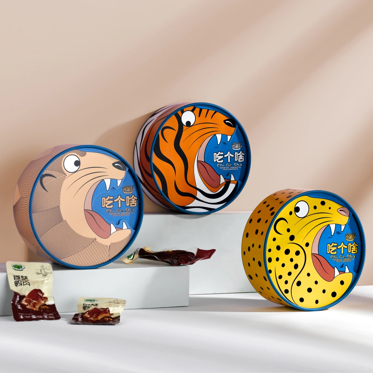
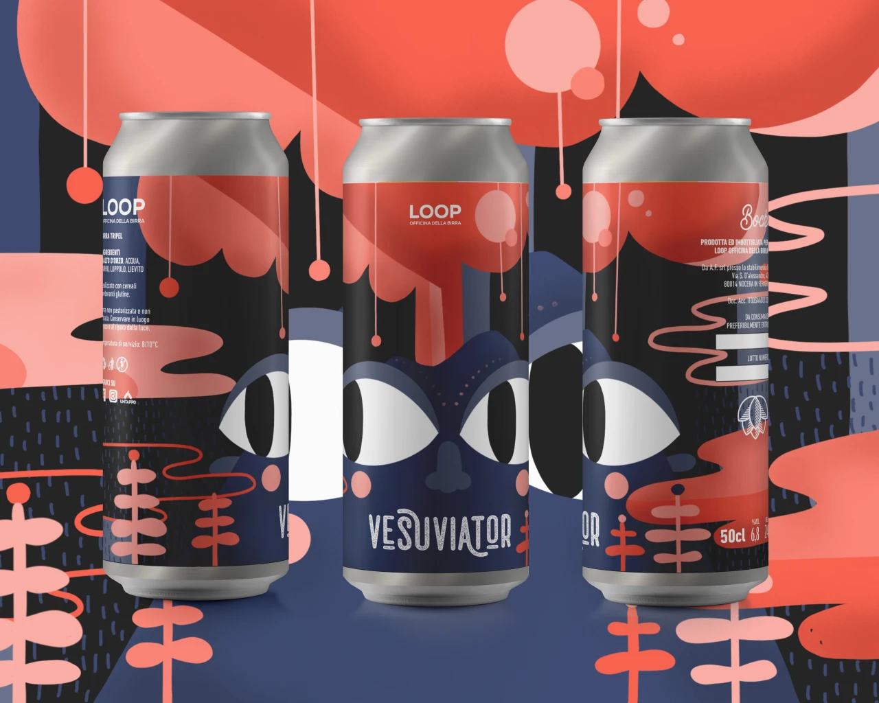
This evolution mirrors broader creative cycles. Maximalism gave way to minimalism, which is now giving way to something more nuanced: bold, expressive design that still understands responsibility. Colour, playfulness and visual joy are back, but not just for the sake of indulgence.
Packaging has become a barometer for how culture itself is shifting away from surface-level signalling and towards meaning that holds up under scrutiny.

Designing for shelves and screens
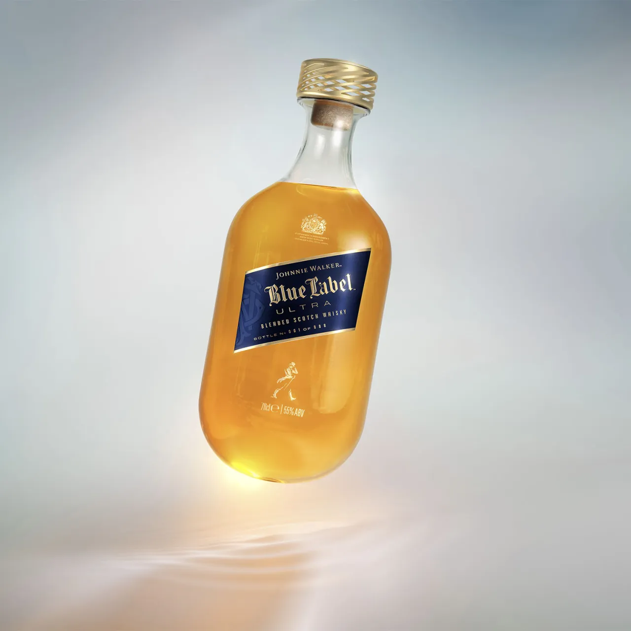
The introduction of Pentawards' new PR & Influencer Gifting category reflects another major shift: packaging is no longer experienced only in-store.
Social media hasn't changed what good packaging is, Ryan argues, but it has expanded what designers must consider. Today, packaging often has to work in motion and sequence, through reveals and unboxings, and across multiple moments rather than a single glance.
Designers are essentially choreographing experiences. A box opening becomes a narrative, all hinged around this idea of the reveal.
Alongside this newfound relevance, the fundamentals still matter. Shelf impact, clarity and instant recognition haven't gone anywhere. What's changed is that packaging now exists in time as well as space, equally at home in a hand, on a shelf, or inside a six-second video.
What juries reward has changed
If packaging once felt like a "beauty parade", that era is firmly over. Across Pentawards' history, Ryan has seen juries increasingly reward work that demonstrates purpose, strategy and cultural relevance alongside visual craft.
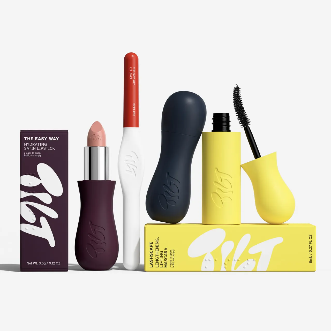
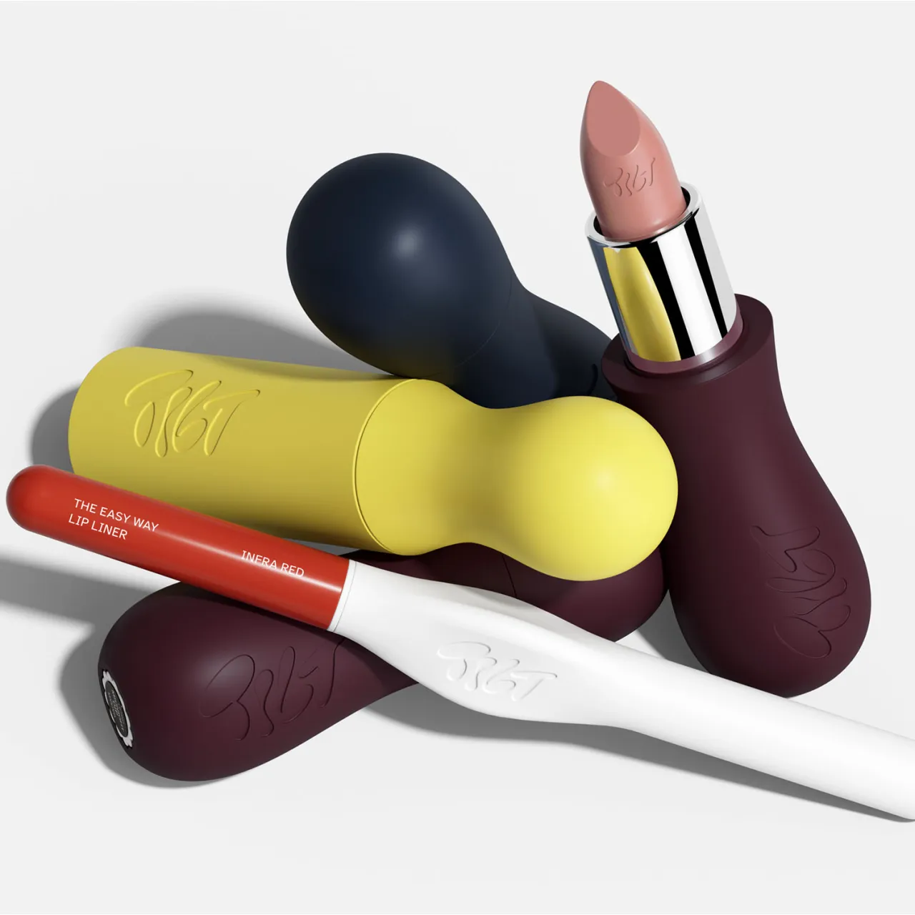
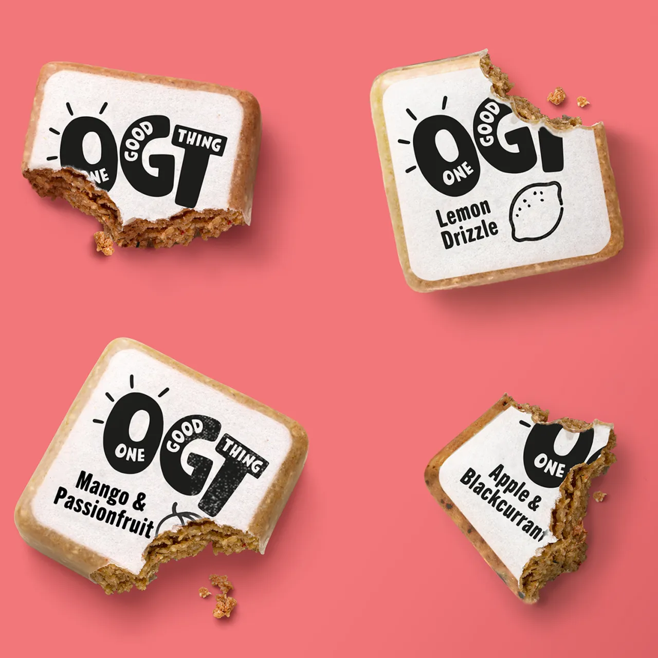
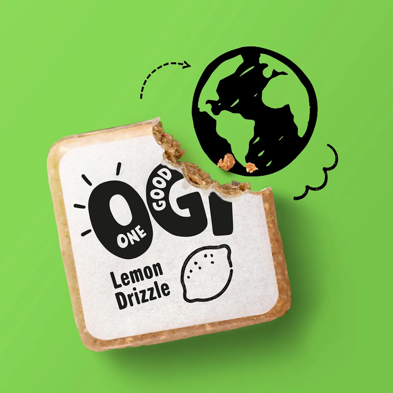
Recent Diamond winners make that shift clear. Tilt, an accessible beauty brand designed by Established, became the first makeup line to receive the Arthritis Foundation's Ease of Use Certificate. One Good Thing, designed by This Way Up, removed wrappers entirely, using an edible beeswax-based coating to reduce waste.
These are examples of systemic changes, and prove the broader point that packaging design is now judged not just by how it looks, but by what it changes.
The next era: human, accessible, experiential
Looking ahead, Ryan believes a mix of technological pressure and human response will shape the next decade of packaging. AI will inevitably influence how designers work, but as automation accelerates, audiences are already showing signs of fatigue.
Packaging, by contrast, remains stubbornly physical. It's one of the few creative formats where material choice, craftsmanship and intention can still be felt. That physicality gives packaging a unique role in the years ahead, particularly as designers shift from creating static containers to designing moments, experiences and emotional connections.
Accessibility will be central to that shift. As populations age and needs diversify, inclusive design will move from specialist consideration to baseline expectation. Much like sustainability, it won't be a niche. It will simply be part of doing good work properly.
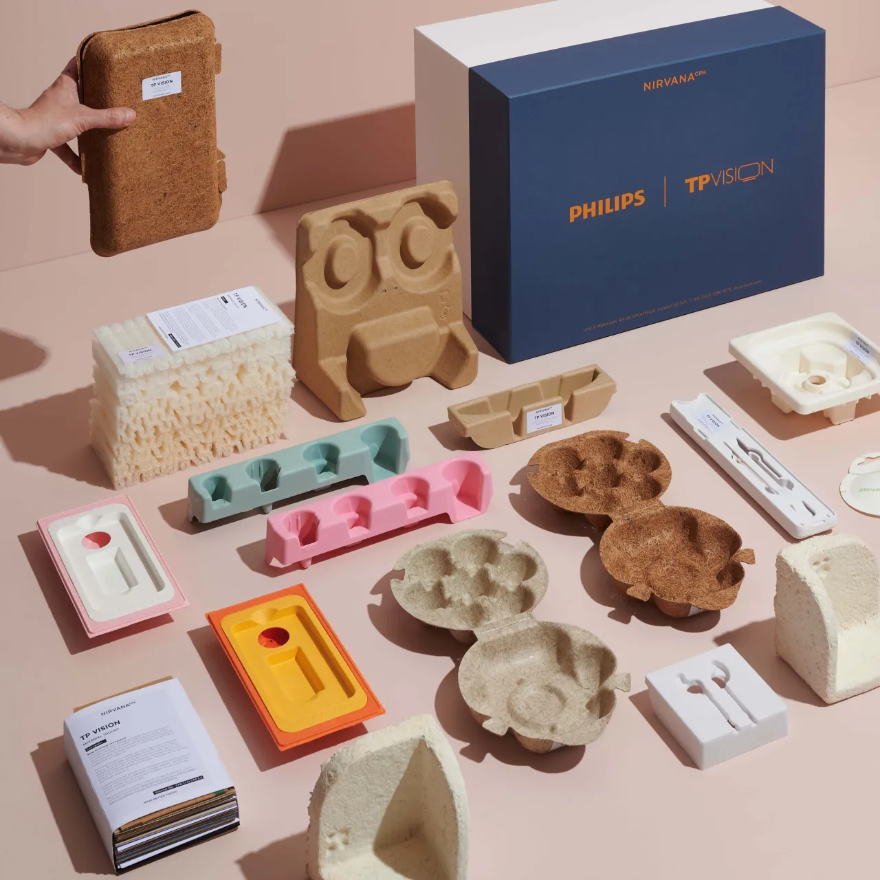
What makes this moment genuinely exciting, Ryan says, is possibility. New materials, new production methods and new ways of thinking are expanding the creative scope of packaging rather than limiting it.
So no, if you were ever in any doubt, packaging isn't boring. If anything, it's one of the clearest reflections of where design, culture and responsibility are heading next. As brands continue to talk about their values, packaging may be the place where those values are finally tested.

Editor's Picks





Trending



Latest Jobs
Staff Brand Designer at Mercury
Full-time·San Francisco·$189,400 – $236,700
Designers / Copywriters / Art Directors / Creatives at Hatched
Full-time·London·£25,000 – £55,000
Lead Digital Designer at Together
Full-time·£55,000 – £75,000
Senior Motion Designer at AlphaSense
Full-time·Remote (United States)·US$116,000 – US$160,000
Senior Technical SEO Specialist at VML/WPP Enterprise Solutions
Full-time·Amsterdam·€80,000 – €95,000
Senior Director, Production, Marcom at Code and Theory
Full-time·New York·$190,000 – $230,000