Why 2025's best rebrands mostly happened while we weren't looking
While everyone was obsessing over spectacular failures, the rebrands that will actually matter slipped by almost unnoticed.
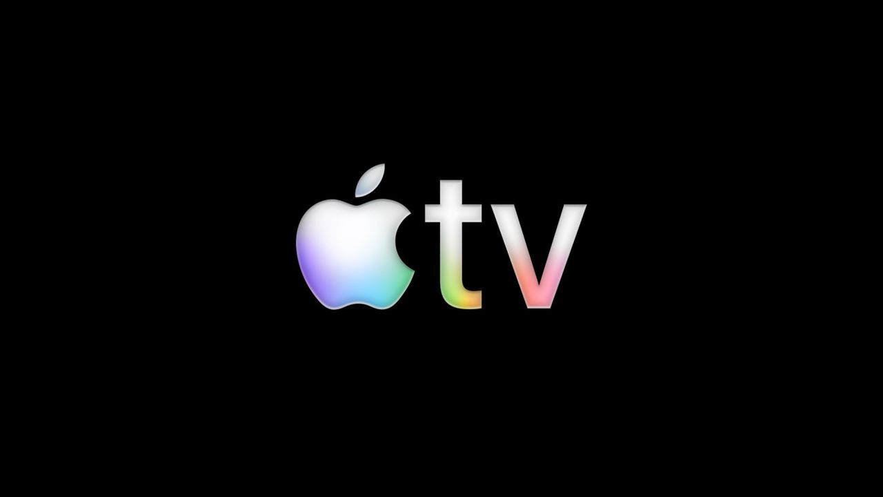
Apple TV got a new name and logo in 2025... but did you even notice?
2025's been a bit of a weird year, hasn't it? For instance, I've spent the past 12 months watching brands flail, fumble and occasionally nail it. But now it's time to sum up the period, it strikes me that the most consequential rebrands of the year were the ones nobody was actually talking about on social media.
Let me acknowledge the elephant in the room first. Yes, Cracker Barrel became a cultural moment. In late August, the American restaurant chain ditched its beloved "Old Timer" logo—the guy leaning on a barrel—for a flat, corporate wordmark that looked like it belonged on a dentist's office. The backlash was swift and brutal. Even Donald Trump weighed in. Within days, the company's stock dropped nearly 10%, wiping out close to $100 million in value, and management scrambled to reverse course.
And yes, the controversy over Jaguar's rebrand continued to rage on, even into 2025. The previous November, the luxury carmaker had unveiled abstract slogans like "Copy Nothing" and "Delete Ordinary", accompanied by a 30-second video full of high-fashion models and... no cars. Not a single vehicle. Critics accused them of abandoning their British heritage for what felt like panicked, trend-chasing marketing.
Nor could we ignore how HBO Max gave us perhaps the most expensive lesson in brand equity of the year. In 2023, Warner Bros. Discovery rebranded the platform as simply "Max", hoping to broaden its appeal. But subscribers kept calling it HBO Max anyway, because it was HBO's programming that had brought them to sign up. By May 2025, Warner Bros. Discovery admitted defeat and brought back the HBO Max name. Two years and untold millions spent to learn what their audience had been screaming at them all along. I wonder if Elon Musk—owner of Twi... I mean, X—was paying attention?
These supposedly disastrous rebrands dominated the conversation. They were meme-worthy, shareable and satisfying to dissect. But while this stuff is fun to talk about, it kind of distracts from all the excellent rebranding work that was happening elsewhere. And believe me, there was a lot to inspire us.
Under the radar
The rebrands that will define 2025, the ones that will reshape how we think about brand evolution, are the ones that pretty much slid under the radar. The strategic whispers, not the public screams.
Take Amazon. They got a new logo for the first time in 20 years. Did you notice? Probably not. And that's exactly the point. Working with Koto, Amazon expanded the arrow in its smile logo and rendered it in a richer orange. The changes were minuscule, but they added up to something meaningful: a deeper, more emphatic smile that reinforces the brand's mission. Importantly, they brought coherence to Amazon's sprawling ecosystem of services. Prime, AWS, Fresh… the constellation of sub-brands now spoke a unified visual language.
This isn't just aesthetics; it's infrastructure. When you're operating at Amazon's scale, clarity becomes a competitive advantage. Every fraction of a second customers spend parsing your identity is friction. Amazon eliminated that friction while nobody was paying attention.
Walmart executed a similar masterclass. Their refresh was so subtle, it barely registered; a slightly fuller "spark" motif, refined typography, and cleaner visual architecture. Yet these weren't cosmetic tweaks. They were part of a systematic effort to unify one of the world's most complex retail ecosystems. Small refinements, repeated consistently across thousands of touchpoints, compound into major perceptual shifts. Ad Age recognised it as one of the year's top five rebrands, but you'd never know from most of the media coverage.
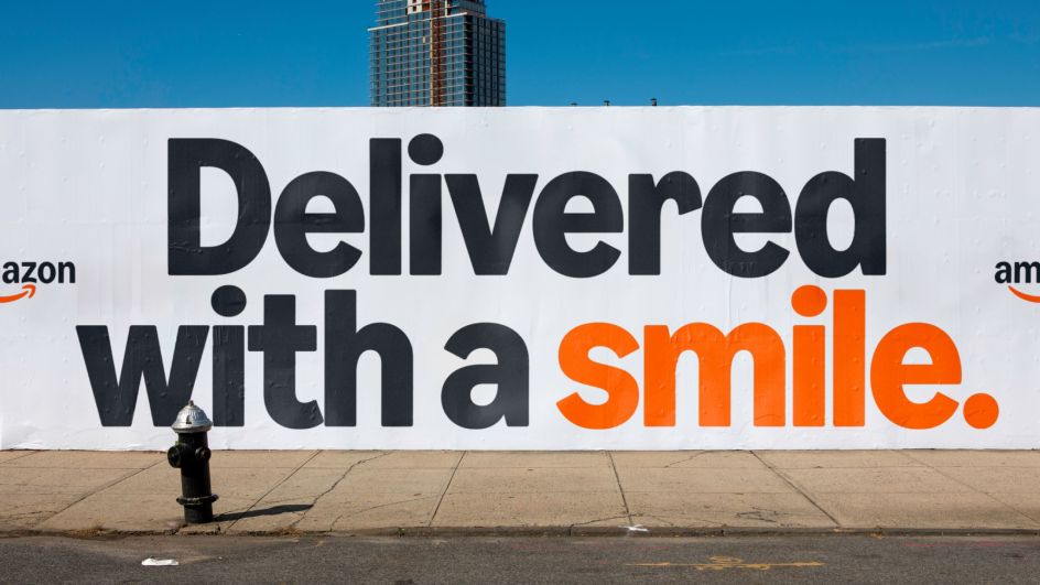
Koto's work for Amazon
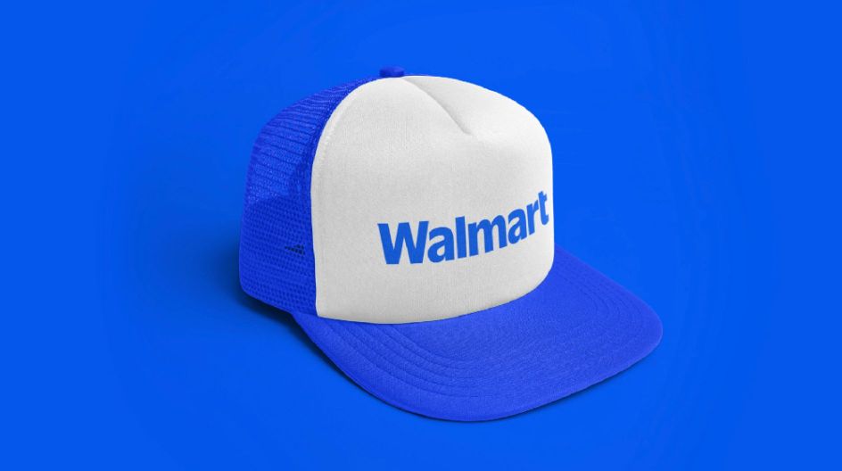
A subtle refresh at Walmart
Then there's Apple TV Plus, which might be the most overlooked rebrand of the year. They dropped the 'Plus' from their name, introduced a sonic logo by Billy Eilish producer Finneas, and a five-second visual identity featuring layered, shifting light. This work by TBWA/Media Arts Lab positioned Apple TV as the home for prestige storytelling; not by shouting about it, but by creating an unmistakable sensory signature. Every time you open the app, you're reminded: this is where the good stuff lives. That's brand-building that actually works.
Elsewhere, events platform Eventbrite redesigned its entire identity around "The Path", a fluid logo system that morphs based on event type. Working with BUCK, they solved the platform's longstanding problem of feeling too utilitarian, too transactional. Now it feels like a cultural catalyst, not just a ticketing checkout. Industry insiders noticed. Most consumers didn't. But over time, that shift in perception will drive real business impact.
Finally, La-Z-Boy might be the cleverest repositioning of the year. In its first comprehensive refresh in over 20 years, led by Colle McVoy, they shed their basement-chair reputation by reframing comfort as wellness and self-care, appealing to Millennials and Gen Z who prioritise their home sanctuaries. The new sleek script logo distances them from their bulky 1970s image without abandoning their heritage. It's evolution, not erasure.
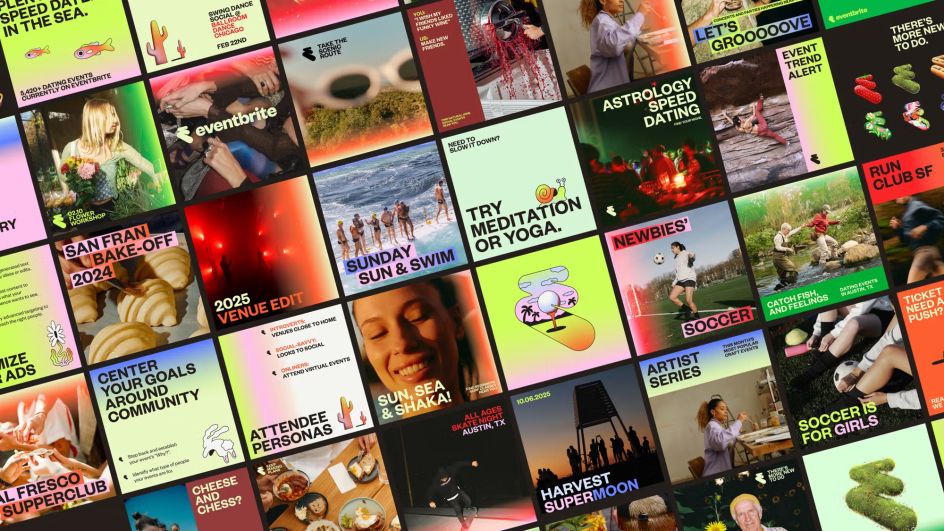
Eventbrite rebrand by BUCK
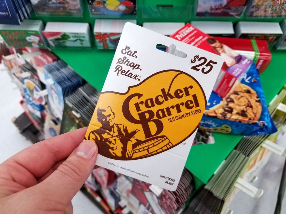
Cracker Barrel backlash. Image licensed via Adobe Stock
The big takeaway
So what's my takeaway from all of this? Unfortunately, as a journalist, I have to confess that my profession often skews reality by focusing largely on the negative. And so it is that the rebrands that dominated clickbait in 2025 were mostly cautionary tales.
But making noise is not the same as making a difference. And so the rebrands that will actually matter in years to come—the ones that shifted market position, clarified customer perception, and built long-term equity—were the ones most of us probably missed.
This, I think, reveals something fundamental about how rebranding works in 2025. We're past the era of the Big Reveal. The splashy unveiling, the press release, the social media storm… these don't build brands anymore. Yes, they grab momentary attention. Sometimes they create backlash. But ultimately, the brands that won in 2025 understood three things the losers didn't.
First, evolution beats revolution. Amazon, Walmart and Apple TV didn't throw the baby out with the bathwater. They refined, clarified and strengthened what was already working. They made themselves more coherent, not more shocking. Rebrands should feel like a natural next chapter, not a totally different book.
Second, system beats spectacle. The most powerful rebrands weren't about one clever logo or one viral moment. They were about building coherent design systems that work across hundreds or thousands of touchpoints. That's not sexy. It's not socially shareable. But it compounds over the years into a massive competitive advantage.
Third, listening beats lecturing. HBO Max learned this the expensive way. When your customers tell you who you are—when they keep using your old name, keep coming back for specific content, keep showing you what they value—believe them. Your rebrand should clarify that relationship, not contradict it.
So my creative takeaway from 2025 isn't about trending toward minimalism or maximalism, nor about popular rebrands vs unpopular rebrands. It's about understanding that the most consequential work often happens below the surface.
While Cracker Barrel, HBO Max and Jaguar were learning painful lessons in public, Amazon and Walmart were quietly building infrastructure that will serve them for the next decade. And so in the long term, those are the rebrands 2025 will actually be remembered for. You just had to know where to look.
Editor's Picks


Trending


Podcasts


Editor's Picks
Further Reading