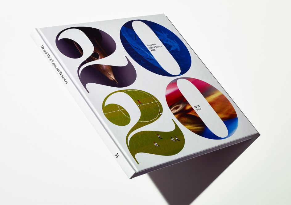
Hat-Trick's designs for the Royal Mail Yearbook look to 20/20 vision for inspiration
London-based studio Hat-Trick has designed the limited edition 2020 Royal Mail Yearbook.
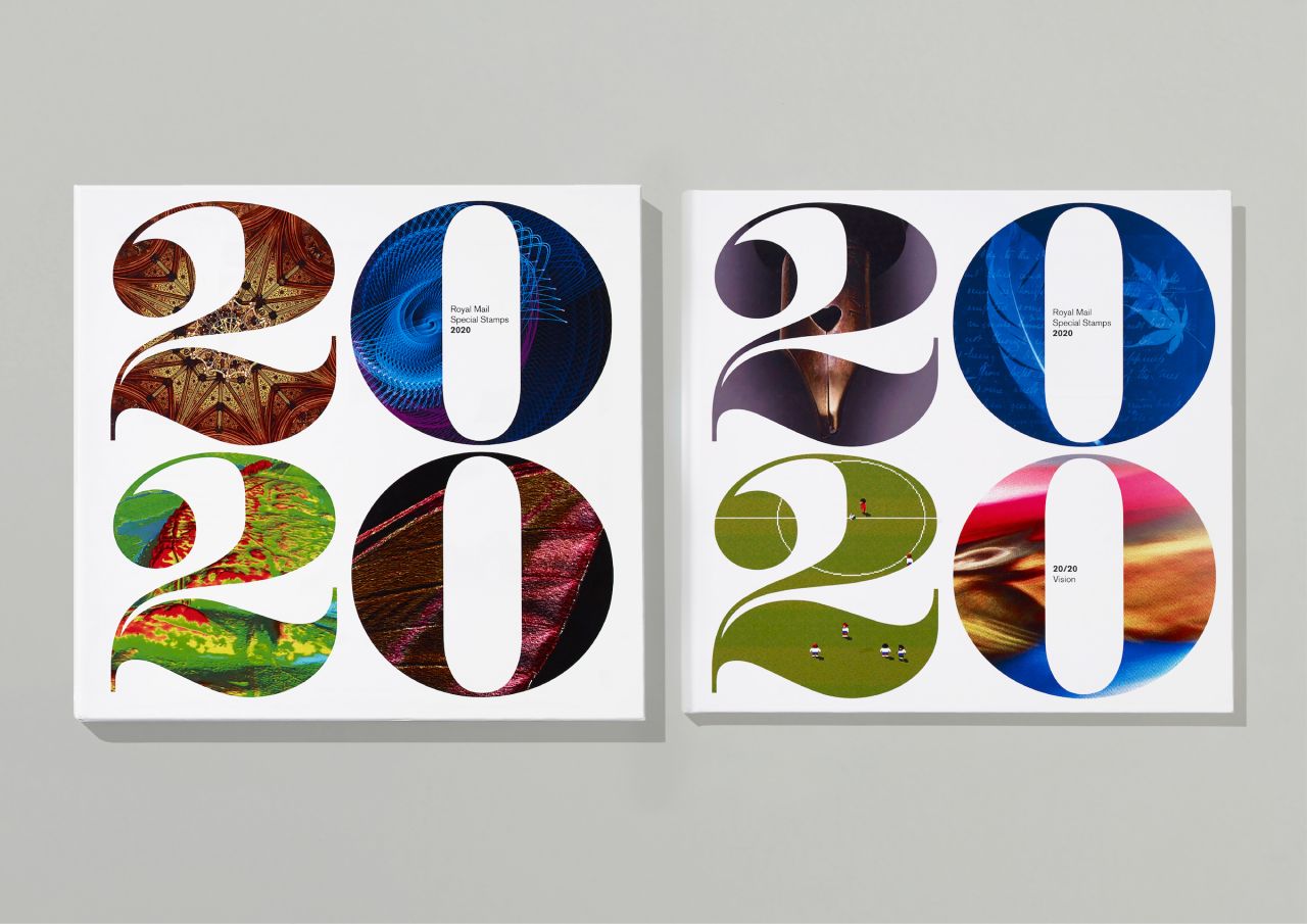
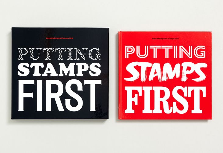
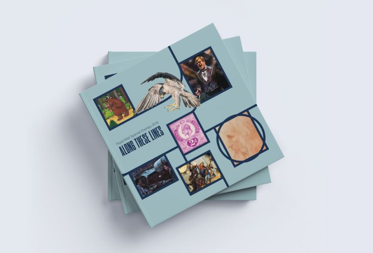
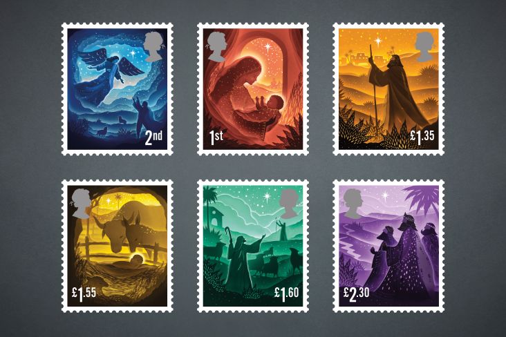
Each year, these yearbooks are published by Royal Mail to collate all the special stamp releases from the previous 12 months in the form of a casebound, limited-edition book.
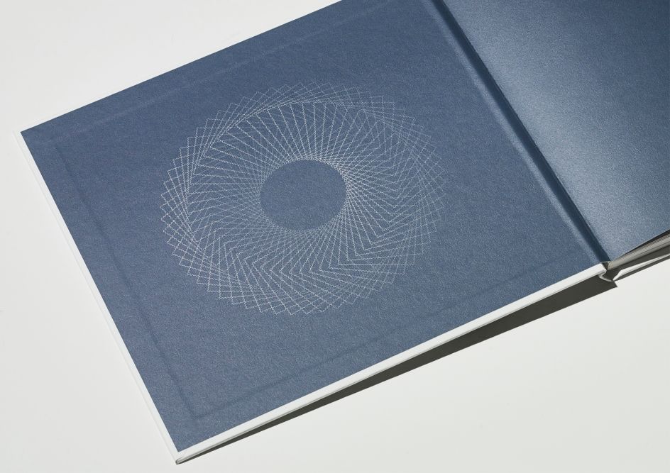
Hat-Trick's designs are based on the idea of 20/20 vision, the annual publication that collates the year's special stamp releases. "We wanted to invite the readers to look again at the diverse range of subjects featured in this year's stamp programme and to offer a new, often unusual perspective on each of the topics celebrated on the stamps," says the agency.
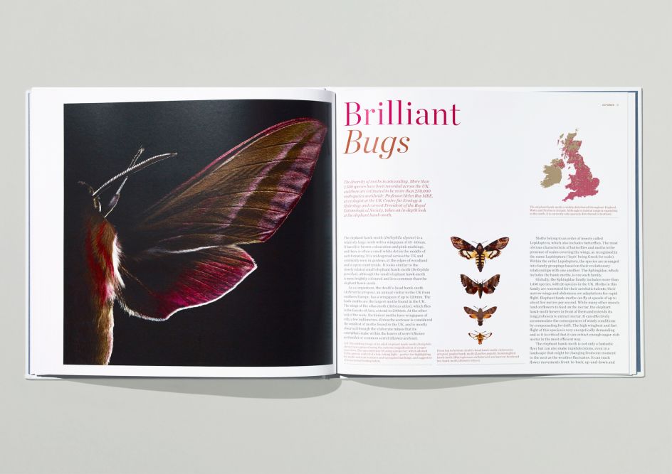
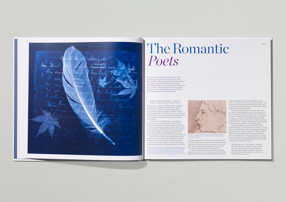
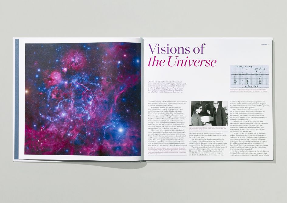
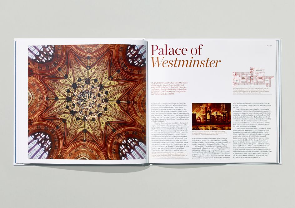
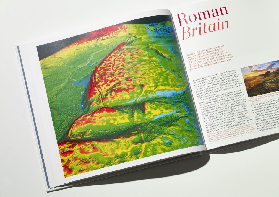
A chapter is devoted to each stamp release with text written by a different expert on the relevant subject to provide readers with the stories behind the various topics. These chapters each open with a full-page image that offers a new look at the subject in question; including macro imaging, an aerial view or a "behind-the-scenes peek" at the stamps' design telescopic imagery of a pulsar star. The designers' explanations of each stamp sets' designs are also featured for every chapter.
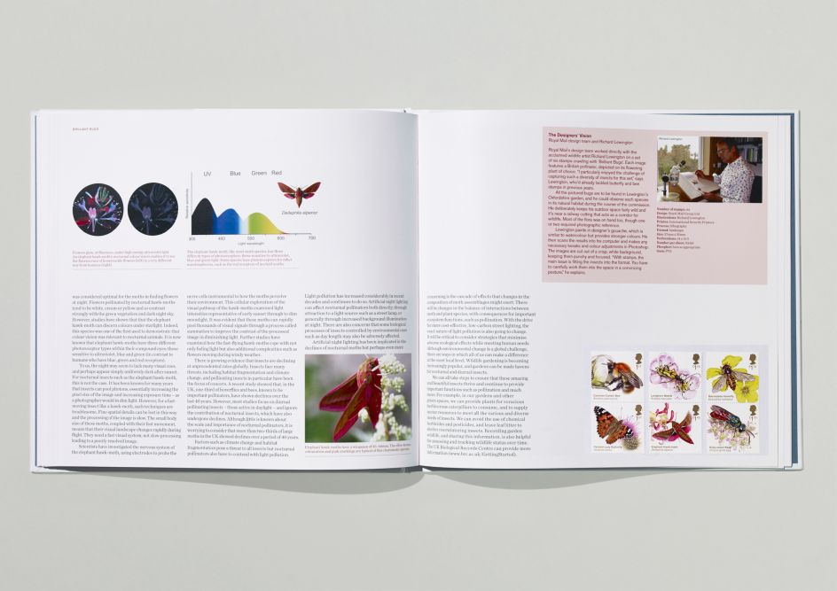
According to Hat-Trick, the idea of using a mixture of image styles to present alternative viewpoints. The team worked with photographer Giles Revell on some of the chapters' imagery.
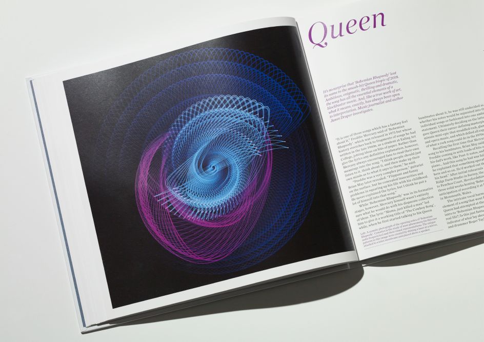
The Queen chapter celebrates the band's legacy by focusing on the iconic karaoke classic Bohemian Rhapsody. Hat-Trick set Revell the challenge of creating a photograph of the song's opening notes using Cymatics—the study of wave phenomena—through representing the audio frequencies. Revell decided to unique pattern formations by shining a laser at a mirror, attached to a latex membrane placed above a speaker playing the song.
For the Sherlock chapter, Hat-Trick managed to track down Sir Arthur Conan Doyle's retractable dip pen that he used to write some of his famed detective stories. Revell shot a super-macro photograph of the gold nib to offer "a forensic-level examination of the object," as the agency puts it.
The overall design was deliberately clean and simple to ensure that the rich content stood out. "For 2020, we felt it was apposite to produce a book that celebrates the 'vision' of stamp design," says Hat-Trick.
Editor's Picks


Trending


Podcasts


Editor's Picks
Further Reading