On the Road to Variable: TwoPoints.Net explores The Flexible Future of Typography
On the Road to Variable – The Flexible Future of Typography is a new book by design studio, TwoPoints.Net that has apparently evolved many times over the last few years.
While this may not be unusual when it comes to publishing, the reasons behind its changes shed an interesting light on its subject matter.
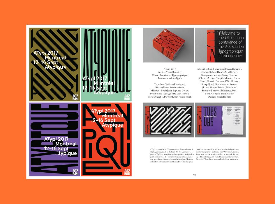
But first, we need to go back to 2009, when the idea for I Love Type (ILT) was born. ILT was a series we developed with viction:ary to honour famous typefaces like Futura, Avant Garde, Bodoni, DIN, Gill Sans, Franklin Gothic, Helvetica, and Times.
It was created out of our interest to explore how classic typefaces were being used in contemporary graphic design at the time. "As students in the late 1990s, we were taught to stick to the ‘all-time classics’ in order to become good typographers," explains Martin Lorenz of TwoPoints.Net. "As we became teachers ourselves, we began to understand the benefit of limiting typeface choices for the untrained eye, and saw a deeper reason for it than just to limit potential 'damage'.
"It was a credible design approach, in that using an often-seen, less expressive typeface actually gave one more freedom and room for creativity because the audience’s eye would not be instantly drawn to the typeface itself, but rather, to what was done with the typeface or the space around it."
When TwoPoints.Net published ILT, many design studios had been working with the same typefaces for decades. "Even though these typefaces were typically attached to specific time periods, the ways with which they were treated to look contemporary surprised and excited us," Martin adds. "As such, it was important for us to introduce the typefaces’ histories at the beginning of each book before revealing the creative work to evoke the same emotions in readers.
"The series had to come to an end after eight volumes, not just because we had finished covering the most popular typefaces out there, but due to the fact that designers everywhere had begun changing their approach to typography. Instead of sticking to the all-time classics, they started becoming more experimental by using and making new typefaces.
"Distinctiveness began to rule over perfection, and instead of perceiving it as a negative development, we saw it open up a whole new playground in the design world. Typography has never been as flexible as it is today, and we are proud to have made a book on a subject matter that deserves to be delved into, no matter how many changes it went through."
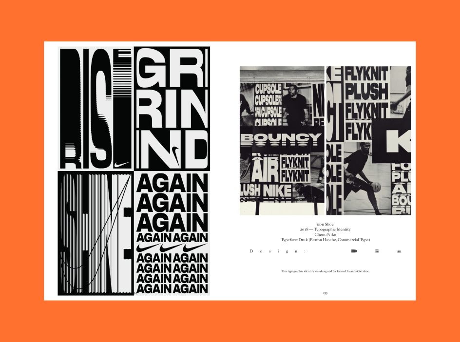
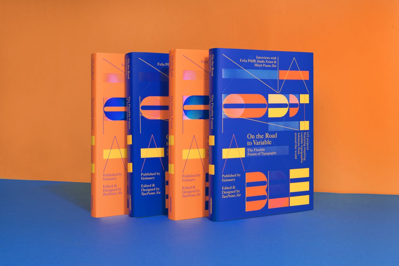
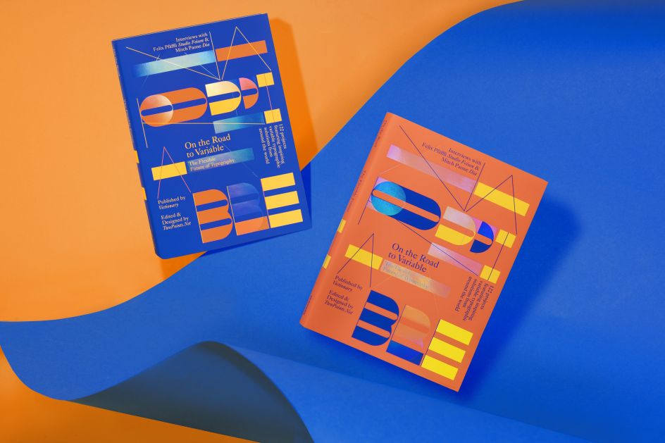
On the Road to Variable – The Flexible Future of Typography explores an eclectic and exciting collection of work that experiments with the modification of existing typefaces as well as the creation of new ones for a fascinating glimpse into the future of type.
It features 122 inspiring works by designers and studios such as A Practice for Everyday Life, Artem Matyushkin, Atelier Tout va bien, Burrow, Daniel Seemayer, Fabian Fohrer, Jim Kühnel, Koln Studio, Lamm & Kirch, Murmure, Semiotik, Studio Feixen, Tobias Hönow and Ward Heirwegh.
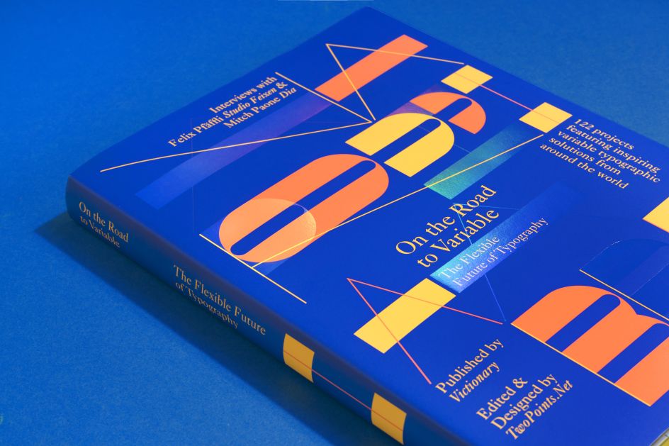
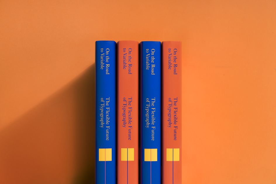
There are two different covers printed with three Pantone colours, two of them fluorescent. On top of the spot colour print, there is a transparent nacre hot foil stamping and the edges are painted with fluorescent yellow. Available via victionary.com.
Editor's Picks


Trending


Podcasts


Editor's Picks
Further Reading


, commissioned by Creative Boom for International Women's Day 2019](https://www.creativeboom.com/upload/articles/12/12230dd8fd7953626f2bd36111c4c9d50dc2b068_732.jpg)
