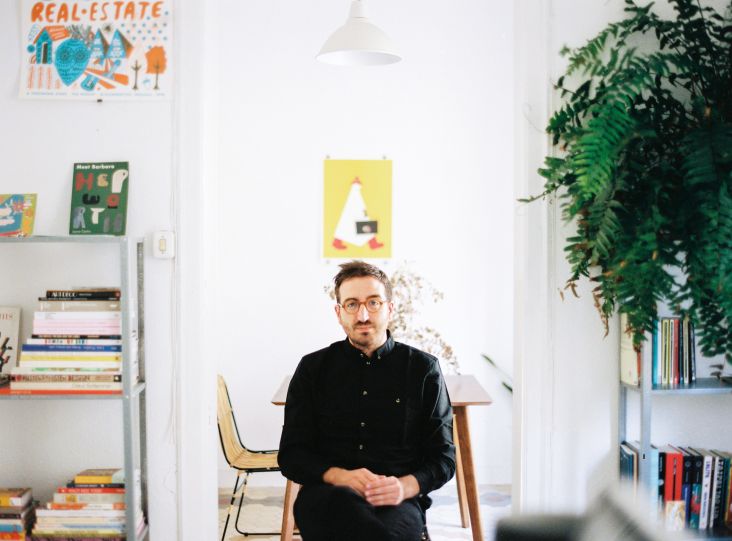
Noma Bar on his favourite work, developing his style and saying a lot without using words
Playful, smart and with a whole load of negative space and minimalism, Noma Bar's work speaks volumes without using any words and is instantly recognisable the world over.
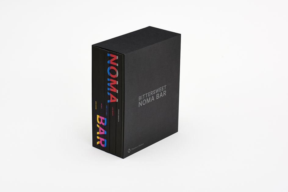
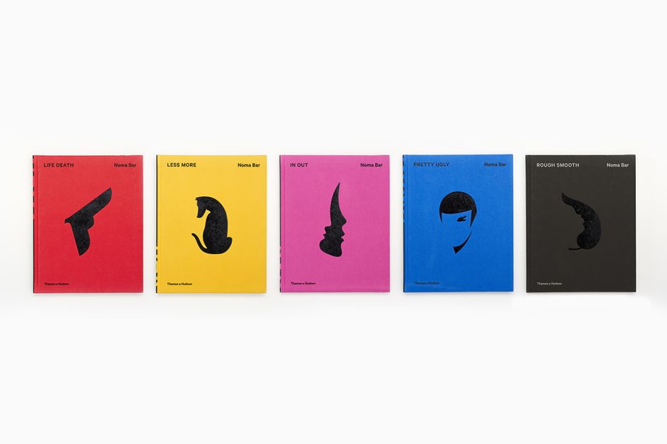
The Israel-born graphic designer and illustrator has produced illustrations for publications such as The Guardian and New York Times and for book covers for Don DeLillo and Haruki Murakami. He's also created ad campaigns for Google, Sony and Nike, and has published three of his own books to date, including his most recent monograph, Bittersweet. We spoke to Noma about this and much more.
You have a new monograph out called Bittersweet. Are there any illustrations or projects that especially stand out for you?
I suppose I’d have to choose William Shakespeare, as it was one of the first projects that established what I’m doing today. At the time, I was going on holiday and almost didn’t take the job. Then the question sprang to mind, “to be or not to be?” and that formed the basis of the artwork. I chose “to be” and sent the final portrait just a few hours later, and still managed to catch my flight to Italy. I love it because every time I look at it, I smile.
The other project that stands out is Cut the Conflict, a series that explored the conflict between warring nations. That was very well received.
Another favourite is an illustration I created for The Guardian in 2008 for an article on men with small penises. The whole page was empty apart from some white negative space in the corner which transforms into a thumb-sized image of a small penis. It shows that an illustration doesn’t have to be super crafted, full of narrative or detail; it can be an empty page with just a tiny hint at the story. This stands out for me, as it questions what illustration is about. I’m very happy with this particular project. Everyone at The Guardian still remembers it. Normally, an illustration of a story like that would be a guy with his head in his hands, looking anxious or frustrated, but this version was subtle. Different.
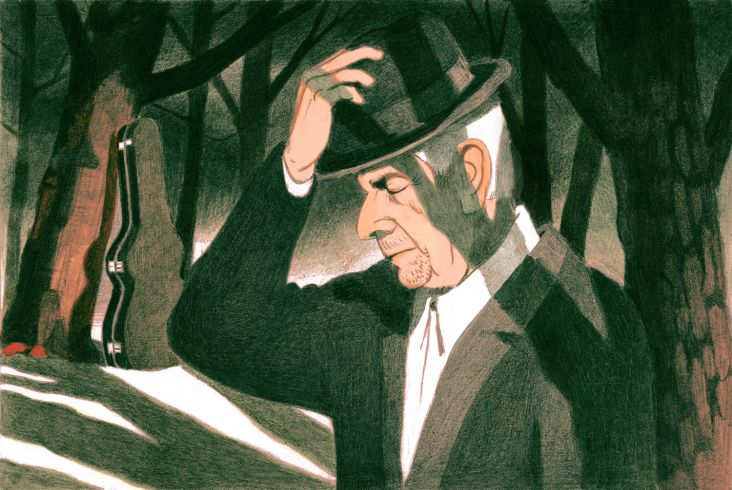
There is another one I really like. It was an editorial piece for a newspaper on the Israeli-Palestine conflict called Wolf and Sheep. You see a sheep at first, but look again from left to right and you spot a wolf. It’s about two sides living together – it doesn’t suggest who is the wolf or who is the sheep. It’s quite open.
I like it because you read it from the right to the left and the left to the right. This double direction appeals to me. I studied Hebrew and used to read books from the right to the left, and I still do that, even though I now speak English and often read from left to right. You can find this sentiment in a lot of my work.
One other project was an animated ad for NewYork-Presbyterian Hospital called UnMasking a Killer. It tells a story of immunotherapy – a radical treatment for cancer, something that not many people know about it, which is offered at this particular hospital in New York. The ad ran during the 2016 Super Bowl and was seen by over 40 million people. It had an amazing response and informed so many people of the innovation. It was also fun to make because it brought my illustrations to life, turning one negative space into something new – always moving and evolving.
You have a very unique style. How did it come about?
I think it’s still developing. Every day, it’s changing. But it began with my move to London when my English wasn’t great. It’s still not good, but I was worse back then. I had a portfolio full of Hebrew and quickly discovered there’s no demand for that.
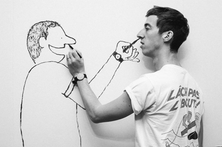
So I went back to basics and started to draw my hands, my fingers and my face. I reverted to what I was drawing before college. Of course, I’d always enjoyed portraits. I tend to stare at people and study their faces. I like picking out odd details like gaps between the nostrils and the expanse between the nose and the upper lip.
In fact, if you have the limited edition version of my book, Bittersweet, then you’ll find a little booklet inside that contains some of my portraits that I created when I was eight or nine years old. I think my style stems from back then.
When I moved here and couldn’t speak English, it was helpful to remember my childhood. The angles, the details, the negative space, and a focus on the graphical elements – when I couldn’t find the words, I would build narratives by using symbols and shapes only. I’d tell a story with images only.
This lack of words, the ability to say something without saying it – it’s hugely enjoyable. To look for different ways to communicate. I always loved Charlie Chaplin and those silent movies, for example. How they say a lot without saying anything at all.
Is that where some of your inspiration comes from?
When I’m using words, I feel like they’re not the right communication tool for me. The natural place would not be on the stage to give a talk about my work. I prefer using strong visuals and images to tell stories.
Now I’m moving into animation and that’s an interesting development because it requires a different approach and new tools. It’s quite challenging telling a story when there imagery is always moving.
Are you a man of many words? Are you a quiet character?
I don’t think I’m a quiet person, no. I think I’ve naturally become quieter over the years. Maybe the work has changed me. But if I’m out socialising, it’s quite a different matter. I’m not the one hidden in the corner.
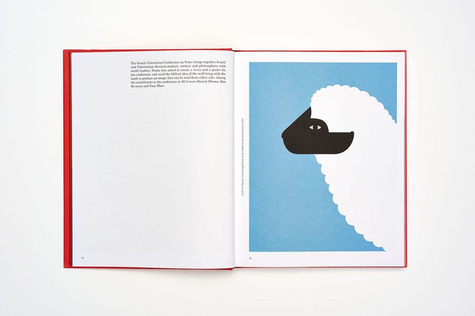
Wolf and Sheep
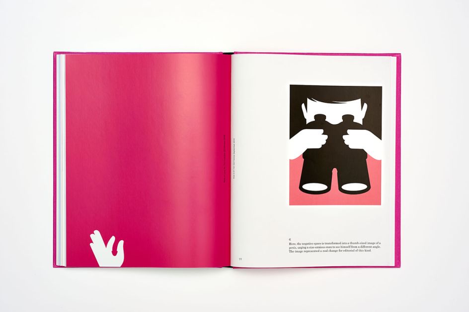
The Guardian
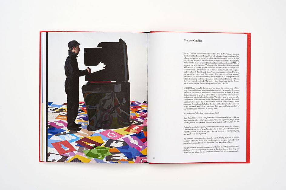
Cut the Conflict
So when did the big break happen for you?
I think my first book, Guess Who?: The Many Faces of Noma Bar, in 2007 was a significant moment for me. At that time, blogging was really kicking off. My work was reaching more people than ever before. It helped to be there at the start of the Internet. Things just happened all at once.
What’s changed since then?
Plenty. Before the Internet changed everything, I’d often meet art directors at national newspapers, like The Guardian, for a coffee or beer to talk through my portfolio. But today, I can just send things by email.
Where you’re based doesn’t matter anymore. It’s amazing that I can now work with 20 countries at the same time. I have clients in Australia, China, Japan, America, UK… it’s great.
Just do good work. Be original. Be yourself. And then people will react to that.
What’s worked well for you in terms of getting your name out there?
There was never any strategy. I just do what I do, and my work goes out there and people see it. Working for editorial publications certainly helps as I get a lot of exposure. Each image is almost an advertisement of my work.
I’ve never had a proper website. Just a holding page. I’ve never taken out an ad or promoted my work. I guess one thing leads to another. It’s all been very natural.
What advice would you give to aspiring illustrators?
Just do good work. Be original. Be yourself. And then people will react to that. Although that’s probably not great advice for everyone, it worked for me.
So it’s about having integrity then? Being picky about the work you take on?
It starts with ideas. If the client doesn’t want me to bring my own ideas to the table, then I’ll probably not accept the job. If they just want me to draw something specific… a bike or an apple, it won’t work.
I’ve realised from the beginning that I want to tell stories with my images. I don’t want my work to be ‘what you see is what you get’. In which case, sometimes it hasn’t worked in my favour.
There's a real art behind choosing which projects to take on. So yes, it's about integrity. You need to believe in the project. The client needs to be on your side and understand and respect what you do.
Editor's Picks


Trending


Podcasts


Editor's Picks
Further Reading
](https://www.creativeboom.com/upload/articles/20/202bb4ac35811567ca041d3112c768635d1d41f1_732.jpg)