James Fooks-Bale, creative director at Monotype, on what it takes to be a great type designer
James Fooks-Bale, creative director at Monotype, took an unusual route into typography. He spent about a decade working in fashion; and is now celebrating around 10 years in the type design industry.
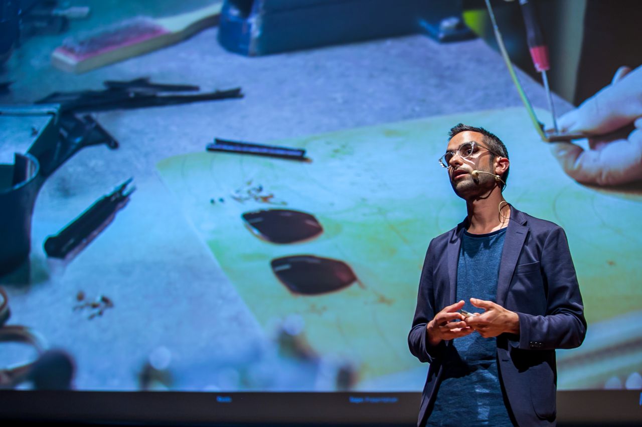
James Fooks-Bale, creative director at Monotype
He worked at Burberry, spending some time working for Lee Alexander McQueen. "McQueen was in the business of selling a vision, taking you to that place, not products," says Fooks-Bale. "It's that level of passion and belief that I've always tried to surround myself with; I think without it, we're being starved."
His interest in lettering is in its ability to "define expression" across everything from a brand, to a product, a political party or a person. "Type is one of those forms that everyone identifies with, whether they know it or not," he says. "Over time, it's somehow managed to transcend cultures, borders, languages, beliefs, age, time, surfaces, and trends. What other medium connects us all like type? Letterforms were built initially to record meaning, make sure that meaning doesn't get lost, help carry a voice, and share."
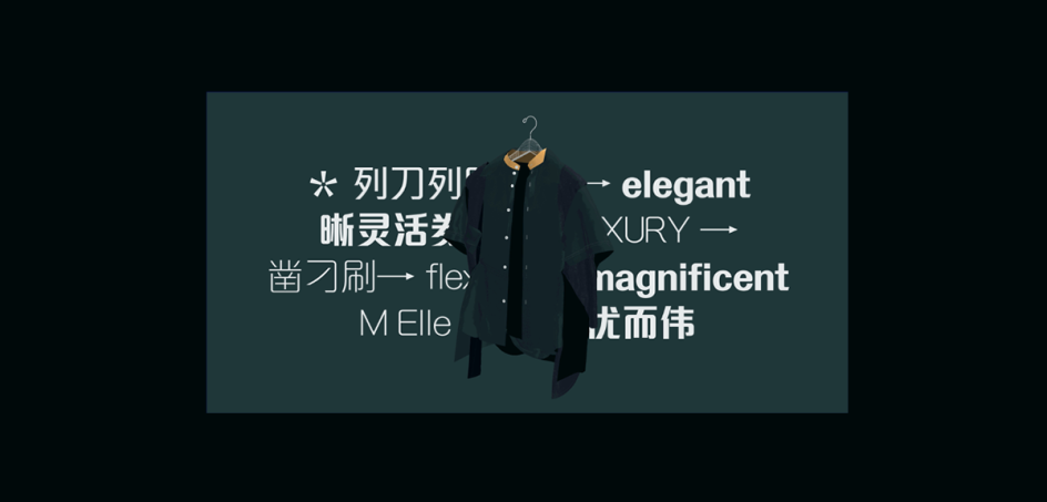
M Elle
For him, an excellent typographer is one who's curious, finding inspiration everywhere from gravestones (!) to social media trends, and who's "extracting every single bit possible out of the ingredients they have to play with"; creating designs that can reflect values, push them further, or contradict them. Ultimately, such letters have the ability to form messages in readers' subconscious, over and above the messages they can read on the screen or page.
Here, he chats to us about Monotype's new variable font version of Futura, type trends, what it's really like to work at Monotype and more.
How did you get into type design?
I started as a typographer, studying at Reading University with some incredible mentors like Gerry Leonidas, Gerard Unger and Paul Stiff. I had always wanted to get into design but first felt the need to get my head around one of the key ingredients of communication, fonts, and typography. From there, it was reasonably straightforward to get hooked on the details and evolution of the type industry, the font selection process, and the use of type. I've given type design a go but prefer working with the type designers to take the tools they build to experiment in application.
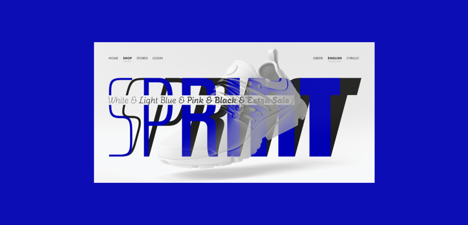
Future Now
What's a typical day like for a designer at Monotype?
It’s fast, iterative, and always a different day here. The industry moves at pace through technological advancements, cultural and ascetic progression, and of course, the way brands need to communicate across borders and a growing number of surfaces. Today, for example, starts early collaborating with some of the India team on one of our products. Following that, we took on a new brief for a new typeface release, looking to understand the angle, feel, and application for public use.
Our team are the test pilots to some extent. Working closely with one of our agency clients, we're building a narrative for a deep dive into type to help push the possibilities for type across their group. A large part of the teams I work with are based in the states, so things properly take-off around lunchtime. When I'm not in a meeting, I tend to be writing, working on a talk track, sketching out something or other, or collaborating with the various creatives minds here at Monotype.
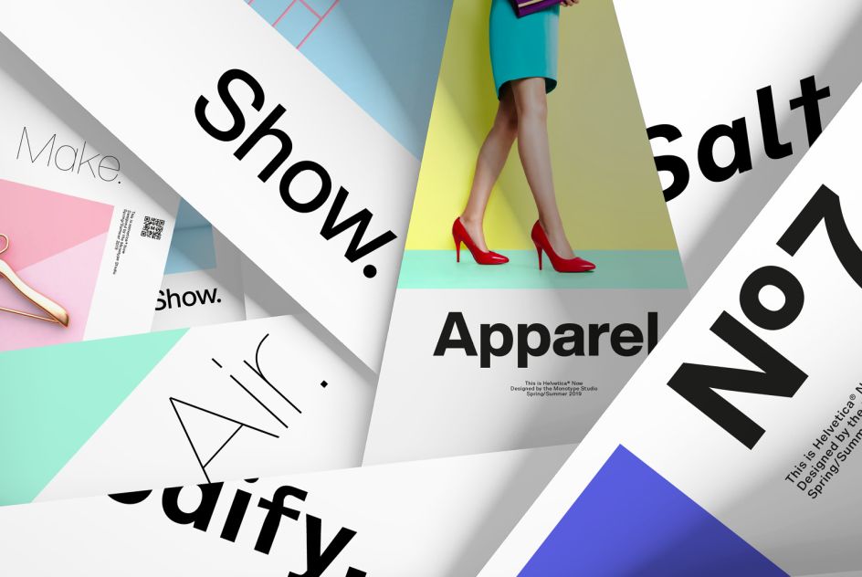
Helvetica Now
What does it take to be a good typographer?
Ultimately it's up to the typographer to set meaning in the minds of the readers' subconscious, not just the screen or the page. Typographers help define the visual expression; for a brand, a product, a political party, a story-teller, and an educator. When we read information, letterforms subliminally convey a message, a personality, and an aroma. Our subconscious relates to certain letterforms with specific themes or ideas. Done right, type choice can reflect values, push them further, or juxtapose with them. The use of that type makes a difference. A great typographer will squeeze everything out of the tools they chose to help push meaning, build relevance, make things easier to understand, and bulletproof across many devices and outputs.
Curiosity goes a long way. I guess typography is no different from other parts of the industry. One of the easiest ways to go deep or wide in typography is to surround yourself with other perspectives. It is not just in the type industry, but in the surrounding design disciplines that shape how people consume content. The more diversity in your collaboration and learning, the better.
FS Rosa
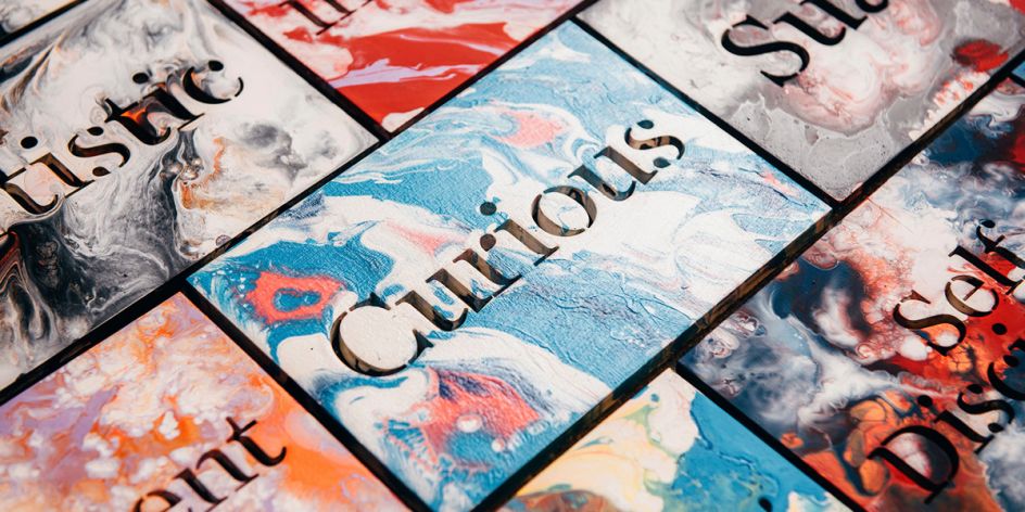
Curious
Why did you decide to create a new version of Futura with a variable font included?
Futura was, and still is, a movement. It defined modern typography in its day and still does, with many brands leaning on its visual voice. Since its original inception in the 1920s, obviously, a lot has changed in the production techniques we use and the typographic demands needed to withstand what a designer needs from their type today. Futura Now was a commitment to become the definitive version of Futura. For me, some of the major features that separate it from the original are the spacing, the additional weights, the display styles, and particularly the variable capability.
How are you seeing people use variable fonts, and how do you think designers and brands will be using them in future?
Variable type has gotten a lot of typographers and designers excited over the last couple of years. In brief, variable works by defining the boundaries of the type design space and then automatically interpolating the spaces between. Variable fonts allow a seamless and seemingly infinite choice of weights and widths. It's something that many people are toying with right now, and the possibilities for what variable can do within the brand and design worlds are fairly unexplored yet—open to the pioneers.
Macklin
The most exciting of possibilities for me is connecting the design to data or sensors to create completely new experiences. How do you apply font outlines that are more fluid and can respond to scale in communication or type that can listen and adapt to sunlight's angle or levels on your tablet or phone? Most of us now carry many sensors in our phones, ambient light, Gryoscope, GPS, Accelerometer. And then, of course, our personal preference settings. Sound, gesture, temperature, light, or pretty much any sense we have as humans could at some point in the future be visual traits of a brand through variable fonts.
What are your predictions for font design for the future?
We're in the process of putting together our trends report, so I'll sit on my hands for a moment. The industry and our clients move at a relentless pace, pushing evolution on an ongoing scale. Seeing brands through our different regions, across the industries we serve, and many of the brilliant minds we partner with on the client-side is an eye-opening experience and gives a pretty broad and in-depth view of where things are moving. I'd love to tell you more, but keep an eye out for the report in the coming months.
Ambiguity
Monotype fonts
Editor's Picks


Trending


Podcasts


Editor's Picks
Further Reading