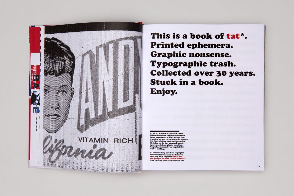
Inspirational graphic ephemera courtesy of Tat, a new book by Andy Altmann
As any graphic designer will know, creative inspiration is everywhere. From storefronts, books and interiors to packaging, fashion...even 'tat'. Yes, that glorious noun that describes junk, rubbish, debris or crap, essentially. Walk into any design studio and you'll spot tat pinned to the walls or placed with loving care on top of a computer screen. It's this 'tat' that designer Andy Altmann is now celebrating in his new book.
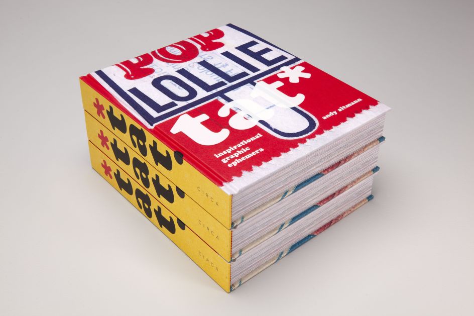
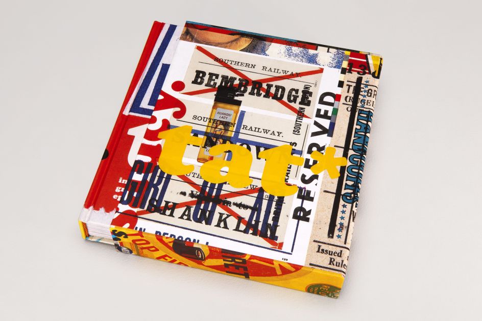
Simply titled Tat, the book features much of the graphic ephemera that Andy – co-founder of the former Why Not Associates – has collected over three decades, finding "inspiration in the ordinary and magic in the mundane", as he puts it. And how he's finally sharing his findings with the world.
It all began as an aspiring student when Andy decided to present a scrapbook of 'tat' instead of a sketchbook for his interview with Central Saint Martins. "I rummaged through the drawers at home and found some football cards from the 1960s and '70s (plenty of Georgie Best), an instruction leaflet from an old Hoover, Christmas cracker jokes… Then I started on the magazines, cutting out images of anything that interested me… and photocopied things from books before reaching for the scissors and glue," he explains. The habit has stuck ever since.
So what makes a piece of graphic 'tat' stand out? Is it the retro aspect? A fascination with a bygone era perhaps? Or a love of primitive printing techniques, naive design or the use of colour? "It's all of the above," says Andy, "but it's never quite that simple. It has to have that indefinable element of magic."
"I'm not really sure why I love 'tat' so much. I think I was attracted to graphic design by its ephemeral nature – much of it ends up in the bin. My dad was an architect and architecture always seemed to so serious," he continues. "Graphics felt like a much more frivolous occupation. At college, I learnt the rules of graphic design, about Swiss typography and how to execute it, etc. But my instinctive love was always towards the bright and brash nature of more ephemeral printed things.
"I found it very difficult not to pick up a fragment of a torn packet lying in the street if the typography or imagery was strong. If it was misprinted then it was even more attractive to me. Some tat can also be very inspirational. I kept many small scrapbooks of the stuff at Why Not Associates and I often flicked through them, looking at the typography and colour combinations, finding elements that would lead to a design solution or spark an idea. I’m hoping that people will find that kind of inspiration in this book of complete and utter tat."
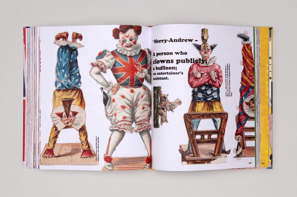
To a graphic designer, most of this book could be deemed as 'bad' design. But Andy thinks there's something unique and special in every piece, whether it was found in the street, online or in a "dodgy-looking shop on the other side of the world".
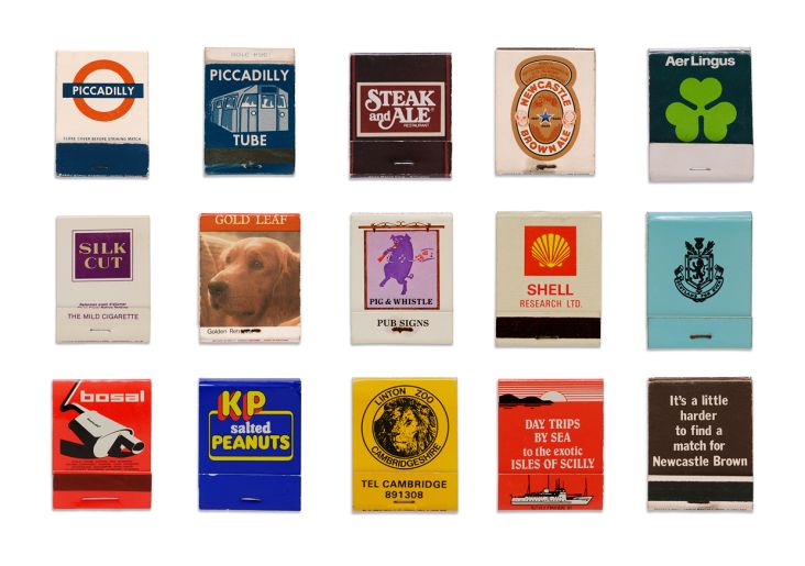
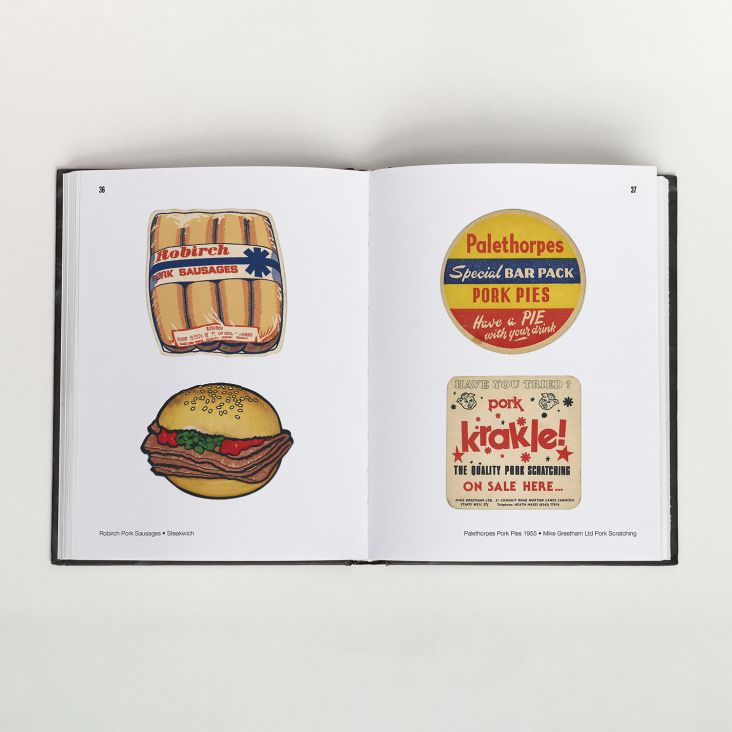
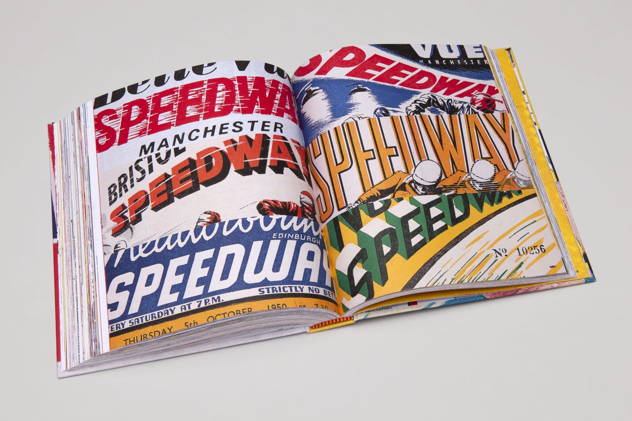
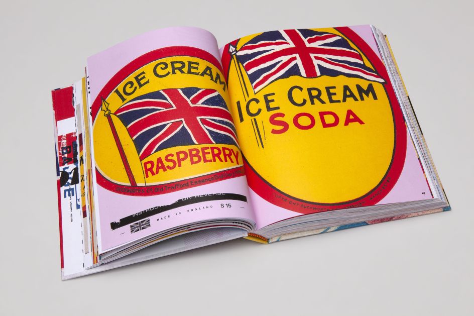
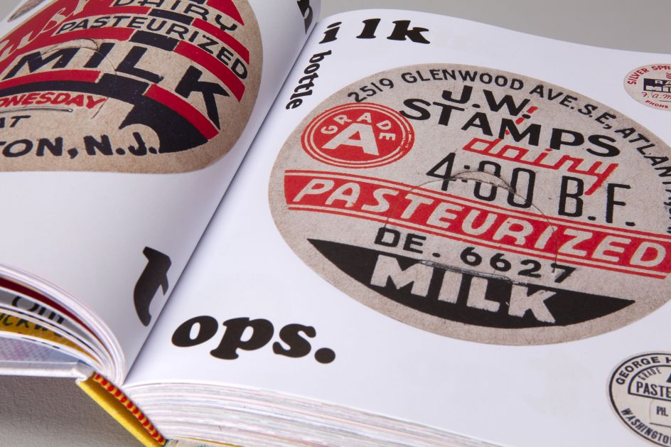
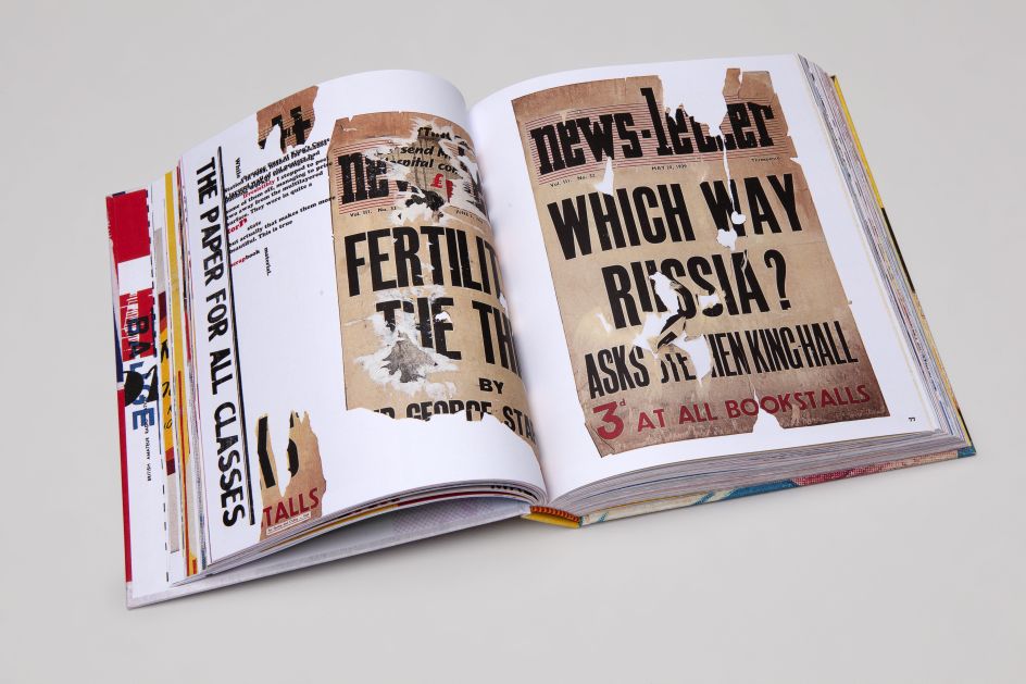
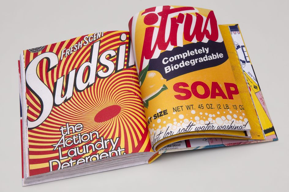
Inside its glorious pages, you'll find sweet wrappers, flashcards and soap powder boxes. There's also speedway flyers, wrestling programmes and bus tickets. "More tat than you can shake a stick at," as the book's description proudly reads. Brought together, it represents a lifetime of gleeful hunting and gathering.
Does he have any favourites? "I'm very fond of my soap powder box collection," Andy tells us. "They come from all around the world, not only collected by myself but also donated by friends and family from their trips abroad over the years. I'm especially fond of a Persil packet from the 1960s, as several generations of my family worked in the Persil factory in my home town of Warrington. I also worked there in the summer holidays while studying at Central Saint Martins in the early 1980s. I think that's where my fascination with the bold, colourful, blatant typography of such packaging stems from."
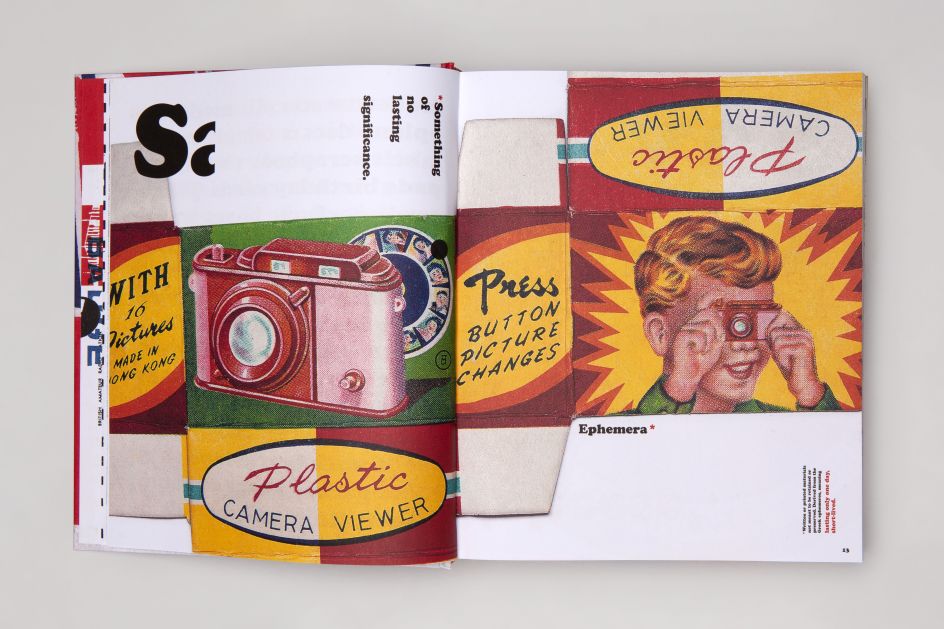
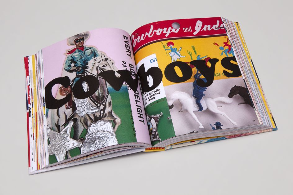
At almost 400 pages, Tat by Andy Altmann is a bit of a visual overload but it's a treasure trove of the eclectic treasure that often finds its way onto every graphic designer's desk. A celebration of a bygone era. An exploration of consumer culture and how it's changed over thirty years.
But are there any particularly embarrassing pieces of tat? "I was perhaps a little embarrassed to include some of the 'Tart Cards' that I had found in the telephone boxes of sleazy Soho, where Why Not Associates' first studio was located in the late eighties and nineties – just in case people thought I was a 'punter'! It was bad enough trying to look casual, as I quickly removed them from their Blu Tacked display on the inside of the kiosk windows. I was only interested in the wonderful naive design, crude typography and often humorous wording, however."
To grab yourself a copy, it's published by Circa Press and will be available to order from 1 April via circa.press.
Editor's Picks


Trending

](https://www.creativeboom.com/upload/articles/90/908fdb6378db1e95d12595416f54e6336d5e80b8_732.jpg)


Podcasts


Editor's Picks
Further Reading