Guide to Iceland is the new gold standard for travel websites
Finally, a travel website that's actually enjoyable to use! Discover how Guide to Iceland makes it easy to plan a bespoke trip and learn how it was created.

Package holidays are great, but sometimes it's more fun and rewarding to book your own bespoke trip, which you can tailor to your own particular needs, interests and schedule. There is, however, one common downside to this approach: the amount of time, energy and stress involved in organising separate hotels, flights, car hire, day trips and more.
Why, you often think, isn't there one single, easy-to-use website where you can organise all of these things at once? Well, the great news is that, if you're visiting Iceland, there now is!
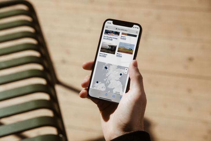
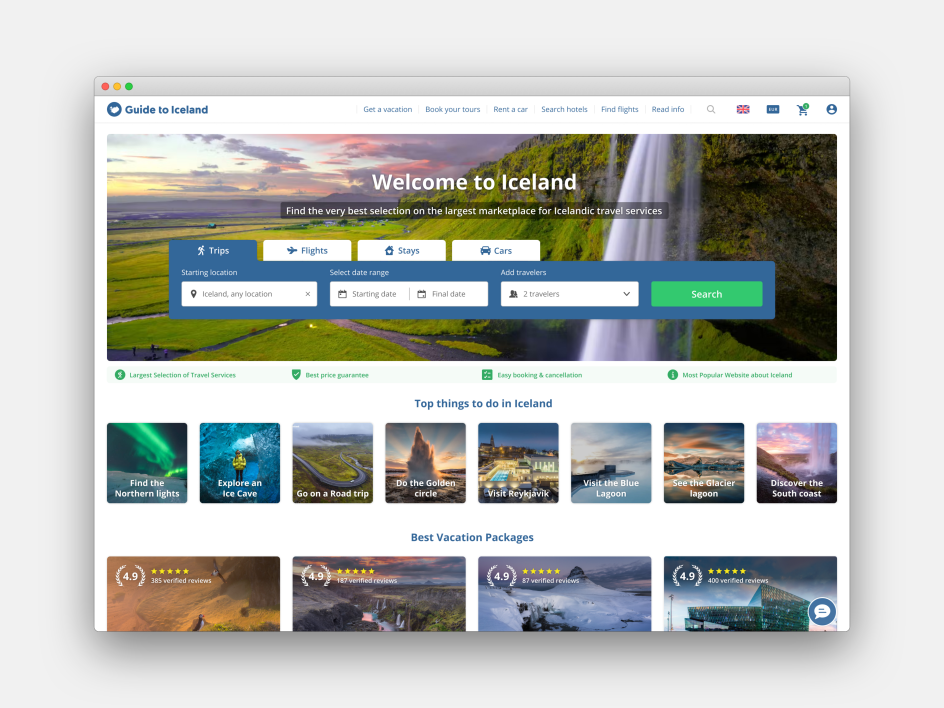
Guide to Iceland makes it simple to access the best Icelandic travel services, within one clean, uncluttered interface. So rather than making you tear your hair out, planning a trip can become part of the fun.
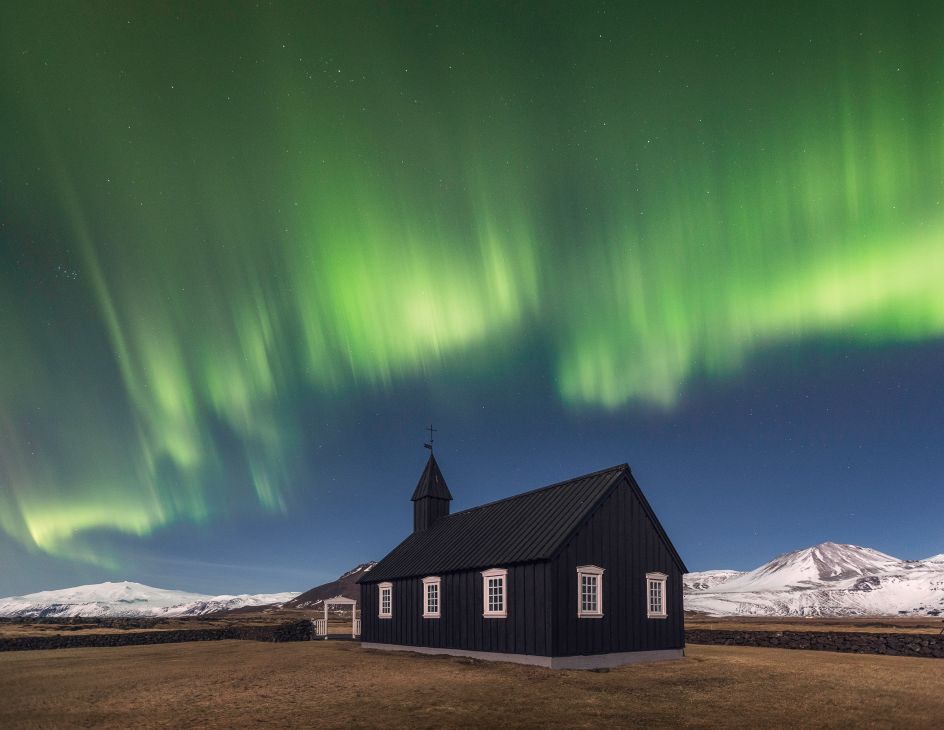
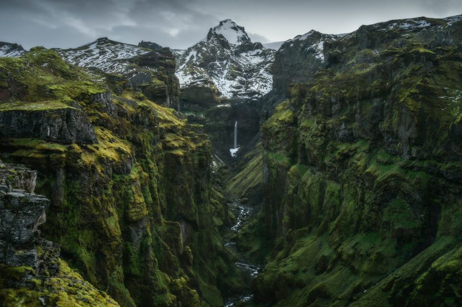
Even if you weren't thinking about heading to Iceland, maybe you should. It's only a short flight from the UK, and despite being just outside the Arctic Circle, it has a temperate climate thanks to the warm winds of the Gulf Stream. This means that whether you want to bathe in the Blue Lagoon, trek across epic ice flows, see star-filled dark skies and the Northern Lights, or just chill in the hip bars of Reykjavík, there's very little stopping you.
Best of all, the Guide to Iceland website makes it a cinch to plan the perfect trip for you. We love it so much, in fact, that we chatted to designer Kjartan Trauner to learn how he made it.

Initial concept
Kjartan begins by outlining the initial aims for the site. "We wanted to be the first travel website to offer the same booking process for all travel services," he explains. "So the user only has to get familiar with one funnel to know them all. By streamlining all funnels on our site, it's super-easy to book any product and manage everything in one place."
Nice idea: but putting it into practice can't have been easy. How did he go about it? "I started with selecting a grid," he recalls. "In this case, it was a 12-column grid, adding breakpoints for different screen sizes and spacing rules. With this strong foundation, it was easy to start designing well-structured, intuitive visual designs."
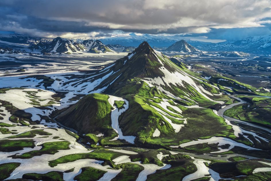
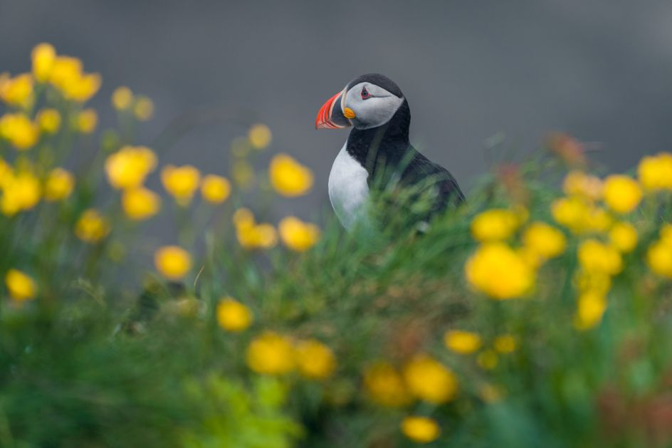
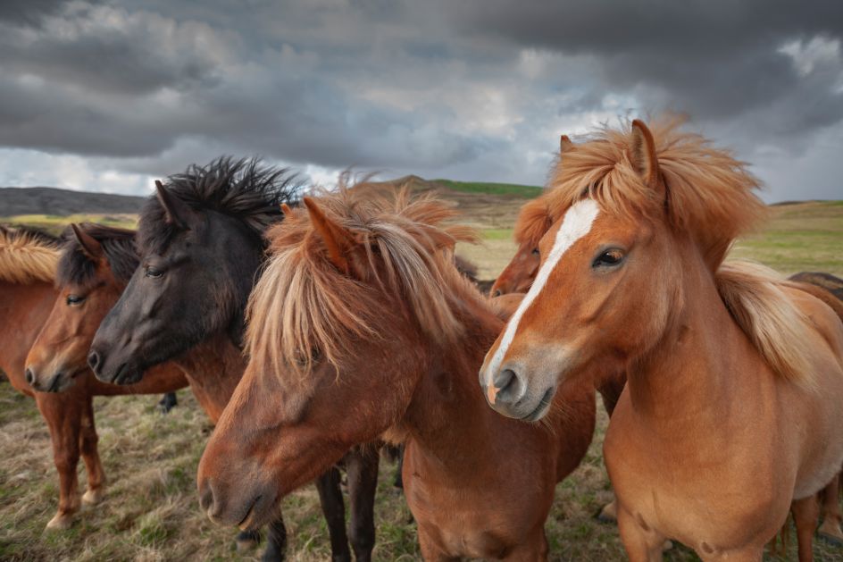
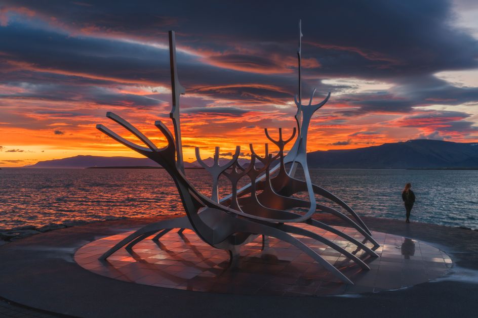
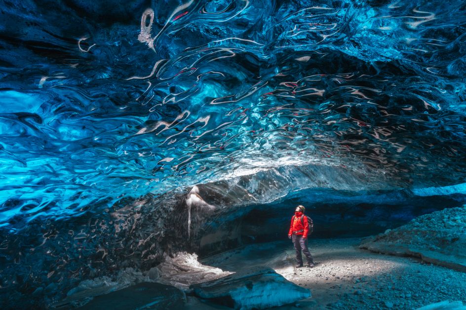
Luckily, he had lots of strong imagery to draw from since one of the company's founders is Iurie Belegurschi, one of the world's top nature photographers.
"Iurie also has a strong team of professional photographers documenting the wonders Iceland has to offer," says Kjartan. And he was keen to make good use of these images. "Guide to Iceland is a very visual website, and I wanted to stay true to that," he says. "We are, after all, selling experiences, and a good image paints a thousand words."

Kjartan Trauner
Speed and simplicity
The beautiful imagery was teamed with clean, clear typography courtesy of Open Sans, a Google font that boosted the site's speed. "I think, in general, clarity is the key to having an appealing and successful website," he explains. "If the first thing you read on the web page summarises what's to follow, you are more likely to spend time on the page. Beauty sparks emotion, and in the end, travel is about experiences and emotion."
Technically, too, simplicity was of prime importance. "Travel is a tricky subject to tackle because there are endless variables depending on location, individual preferences and constant changes globally," Kjartan explains. "Access to a stable internet connection varies a lot, that is why we focussed on a lightweight site. We implemented various solutions to ensure you can use the site with even the weakest connections. That is why we developed a Progressive Web App, for better accessibility and performance."
Tools and testing
Figma was the main tool Kjartan used to craft his designs. "It's a great tool to collaborate with a team located around the world," he says. The development team and the department heads, meanwhile, used React.js to develop and build Kjartan's designs into a working website.
The team did some user testing to get detailed information from new users. "Plus, I think what is unique about our company is the agile testing we do ourselves," adds Kjartan. "Everyone in the company has a voice and is encouraged to challenge elements and the behaviour of the website."
Ironically, the final result looks so simple and straightforward that some might think it didn't involve much work at all. But anyone who's worked in web design will understand the opposite is true.
"Growing up using Apple products, I think I need to quote Steve Jobs here: 'Simple can be harder than complex'," says Kjartan. "The more time I spend on designs, the more I realise the importance of 'less is more'. And I always try to revisit designs with an open mind. Nothing is perfect; the world changes, and you have to be agile and open to improvements every day."

Editor's Picks


Trending


Podcasts


Editor's Picks
Further Reading