How designers can help brands to stand out by tearing up the rule book
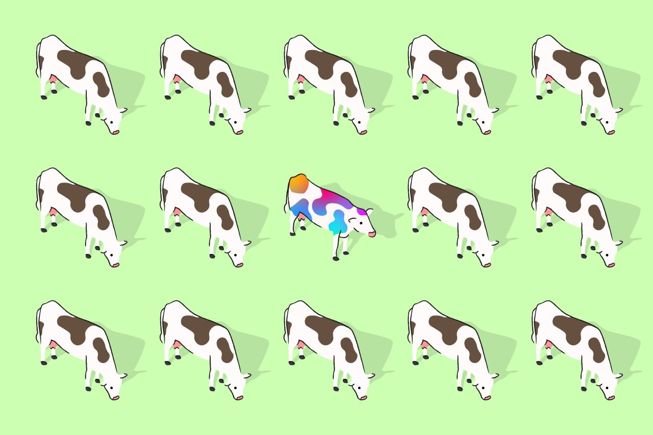
Since farmers started branding livestock in 2000BC, branding's primary role has been to make a product, service, organisation or cow uniquely identifiable. Why, then, is so much of modern identity design so indistinguishable? And how can we fix it?
Everyone knows that standing out is good, right? If you work in the world of design and branding – either as a creative, a client, an agency or a brand owner – your job is to help the brands you represent get noticed and remembered.
Why? Because the more people notice and remember a brand, the more likely they are to choose it when they're ready to buy.
And what's the easiest way of getting noticed and remembered? Be different. The Von Restorff effect demonstrates that an item that's notably different from the rest in size, colour, or other basic characteristics will be more readily recalled than the others.
This isn't just theory, as anyone with a passing familiarity with the work of Byron Sharp or Jenni Romaniuk will know. And it shouldn't be a surprise to anyone who has watched the rise of Oatly, BAYC, Lego, Tesla or (sorry to say) Brewdog. All brands that - in different ways - aren't afraid to stick their neck out.
Being different pays.
So why are we scared of standing out?
But if everyone knows this, why does so much of design and branding shy away from difference?
This is not a new observation; Bloomberg's Ben Schott wrote a much-discussed piece on 'blanding' in 2020. Since that article, identities have gotten a bit weirder. Spikier typefaces, lots of abstract 3D, and everything feels a bit more web3-y. But they've evolved in such a homogeneous way any new ideas have been quickly copied. Each new identity feels like an incremental remix of what's gone before.
Why does so much contemporary design look so similar?
As designers, clients, brands and agencies, we've allowed ourselves to be persuaded that certain types of products need to look a certain way to be successful. We've let people who should know better convince us that 'category codes' are carved into granite, rules never to be broken if you want to avoid a Tropicana style disaster.
And in our obsession with staying relevant to audience groups that have been smooshed together into gigantic cohorts with supposedly homogeneous traits (Gen Z makes up 30% of the world's population), we've fallen foul of trends and become tied to mood boards, constrained by vibes.
This is 'design by hashtag'.
Change your mind
As an industry, we can do better. Much better. And the best thing is, it won't actually be that hard. Because so many brands look so similar, standing out will be easy. It just requires a change in mindset.
1. Reframe risk
First of all, we all need to think about risk differently.
Creating design work that blends in with the competition is a surefire way to ensure the work will underperform. That's not 'safe'. It's stupid.
In that context, creating something that stands out doesn't seem particularly risky, does it? 'Brave work' is – when you think about it – just another way of saying effective work.
And look, I'm not talking about being reckless here. You still need to think strategically, and you still need to create work that will resonate with your audience. But if that points you to make the same creative decisions as your competitors, the strategy's probably not the right strategy.
Get everyone bought into a different way of thinking about risk, and you're setting yourself up for success.
2. Identify the rules you can break
Every category has conventions. Some are helpful and give you a shorthand to help people understand the product. But the more conventions you embrace, the less chance you have of anyone noticing you.
We did some work in the recruitment category a while back, and it was hilarious how similar the brands all looked. Same colours, same typography, same language, same illustration styles. Stick your thumb over the logos, and they were literally indistinguishable.
So think about different ways you can break those conventions while retaining just enough not to confuse people. Which ones are helping? Which ones can you break to show how you're different?
The smartest brands do this well. Tony's kept the fun of chocolate but added purpose and a fresh aesthetic. Nuud and Cashapp kept the category colours for gum and fintech but created a wildly different design language. Dead Happy and Liquid Death went further, turning everything upside down (diced with death?).
3. Bin the mood board
Mood boards have a lot to answer for. While they have their place, if you're defining what something looks like by compiling a curated page of stuff that's already out there, it seems pretty unlikely that you'll end up with anything new.
Elizabeth Goodspeed expands on this in her lament of the sameyness of modern art direction. She writes, "ubiquitous styles operate less like trends and more like memes; remixed and diluted until they become a single visual mass. In today's extremely-online world, the vast availability of reference imagery has, perhaps counterintuitively, led to narrower thinking and shallower visual ideation".
It's hard to argue. Mood boards are the echo chamber of the design world.
4. Hero the idea
If you can cut your addiction to the reassuring familiarity of the mood board, you're much better placed to let the idea guide the work.
So when you get your creative brief, forget the aesthetics. Go looking for an idea that communicates the strategy.
The bigger and more conceptual the idea, the greater power it has to inform creative decisions and create something genuinely distinctive.
At Ragged Edge, the ideas for some of our recent projects include A Not-So-Secret Society, An Evil Future Corp and an Emporium of magic.
More broadly, we've seen it done successfully by Simulate (a vegan chicken nugget brand reimagined as a shitposting tech company), Habito (a mortgage company realised as psychedelic heaven), or Burger King (fast food as a return to 70s wholesomeness).
Once you have the idea, it's easy to make the rules for that world. And the design decisions follow. Suddenly you're picking typefaces, illustration styles, and graphic systems because of what they communicate rather than because they're on-trend or look cool.
Embrace the unfamiliar
But perhaps it's simpler than all that. Perhaps it's just a mindset. An ambition. Nobody gets into design because they want to make stuff that looks like everything else. So think of this article as your justification to go out and make things the world has never seen before.
Express yourself and lean into what's different. Your clients, bosses, brands, and customers will love you for it.
Further Information
This article was written by Max Ottignon, the co-founder of branding agency Ragged Edge, where he's spent the past 15 years helping brands drive change globally. He's built his career on challenging conventional thinking in the workplace and in the way the branding industry works.
Editor's Picks


Trending


](https://www.creativeboom.com/upload/articles/90/908fdb6378db1e95d12595416f54e6336d5e80b8_732.jpg)
Podcasts


Editor's Picks
Further Reading