March has been a bruising month so far. Energy bills are climbing, markets are rattled, and the conflict in the Middle East is casting a long shadow over an already anxious global mood. At times like these, it might seem frivolous to talk about typefaces. But actually, I'd argue the opposite.
Design that is thoughtful, durable and rooted in genuine craft matters more than ever during periods of instability. And this month's typographic releases make a persuasive case for that position.
A compelling theme emerges across several of the strongest entries: the past as raw material. Neville Brody reaches back to revolutionary agitprop and constructivist brutalism. Fred Wiltshire riffs on an 1880s Herman Ihlenburg display face. ALT.tf revives lettering from a 1972 feminist text. Rubén Fontana synthesises centuries of calligraphic tradition with sculptural precision.
In each case, the historical reference functions as a starting point, not a destination. Perhaps it's no coincidence that, in uncertain times, designers find themselves reaching for anchors.
Elsewhere, systems thinking dominates. Mark Caneso's Please evolves across three subfamilies, each carrying a distinct typographic voice. CoType's Aeonik Soft extends an established, well-respected superfamily into an entirely new emotional direction.
Whether you're drawn to display faces with genuine cultural backbone, type families built for tomorrow's interfaces or serifs that balance formal ambition with everyday utility, there's plenty here to hold your attention.
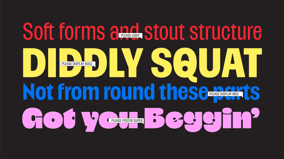
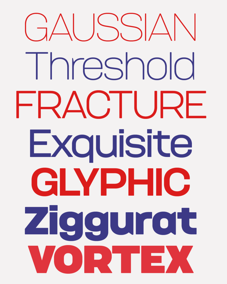
1. Please by Mark Caneso
Please began with a single letterform. For Mark Caneso of ps.type.lab, it was the double-storey lowercase 'a'; specifically, what happens to it under extreme weight. As the heaviness increases, the letter's counters begin to close in on themselves. Rather than fight this structural inevitability, Caneso leaned into it: merging the counters and asking whether the result still read as an 'a', and whether that even mattered if it looked compelling. That single experiment became the organising logic of an entire family.
The result is a type family of three distinct subfamilies—Please, Please Display, and Please Poster—each with a slightly different default character set and, therefore, a slightly different typographic voice. Rather than burying alternate glyphs in stylistic sets, Caneso built those variations directly into separate font files, making it straightforward to find the right flavour without hunting through OpenType features. Proportions also shift across the weight range: lighter styles feel gently condensed, whilst heavier styles relax toward more expansive forms, even as the overall character stays compact throughout.
At the extreme end—the Poster subfamily, running from Heavy to Jumbo—things get, as Caneso puts it, "delightfully strange". Exaggerated counters and bold shapes produce forms that hover between familiar and alien, functional and purely expressive. Ultimately, Please rewards those willing to push it, offering one typographic personality at comfortable display weights and an entirely different one at the limits.
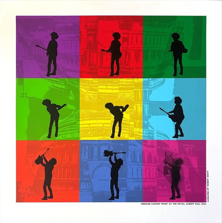
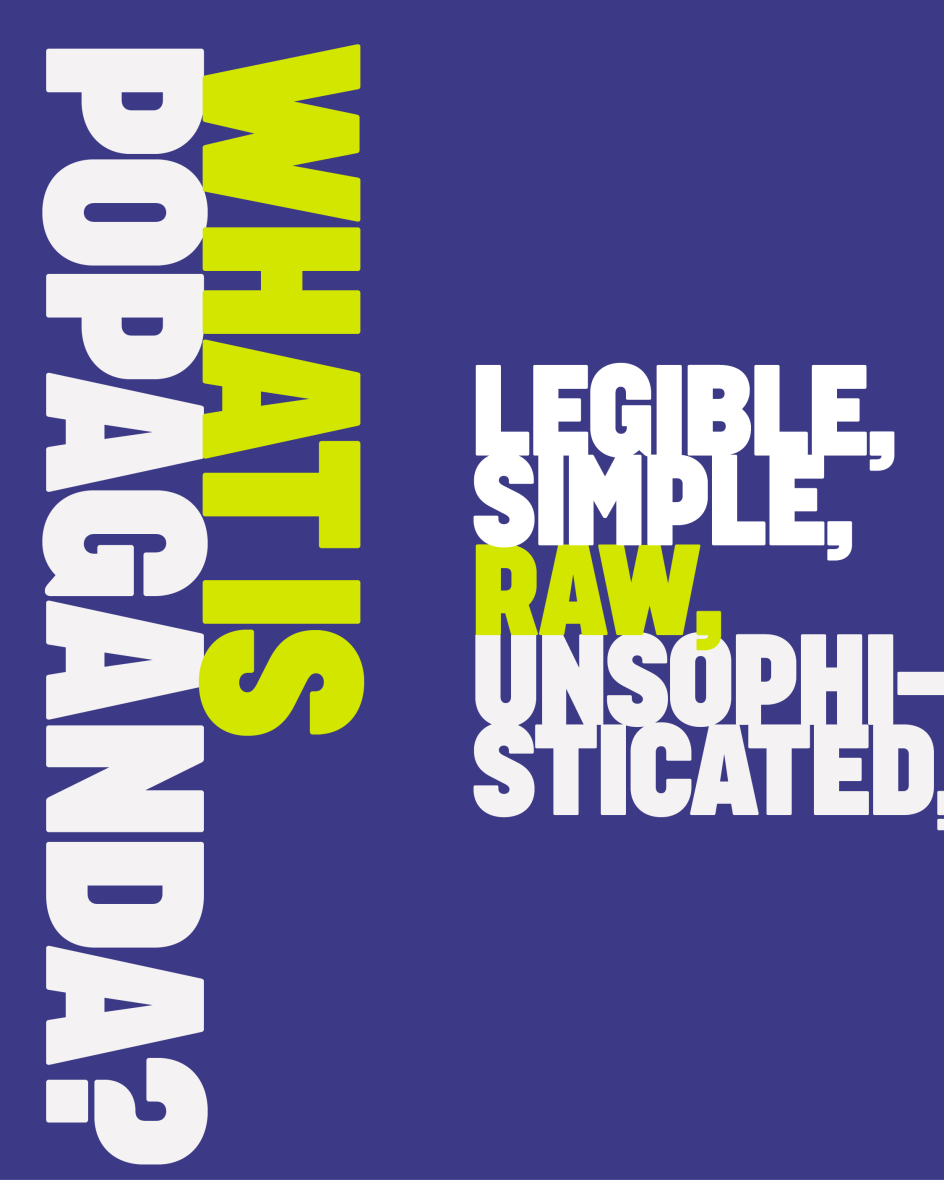
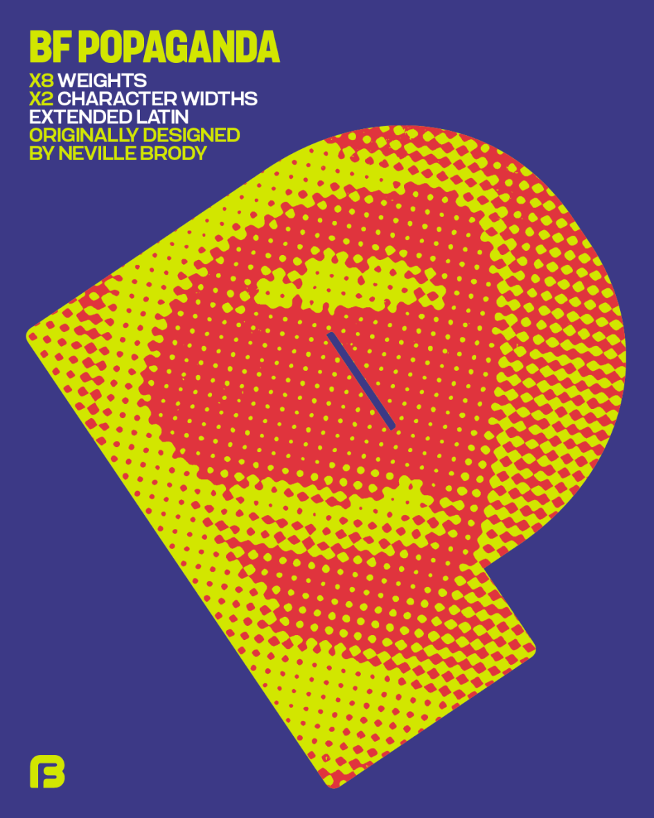
2. BF Popaganda by Neville Brody
Originally developed as part of Neville Brody's editorial design for Arena Homme+, BF Popaganda arrived at its form through an idea of concrete poetry: treating words and characters as heavy, impactful blocks that fill white space with weight, drama and emotional force. The typeface was deployed at poster and headline scale throughout that AH+ issue, its loosely geometric, constructed letterforms imbued with enough human touch to resist feeling purely mechanical or cold.
The visual DNA of propaganda posters, protest placards and agitational print culture runs through every letterform, but BF Popaganda is not a historical recreation. A large x-height and abbreviated ascenders and descenders concentrate visual mass in the mid-zone, amplifying the heavy caps and bringing genuine drama to headlines whilst maintaining legibility when deployed at text sizes. The tension between blunt impact and considered craft is what gives it its character.
Since its debut, BF Popaganda has been expanded into a broader range of weights, 16 styles in total, and is now available for purchase via Type Network for the first time. The expansion gives the typeface a range it previously lacked, making it adaptable across a wider span of applications without compromising its confrontational personality.
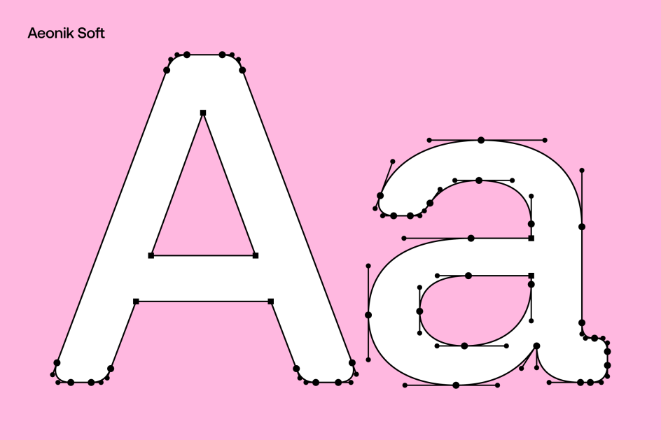
3. Aeonik Soft by Mark Bloom and Joe Leadbeater
CoType Foundry's Aeonik has built an impressive reputation, its geometric clarity finding favour among brands including Revolut, Eurosport and Alipay. Aeonik Soft extends the superfamily not by recapitulating its strengths but by interrogating them. Where the original is precise and clean, Aeonik Soft softens its terminals and corners, introducing warmth and approachability without disrupting the neo-grotesque logic underneath. It's an addition that makes the family more complete rather than simply larger.
This isn't a rounded typeface in the conventional sense. The mechanical backbone remains largely intact; what changes is its emotional register. Subtly curved corners replace the harder edges of the original, creating a version that feels more expressive and conversational, but never informal. The result is particularly well suited to editorial work, identity systems, packaging and children's content; contexts where Aeonik's modernity benefits from a gentler touch.
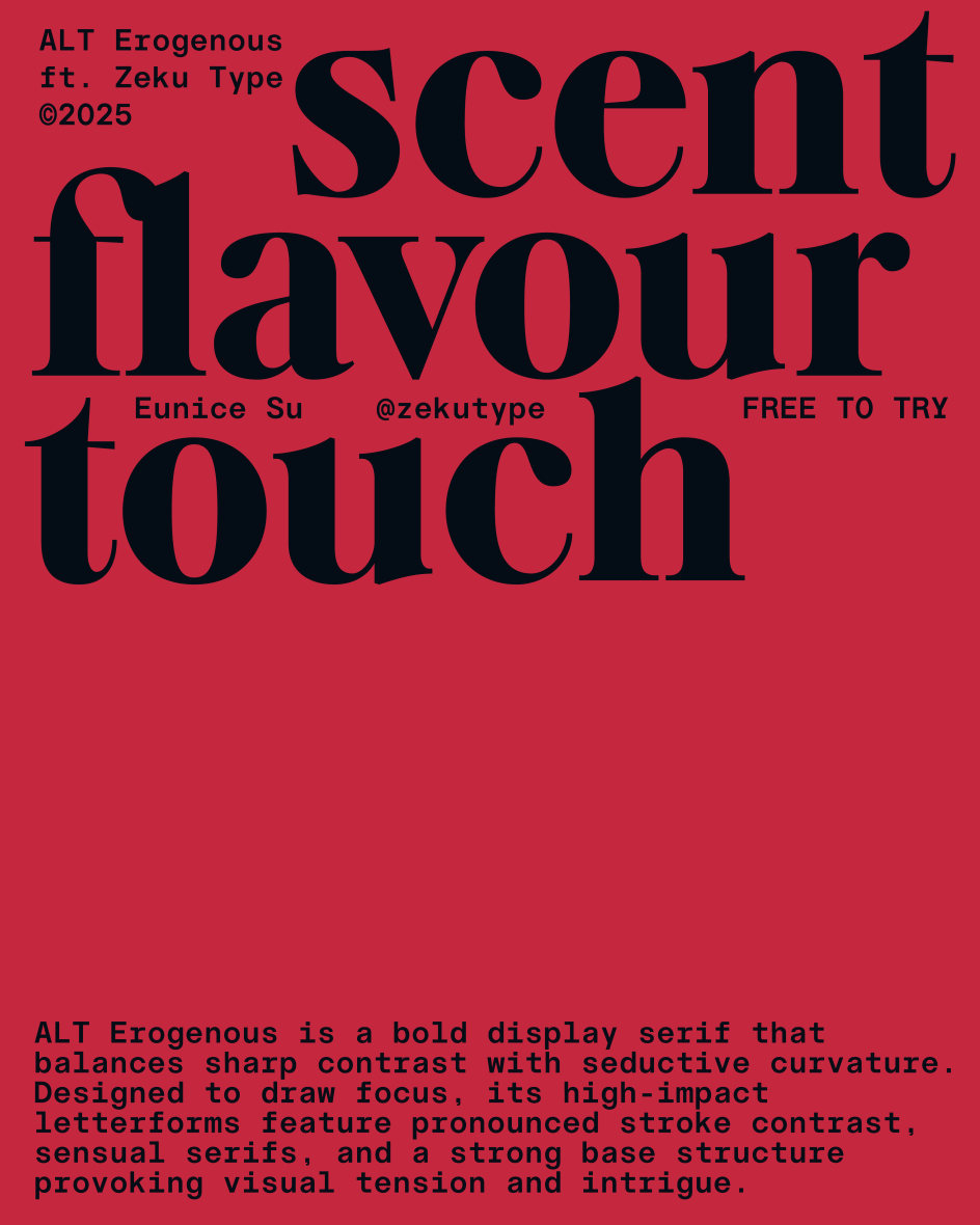
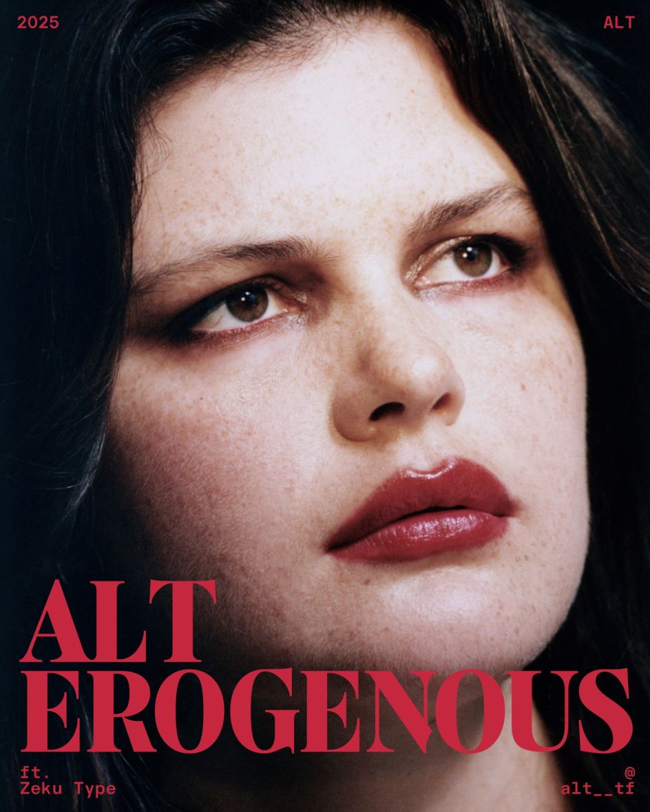
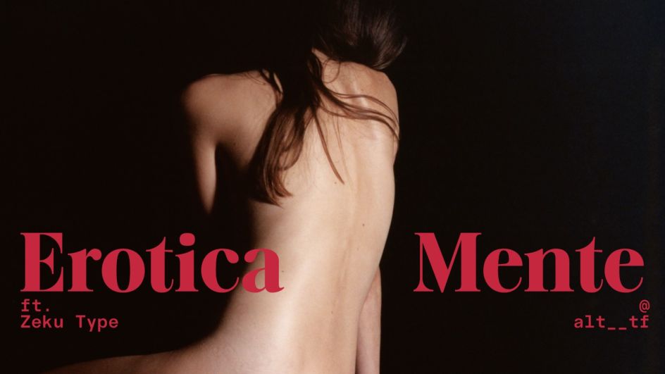
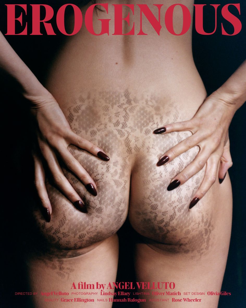
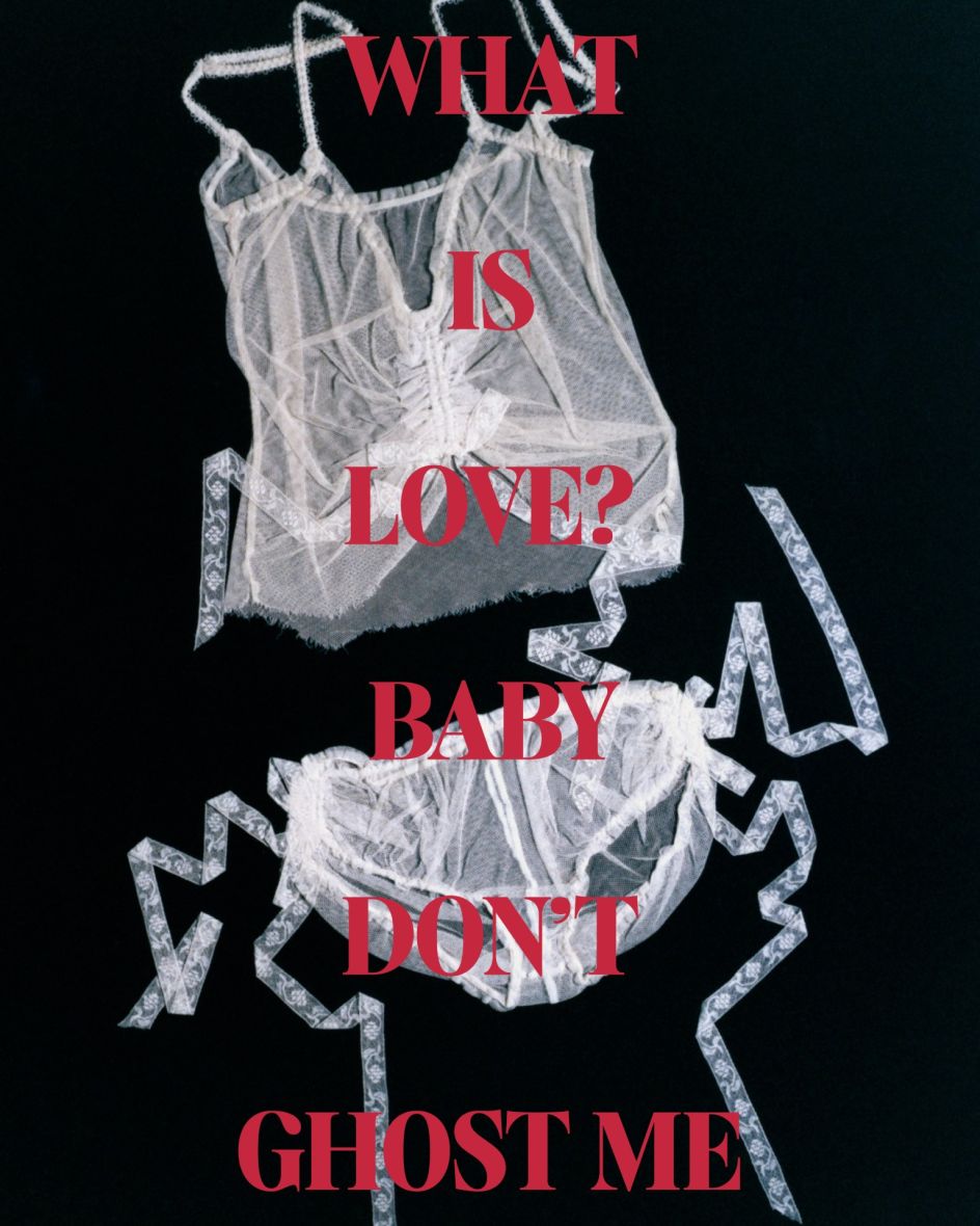
4. ALT Erogenous by ALT.tf & Eunice Su
ALT Erogenous begins with a book cover. In 1972, Ingrid Bengis published Combat in the Erogenous Zone, an influential text exploring female identity, freedom and emotional duality. The lettering on its cover (bold, charged, absolutely of its moment) became the starting point for this revival by ALT.tf, developed in collaboration with Taiwanese type designer Eunice Su. The typeface is positioned explicitly as "a typographic response to these emotional and social complexities, a way to visualise internal tension and cultural questioning through form."
As a display serif, ALT Erogenous works through controlled contrast. Sharp, high-contrast strokes sit alongside seductive curvature; stylistic sharp terminals contribute to a visual tension that feels simultaneously confrontational and refined. The strong base structure anchors forms that might otherwise feel too volatile, creating a typeface that is emphatically designed for unapologetic display use.
ALT Erogenous works at its best when given room: a single word at poster scale, a masthead, a campaign headline. In those contexts, the tension between vulnerability and resilience finds its fullest expression.
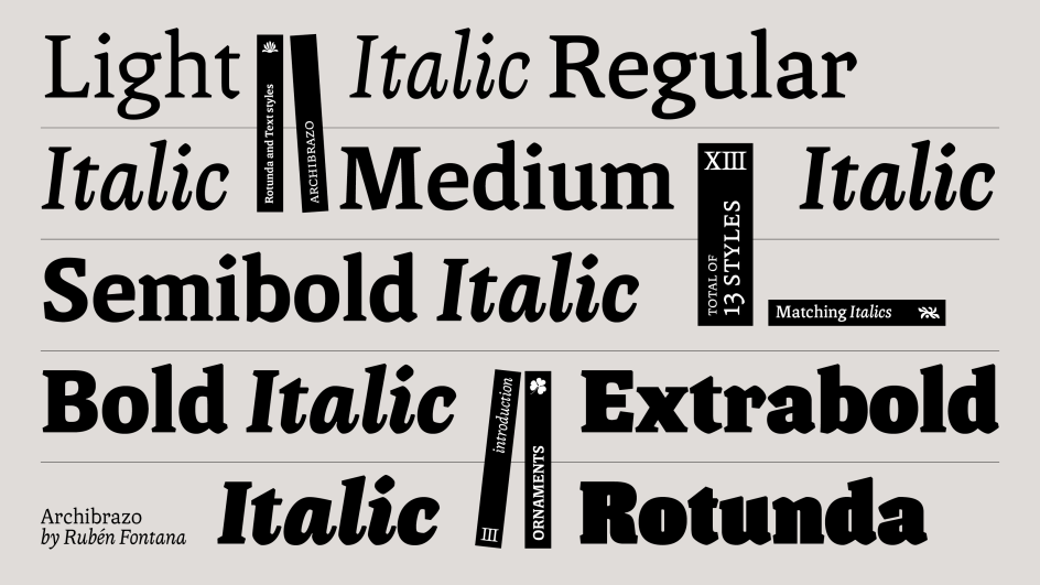
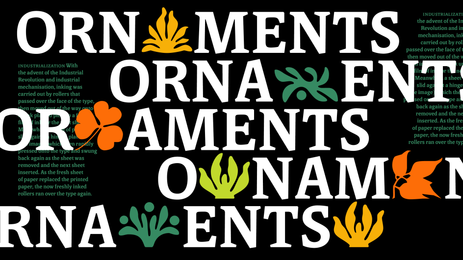
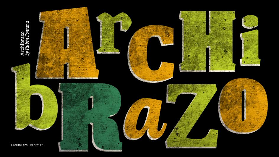
5. Archibrazo by Rubén Fontana
Rubén Fontana is one of the most respected figures in Latin American type design, and Archibrazo, released through TypeTogether earlier this year, represents a characteristically considered piece of work. The typeface brings together two traditions that might seem at odds: the fluidity of calligraphic practice and the hardness of sculptural form. The result is a serif family that wears its sources with confidence, without collapsing into historicism or affectation.
Seven weights address the full span of typographic application, from refined running text to assertive display work. Sculptural wedge serifs and carefully carved countershapes drive the family's optical performance, creating clear differentiation between strokes and contributing to the legibility that Fontana has positioned as central to the design. The Archibrazo Rotunda weight occupies a special position within the family; a heavier, rounder voice well suited to titling, branding and poster work, where presence matters as much as precision.
There's something admirable about a type designer who brings decades of craft knowledge to bear on a contemporary brief and produces something that feels neither anachronistic nor trend-dependent. Archibrazo achieves that balance. It would be well-suited to editorial publishing, cultural institution branding, and any context that values typographic tradition whilst remaining alert to the demands of contemporary design practice.
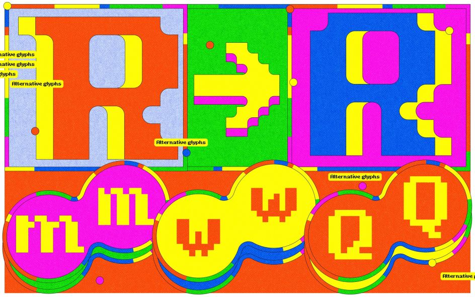
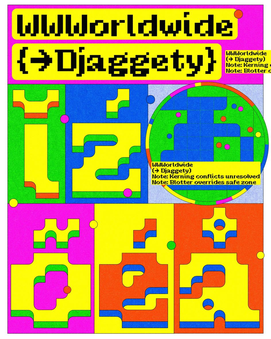
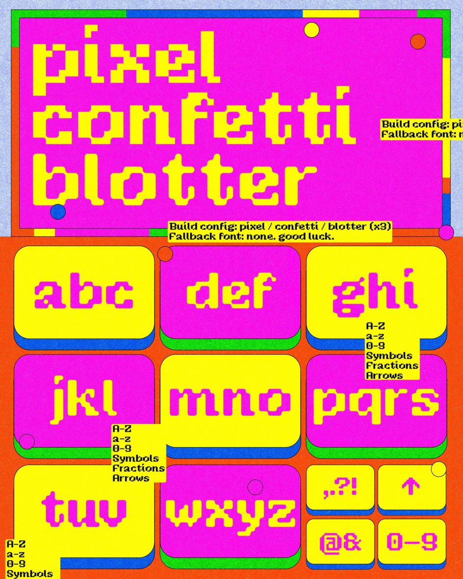
6. Djaggety by Alessia Mazzarella
Djaggety began in a classroom. Alessia Mazzarella, who teaches type design to BA Graphic Design students at Typeland, uses an 8×8 grid exercise as a standard introduction to letterform construction. The constraint, she explains, strips away the paralysis of infinite choice and forces students to focus on what makes a character recognisable within a tightly defined system. During one iteration of the exercise, she found herself drawn into the process rather than simply demonstrating it.
The grid imposed what Mazzarella describes as "brute, binary limitations": a sharp contrast to the refined micro-decisions of professional type design. But rather than correcting for the unexpected quirks that emerged, she made them design decisions. Width variations that might otherwise have been smoothed away became contextual alternates; initial capital forms were added where they felt right. What began as pedagogy became a full display family of three styles: Pixel, Confetti and Blotter, each approaching the same 8×8 core from a slightly different direction.
Djaggety is modular, expressive, and in Mazzarella's own words, "a little unruly". It performs best at display sizes, where its contextual alternates, four stylistic sets and variable axes across all three styles give designers genuine creative latitude. Overall, it's a good lesson in how constraint can generate, rather than foreclose, creative possibilities.
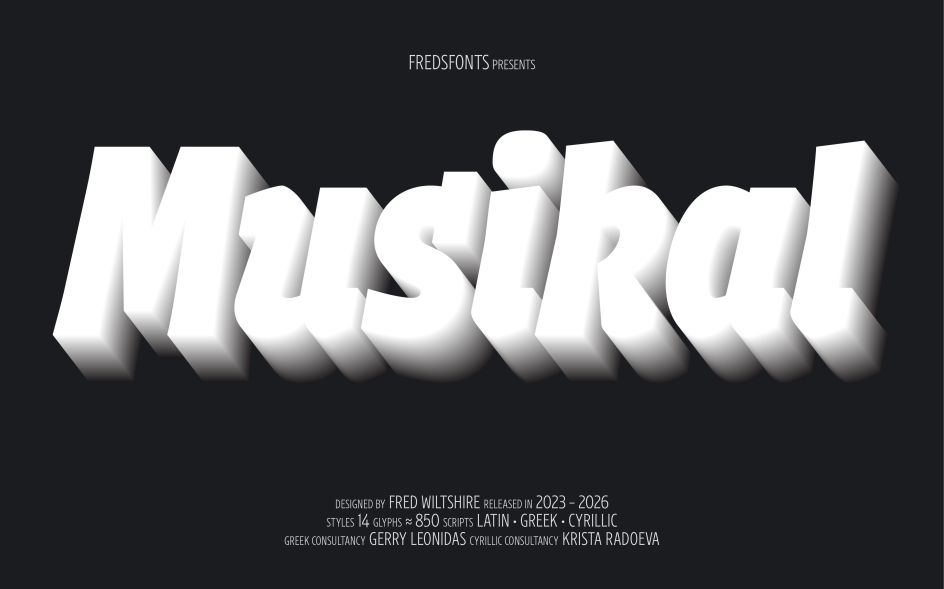
7. Musikal by Fred Wiltshire
After three years in development on Future Fonts, Fred Wiltshire's Musikal has reached v1.0: a significant milestone for a typeface that began with a conscious act of divergence. Herman Ihlenburg's Obelisk (1880s) served as the starting point: a high-contrast, ornamental display face of considerable geometric rigour and decorative confidence. Rather than reviving Obelisk directly, Wiltshire took its "playful nature" as a conceptual springboard and built something clearly of the present.
Where Obelisk leans into sharp serifs and formal geometry, Musikal brings a more organic sensibility: small tapered serifs, off-centred axes and what Wiltshire describes as "simplified yet imposing ornamental strokes". The visual link to drawn letterforms gives the typeface an authenticity that purely geometric display faces can lack. Its condensed proportions concentrate rather than disperse its character, making individual letterforms (particularly the a, c and s, with their prominent downstrokes) natural focal points in any composition.
Musikal ships in 14 styles, both Upright and Italic, with approximately 850 glyphs per style covering Latin Extended, Greek and Cyrillic, with various stylistic sets offering additional flexibility. At display sizes, it has the rare quality of feeling simultaneously precise and alive: a difficult balance to strike.
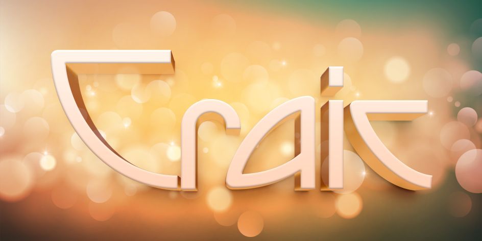
8. Craic by Matthew Gallagher
Named after the Irish word for fun or enjoyment (pronounced 'crack'), Craic is Matthew Gallagher's latest revival through his designoMatt foundry, drawn from a typographer's handbook of the early 20th century and extended into a full contemporary Latin character set.
Its roots lie in the Arts and Crafts movement in North America, a tradition defined by a rejection of industrial anonymity in favour of handcrafted warmth, decorative specificity and forms that feel considered rather than manufactured. Those values translate well to type design, and Craic wears them with easy confidence.
The typeface occupies the productive space between workhorse and decorative object. Matthew describes it as robust yet elegant. It's a combination that hearkens back to what he calls "a simpler time," though without the nostalgic pastiche that often undermines historical revivals. Craic's primary value is likely at display scale: headlines, logotypes and decorative applications where its character can breathe. But it carries itself respectably in typeset text too, where its unusual details add quiet personality without compromising legibility.
A generous selection of alternates and discretionary ligatures gives designers meaningful room to adjust Craic's tone across different applications. At $12.99, it's one of the most accessible-priced entries in this month's round-up, making it a particularly low-risk addition to a typeface library.
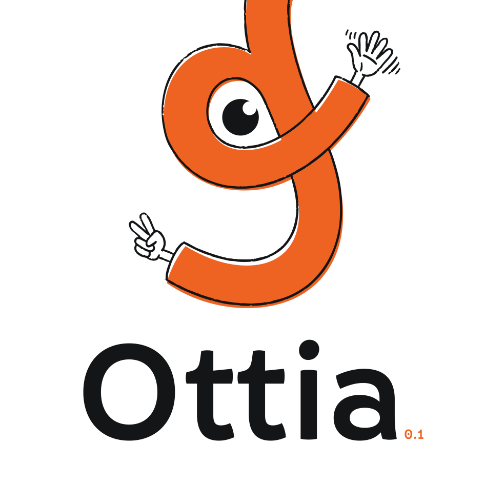
9. Ottia by Ana Sanikidze
Ottia is one of March's most distinctive releases: a soft, playful display typeface developed on Future Fonts by Ana Sanikidze of Wicked Letters, a type designer based in Tbilisi, Georgia, who specialises in both Latin and Georgian scripts. It began as something relatively straightforward—a revival of lettering from a 20th-century Georgian children's book cover—but evolved, as the best type projects often do, into something with its own identity.
What distinguishes Ottia from most display typefaces is its bi-scriptual ambition. Rather than designing a Latin typeface and retrofitting Georgian characters to match, Sanikidze approached the two scripts as genuine collaborators, each making concessions to the other, and neither was treated as an afterthought. The result is a typeface in which both character sets feel proportionally and tonally at home: a rare achievement, and one that will be of particular value to designers working across multilingual or international contexts.
The design language is characterised by low contrast, a generous x-height and open counters, brought together through softly rounded forms, curved cuts and details that invite exploration. At its current v0.1 stage, priced at $30 on Future Fonts, Ottia includes basic Latin and Georgian characters, along with essential punctuation, numerals, and stylistic sets. Planned development will expand the character set, introduce additional weights and add a cursive style.
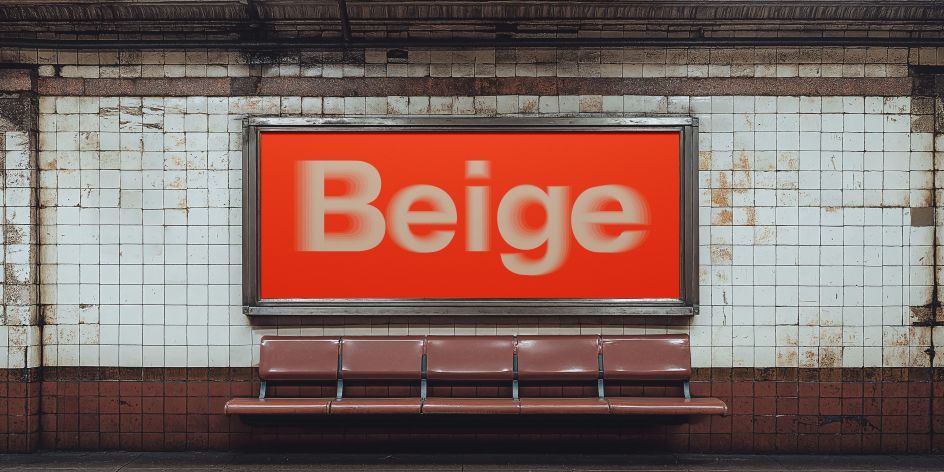
10. Beige by Krista Radoeva and Lora Shtirkova
Beige arrives as the debut release of About Type, Krista Radoeva's newly launched type foundry. Launched alongside three other typefaces at the start of 2026, it's the product of four years of patient work, and it shows. This is a typeface that knows exactly what it is and why.
The name is an ironic nod to the visual neutrality so often favoured by designers; a wry acknowledgement that the neo-grotesque tradition has, at times, become synonymous with blandness. But the process of drawing Beige revealed something more essential: the importance of having a dependable, versatile sans that still carries a point of view.
The family spans ten weights with a matching monospaced variant, making it suitable for complex typographic systems across a wide range of applications. Extensive stylistic alternates allow designers to fine-tune the tone of each piece, adjusting the typeface's level of neutrality and expression project by project.
Beige supports Latin, Extended Cyrillic and Greek, with a generous set of typographic extras. It can be calm and restrained, or quietly distinctive; your version of neutral, as Radoeva puts it, is shaped by choice. For anyone frustrated by the false binary between personality and function in the sans-serif space, Beige offers a thoughtful third way. It's familiar but never generic, dependable but never inert. A strong debut for a foundry that clearly has more to say.
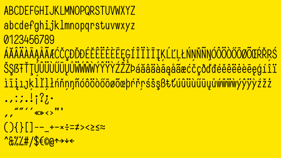
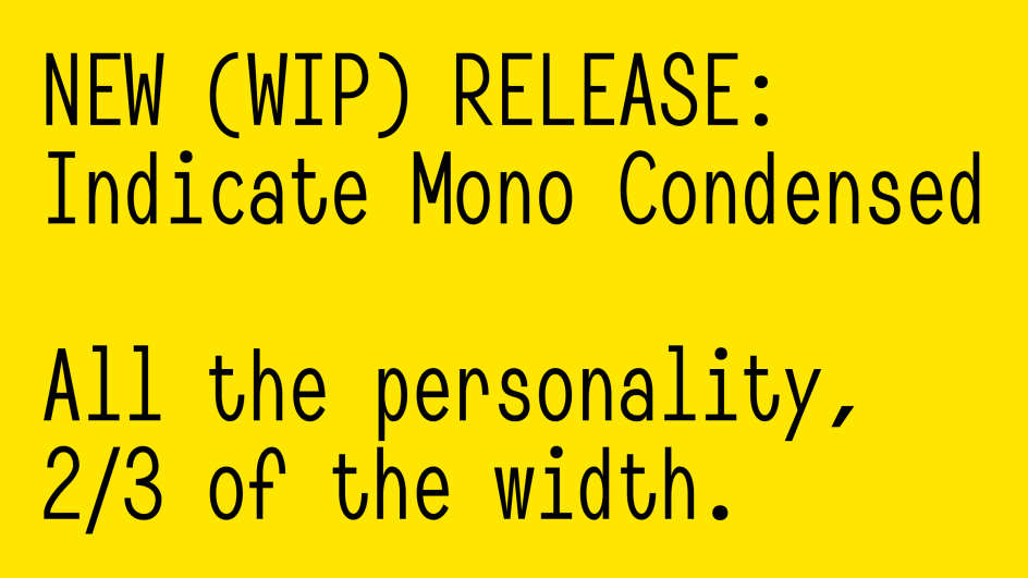
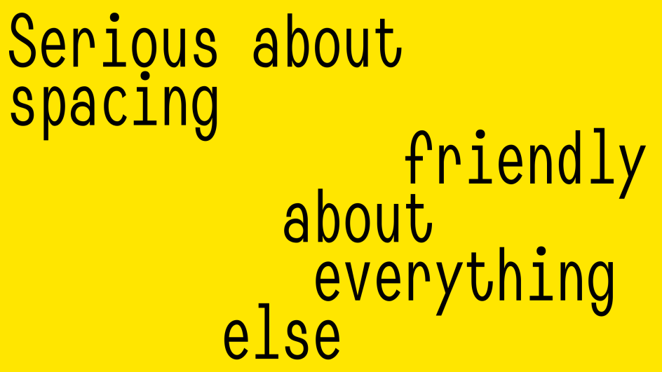
11. Indicate Mono by Jonas Pelzer
Monospace typefaces occupy an odd corner of the typographic world. Associated with code, terminals and technical documentation, they carry strong aesthetic expectations. A certain clinical austerity, a deliberate lack of warmth. Indicate Mono, from Jonas Pelzer of Jonas Type, sets out to dismantle those expectations whilst preserving the strict structural logic that makes monospace useful in the first place.
Jonas's approach is patient and methodical, which is appropriate given that Indicate Mono has been in development since April 2023. The Regular style launched first; the Condensed followed in January; Bold and Expanded styles are in the making. This gradual, public development model (releasing styles as they are ready, with purchasers receiving free updates even after prices rise) reflects a philosophy of genuine craft over commercial pressure. The current styles are available on a pay-what-you-want basis with a minimum of €10, making Indicate Mono among the most accessible entries in this month's round-up.
The result is a monospace typeface that feels human. Warm, friendly letterforms bring approachability to a genre that typically resists it, without sacrificing the fixed-width practicality that defines the format. For designers working in digital product, editorial or any context that calls for code-adjacent typography without clinical detachment, Indicate Mono is well worth investigating.
12. Aether by Dominik Thieme
In 1883, American punchcutter and inventor Linn Boyd Benton developed a system he called Self-Spacing Type, a method of assigning predetermined character widths to letterforms to reduce the time and labour required for manual justification. The approach influenced later Linotype technology and contributed to the mechanisation of typesetting. Dominik Thieme's Aether takes this forgotten system as both structural framework and conceptual premise.
By arranging letters within a fixed horizontal framework, Aether creates a cohesive rhythm of stems and intervals: a rational, spatially unified typographic pattern whose historical origins make it feel entirely logical.
The typeface comes in two stylistic variations that highlight its parametric design. Aether A, without optical adjustments, features dark and prominent brackets and joints for a bold, striking appearance, whilst Aether B incorporates optical refinements for enhanced legibility and a more considered aesthetic. Alternate characters further enhance the geometric character, and a wide range of ligatures harmonise spacing in mono-spaced columns.
Overall, the result is a Modern-style serif that earns its classification through structural rigour rather than stylistic pastiche.
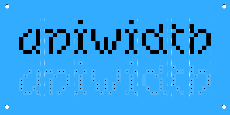
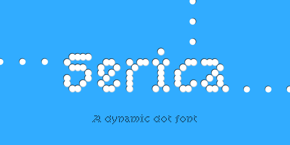
13. Serica by Daniel Gremme
Here's an origin story as specific and unlikely as any typeface released this month. Daniel Gremme first encountered the Dutch merklap—a traditional embroidered sampler, often made to mark a birth or milestone—whilst studying at the Royal Academy of Art in The Hague, when a classmate showed him the one her grandmother had made for her arrival into the world. The dot-matrix logic of counted thread embroidery, its strict grid discipline and the distinctive rhythm created by avoiding overlapping stitches lodged in Gremme's imagination. Three years later, it became a typeface.
Serica is a uniwidth dot-matrix type family built around three shape styles (Circle, Square, and Squircle), spanning 23 styles in total, plus a variable font. The decision to avoid any overlapping strokes is the design's defining structural constraint, and the one that most directly translates its embroidery origins into typographic form.
At small sizes, the result is an even, consistent grey that reads with unexpected clarity; at display sizes, the underlying grid becomes a visual texture in its own right. The reduction to a 7-unit cap height necessitates steep diagonal angles, which contribute to the rhythmic character Gremme has carefully refined across the full family.
Beyond its structural properties, Serica is generously featured with localisation, swashes, ligatures, alternative letters, compact shapes, number styles, and even emojis. Stylistic sets SS01 and SS02 allow designers to modulate the rhythm for circular or compact shapes, respectively.
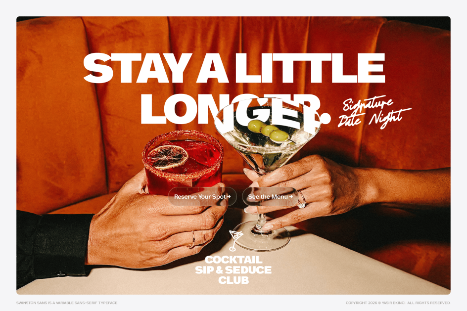
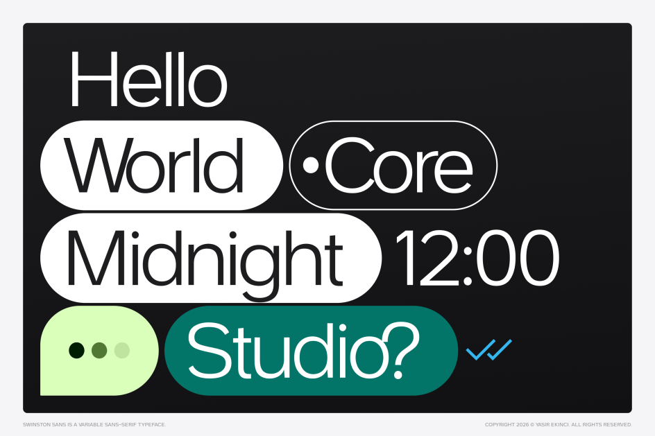
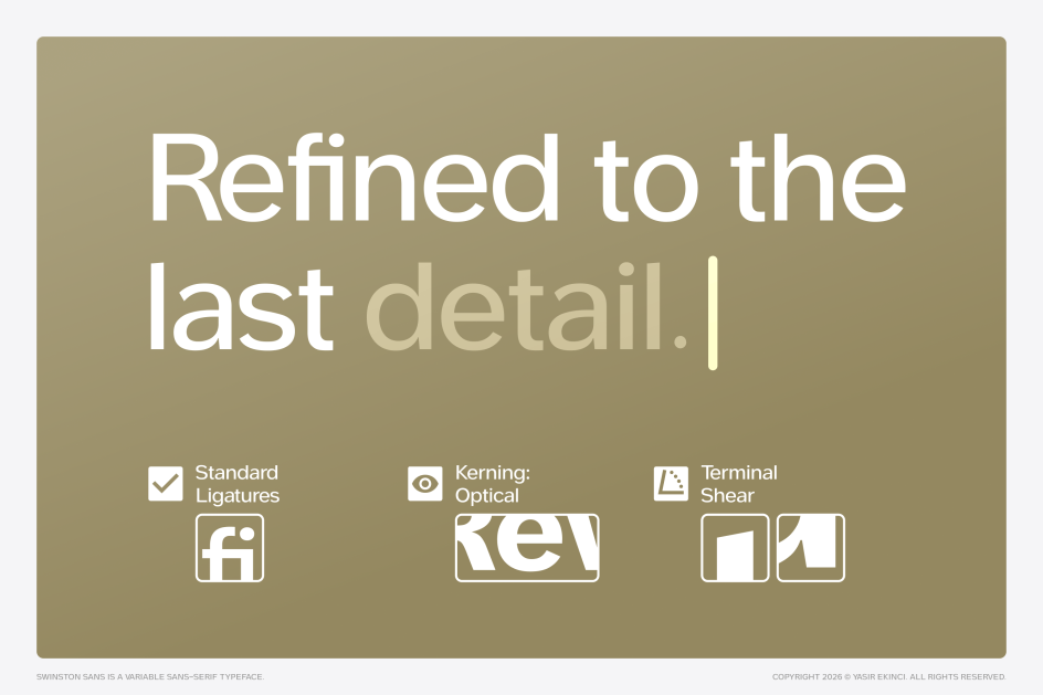
14. Swinston Sans by Yasir Ekinci
Swinston Sans carries its origins in unusual detail. Designer Yasir Ekinci traces the typeface's DNA across three European cities visited in sequence, each contributing something distinct to the final design.
Rotterdam supplied the industrial grid logic: specifically, the destination blinds of the RET tram network. These high-contrast signs were engineered for what transit designers call "glanceability": legibility within milliseconds, through rain-streaked glass, for a passenger in motion.
Amsterdam gave Swinston its italics, inspired by the "op vlucht" lean of the canal houses along the Herengracht. These are buildings that tilt forward with historical purpose, their angle originally designed to assist merchants hoisting goods to upper floors. Lisbon, and specifically Tram 28 navigating the impossibly narrow streets of the Alfama, taught Ekinci about density: how a design can remain vivid and legible when compressed into very small spaces.
The result is a variable typeface system with weight and slant axes. From Thin to Black, from Roman to Italic, these fonts are engineered to serve contexts ranging from fintech dashboards and AI interfaces to editorial spreads and display typography.
Its signature detail is 15° angled terminals, which give Swinston a distinct visual rhythm that persists across the weight range, preventing the neutrality that afflicts so many geometric sans serifs when pushed toward the light end of their axes. The generous x-height, open apertures and balanced counters ensure legibility at small sizes without sacrificing presence at large ones.
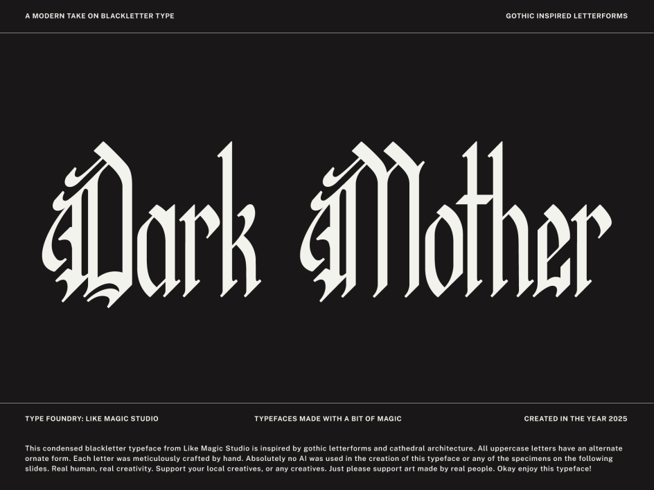
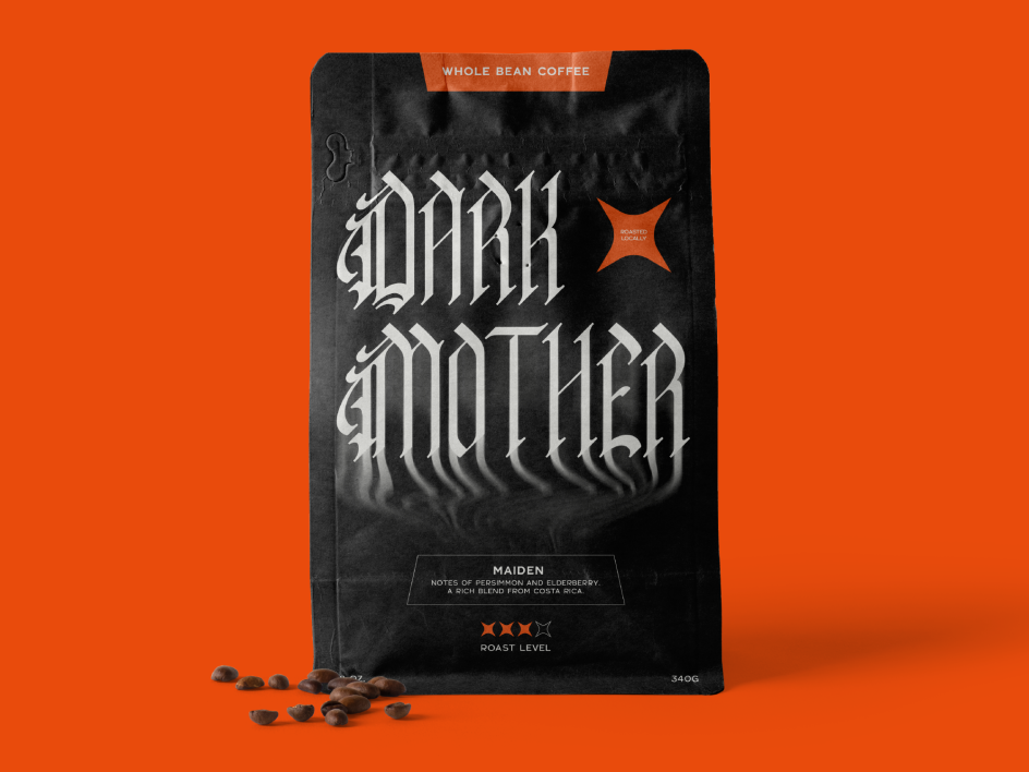
15. Dark Mother by Brette Guilmette
Dark Mother occupies a corner of the typographic landscape that rarely appears in monthly round-ups: the condensed blackletter, executed with contemporary restraint.
Brette Guilmette of Like Magic Studio draws on two historical sources (Gothic architecture and medieval manuscript tradition) and handles the synthesis with more elegance than the genre typically allows. The curved apex that recurs throughout the letterforms is a direct and knowing reference to the pointed gothic arch; the calligraphic flow of the strokes connects the design to the manuscript scribes who developed blackletter as a practical writing system centuries before it became a typographic convention.
What distinguishes Dark Mother from the more theatrical end of the blackletter category is its legibility. The condensed proportions and calligraphic rhythm create density without illegibility, which opens the typeface to a wider range of applications than many display blackletters can credibly claim. Movie titles, packaging, logotype work and editorial headlines are all viable contexts.
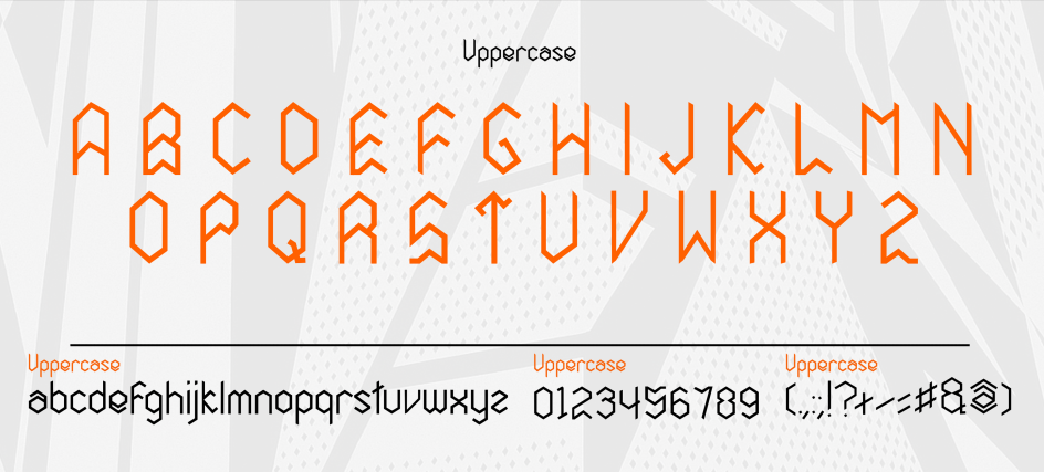
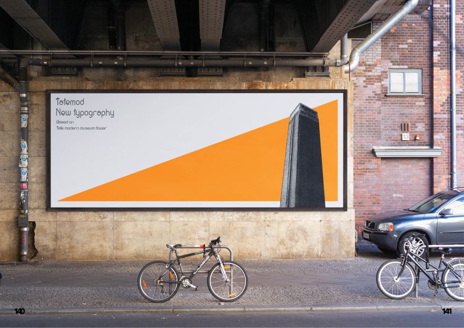
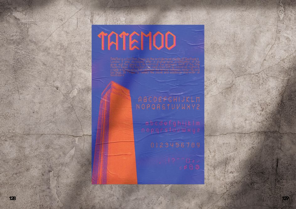
16. Tatemod by Jose Martinez
Tatemod closes this month's round-up with something that feels very site-specific. Jose Martinez's free display typeface was developed in direct response to the architectural identity of Southwark, and specifically to the Tate Modern, whose switched-off turbine hall and brick chimney stack have become one of the most recognisable silhouettes in London.
The result is a display typeface that carries its conceptual origins visibly, without feeling like an exercise in graphic design theory. The modular construction imposes consistency across the character set, creating the kind of typographic rhythm that emerges naturally when a strict system is applied with discipline.
At display sizes, which is where Tatemod clearly performs best, the architectural reference reads not as a novelty but as a genuine design principle, giving the letterforms a structural authority that purely expressive display faces often lack. In a month dominated by variable systems and extensive families, there's something refreshing about a typeface with a single, clear purpose and the restraint to stick to it.

Editor's Picks


Trending


Podcasts


Editor's Picks
Further Reading