Uther Studio on making a home renovation app feel like a friend, not a filing system
The newly launched studio's debut project proves that the most useful thing a renovation app can be is the person who's already been through it.
For anyone who's ever experienced the stress of renovating their home, here's a trigger warning. This article is all about the rebranding of the renovation planning platform Hey, Barb. And reading any further may well reignite a certain type of trauma.
Contractors who don't show up. Budgets that quietly double. 17 browser tabs open at any one time. That folder of invoices. And more generally, the sinking feeling that you don't actually know what you're doing and that nobody is coming to help.
Hey, Barb is an app designed to help avoid situations like that. Squarely aimed at homeowners managing their own projects, it exists to bring structure to what is, for most people, an overwhelming and poorly supported process.
So when the Hey, Barb team came to Uther Studio—a newly launched creative agency based in Stockport—they needed a brand that could hold all of that anxiety and transform it into something that felt manageable, approachable, even (whisper it) potentially enjoyable.
It's certainly an interesting brief for any studio to take on. And for Uther Studio's director, Liz McCracken, it was the first public-facing project her agency had ever delivered. So no pressure there, then.
What they didn't do
At this point, it's worth considering what Hey, Barb could have looked like. Renovation, as a visual category, tends toward one of two modes. There's the aspirational end (polished interiors photography, muted palettes, the aesthetic of a Scandi kitchen that nobody actually cooks in). And then there's the functional end: the world of hardware-store signage, clip-art toolboxes, and a font that communicates urgency without saying anything else.
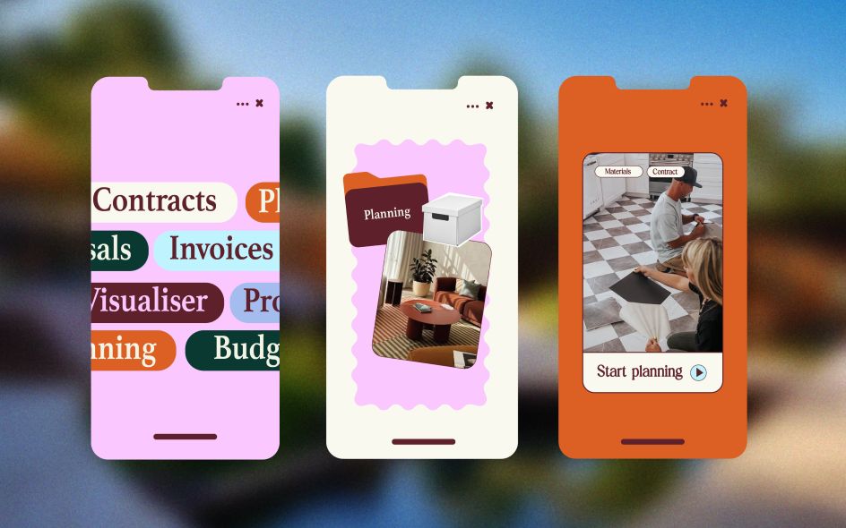
Neither of those, though, felt right. Hey, Barb isn't selling dream kitchens, and it isn't a tile supplier. It's something more specific and more useful: a platform that sits beside you during the hard bit, helping you keep track of contracts, invoices, timelines, and decisions while everything else feels like it's spiralling out of control.
The approach, then, was essentially human in nature. "Hey, Barb needed to feel like a calm, capable presence in what is often an overwhelming process," says Liz. "We focused on building a brand that feels clear, human and supportive, while still having the confidence to stand out in the market."
That phrase, "calm, capable presence", is doing a lot of work here. It describes not a visual style but a personality. And personality, as any brand designer knows, is considerably harder to achieve than style.
What they built
The resulting identity is warm without being soft, confident without being corporate, and (crucially) funny, without trying too hard.
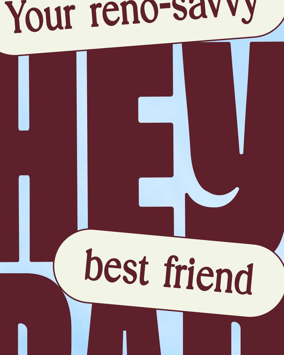
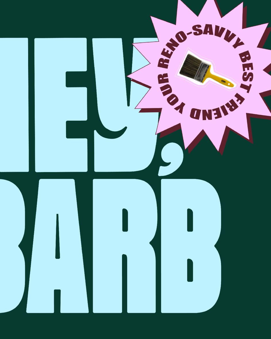
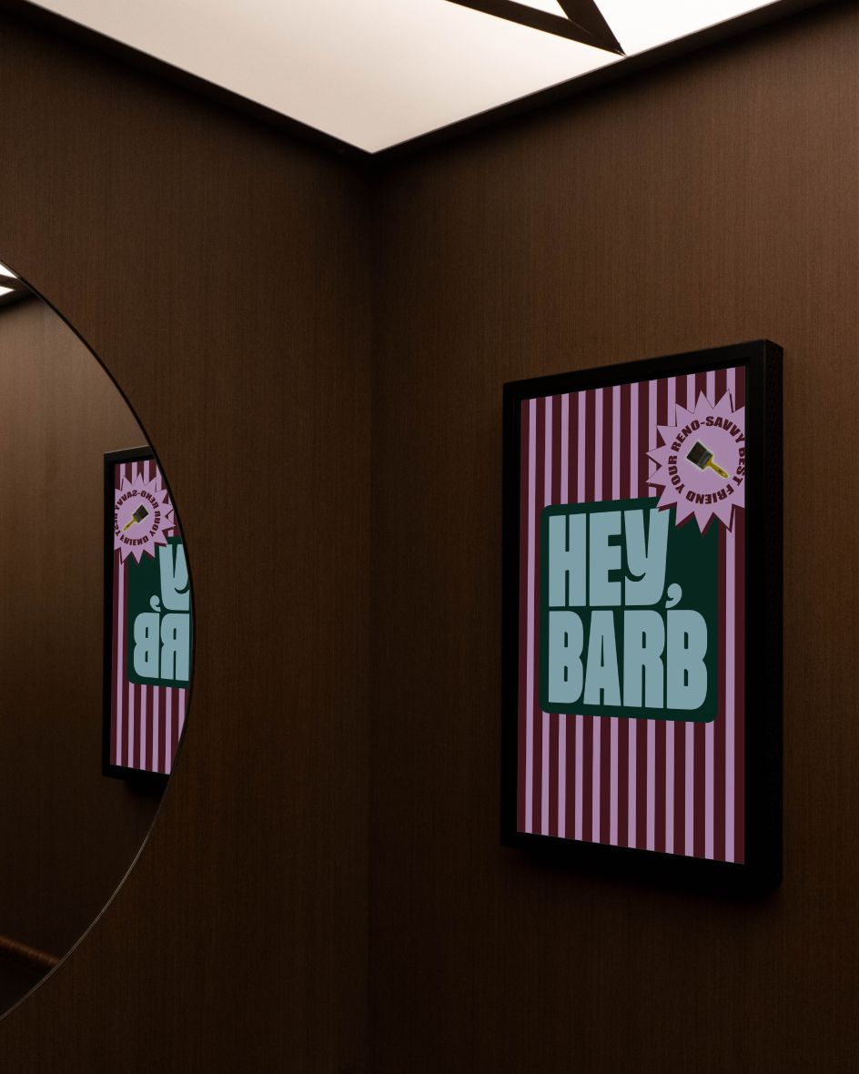
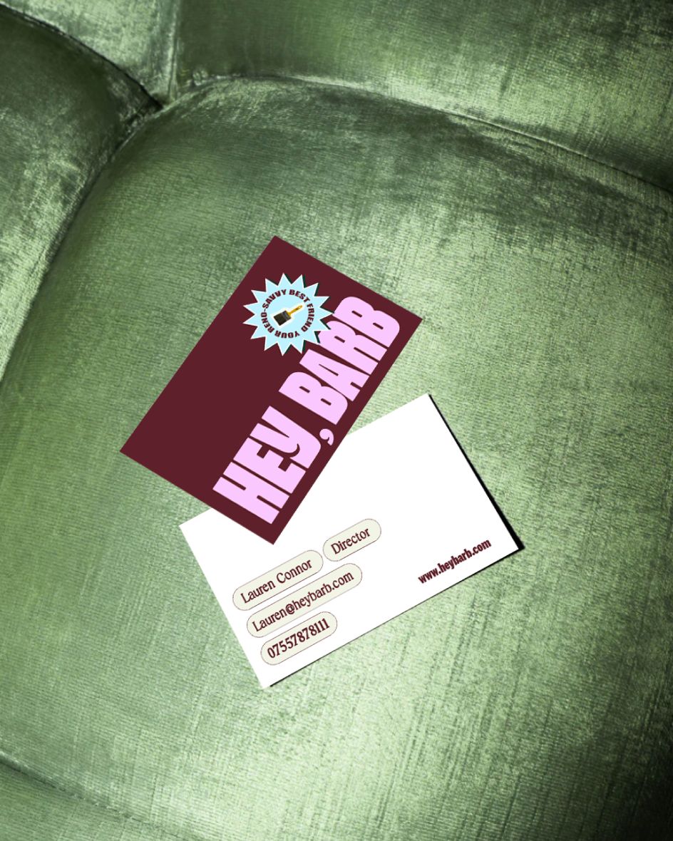
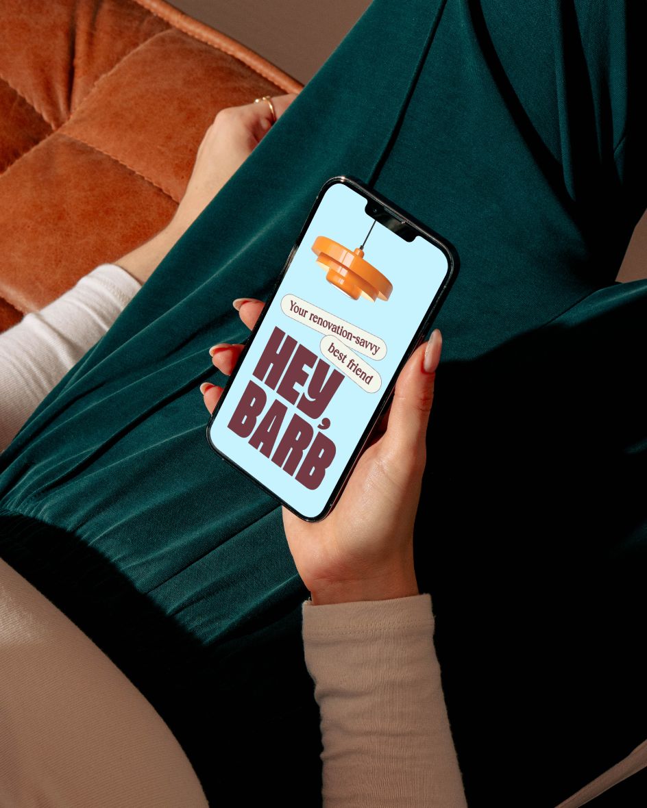
The name itself sets a tone: informal, friendly, the kind of thing you'd text someone who'd already done a loft conversion and knew which questions to ask. The visual language leans into that register. Bold, chunky typography that occupies space with ease.
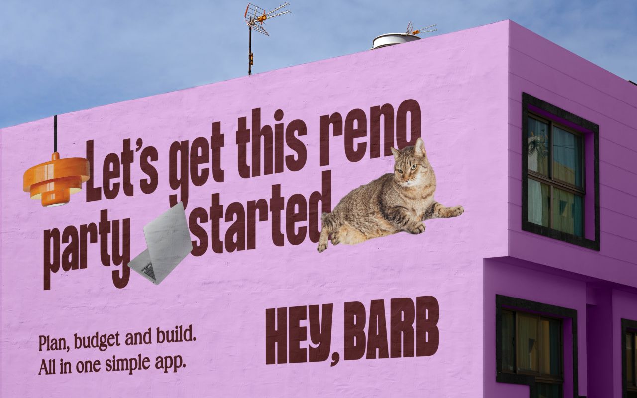
This is complemented by a colour palette that manages to feel both retro and contemporary. There are dusky pinks, deep maroons, sky blues and burnt oranges that recall 1970s print design without feeling overly nostalgic. We also see splashy, starburst call-outs and pill-shaped labels that carry functional information without losing personality.
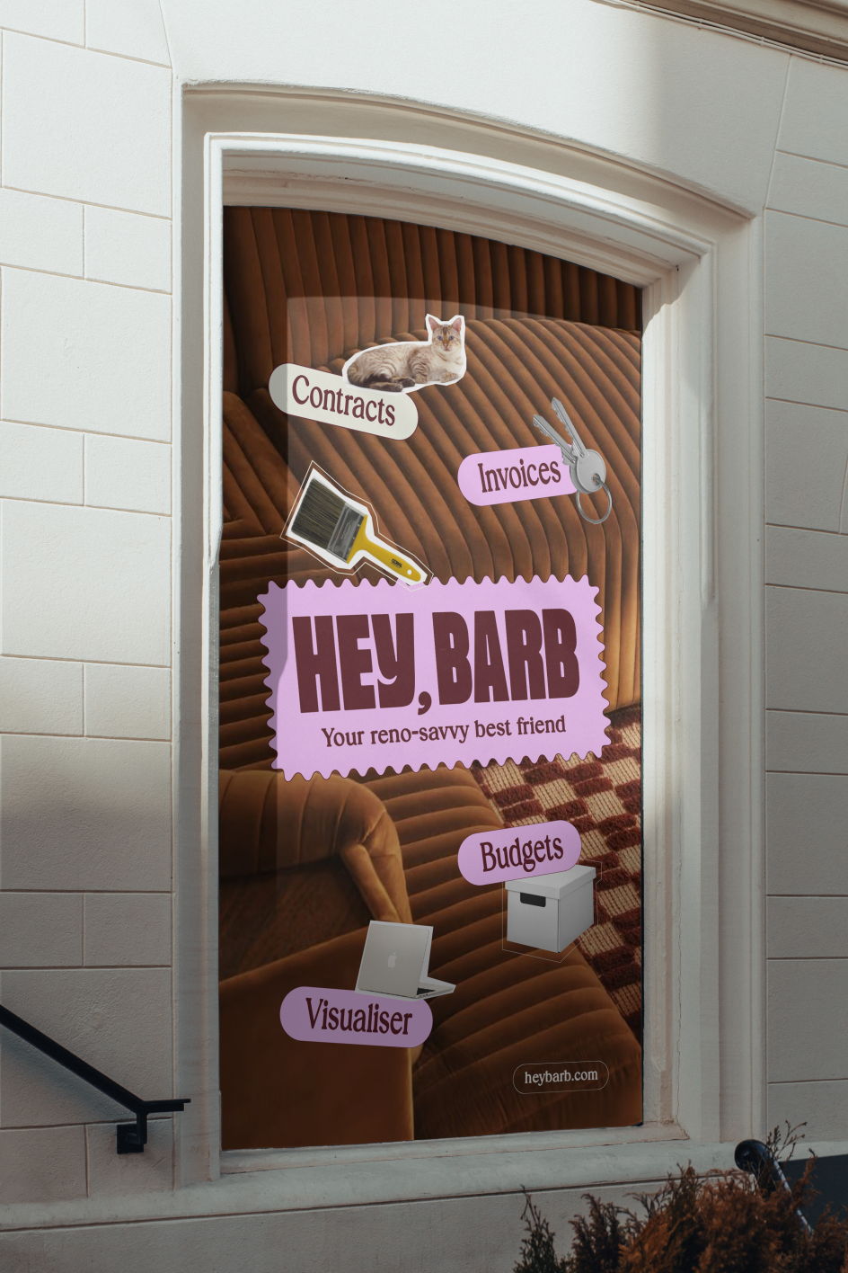
There's a fat tabby cat in the imagery that perhaps best captures the brand's spirit, sprawling across a wall-sized mural with the kind of effortless confidence that Hey, Barb itself is trying to project. It's a small detail, but it reveals something important about creative thinking.
This isn't a brand that takes itself entirely seriously. It knows that renovations are stressful, chaotic and occasionally absurd, and it's willing to acknowledge that.
The debut question
For designers, there's something extra-interesting about this project's context. This was Uther Studio's first public work: the piece that would define how the agency was perceived from day one. The temptation must have been to overreach, to produce something so demonstrably "clever" that the portfolio announces itself.
Thankfully, Liz, who brings more than 15 years of experience in brand identity across multiple sectors, appears to have resisted that temptation. The Hey, Barb work is confident, but not showy. It solves a real problem for a real audience with real clarity. And the craft is visible in the decisions that have been made, rather than in decoration applied on top of them.
It all goes to show that sometimes the best way to announce a new agency is simply to do good work and let the work speak for itself.

Editor's Picks


Trending


Podcasts


Editor's Picks
Further Reading