Scorpion Rose Studio rebrands kids' accessories brand Goldbug with nuanced nostalgia
Elements of Goldbug's old identity were retained and refreshed where possible to preserve the brand's 56-year legacy.
Lafayette American's Scorpion Rose Studio has rebranded the women-owned infant and children's accessories brand Goldbug, introducing a new visual language to help the company transition from B2B to B2C.
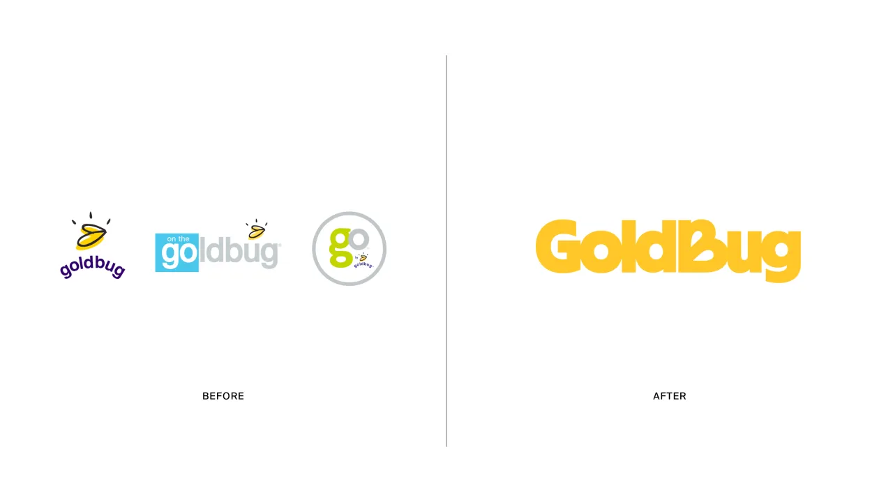
Since its inception in 1968, Goldbug has distributed infant and children's accessories under four different brand names: GO by Goldbug, TravelBug, On the Goldbug, and Goldbug. When Golbug decided to become a direct-to-consumer brand, it approached Scorpion Rose Studio with a brief to consolidate its various brands into one cohesive identity driven by a visual language that connects with its target consumers in an emotionally resonant way.
The studio's head of design, Meg Jannott, describes the brief as "exciting and ambitious" while stressing the importance of the client's category as parenting is overwhelming enough without having to sift through hundreds of brands that don't resonate with them. Scorpion Rose Studio set out to make Goldbug the exact opposite of this: a confident and flexible brand that immediately creates a strong connection.
H2 Beauty in unscripted moments
As exciting as this project was, it did not come without its challenges. Fairly early in the strategic process, the studio had to decide whether the combination of existing Goldbug brands would live under the GoldBug name or if the products should live under some all-new identity with a new name.
Despite the studio finding strengths and weaknesses in many "fun, quirky, playful and dynamic names", Jannott says that extensive research revealed that GoldBug's 56-year legacy has cultivated brand loyalty and positioned it as an expert in its category. So they stuck with the original name.
The design team delved deep into the essence of parenthood for the strategy work, "acknowledging the beauty found in the unscripted moments of everyday life", according to Jannott. This immersion unearthed the idea of "Everyday Adventure", which seeks to reframe the chaos of parenting as "a collection of authentic memories that contribute to the magical journey of growth".
Before the pandemic, the brand was largely recognised for its travel accessory offering. However, since this category is still in decline, Scorpion Rose Studio opted for a brand idea that would shift this perception to "everyday and on-the-go". Jannott says, "This concept served as the foundation for our strategy, informing every aspect of the design process."
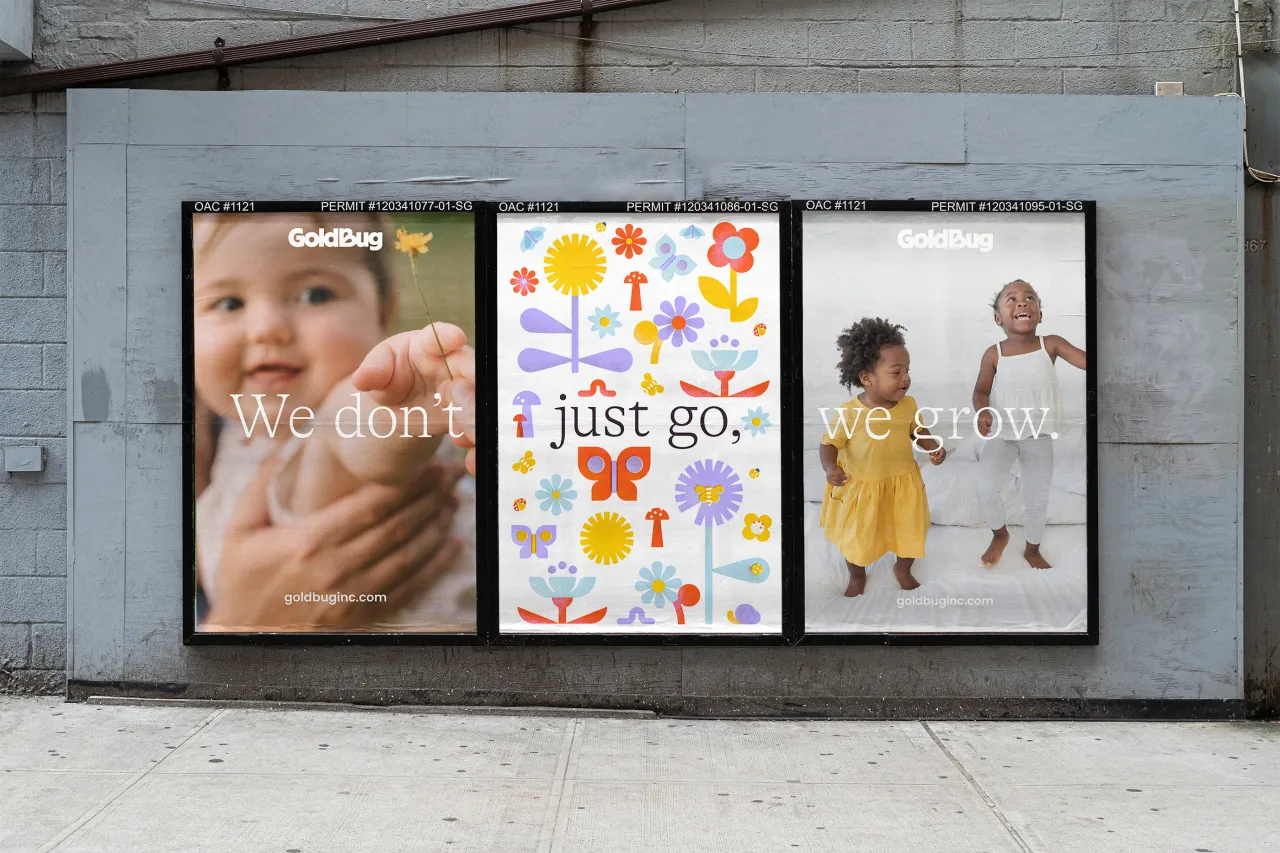
From this, the tagline "We don't just go, we grow" was established, a message crafted to encapsulate the brand's ethos around supporting children and parents on their journey of growth and discovery.
H2 "A touch of nostalgia"
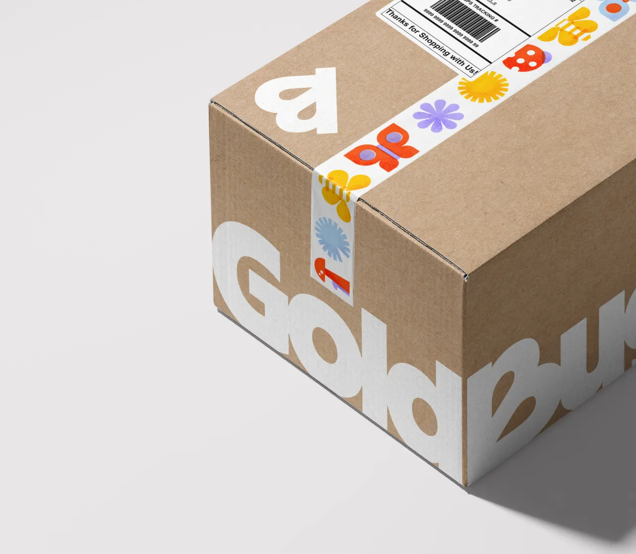
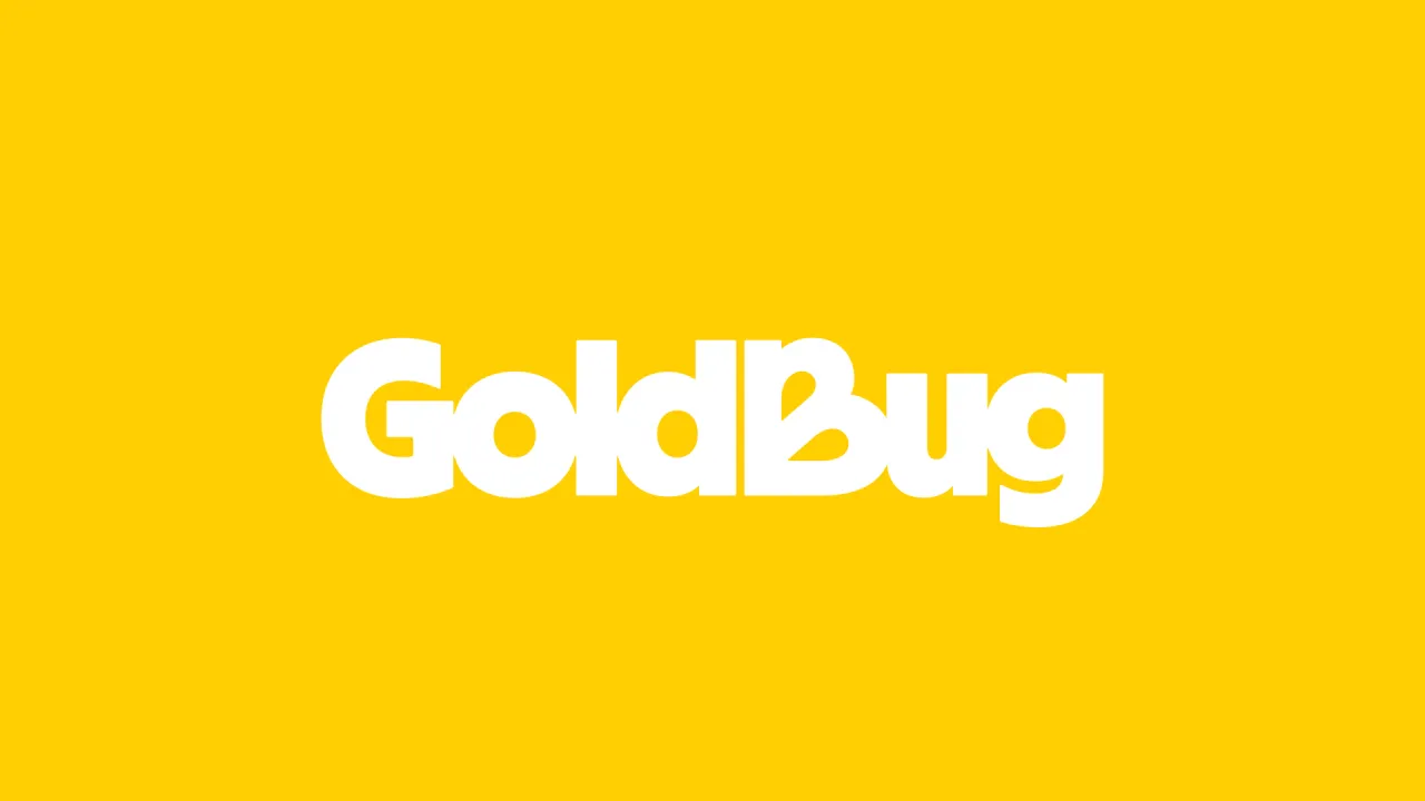
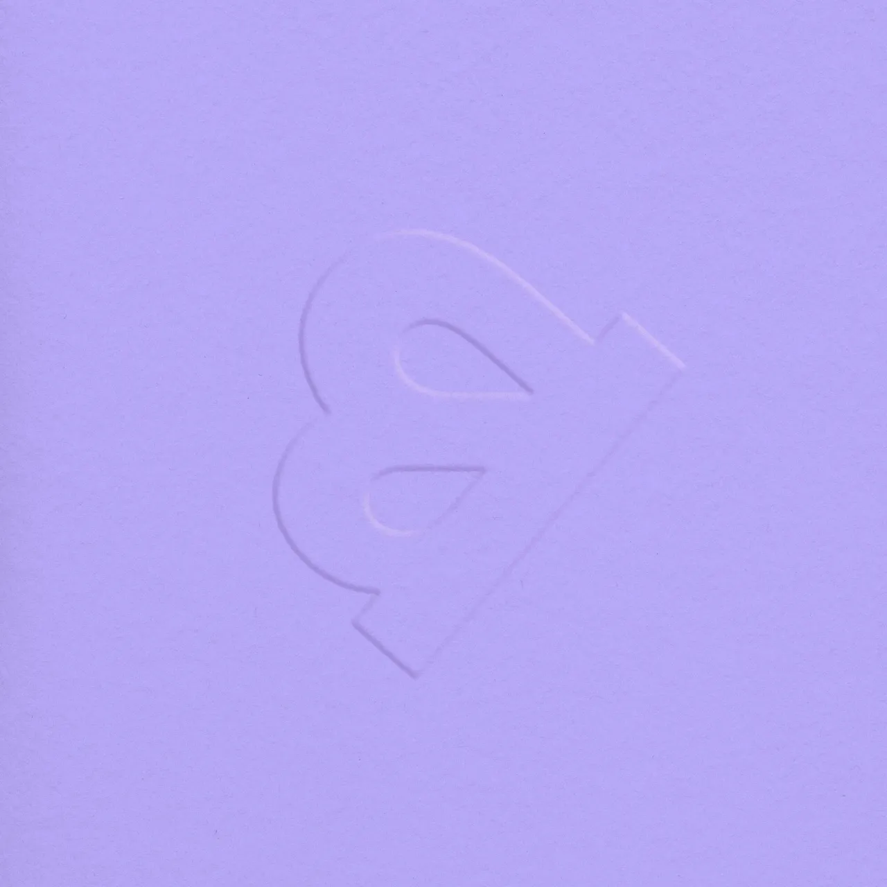
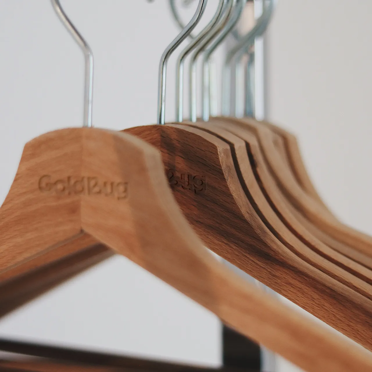
"The new brand emerged like a chrysalis from the previous Goldbug logo, bringing the company's legacy into an all-new chapter", says Jannott. Goldbug's previous identity also featured a butterfly, which the studio took and evolved into a bolder, more confident mark that can be integrated into the logotype.
It appears as the letter B in the typographic mark, built from the typeface MD Nichrome designed by Rutherford Craze for Mass-Driver. Jannott explains how this font is inspired by 70s and 80s typography and comes with "a touch of nostalgia, but it also feels modern and familiar". She adds that a "hint of the past was important to build trust with parents while also evolving the mark to be timeless and relevant to today's customer".
The notion of family connection was also baked into the logomark, as each letterform is joined to its neighbour.
H2 Taking cues from insect ecosystems
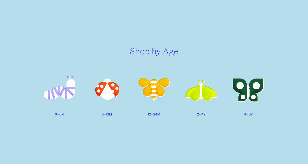
Looking to the insect world, Scorpion Rose Studio was drawn to "the stages of metamorphosis a child goes through" as well as the notion of insect ecosystems, like how a caterpillar transforms into a butterfly. The butterfly was already going to be a key symbol in the logo, but the studio introduced various other insects into the illustration system to help signify the different childhood stages and age brackets.
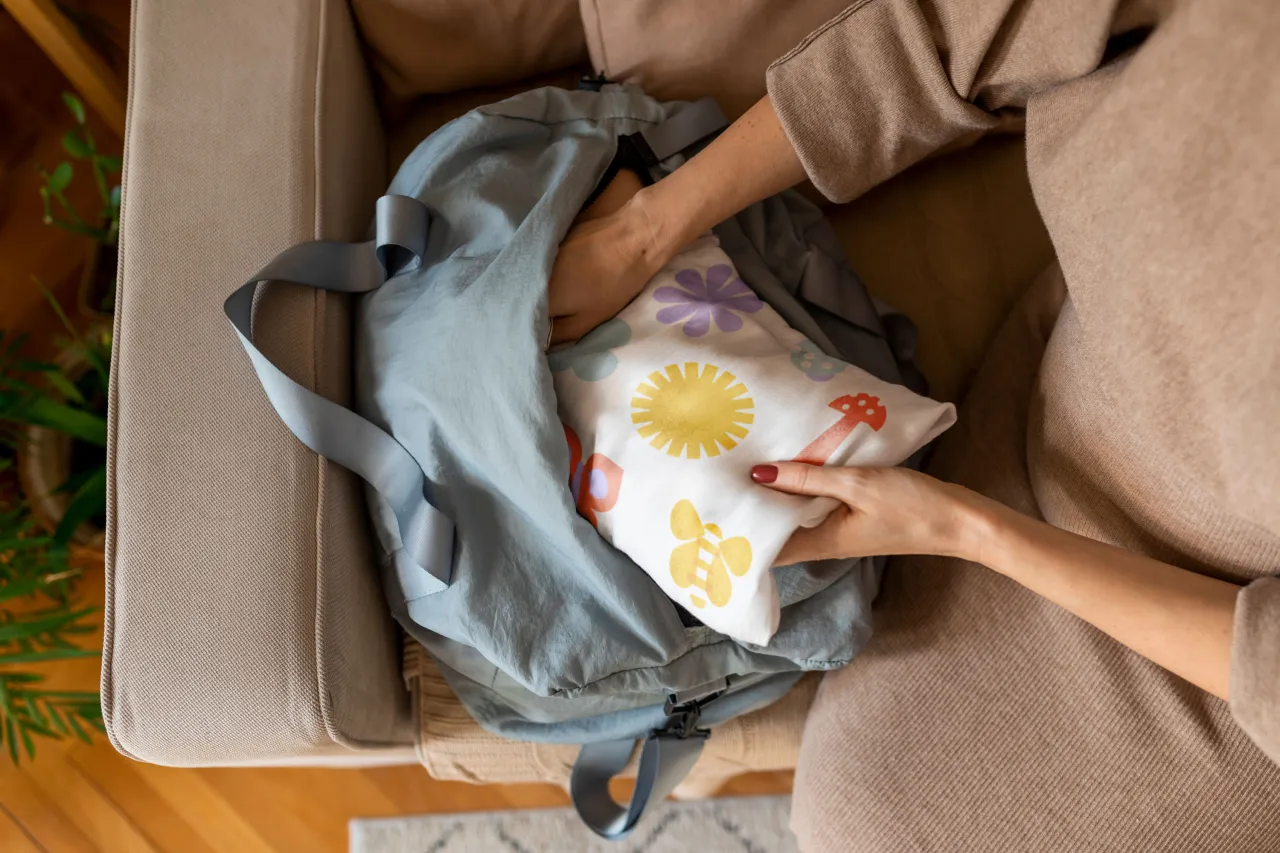
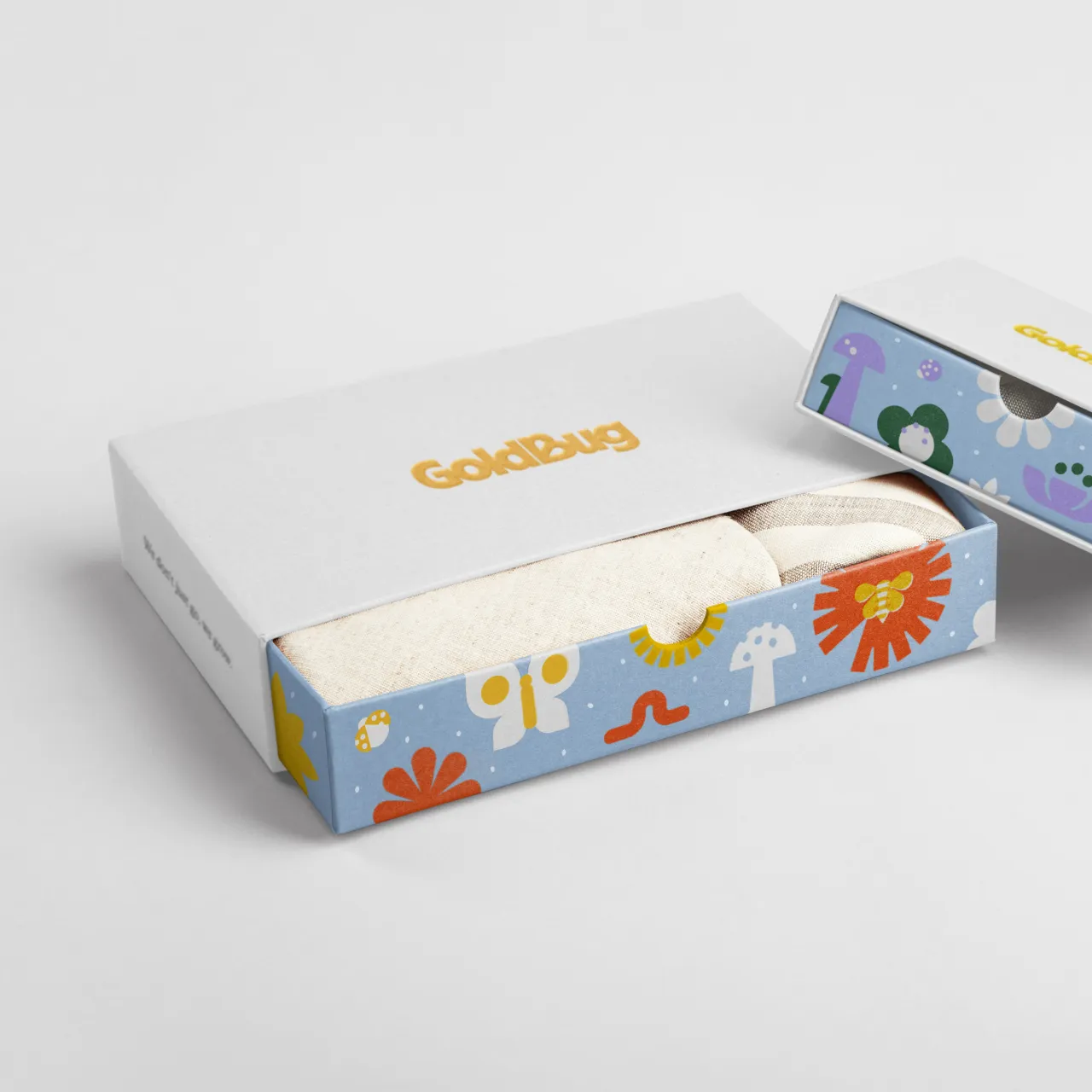
Scorpion Rose Studio was able to add a personal touch to the brand through Goldbug's illustrations. One element was inspired by a story about one of the design team's favourite graphic designers, Alexander Girard, whose parents let him freely explore his creativity from a very young age, ultimately leading to him designing and illustrating incredibly imaginative and complex universes.
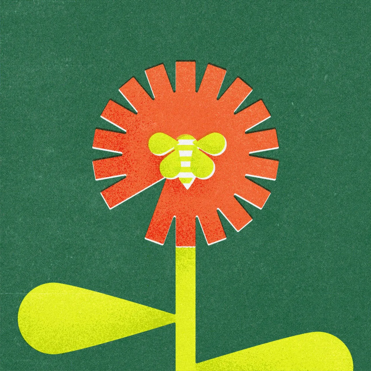
"That design ethos, rooted in childhood nostalgia and a belief in the power of imagination, lived on in his later work, evoking a sense of joy and wonder in all his designs, capturing the essence of that idyllic utopia throughout his career", says Jannott. She describes how textural imperfections were embedded in the brand mark in a bid to reflect "the tactile and sometimes messy process of parenting and kids' development" and to add "an additional emotional layer of playful nostalgia, without feeling contrived or saccharine".
As part of this subtly imperfect theme, the photography direction also sought to highlight candid, authentic moments, showcasing parenthood as a time of spontaneity and joy while alleviating the pressure that parents feel every day.
H2 Evoking Mother Nature
For the brand typography, Scorpion Rose Studio opted for GT Alpina by Grilli Type paired with Poppins by Google. The combination of this beautiful serif with personality and the geometric sans-serif perfectly represents the whole brand.
Jannott says the former adds a layer of "playfulness and emotion without being too heavy-handed," while the latter brings "refinement and modernism to the broader visual system" and mimics the logotype's style.
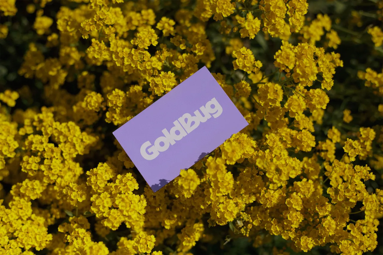
As the name suggests, gold is a driving factor in the colour system. However, the studio wanted to instil the same nostalgic yet fresh design principles into the colour palette as with the rest of the brand. "Vibrant yet imperfect. Bold yet friendly. All together, these tensions evoke both confidence and happiness," says Jannott.
To evoke these emotions and link back to the insect ecosystems, Scorpion Rose Studio looked to Mother Earth for inspiration with colour swatch names such as Poppy Red, Forest Green, Lavender and Algae Yellow.
Editor's Picks





Trending



Latest Jobs
Senior Digital Designer at Red Antler
Full-time·New York·$95k-$130k
Graphic Designer at The National Gallery
Full-time·London·£39,353
Creative Director at Art&Graft
Full-time·London·£70k-£90k
Designers / Copywriters / Art Directors / Creatives at Hatched
Full-time·London·£25,000 – £55,000
Senior Account Manager (Maternity Cover) at Johnson Banks
Contract·London·£45k–£55k
Junior Creative Designer & Visual Researcher at Hollywood Secret Service
Full-time·Brighton·£26,000–£28,000