Rick Banks collaborates with Lance Wyman to digitise his 1976 USA Bicentennial font
On picking up an old Computer Arts magazine in 2019, Manchester creative Rick Banks discovered an interview with the acclaimed graphic designer Lance Wyman, talking in detail of his 1976 USA Bicentennial font.

It was something Unit Editions covered beautifully in its book, Lance Wyman: Process, where we learn more of the fascinating trials and tribulations of creating a logo and graphic identity for the event which marked the 200th anniversary of the Declaration of Independence.
Banks decided the brand's typography should be digitised along with the less publicised lowercase, so he contacted Wyman to see if he'd be interested. "Thankfully, he liked the idea," Banks tells Creative Boom. And so the pair worked together to make it happen. "We sent files back and forth, constantly tweaking letters here and there. It was a long time in the making but a lovely collaboration and design process."
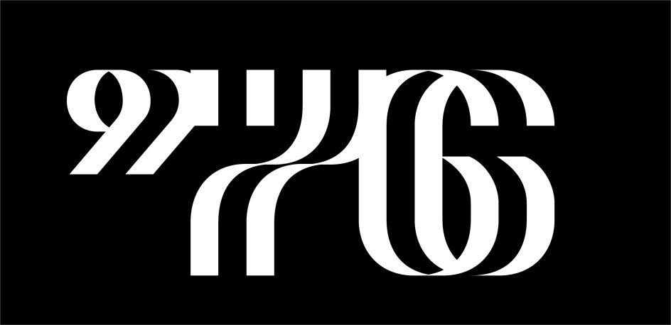
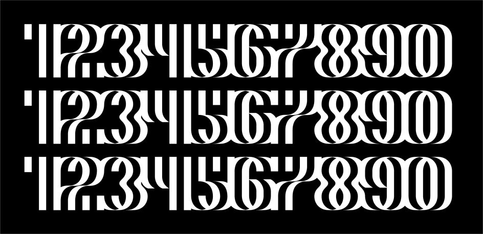
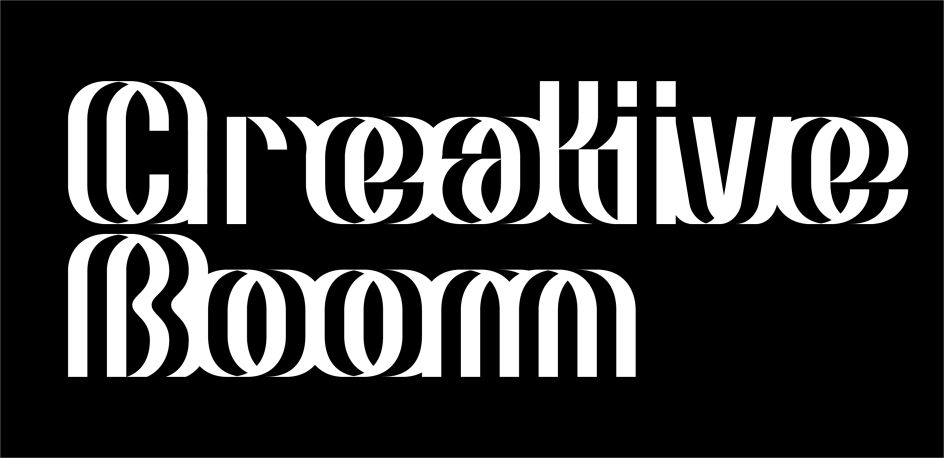
Called F37 Wyman, each letter of the type family is designed on a grid and uses OpenType to snap each letter into place, creating an even bolder optical illusion. It's available to purchase via Banks' foundry.
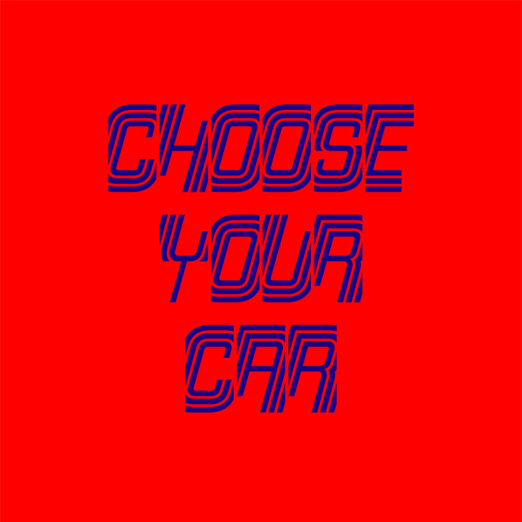
"Lance's original '70s lettering is so beautiful and iconic in its sense of simplicity and modernity. It just had to be revitalised and digitalised for the modern world," adds Banks. "Interestingly, some letters weren't really working, so Lance redesigned them and we suggested some alternates too. We tried some things and they just didn't work so we reverted back to the previous designs."
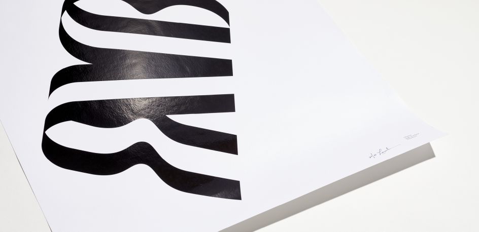
One unconventional design aspect of the type is the negative side bearings that allow the letterforms to overlap. "In early sketches, you can see quite a few letters changed from the original reference," says Banks. "The 'J' is less curly, whereas the 'K' has more curves. The capital 'F' totally changed, too, to become more fluid and organic. The original 'i' was my favourite character but sadly it was dropped as it didn't fit in – even though it's still in the font file as an alternate."
Speaking of the collaboration, Lance Wyman tells Creative Boom: "I am very happy getting the font digitised. Rick has been great to do it with, it was fun seeing the letters come alive. I hope the font gives designers a creative tool. I look forward to giving it a try myself. It was originally designed to celebrate a bicentennial, I want to explore what else it can be used to celebrate."
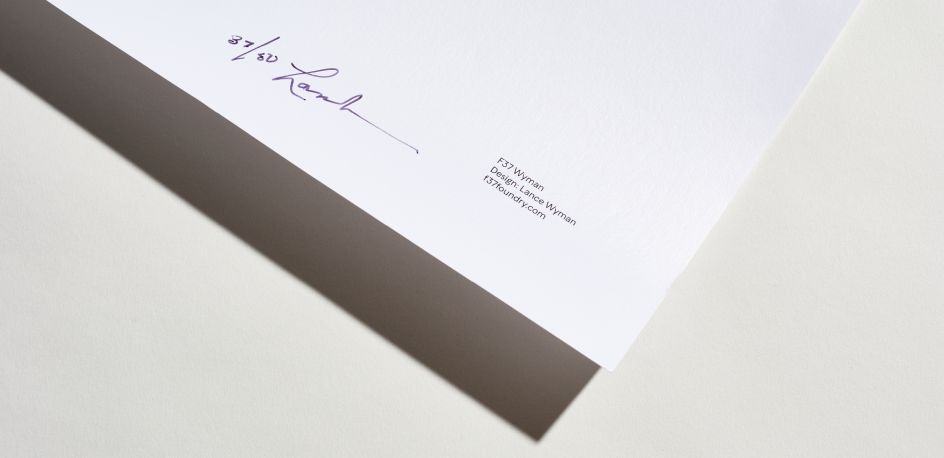
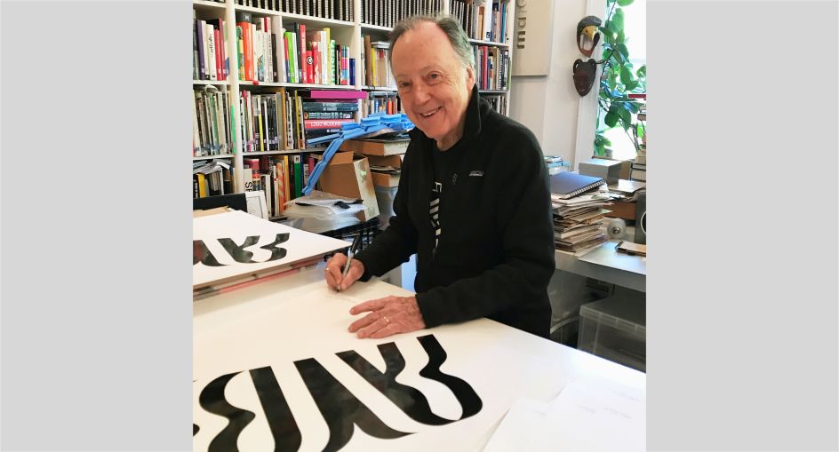
Wyman has designed some posters as part of the collaboration, printed on Omnia White with a high build, ultra gloss UV varnish. Limited edition only, there are only 50 available, each personally signed by Wyman himself in New York. You can grab one at face37.com/shop.
Editor's Picks


Trending


](https://www.creativeboom.com/upload/articles/90/908fdb6378db1e95d12595416f54e6336d5e80b8_732.jpg)
Podcasts


Editor's Picks
Further Reading