A LINE creates a pixelated identity with momentum for Forward
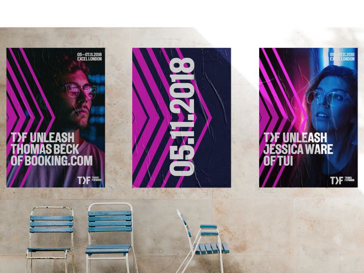
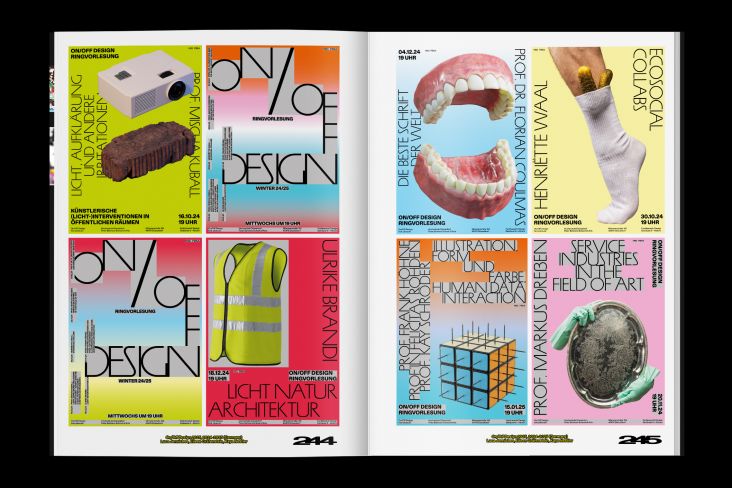
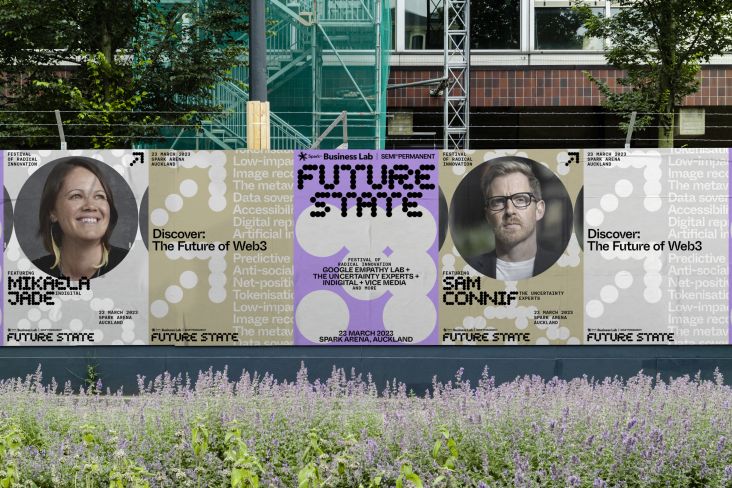
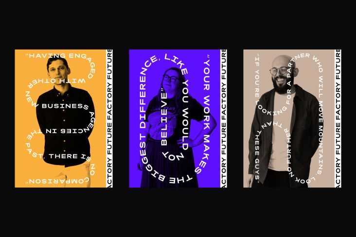
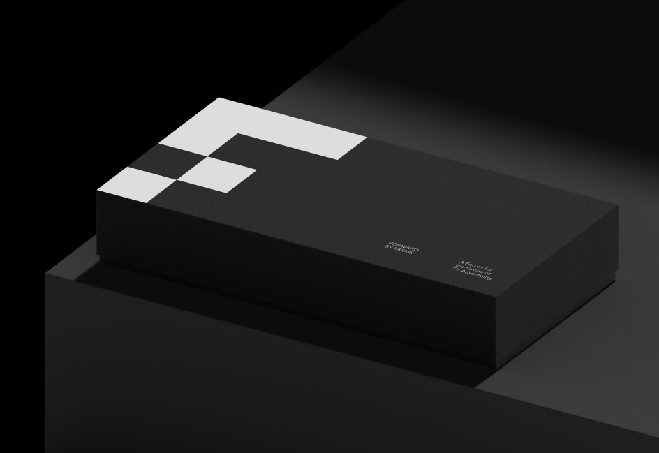
Brand strategy studio A LINE has collaborated with thought leadership events Forward to create a pixelated identity which looks to the future. With bold colours and a sharp, unmistakable central logo, Forward looks set to have the momentum it needs.
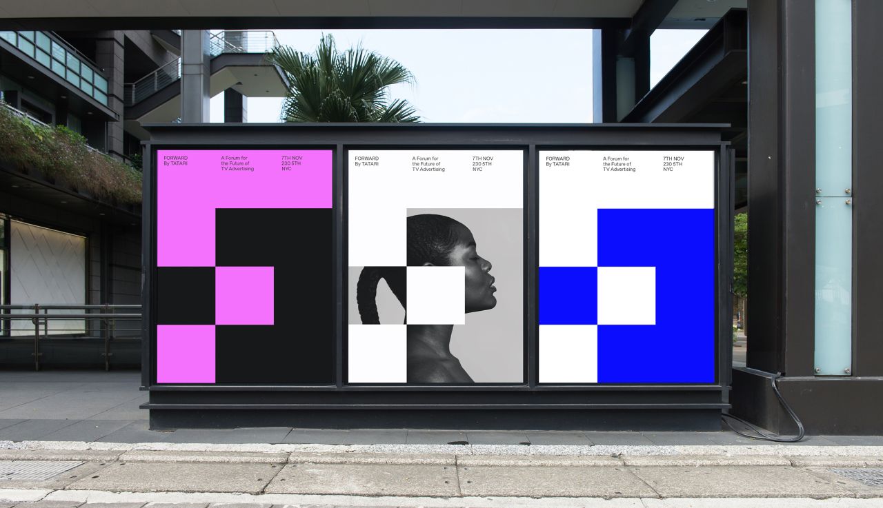
What does TV advertising look like for brands in the future? That's the meaty subject that experts and thought leaders will be chewing over at Forward, a series of events conceived by technology Tatari. Taking place in New York City later this year, the events have already been given a striking name and visual identity by A LINE.
Armed with a brief to create something that felt both bold and futuristic yet also smart and intimate, A LINE settled on the name Forward as a nod to the fast-moving pace of the digital media industry.
"The idea for the name was born from the future focus of the event," the studio explains. "In an industry as fast-moving as media, and where the only acceptable movement is forward, this felt like a natural fit."
To maintain a connection between Tatari and the Forward event, A LINE used the company's existing design system as a springboard. From here, they modified the existing blocky, black and white Tatari logo and adapted it to fit the Forward identity. The result is a natural evolution which maintains a satisfying consistency with its parent company.
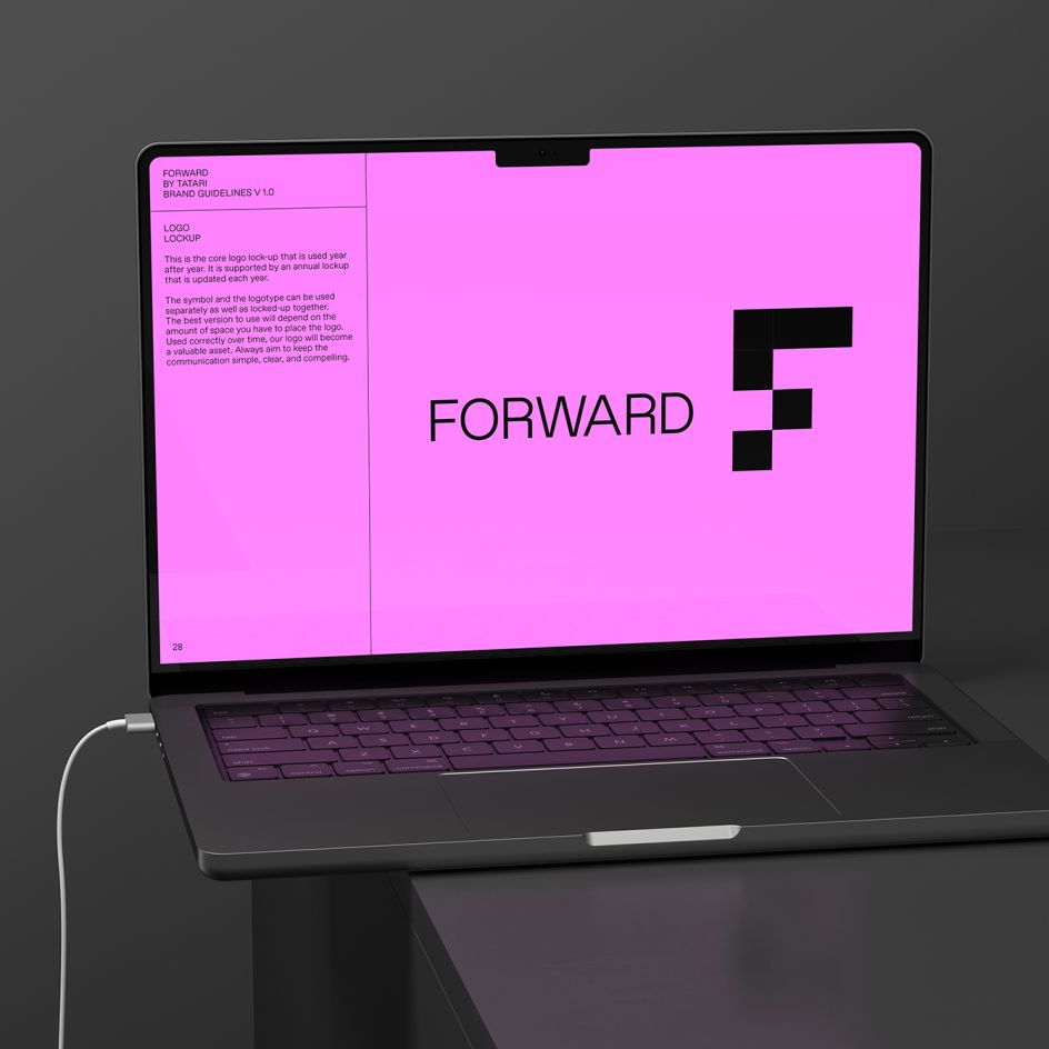
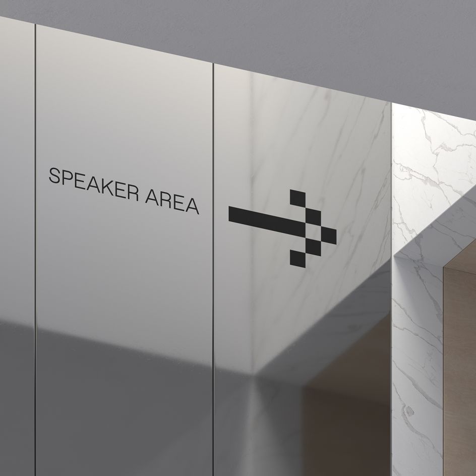
Take the symbol at the heart of the Forward branding: a giant letter F which appears to be made out of huge pixels. This not only shares similar design traits to Tatari, but its subtly distorted form taps into the theme of the events. Thanks to a section of the F being missing from where the arm usually branches out, the letter resembles an arrow pointing, suitably, forwards.
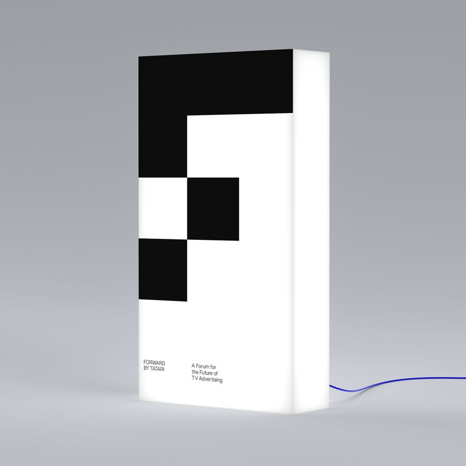
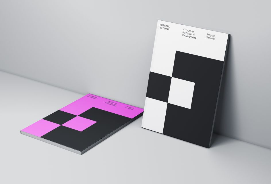
"The pixel-based design language was used to construct a graphic "F" symbol, and the colour palette was simplified to work with the more limited number of brand applications needed," adds A LINE.
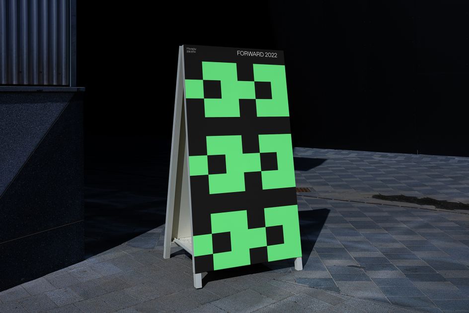
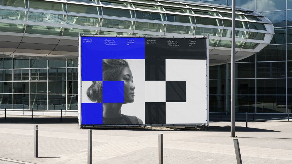
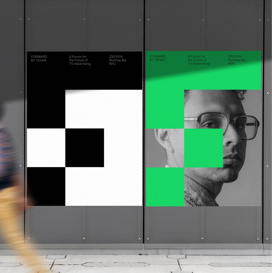
As well as the distinctive logo mark, which will appear across posters and merchandise such as clothing and water bottles, a series of motion assets were also created to demonstrate the flexibility of the design system and support digital signage at the event.
"The outcome was a fresh, modern brand identity that works as both a sub-brand and a standalone brand, and which manages to feel both timeless and futuristic," adds A LINE. "The first event in the series is planned for late 2022 in New York City."
Editor's Picks


Trending


Podcasts
Editor's Picks
Further Reading