dn&co becomes DNCO as it celebrates success and gets ready for more growth
Creative studio dn&co has today unveiled a new name and brand identity in the shape of DNCO. Designed to celebrate the studio's transition to a 100% employee-owned business, the revamped look also allows DNCO to grow further and achieve even more.
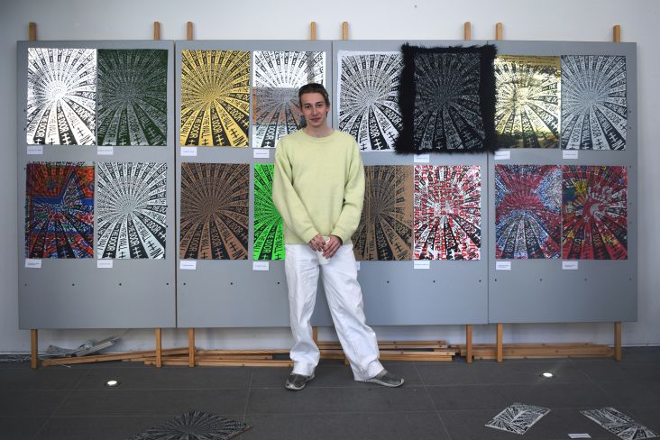
Founded in 2006, DNCO has become a leading studio when it comes to culture and place branding. Recent clients include The Design Museum, the V&A and Edinburgh Park, to name but a few. And as well as creating incredible work, one of the fundamental components of its success was the studio's decision to become an employee-owned business in 2019.
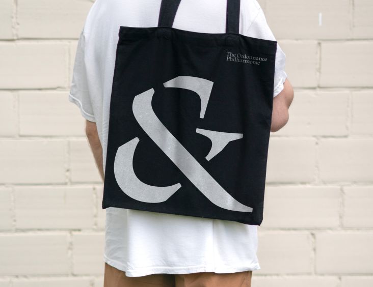
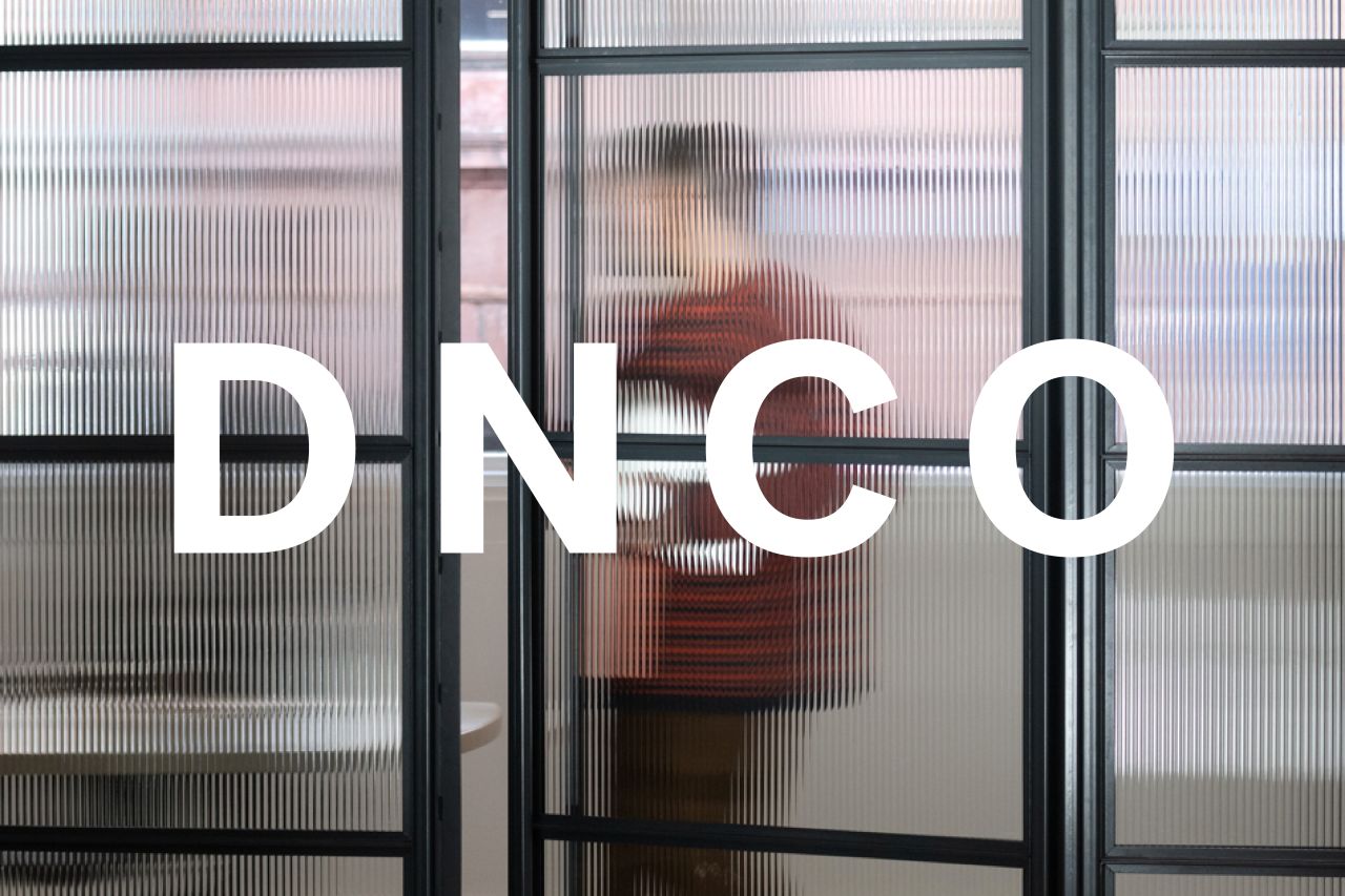
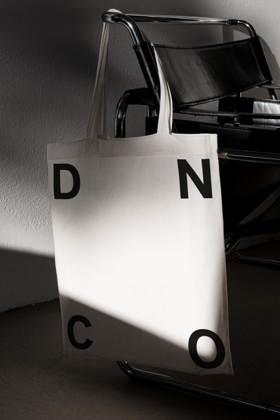
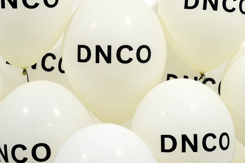
To reflect the 40-people-strong company's new collaborative nature, the rebrand has ditched the ampersand and switched to all caps. This not only makes the studio name easier to pronounce – which is important as it eyes up significant international expansion – but it also aligns with the studio's web and social footprint.
At the heart of the new brand, though, sits DNCO's values. These include its curiosity about the world, its employee-owned status, which means that decisions and responsibilities are shared, and a caring culture which nurtures creative talent and aims to help clients become more sustainable.
Speaking of how the rebrand came about, DNCO Founding Director Joy Nazzari said: "When we became a 100% employee-owned company, it was an incredible endorsement of our own future and the people in the business. It was also the perfect cultural foundation to overcome the challenging pandemic years.
"As we come out of that, we are, in many ways, a different company – bigger, stronger, with more diverse abilities, and a bolder vision - to shape the brands our world needs next. Our name and our brand no longer represented us, so it was time to change.
"DNCO encapsulates who we are today and our ambition for the future. It's not an acronym, but in a way, you can interpret the name as an imperfect contraction of Design Community. What it really signals is a company that has gone well beyond what those four letters originally stood for, to something bolder and more ambitious."
Treating the rebrand as a client project, DNCO assigned a team of strategists and designers led by a client manager. Together they carried out stakeholder interviews, ran workshops, and stuck to a rigorous timeline with milestone meetings along the way where DNCO was referred to as a client instead of in the first person.
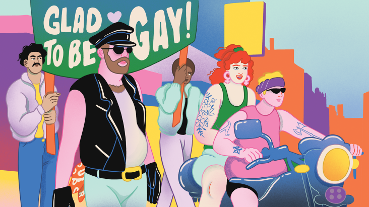
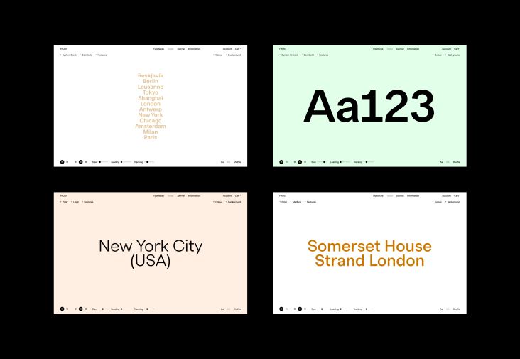
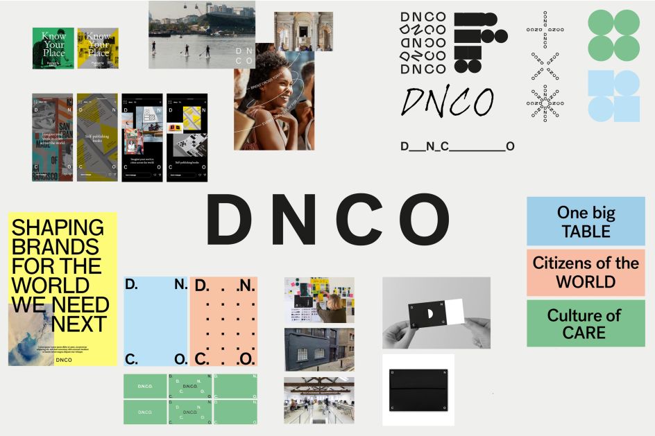
What worked for DNCO's clients appears to have worked for them, too, as the new identity effectively communicates a sense of confidence. Thanks to the use of illustration, colour and the capitalised word marque, the studio's new look also packs a strong personality.
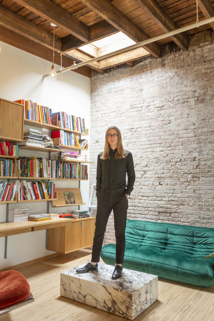
"Designing your own studio identity must rank among the most uncomfortable jobs in the business, and the opportunity for navel-gazing is at an all-time high," says Patrick Eley, Creative Director of DNCO. "We knew, though, from years of conversations around our name, that our brand would benefit from a wholesale review of the kind that never normally happens in the day-to-day running of a studio. It was also an opportunity to involve the team that uses the identity on a daily basis and create a real sense of ownership — something that fits perfectly with our employee-owned credentials.
"We've created a simple, elegant design fit for the next 15 years. On the one hand, it's quite a recessive identity, allowing the work we make for others to shine out, but on the other, it's got increased confidence and attitude, with the development of a stronger, more playful visual language we never had before."
Meanwhile, DNCO Design Director Sam Jones says that the new identity was a visual exercise in "evolution, not revolution". By taking stock of the elements the studio was keen to retain and removing the gap between the visual identity and the warm faces of the team, Sam claims that DNCO is now open to "spirited moments of communication."
Sam adds: "The addition of illustration also opens up greater opportunities for varied visual tones across self-initiated projects in the coming months. Our approach to typography was a balancing act between creating a voice of confidence and warmth. We chose Sharp Type's Post Grotesk for its blend of unashamedly robust forms and softer quirks – including rounded tittles with a hint of wit.
"The typeface was also used for the new logo; an unapologetic but straightforward uppercase word marque that draws a line in the sand from the studio's previous lowercase identity and lays down a marker for the future."

Editor's Picks


Trending


Podcasts


Editor's Picks
Further Reading