Who is DAVID? The agency's new brand says it all
Fernando Musa founded DAVID, an agency directly inspired by legendary adman David Ogilvy, in 2012 at the height of Madmen-era nostalgia. If naming the agency after Ogilvy wasn't enough, Musa also borrowed the Father of Advertising's likeness for DAVID's monochrome logo and wordmark, cementing the agency's midcentury modern style.

But a lot can happen in 10 years (193 Cannes Lions, nine Superbowl commercials, and five new offices, for a start). While the DAVID team still looks to Ogilvy for inspiration, there's no denying that DAVID – in name and deed – possesses creative genius in its own right.
Enter a new brand for a new decade. To celebrate its tenth anniversary, DAVID has created and launched a bold brand refresh with a striking new identity that, while continuing to honour Ogilvy's vital legacy, gives credit where it's due to the DAVID team through a clever, customisable logomark.

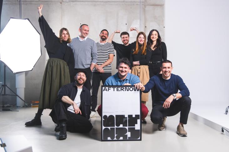
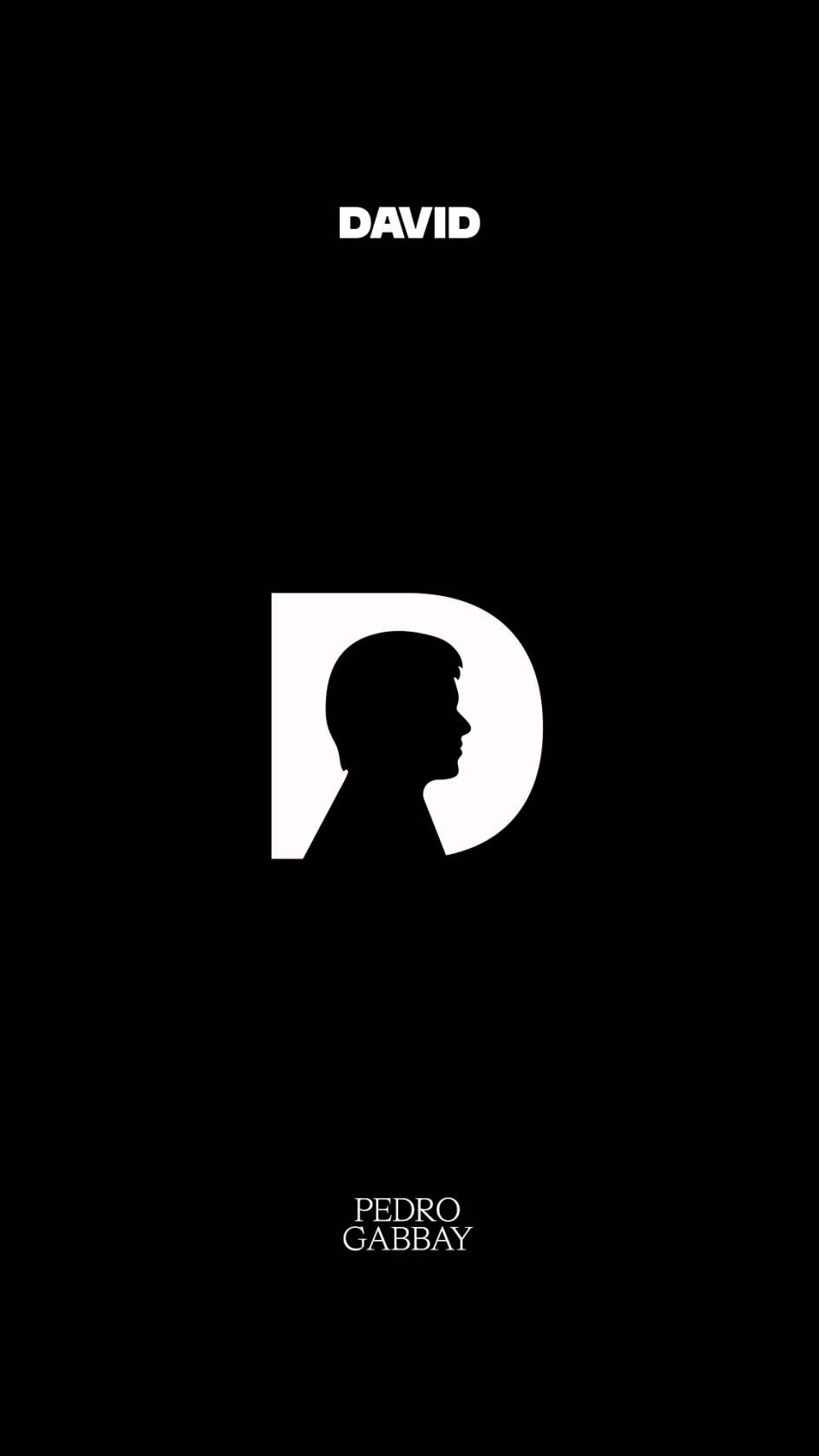
The new brand keeps DAVID's black-and-white colour palette but brings a fresh boldness through type and graphic elements. Designed in-house by the DAVID Madrid team, led by CCO Saulo Rocha, the new visual identity brings the letter D in the primary font type (DAVID Headline), with the figure of David Ogilvy at the centre. The secondary typography has been replaced with HW Cigars.
"Doing the redesign ourselves is part of the beauty of this project. It would've been so much easier to hire a great designer, really. But letting our creatives come up with the big idea and bring it to life is an essential part of this new chapter," said Rocha
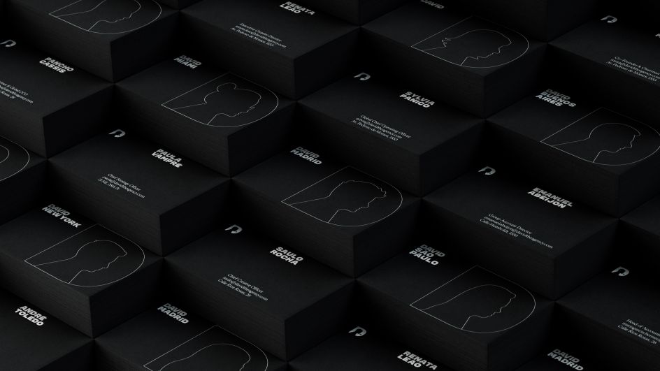
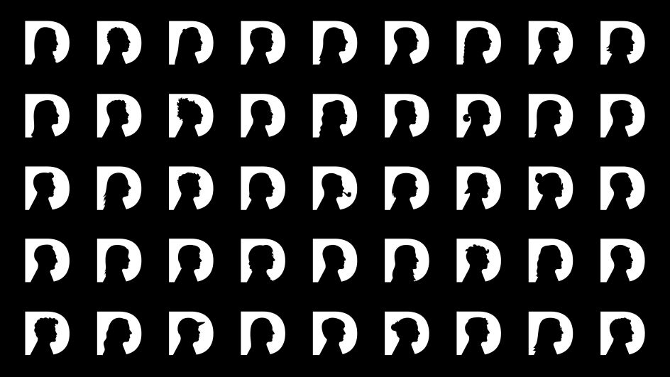
While Ogilvy's profile is at the centre of the primary new logo, harking back to Ogilvy's legacy and his impact on DAVID, the real standout element of DAVID's new identity is that it's a fully customisable tool. Each team member can use their profile as the logo, and those profiles also make up a suite of brand assets that DAVID can apply in internal and external comms to honour the diverse network of real people working at DAVID.
In-house illustrators created the customised, employee-inspired logos, and the team at DAVID plans to continue developing new customised ID tool kits as part of the onboarding process for new employees.
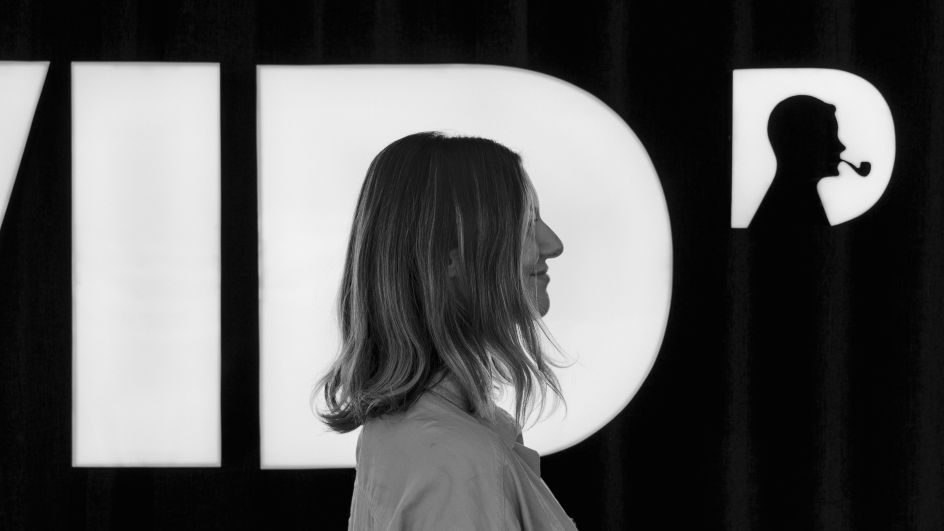
Image Credit: DAVID
The rebrand was born from a question that Rocha, and the wider global team at DAVID, had been mulling over for some time: Who is DAVID?
While it's true that Ogilvy is a central inspiration for the agency, Rocha and his team knew it was time to widen the definition of what it means to be DAVID. And what better way to do that than by using the identity to showcase who is behind DAVID – the 300+ employees living out David Ogilvy's legacy in their daily work at DAVID?
After ten months of work and hundreds of pictures, the agency officially began using the ID system last week, and DAVID employees around the globe have welcomed the new identity and its ability to illustrate their contribution to the agency.
Wil Carvalho, a copywriter in DAVID's Madrid office, told Creative Boom that he loves the brand and the way he is featured as part of it: "I felt that somehow I was eternalised in DAVID regardless of where I go. My vision of the world will always be collective, and I believe that everyone has something to add, and that's what I could see in this rebranding; I felt that each of us matters and can add a bit to the legacy of David Ogilvy and DAVID."
Irene Leon, an account manager at DAVID New York, echoed Cravalho's sentiment. "It's our logo, with our own signature touch, which shows how the DAVID values really are our own too," Leon told Creative Boom. "Each of us brings something very different and unique to our culture, and I love how it portrays exactly that: we are DAVID, and DAVID is more than one person; DAVID is each one of us."
The potential for this customisable, employee-first ID is vast, and teams worldwide are already finding new ways to use it. CCO Saulo Rocha at DAVID Madrid told Creative Boom that the flexibility of the design means infinite iterations are possible: "We could potentially create versions of the logo featuring clients, or brand mascots, for example."
One recent application is particularly sweet: When Rocha welcomed his daughter into the world a few weeks ago, the team sent a gift basket complete with a blanket featuring his daughter's profile in the DAVID logo. "It was a beautiful moment in my life," Socha told Creative Boom, explaining how the gift perfectly captures the new brand's spirit and inherent investment in the agency's people.
DAVID's new brand is certainly ambitious. Art director at DAVID Madrid, Pedro Gabbay, told Creative Boom that it was a rigorous process to create all 350 portraits: "We had to develop a visual style that we would be able to replicate, and everything also needed to connect seamlessly to the hero logo featuring David Ogilvy's silhouette. It was a real challenge for our illustrators to find a balance between the personal, identifiable elements of every team member's profile while keeping the illustration in alignment with the main David silhouette."
But the challenge paid off. The DAVID identity is a smart, modern, and emotionally intelligent new take on the agency, what it stands for, and who it is. The suite of silhouettes gives DAVID a genuine identity, and the design goes above and beyond to celebrate its answer to the question: Who is DAVID?
Editor's Picks


Trending


Podcasts


Editor's Picks
Further Reading