#WeThe15: Pentagram and adam&eveDDB create identity for disability inclusivity movement
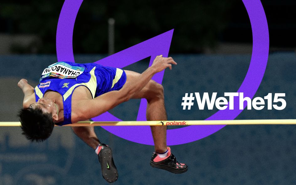
Renowned design companies Pentagram and adam&eveDDB have teamed up with the International Paralympic Committee to create an identity for the recent launch of #WeThe15, a movement that's campaigning to change attitudes towards disabled and improve their quality of life.
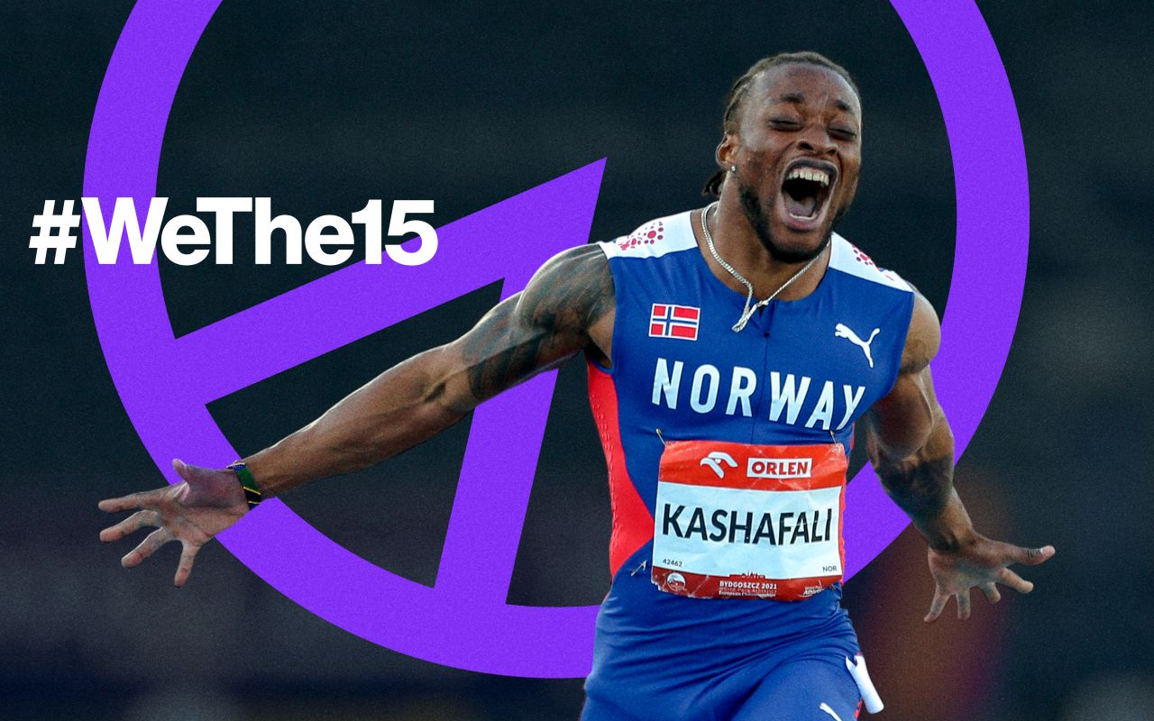
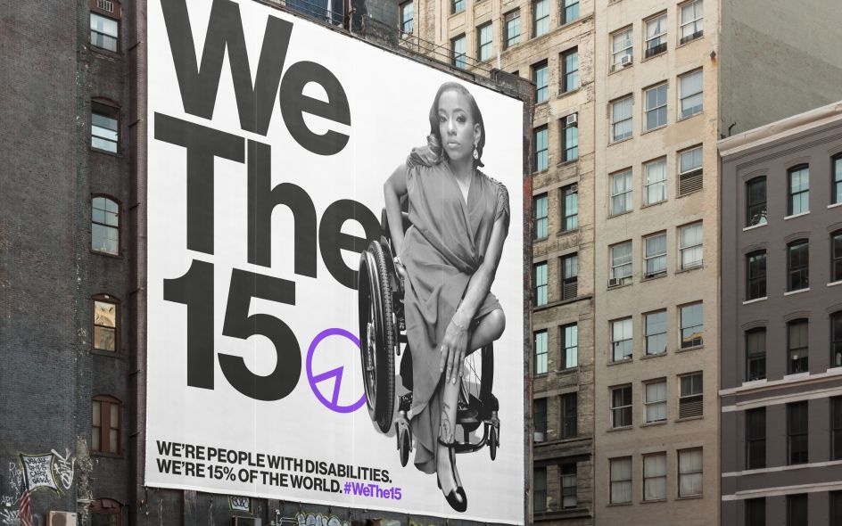
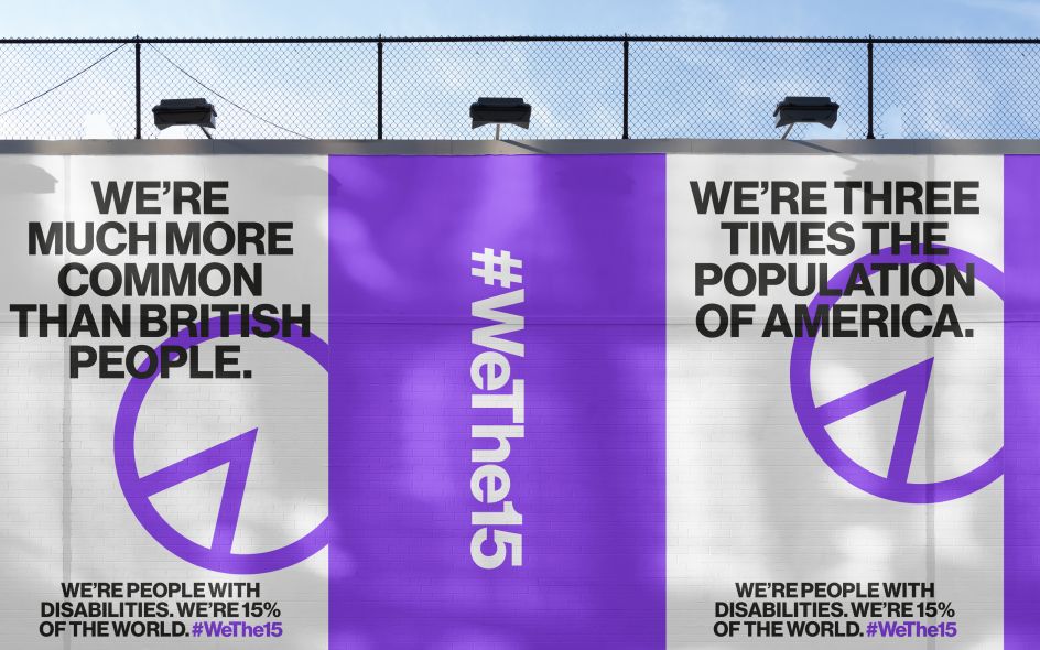
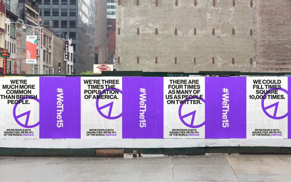
Working with twenty organisations, including the UN, UNESCO and the International Disability Alliance, the two creative studios have joined forces to create the identity for the movement that will benefit the 1.2 billion persons who have a disability. Taking its name from the 15 per cent of the population who have a disability, #WeThe15 aims to break down societal and systematic barriers, increase representation and awareness, and dispel cultural misconceptions.
The identity designed by Pentagram drives home its message with a pie chart-style logo which visualises what 15 per cent of the population looks like. As well as clearly displaying the percentage in a vibrant shade of purple - the international colour of disability - the symbol is titled at a 23.5 degree angle to represent the tilt of the earth's axis during the Paralympic Games.
Pentagram's Harry Pearce told Creative Boom: "It isn’t often that one has the chance to create something that can have a positive impact for 15% of the world’s population – it has been a privilege to be a part of the team behind WeThe15 and to work with the IPC on such an important campaign."
Accompanying the visual elements is an innovative piece of sonic branding created by Yuri Suzuki which allows the #WeThe15 experience to be enjoyed by the hearing impaired. The sonic branding works by rhythmically spelling out ‘We The 15’ through the use of close intervals. By being arranged across three octaves, people with hearing loss can still hear the fundamental tone and structure of the sound and appreciate it.
Surprisingly, Yuri explains to Creative Boom that: "The brief didn’t actually require the sound design to be inclusive, but I believe that it’s fundamental to design sound that everyone can access.
"I thought it would be great to design sound based on people’s frequency of hearing loss. There are different spectrums of frequency that can be difficult to hear (low, mid and high frequency), and we aimed to cover all of these when designing the sonic branding for #WeThe15."
Designed to work at the Paralympic Games themselves, the sonic branding was inspired by a workshop conducted by the blind artist Takayuki Mitsushima in Kyoto. Yuri reveals that: "It showed me how much we rely on sound for finding our way around, and we deliberately designed this logo in mono instead of stereo so that it works well when used at Paralympic venues. We tried to make the melody catchy and easy to remember, representing “We-the-fif-teen” almost as a lyric."
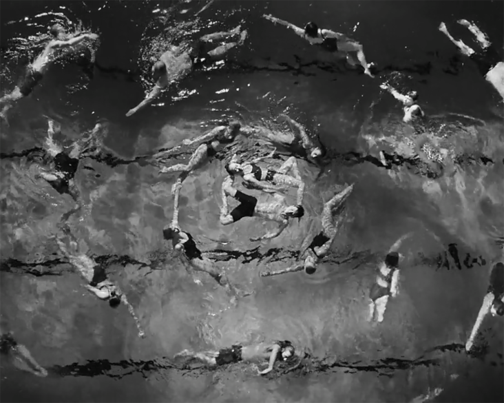
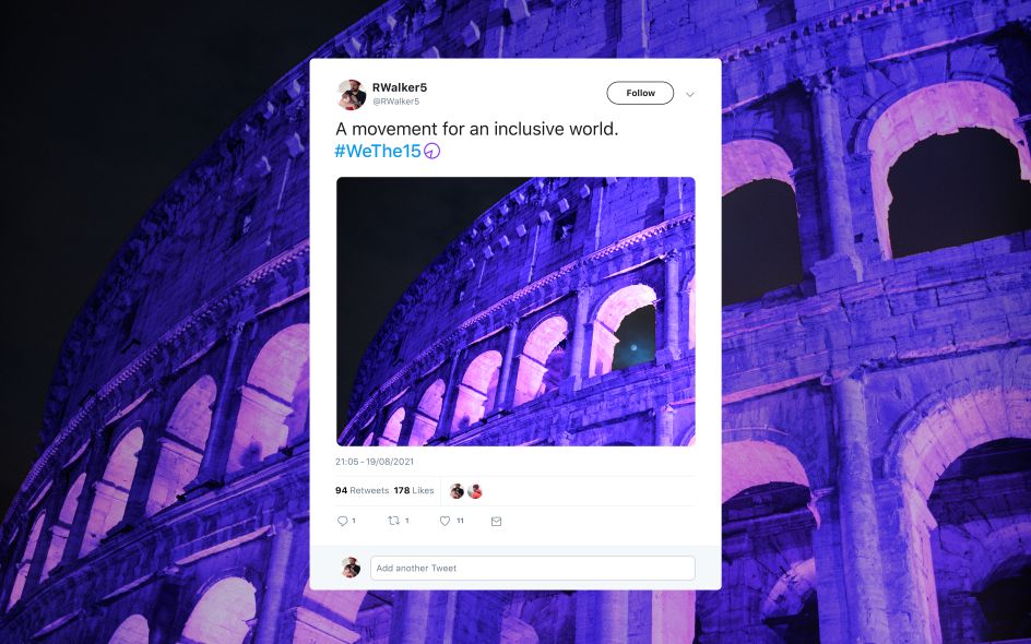
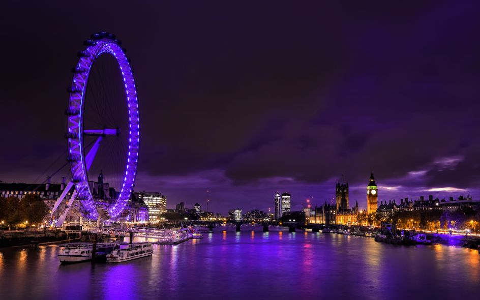
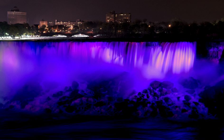
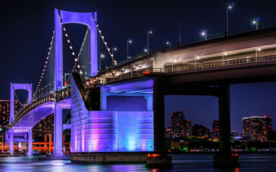
To mark the launch of #WeThe15, 90 iconic landmarks around the world such as the Niagara Falls, Tokyo's Rainbow Bridge and the London Eye were illuminated in the brand's distinctive purple light. Capping off the launch will be the screening of a film made by adam&eveDDB at the Paralympics Games Opening Ceremony on 24 August.
Editor's Picks


Trending


Podcasts


Editor's Picks
Further Reading