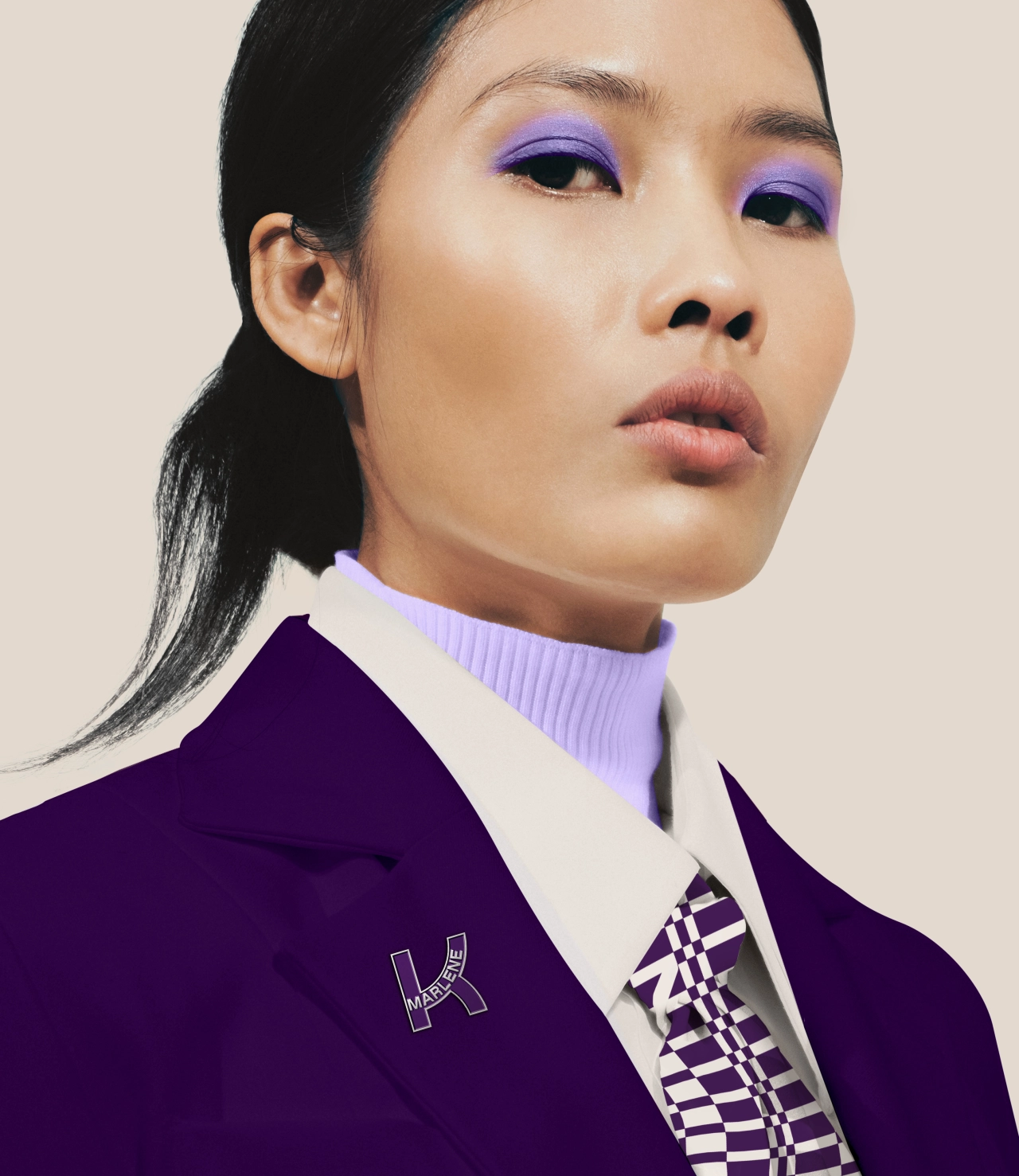
Kathrein Privatbank is a private bank based in Vienna that prides itself on providing a personalised experience for its customers. Every product and service they offer is in the pursuit of personal, and they wanted their branding to reflect this more completely.
So they turned to &Walsh, a well-known creative agency based in New York specialising in brand strategy, art direction, design and production across all platforms.
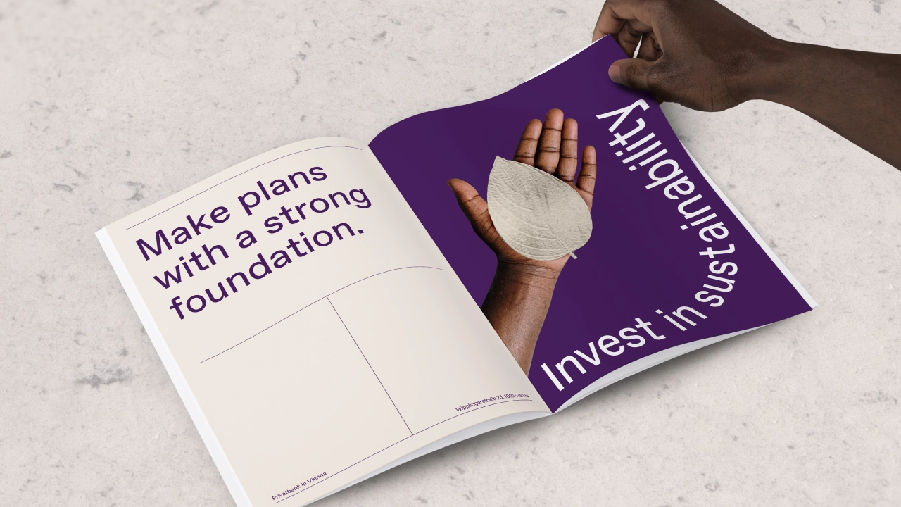
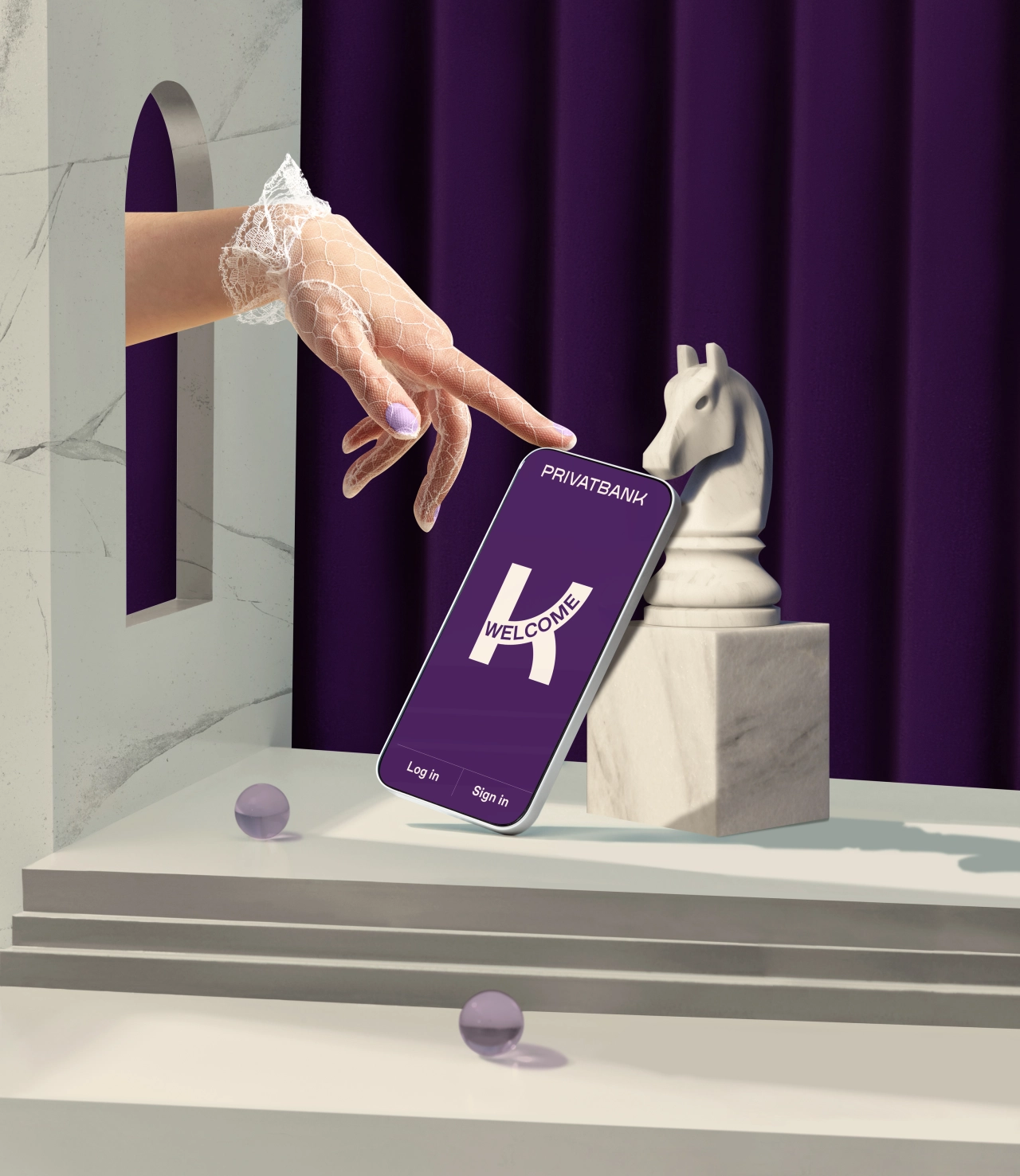
In crafting the new identity, &Walsh focused on the company's Austrian roots, combined with their deep commitment to personalisation, to separate them from their larger global rivals.
The new brand strategy addresses the shifting mindsets towards money that the world is seeing today. The emphasis, then, is on prioritising people's full story and values rather than just the simple goal of financial gain. This deep commitment to personalisation is reflected in the design choices throughout the visual identity.
Key brand elements
To represent Kathrein's heritage in Austria, &Walsh drew from visuals from the Viennese Secession – an art movement closely related to Art Nouveau that was formed in 1897 by a group of Austrian painters, graphic artists, sculptors and architects – to create a series of graphic ornaments and patterns.
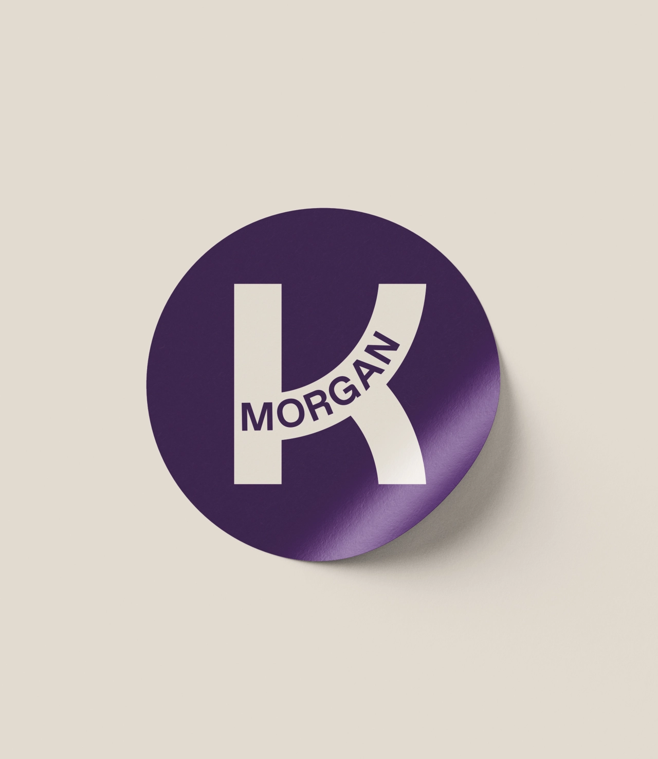
Meanwhile, the 'K' logo system was designed to embrace the bank's core mission around personalisation.
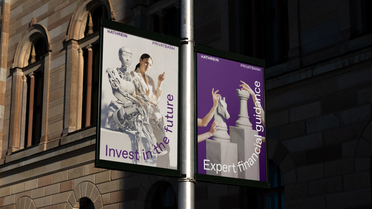
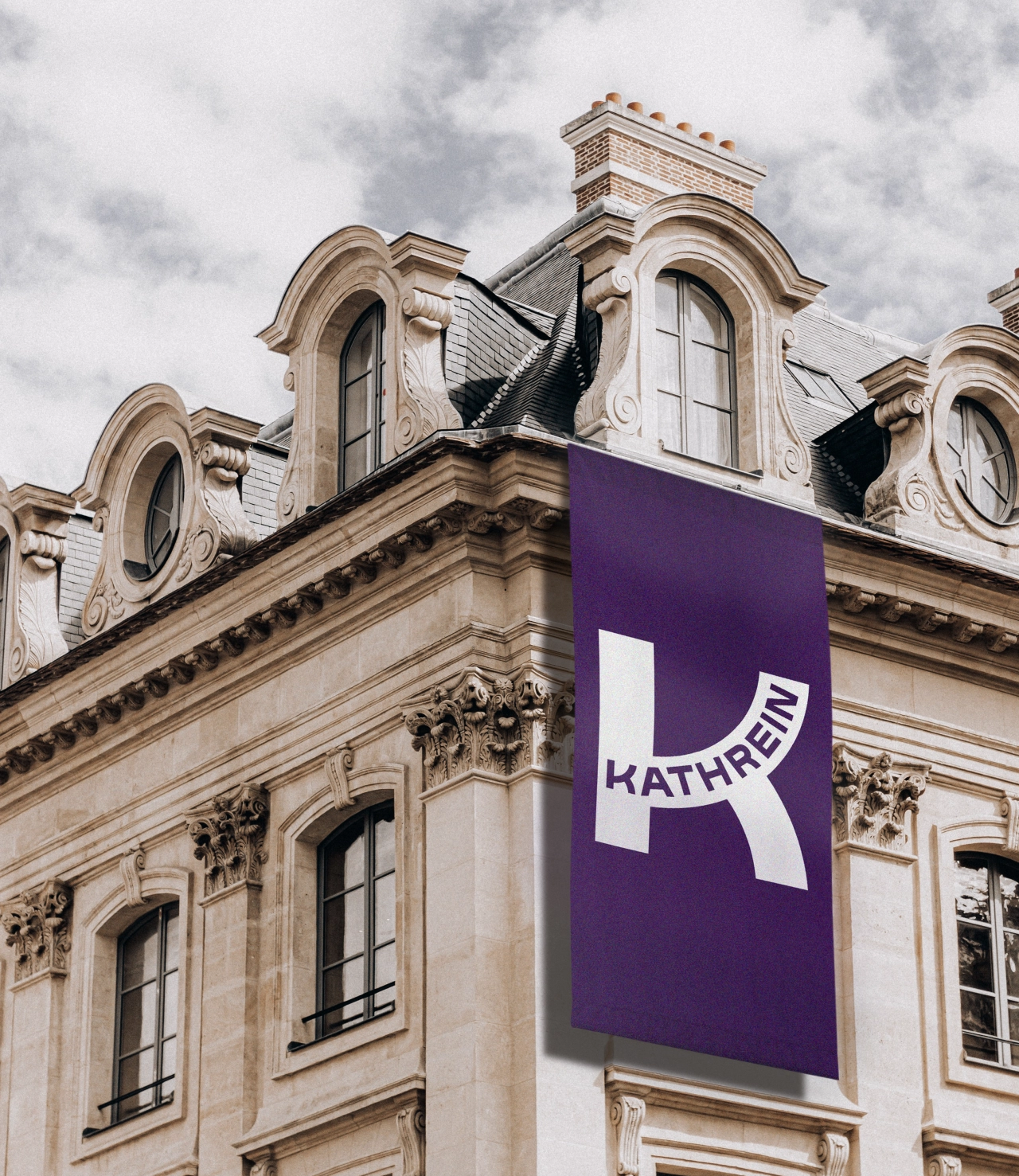
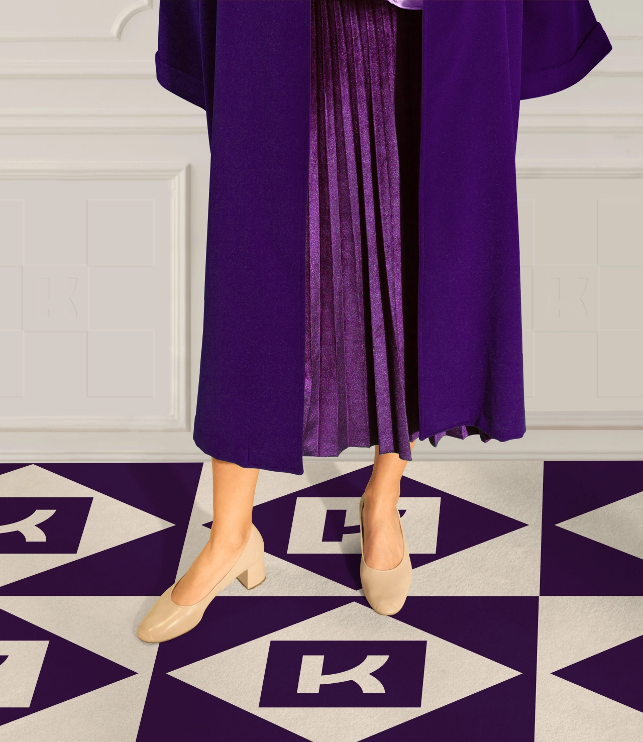
Whether used in print or digital, the logo can be customised with each of Kathrein's clients' names. And the typography used throughout the branding reflects the upward and forward path of the K logo, symbolising how the bank helps people better move through life.
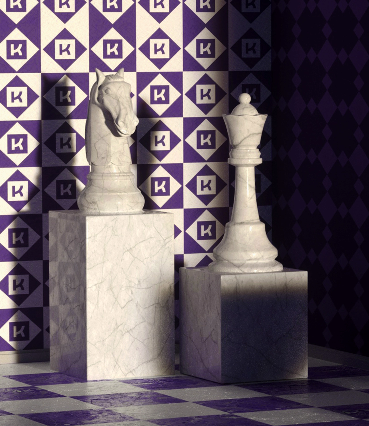
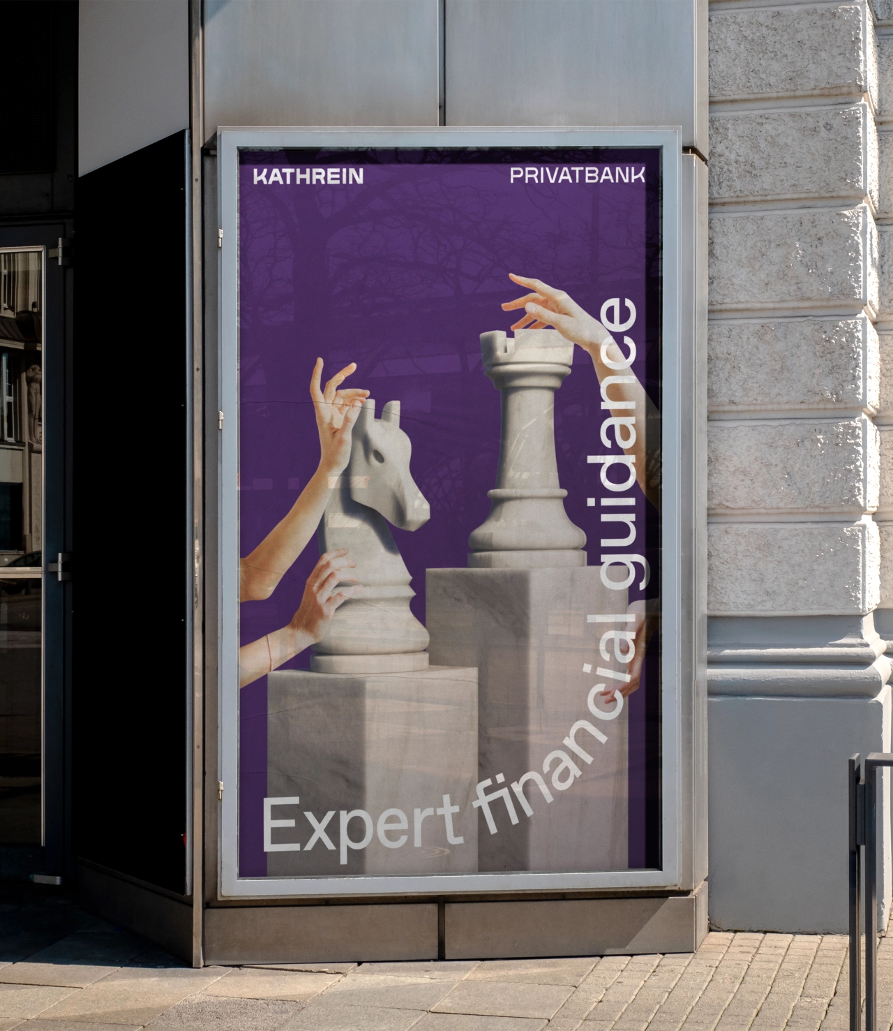
Marble is also an essential part of Viennese art and architecture history, and so &Walsh created a series of sculptures that relate to different categories of financial investments, such as sustainable solutions, artificial intelligence, and the arts.
Editor's Picks





Trending






Latest Jobs
Client Partner at Halo
Full-time·Bristol·£30k–£36k
Senior Designer at Jubba
Full-time·London·£50k-£60k
Senior Digital Designer at 3800
Full-time·Sheffield·£40k-60k
Account Director at How&How
Full-time·London·£73k-£79k
Midweight Graphic Designer at We Are Your Friends
Full-time·London·£36k–£44k
Brand Designer, Product Launches at Figma
Full-time·New York·$127k–$269k