'I think in lines': Vidhya Nagarajan on illustration as visual problem solving
The New York-based illustrator reveals how limitations such as simple colour palettes helped to form her popular and one-of-a-kind art style.
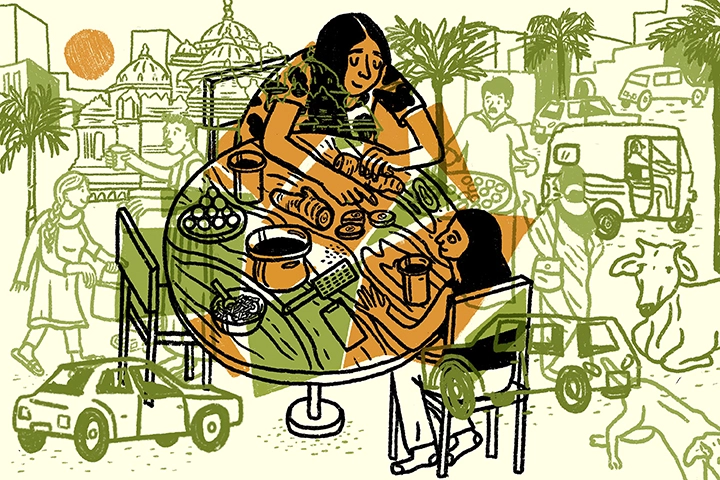
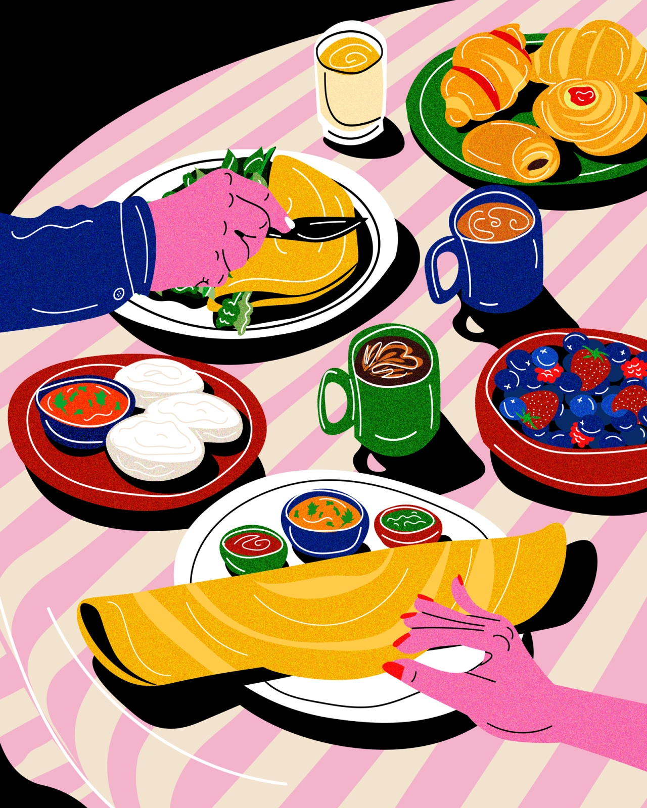
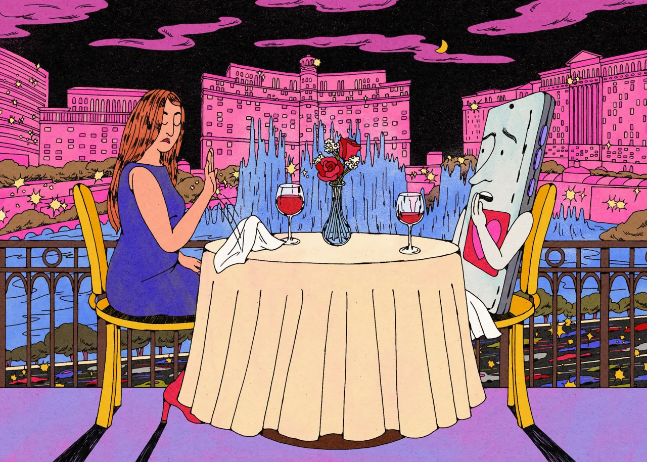
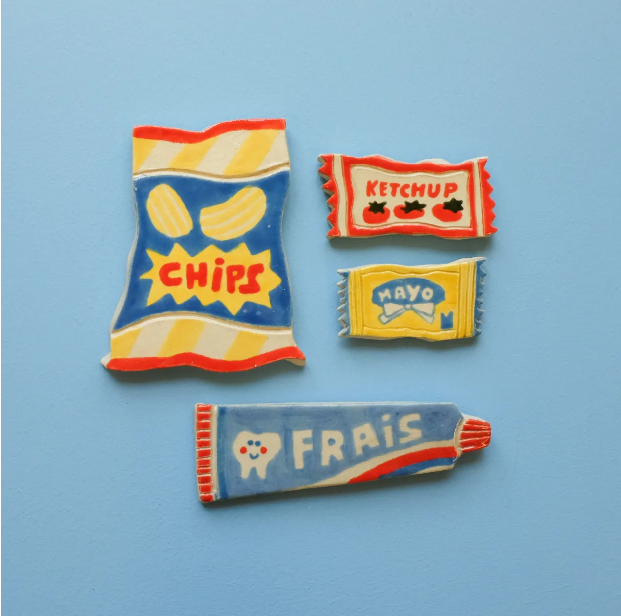
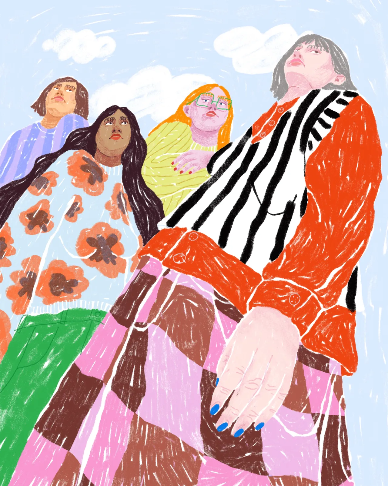
Vidhya Nagarajan's illustrations are a joy to behold. Instantly recognisable by their flowing line shapes and dynamic patches of colour, it's no wonder that she's been snapped up by the likes of Google, Apple and The New York Times, to name but a few of the illustrious brands on her client list.
For Vidhya, her life as an illustrator fulfils a life-long dream. Even as a kid, she was always drawing and cited art as her favourite high school class back in the day. "I knew I wanted to do something with art, but I did not know what was possible until I found out what illustration was in college," she tells Creative Boom.
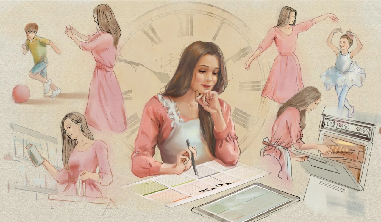
Part of the unique appeal of illustration for Vidhya is that there is a degree of problem-solving. Commercial artists are often tasked with visually communicating someone else's idea, which frequently includes working to both a brief and a deadline. With these constraints in place, illustrators have the guidance to make creative decisions more quickly.


You wouldn't think of it to look at them, but the colours in Vidhya's illustrations result from these limitations. "I use a limited colour palette because I like the way it looks, and I like setting up limitations for myself," she reveals.
"Making an illustration means you have to make hundreds of choices. When I started illustrating, I struggled with selecting colours, so I pared down my choices. I started using black, one colour and then the white of the paper. This set up a really simple value structure and cut down on the number of choices I had to make. Keeping colours simple also helps in my screen printing process."
Another distinctive quality in Vidhya's work is the bouncy, flowing line shapes she uses to draw everything from people to buildings and animals. But whereas her colours are born out of necessity, her characteristic lines appear more deep-seated and organic. "I think in lines," she explains. "Every drawing or sketch starts with a line drawing."


When she's not thinking in lines, Vidhya likes to travel, and her various sojourns become the focus of her art. "Travel has changed my work because it makes me notice every little thing," she says. "When I go to a new city, I am inspired by everything different from where I live.
"In Japan, the sewer lids are works of art; everything is smaller and quieter but pristine. In London, public art is abundant in so many mediums and from so many different eras. In Lisbon, it's the tiles and pattern. In Copenhagen, it's the furniture and minimal aesthetic. In Mexico City, it's the ladies with their colourful candy carts and hand-painted signs. All this and more makes its way into my brain and onto paper somehow."
As well as illustrating what she discovers during her travels, Vidhya also pens beautifully realised annotations which describe what she has experienced or encountered. These take the form of written notes but are often centred around elaborate, signage-Esque lettering of the place name itself. Could this be the start of a new medium for Vidhya?
"I started lettering because I'm interested in typography, but I wanted to have more control over it," she says. "So I started drawing it. I taught myself by collecting samples of type and lettering I liked and taking pictures of signage whenever I travelled. I'm teaching a class on lettering this spring!"
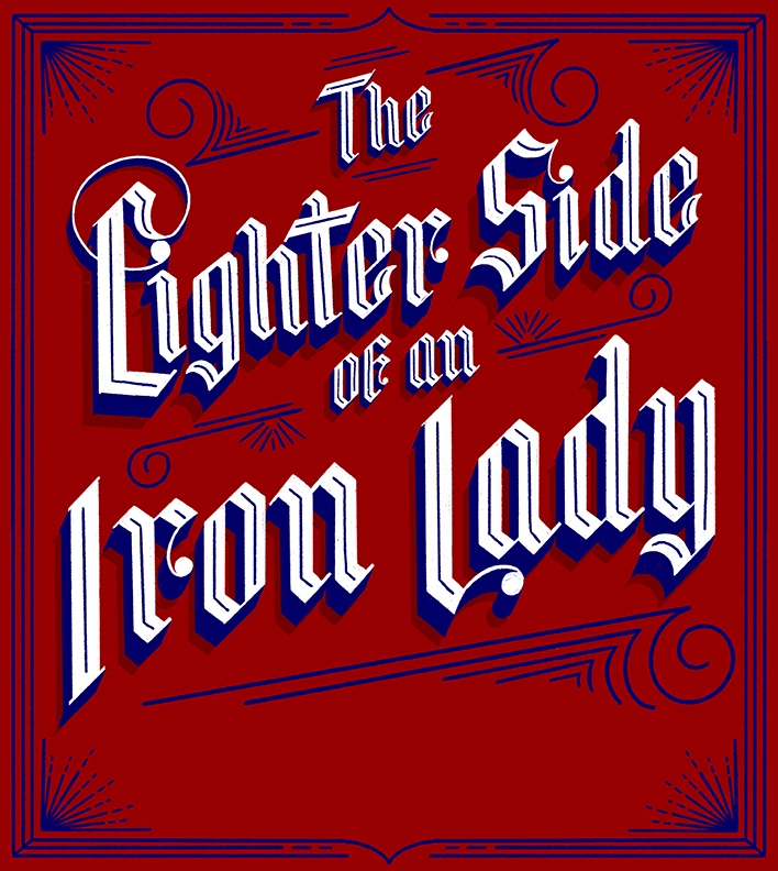

Of all the places Vidhya has visited and illustrated, Lisbon is a favourite. "I had never been to Portugal before, and I loved the city, the food, the people, the climate, that you have to hike up hills and steps multiple times a day and the art."
As for the future, Vidhya wants to travel even more in 2023 and start screen printing again. Currently, she's working on personal projects, having recently finished a small piece for the New York Times.
"I'm working on a print for a non-profit organisation, I Paint My Mind, and I'm currently planning the semester," she concludes. "I also teach at Washington University in St. Louis in the Sam Fox School of Design & Visual Arts.
Editor's Picks





Trending




Latest Jobs
Junior Account Manager at Gardiner Richardson
Full-time·Newcastle·£30,000 – £32,000
Design Developer, Opinion at The New York Times
Full-time·New York·$113,946 – $136,000
Designer, Marketing (Games) at The New York Times
Full-time·New York·$85,000 – $100,000
Copywriter at David&Goliath
Full-time·Los Angeles·$75,000 – $95,000
Senior 3D Motion Designer at Art&Graft
Full-time·London·£50,000 – £65,000
SEO and GEO Content Strategist at Loom Digital
Full-time·Bristol·£35,000 – £37,000






](https://media.creativeboom.com/1bb3b075-5133-4f0f-ba3f-990846e03f64/conversions/80c02674c86382c771c49e94d6353ee1ca7165d2-medium.webp)