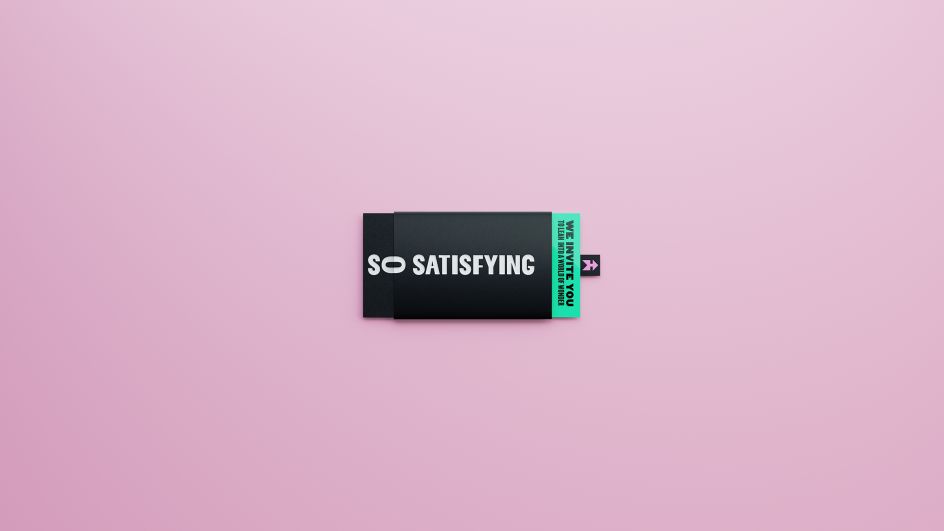
Vault49 creates the first ASMR-inspired logo
New York and London brand design agency Vault49 has created what it claims to be the first ASMR inspired logo for media brand So Satisfying, which hosts and curates video content aiming to ignite autonomous sensory meridian response (ASMR) in viewers.
ASMR is a term that refers to a feeling of euphoric tingling and relaxation that some people experience when watching certain videos or listening to particular sounds, which varies according to t the individual.
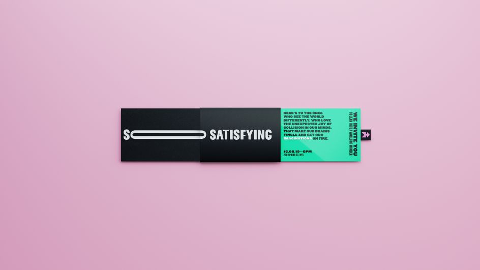
So Satisfying is a new IMGN Media brand broadcast mainly across social channels including Instagram, Snapchat and TikTok; and Vault49's work aims to be "an example of how to capture a budding audience and define an emerging category."
Leigh Chandler, partner and creative director, Vault49, says: "ASMR... evokes an emotional response in people who view it, at once engaging and hypnotic. Therefore, the brief for So Satisfying was a unique challenge – how can we capture the feeling of ASMR content in a logo alone?"
Vault49 worked with its in-house CGI artists and animators to create bespoke ASMR content to inspire and work in conjunction with the new identity and brand, which it says needed to be "distinct and communicate the heightened experiences achieved through watching satisfying content". Bespoke animated statements are used to describe the ASMR experience.
"'So' is the unique part of the name – other brands in the ASMR space also use the word 'satisfying' within their name," Chandler adds. "'So' is also an emotional, descriptive word. Therefore we wanted to give it more emphasis – it's not just satisfying; it's sooooooo satisfying.
"We explored various creative ways of capturing the emphasis on the word 'o' and landed on simply stretching it. It is represented fully in its animated form, and as the brand exists largely in the digital space, it was essential for us to bear this in mind from the very beginning."
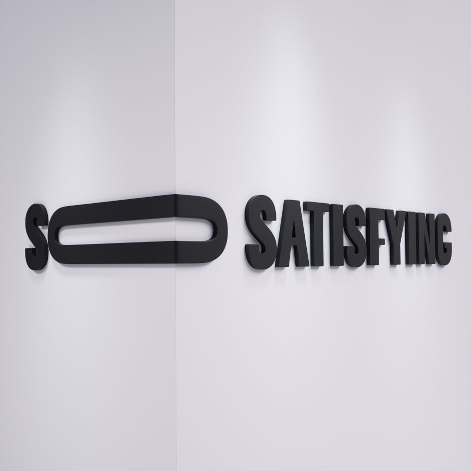
The identity is used across all touchpoints, including printed communications, online and in interior spaces, where the 'o' of the logotype can be manipulated according to the architecture 'r' using paper engineering.
At the heart of the identity is a logo that takes both static and motion forms that aim to capture the videos' sensorial elements. It's an animated logo that stretches and contracts, "mirroring the elastic qualities of So Satisfying's content," says Vault49. "As brands appear across digital platforms, animated logo icons will play an important role, while functional tech brands are increasingly communicating their experience through an animated logo."
The agency adds, "Even the static logo simulates movement, with stretched graphics recalling the shape-changing character of the brand's world."


](https://www.creativeboom.com/upload/articles/90/908fdb6378db1e95d12595416f54e6336d5e80b8_732.jpg)


 for Creative Boom](https://www.creativeboom.com/upload/articles/c4/c4c9db57e514f5f70d7a2d80348e2218d3c6d069_732.jpg)