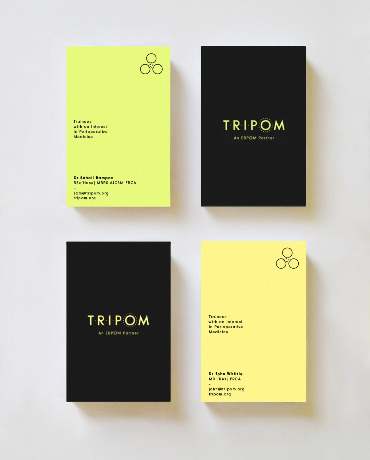
Superfried develops new identity for TRIPOM to stand out from the usual medical cliches
Two doctors recently approached Manchester studio, Superfried, to help them develop a new, not-for-profit web-based education resource in a rapidly growing field of Perioperative Medicine – that's "medical care of patients from the time of contemplation of surgery through the operative period to full recovery" to you and me. They wanted a new brand identity and the development of a complex web-based platform that was fun and vibrant to connect with their target student demographic.
All images courtesy of Superfried
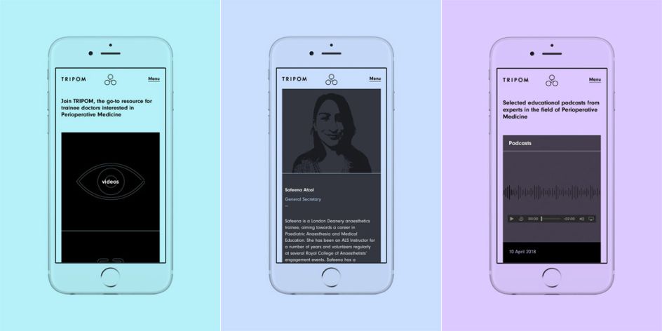
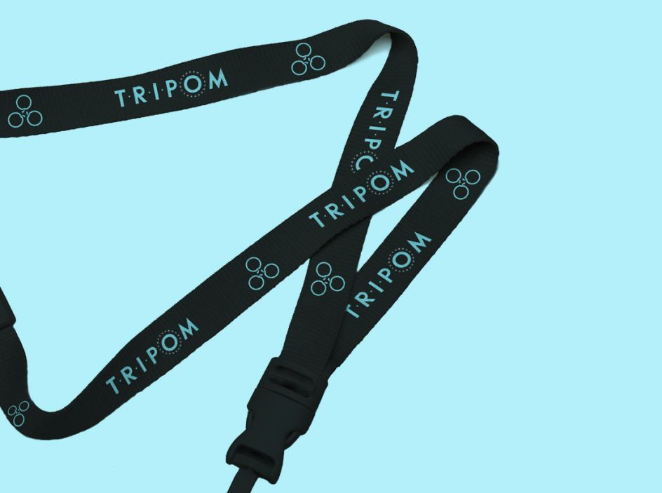
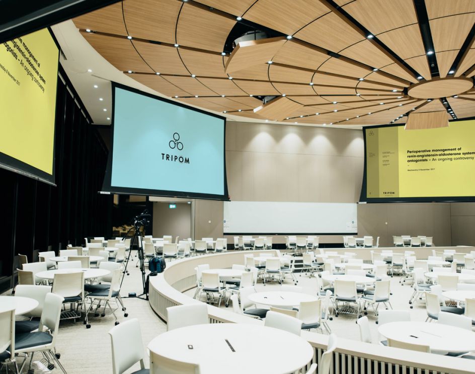
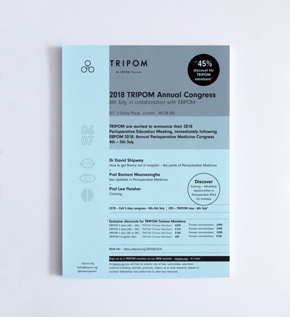
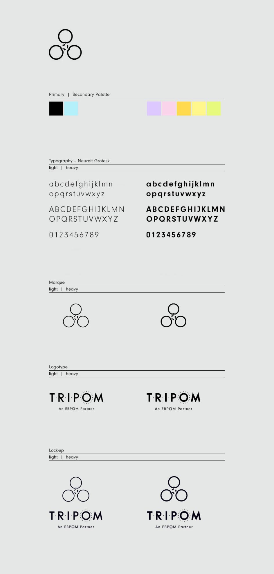
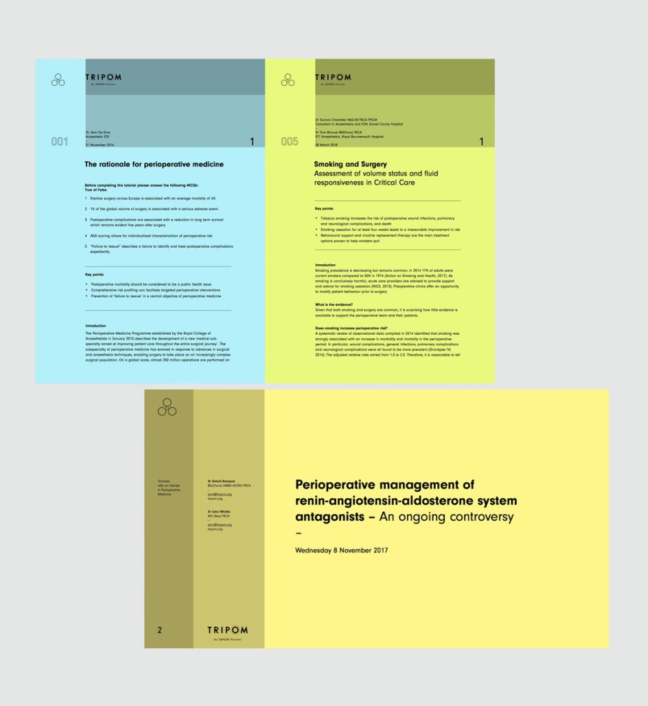
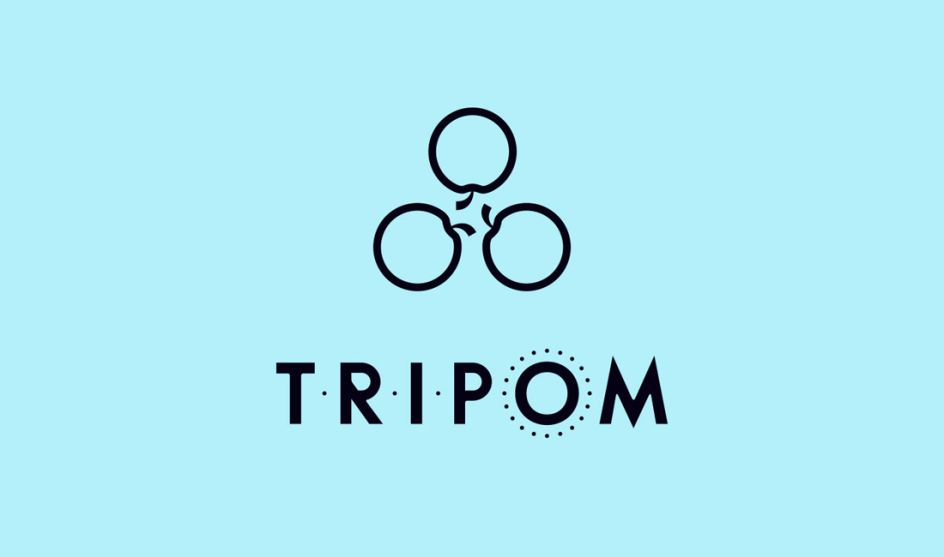
Called TRIPOM (Trainees with an Interest in PeriOperative Medicine) their existing DIY identity played on the pun TRI (three) + POM (Apple in French). "This was a great idea and established standout from medical cliches," says Mark Richardson of Superfried. "Numerous arrangements and styles were explored, but a triangular/rotational form was selected – having an apt chemical/medical diagrammatic feel."
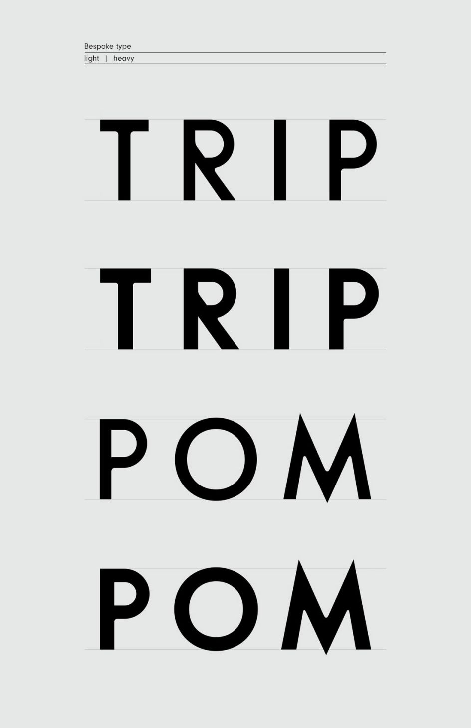
For the logotype, a bespoke uppercase lettering was developed with the subtle addition of dots to convey its acronym nature. The holding organisation, EBPOM, had also asked that the identity conveyed a connection to its brand. To achieve this, Mark added a circle of dots around the 'O' in its logotype, which was "the best compromise available to appease all parties".
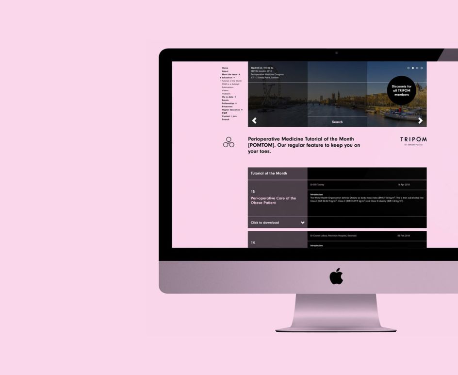
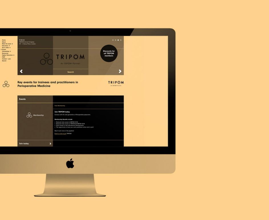
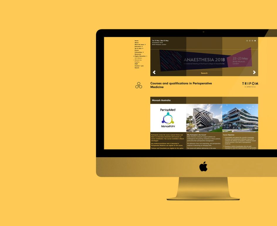
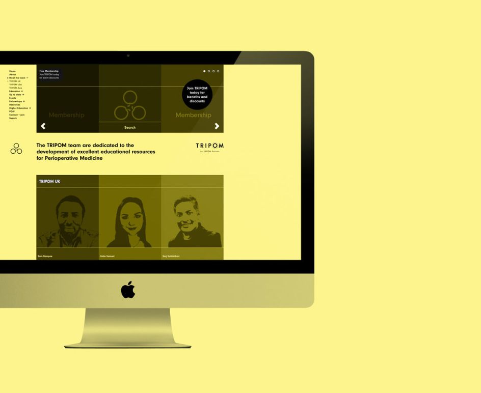
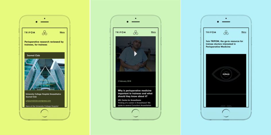
The website, built by Cotton, was designed with a versatile three column grid system and strived to make its complex content simple and easy to navigate with minimal fuss and distraction. "This has been a challenging project, requiring design discipline to create a vibrant and engaging resource, whilst maintaining focus on the information led content and usability," says Mark. "Consequently, it is now very rewarding to finally launch TRIPOM with the hope that it is both beneficial and easy to use for all trainees."

Editor's Picks


Trending


Podcasts


Editor's Picks
Further Reading