Studio Gruhl's work is a masterclass in concept-driven design that's cool, but not trendy
It's always so refreshing when you get sent work that makes you feel genuinely excited – that's aesthetically considered but thoroughly original, that looks effortless cool without being trendy, that somehow does all these things by pushing boundaries that the client says yes to.
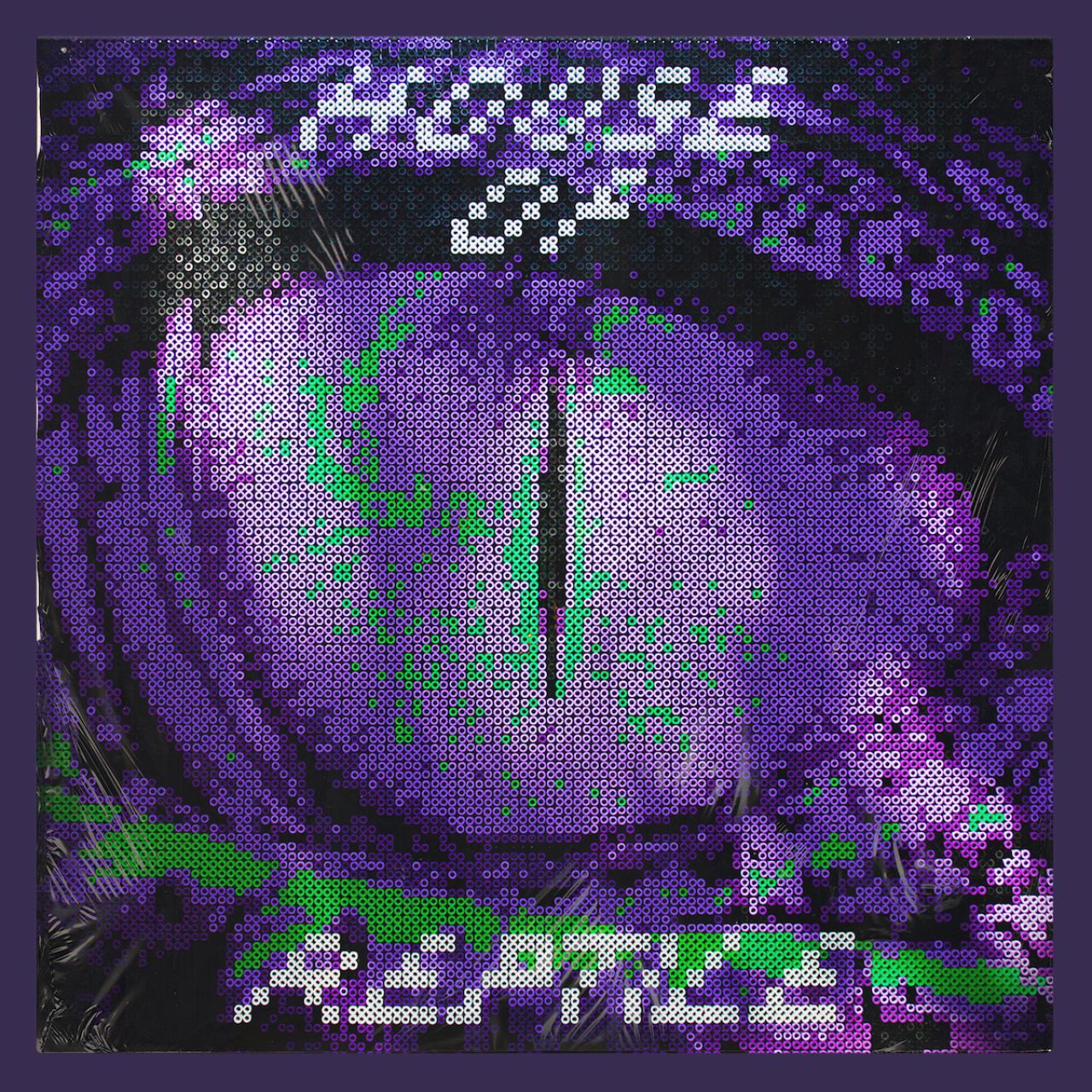
House Of Reptile EP artwork
That's how we felt when Malte Gruhl got in touch about his new studio, Berlin-based Studio Gruhl. He set up the studio last year, having previously worked in New York, London, LA and Berlin for various branding and digital agencies such as R/GA, JKR and Anomaly for clients including Nike, The New York Times, Chobani and Adidas.
"Looking back, I never felt comfortable in a box (branding vs digital, design vs art direction, etc.), I always enjoyed the different aspects of working in design," says Gruhl. "It's important to me that I'm not limited by the tools I am using; but rather I can focus on the core concept of an idea."
What makes Studio Gruhl interesting (aside from the work, of course), is that it states its goal as working from a doggedly conceptual standpoint. That's not wholly unusual; but in the case of this work, it's very, very visible.
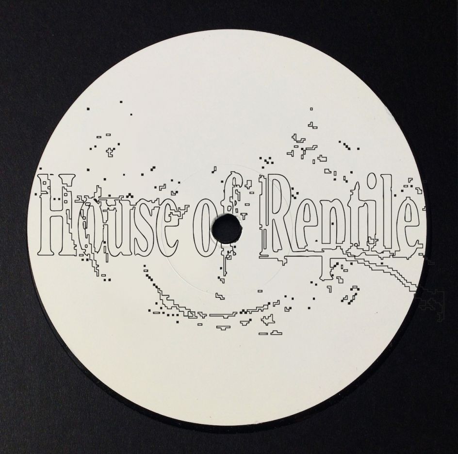
House Of Reptile logo
House Of Reptile
"Depending on the concept, the output should be as diverse as possible," says Gruhl. That means his projects are manifested in any number of ways: done by hand, typographically focused, a website, 3D image-making, and more: "It shouldn't matter how it's done but that it aligns with the strategy and visualises the brand vision."
He adds, "For me, design must work on multiple levels, in a way as if you have a macro level and then step back to see the whole picture. The concept, the composition and the details are all equally important to create memorable objects."
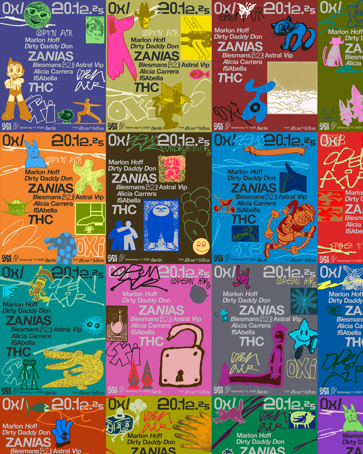
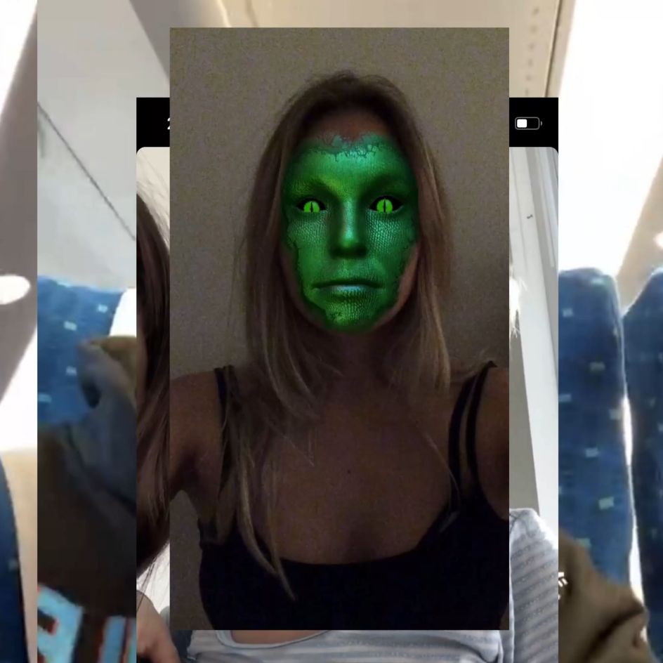
One of the standout projects in the Studio Gruhl portfolio is the work for east London-based record label House of Reptile. The branding was born of the designer's research into ancient visual representations of reptiles such as the Ouroboros, and some pretty wild theories of reptile aliens living among us (i.e. the Lacerta Files).
Daniel Becker Charlotte

Daniel Becker Emily
These "create visual clues and hints to give the brand something of an X-Files feeling," says Gruhl. "The visual system should take the observer on a visual trip to an otherworldly experience." As such, the typography and its associated system of symbols work with the logo to suggest to the reader that there are layers of information that are hidden. These secret messages will gradually make themselves plainer as further designs for the label emerge in the future. We're not sure what these coded messages will reveal, but we're assured: "It's gonna be pretty intense."
Gruhl also worked on the designs for the House of Reptile EP. The idea was to honour the work and dedication that goes into creating an EP and a record label by creating a physical artwork, subtly demonstrating the idea of labour intensiveness. Small beads were chosen as a recurring graphic device across the label's touchpoint, including sleeve designs and digital applications. "It creates a unique voice, but also it's a nice twist for a genre which normally is represented through very digital-focused aesthetics or 'acid graphics'."

Daniel Becker Aureole
Precog Magazine Artwork
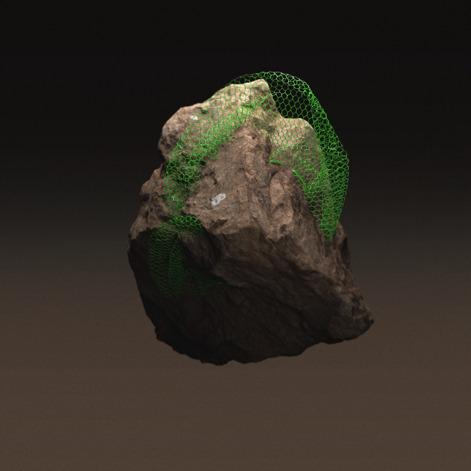
Future Fossils work, sandstone
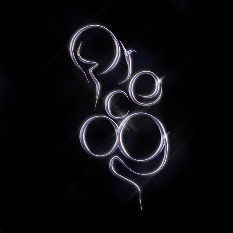
Precog logo
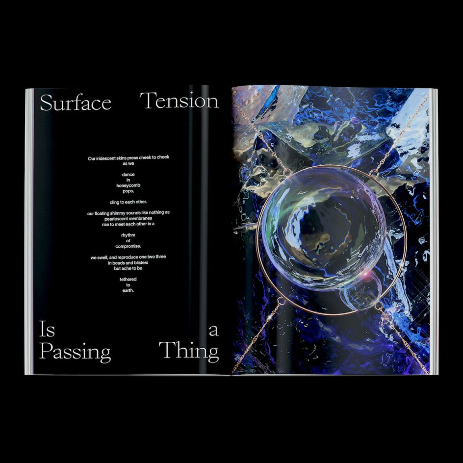
Precog magazine
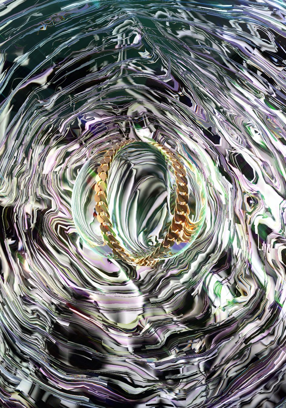
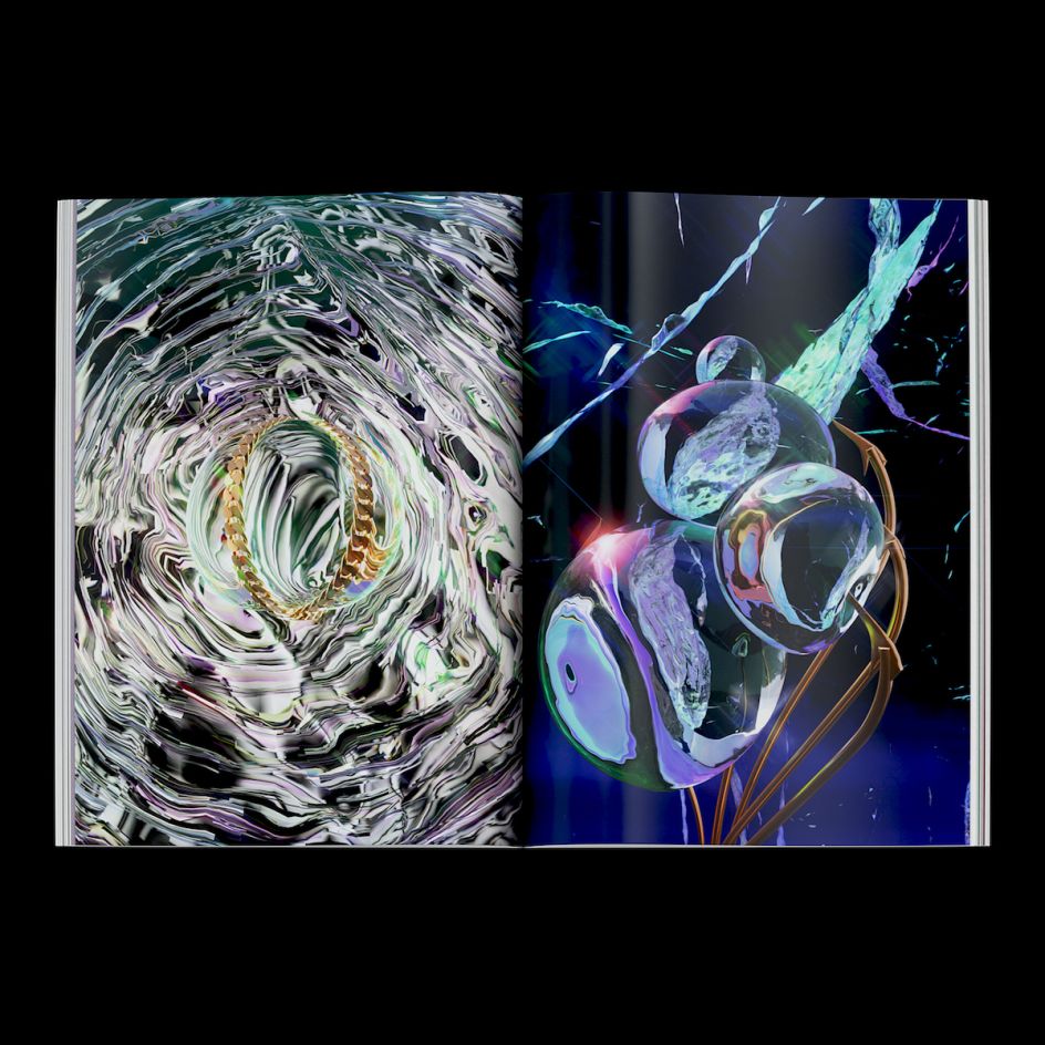
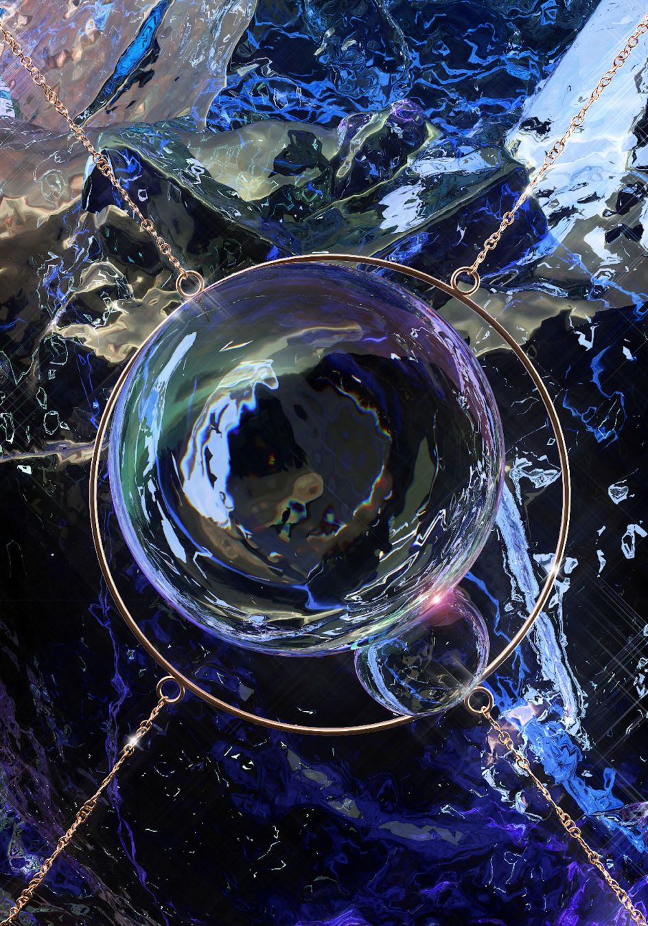
Precog chain
Precog magazine
Precog circle
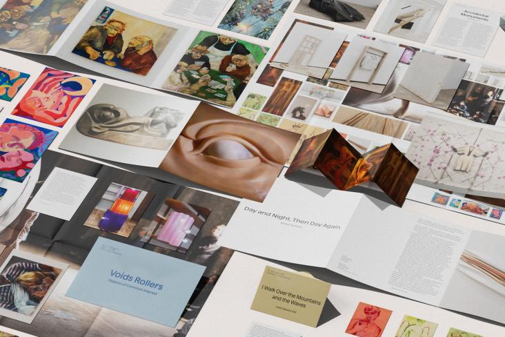
Editor's Picks


Trending


Podcasts


Editor's Picks
Further Reading