Jose Manuel Vega goes off script with his identity for film production company Pérgamo
Graphic designer Jose Manuel Vega has dodged the tropes and cliches that define the world of cinema with his identity for film production and screenwriting company Pérgamo.
Good stories and good design have a lot in common. But perhaps most importantly of all, they both avoid the obvious. This is certainly true of the branding for Pérgamo, which saw its creator turn to a famous museum artefact for inspiration.
Speaking of how he came o be involved with the project, Barcelona-based designer Jose Manuel Vega told Creative Boom that he originally met the founders of Pérgamo while doing an Erasmus internship in Germany almost ten years ago.
"They already were doing short films and writing scripts back then, but just for fun," he explains. "Early this year, they decided to go serious with the project and immediately contacted me to develop their brand identity."
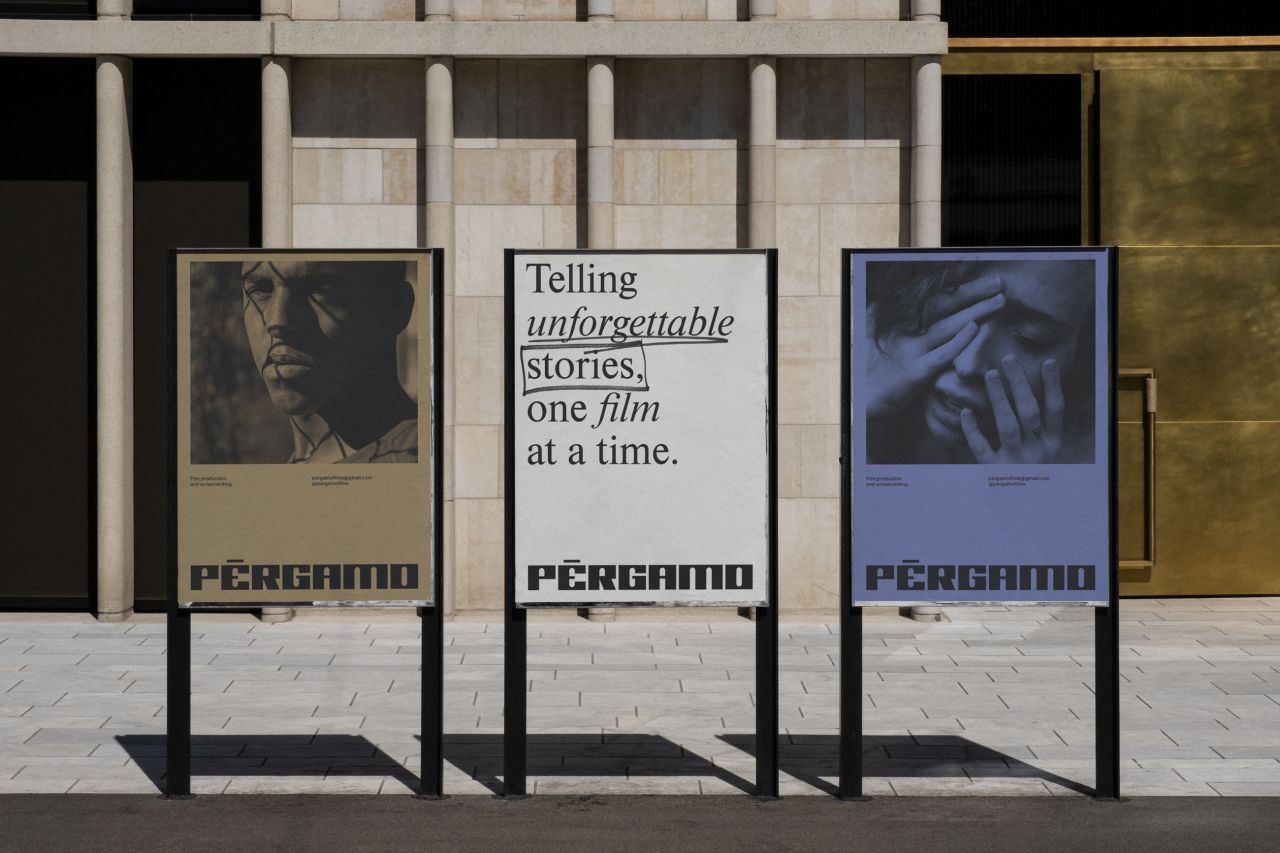
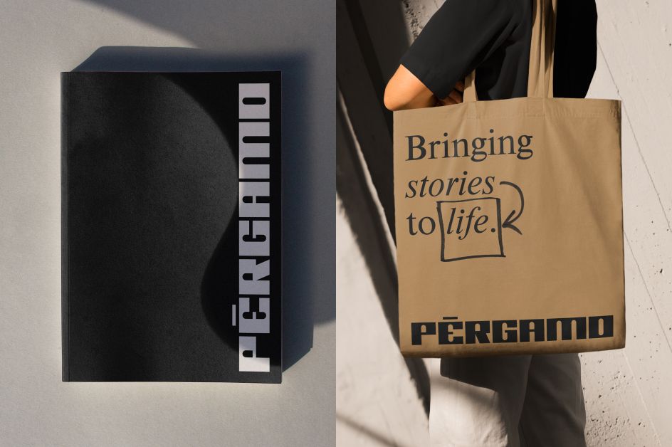
Regarding his brief, Jose was given almost total creative freedom. The only condition was that he had to avoid the classic look and feel of film production companies. So that meant no black-and-white colour palettes or condensed sans-serifs and no use of film tape or cameras in the logo.
With this in mind, Jose set to work. And it was while chatting with one of Pérgamo's founders he learnt a valuable insight which shaped the look of the identity. "Apparently, they decided to name the company after a visit to Pergamon Museum in Berlin," Jose reveals.

"They were very impressed with some of the reconstructed monuments found there. One of these reconstructed monuments was the Ishtar Gate, which I hadn't heard of. When I Googled it, I knew I had found the insight I sought."
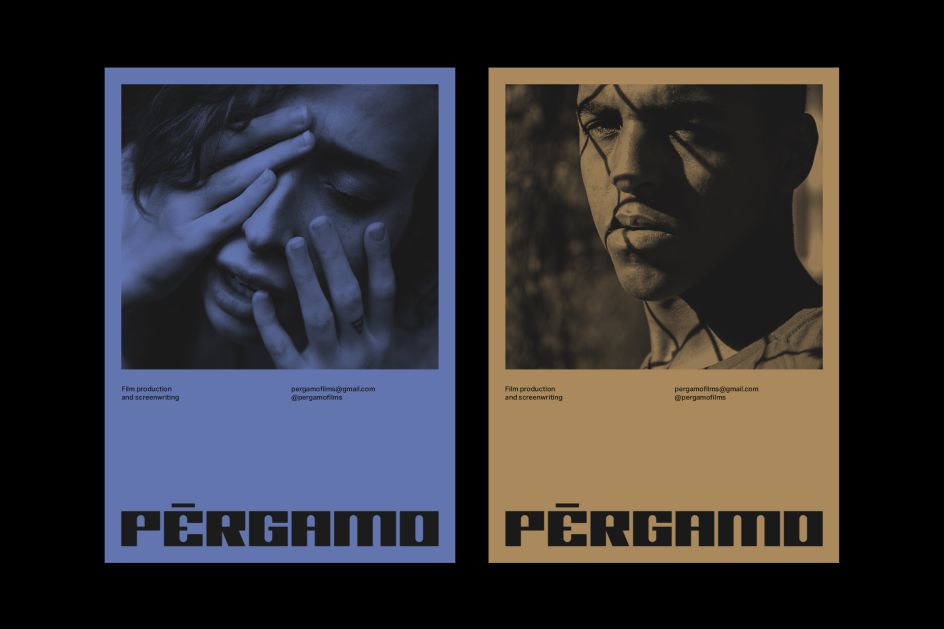
Its striking shapes and beautiful blue and brown colours drew Jose to the gate. "Imagine what the people of ancient Babylon must have felt when seeing that giant, blue, bricked entrance," he wonders.
"Those colours have been iconic enough that even Stefan Sagmeister used them when designing the Bridges to Babylon album cover for Rolling Stones, so it seemed clear that they were the right choice for the identity."
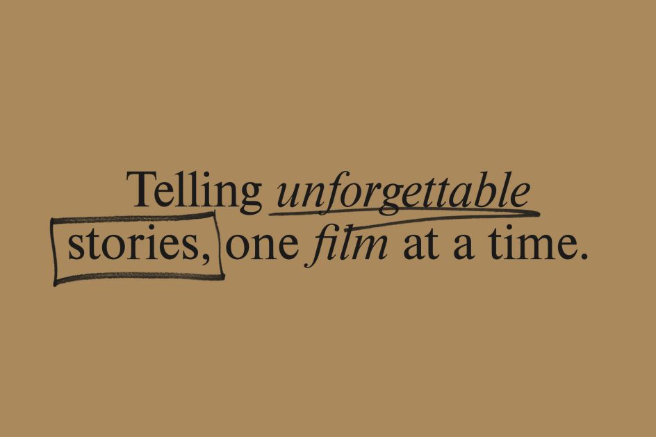
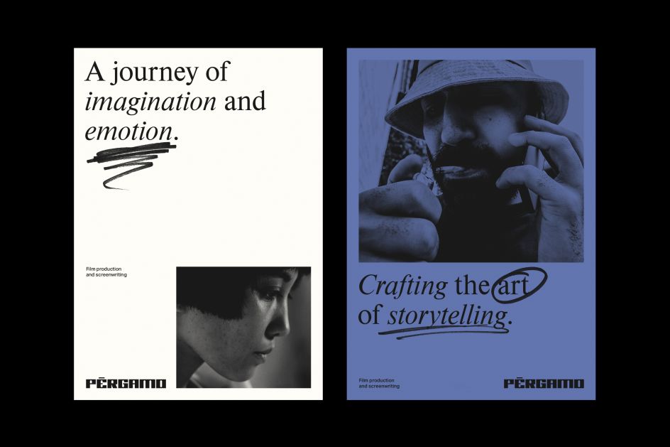
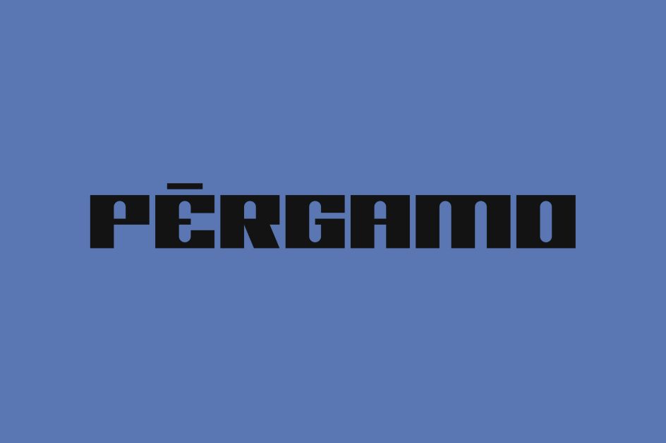
As for the lettering, this developed from Jose's realisation that the shape of the gate could be used to form the letter 'A'. The rest of the typeface was designed in response to this and resulted in a powerful, blocky font which stays true to the brief by being distinct from Pérgamo's peers. Accompanying this font are handwritten notations which further reinforce the production company's screenwriting side.
However, striking the right balance between the Ishtar gate and the design proved to be the biggest challenge for Jose. "I didn't want it to be too obvious, but I also didn't want to drift too far away from it."
It's this distinctive use of colour, design and type, which Jose ultimately feels works to the identity's advantage, though. "I believe that it is quite different from what you can find in the industry where the company operates. Also, there is actually a great story behind the identity. And while not everybody knows it, this story supports every graphic design decision I made quite well."
Editor's Picks


Trending


](https://www.creativeboom.com/upload/articles/90/908fdb6378db1e95d12595416f54e6336d5e80b8_732.jpg)
Podcasts


Editor's Picks
Further Reading