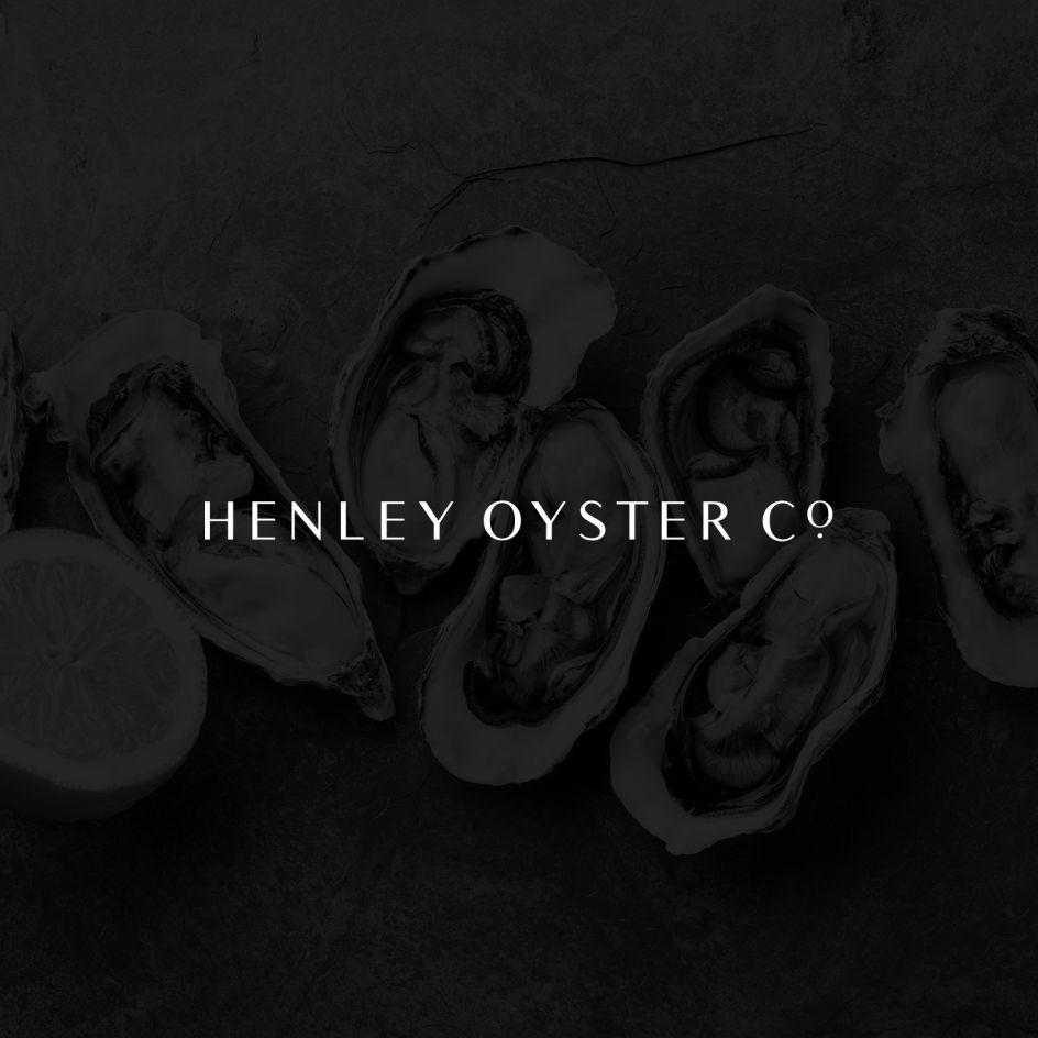
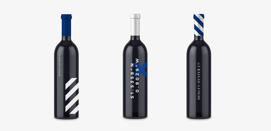
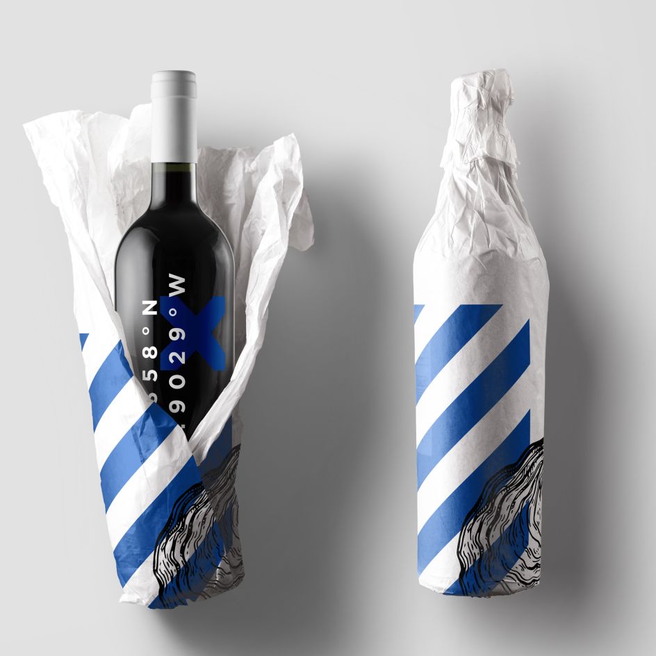
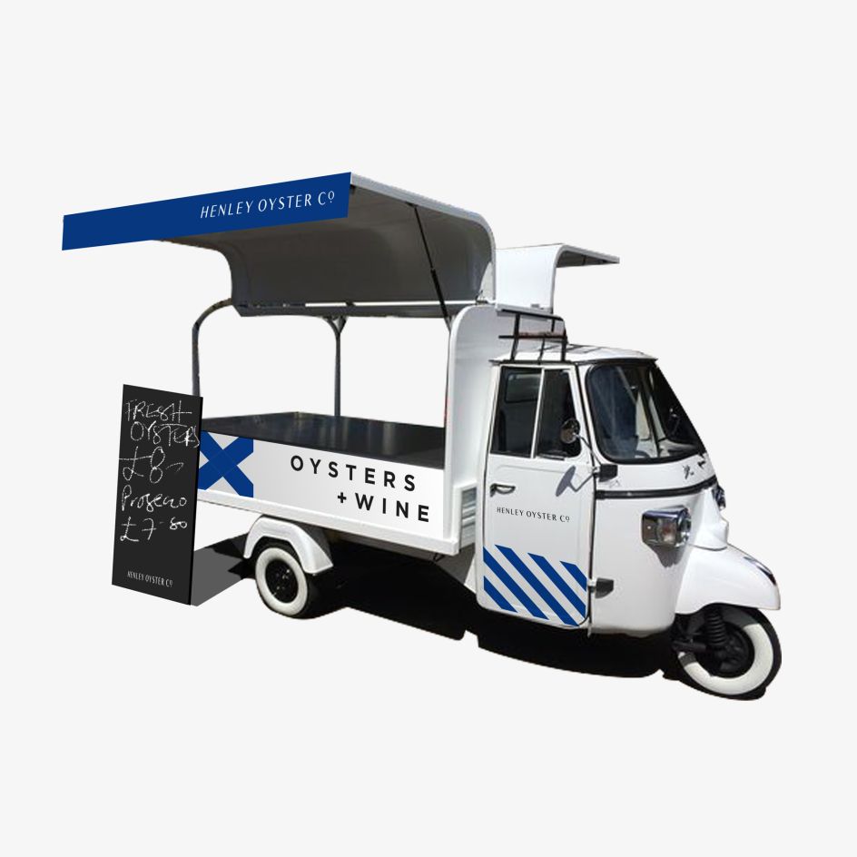
'Prestigious but contemporary' was the brief behind this new idendity by Carrousel for Henley Oyster Co.
Designed for a 2018 summer launch, Henley Oyster Co. is a mobile oyster and wine cart set to tour Henley-on-Thames and the surrounding areas. For its identity, it approached independent London studio Carrousel, asking for a "prestigious but contemporary" look and feel.
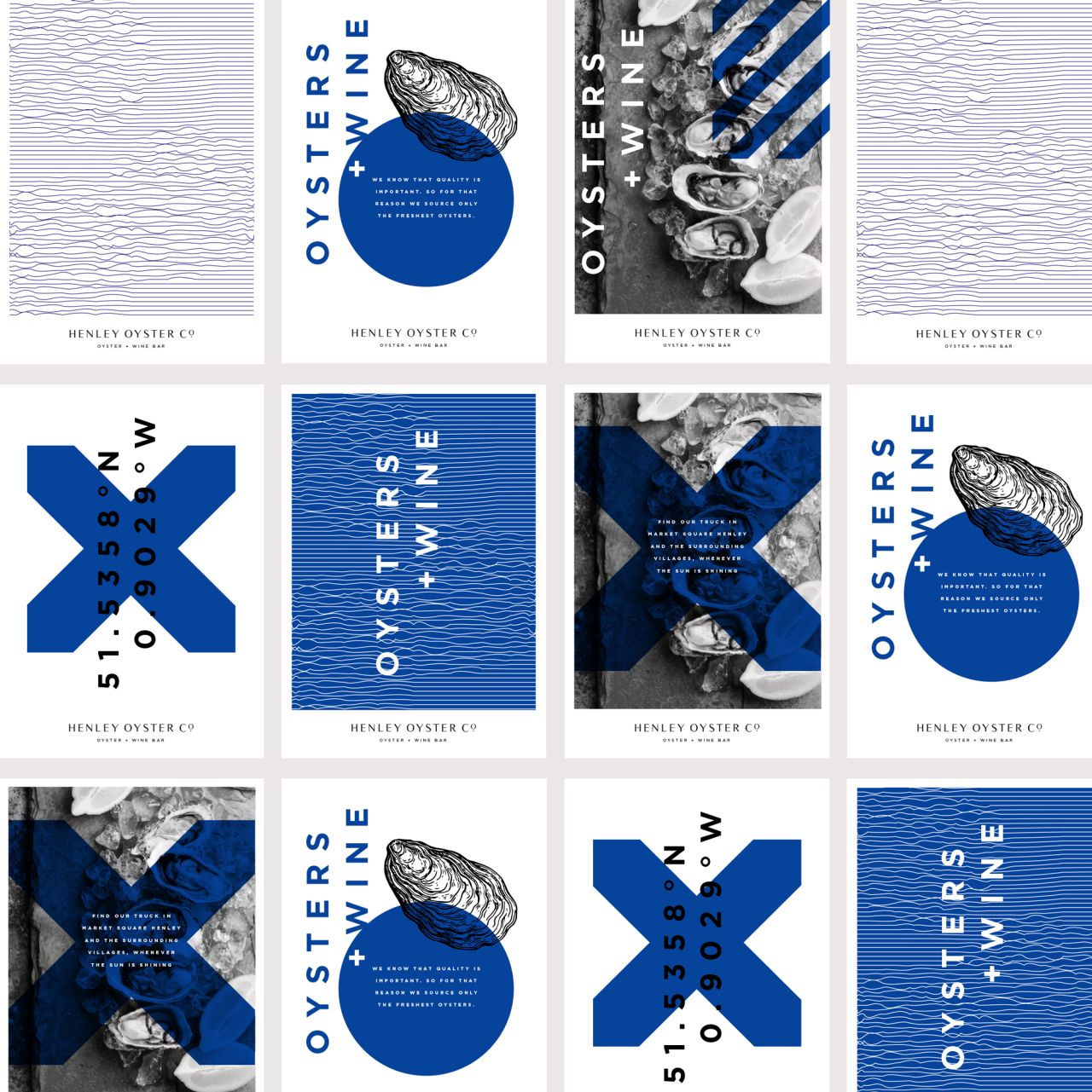
Apparently taking inspiration from the geometric nautical alphabet and naval flags, the longitude and latitude of the market square in Henley-on-Thames and photography which heroes the core offering; Carrousel created a flexible identity system which works across a variety of applications.
The logotype is crafted from the ubiquitous Times New Roman, a contemporary take on an old classic. The use of the small dot is a subtle nod to the precious pearls found within oysters. More lovely work over at carrousel.agency.


Editor's Picks


Trending


Podcasts


Editor's Picks
Further Reading
](https://www.creativeboom.com/upload/articles/90/908fdb6378db1e95d12595416f54e6336d5e80b8_732.jpg)