'Communicating with images is somewhat universal': Miki Lowe on how a love of travel and literature has shaped her art
The work of Anglo-Japanese multidisciplinary designer, artist and illustrator Miki Lowe is inspired by her multicultural background and love of literature. We caught up with her to learn more about her creative practice and how she finds poetry in everyday life.
Bought up in France and now based between London and Spain, it's perhaps unsurprising to learn that Miki Lowe's multicultural setup and life experiences have shaped her art. Having been exposed to a variety of ways of living and languages from a young age, the New York Times, Atlantic Magazine and Penguin Random House artist says that this stimulating way of life has broadened her both as a person and as an illustrator and designer.
"I think it's important in this job to get under the skin of an outside perspective and try to understand it to respond to it," she tells Creative Boom. "It has given me a rich and incredibly varied bank of creative references, and I wonder if it's linked to why it's hard for me to be just one thing – solely an illustrator, a designer, or an artist – and why I want to keep my practice so versatile."
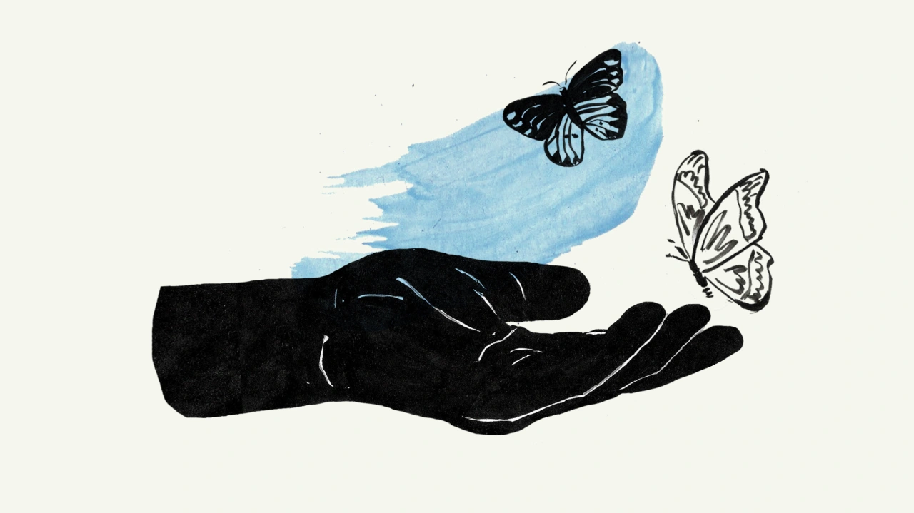
This upbringing has also been useful for Miki in seeing how culture affects design across different countries. "Communicating with images is somewhat universal, but the way it's done between France and Japan, for example, can be quite different," she explains.
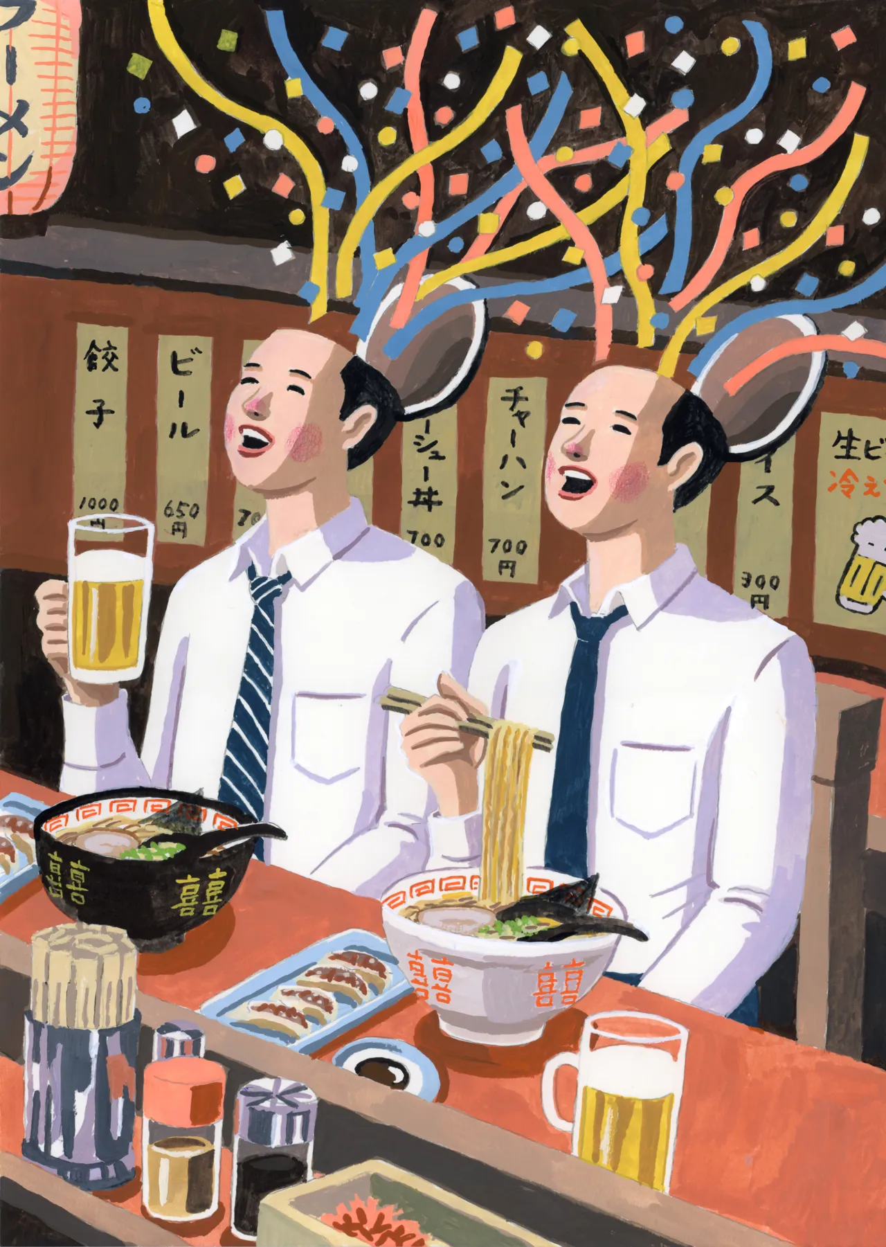
"The visual culture in Japan particularly fascinated me – the architecture, the packaging, store signs, the Ghibli animations – and although I haven't developed a style that is very obviously influenced by Japanese arts, it has deeply influenced me.
"Going to live in Spain as an adult made a noticeable difference in my work. Being in and soaking up a new environment and drawing inspiration from it gave me a new outlook and led to style changes too."
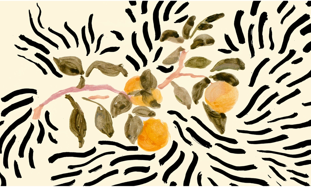
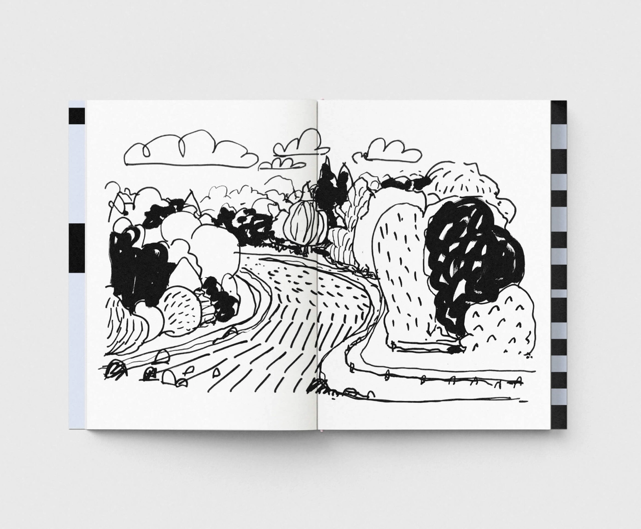
This style change led Miki to settle on a simple 'less is more' attitude that captures the subject's essence rather than being a detailed copy. "Perhaps that's quite a Japanese philosophy, now that I think of it," she adds. "And it's mostly handmade, hand-drawn or painted.
"It took a while for me to find my language, and it's not a finished process. I tried many things; I loved images by other creatives that were extremely complex, bold, or structured, and I wanted to do it all, but it felt like I was constantly overcomplicating things for myself. When I started stripping my work down, it felt more natural. I wouldn't go as far as saying effortless. I find that achieving simplicity and fluidity can be hard too."
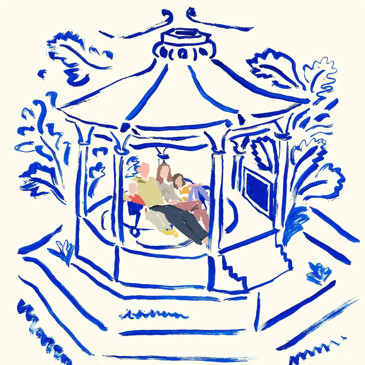
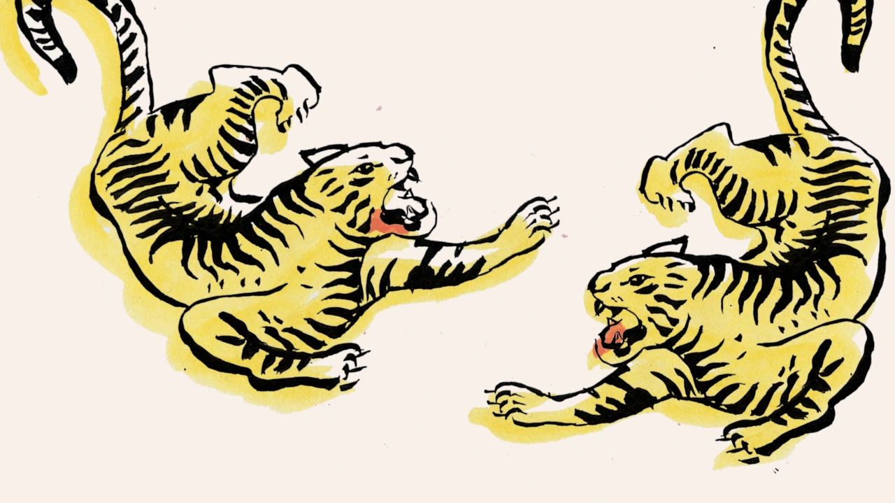
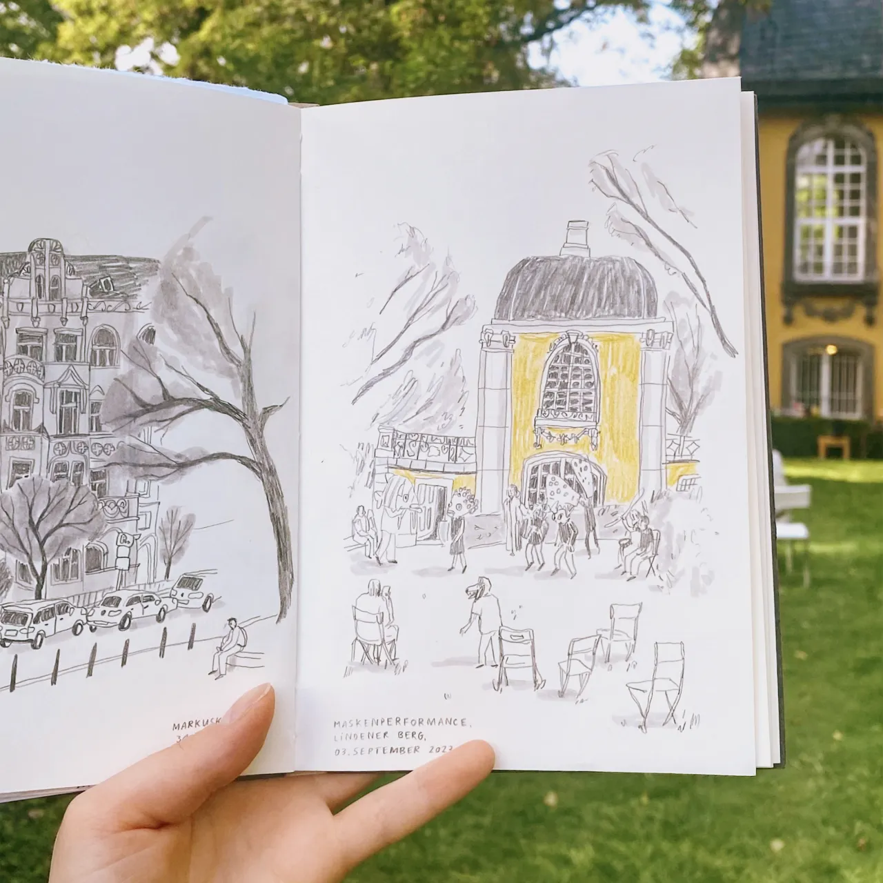
Miki decided to focus on a handmade approach at a curious time. Just as her career was getting started, digital illustration was starting to explode, making her wonder whether she should take it up too. "I had a go at it, but it felt more contrived than working on paper, and I didn't get as much joy.
"I did embrace digital for graphic design. But when it comes to drawing, although I do use it occasionally if it feels fitting, it's more of a tool to edit my drawings, create compositions, or work more efficiently. I like the movement and the happy accidents I get through working by hand."
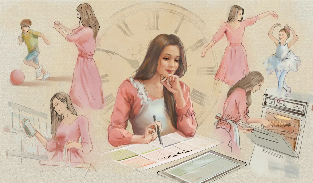
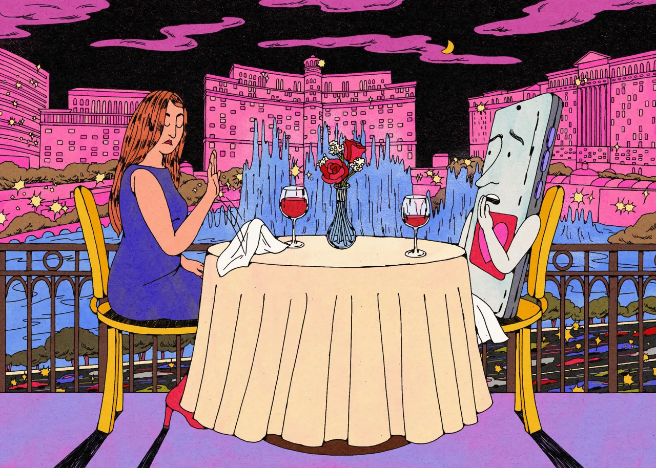
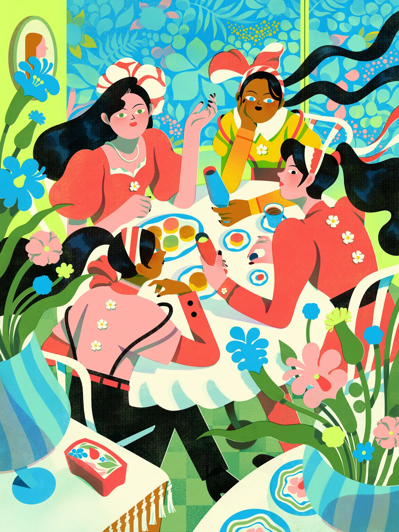
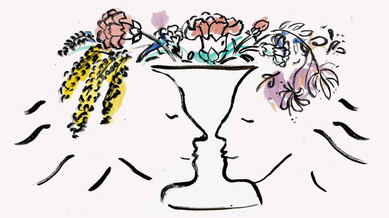
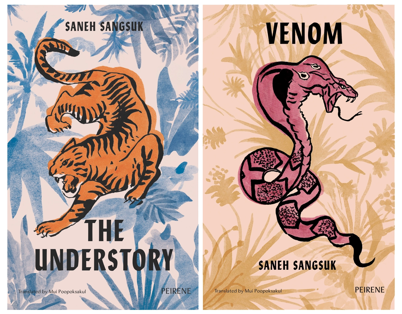
As well as working by hand, another signature trait of Miki's art is that it blends the everyday with the surreal. She feels that by doing so, she adds a touch of romance and poetry to the everyday experiences she captures. "I would like it to highlight mundane moments, for myself as much as for others. I think it also creates an element of escapism, a way of seeing and imagining beyond the mundane."
Speaking of poetry, literature is Miki's other passion. In fact, she reveals that it's probably what made her develop an illustrative style that she describes as figurative but fanciful. "It's what led me to represent reality with a twist of fiction instead of hyperrealism or abstract. Writing conjures up stories and moods with words, which linger inside your head after the book is finished. It made me want to do the same with images."
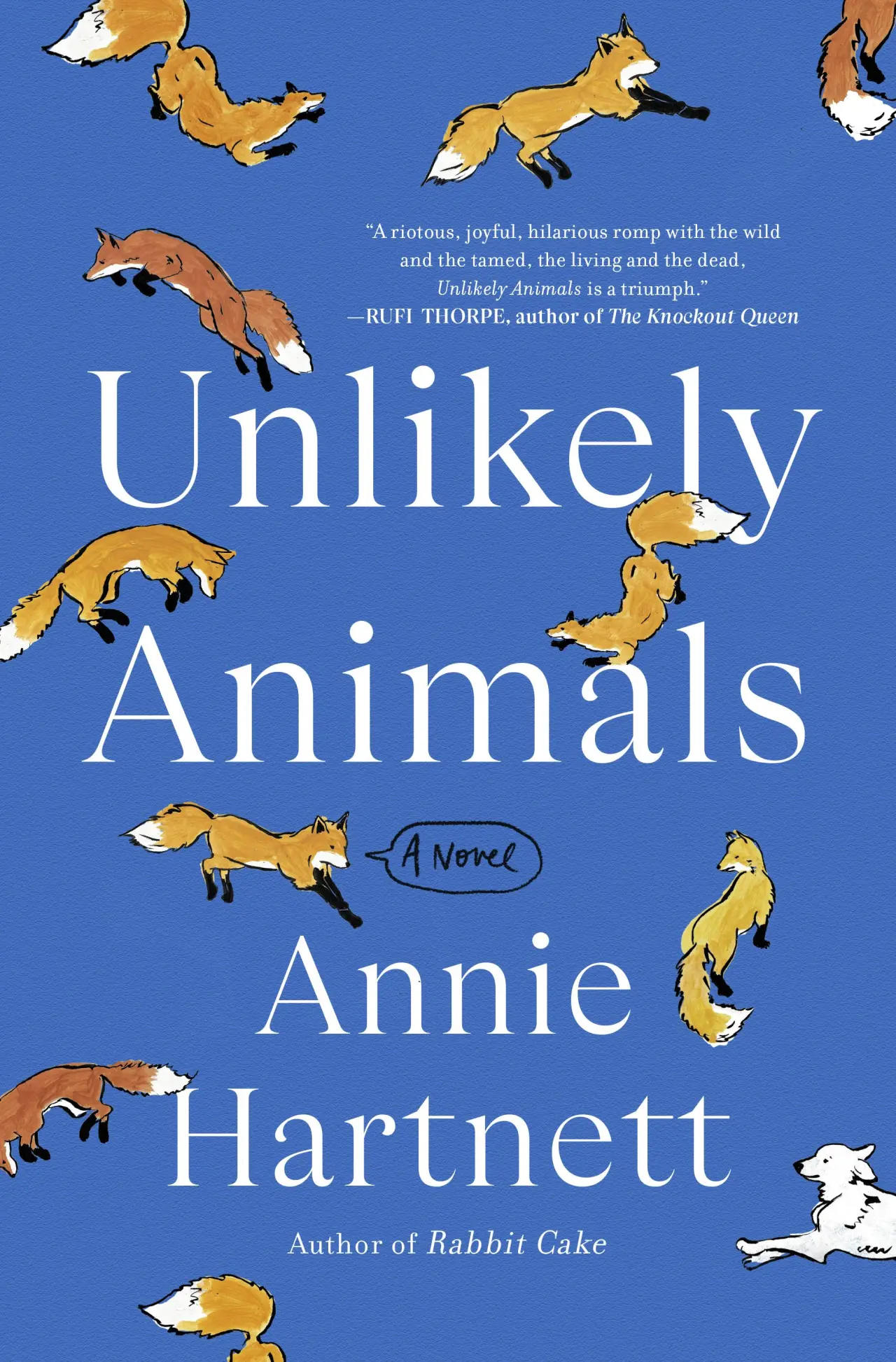
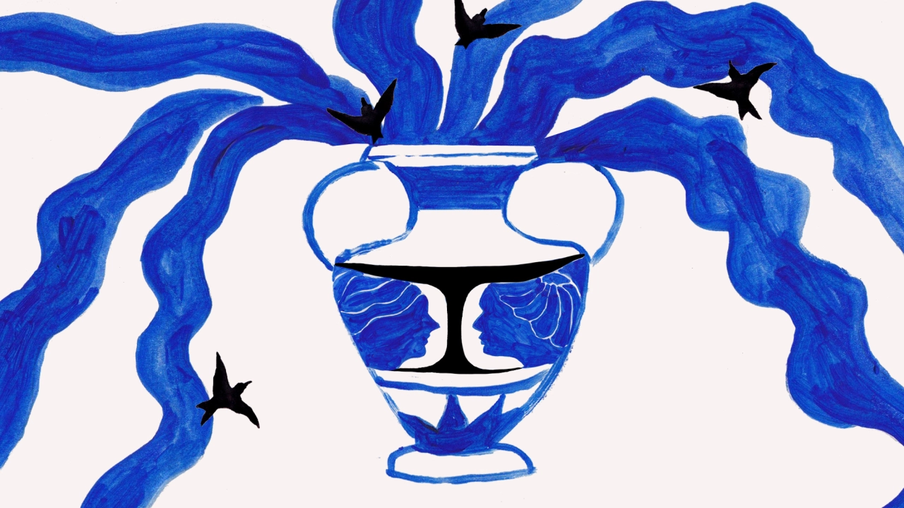
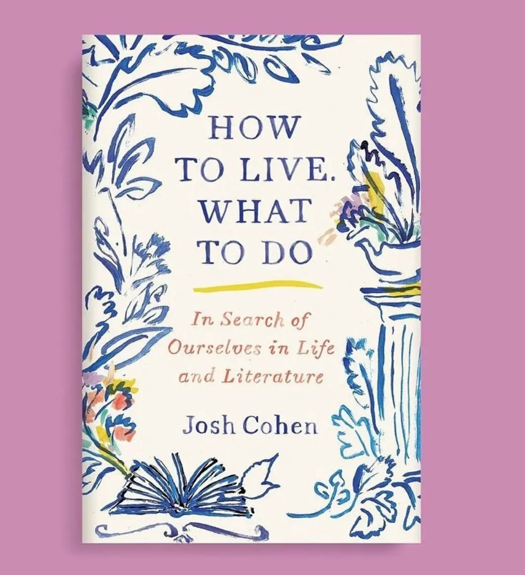
Just like travelling and living in different places, literature exposed Miki to perspectives that were different to her own. "It exposes me to many stories, beliefs, people and places that I wouldn't come across in my own life. It opens my mind to different points of view, which I correlate with illustration; it's often about giving shape to someone else's perspective. It fed and flexed my imagination and brought me new ideas.
"To give a couple of tangible examples, "Bluets" by Maggie Nelson gave me the idea to start drawing with blue paint; the detailed descriptions from Lampedusa's The Leopard influenced the kind of iconography and imagery I like to make.
"Maybe my love of books is also tied to my preference for working by hand. Don't get me wrong, I love my computer – it's essential – but I prefer reading and drawing on paper rather than on screen. I'm interested in innovation and its possibilities, but I'm quite attached to more traditional things. That might be another Japanese influence, this desire to keep some tradition alongside new technology."
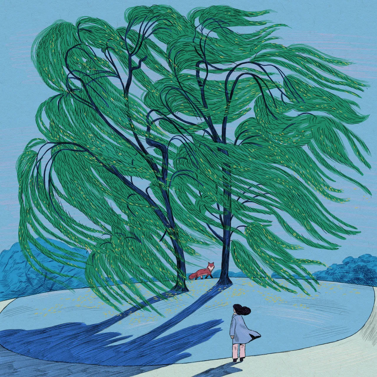
One of Miki's favourite projects ties all of these factors together. After getting an email out of the blue from an art director at the Atlantic, Miki was commissioned to illustrate a new poetry series just as the pandemic and lockdowns got underway. Miki says she thinks the project came about because she posted her work online, and at the time, she couldn't believe her luck.
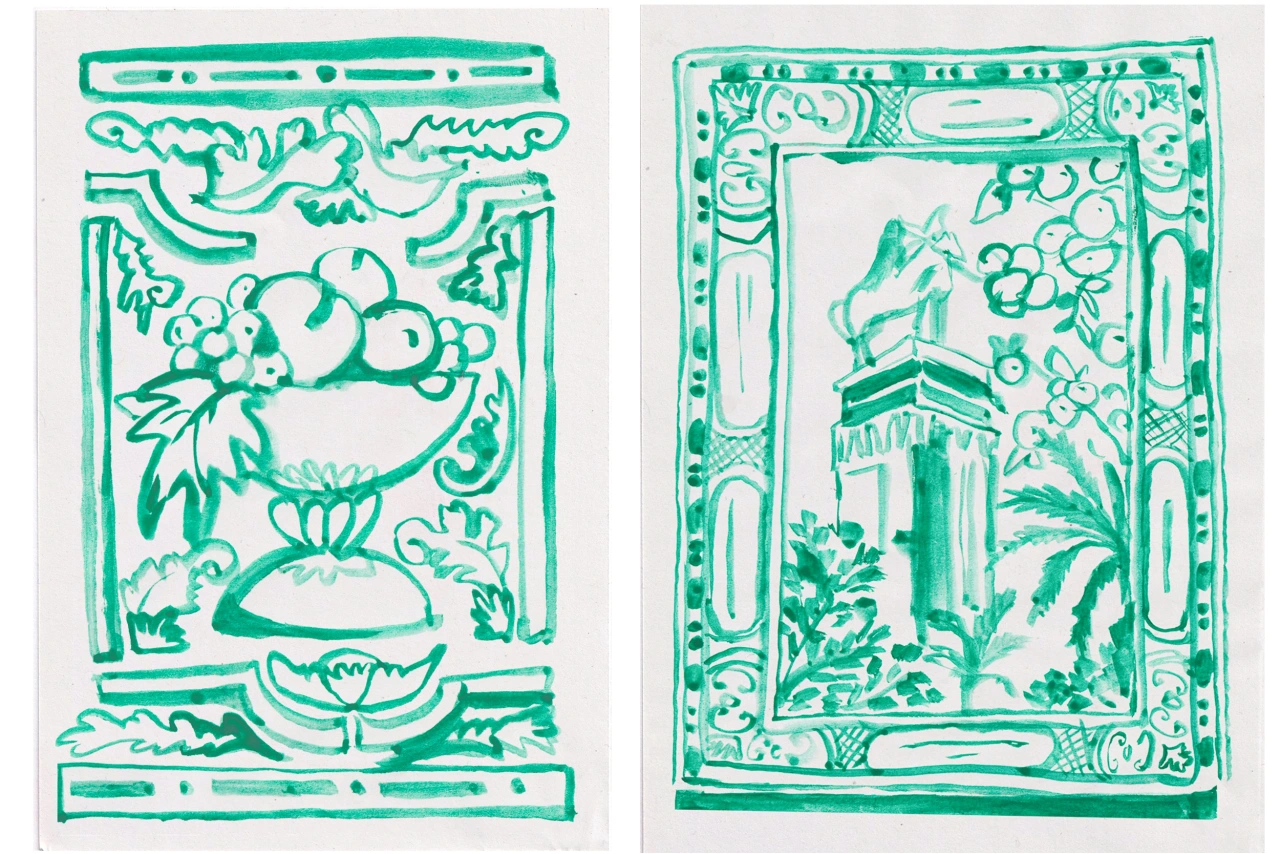
"I loved the Atlantic as a media outlet, so there was no doubt about being onboard. I was schooled in France, where there was a lot of poetry study in the curriculum, and it is a discipline I always found compelling to try and visualise, so working with poems as material also appealed to me.
"With each poem being so different, both in terms of style and content, I get windows into these different worlds and subject matters. Each poem is a new challenge, and having done many doesn't necessarily make the next one easier; sometimes, they can be quite abstract and cryptic. And they often contain or deal with themes that are difficult to represent appealingly.
"It's an incredibly interesting series to work on, and the metaphors and symbols in poetry are very stimulating to create imagery for."
When tackling these poems, Miki approaches them just like any other creative brief. First, she pulls it apart. Then she scrutinises it and asks herself many questions about what she is trying to communicate or convey at a fundamental level.
"When I make intuitive choices, I ask myself: why this colour (for example)? What does it communicate? Does it make sense?" she concludes. "I tend to question the function of my choices; I feel the need to be able to justify them."
Editor's Picks





Trending




Latest Jobs
Senior Social Media Manager at Whitney Museum of American Art
Full-time·New York·$95,000 – $100,000
Head of Design at Engage
Full-time·Leeds·£55,000 – £65,000
Designer at BPD
Full-time·London·£30,000 – £34,000
Lead Digital Designer at Together
Full-time·£55,000 – £75,000
GTA VI Social Lead at Future
Full-time·Bath·£29,000 – £40,000
Designer, Marketing at The New York Times
Full-time·New York·$85,000 – $100,000