Perq Studio creates foodie but friendly new identity for non-profit supper club Mike's Table
Perq Studio by name, perky by nature, the London-based design agency takes its name from a mixture of said perkiness and the Italian word 'perquisire', which means to search diligently.
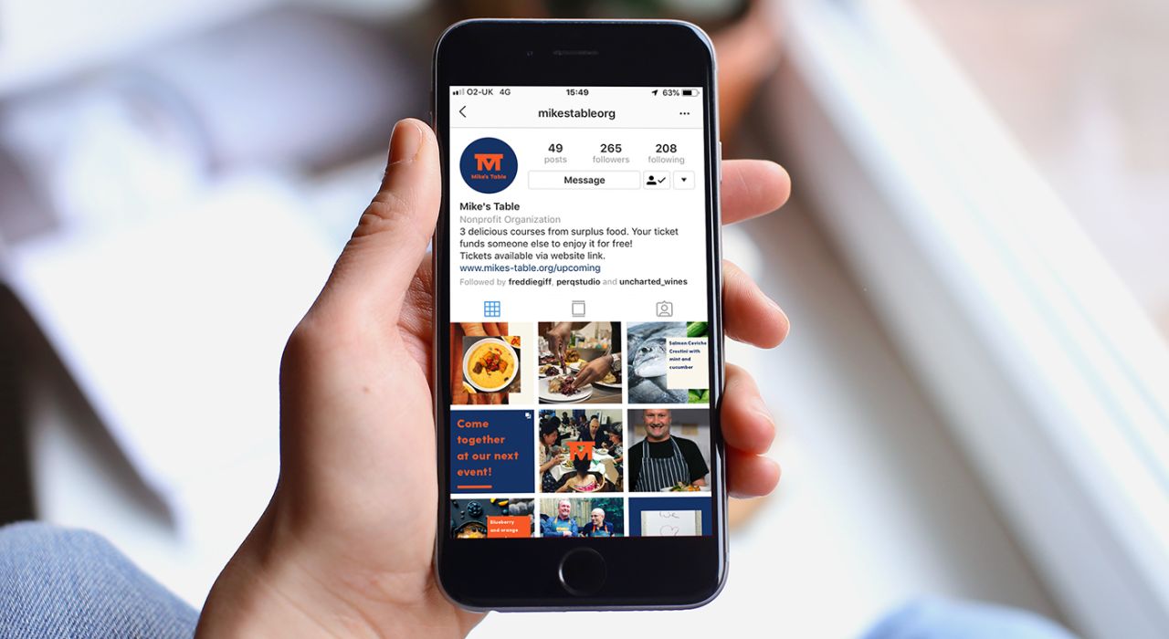
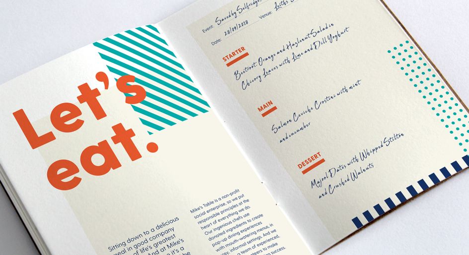
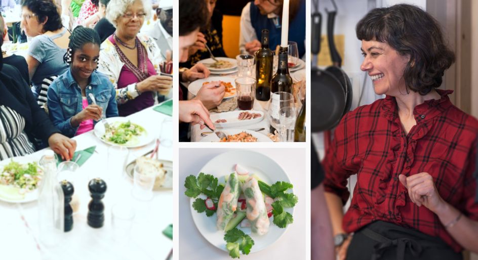
Whatever it means, it makes cute work—such as this identity for non-profit supper club Mike’s Table. A ticket sold to each guest also "pays for someone else to take a seat at the table too," Perq explains.
"That person may be a carer, a refugee or someone recovering from illness or addiction, but whatever their story they get to enjoy a mouth-watering three-course meal, all created from donated ingredients." The organisation was founded by Louise Holstein to honour her late husband Mike.
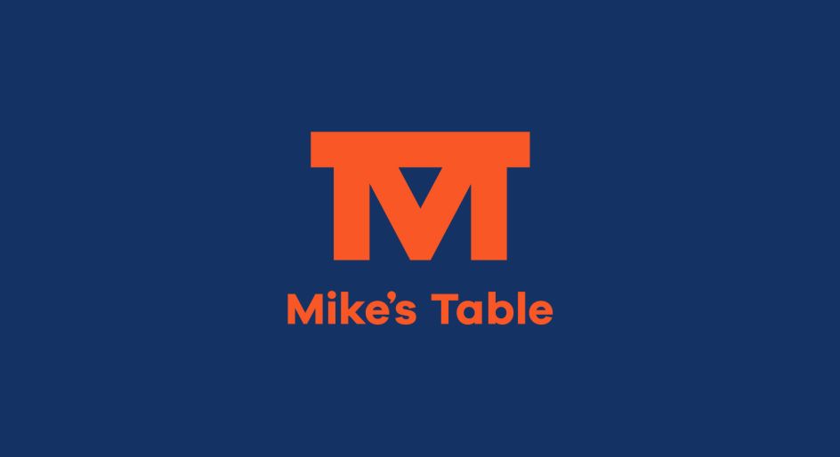
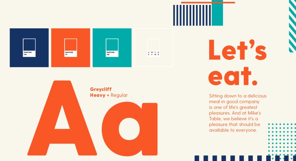
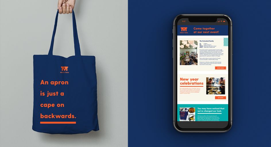
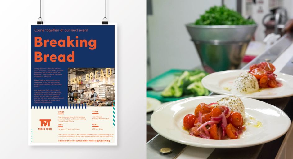
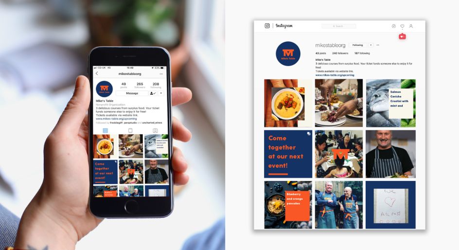
Perq Studio created the strapline "it's on me," and aimed to create designs that hint at the brand's "ethical and foodie credentials." It retained the original orange brand colour and transformed the existing logo into a "confident mark and added a modern, foodie colour palette to support it," says the studio. "The result is a playful, friendly aesthetic."
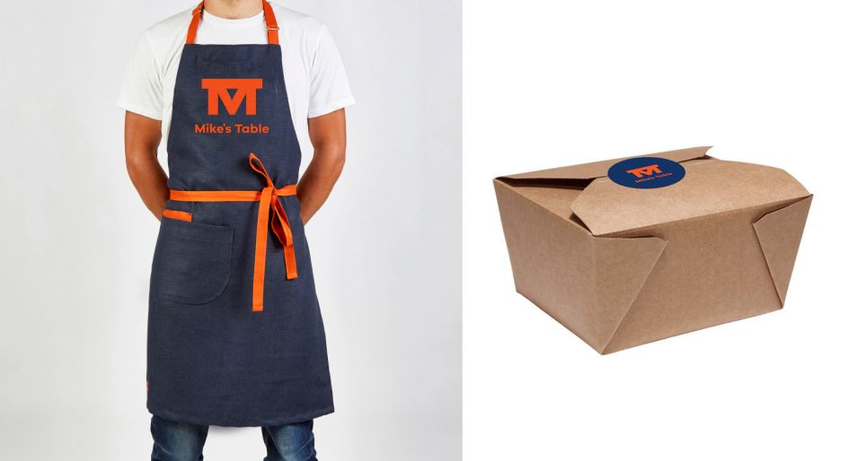
The new designs are used across everything from event collateral such as menus to social media images, posters and newsletters, with a website refresh in the pipeline.
The studio carried out the work pro bono.

Editor's Picks


Trending


Podcasts


Editor's Picks
Further Reading