Looking for something?

Tap outside or press close

A bold, yet distinctly Scandinavian identity for a food festival inspired by seeing farmers as 'rockstars'

Scandinavian Design Group is behind some striking new branding for Matstreif, the largest food festival in Norway.
Written By:
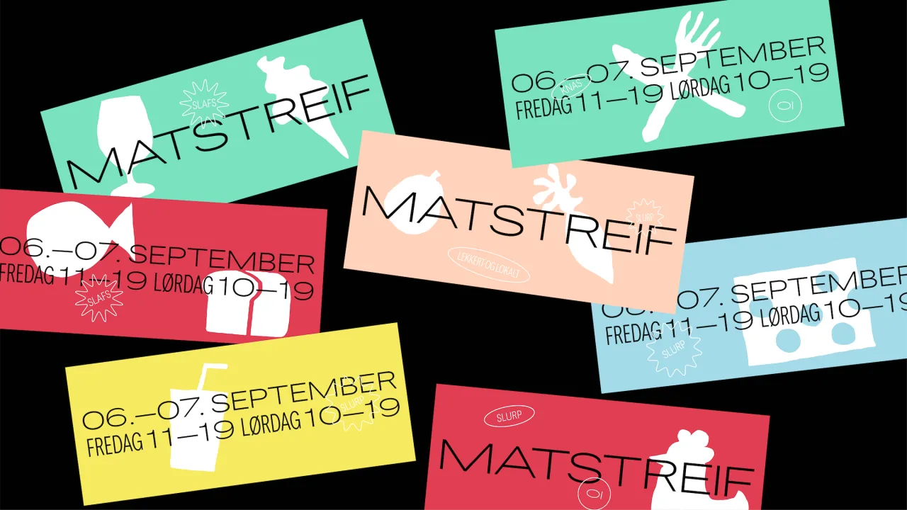
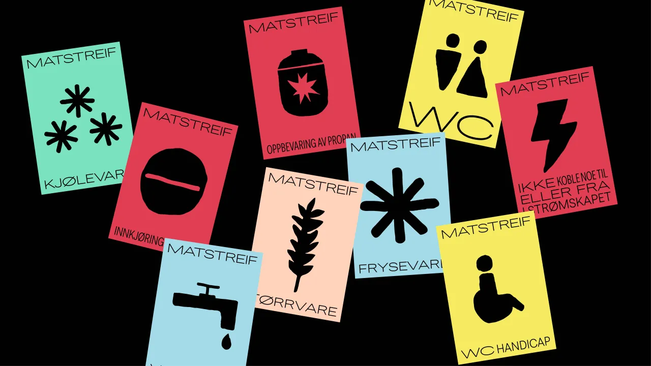
Collection of colourful Matstreif festival posters with bold symbols and Danish text on black background, showcasing the new branding identity

The event, which takes place in Oslo in September, now bears new designs across all touchpoints including printed materials, staff uniforms, lanyards, promotional banners, lanyards, tote bags and more.

According to the agency's creative lead and designer Nicklas Haslestad, the team was briefed to create a new visual identity for the festival's 2019 edition to attract more visitors. Following initial research, he says that the "need for a stronger, different and more modern identity emerged."

The new identity merges the Scandi reserve and pared-back approach we'd expect with bold colours and a distinctive typeface, the bespoke font Smaks Sans, created in-house by Scandinavian Design Group. The name of the font translates as Sans of Taste, and the variable nature of the typeface means it can be applied to numerous different touchpoints and brought to life in animated forms online.

Haslestad says the overall aim of the new identity was to "to be visually striking in both Oslo and Norway in general - an active approach to reverse the trend of declining visitor numbers." The visual aspects including the typeface, bold colours and a new illustration style are complemented by a new approach to illustration and documentary-esque photography style. The tone of voice was reworked to be "tasteful and humorous" while aligning with the overall feel of vibrancy and flexibility.

Inspiration for the designs was drawn from music festivals to add more energy, vibrancy and dynamism to things. "The festival and identity are filled with life, taste, humour and energy," says Haslestad. "The farmers, their origins and food are put in the centre and became rock stars for the weekend."

According to Scandinavian Design Group, following the launch of the 2019 identity, visitor numbers increased dramatically.
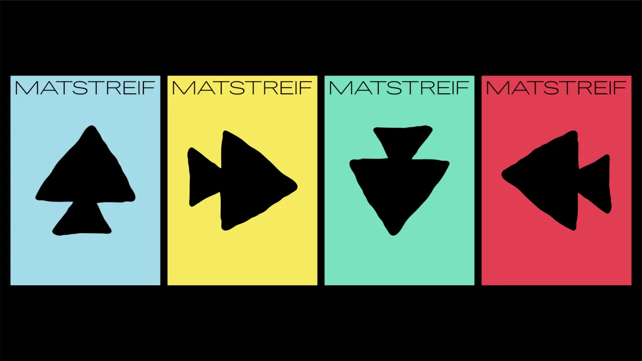
Four Matstreif branding cards featuring black directional arrows on blue, yellow, mint and red backgrounds
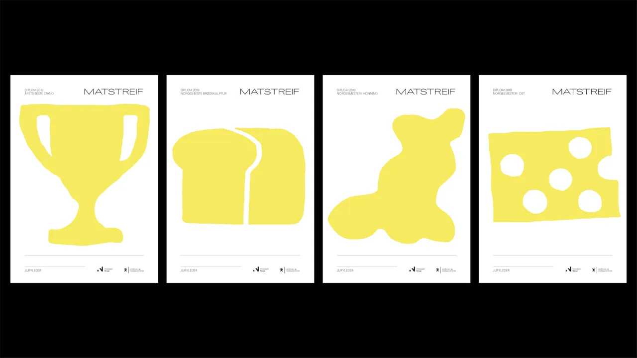
Four posters for Matstreif food festival featuring bold yellow silhouettes of a trophy, bread loaf, map of Norway and cheese on white backgrounds
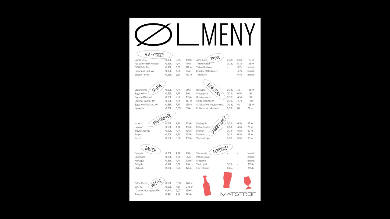
Matstreif food festival menu designed with the custom Smaks Sans typeface and red accent colour, organised into categories with Matstreif branding at the bottom
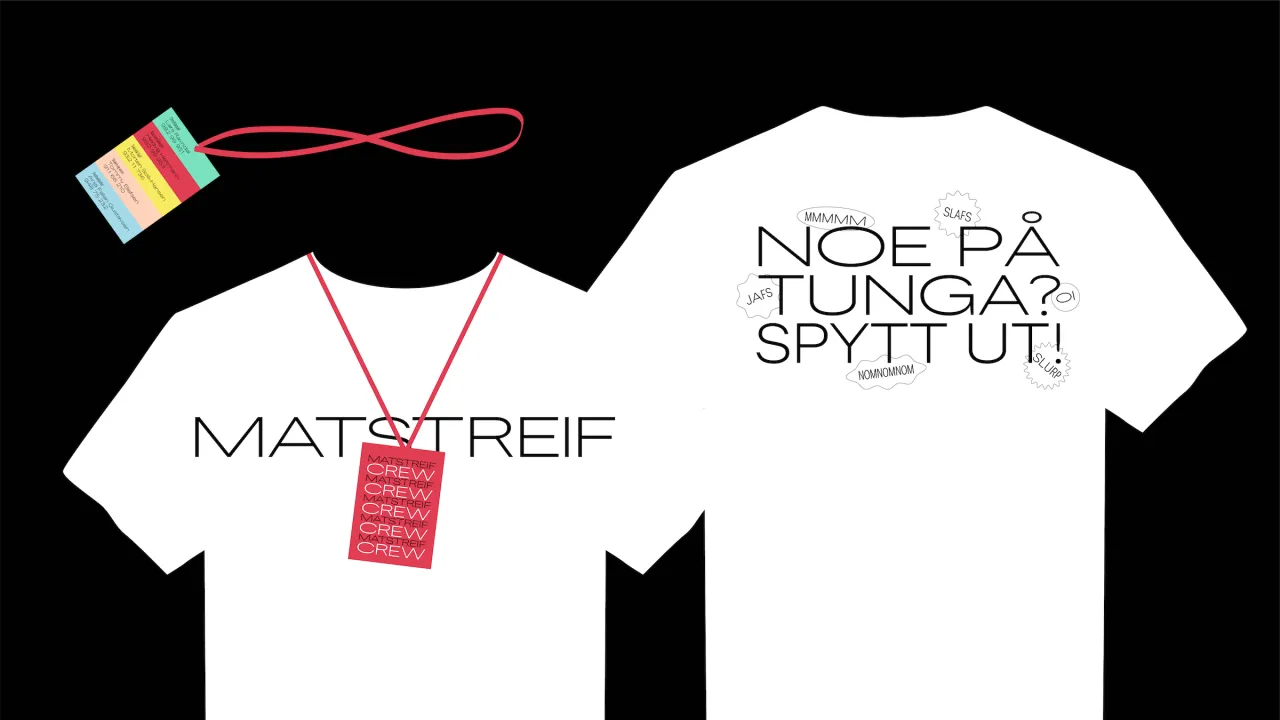
Two white t-shirts displaying Matstreif branding in the custom Smaks Sans typeface, with a red lanyard and rainbow keyring shown above
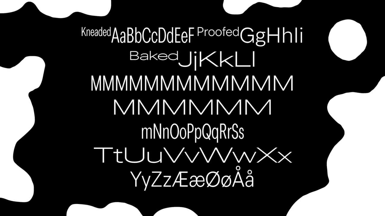
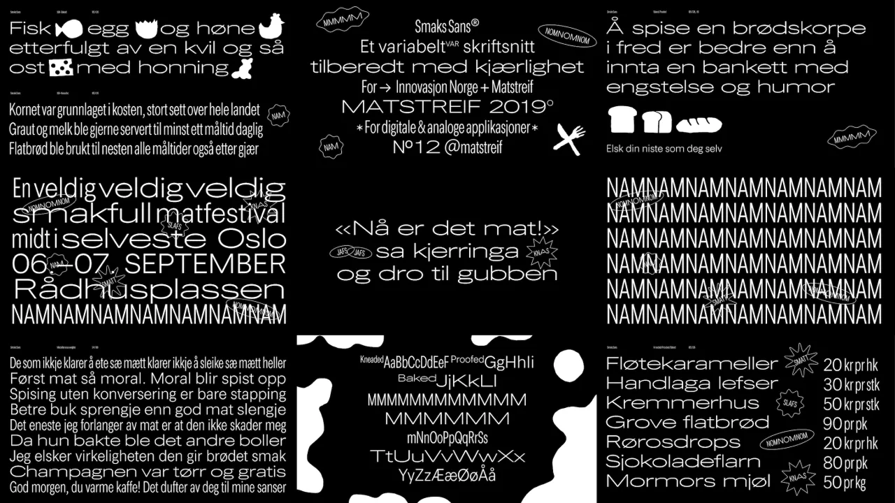
Bespoke Smaks Sans typeface displayed on black background showing uppercase and lowercase letters with descriptive labels like Kneaded, Proofed and Baked
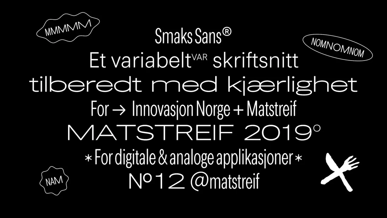
White text on black background showing Matstreif 2019 branding with the custom Smaks Sans typeface and decorative line-drawn elements
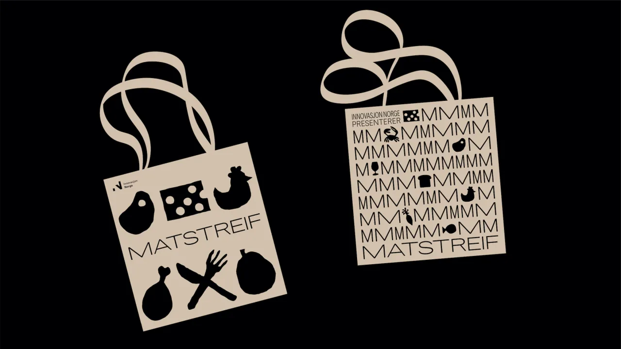
Two cream linen tote bags with rope handles featuring Matstreif branding in black, one with illustrated food icons and the other with repeated M letterforms, displayed against a black background
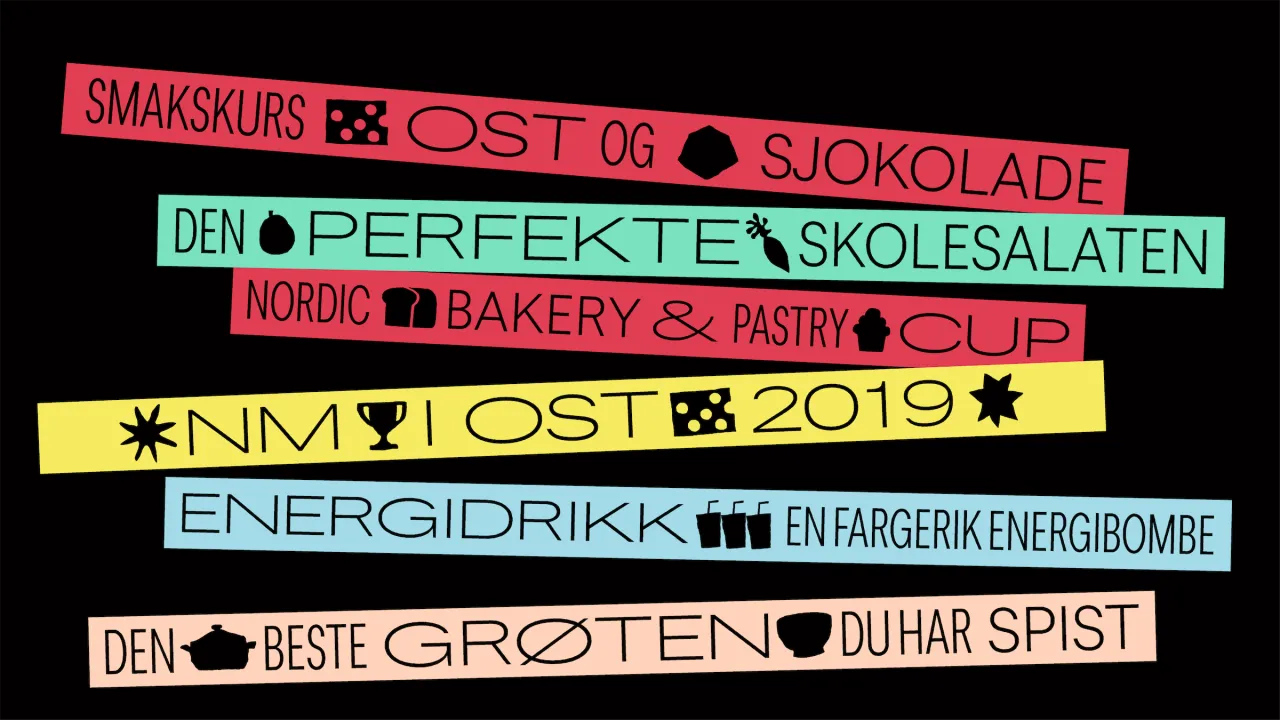
Colourful horizontal bands displaying Norwegian text in the custom Smaks Sans typeface, including phrases about taste, chocolate, bakery, and food festival categories
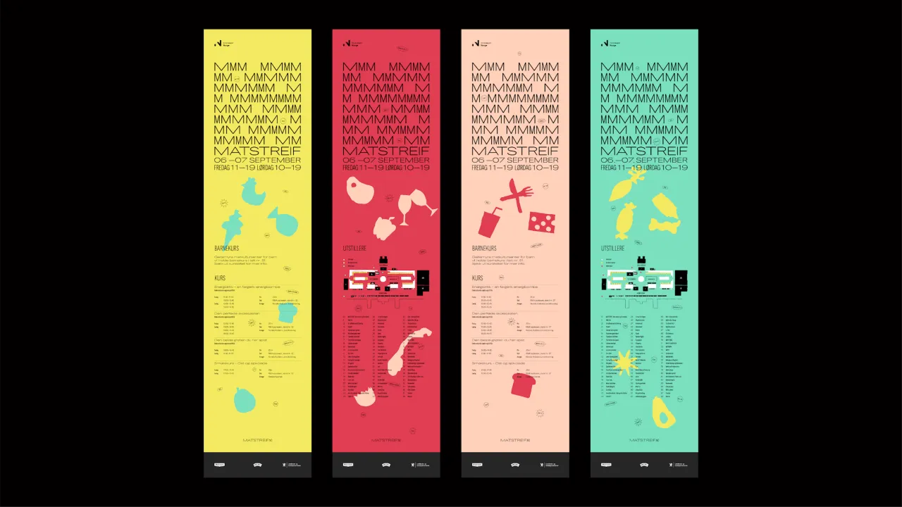
Four vertical posters for Matstreif food festival in yellow, red, beige and mint green, each featuring the custom Smaks Sans typeface and illustrated food and farming icons
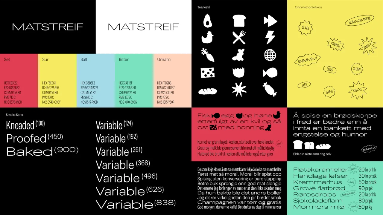
Matstreif branding guidelines showing the custom Smaks Sans typeface in various weights, icon set, colour palette and typographic specifications
Overlapping promotional materials for Matstreif food festival featuring bold mint, coral, yellow and blue rectangles with event dates in September and the festival name in Smaks Sans typeface
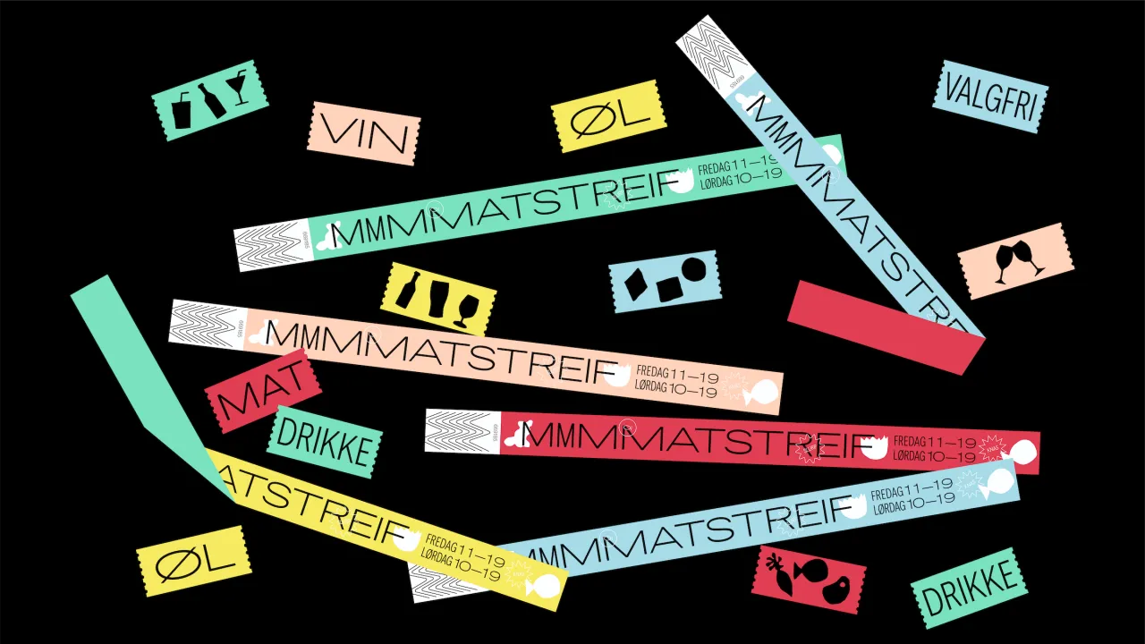
Colourful branded lanyards and labels for Matstreif festival scattered on a black background, featuring the custom Smaks Sans typeface in various colours and sizes
Matstreif 2019 branding guidelines displaying the bespoke Smaks Sans typeface, colour palette, photography styles and graphic elements on a black background
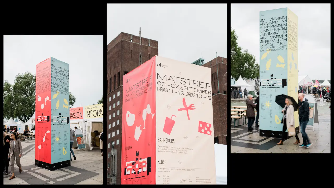
Three tall branded tower structures at Matstreif festival displaying pink and blue panels with bold typography and illustrations promoting the 2019 Norwegian food festival
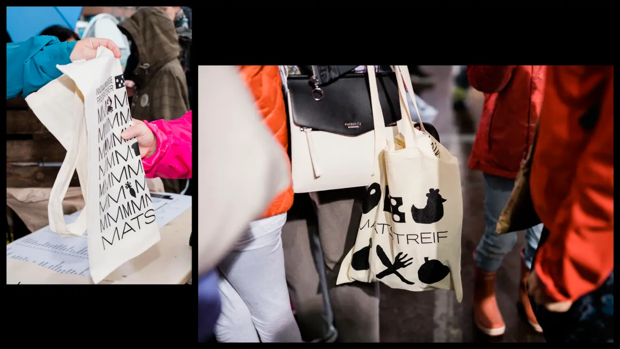
Matstreif tote bags featuring bold black graphics and typography on cream fabric, held by people wearing colourful clothing at the festival
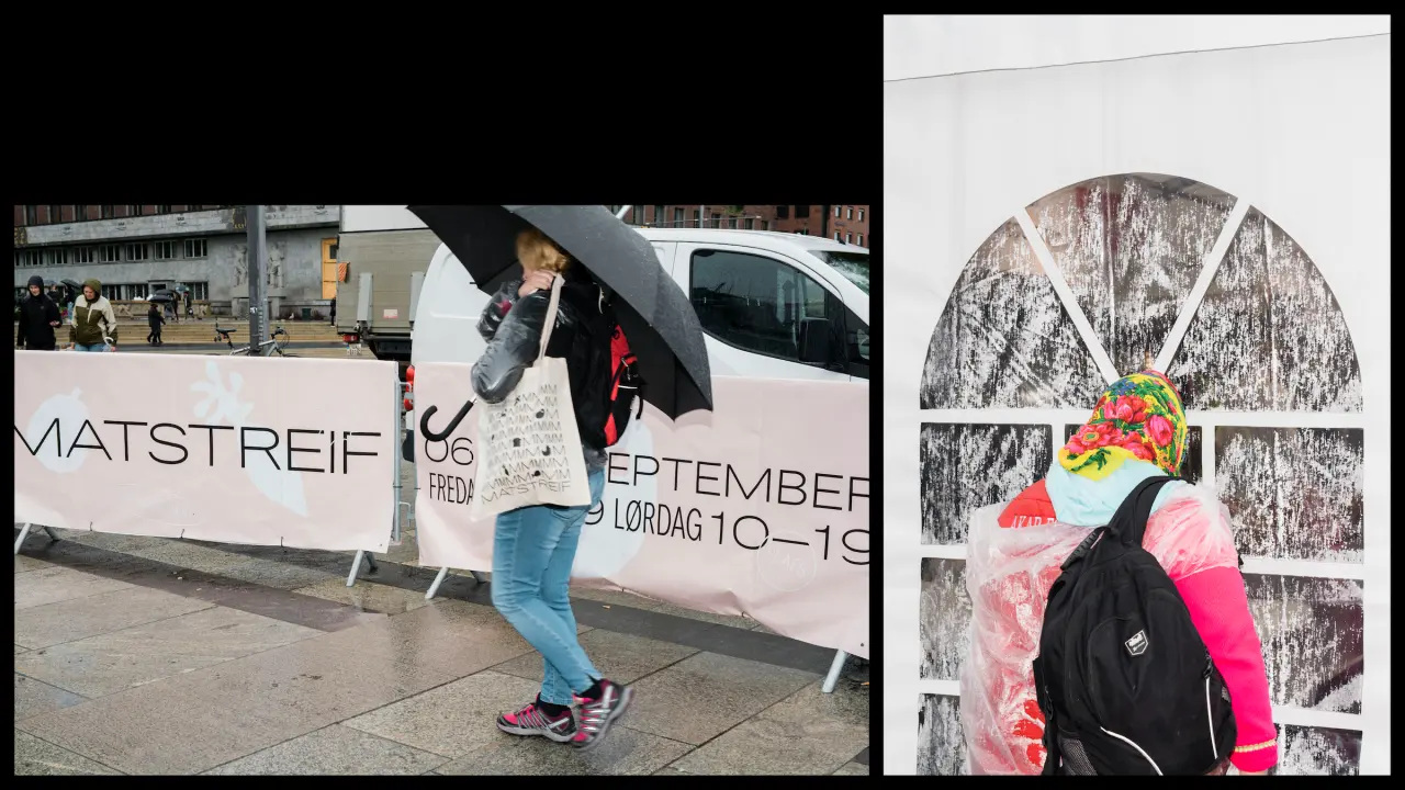
Left: Person holding Matstreif festival banner in outdoor setting; Right: Close-up of festival promotional materials including colourful shapes attached to textured surface
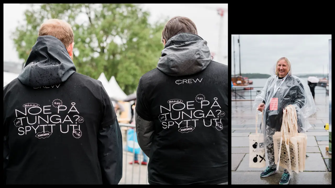
Two crew members wear black hoodies with the Matstreif festival branding, while a third person holds a large woven basket on a dock
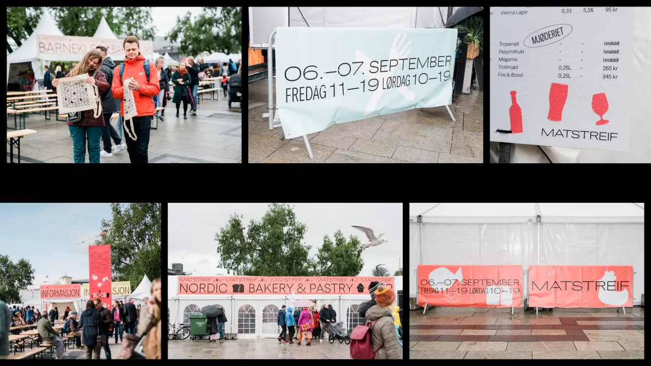
Collage of six images showing Matstreif festival branding, signage and event scenes with bold pink graphics, Nordic Bakery & Pastry marquee, and festival attendees in Oslo September 2019
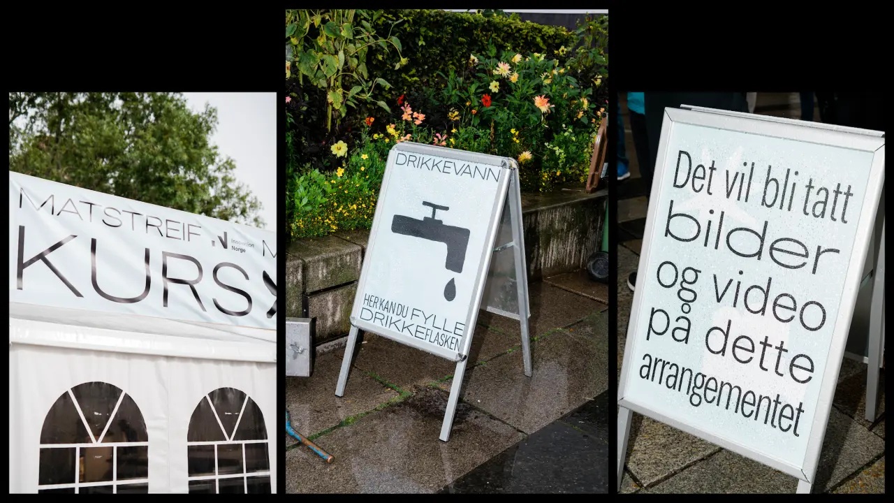
Three promotional A-boards displaying Matstreif branding, including signage for a water fountain and information about images and video arrangements, set against a backdrop of flowering plants
Share