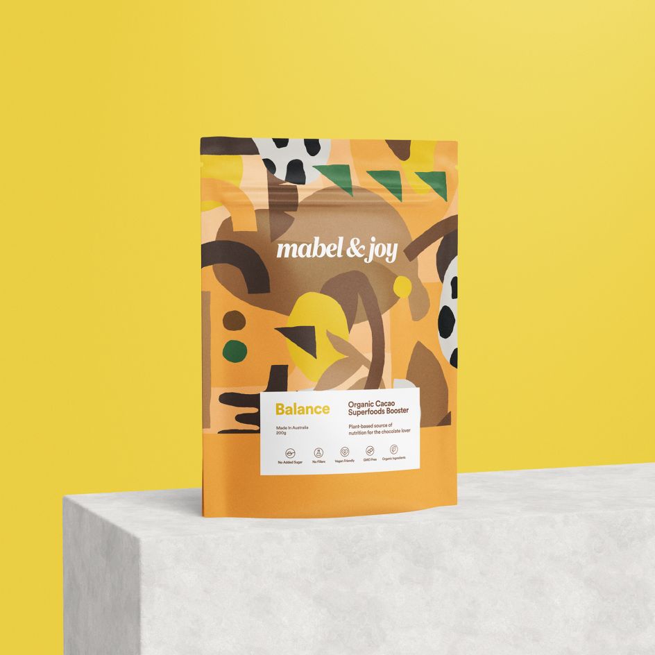
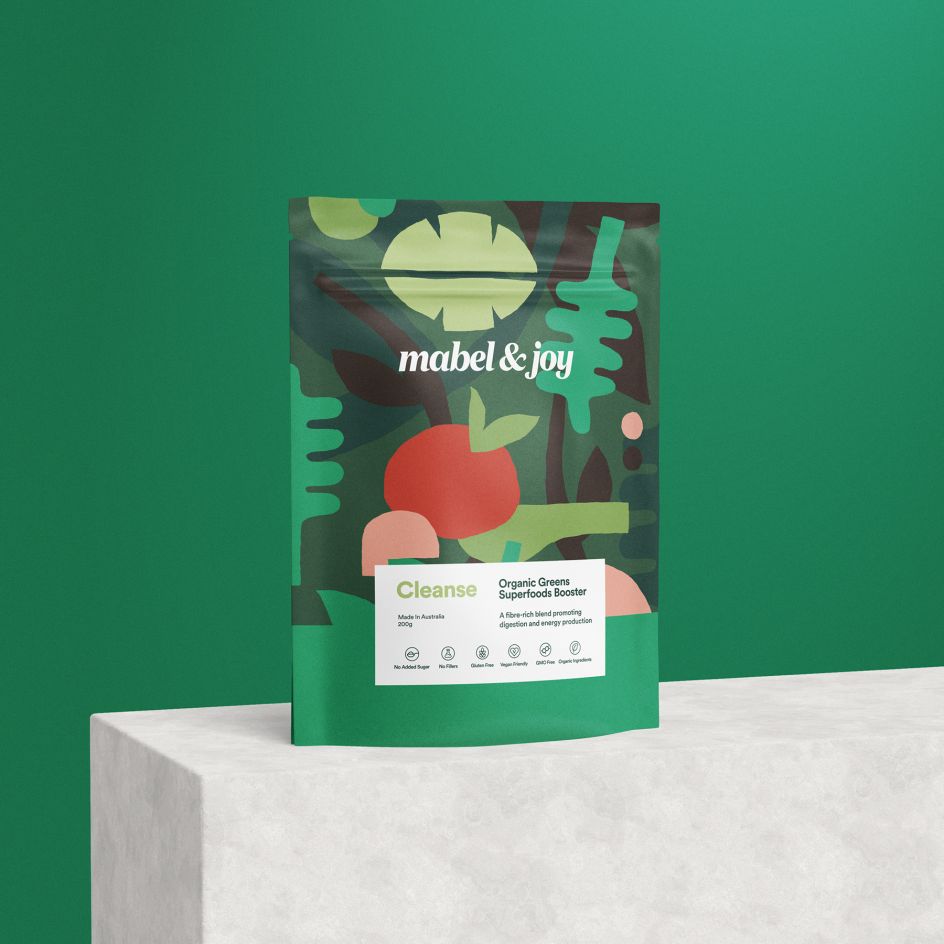
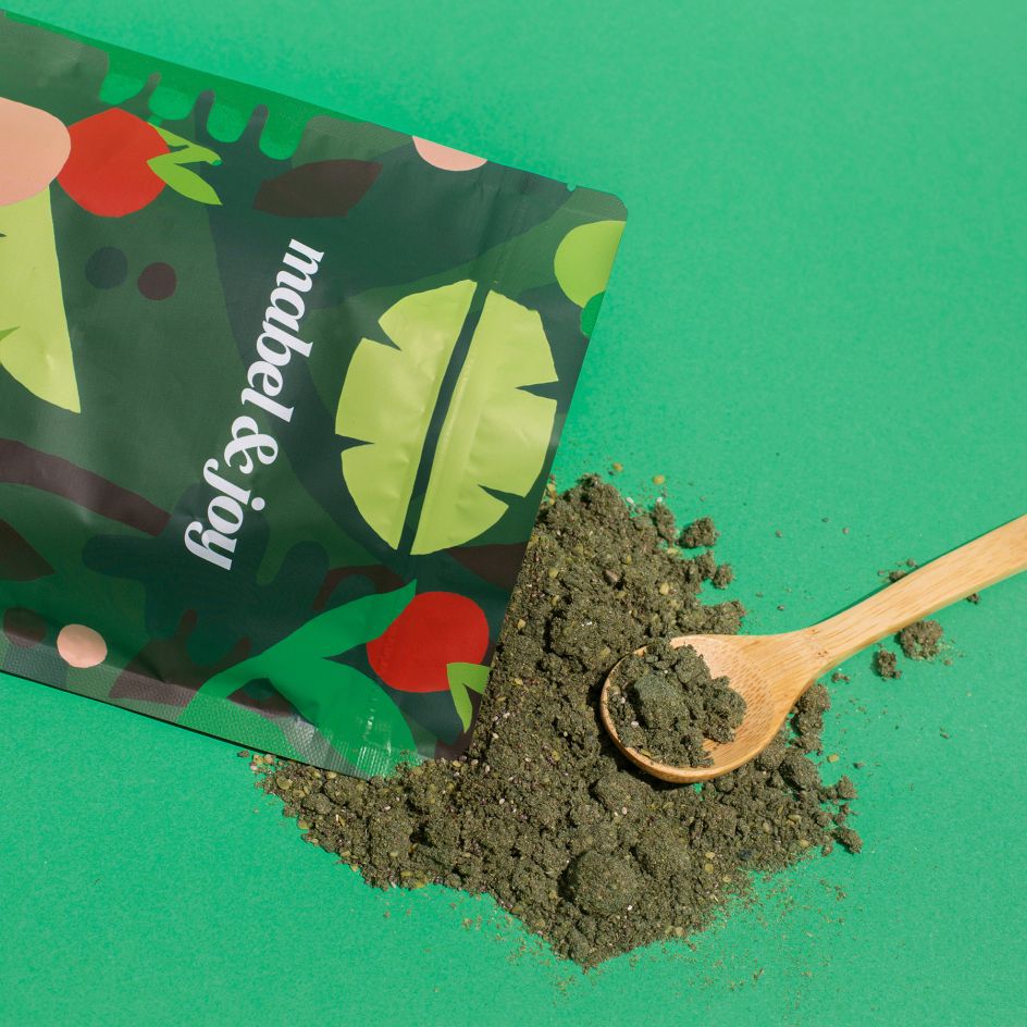
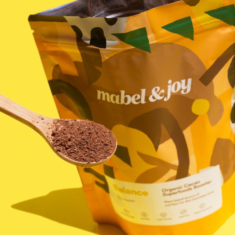
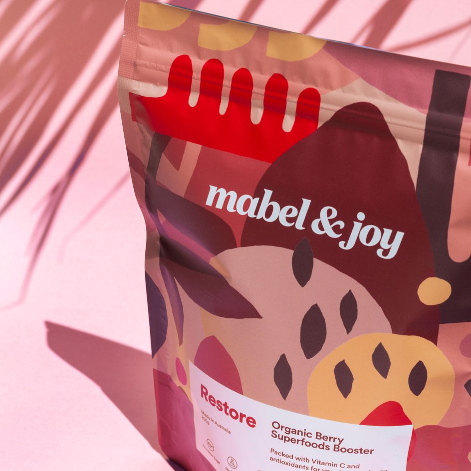
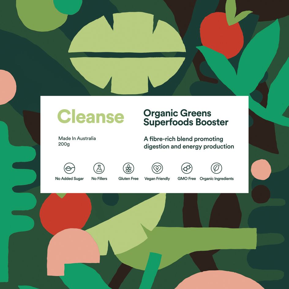
Matisse-like graphic design adds flair to an organic superfood range
Jo Cutri Studio's new work for Mabel & Joy owes a thing or two to cut-out maestro Matisse, but brings modernity and playfulness to the range of Organic Superfood Boosters.
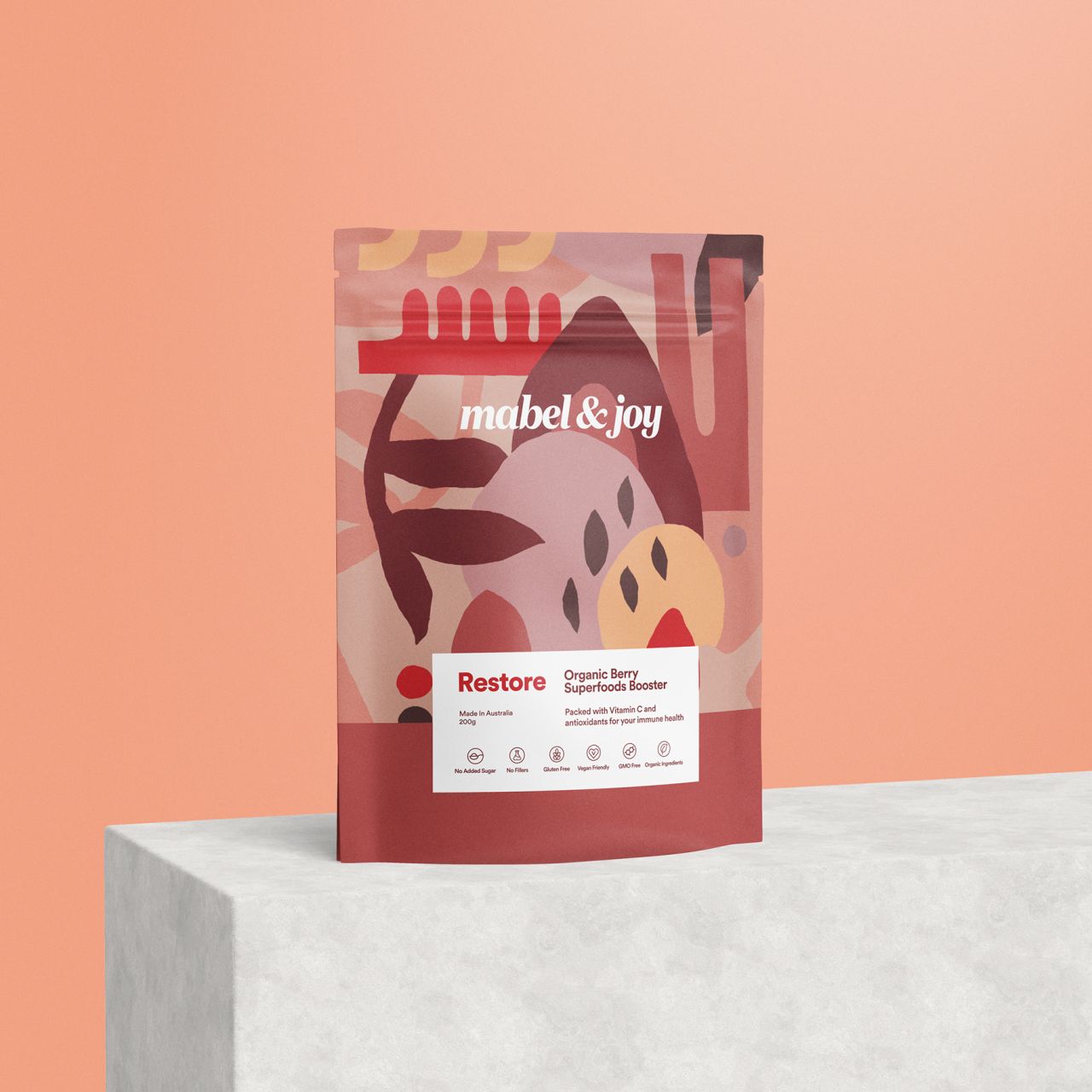
Mabel & Joy's boosters are all made in Australia from only organic ingredients. Different designs and colour palettes are used across each flavour in the range—Balance, Cleanse and Restore. "The main ingredients were incorporated into the illustrations and the bold colours align with each of the flavours," Jo Cutri, the studio's founder explains.
Whimsical serif type in all lower-case is used across the range, against various patterns that use abstracted shapes based on the ingredients and underscoring those natural cues: leaves and fruits, of course, abound.
The copy is kept to a minimum to let the striking graphics take centre stage, neatly contained within a white box on the front of the packs.
Based in Melbourne, Australia, the studio works across branding across digital and print platforms, as well as web development and hosting. Check out more of the studio's work on its Instagram.
Editor's Picks


Trending


](https://www.creativeboom.com/upload/articles/90/908fdb6378db1e95d12595416f54e6336d5e80b8_732.jpg)


Podcasts


Editor's Picks
Further Reading