People People crafts colourful identity based on building blocks for urban development
The Seattle agency draws on modular and geometric forms to create striking new branding for Kirkland Urban, a mixed-use development in King County, Washington.
From the public's point of view, inner-city development is always a bit of a mixed bag. On the one hand, we all like to see urban renewal and shiny new places to visit. On the other, building them usually involves a lot of noise and disruption, makes it difficult to get around, and seemingly goes on forever. So it's good to give your fellow citizens a sense that there's light at the end of the tunnel, so to speak and that it'll all be worth it in the end.
Branding plays a big part in this, of course. For a great example of how to do it, it's worth checking out this new identity for Kirkland Urban, a mixed-use development northeast of Seattle, in the city of Kirkland in King County, Washington.
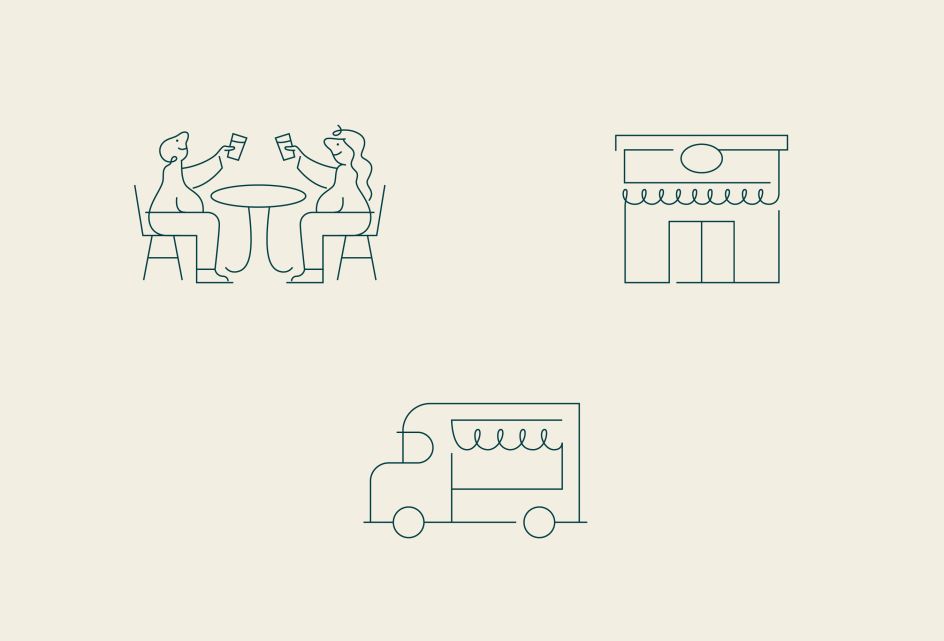
Kirkland Urban is a vibrant extension of downtown Kirkland, bringing together a collection of neighbourhood services, shops, restaurants, and a large public plaza. Located adjacent to Peter Kirk Park and walking distance to the waterfront, it's been in development for some time: the first phase opened in 2019.
More recently, it was in the process of adding a third building and needed to reimagine its visual identity. So they tapped up the branding studio People People, a Seattle-based, woman-owned branding and interactive firm helping businesses and communities across the Northwest and beyond since 1998.
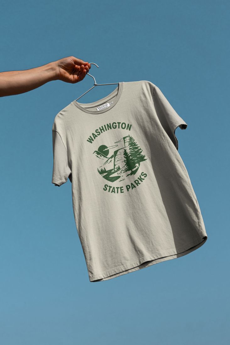
We loved People People's work celebrating the diversity of Washington State Parks, and it's great to see the same skillset applied here to a very different environment.
Brief and research
The client desired a more robust brand system that would capture the development's unique personality, differentiate it from other projects in the area, and inform the new website and a future environmental signage package.
People People conducted local focus groups to drive their work. During their research, designers learned Kirkland residents sought welcoming environments with spaces designed for shopping, dining and gathering. (That may sound obvious, but if you've ever been to a retail park where there's nowhere to get a cup of coffee or general public space to sit around and chat, you'll know how important these things are.)
Inspired by their findings and the development's diverse array of offerings, People People recommended positioning Kirkland Urban as a collection of businesses, spaces and experiences, each with its own character, coming together in one place.
Graphic elements
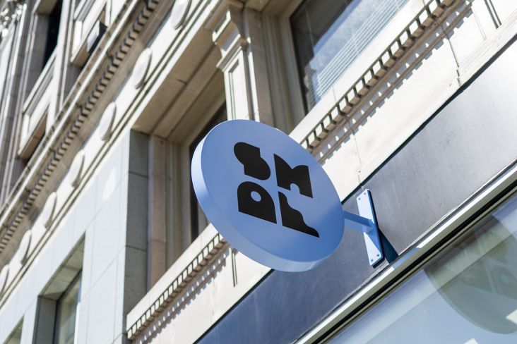
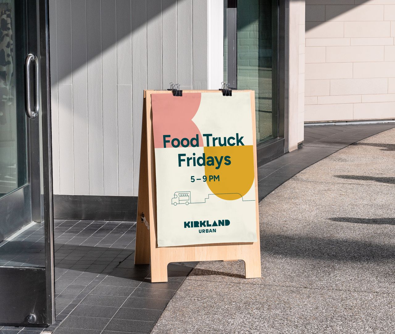
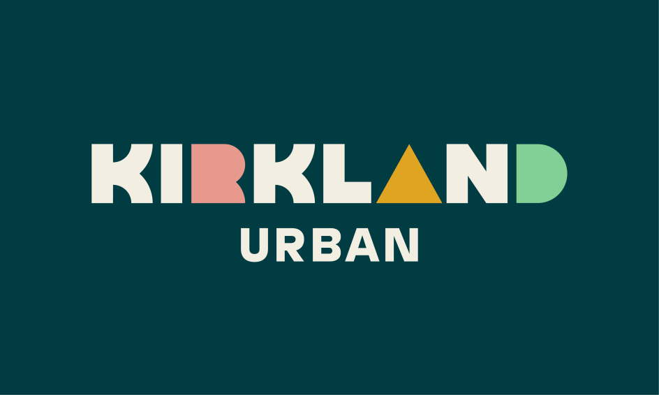
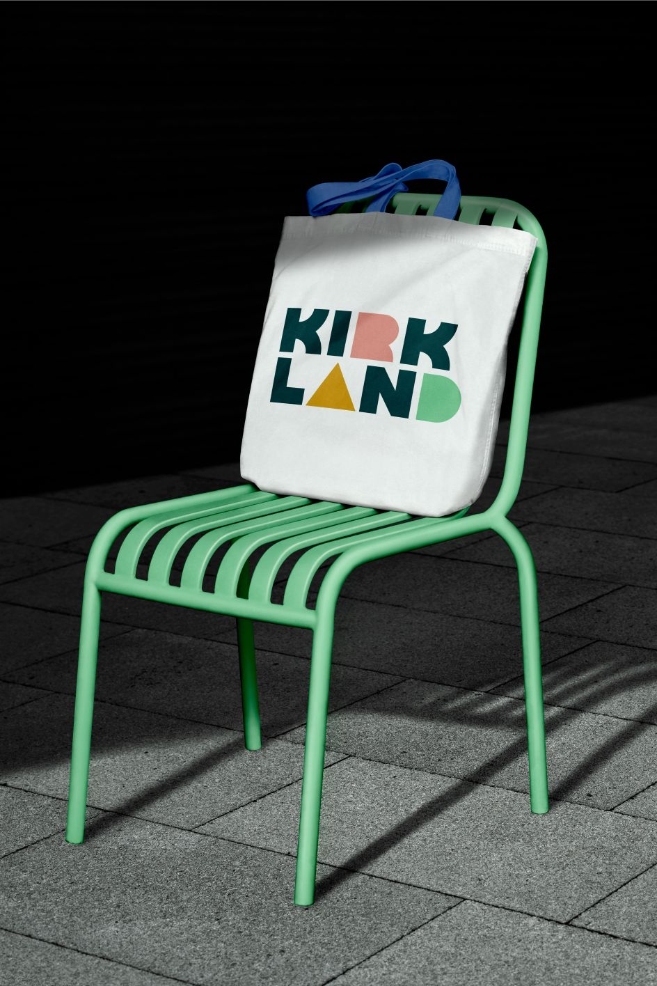
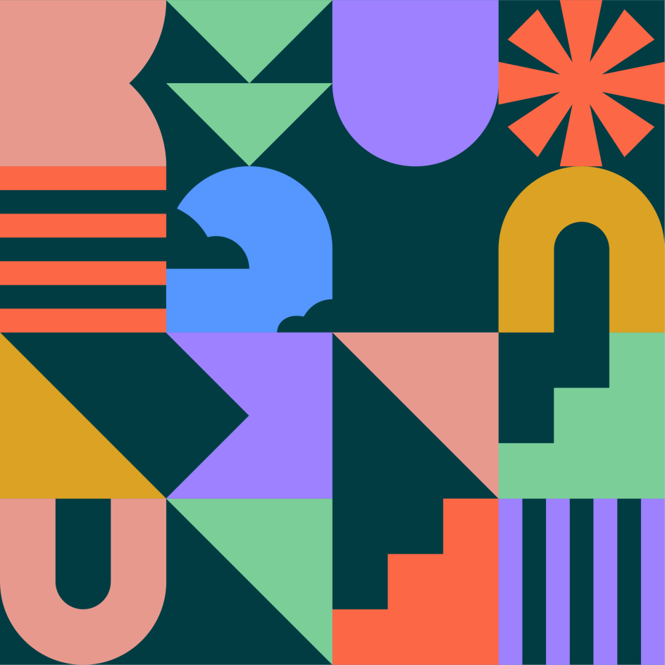
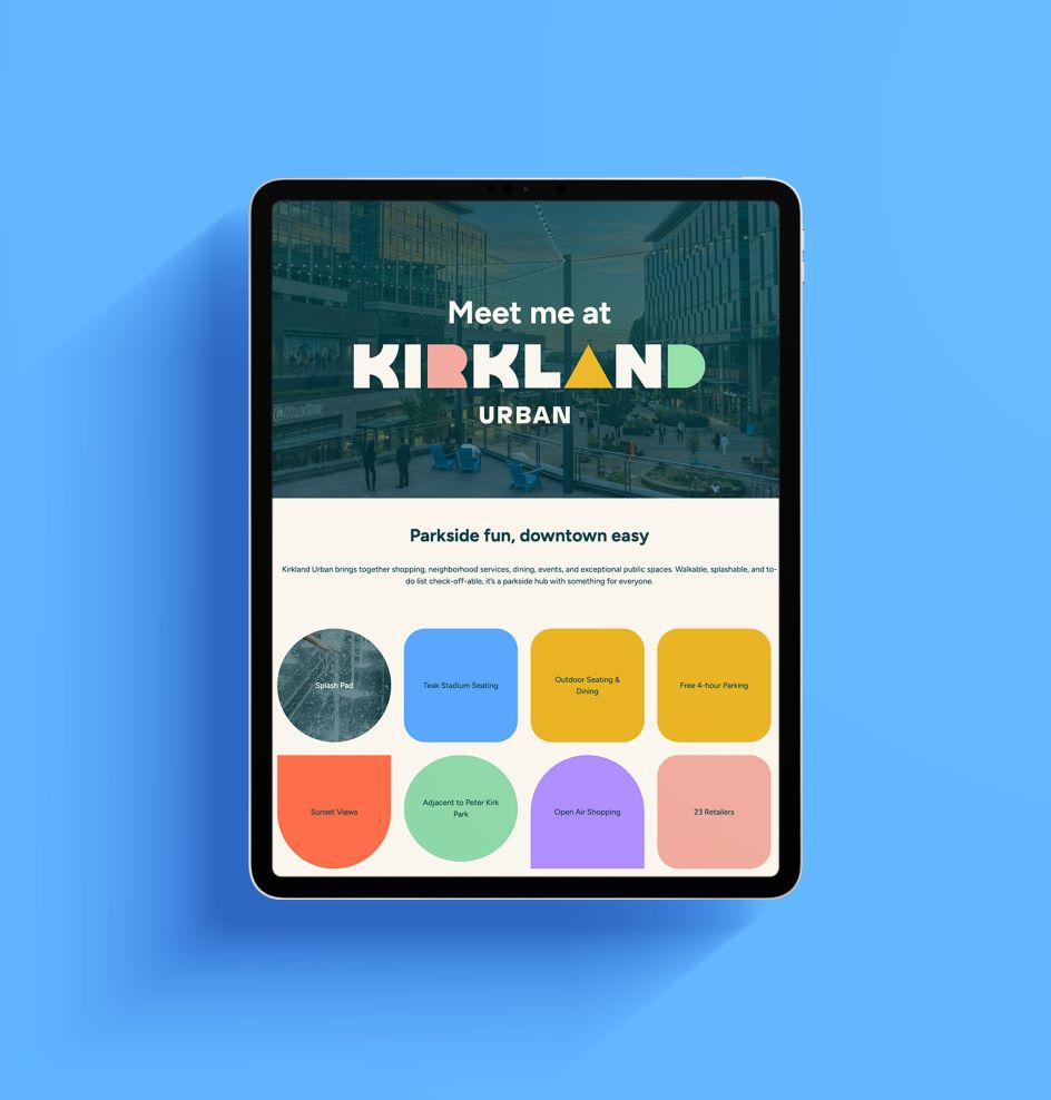
People People created a bright and playful building-block-inspired brand to bring the concept to life. Central to this is the primary logo, which features fully custom, geometric typography. People People gave each letter a unique personality as a nod to the many experiences Kirkland Urban has to offer, from restaurants and breweries to salons and clothing stores.
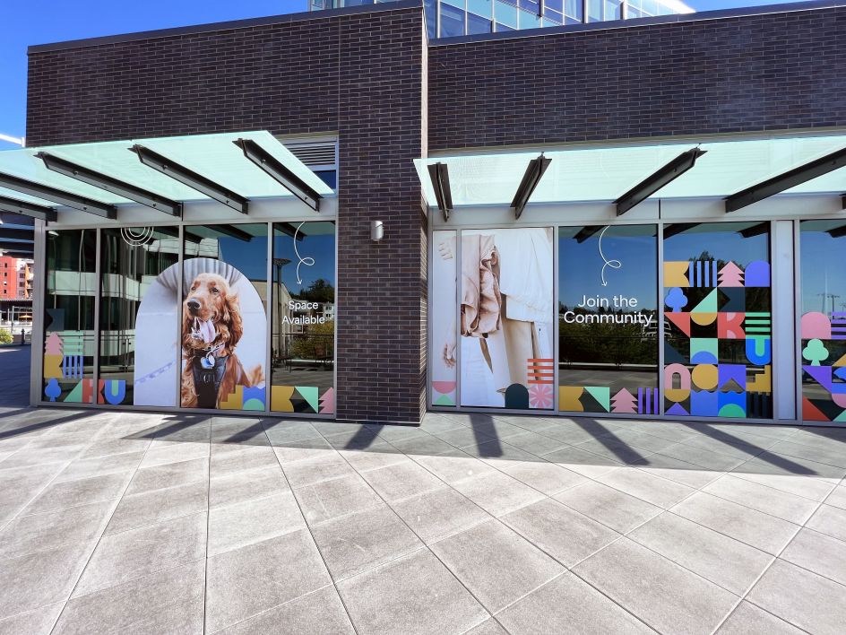
Modular, block-like supporting graphics can be used on their own or paired together to form eye-catching patterns. The colour palette features an inviting combination of warm and cool hues, including grounding teal, mint green, electric blue, violet, vermillion, bright ochre, and salmon. Over 100 window graphics in these forms and hues are installed around the project site.
People People have also designed and developed Kirkland Urban's new website, which welcomes visitors with lively animations, upcoming events, and an interactive business directory.
The final stage of the project will include a new environmental signage package featuring interactive directories and murals, which is currently planned to roll out in early 2024.
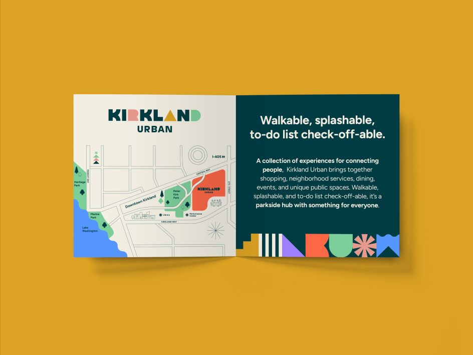
Complementary messaging communicates the concept verbally. "For a memorable, impactful placemaking brand, it is important that both the messaging and the visual brand come from the same foundation and communicate similar personalities," explains People People's creative director Shannon Palmer. "Catchy, friendly headlines include 'Walkable, splashable, to-do list check-off able' and 'Do all the things, do nothing, do your day.'.
It all adds up to a bright and playful visual identity that reflects the essence of not only Kirkland Urban but the broader Downtown Kirkland area. With a strong fusion of custom typography, modular graphics and captivating colours, the rebrand highlights the community's desire for welcoming spaces and establishes the development as a unique and dynamic hub.
Editor's Picks


Trending


Podcasts


Editor's Picks
Further Reading