COLLINS rebrands San Francisco radio station for the next 80 years
KALW is a lauded public radio station with a storied history serving the SF Bay Area. Design agency COLLINS explain how they helped it to rebrand and why the work struck a personal connection with them.
Now, much of the world has switched to streaming, the idea of listening to a radio station feels old-fashioned. But local radio remains the one big exception, and it's one that really came into its own during the Pandemic era.
For San Francisco's Bay Area, that special local station is KALW. With their 80th birthday approaching, COLLINS – the brand experience design company based in New York and San Francisco – was challenged with creating a new identity that would serve them for the next 80 years.
It was a project close to everyone's heart, explains designer Barney Stepney. "COLLINS has had an office in San Francisco for several years now," he says. "It's a city we love and owe an incredible amount to, so we aim to work to support our community as much as we can."
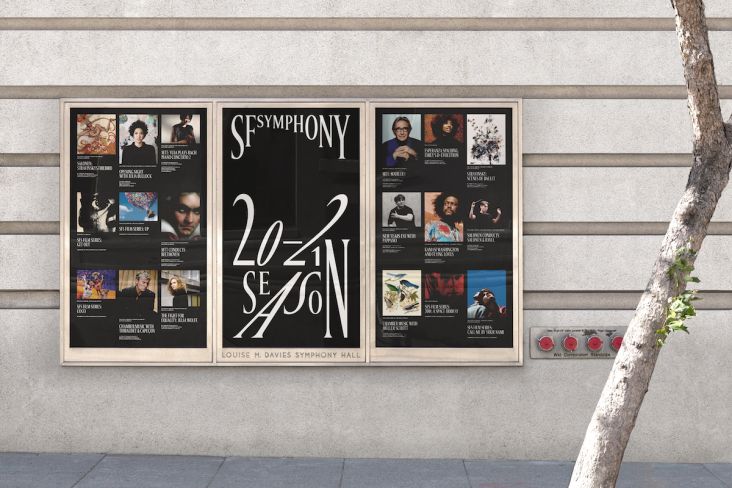
In 2016, for example, they began their work with the local science museum The Exploratorium, and since 2019 they've had a partnership with the San Francisco Symphony orchestra.
"In large part, San Francisco's vibrancy and perpetual sense of possibility are due to its many music and cultural scenes," says Barney. "KALW is a critical voice for those spaces, and they also happen to be one of the most pioneering radio stations in the US. So for us, it was a unique opportunity."
And music is in COLLINS' DNA, he adds. "We've worked with Spotify, Warner Music, SF Symphony and Bose, too, and so the internal well of language and experience in crafting design solutions for musical or music-adjacent organisations is deep here. With KALW, we had a special chance to further that experience by working with a station that was such a Bay Area fixture."
COLLINS' team delved into KALW's history to create a visual identity system that directly reflects its uniqueness and showcases its connection to the Bay Area.
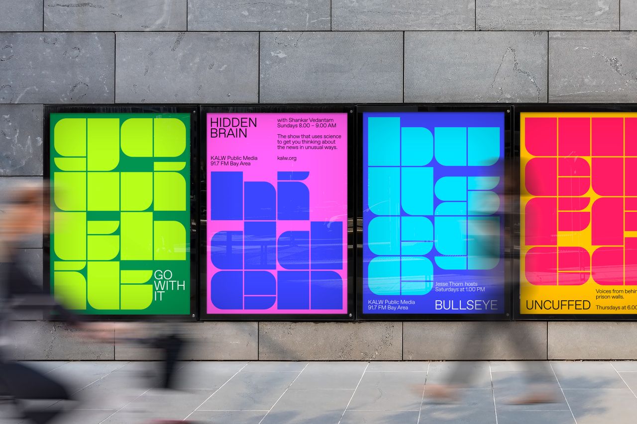
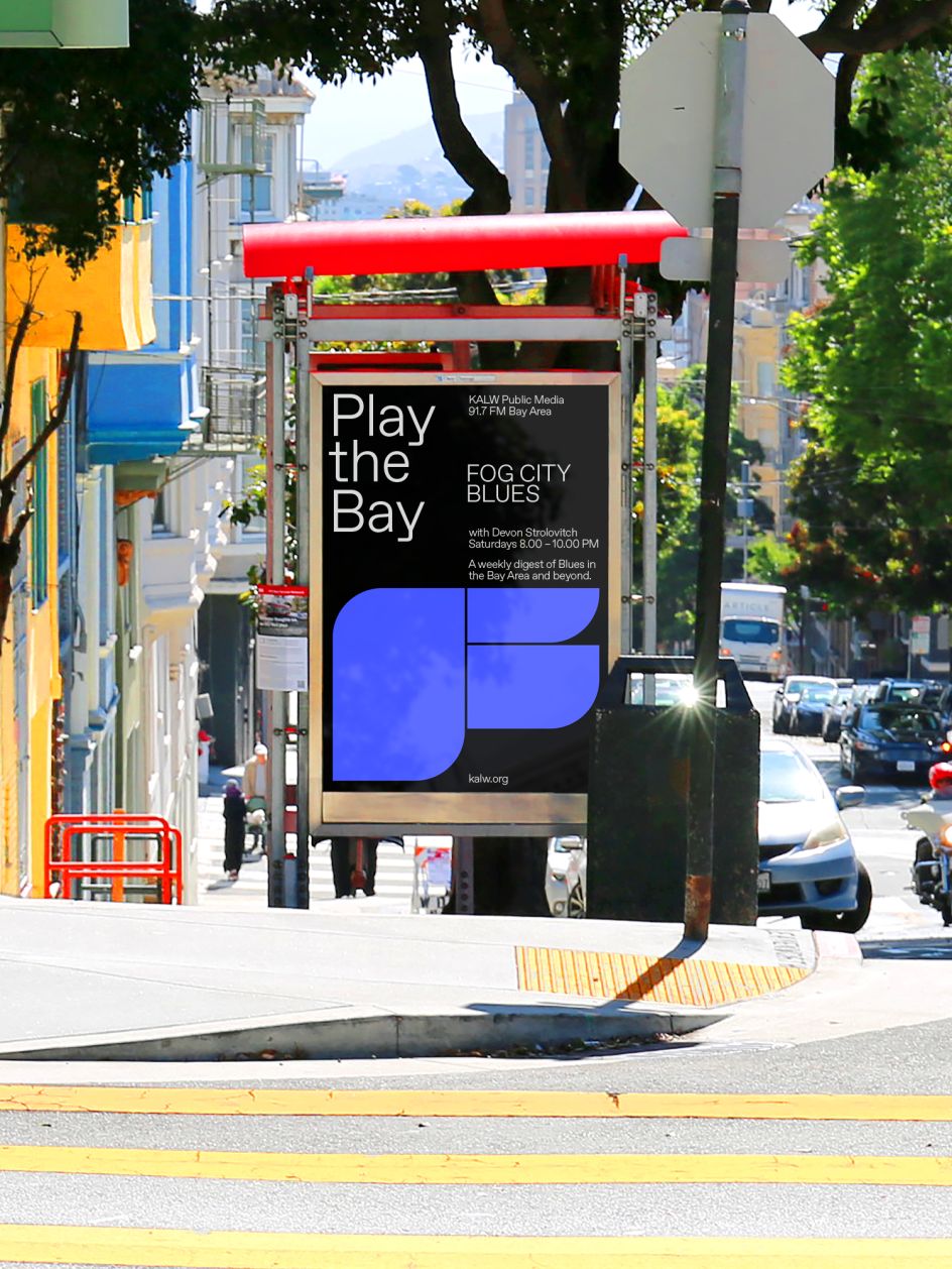
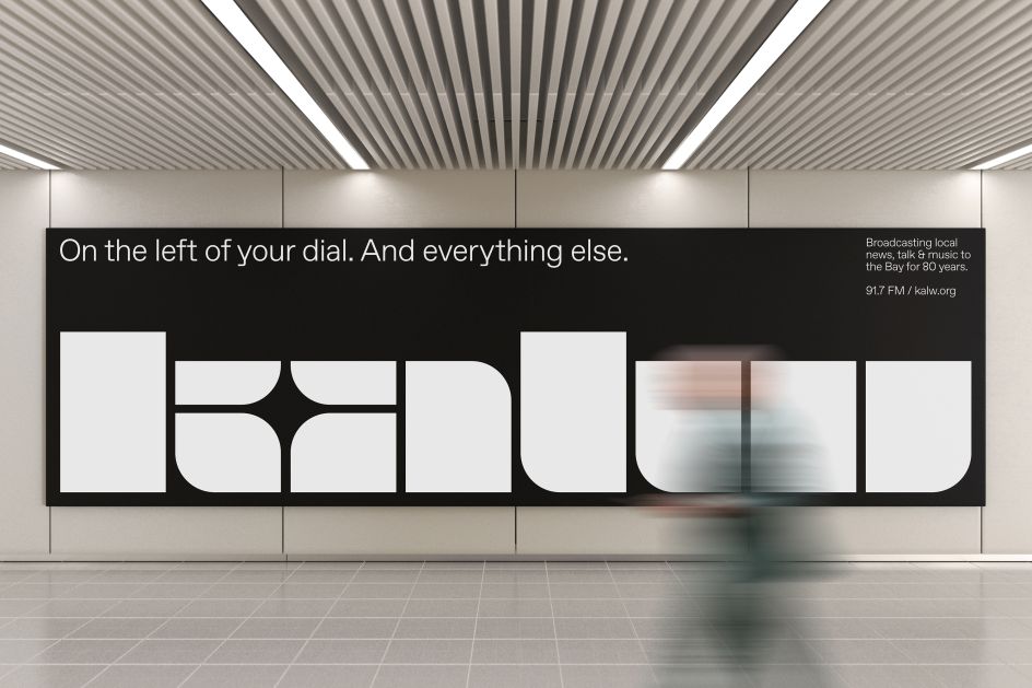
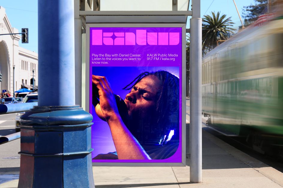
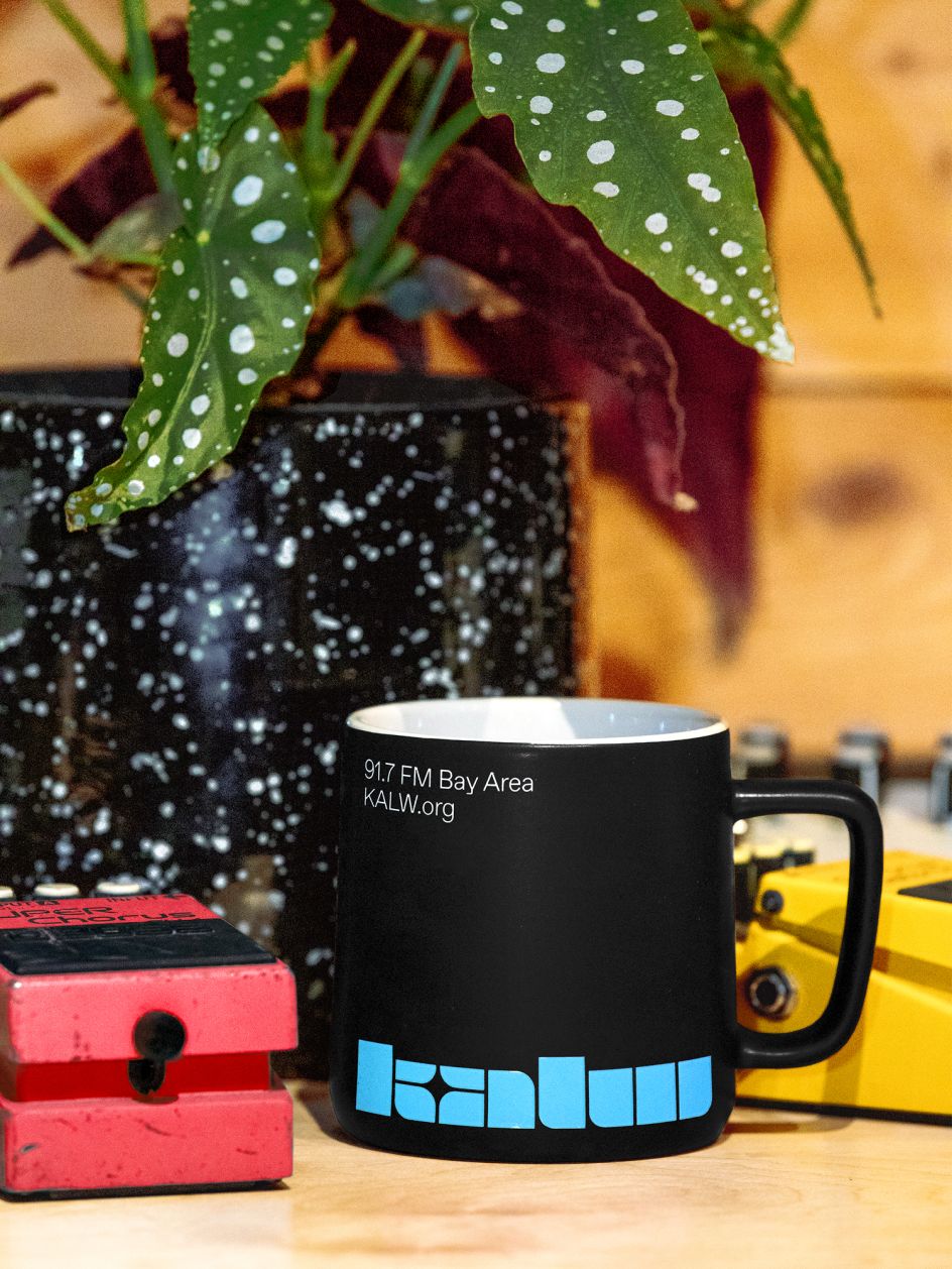
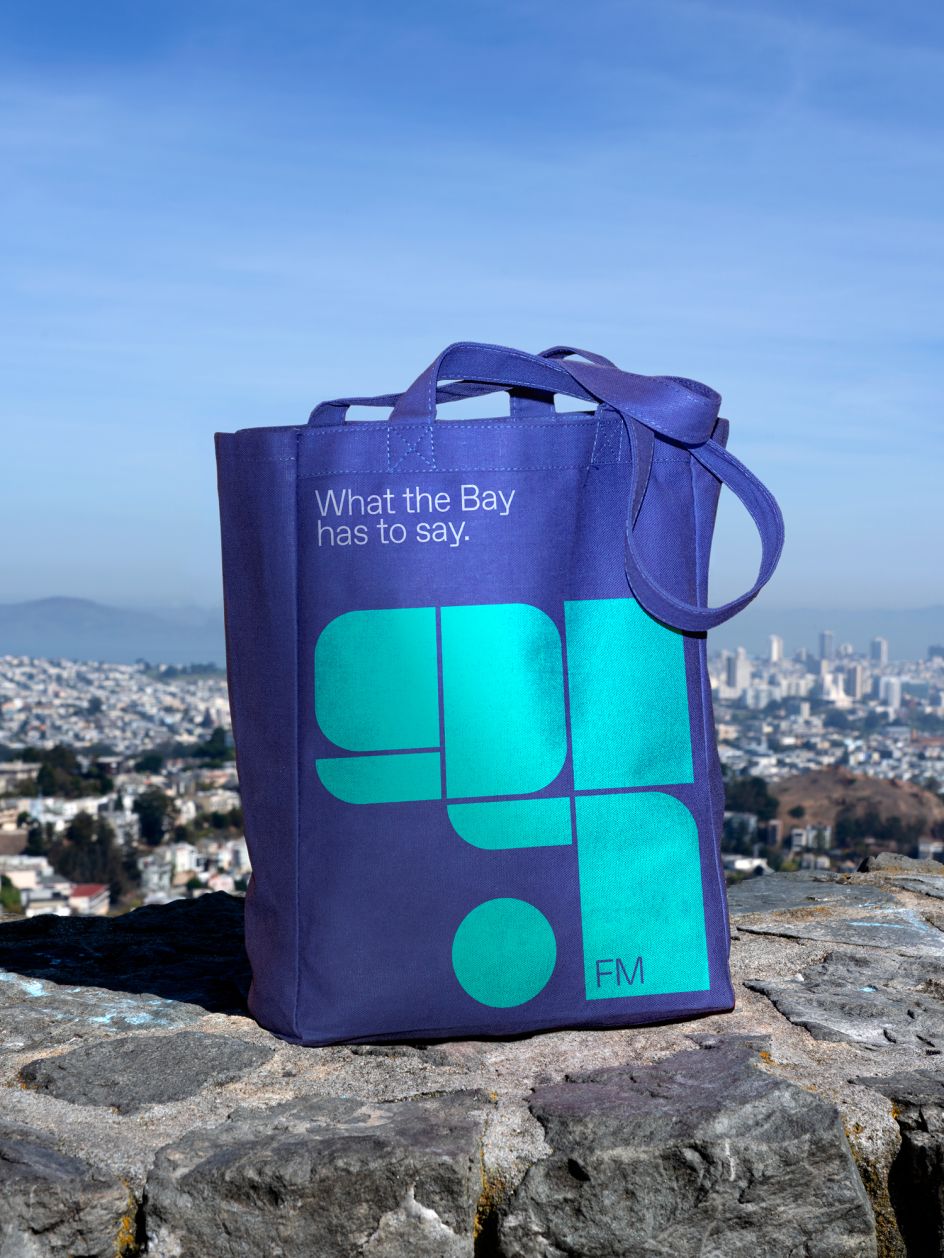
"In our research, we came across a logo that KALW used in the late 70s," says Barney. "It was strange, made from stencil lettering, with weird shapes and dimensions that were entirely inconsistent with each other. In its rigidity of form, we instantly recognised the logo was also inconsistent with the fluid, flamboyant, hippie style of art and design in San Francisco in the 1970s. In that weirdness, though, we found surprising character, memorability and tons of energy."
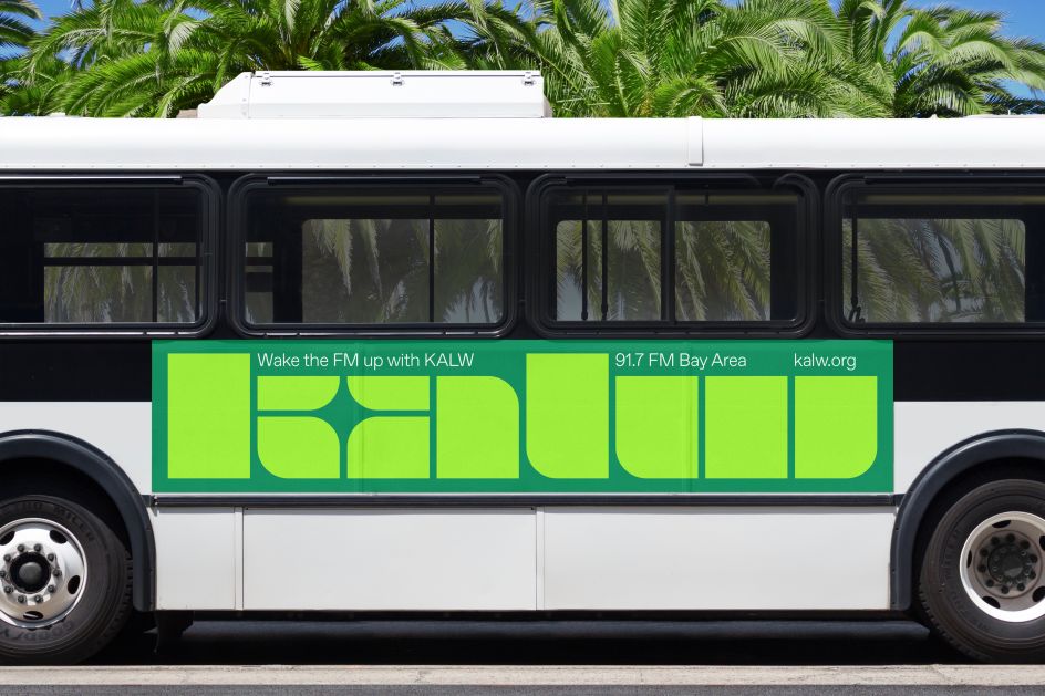
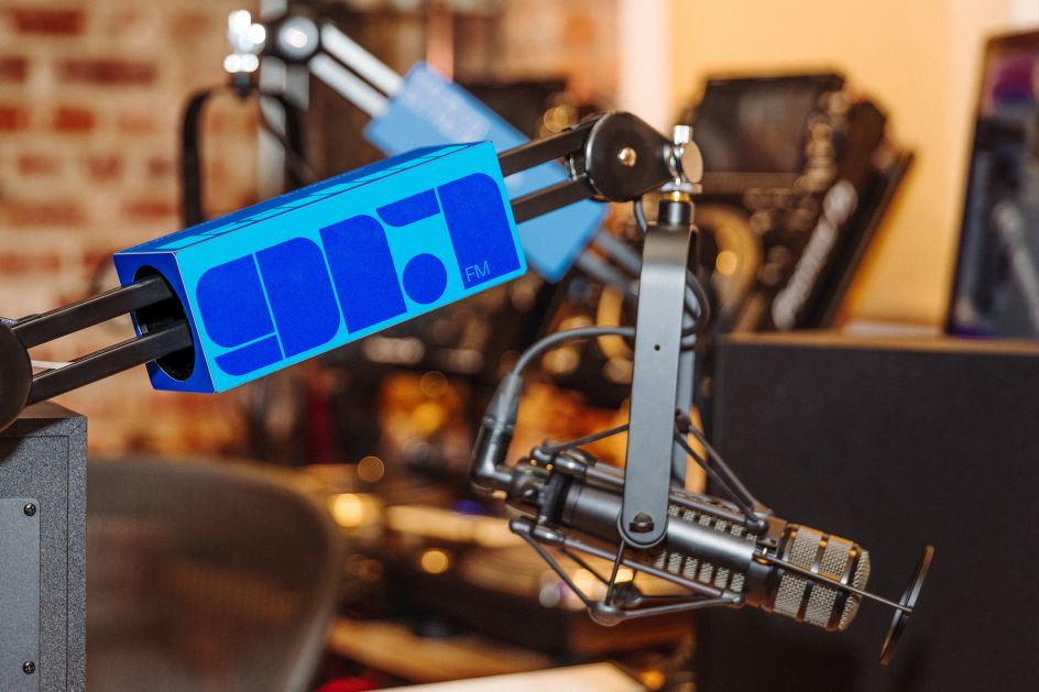
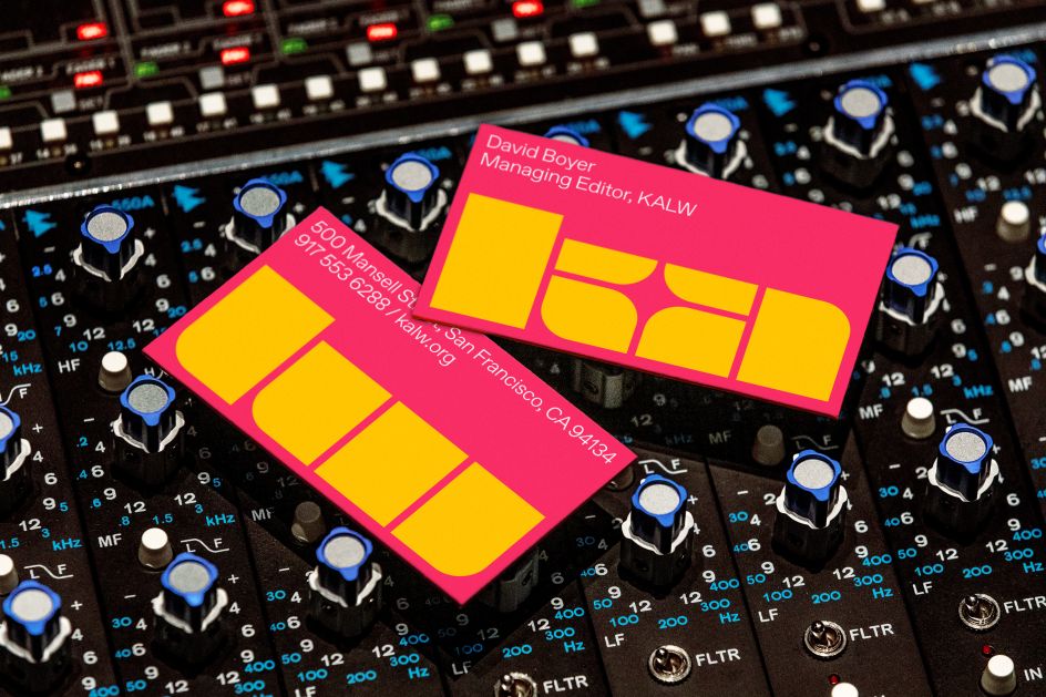
They were all enthused by the idea of using a stencil for the new identity, he continues. "There's a blunt, utilitarian aspect to a stencil that anyone can understand. It is also representative of building blocks coming together to form a whole, and a community, which is exactly what KALW has successfully done over the last 80 years. A bold voice travels far.
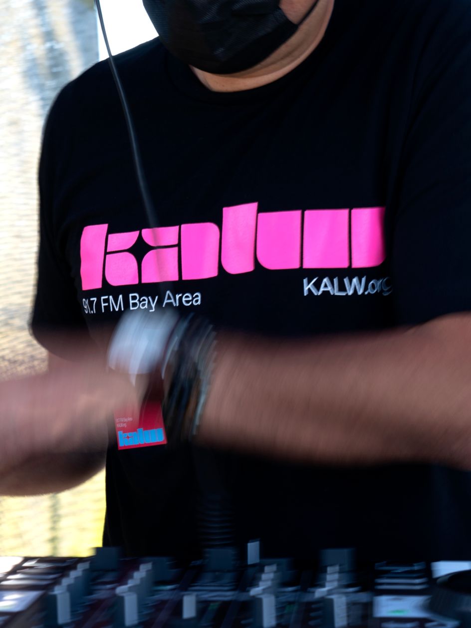
"We wanted to create a logo that would be as unique and powerful as KALW's voice itself and expresses the vibrant future they continue to build with the Bay Area community. We wanted the logo to act as the main source of imagery in KALW's communications. This puts the brand identity front and centre."
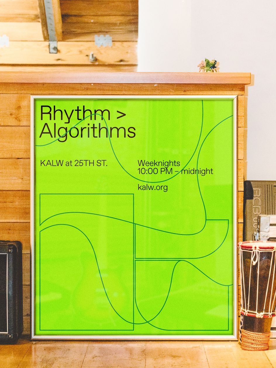
The rest of the brand system, including the colours, was inspired by both the simplicity of jazz and classical concert posters from the 1950s and '60s and Disney films such as Fantasia 2000's George Gershwin's musical composition Rhapsody in Blue.
"Those intense colour pairings were memorable and delivered life and energy in short, bright bursts," says Barney. "We wanted to do something similar for the KALW brand, so we employed colour pairings that vibrate and feel unfamiliar.
"The result is a colourful and bold identity, including a new logo inspired by letterforms of jazz and classical concert posters from the 50s and 60s, that can grow with the station as they continue to reimagine and redefine local radio."
Editor's Picks


Trending


Podcasts


Editor's Picks
Further Reading