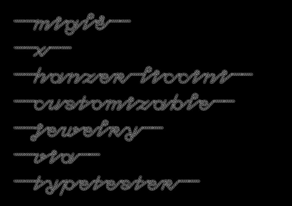
Hanzer Liccini fuse intrepid typography with clever jewellery design
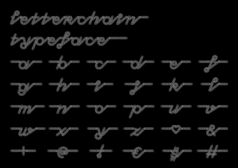
In a fascinating coalescence of type and product design, alongside a continuation of its experimental typographic practice, Studio Hanzer Liccini has bridged the gap between typography and jewellery in its typeface designed for Berlin-based jewellery company Miglė and its latest Letterchain collection.
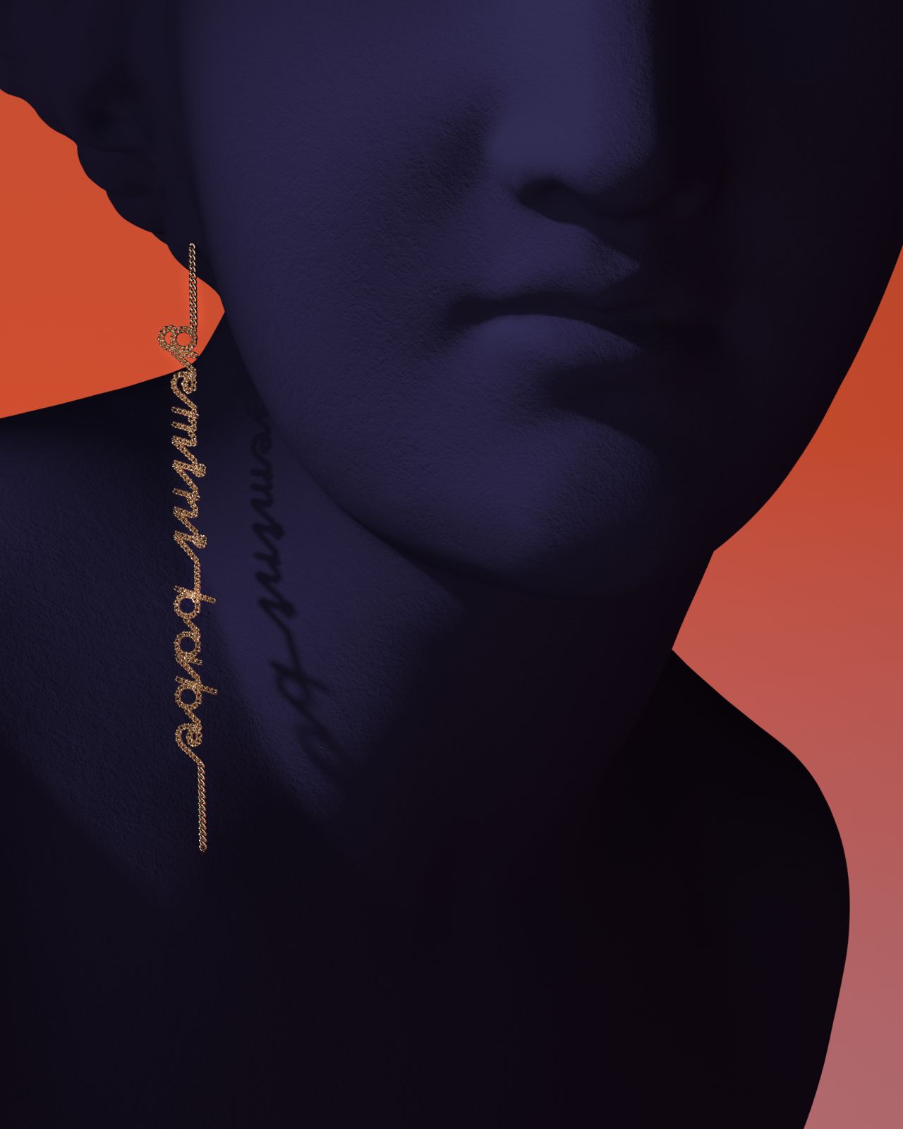
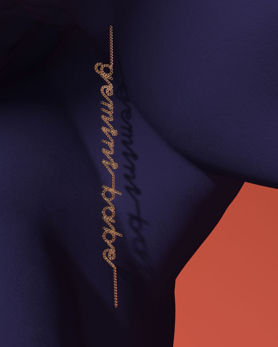
MIGLE x Hanzer Liccini, Letterchain earring, image by Marie Dommenget, 2021
Elias Hanzer, one half of the fellow Berlin-based design studio composed of himself and Lucas Liccini, explains that "the project was intended to be a different take on the already existing 'letters-on-a-chain' products."
Seeking to continue its heuristic approach, considering the chain's inherent physical parameters, Hanzer Liccini demonstrated the mastery of its practice – forming a practical and methodological grounding to crafting something innately artistic and cultivated. It manifested in creating a programme that metamorphosises the digitally written character glyphs into continuous words and names, cast onto precious metal.
Further extending the emphasis between digital and physical, the resulting typography is akin to beautiful calligraphy while remaining firmly algorithmic and an exhibition of insatiable, contemporary type design, through its dynamic shapes and fluid-come-structured physical rhythm.
There is an obvious element of candour and fun instilled within Hanzer Liccini's work; whereby in taking rudimentary tools like type testers, it sees what its creative interpretations could be and how they approach it playfully.
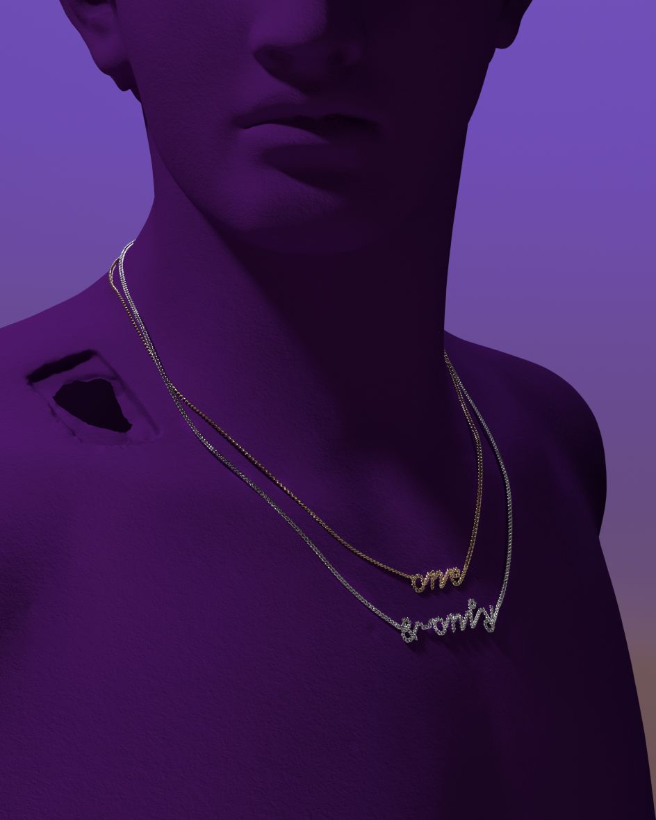
MIGLE x Hanzer Liccini, Letterchain necklace, image by Marie Dommenget, 2021
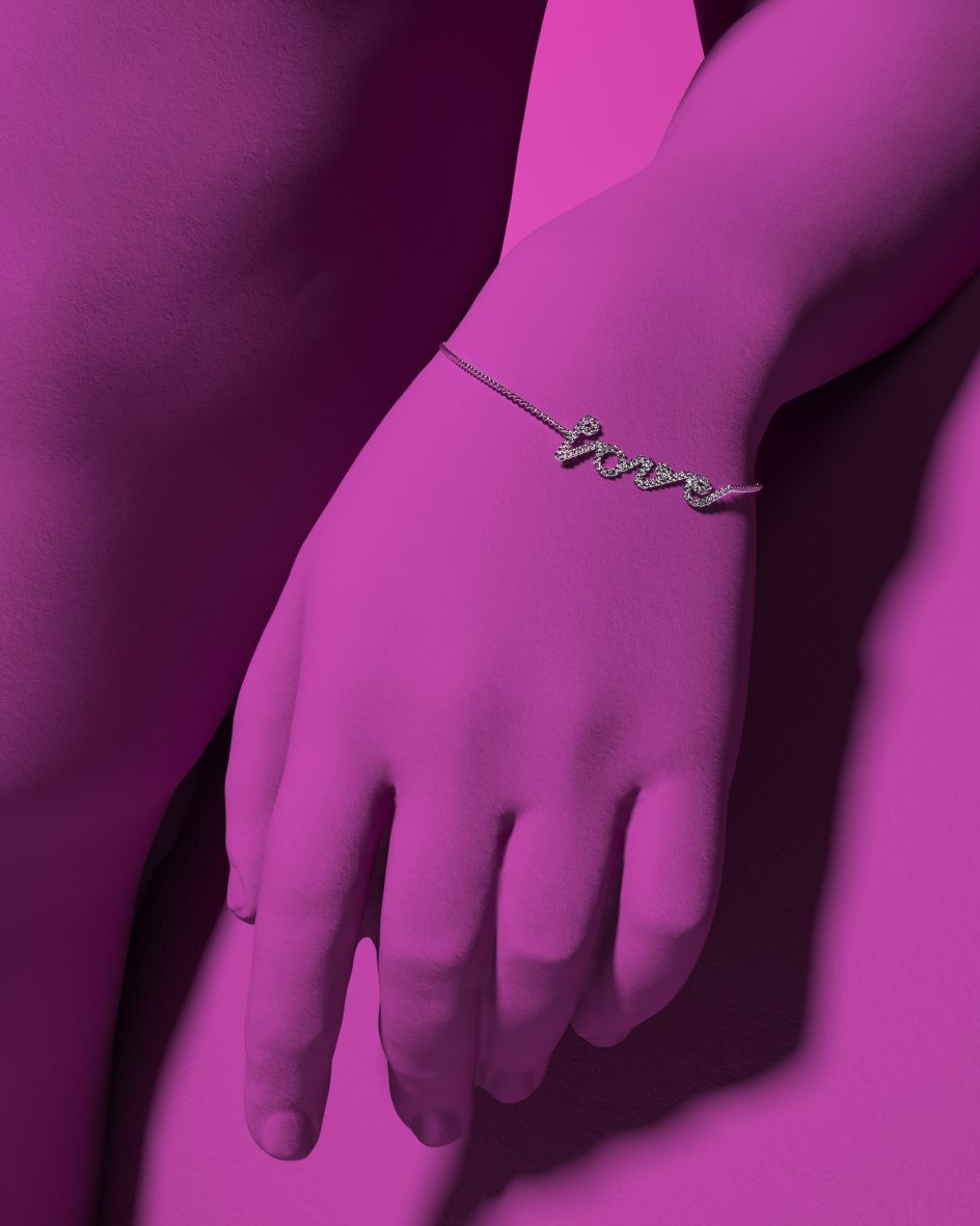
MIGLE x Hanzer Liccini, Letterchain bracelet, image by Marie Dommenget, 2021
"Another thing we enjoyed was the range of development stages," Elias elaborates, after undergoing both digital iterations of the typeface and physical test-castings of the jewellery. "The letters were bound to the physical size of the real chain," he adds, a fact that turned out to be integral to the form of the individual letters due to the changing type affecting the chain segmentation of the piece.
With campaign artwork created alongside visual artist Marie Dommenget, the project is a tour-de-force of collaboration – both in terms of the space the project intersects and the multi-disciplinary creatives involved. "Combining the digital and the analogue," Hanzer Liccini explains, the typeface exists as a downloadable font as well as a physical element within the jewellery; coming in silver and gold – customisable across necklaces, bracelets and earrings.
Through this project, the dynamic duo has not only proved the transience of its typographic practice and the exciting outcomes these disciplinary alliances brew but have set a new standard towards customisation and our subsequent creative expectations. "We hope collaborations of this kind between different disciplines lead to more exciting crossovers," Elias explains, looking forward towards a future creative industry, "yielding novel approaches and new outcomes."
MIGLE x Hanzer Liccini, Letterchain earring, image by Marie Dommenget, 2021
Editor's Picks


Trending


Podcasts


Editor's Picks
Further Reading